The product roadmap that boosts innovation

I wish I could say I invented the following approach to product roadmapping.


But the reality is that I’m not the first product manager who tried planning with quarterly and feature roadmaps before coming to the conclusion that there’s no room for product innovation here.


I’m also not the first to realize that you need more space and flexibility to lead a product than a feature roadmap can give you.


When I came around planning with the simple card-based roadmap known as theme-based roadmapping, it was because it just made sense.


Theme-based roadmapping isn’t a methodology, so it doesn’t force you to follow any particular set of rules. It wasn’t invented by a company, so it doesn’t force you to work with any particular software or product.


It’s simply an approach to product strategy that looks like this:


flexible-roadmap-attributes

And talks like this:


“Hey, we don’t know what the future holds. So this is an outline of what we’d like to do, and we’ll fill in the blanks as we go.”


But what’s there to love? Well, this open-ended approach creates space for the experimentation, collaboration, and creativity that make truly innovative product solutions possible.


Theme-based roadmaps start with a problem statement and move towards a solution, rather than start with features and struggle to keep up with a far more rigid roadmap.


It’s freedom from dates and dependencies on a flexible document that you can bend as much as you need to solve customer problems and meet your goals.


Theme-based roadmapping is essentially a plan for figuring out the plan—a perfect way to make space for a breakthrough.


“Theme-based roadmapping is a perfect way to make space for a breakthrough.”


In this post, I’ll show you how it works and how to use it to surface your best product ideas for your roadmap.

What is a theme-based roadmap?


Theme-based roadmapping reflects the way a healthy organization works by establishing clear priorities that everyone at the company can understand so everyone can work towards the same goal.


What problems do you want to solve right away? What do you want to achieve now? What could wait until later?


roadmap-details

Each column of the roadmap represents a time horizon, communicating the rough order of your priorities:


  1. Current: Stuff that you’re currently working on
  2. Near term: Stuff that’s coming up soon
  3. Future: Stuff that you’d like to work on in the future, but need to do a bit more research before you move it forward


You can have more columns if you want, and you can label them as you wish. Our own roadmap consists of 3 columns, but Slack has 5.


Each card stands for a theme, or problem you want to solve. You can shift these cards around when your business priorities change—and they most certainly will.


This gives you a great deal of flexibility to push a card up when your customer feedback shows that what you thought was a small problem is actually affecting your entire user base. It lets you push up and prioritize a major project because you’ve finally managed to put a team together around it.


So for example, let’s say you’ve been wanting to overhaul your digest emails (high impact, high effort) but you just haven’t had the resources for it. But then you hire an email specialist. That means you can move that task straight to the top of your priorities.


Conversely, if you realize the scope of a problem is bigger than you can handle right now, you can move it down your priorities.


bigbuy

Now let’s take a closer look at how to actually define these themes.


Define roadmap themes by sniffing out the root of the problem


The best place to start setting out themes is by looking at your product backlog and your stream of customer feedback for clues.


“Product managers usually have hundreds of things on this sort of list, somewhere in Excel, of feature requests or feature ideas that they try their best to prioritize,” says product consultant Bruce McCarthy.


“But they haven’t usually gone and dug underneath the request to understand the real underlying need, to understand the problem that the customer wants solved.”


When people give their inputs—whether users or colleagues—they tend to offer you symptoms and pain points.


“It’s hard to tell if I’m putting an item in my wishlist or in my shopping cart.”

“I didn’t get a notification email after I made my purchase.”

“Why can’t I pay with PayPal?”


Each of these at face value adds up to a lot of little fixes. But if you dig in to find the root of the problem, you’ll see a theme emerge: Your checkout process isn’t working.


So the question you ask yourself isn’t “What odds and ends can we deliver on to improve our checkout process?”

The better question is: “How can we best approach our checkout process to benefit a maximum number of users?”


Themes represent the underlying problem you really want to solve for your users.


ideas-themes

Your precision around this—knowing exactly where your users are struggling or what they want to achieve—is more than half the battle.


As McCarthy says, “A bunch of the little onesie-twosie-type of requests like, ‘Move this button, or change this color!’ will all evaporate from your list of 150 things to do, because you solved that one underlying need that you didn’t know existed.”

Explore many possible solutions to a single problem


The exciting thing about understanding the root problem really well first, is that now you can get creative about how you might solve it.


No idea is too big or ridiculous. It’s all about creating choices and thinking outside the box so you’re not using your time and resources to deliver myopic solutions.


It’s at this “divergent thinking” stage that Spotify came up with its popular Discover Weekly. It’s how Facebook’s Newsfeed became a thing. It’s how we at ProdPad ended up building the customer feedback tool we had once said we never would.


convergent-divergent

Each of these features were a departure from linear thinking, and the risk paid off. Facebook’s move from simple, static profiles to the real-time Newsfeed was a radical approach to solve a user engagement problem. Today, it’s the company’s defining feature.


Let’s think about everyday problem solving. Say your customers are suggesting that you need some “social stuff” in your app. Here are the kind of questions you might ask yourself to figure it out:


  • Are a lot of customers asking for it? Is it something that would help you meet your business goals? Your most vocal customers might make you feel like a problem is bigger than it is, while a silent majority is perfectly happy with how things are. Is this issue really a deal breaker or a nice-to-have for a minority of customers?
  • If you don’t offer social sharing options today, how are users solving the problem right now? Look to their current behavior for clues: Do they copy/paste links into tweets manually? What are they linking to? Maybe they aren’t trying to solve it at all, which indicates that it might not be as big a priority as you think it is.
  • Why do they want to share it? What do they expect to get out of it? Why do they think it’s important for their social circles? You might realize that no one actually wants to share something as publicly as a tweet. They would rather just send it to individual friends or family via FB Messenger or Whatsapp.


As you converge onto a solution, your theme-based roadmap makes any idea genuinely possible as long as it aligns with your product strategy.


Just pop them under your roadmap card and keep rolling.


social-sharing-card

Final thoughts

Successful products don’t succeed because they build incrementally better features—they succeed because they solve problems in the best way possible.


This is why you should pay attention to theme-based roadmapping—it gives you the superpower to rally your entire organization around your best ideas.


“Successful products solve problems in the best way possible.”


Here’s what you’ve always known: There are no benefits to building features before you know what the problem really is. You don’t score points for trying to predict the future on your product roadmap.


Your real advantage is building up an ability to observe and reconcile what your users need with what’s viable for your company, and aligning every team at your company to work towards that outcome.


Gantt chart roadmaps and feature roadmap planning can’t hold a candle to this kind of agile.

Want to move fast? Be competitive? Move to the front of the pack? It’s time to reconsider the way you plan your products.

Keep reading about product design


from InVision Blog http://blog.invisionapp.com/product-design-roadmap/

Principle for Pros

Original image from Unsplash

Principle for Pros: The Most Efficient Sketch to Principle Workflow 💯

You’ve probably used Principle before and you probably hated it because you couldn’t figure out how to create a modular, organized workflow. You probably didn’t understand why ghost layers were flying around in places you never built.

This article will change how you prototype with Principle.

Organization is Key 🔑

The key to an enjoyable Principle experience is organization. And that starts in your Sketch file. If you’re not organized before you sync your Sketch file, you’re in for a nightmare of an experience.

How you should do it

I’ve written at length about the importance of organization and modularity within design files, but this is just more proof that it’s time you made the switch. It’s a much more proactive and efficient process.

I use a style of organization that’s very similar to what developers use. I learned Block Element Modifier (BEM) syntax during my early days as a developer and it’s made a world of difference with my work.

BEM syntax can be broken down very simply like this:

block-name__element-name — modifier-name

Or in English, something like this:

person

person__hand

person__hand — right

person__hand — left

If you look at my artboards and groups/layers you’ll see they follow a pattern, something like this:

artboard-name

artboard-name — modifier

And if you look at my groups/layers you’ll see patterns like this:

module-name

module-name__element-name

module-name__element-name — modifier-name

I do this for a few reasons

  1. It’s easy to find everything and follow the flow of the app.
  2. My designs are structured modularly, which allows me to cascade changes across the file in an instant, exponentially increasing the speed of my iterations.
  3. When it comes to handing off to someone else, the file is structured in a way that can easily be understood without much of a formal hand-off.

DOWNLOAD SKETCH FILE

You can get an in-depth explanation of the way I do this by reading an article I previously wrote titled You’re Burning Budget on Design: How to Save Time and Money with Modular Design.

Basic Principle 🐣

If you want to, you can use Principle like you would use InVision or similar tools — state based, single click interactions. This isn’t the best way to use Principle, but if you need to get something out the door quickly, this might be your best bet.

This can be achieved very simply by exporting each state of your interface as a PNG and then adding invisible layers over your views to act as hotspots.

The most important part of this is that you don’t turn the layer’s opacity to zero, you turn the opacity within the color selector to zero. If you turn the actual opacity setting to 0, the button will be invisible and not clickable.

After you’ve got all the hotspots hidden, all you have to do is connect the screens and you’ve got yourself a clickable prototype!

DOWNLOAD BASIC PRINCIPLE PRD FILE

Professional Principle 💼

Building out a more polished prototype with Principle can be quite a bit messier. This is where your layering and naming come to the rescue.

You’ve probably already noticed without me saying anything that the states visible in my Sketch file do not exactly match my Principle file.

There’s a reason for that, and it has to do with animation.

Animation within Principle is state based. That means groups and layers move based on their state on each artboard.

In the example, below, the layer demo-shape has no border radius, is colored hex #FA5367 and is located at (70, 500) in State 1 of our animation. In State 2 demo-shape has a border radius of 70, is colored using hex #2B96FE and is located at (190, 270) on the screen.

Between states, it would look something like this.

If you have janky animations it’s probably because your groups/layers weren’t named appropriately before being imported.

Principle is a state-based prototyping tool that uses linear motion to move groups and layers around based on the names you define for your groups/layers, the attributes you apply at each state, and the driver or animation settings you apply to each interaction.

When you import without defining your groups/layers, Principle will define those names for you. This automation leads to naming collisions with your groups/layers between states, which is what causes janky animations.

In order to get the smooth animations you have to make sure your groups/layers are named appropriately and that they’re available on every screen they interact with— including states where those groups/layers might not be visible.

Here’s what’s really happening under the hood of Principle prototypes and why you’ll notice so many layers hanging off the artboard/viewport in my Principle files:

As you can see, the keyboard is available for every state of the application, but it’s only shown in the viewport when it’s needed—same with the ‘Log Out’ button.

If the keyboard and the button weren’t available for each state to use, the program would not recognize their transition and they would come in much more immediate—often feeling abrupt or glitchy.

DOWNLOAD UNANIMATED PRD FILE

DOWNLOAD ANIMATED PRD FILE

Expert Principle 💎

After you get the fundamentals down and conceptually grasp how things move, Principle becomes a game of hacking the senses. There are some really incredible Principle prototypes/animations out there that look beautiful but really aren’t that hard. Ultimately, they’re all done using linear or rotational motion, and creative layering.

Rich Media

One of the more powerful aspects of Principle is that it allows you to embed videos, which a lot of other prototyping softwares do not yet allow.

This can take your prototype to the next level, especially if your product is video focused.

DOWNLOAD SOURCE

Decorative Transitions

Although Principle is not a software that you want to be building in, you can use vector based assets built outside of Principle to create some beautiful effects by hacking the system.

In this demo, vector assets are moving in a linear motion, across the screen. It’s creative animation and layering that make this effect happen.

DOWNLOAD SOURCE

Non-Linear Motion

Non-linear motion is perceptually created through creative layering. The non-linear assets themselves are created in a software that has vector access and then imported to Principle for animation.

Check out Jardson Almeida’s Dribbble for more work

If you open up the asset to this file you’ll see that all of the motion in this prototype is created through linear or rotational animation and the perception of non-linear motion is due to creative layering.

DOWNLOAD SOURCE

Asynchronous Animation

Just like the last few animations, this animation looks a lot more difficult than it is.

Check out more from Mario Šimić on his Dribble

If you actually pull out the asset and play with it, you’ll see that the animation is an incredibly creative skew of your perception through a combination of incredible layering and linear motion timing.

DOWNLOAD SOURCE

Interactive Motion

Motion that involves multiple pieces moving at different speeds and/or in different directions based on user interaction with a single layer/group is typically created using Drivers.

Drivers are a little more in depth than simple state to state animation, but they’re not incredibly difficult to pick up. You can read more about drivers in the Principle Documentation—they have a great tutorial video too.

DOWNLOAD SOURCE

How creative can you get?

I hope the software feels much more approachable now. After getting hands on with Principle for a bit I think you’ll start moving fast very quickly. It’s really understanding and focusing on the fundamentals that will help you the most.

If you have any questions or want to know how something was made, I’d be more than happy to chat more in the comments section or you can ping me directly.

I’d also love to see the work you create!

For more Principle inspiration, check out Principle Repo.

Thanks for reading, and I hope this helps!

from uxdesign.cc – User Experience Design – Medium https://uxdesign.cc/principle-for-pros-f50d281b2581?source=rss—-138adf9c44c—4

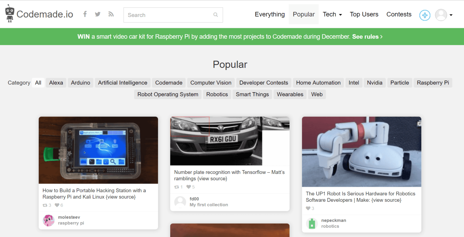
CodeMade.io is a place to find open-source Internet of Things Inspiration

CodeMade.io is a place to find open-source Internet of Things Inspiration

Most people who learn to code typically encounter the same problem during their first few months. They’ll read a book or two and learn the basics of a programming language. They’ll write a few short programs. They’ll figure out how to print “Hello World” to the screen, and then they’ll figure out how for-loops work. And then they’ll hit a brick wall, and struggle to figure out where to go from there.

At this point, I typically recommend that the person reads some open-source code on GitHub, checks out Project Euler, and the Daily Programmer subreddit. But going forward, I’m going to add CodeMade.io to my list of recommendations. Here’s why.

Europe, are you ready?

TNW Conference is back for its 12th year. Reserve your 2-for-1 ticket voucher now.

CodeMade is a user-generated collection of (mostly) physical computing products, complete with links to their source code. Projects are grouped by category, and range from basic Arduino projects that anyone can grasp, to more sophisticated ones that use artificial intelligence and deep learning. This makes it trivially easy for a beginner to find a cool project, and start building.

These projects are sourced from a variety of sources (GitHub, Instructables, Make Magazine, LifeHacker), and are aggregated into collections. I suppose you can think of it as being a bit like Pinterest, but for nerds.

It’s early days for CodeMade, and while the collection of available projects is relatively limited, the site’s got a small but expanding community. I’m cautiously optimistic that it has the potential to become a must-visit for journeyman programmers on their way to Internet of Things greatness. You can check it out here.