Design Principles Behind Great Products

Lately, I needed to come up with some top level principles for the product I’m currently working on. I seek for some simple yet powerful concepts that will guide our team design decisions and break stalemates in discussions. For the first step, I decided to look around to see what others come up with. Through a miracle of time, I bring together this compilation, that should be useful for those who face the same challenge.

But first, I found that there are some misleading concepts what are design principles itself, so let me take a quick dive into the topic.

The range of principles

If you try to google “Design Principles” you most likely run into some basic rules of graphic design: proximity, balance, contrast, space, etc. Things that good designers usually familiar with, or, most likely, know inside out.

The next huge part is principles of a rational design process. It’s a set of concepts that makes you a true professional who’s able to provide an excellent design with great efficiency. Applying these principles to the whole team sets a bar of standards that new employees should match or reach in the short term. Let’s take a look at the GOV.UK Design Principles.

The list seems reasonable, but what I think is that such things are an industrial standard by now. Everybody design with data, and everybody tries to understands context. I believe that if you choose design principles for your team, you should pick some that are groundbreaking and challenge your team to go further.

Some teams put their principles online, and I regularly bump into some statements which sound like “be human” or “be communicative.” I hold a firm belief that such shit isn’t worth to be hanging on a wall unless your team is full of insensitive silent jerks and you want to change that fact. Why did you hire them in the first place?

So, what I was looking for, are product design principles. And the Gov.UK provides at least one:

This is for everyone
 Accessible design is good design. Everything we build should be as inclusive, legible and readable as possible. If we have to sacrifice elegance — so be it. We’re building for needs, not audiences. We’re designing for the whole country, not just the ones who are used to using the web. The people who most need our services are often the people who find them hardest to use. Let’s think about those people from the start.

Design Principles of your product should tell you, your team and stakeholders which directions you should be going in the tough choices. They should focus on what distinct your product from others, how it feels and what is important for the business and your customers.

You are probably aware of the Apple’s Human Interface Guidelines or Google’s material design guidelines. Design principles behind these systems try to unify different products under the platform and bring the shared feeling to them.

If your product exists on various platforms, you should consider having a design system and some principles behind it, as well as the product design principles. You want to distance your product from others and unify the experience through different touchpoints, operating systems, and screens.

There goes the same problem: some teams put obvious design principles for their product: clarity, simplicity, usability — but you can’t create a good product without keeping such things in mind, and nowadays professionals stick with such principles by default.

Wrapping up

  • Principles of good design
    a scope of rules that define a great design.
  • Principles for the design process
    explains the way of work to create great products.
  • Design principles for the products
    how a product should feel, what emotions should it brings, what distinct it from the others.
  • Design principle for the systems
    unify your product experience in different circumstances.

Do you need design principles for your product?

Having strong principles doesn’t necessarily make your product strong at the end. Apparently, the great product requires great execution at all stages of creation, and design principles are just a small bit that guides your decisions and brings valid arguments in the disputes. They share the common vision and save time.

What are the good principles?

  • Simple
  • Have a real world examples
  • Guide design decisions
  • Reflect your brand

Collection

I gathered all principles that feel right to me. I don’t include basic design rules or process principles, but I added the Design Systems principles since they are overlapping with product design principles.

Cheers!

Here we go:

Unified
Each piece is part of a greater whole and should contribute positively to the system at scale. There should be no isolated features or outliers.

Universal
Airbnb is used around the world by a wide global community. Our products and visual language should be welcoming and accessible.

Iconic
We’re focused when it comes to both design and functionality. Our work should speak boldly and clearly to this focus.

Conversational
Our use of motion breathes life into our products, and allows us to communicate with users in easily understood ways.

Design as the “mutual friend”
Helping minimize uncertainties and setting expectations online, in the product, is an enabler for a meaningful experience offline, in the real world. We build products to let users get to know each other; we also learn what you’re looking for, and with that knowledge, we open the door to new experiences. We set the stage, help make the introduction, then get out of the way. And like a good friend, we’re there for you when you need us.

Design for first impressions
Although Airbnb requires some information from our users to book, we don’t require disclosure. That is, we ask guests to tell us who they are, but it’s up to them to tell us about themselves.

Trust takes effort
As with most things in life, you get out of Airbnb what you put into it. Trust on Airbnb is shared; it goes both ways. We’ve found the more effort a guest can signal to a host, the more trust a host is willing to give that guest.

from Sidebar http://sidebar.io/out?url=https%3A%2F%2Fmedium.muz.li%2Fdesign-principles-behind-great-products-6ef13cd74ccf%23.9m10krl99

The UX Audit: A Beginner’s Guide

The UX Audit - A Beginner's Guide

Imagine you run an eCommerce website. You know that visitors find you in search engines and that they interact with your homepage. They even get started on your checkout process. But at some point, they do not convert. And you do not know why. It might be time to update the information hierarchy. Or the user flows. But how do you know what needs rejigging and what does not?

A User Experience Audit (UX Audit) is a way to pinpoint less-than-perfect areas of a digital product, revealing which parts of a site or app are causing headaches for users and stymieing conversions. As with financial audits, a UX audit uses empirical methods to expand an existing situation, and offer heuristics-based recommendations for improvements, in this case, user-centric enhancements. Ultimately, a UX audit should let you know how to boost conversions by making it easier for users to achieve their goals on your site or software.

This beginners’ guide to the UX audit aims to equip teams with the basics to conduct their audit, or to better understand the benefits and limits of an external audit.

What Happens During a UX Audit?

First up, the big questions. What exactly happens during a UX audit and how does it fit in with usability testing? During a UX audit, an auditor will use a variety of methods, tools and metrics to analyse where a product is going wrong (or right):

  • Review of business and user objectives
  • Conversion metrics
  • Customer care data
  • Sales data
  • Traffic/engagement
  • Compliance with UX standards
  • Usability heuristics
  • Mental modeling
  • Wireframing & Prototyping
  • UX Best Practices

The difference between usability testing and a UX audit is one of information flow direction: an audit infers problems from a set of pre-established standards or goals, whereas testing infers problems from user actions. Granted, an auditor may use usability testing during an audit if they do not have access to the fundamental metrics, but they will combine the results with data collected over the longer term and weigh them up against industry standards and product goals.

What can a UX Audit tell you, and what are its Limitations?

It is important to point out that a UX audit is not a panacea for all a site’s UX woes. It is ineffective if recommendations are not actionable, or are not followed up. It also requires a significant investment of time and labour, to the detriment (or at least delay) of other tasks when the internal team does the audit.

However, while a UX audit cannot solve all the problems of an ailing site or app, it can be used to answer some profound questions:

  • What is working, and what is not?
  • Which metrics are collected and which should be collected?
  • What does the data tell you about user needs?
  • What has already been tried, and what impact did it have on metrics?

An efficiently done UX audit incurs plenty of benefits for a product. It provides actionable follow-up activities based on empirical evidence, not hunches. It supports strategic design plans. It produces metrics that can be used in future tweaks. And it helps form hypotheses about why users act in a certain way, and how they might behave in the future. Most saliently of all, it contributes to boosting conversions and ROI once follow-up action is taken.

Who Should do a UX Audit, and When?

Tim Broadwater, writing on LibUX, sets out a good rule of thumb on when you might want to carry out a UX audit: “(an audit) should be conducted in the very beginning steps of a website, web application, dedicated app, or similar redesign project.” The word ‘redesign’ is key here; audits are usually carried out on a product or service that has been live for some time has a backlog of data to examine. New features and products are more likely to be put through their paces with usability testing rather than a holistic audit.

As a general rule, companies without a dedicated UX team stand to benefit most from a UX audit; those with an in-house team are most likely evaluating the product and tweaking the experience continually.

If cash flow allows, it is advisable to have external parties carry out the audit: it is hard for internal teams to get a distance between themselves and the product, and subconscious prejudices will hamper the process. Nate Sonnenberg gives a helpful outline of how much it costs to call in the auditors: upwards of $1000 for a couple of days with a one-person team; the full monty of a UX team coming in for four weeks and providing in-depth, goal-orientated insights could cost up to $10,000. But, according to Nate, in 2-3 weeks you will find 80% of issues, which is enough to get started.

However, all is not lost if the budget does not stretch to an external audit: it is possible to audit your product internally by following an objective process, utilising the wide variety of available tools and (if you are not already) becoming au fait with UX best practices and standards.

Let us take a look at what you need to get started on your UX audit.

What do You Need to Get a UX Audit Done?

You will want to involve a cross-section of the team – designers, developers, product strategists and business managers. Also, it helps to nominate an audit lead, who will take decisions on process and timeframe.

As with any other project, the following also have to be agreed from the get-go:

  • Audit goals (conversion, ROI, etc.)
  • A time limit, which is important because you could, theoretically, go on auditing forever
  • How many resources you are willing to dedicate to the audit: time, workforce, money

An Overview of the Process

Once you have set the basics, it is time to adumbrate the process. Starting from a birds-eye perspective, the UX audit consists of six main stages: metrics and materials gathering; validation of results, the organisation of data; review of trends and tendencies; reporting of findings; creation of evidence-supported recommendations.

Metrics and Materials Gathering

The most difficult part of a UX audit is possibly the first step, the gathering of relevant materials. If goals were properly defined before embarking on the audit, you would know what kind of information you need; now you just need to think which metrics will provide you with that information.

Get team members on board in information sharing existing information and tracking useful metrics you do not currently have, and this step will be easier.

Here are some sources of metrics and materials helpful in an audit:

  • A heuristic product evaluation: Conduct a cognitive walkthrough of the product to see things from a customer’s perspective. Take notes as you try to achieve user goals, and focus on identifying potential obstacles. Be aware that your knowledge of the product will make this task difficult – basing the process on established criteria, such as Nielsen’s heuristics, will help you stay focused.
  • Website and mobile analytics: If a heuristic evaluation provides you with qualitative data, then analytics tools will provide the necessary quantitative information you need. Most people should be familiar with the basic functions of Google Analytics, such as traffic source, traffic flows and trends over time; more advanced functions can elucidate user flows within the website, conversion (and abandonment) hotspots and what users are doing before and after they visit your site. Tools such as Kissmetrics and Crazy Egg can supplement basic analytics with features such as heat maps and churn rates; app analytics can be collected either through Google mobile analytics, are through a dedicated tool such as Mixpanel. Make sure you are going far back enough in the analytics to recognise trends, rather than basing the audit on isolated data points.
  • Conversion rates or sales figures: If the premise of your site or app is eCommerce, sales or download figures can be useful to a UX audit. For example, here at Justinmind, we measure how many blog readers download our prototyping tool and from which particular posts: this gives us an insight into how our content fits in with the wider user experience of Justinmind and whether we are meeting user pain points.
  • Stakeholder interviews or user surveys: As with any UX endeavour, you have got to get out there and talk to real people. Start off by interviewing internal product stakeholders such as product owners and developers, questioning them for insights on the product’s plan, requirements and ongoing development challenges. You can also ask what they want to see out of the UX audit, which will generate faith and goodwill in the audit process. Also, find out if the marketing or sales department has ever conducted user surveys: there is likely to be a wealth of comment and feedback within these surveys that you can use in a UX audit. You can organise this feedback into categories – findings per screen or task, for example – and according to severity.
  • Previous product requirements: Acquiring access to an application’s original requirements will save you time and help you understand why design decisions happened the way they did; this information will be useful when it comes to writing up viable recommendations.

At this stage, it is possible to pause and validate the qualitative data collected through usability tests. For example, if past user surveys revealed that the customer check-out process was complicated, conduct usability tests to see if you can back up this unsupported claim.

How to Organise the Materials you have Collected

In a word, spreadsheets. All the information obtained in step one should be tracked on a worksheet and aggregated. Upload the spreadsheet into the Cloud and make it a living, collaborative document where questions and ideas are recorded alongside relevant metrics.

If you are unsure about what you need to put in the spreadsheet, try out these helpful templates:

Look for Trends and Tendencies

The moment when you have to turn data into insights is often nerve-wracking: turning metrics into meaningful change is a profound issue that is beyond the remit of this article. Suffice to say that there are methods that will help you make sense of the information in front of you, such as data-mining, card sorting (not just for UX architects but also perfect for aggregating any mound of information) and insight incubation. Check out Steve Baty’s post in UXmatters for more on finding patterns in UX research.

Reporting of Findings

After mining data for insights it is time to develop hypotheses about the application’s user experience status: why do users act as they do instead of in the way stakeholders want them to. You can compare the insights you garnered against the following four keystones of successful products:

  • Relevance: is the site or app addressing a user pain point? Is there a disconnection between expectation and reality when users find your product?
  • Value proposition: is the value to the user clear and convincing?
  • Usability: are there points of ambiguity or uncertainty in your product interface, or do customers’ intuitively understand what to do?
  • Action: Are calls to action visible and relevant, and do they incentivise users to take action?

Creation of Evidence-Supported Recommendations

Finally, data-driven recommendations for UX improvements can be written. The key here is to make recommendations as applicable as possible. We are fans of the recommendations given by Joseph Dumas, Rolf Molich and Robin Jeffries in ‘Describing Usability Problems: are we sending the right message?‘:

  • Emphasise the positive
  • Express your annoyance tactfully
  • Avoid usability jargon
  • Be as specific as you can

On a more substantive level, do not forget to supplement recommendations with examples, rather than just identifying areas for general change. For example, in this sample UX audit report from Intechnic, recommendations include “for forms and resources, rearrange according to the number of clicks” and “in navigation drop-downs, remove images”. Suggesting solutions for the design-development team will always be a more positive, effective tactic than merely criticising where the application has failed on user experience.

Basic UX Audit Resource Kit

Your UX audit kit will obviously depend on the product you want to audit, and the final objectives that you’ve set out. However, the following resources and activities should equip you with everything you need to get started:

A Beginner’s Guide to the UX Audit – the Takeaway

A user experience audit requires significant investment in terms of time and human resources if done internally, and money if contracted out to professional UX auditors; it is not to be undertaken lightly. However, the benefits to an established site or app are visible, particularly if conversions are stagnant or slow-growing and the users’ voice is not represented in the product improvement process. By undertaking a UX audit, you can bring about significant, data-driven change to an application and see upticks in both user satisfaction and ROI.
from UsabilityGeek http://usabilitygeek.com/ux-audit-beginners-guide/

Law Firm Hogan Lovells Learns to Grapple with Blockchain Contracts

A blockchain distributed ledger may not replace all lawyers, but one firm is studying how the technology could eliminate many of the manual steps typically needed to execute contracts. New York City-based law firm Hogan Lovells is experimenting with so called smart contracts and exploring the legal and organizational issues raised by the agreements executed […]

from CIO Journal. http://blogs.wsj.com/cio/2017/02/01/law-firm-hogan-lovells-learns-to-grapple-with-blockchain-contracts/?mod=WSJBlog

Designing Anticipated User Experiences

Anticipatory Design is possibly the next big leap within the field of Experience Design. “Design that is one step ahead” as Shapiro refers to it. This sounds amazing, but where does it lead us? And how will it affect our relationship with technology?

I’ve dedicated my Master thesis to this topic to identify both ethical as design challenges that come with the development of predictive UX and application of Anticipatory Design as design pattern. With as overarching question “How Anticipatory Design might challenge our relationship with technology”.

A Future Without Choice

Anticipatory Design is an upcoming design pattern within the field of predictive user experiences (UX). The premise behind this pattern is to reduce cognitive load of users by making decisions on behalf of them.

Despite its promise, little research has been done towards possible implications that may come with Anticipatory Design and predictive user experiences. Ethical challenges like data, privacy and experience bubbles could inhibit the development of predictive UX.

We’re moving towards a future with ambient technology, smart operating systems and anticipated experiences. Google Home, Alexa, Siri and Cortana are all intelligent personal assistants that learn from your behaviour, patterns and data and will likely anticipate your needs in the near future pro-actively.

Anticipated user experiences are a promising development that releases us from our decision fatigue. With the approximately 20.000 decisions we make on daily average, most of us are suffering from it.

Less Choice, More Automation

Anticipatory Design is a design pattern that moves around learning (Internet of Things), predicting (Machine Learning) and anticipation (UX Design).

Anticipatory Design Mix

Smart technology within the Internet of Things learns by observing, while our data is interpreted by machine learning algorithms. UX design is crucial for delivering a seamless anticipated experience that take users away from technology. Anticipatory Design only works when all three actors are well aligned and effectively used.

Anticipatory Design as design principle is already used in quite a few products without us being actively aware of it. Products like Nest, Netflix and Amazon’s Echo are good examples of how products learn, adjust and anticipates on given data of the user.

5 Design Considerations

Over the past few months I’ve interviewed severel experts in the field of UX and A.I. to investigate what challenges lie ahead and what considerations are there to make. The following 5 design considerations were distilled:

1. Design Against the Experience Bubble

We saw what happened with Trump, the filter bubble is real and most of us circle around in our own ‘reality’. Eli Pariser described with ‘the filter bubble’ in 2011 how the new personalized web is changing what people read and how people think. The same risk applies when devices around us anticipate our needs and act on them. An Expe- rience Bubble at which you get stuck in a loop of returning events, actions and activities. Algorithms are causing these returning events. Algorithms are binary and unable to understand meaning behind actions. It is worrisome that algorithms are not conversational. There should be a way to teach algorithms on what is right, wrong and accidental behavior.

2. Focus on Extended Intelligence Instead of Artificial Intelligence

The head of MIT Media Lab, Joi Ito, gave a very interesting perspective that coloured my beliefs regarding design principles to follow. Mr. Ito said that humanity should not pursue robotics and Generalized AI but rather focus on Extended Intelligence. This, because it is in humans nature to use technology as an extension of itself. It would feel inhuman to replace our daily activities by machines.

3. Responsive Algorithms Make Data Understandable

Current used algorithms are binary and limited to the actions and input of users. Conceptually they pretend to be ‘personal’ and ‘understandable’ about our actions but in real-life it is a matter of ones and zero’s. Algorithms are not ready for predictive systems and need to be more responsive in order to adapt to people’s motives and needs. Revisiting the feedback loop is a way to implement responsiveness. In this way, people can teach algorithms what- but foremost why they like or dislike things.

4. Personality Make Interactions More Human-Like

The Internet of Things (IoT) is growing as a market and there’s a shift from mobile first to A.I. first, meaning that users will get a more personal and unique relation and experience with their device.

When I interviewed respondents and asked them about their view on smart operating systems and Artificial Intelligence, most people referred to the movie Her as a future perspective. This perspective is intriguing. However, looking at recent developments for smart assistants like Siri, Cortana and Google Home an essential feature is missing: personality.

Personality adds huge value to our interactions with devices, because it gives a human touch. We can relate more to devices if it has a personality. Looking at services like Siri, I believe that the personality will be more relevant in the future than the amount of Gigabytes.

5. Build Trust by Giving Control and Transparancy

Today, people need to hack their own online behavior to receive the right content. It is so frustrating when you buy a gift for someone else, and get bombarded after purchase with adverts of the same product (THE SAME PRODUCT, that you just bought…).

Algorithms often misinterpret my actions. There’s room for improvement. Data interaction has become a crucial element in developing experiences for the future. Respondents that I’ve interviewed voiced their concerns about the lack of transparency and control that comes with the internet. Much personal data ends up in a ‘black box’. No one knows how our data is used and processed by big tech firms. Providing options for automation should build trust and enable growth.

UX Design is Evolving

The craft of UX Designers is changing. Increasing responsibilities, interactions and forms influence the design approach.

User Interfaces for example increasingly take different forms (e.g. voice-driven interfaces) that require a different way of design thinking. UX designers are getting more exposed to ethical design since a lot of confidentiality is involved by creating predictive user experiences.

With the dawn of fully automated consumer-facing systems, a clear view on design mitigations and guiding prin- ciples are desired since future designers will face much more responsibility concerning topics like privacy and data.

Current sets of design principles from Rams, Nielsen (1998), Norman (2013) and Schneiderman (2009) are insufficient for automation because principles regarding transparency, control, loops and privacy are missing.

The evolvement of Experience Design within a context of automation requires discussions and design practices to mitigate forecasted design challenges.

Let’s Continue This Conversation

Predictive UX is an increasingly growing field of expertise. The craft of UX design is changing with it. As we are at the shift of a new AI- driven era, it is important to share design stories, insights and practices to continue the development of Anticipatory Design as pattern, and predictive UX as a service.

Please join the movement and share your thoughts on Predictive UX & Anticipatory Design

www.anticipatorydesign.com

from uxdesign.cc – User Experience Design – Medium https://uxdesign.cc/designing-anticipated-user-experiences-c419b574a417?source=rss—-138adf9c44c—4

Material Design and the Mystery Meat Navigation Problem

Material Design and the Mystery Meat Navigation Problem

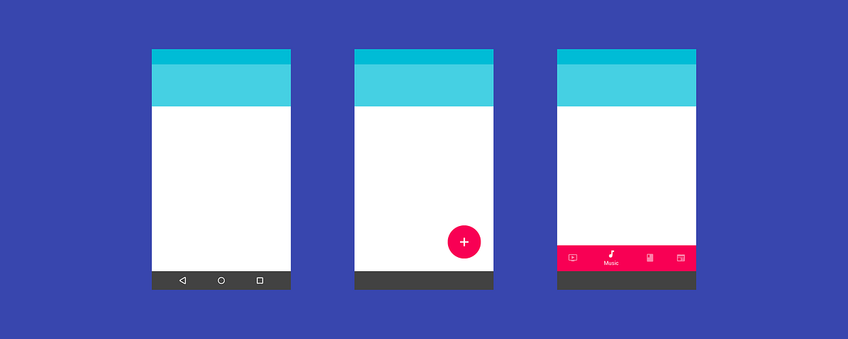
In March 2016, Google updated Material Design to add bottom navigation bars to its UI library. This new bar is positioned at the bottom of an app, and contains 3 to 5 icons that allow users to navigate between top-level views in an app.

Sound familiar? That’s because bottom navigation bars have been a part of iOS’s UI library for years (they’re called tab bars in iOS).

Left: Material Design’s bottom navigation bar | Right: iOS’s tab bar

Bottom navigation bars are a better alternative to the hamburger menu, so their addition into Material Design should be good news. But Google’s version of bottom navigation bars has a serious problem: mystery meat navigation.

Whether you’re an Android user, designer, or developer, this should trouble you.

What’s mystery meat navigation, and why’s it so bad?

Mystery meat navigation is a term coined in 1998 by Vincent Flanders of the famous website Web Pages That Suck. It refers to buttons or links that don’t explain to you what they do. Instead, you have to click on them to find out.

(The term “mystery meat” originates from the meat served in American public school cafeterias that were so processed that the type of animal they came from is no longer discernible.)

An example of mystery meat navigation | Source

Mystery meat navigation is the hallmark of designs that prioritize form over function. It’s bad UX design, because it emphasizes aesthetics at the cost of user experience. It adds cognitive load to navigational tasks, since users have to guess what the button does. And if your users need to guess, you’re doing it wrong.

You wouldn’t want to eat mystery meat—similarly, users wouldn’t want to click on mystery buttons.

Strike 1: Android Lollipop’s Navigation Bar

Material Design’s first major mystery meat navigation problem happened in 2014 with Android Lollipop.

Android Lollipop was introduced in the same conference that debuted Material Design, and sports a redesigned UI to match Google’s new design language.

Navigation bar in earlier versions of Android

One of the UI elements that got redesigned was the navigation bar, the persistent bar at the bottom of Android OS that provides navigation control for phones without hardware buttons for Back, Home and Menu.

In Android Lollipop, the navigation bar was redesigned to this:

Navigation bar, Android Lollipop and up

See the problem?

While the previous design is less aesthetically appealing, it’s more or less straightforward. The Back and Home icons can be understood without the need for text labels. The 3rd icon is a bit of a mystery meat, but on the whole, the UX of the old navigation bar wasn’t too bad.

The new bar, on the other hand, is extremely pretty. The equilateral triangle, circle, and square are symbols of geometric perfection. But it’s also extremely user-unfriendly. It’s abstract—and navigation controls should never be abstract. It’s full-blown mystery meat navigation.

The triangle icon might resemble a “Back” arrow, but what does a circle and a square mean in relation to navigation control?

Making sense of the navigation bar icons

Strike 2: Floating Action Buttons

Floating action buttons are special buttons that appear above other UI elements in an app. Ideally, they’re used to promote the primary action of the app.

Specs for the floating action button | Source

Floating action buttons also suffer from the mystery meat navigation problem. By design, the floating action button is a circle containing an icon. It’s a pure-icon button, with no room for text labels.

The truth is that icons are incredibly hard to understand because they’re so open to interpretation. Our culture and past experiences inform how we interpret icons. Unfortunately, designers (especially, it seems, Material designers) have a hard time facing this truth.

Need proof that icon-only buttons are a bad idea? Let’s play a guessing game.

Below is a list of what—according to Material Design’s guidelines—are acceptable icons for floating action buttons. Can you guess what each button does?

Mystery button 1

Ok, that’s a simple one to warm you up. It represents “Directions”.

Mystery button 2

What about this? If you’re an iOS or Mac user, you might say “Safari.” It actually represents “Explore.”

Mystery button 3

Things are getting fun (or frustrating) now! Could this be “Open in contacts”? “Help, there’s someone following me”? Perhaps this is a button for your “Phone a friend” lifeline.

Mystery button 4

Hang on, this is the button for “Open in contacts.” Right? Or is this “Gossip about a friend” since the person is inside a speech bubble?

Ready for the final round? Here’s the worst (and most used) icon:

Mystery button 5

You might think the “+” button is rather simple to understand—it’s obviously a button for the “Add” action. But add what?

Add what: that’s the problem right there. If a user needs to ask that question, your button is officially mystery meat. Sadly, developers and designers of Material Design apps seem to be in love with the “+” floating action button.

Precisely because the “+” button seems so easy to understand, it ends up being the most abused icon for floating action buttons. Consider how Google’s own Inbox app displays additional buttons when you tap the “+” floating button, which is not what a user would expect:

The “+” button opens up a menu of… more buttons?

What makes things worse is how the same icons have different meanings in different apps. Google used the pencil icon to represent “Compose” in Inbox and Gmail, but used it to represent “Edit” in its photo app Snapseed.

Same icon, different meanings: “Compose” in the Gmail and Inbox apps, “Edit” in the Snapseed app

The floating action button was intended to be a great way for users to access a primary action. Except it isn’t, because icon-only buttons tend to be mystery meat.

More on floating action buttons:

Strike 3: The New Bottom Navigation Bar

This brings us to the bottom navigation bar, introduced in March 2016.

For bottom navigation bars with 3 views, Google’s guidelines specify that both icons and text labels must be displayed. So far, so good: no mystery meat here.

Bottom navigation bar with 3 views: so far, so good

But for bottom navigation bars with 4 or 5 views, Google specifies that inactive views be displayed as icons only.

Bottom navigation bar with 4 views: mystery meat

Remember how hard it was to guess what the floating action button icons mean? Now try guessing a row of icons used to navigate an app.

This is just bad UX design. In fact, the Nielsen Norman Group argues that icons need a text label, especially navigation icons (emphasis theirs):

“To help overcome the ambiguity that almost all icons face, a text label must be present alongside an icon to clarify its meaning in that particular context.… For navigation icons, labels are particularly critical.”

That Material Design’s newest UI component condones mystery meat navigation is not only frustrating, but also weird. Why should text labels be shown when there are 3 views, but be hidden when there are 4–5 views?

An obvious answer would be space constraints.

Except tab bars in iOS manage to contain 5 icons, and still display the icon and text label for each of them. So space constraint isn’t a valid reason.

iOS tab bar in the App Store, Clock and Music apps: 5 icons, all with text labels

Google either decided that icons can sufficiently represent navigational actions (which is bad), or they decided that aesthetic neatness is more important than usability (which is worse). Either way, their decision worsened the UX of millions of Android users.

Material Design and Form over Function

When Material Design was launched in 2014, it was to much fanfare. It’s bold, and rides on (and one-ups) the flat design trend. The pairing of vibrant colours and animations make it pretty to look at.

“Make it pretty!” — Material Design designer | Source

But perhaps it’s a little too pretty. Perhaps while working on Material Design, the designers got a little carried away.

Time and again, Google’s guidelines for important buttons and bars seem to prioritise form over function. Geometric prettiness was chosen over recognisability in Android’s navigation bar. Aesthetic simplicity was championed in floating action buttons, turning them into riddles in the process. Finally, visual neatness was deemed more important than meaningful labels in bottom navigation bars.

That’s not to say that mystery meat navigation is a Google-only problem. Sure, you can find mystery meat in iOS apps too. But they don’t usually appear in critical navigational controls and promoted buttons. They also aren’t spelt out specifically in design guidelines to be mystery meat.

Speed graph showing the correct (blue) acceleration for animations

If Google designers could devote time and effort into creating speed graphs for animations, perhaps they could spend a little time to make sure their designs aren’t mystery meat.

After all, an animated mystery button is still less delightful than a static but clearly labelled button.

from Sidebar http://sidebar.io/out?url=https%3A%2F%2Fmedium.freecodecamp.com%2Fmaterial-design-and-the-mystery-meat-navigation-problem-65425fb5b52e%23.5w65oqu37

Data Humanism, the Revolution will be Visualized.

SNEAK CONTEXT IN. (ALWAYS)

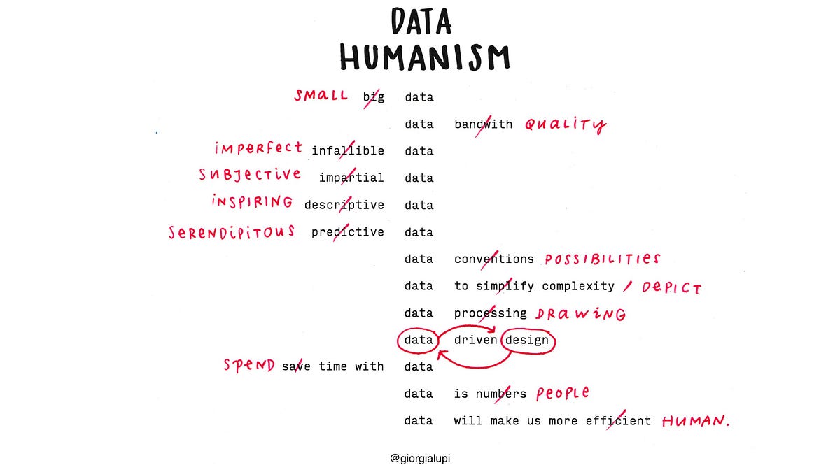
A dataset might lead to many stories. Data is a tool that filters reality in a highly subjective way, and from quantity, we can get closer to quality. Data, with its unique power to abstract the world, can help us understand it according to relevant factors. How a dataset is collected and the information included — and omitted — directly determines the course of its life. Especially if combined, data can reveal much more than originally intended. As semiologists have theorized for centuries, language is only a part of the communication process — context is equally important.

This is why we have to reclaim a personal approach to how data is captured, analyzed and displayed, proving that subjectivity and context play a big role in understanding even big events and social changes — especially when data is about people.

Data, if properly contextualized, can be an incredibly powerful tool to write more meaningful and intimate narratives.

To research this realm, I undertook a laborious personal project: a yearlong hand-drawn data correspondence with information designer Stefanie Posavec. We have numerous personal and work similarities — I am Italian and live in New York, and she is American and lives in London. We are the exact same age, and we are only-children living far away from our families. Most importantly, we both work with data in a very handcrafted way, trying to add a human touch to the world of computing and algorithms, using drawing instead of coding as our form of expression. And despite having met only twice in person, we embarked upon what we called Dear Data.

For a year, beginning Sept. 1, 2004, Posavec and I collected our personal data around a shared topic — from how many times we complained in a week, to how frequently we chuckled; from our obsessions and habits as they showed up, to interactions with our friends and partners. At the end of the week we analyzed our information and hand-drew our data on a postcard-sized sheet of paper, creating analog correspondence we sent to each other across the Atlantic. It was a slow, small and incredibly analog transmission, which through 52 pretexts in the form of data revealed an aspect of ourselves and our lives to the other person every week.

We spent a year collecting our data manually instead of relying on a self-tracking digital app, add- ing contextual details to our logs and thus making them truly personal, about us and us alone.

For the first seven days of Dear Data we chose a seemingly cold and impersonal topic: how many times we checked the time in a week.

On the front of my postcard, (as shown above) every little symbol represents all of the times I checked the time, ordered per day and hour chronologically — nothing complicated. But the different variations of my symbols on the legend indicate anecdotal details that describe these moments: Why was I checking the time? What was I doing? Was I bored, hungry or late? Did I check it on purpose, or just casually glance at the clock while occupied in another activity? Cumulatively, this gave Posavec an idea of my daily life through the excuse of my data collection — something that’s not possible if meaning isn’t included in the tracking.

As the weeks moved on, we shared everything about ourselves through our data: our envies, the sounds of our surroundings, our private moments and our eating habits.

We truly became friends through this manual transmission. And in fact, removing technology from the equation triggered us to find different ways to look at data — as excuses to reveal something about ourselves, expanding beyond any singular log, adding depth and personality to quantitative bits of information.

In a time when self-tracking apps are proliferating, and when the amount of personal data we collect about ourselves is increasing all the time, we should actively add personal and contextual meaning to our tracking. We shouldn’t expect an app to tell us something about ourselves without any active effort on our part; we have to actively engage in making sense of our own data in order to interpret those numbers according to our personal story, behaviors and routine.

While not everyone can do a project as hyper-personal as this one, data visualization designers can make their interpretations more personal by spending time with any type of data. This is the only way we can unlock its profound nature and shed light on its real meaning.

from Sidebar http://sidebar.io/out?url=https%3A%2F%2Fmedium.com%2F%40giorgialupi%2Fdata-humanism-the-revolution-will-be-visualized-31486a30dbfb%23.y7krgbafl

Making Chatbots Talk — Writing Conversational UI Scripts Step by Step

Making Chatbots Talk — Writing Conversational UI Scripts Step by Step

As a content writer, working in UX design agency, I’ve learned to accept the fact that visuals usually have much bigger impact than the text. From my perspective, this is a bit frustrating. So when my team was faced with the task of designing a website chatbot, I was really excited: finally the time has come for writing to take over!

In this article, I want to focus only on writing the script, describing the whole process step by step. The complete case study of designing the chatbot was written by Leszek Zawadzki.

First Things First

As the chatbot was to be represented by our client’s brand hero — Cody, the script had to match his friendly and playful personality. The first ideas came to my head as soon as I’ve heard about the project: I immediately started creating the first conversation scenarios in my mind. But, soon I realized the bots and user exchanges are all quite meaningless. Yes, small talks are good for starters, but the script has to fulfil some goals. Determining what these are and figuring out the ways to fulfil them should, then, be the first thing to do.

Step 1: Setting the Goals

The main aims of our client — a web development company — was using conversational UI website to present their skills and services as well as increase brand awareness. Focused on these two, my team created a list of end goals to which the conversation was supposed to lead:

  • the user visits company blog
  • the user shares feedback about the company blog
  • the user leaves his/her email
  • the user leaves information about his/her occupation
  • the user visits services page
  • the user visits about us page
  • the user visits main company page or one of the landing pages
  • the user contacts the company
  • the user shares the chatbot website
  • the user bookmarks the chatbot website
Final version of end goals on the whiteboard.

With the end goals determined, we knew exactly where should the conversation with the bot lead to.

Step 2: User Research

Since end goals are well… at the end, we knew it’s crucial to write the script in such a way that the user feels engaged enough throughout the whole conversation to reach that final point. Unfortunately, it’s rather difficult to entertain someone you know nothing about and it’s even harder when your conversation is taken out of context. In everyday life, you always have some basic idea about your interlocutor (even if it’s just your first impression based on their appearance) and your meeting usually has some, more or less obvious, reason.

We wanted to achieve a similar conversation background, at least to the extent it’s possible in the chatbot script. It didn’t seem possible without some kind of user research. I started with entry points, writing down all the possible contexts the user might enter the conversation: Medium article, Facebook post, Twitter ad and so on. Then, I created a basic profile of each type of user, including their profession, interests, lifestyle, and the reasons why they might decide to chat with a bot.

Basic persona sketch.

In the end, the different types of users were organized into two main groups: 1) potential clients of the company 2) people interested in the chatbot per se.

Step 3: Initial Transcript Form

Now I was ready to write the script. Or at least, I thought I was. I took A4 pad (don’t think I’m crazy, I just like the old-school methods) and got down to work. 5 minutes later I already knew I had one more thing to figure out: “How the hell am I going to write this down?” Each response the user can choose from means starting another conversation, so should I write them all separately, cross-reference, do a tree diagram? I decided the last option would be the best and I think it was. I had to rush, though, to the nearest stationery store to buy large bristol board, since it turned out my tree had been sprouting branches like crazy.

Early stage of transcript in the tree diagram form.

Overall, when the script was finished, I was pleased with the form I had chosen. On a tree diagram the conversations were clearly separated and at the same time visible all together. What’s more, using arrows when the different parts of talk meagered helped to save time on rewriting the same part a couple of times.

Step 4: The Script

Finally, after a few hours of work, I reached the phase I initially thought will be the first and also the last one — writing. In fact writing per se took less time than the ideation process that accompanied it. Before I composed any part of the conversation, I had to take into account a lot of different things.

Open-ended vs. Closed-ended questions
We wanted the conversation to feel as natural as possible, so initially, I planned to include quite a few open-ended questions. This would definitely be beneficial from the point of view of users who would have freedom to speak (or rather write) what they like. However, since our bot wasn’t supposed to be based on AI, it would be extremely difficult to create relevant responses. No matter how hard you try, you won’t be able to predict what the user might say and any time you fail to provide a relevant answer the talk becomes nonsense or at least awkward. Also, in the case of open-ended questions, we would run the risk of the conversation drifting away from the end goals.

We wanted to avoid that, even at the cost of limiting the interlocutor freedom, so in the end I decided to keep only two open-ended questions to which the bot’s answer can stay the same, no matter what the user writes.

1) Question about the user name to which Cody would always* answer “Nice to meet you” 
2) Question about the user profession which, apart from 3 pre-defined options to choose from, would feature a text input (these would help to filter the users from client and non-client group). Here whatever* the user says, Cody can express interests and pass to another topic.

*That’s what I thought until I realized, I should also take into account…

Random and irrelevant answers
Yeah, even if you ask a simple question, like “What’s your name”, you have to be prepared for the possibility that someone won’t give the most expected answer. Some people will for sure try to challenge the bot by typing swear words or simply gkbbsdfjsdtvbndxus. Of course, you may just ignore that and let your bot politely say “Hi!” to Supercalifragilisticexpialidocious or fuckerfuck, but I decided to solve this problem by preparing a special answer for such circumstances.

Chatbot’s reaction to irrelevant user response.

Leszek says more about dealing with irrelevant answers in his article.

Context
In real life, the circumstances of the talk are always meaningful and shape the conversation in some way. It may seem that in the case of chat with a bot, the context will always be the same — the user enters the site and that’s it. But the source he/she enters from, time and frequency matter and it would be a pity to ignore them.

The first thing I wanted to do then, was to take advantage of cookies to determine if a given user is talking to Cody for the first time. If it’s a re-visit, instead of asking the user for his/her name again (which would be quite strange if Cody was a real person), I decided to refer to the previous meeting.

Using cookies to recognize revisiting users.

Another way to give conversation some context is by using referral URL analysis to determine the source the user enters from. No matter if it’s an ad, social media or blog post, referring to it can be a good starting point for the conversation, which will feel much more personalized for the user. The same goes for the device the visitor browses the site from.

In Cody’s case, mobile or desktop context had a big influence on the script. Unfortunately, I realized that at the point it was almost finished. I included in the script a fragment where Cody was showing the keyboard shortcut for “add to bookmarks”, encuranging the user to press Cmd/Ctrl + D. Probably because I liked that part so much, I somehow didn’t realize it won’t make much sense on mobile and later was forced to add an alternative version for that part, which with an almost finished script wasn’t an easy task. 
 
Fulfilling Goals
As we already had the user groups determined, all I needed to do is to create a path that would lead them to the end goals. First, I linked different user groups to the goals that should be the most beneficial to achieve by them from the company point of view.

1) Potential clients were to be directed to one of the company pages and encouraged to contact or leave their email. 
2) Those interested in the bot per se were to visit the company blog and share feedback on it.

Additionally, sharing the chatbot website and bookmarking it applied to both groups.

I decided it will make sense to create two separate scripts and link them only at the beginning and end of the conversation that I wanted to be similar in both cases.
 
The script for clients seemed to be more complicated. The most important goal here was to direct the user to the appropriate company page or promotional landing page. To do that, I had to collect some basic information about the visitor. The initial research I made helped a lot here. Knowing that most of the potential clients would be designers, developers or business owners, choosing one of these options when Cody asks them about their job, determined the next steps. In the case of first two clients, these were limited to providing the right page or contact person, but in the business owner case, the next filtering was necessary.

Using chatbot to gather information about the visitors.

Having the more difficult part of the conversation done, the part for non-clients went pretty fast with Cody speaking mainly about his story and origin. A pleasant chit-chat, you usually exchange with a new person, was subtly filled with utterances focused on increasing brand awareness.
 
Loops
To avoid creating hundreds of separate conversations and risking some important information are missing in one of them, I decided to depend on what I called loops: one conversation was split in two or three, proceeded for some time and then a couple of different talk branches met in the same place. That way, we were sure things that really matter from the point of view of project goals will be featured in each chat scenario.

There was only one problem with that, once or twice it turned out the user was asked the same question for the second time. Spotting that at the point where I already had half of the script was a huge frustration. I had two options: rewrite a big portion of the script, this time making sure none of the loops lead to repetition, or… find another solution. I instantly decided on the latter, but it took me some time to come up with a remedy.

Dealing with repeated parts of the conversation.

In the end, it turned out to be very simple. If people can forget and ask about the same thing a couple of time, what’s wrong with Cody doing the same?

Step 5: Development Instructions

Ok, the script is ready and checked a few times for potential holes or mistakes. All that needs to be done is hand it to developers in some digestible form — we couldn’t give them bristol tree diagram with my terrible handwriting and force them to decipher and type it all by themselves. Our script needed to be developer-friendly.

First idea was to use some kind of software like Xmind of Freemind that would enable me to reconstruct the tree form, but when I looked at two bristols that covered half of the wall, I decided it wouldn’t be the best solution. Then I thought about cross-references, however, I was worried it might be too many of them which would make the script very complicated to read. I started with writing down all conversations separately, then.

After 3 hours of writing, copying and pasting, I had almost a hundred conversations and, though I’m not the best at maths, I estimated we’ll finish with 480 different versions, if I continue this way. It didn’t make sense so after discussing the script form with my them, we’ve ended with writing it down in the cross-reference form.

Final version of the script.

The whole conversation was divided into unique parts (any fragment that repeated at some point, appeared only once) — each named and accompanied with a number and a letter that referenced to one another. The developers were provided with the key to read the script.

Key
/ diffrent responses that:
- change the conversation if the sign (1) or (1A) appears
- not change the conversation if no sign appears
| different user responses followed by relevant bot responses, without changing the course of conversation
[1A] parts of conversation
(1A) cross-reference to another part of conversation

12 pages instead of 86 I already had (remember I’ve done less than a quarter of it before I gave up) was an achievement. And though it took us a moment to explain the script and the key to developers, in the end they knew exactly how to approach it. Our job was done.

Conclusions

Writing doesn’t usually seem like much of a challenge. Good coffee, text editor, a bit of inspiration and voilà. Not this time… Creating conversational UI script is a challenge, especially when you do it for the first time. That project taught my team a lot and next time we’re faced with preparing chatbot script, we’ll already have a set of guidance:

  • start with determining the main objectives of the script — end goals the users should be lead to
  • do research to get at least the basic idea of who the chatbots visitors will be
  • prepare the script outline first, deciding on the type of questions to use and a basic path leading users to the goals
  • think over the context of the conversation (device used, entry points, reasons to enter the site) and accommodate the script to it
  • try to predict less expected situations such as revisits or irrelevant answers
  • decide on the form of the transcript, before writing
  • think of the structure of the conversation — should it consist of separate chats or should they be connected at some point
  • talk to developers and decide in which form should the script be digitalized

And last but not least: think twice before rushing into doing something.

from uxdesign.cc – User Experience Design – Medium https://uxdesign.cc/making-chatbots-talk-writing-conversational-ui-scripts-step-by-step-62622abfb5cf?source=rss—-138adf9c44c—4