Atomic Design & creativity

I’ve been using atomic design in my projects over the last 2 years now. And since then, I can’t help but talk about it to everyone around me 😉

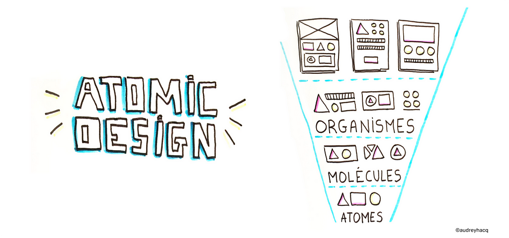
Quick reminder : Atomic Design is a methodology, invented by Brad Frost and based on the idea that designing interface should always rely on the smallest part of the interface (atoms) in order to build any other assets.

While I was trying to convince people around me about this methodology, I noticed that some people (mostly creative people I have to say…) were concerned about the « industrial » aspect of this methodology.

It’s the end of my creativity!

“We’ll turn into robots designing components”

Unfortunately, when we talk about “industrialization” and “reuse”, many people understand “standardisation” and “creative limitation”.
I disagree.

When you really find your own interpretation on how to use Atomic Design, you can decide precisely where and when you want to give room to creativity.

Let’s see what happens when we name it differently

When I started using Atomic Design, I read many articles and discovered how other people were actually using it their own way depending on the project, the size of their team…

Vocabulary used in Atomic Design doesn’t often speak to the teams. Worse, it can create confusion. For example, what is the difference between molecules and organisms? Or templates versus pages?

And it’s fair to say that chemical and biological metaphors can be “scary” for non-scientific minds (myself included 😉

I decided to find different metaphors to convey the same idea of starting from the smallest piece to build from.

Metaphor #1 : Lego

This is the first metaphor I found interesting and it’s definitely the most commonly used when approaching components systems.

I have bricks of different shapes, sizes and colors:
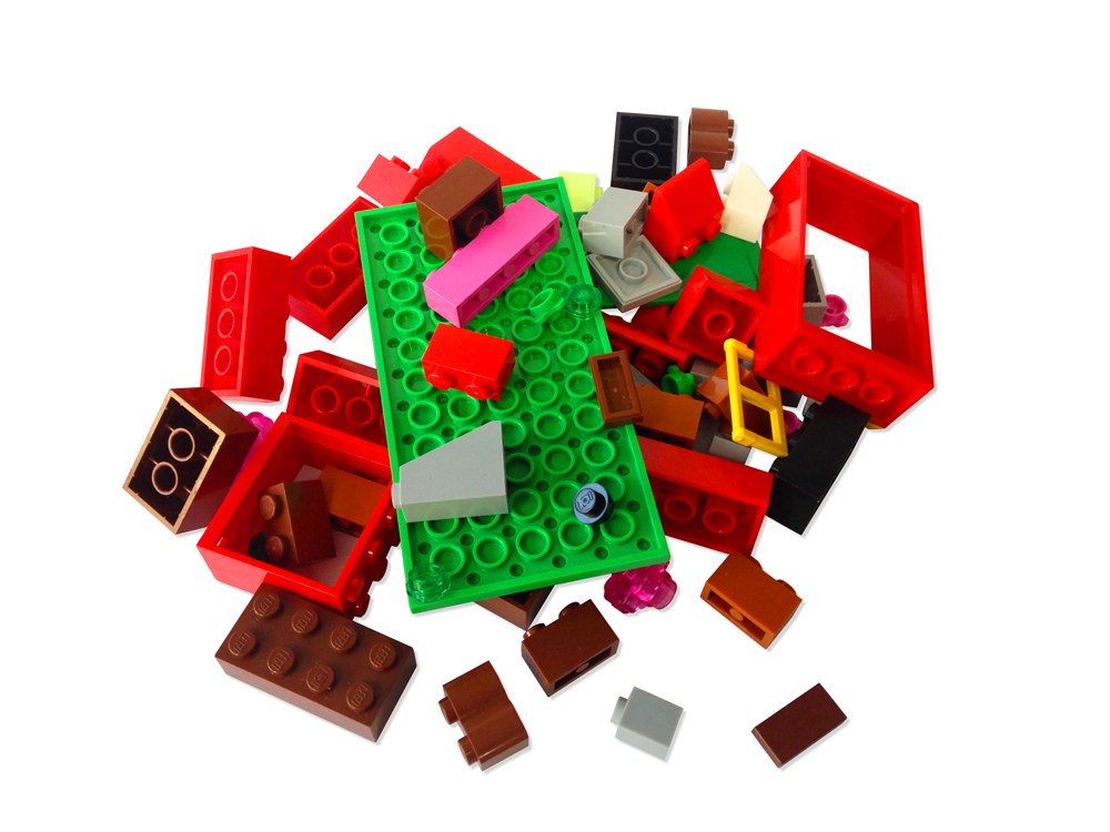
Your raw material : atoms

With this bricks, I can build different elements:
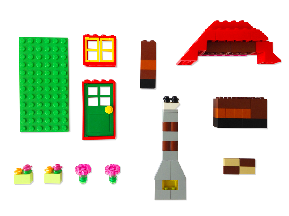
Simple or complex elements (molecules & organisms)

And by assembling these elements, I come to a final result which can even be a part of something much bigger:
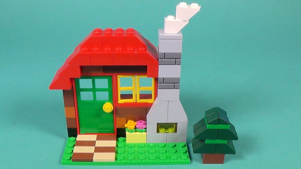
One of the possible results

What’s great with Lego is that you can extend the metaphor: the style guide that will be developed is like a Lego storage box with rules on how to use them (Building instructions):
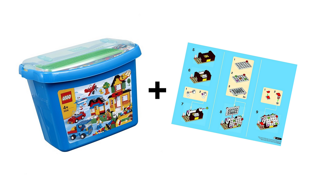
The Style guide : the storage and the building instructions, essential to use the system correctly

This metaphor is more fun than the atoms and it pleases the teams a lot (especially developers 🙂

Nevertheless, something is still missing with regard to our designer job…

How to make understand that, when designing a product, we’re not just assembling blocks… We also want our user to feel something.

Metaphor #2 : music

Recently at Backelite, I introduced the Atomic Design methodology for one of our clients. And I was lucky to work with a talented Art Director: Florian Cordier.

Working with Atomic Design was not a choice of his own and he was not really comfortable with the idea… He thus decided to find his own metaphor and he developed the following one, which I find absolutely brilliant.

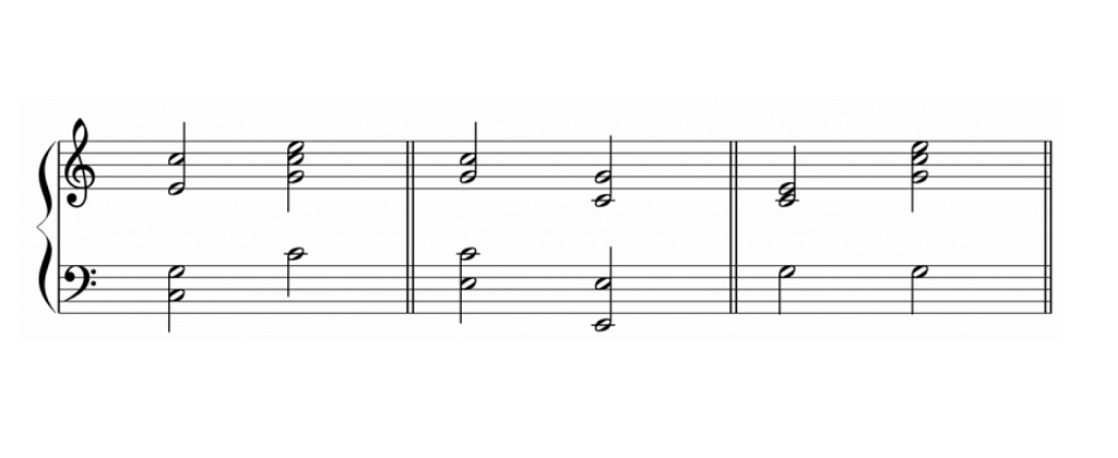
It begins with the idea that music starts with 7 notes and some rhythm indications:
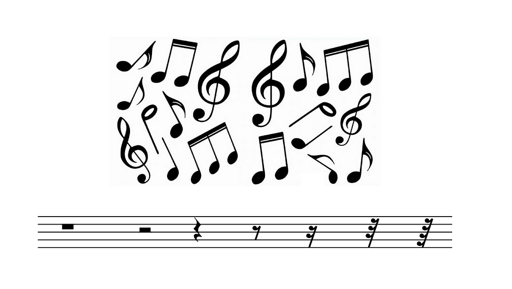
7 notes: infinite design possibilities

We can combine those notes to create chords:
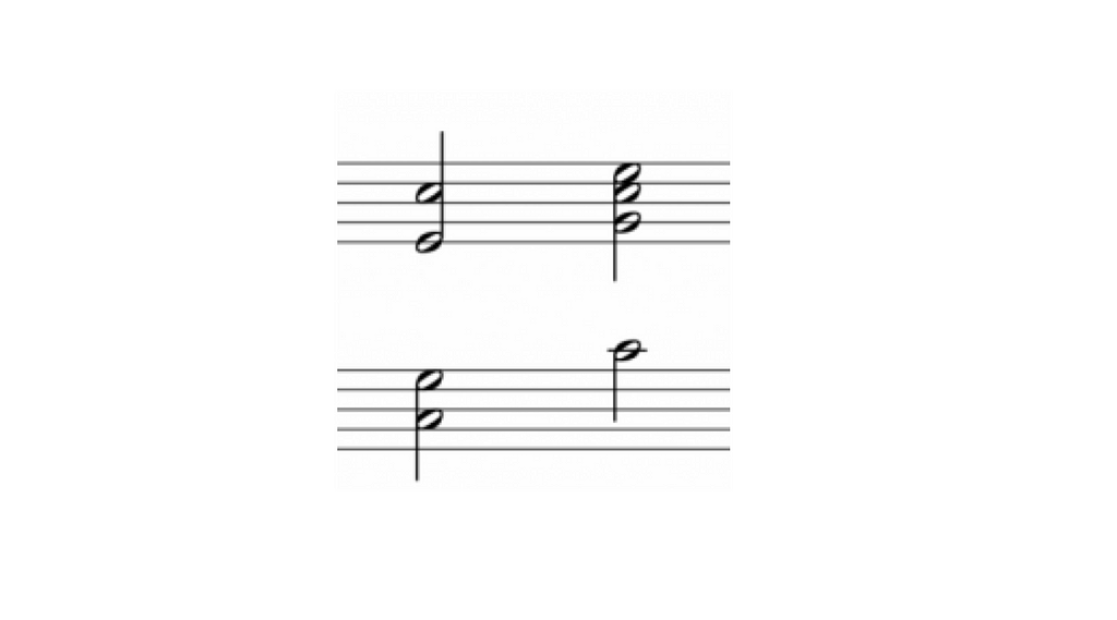
We can combine this notes to create chords (molecules)

We mix these chords into verses:

Verses that will tell a story and can be reuse in the music piece

And with those elements we’ll create an entire sheet of music and why not even an opera!

One of the possible results

What is very interesting with this metaphor is that we bring 3 new notions that are essential when designing a product: harmony, melody and rhythm.

HARMONY

It’s the right organization of the components. It’s what is going to make the final result harmonious and well balanced.
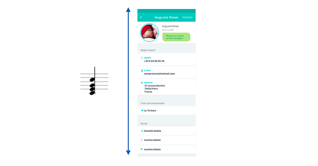
The harmony of the final result

MELODY

It’s the story we want to tell to our user and the global vision of the flow. Sometimes the flow needs to be quick and sometimes it needs to be calm.

The melody of the user flow

RHYTHM

Last but not least, the rhythm is what will give user some emotions while using the product: animations, illustration, tone of voice…

Add some rhythm to give emotions to the user. ©TouchUp

Thanks to this metaphor, we add the emotional and creative aspect that often lacks when one speaks about design systems

Good composer and good interpretations
Pleasant and long lasting music requires good composers and good interprets. A simply well executed piece, even if the technique is perfect will not be enough to thrill the audience. In the same way, a rich system of components will not be enough to make a good user experience!

We’ll still need:

  • Good composers to create a unique and reusable system
  • Good musicians to interpret it their own way and bring it to life

And sometimes, we need to break the rules in order to generate surprise or emotion.

When to be creative… Or not?

For me it’s obvious : we can be creative while using design systems and Atomic Design methodology.

The next question will be:

“When do we need creativity and when do we need consistency?
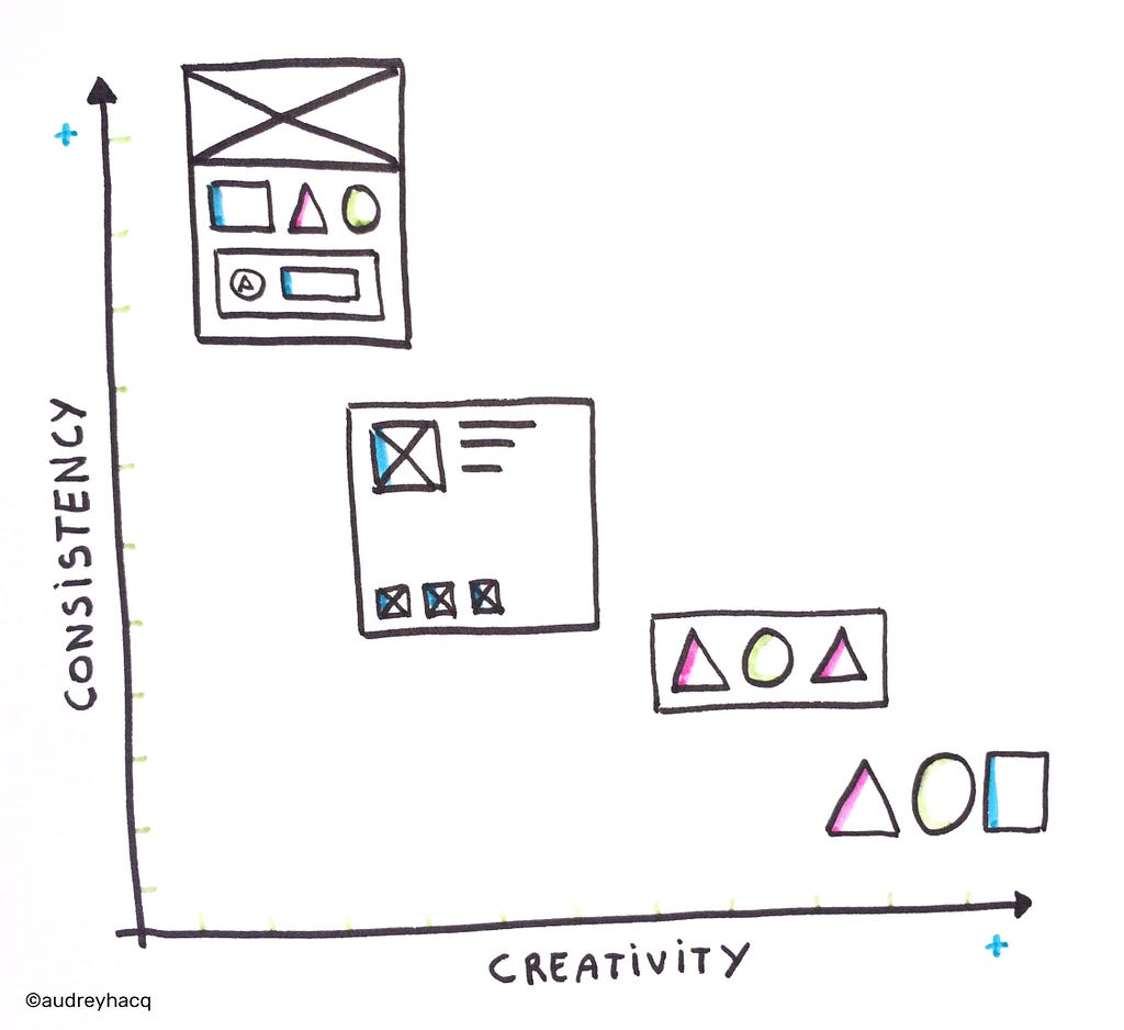
Starting from atoms and molecules give us more creative possibilities than starting from templates and organisms

We will have then to identify where do we want a strong consistency and where do we want to create surprise, emotion, or to show the uniqueness of the brand.

  • If we want a strong consistency and a lot of reuse, we will start from the more concrete and complex components (such as templates and organisms).
  • If we rather want to give designers more creative possibilities, we will give them atoms and molecules so they will create new components while keeping a family resemblance.

Never forget: be consistent, not uniform!
What are we going to do with all this time saved?

Industrialization can help us to save time on repetitive and useless tasks for which designers have no added value, as for example: perform the same modification on 15 different screens, create 20 times the same component, replace 10 times the same wording …

This newly acquired free time should allow us to work on much more interesting elements for our users and/or our clients : the right user flow, the brand identity, the analysis of user feedbacks, the development of innovative and relevant solutions, the emotional design…

If you’re curious about how to begin creating a system of components using Atomic Design, you can also read: “Atomic Design : how to design systems of components”.

Audrey wrote this story to share knowledge and to help nurture the design community. All articles published on uxdesign.cc follow that same philosophy.


Atomic Design & creativity was originally published in uxdesign.cc on Medium, where people are continuing the conversation by highlighting and responding to this story.

from uxdesign.cc – Medium https://uxdesign.cc/atomic-design-creativity-28ef74d71bc6?source=rss—-138adf9c44c—4

How Branding Tripled My Income in Six Months


How Branding Tripled My Income in Six Months

After months of development you’re finally ready to launch the product your clients will adore. Your brand new website is beautiful, and at the price you’ve set, no one could turn you down. You go to industry events to promote your work, and traffic to your site is growing everyday.

All of which has amounted to zero customers and you have no idea why.


This was my client’s situation when she approached me for help. She worried her service was shoddy or that the price was too high. I assured her that wasn’t the case.

We tripled her profits in six months without changing her product. She’s won awards for her work, and clients regularly request for her services a year in advance.

How did she go from nonexistent to trend setting? By developing her brand.

Brands get a bad rap as superficial or unimportant, but by neglecting your brand you’re leaving thousands of dollars on the table.

Unfortunately, the above scenario is not unique; many of my clients have struggled to grow their business because they underestimated their brand’s impact. Brand building takes brainpower, not muscle, so putting yours to work is easy when you know what to do.

In this article, I’ll cover what a brand is and how you can use yours to reach the clients and profits your business deserves.

What is a brand

Did you know branding originated from the marks made by ranchers to identify their cattle?

Many businesses end up with poor brands simply because they don’t understand what one is. A brand is what people feel about your company — your customers’ psychological and physical impression of your business. The distinction here is that brands are defined by customers, while businesses can only influence their customers’ impression. The efforts made to influence a customer’s opinion of the business are called branding.

Brand Anatomy

Brands can be broken down into four distinct layers: brand materials, brand traits, brand values, and a brand promise. Each shapes the customer’s experience of your brand and ultimately informs their perception of your business.

Brand Materials — the “What”

Brand materials are the things you say, the things you make, and the things you do. Your materials are the content you put into the world to represent your brand, including:

  • Logos
  • Websites
  • Flyers
  • Packaging
  • Banners
  • Business cards
  • Ads

Your materials are the surface-level objects where your customers interact, share, and enjoy your products.

Brand Traits — the “How”

Brand traits are the unique characteristics of your brand. They are the emotional responses felt by customers brand based on your business’s presentation.

Brand traits can be felt across all five senses, though most businesses prioritize the visuals of their brand materials. Grungy textures and hard angles, for example, make products and brands seem masculine and rugged. Softer colors and rounded edges associate brands with user-friendliness or femininity.

Some business try to refine how they taste, feel, and sound, but in most cases it’s not necessary.

Sidebar: many business owners assume they need to know exactly how their products should look and feel, and enlist designers and/or developers only to execute their ideas. While I encourage you to understand your business deeply, designers (like myself) can make immense improvements to your projects when brought on as strategists rather than “pixel pushers”.

Designers are trained specifically to translate ideas and values into the visual language of present-day culture. Approaching designers with a pre-defined solution is a missed opportunity to benefit from all of their training and experience. Instead I encourage business owners to deeply know the “what” and the “why” of their brand, and consider collaborating with creative professionals to best define the “how”.

The design of your materials and the function of your products create a powerful brand experience your customers will remember when comparing your brand against others. For example, Dollar Shave Club offers cheaper razors of similar quality to the Harry’s brand I buy, but the Harry’s brand has an atmosphere of simplicity and friendliness that makes their products worth paying a little extra.

It doesn’t matter that the price is cheaper for essentially the same product. I pay a little more because I want the experience of a premium product. Price clearly isn’t just indicative of quality, it’s also indicative of the overall experience.

Brand Values — “Why”

Brand values are the third and deepest layer of brands. Your brand values are not just what you stand for, they’re the people you care about and the problems you solve. If materials are what you do, and traits how you do it, your brand values are why you set out to do them that way in the first place.

Brand values help determine the audience your product is for, and in turn the design and atmosphere that will resonate best with them. A clear tie between the values and materials of a brand will strengthen your messaging and create clarity amongst the clutter of your competition.

Values are also divisive, and showcasing them is an easy way to split a generalized audience. When Chick-Fil-A President and CEO Dan Cathy spoke out about his disapproval of gay marriage, sales dropped immediately, because many of their customers don’t share his values.

While many businesses offer the same products or services, their reasons for doing so can be completely unique, making them a great tool to stand out.

Customers are very aware of the causes businesses defend. Buying a brand’s products is an indirect way for customers to define themselves by the values associated with that business.

Do you have an Apple or Android phone, own an Xbox or PlayStation console, or take an Uber or Lyft ride? Each offers similar experiences to their competitor, but their values influence the product and the type of customers they have.

Each elements is influenced by the Brand Promise

The Brand Promise

Whether written down or unspoken, customers associate brands with a core function tied together by the materials, traits, and values communicated to them by the business. This commitment is the brand’s promise to solve a problem at the intersection of the business’s and the customers’ values. The strength of a brand is wholly dependent on the ability a business has to own up to that promise.

Chipotle, for example, built their whole brand around the value of independent farming. They believed that the meat produced through these farms is of better quality and better for our environment and economy. Chipotle designed their brand materials to convey these values and infer the promise of an eco-friendly restaurant where people could buy a healthier, guilt-free burrito.

Chipotle customers love Chipotle’s food and love that their dollars are being spent wisely and safely. Unfortunately, the business suffered huge losses in 2016 when cases of food poisoning were reported linked to poor meat quality standards. The reason being that they failed to meet their brand promise.

Supposing Chipotle paid no mind to their meat sourcing and focused instead on taste alone, the situation may have been better since those expectations were never set. Unfortunately, Chipotle customers felt the brand didn’t keep their promise and ultimately lost trust and interest in Chipotle’s message.

Companies like Coca-Cola benefit from having a simpler brand promise. While Coca-Cola has had many tag lines over the years, from “Coca-Cola. Enjoy.” to “Taste the Feeling”, they’ve all been variations on a promise to be refreshing. Coca-Cola may have values and endeavors beyond taste, but their customers only expect to be refreshed by their soda. Year after year, Coca-Cola delivers on that promise, and year after year, their profits soar.

How to Use Your Brand

With the components of a brand fleshed out, the influence they have over a customer is clear. Brand expert Marty Neumeier writes:

As the pace of business quickens and the number of brands multiplies, it’s customers, not companies, who decide which brands live and which ones die. An overabundance of look-alike products and me-too services is forcing customers to search for something, anything, to help them separate the winners from the clutter.

People tend to think their brand is imaginary or unimportant, but brands can be used in strategic ways to attract real customers and real profits.

Positioning

A well-crafted brand highlights the differences between your business and the competition, making it easier for customers to find the right choice for them. High-end or low-end, serious or playful — your brand traits position you into different purchasing categories that can set you apart from the competition.

Recognition

It takes seven times, on average, for someone to notice your business. You’re valuable content goes unnoticed when not backed by a consistent design to represent your brand.

By setting design standards for your materials, customers will recognize your content, expect the level of detail and care put forth from your previously established works. All businesses have a “look”; by keeping consistent standards, you help customers recognize yours.

Authority

Keeping your promises builds trust among customers. When customers trust you, they are more likely to try new products and recommendation you offer since you’ve already done well in the past.

Following my previous example, when my chosen razor-brand Harry’s launched their new face wash, I decided to try it based on the experience of my past purchases with them. I trusted them to make something I would like based on their reputation.

Delight

Customers pay more for things that make them happy. By using your brand to create a delightful experience, you add real value to your product that you can use to your advantage when pricing (price elasticity).

Personality

Only you can do it your way. Injecting personality into your brand is an untouchable advantage over your competitors. Personality can affect positioning, recognition, authority, and delight; so adding yours into your mix of materials can have multiplied effects on your customers.

The Results of Good Branding

Good branding is not measured by stylishness or consistency. Great brands make real money by engaging with customers.

Marty Neumeier says the goal of branding is to ”delight customers so that more people buy more things for more years at a higher price.”

Delightful brands will be rewarded with:

  • More repeat customers
  • Customers that better appreciate the brand’s products
  • More trust from customers and industry recognition
  • More social sharing from happy customers
  • Price elasticity

Delight can be broken down into clarity and uniqueness. By designing something unique for a specific audience with specific values and goals, you create a one of a kind experience that can’t be bought elsewhere. The more uniqueness built into the product, the more control the business has over the price, reports Business Insider’s Ira Kalb.

Put Brand Strategy into Practice

What will your brand stand for?

The benefits to be gained from a great brand are clear, so I encourage you this information to start making real profits off your brand. I’ve made my Brand Assessment Worksheet available for my newsletter subscribers. The worksheet will help you evaluate the strength of their brand and includes additional ideas for refining your brand experience. I’ve included the sign-up link below so you can download your copy.

I’ve come to love brands not for the companies they represent but for the channels through which they convey their legacies over time. We are surrounded by brands all the time, but it’s up to us to use them to delight the world.


This post was originally published on the Jake Cooper Design blog at http://www.jakecooperdesign.com/what-is-a-brand/

from WebdesignerNews https://medium.com/@jakecooperdesign/what-is-a-brand-how-youre-missing-out-by-not-putting-yours-to-work-68ef153c1543