ISUX Design Trend Report


ISUX has done a design trend research to share insights on 2019 – 2020 design trends. It is not necessary to follow the annual design trend report, but it is important whether the designer is aware of the trend.First, we summarized the overall graphic designtrends and then went through the recent expansion of the character market.Also, we have researched the avatar design trends started from the Zepeto appand Memoji and analyzed the UX trend for the last.
In this article, we would like to share ‘Graphic Design Trends’, the first part of the ISUX design trend report. ‘Graphic Design Trends’ shows the recent branding and motion graphic cases and summarizes 12 notable trends in overall graphic design.

Typography is constantly an important element in design and is used as a method of delivering strong brand messages. Since last year, a lot of brands applied bold San-serif fonts or used strong typography on their designs which has made this become a part of graphic design trend. In addition, there are a lot of typography cases that applying motions and can also find cases applying three-dimensional effect to typography reflecting 3D trends.


This is a moving poster design with a kinetic typography concept. Beyond simply placing image and text, three dimensionally moving text over a fixed image conveys a new impression. These graphics are mainly shared through SNS in forms of short looping video.

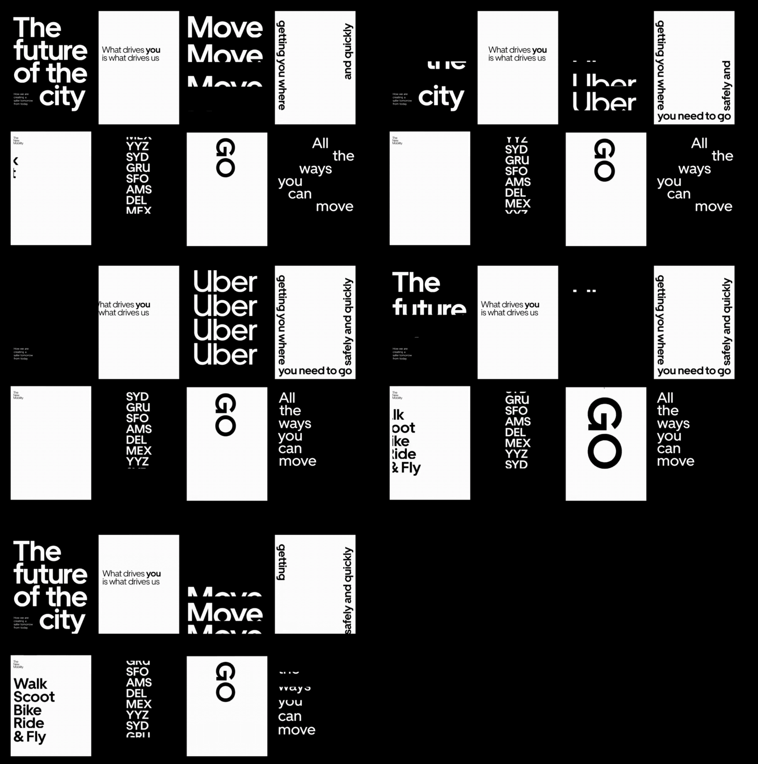
Uber developed San-Serif brand fonts along with logo redesign and applied them throughout the brand system. Uber’s moving posters designed with their brand font delivers Uber’s brand messages more strongly.


Dia studio often applies kinetic typography to their branding projects. This ’Squarespace’ branding is one of their representative portfolio.


A typography design case which contains event information applied in 3D form as if it were a gift wrapping. A looping gif was applied as a main graphic of the design system.

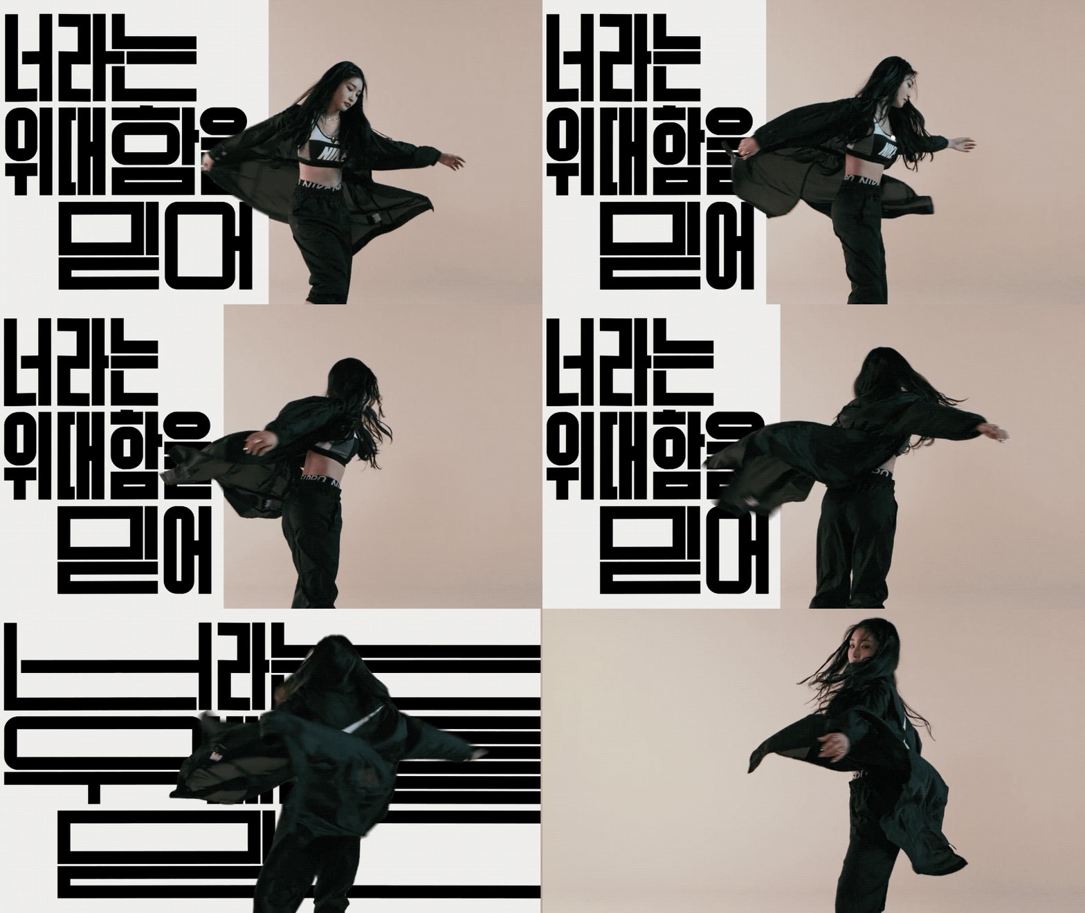
The Nike Women’s advertising campaign in which Korean celebrities appear to support the subjective life of women, also applied bold gothic for their font. This font which is designed by Design Studio Guteform, basically has an extended form and also has a system that extends to a wider format to match with the proportion of the media. Dynamic and intense typography delivers messages of the campaign and interacts with other design elements which maximizes the graphic effect.

As Instagram applied colorful gradient for their brand color, color gradient trends have been going on for several years. Recently, bright and strong contrasted colors have been used in all graphics of branding, UI, and package design and this trend is applied not only to graphics but also to photography. The strong color combination, dreamy color tone and colorful gradient are expected to be applied to overall design in 2019–2020.

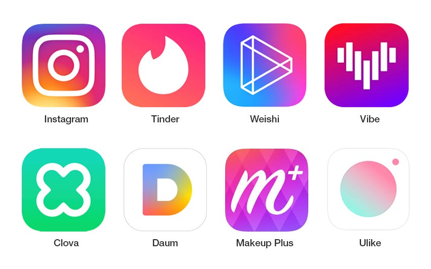
Recently, a lot of mobile apps apply colorful gradients on their icon design.


Eurosport’s 2018 Pyeong Chang olympic broadcast also applied strong color gradient to all the application designs including logos, graphics and photography. Especially, the contrast of fluorescent graphic and the dark background emphasis the atmosphere of winter sports.


This is a rebranding project of NBA news broadcasting company which reflects the latest trends like using colorful gradients and bold typography. They applied a system which various graphic outputs can be produced by applying various colors, fonts and layouts.

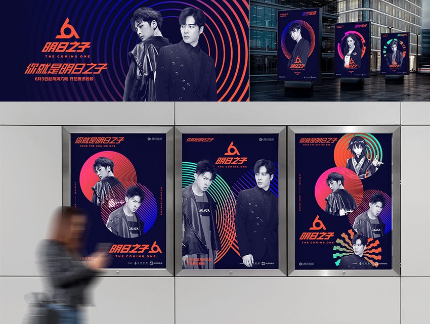
A branding for Tencent Video and Wajijiwa’s idol audition program ‘Mingri Zhi Zi’, expressing the talents of the participants with colorful gradients in different forms of circles. The graphic motifs change with participants as the program goes on.


Recently, asymmetric layout which only shows a part of the entire image has been applied a lot compared to the past when it was often designed based on the fixed grid system. Although each application seems to show only a part of the entire image, designers can apply the graphics to each applications that extend infinitely in a large system. By applying asymmetric layout, designer can have more freedom about applying the graphics elements which can convey a strong impression.

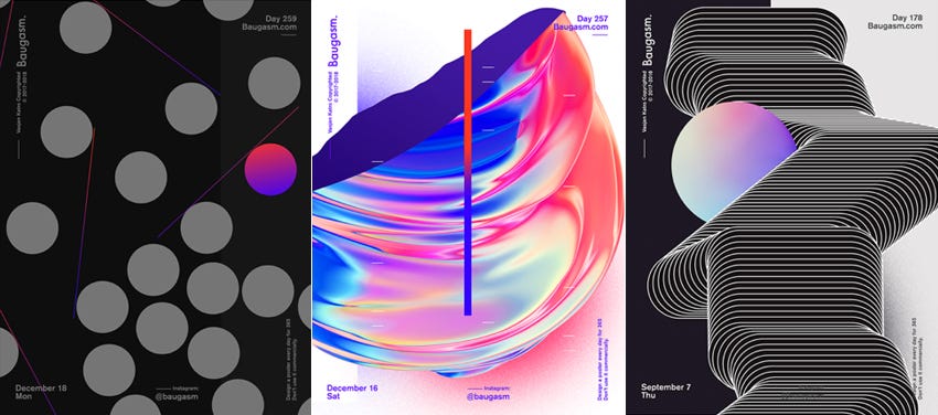
Graphic designer Vaszen Katro keep tries experiments with shapes, colors and layouts reflecting recent trends. Especially, there are many graphic outputs using asymmetrical and open layouts which are recent trends.


@CFC
Korea’s leading cosmetics company(Amore)’s independent cosmetic brand ‘easy peasy’ tried to make this color cosmetics brand feel easier and more familiar based on their brand keywords easy, active, fun, bold and chat. In particular, the curves that seem to be drawn freely by hand applied throughout the branding system make all the graphics asymmetrical and express free and friendly brand image.


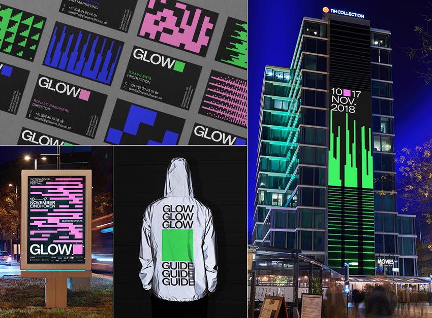
It is an example of identity that can expand the shape into various graphics and patterns using a simple square as a basic unit. The basic graphic elements are maintained simple, maximizing the effect of interactive image.

@CFC
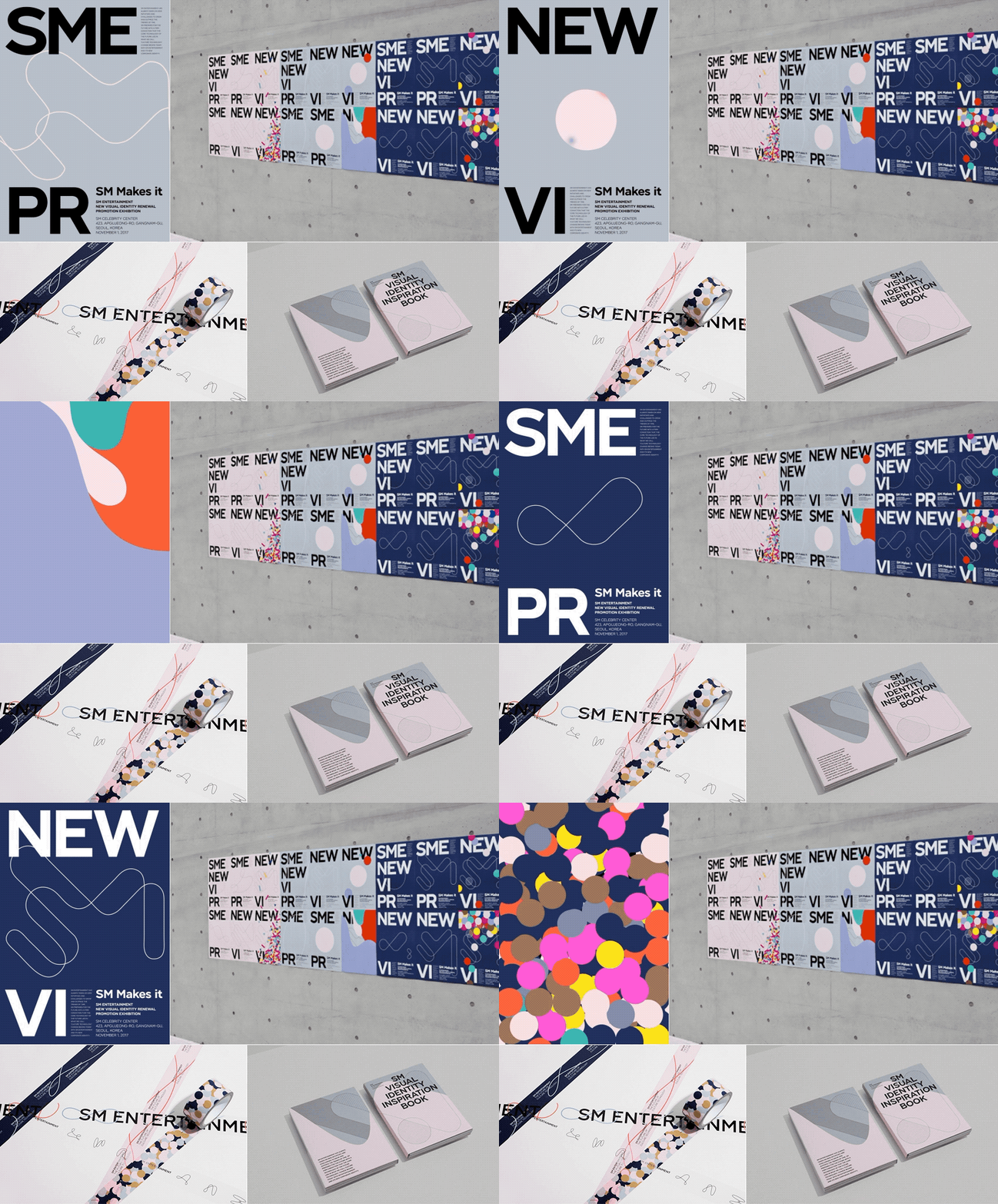
SM Entertainment, one of Korea’s largest entertainment agencies has developed a new brand identity that can reflect their expanding business. It is a flexible identity which basic circle changes it’s shape continuously making forms like connected S and M. The flexible symbol and the circular pattern of various colors are the core of SM Entertainment’s visual identity system.

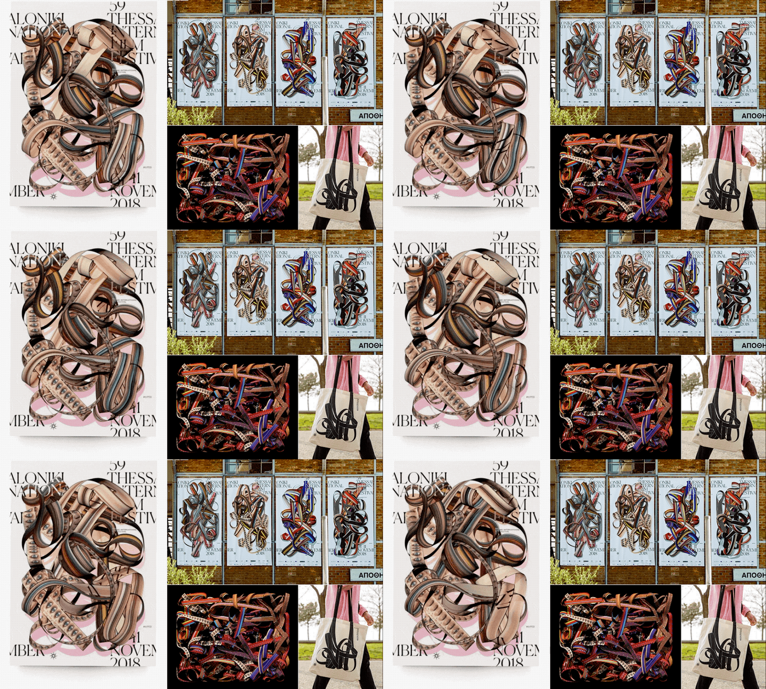
This is an interesting branding case of a movie festival, designed with the images of film reel tangled instead of using a formal logo. It is a complex tangled film form which is not fixed, reflecting various colors and images in a complex way expressing various stories and emotions that movies can share to people which is the main purpose of the festival.


The basic rectangle unit conveying the core message of the exhibition is repeatedly copied in to three dimensional space which expresses the identity of the exhibition. This identity system has applied in interactive and modified forms throughout the exhibition, which has also been applied to various applications in different shapes.

3D trend has been so popular that graphic trends can not be discussed without it. Nowadays there are many attempts to show more vivid and fresh impression by applying sophisticated texture to 3D images. People are defining a new realism by adding a realistic texture to the geometric 3D forms which creates graphics that can not exist in reality.


George Stoyanov expressed the beauty of shape by compositing various geometric forms. This kind of visual attempts are interesting because it is difficult to make in reality.

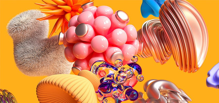
This image was designed with geometric objects of different shapes, textures and colors expressing the identity of Adobe Think Tank which is a forum containing various topics.

By applying various materials and colors on the form of walking people, this advertisement conveys an unrealistic and fresh impression.

@GRIF
The main copy “cozy” feeling is applied as soft fur material which give a new impression. This unrealistic graphics in a realistic texture gives a fresh feeling.

Using organic shapes is not a new trend that also can be found a lot recently on various graphics. It is sometimes used as a graphic motifs of brand identity, but also applied to short motion graphic videos or designed in 3D forms. This organic shape with strong colors or gradients conveys a sophisticated and dreamy atmosphere.

Organic forms are often applied in 3D, and this trend is widely applied in short video works shared on SNS. Especially for this year, there are many cases which transparent texture is applied to 3D organism form. This transparent material reflects the surrounding color and creates a mysterious atmosphere by applying various colors.

By applying bright and colorful gradient to organic shapes, this graphics express the identity of electronic music festivals in Paris.

Illustrations once had been backed up in trend by various graphics using photographs but now became a strong design trend. Lot of brands are trying to use graphics that can give a new impression to their brands by hiring famous illustrators. In addition to 2D illustrations, 3D character illustrations have become a trend since last year and more cases are being used for branding.

The illustration style applied in Uber’s new identity are the fun elements in the concisely organized brand system.

这是Spotify运用了2D插画的品牌视频。手绘质感,色彩简单,人形的四肢都很大是最近的插画趋势。

This is an example of 2D pattern design based on 3D character which is applied on package design and to the brand video.

Isometric is a method to draw 2D graphics in to three dimension which has been a trend widely applied in graphics and motion videos recently. A lot of designers use this technique to give a new impression by showing the whole graphic in one frame, creating a playful and unique atmosphere. It seems that isometric will be also popular this year as last year.

The illustrator Mohamed Samir who often uses isometric techniques and colorful gradients designed a series of interesting posters.
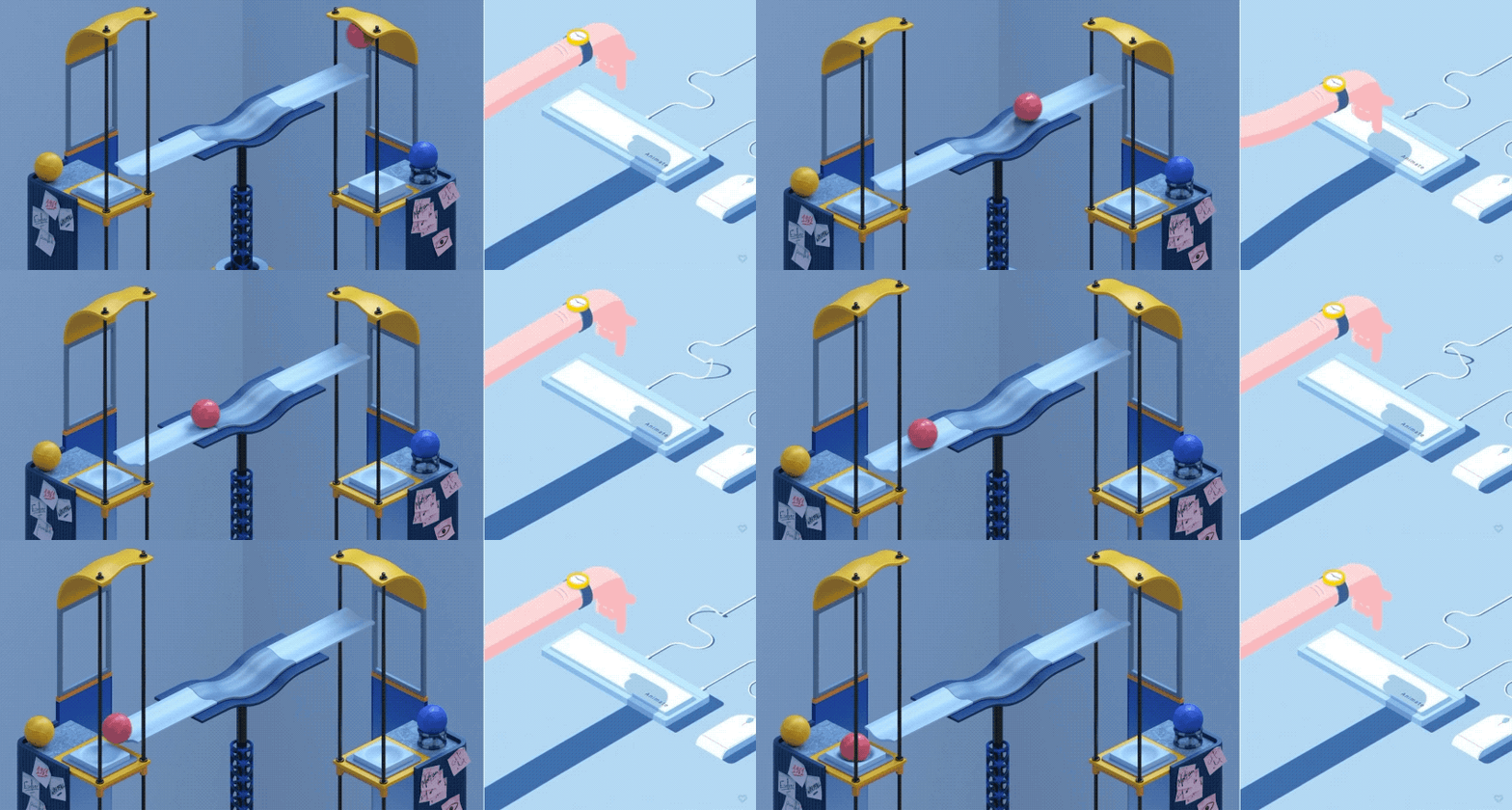
@Matthieu BRACCINI @Panic Studio
The isometric method can give an impression that objects become like a miniature. Recently, a lot of cases can be seen which have made the screen more special and interesting using this isometric technique.

Combining various type of graphics from different media was a common way to have an interesting effect from the past. Recently, there are lots of graphic cases that gives fresh impression by combining bold colors, realistic photographs or 3D images. Realistic images or videos combined with flat elements are considered to be one of the major trends of 2019–2020.

@Sergio Fuego @giantantstagram
When 2D and 3D images are combined, three dimensional effect can be more prominent and special. These videos are good cases using this method.\
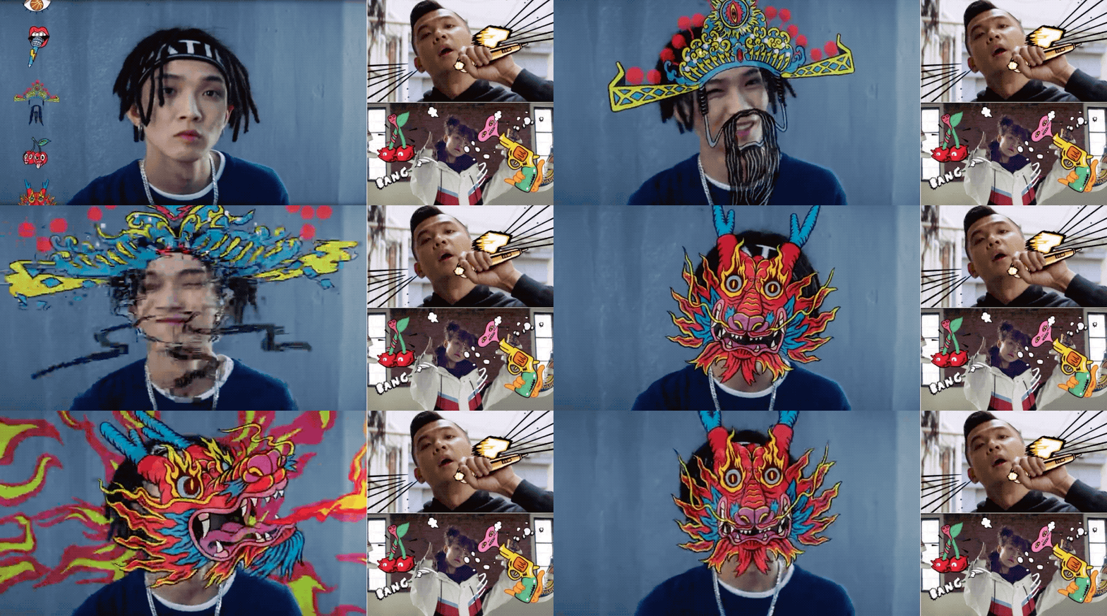
This campaign video of Converse is a good design reference which contains the mixture of live action videos and 2D graphics.

By adding glowing scribble animations to live-action videos, the videos can be more dynamic and interesting. Recently, more videos of dancers and singers in SNS platform apply this kind of effect.

There are a lot of work that is hard to know whether it is 2D or 3D. These videos can convey a new feeling by expressing the motion of the object in three dimensions rather than simply using 2D graphics.

As sharing graphics and images through SNS has become very common, short and repetitive motion graphics can be easily seen. A brand logo, illustration and various graphics are all shared in a short looping animation form.

These short videos convey unique and fun image by repeatedly applying short actions to a simple and flat illustrations.

As 3D become a main trend, short and repetitive images using 3D are also noticeable. Adding the real texture and 3D effects can convey unique atmosphere.

The development of AR/VR technology had a great impact on graphic and multimedia design trends. Recently, these new technologies lead people to have three dimensional brand experience.

Even though it is printed on a paper, this poster allows people to have interactive experience using 3D AR technology. The poster only contains simple geometric graphics and minimal information, but when it is seen through mobile, people can get more information and see three dimensional shapes.

Apple used the memoji to advertise Apple music which is based on AR technology. The famous artists such as Ariana Grande promoted their latest songs, while Apple had advertised Apple Music and memoji together through this ad.

@AKQA
This is a Shanghai Nike’s 360 degree online retail shop project through VR technology that allows you to purchase and experience services based on the amount of sweat that you made through exercise.

@POL
It is Audi’s project that use AR technology to bring the car to its own place and allow the consumers to actively experience driving the car.

The real singers who sang POP/Stars on the opening stage of the League of Legends 2018 and the characters of K/DA had stage together using AR technology. The characters were tracked in real time and gave the effect of performing on the actual stage.

New retro, which interprets retro in a modern sense, has became a new trend. New retro is a word that combines ‘New’ and ‘Retro’, a modern interpretation of nostalgia for the past. It has become a new trend not only in design but also in various fields such as fashion, architecture and pop culture.

Retro graphics and videos that reinterpret video games and Hollywood movies that were popular in the 80s and 90s became popular again.

As well known cafe branding case in Korea, Firtz Coffee created a unique brand identity with retro logo and graphics.
A trend does not flow in one direction but can extend to various ways as we see how latest design trend reflects technologies such as 3D and AR/VR but also contains the retro style. I hope that these various graphic design trends will be applied in a new way, so that creative and interesting design outputs can be created.
Thanks for your reading and it comes to the end of Graphic Trends. IP Character Design Trends are coming soon…
from Medium https://medium.com/@tencent.isux/2019-2020-design-trend-graphic-620b6e9e693f
