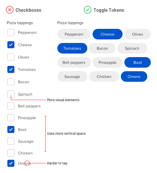
What interface component would you use for selecting from a large set of options? For most designers, checkboxes come to mind. But a long list of checkboxes is intimidating to users and can cause them to abandon your form. Not only that, but checkboxes are not efficient or easy to use because they take up space, increase the number of visual elements, and offer small tap targets.
A better component for option selection is toggle tokens. Toggle tokens conserve vertical space so you have room for more content and users don’t have to scroll. Checkboxes require vertical stacking, but toggle tokens allow for both vertical and horizontal stacking. This creates a compact arrangement that makes it less intimidating for users.

Not only that, but toggle tokens don’t require a checkbox and checkmark with the label. As a result, there are fewer elements on the screen competing for the user’s attention. Minimizing visual noise allows users to focus on the options.
The small tap targets of checkboxes can also cause tapping issues. Toggle tokens offer larger tap targets so users can make selections without mistapping.
All these benefits make toggle tokens a better component for selecting options than checkboxes. However, there is an exception when checkboxes fare better.
If your options have long text labels that wrap to multiple lines, you should use checkboxes. Checkbox labels aren’t horizontally constrained and allow enough space for more text. On the other hand, toggle tokens are constrained by its background shape and should only be used when your options are single text line labels.

The name “toggle token” is also as intuitive as the name “checkbox.” It comes from its token-like shape and toggle functionality. Next time you’re thinking about using checkboxes for option selection, consider toggle tokens instead. You’ll conserve screen space and simplify the interface, which will prevent users from abandoning your form.
from UX Movement https://uxmovement.com/forms/why-toggle-tokens-are-a-better-alternative-to-checkboxes/
