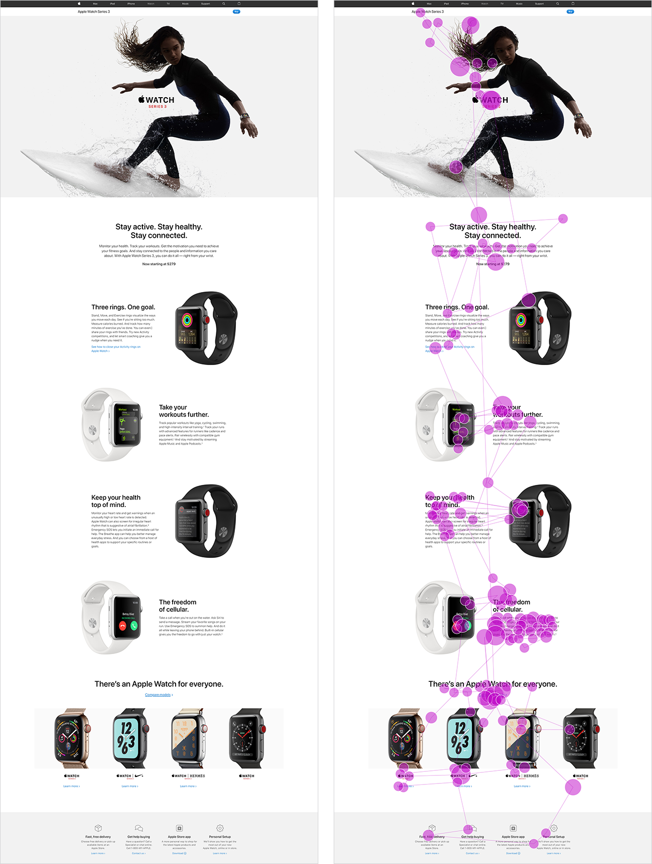
The more things change, the more they stay the same.
We recently published the 2nd edition of our How People Read Online report, almost 15 years after the 1stedition was published. Looking back over the findings from the 5 eyetracking studies conducted for these editions, we can trace how online reading behaviors have changed (or not).
We’ve been saying this since 1997: People rarely read online — they’re far more likely to scan than read word for word. That’s one fundamental truth of online information-seeking behavior that hasn’t changed in 23 years and which has substantial implications for how we create digital content.
The reason why that finding (and others discussed here) is still true is because it’s based on basic human behavior. Even though massive technology shifts have changed some behaviors, many of our original findings about how people read online remain true, even after 20+ years.
Methodology: Eyetracking
Eyetracking equipment tracks a user’s gaze as she uses an interface. This type of research is valuable for many purposes (including evaluating visual design), but is particularly useful for studying what people do (and don’t) read online.
Most of the studies discussed below contained both a quantitative and a qualitative portion:
- In quantitative eyetracking studies, researchers aggregate viewing behavior across a large number of participants. The results include heatmaps and gaze metrics (for example, the average number of fixations on a particular element of interest in the interface.)
- In qualitative eyetracking studies, researchers analyze individual users’ viewing behaviors through gazeplots and gaze replays. In many cases, we asked participants to bring their own tasks (for work, school, or personal life) to perform for this part of the session.
The findings in this second edition of the report come from a series of studies spanning 13 years, involving over 500 participants and more than 750 hours of eyetracking time.
Early Studies (2006-2013)
In 2006, we conducted a large-scale eyetracking study to understand how people read online. The study involved over 300 participants. The findings from the 2006 study formed the basis of the first edition of our How People Read on the Web report.
We later conducted two small qualitative studies (in 2009 and 2013) to generate new findings and examples to update the report, but these did not result in comprehensive changes or in a new edition of the report.
Latest Studies (2016-2019)
In 2016 and 2017, we conducted 2 quantitative eyetracking studies in two different locations in the United States:
- Raleigh, North Carolina (46 participants)
- San Francisco, California (105 participants)
These studies aimed to study how people read online and also collect data for other research goals (including the impact of low-signifier interfaces on interaction design.)
In 2019, we conducted a large-scale eyetracking study specifically to gather findings for the second edition of the How People Read Online report. The study was conducted in two locations:
- Raleigh, North Carolina, USA (48 participants)
- Beijing, China (12 participants)
We find that behavior patterns, including reading patterns, are very similar across languages and cultures, because they’re based on human behavior. When we do find cultural differences, they’re often present when we compare American or European cultures to Asian cultures. The qualitative portion of the study that was carried out in Beijing aimed to identify any cultural differences in content processing, if they existed.
What Has Changed?
New Layouts, New Pattern
Since 2006, the ways we present language have changed. Responsive design means that content can be displayed flexibly depending on the window width or device size. As a consequence, some advice we gave in 2006 no longer applies. For example, the 1st edition recommended that people use a “liquid layout” instead of a “fixed layout” for text. While that recommendation was helpful at the time, the rise of responsive design has so thoroughly popularized that approach, that we don’t need to recommend it anymore.
Additionally, the rise in popularity of comparison tables and zigzag layouts (where text and images alternate in each row on the page) has coincided with the development of a new gaze pattern.
On pages with distinct cells of content, people often process those cells in a lawn-mower pattern: they begin in the top left cell, move to right until the end of the row, then drop down to the next row, move to the left until the of the row, drop down the next row, and so on. (The name of this pattern is inspired by the way a lawn mower sweeps methodically back and forth across a field of grass. The mower moves from one side of the lawn to the other, then flips around and mows the next row of grass in the opposite direction.)


Complex Search-Results Pages
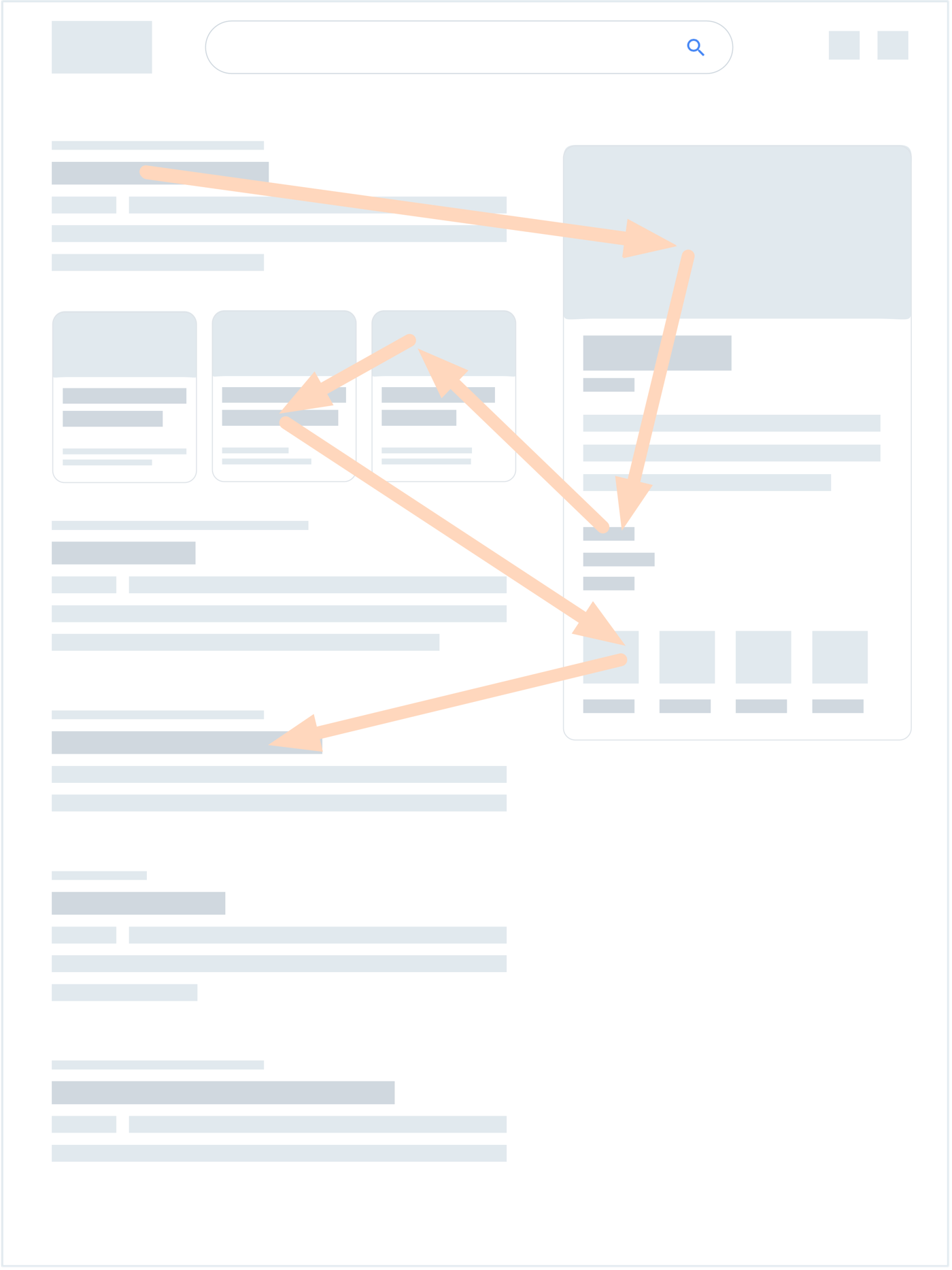
We found that users are scanning SERPs much less linearly than they used to — likely due to the rise of SERP features on Google’s SERPs, as well as competitors like Bing.
The rich, diverse layouts of modern SERPs caused the development of a new pattern: the pinball pattern. In a pinball pattern, the user scans a results page in a highly nonlinear path, bouncing around between results and SERP features.


Beyond shifting gaze patterns, these SERP features also had immense impacts on information-seeking behavior. SERP features can:
- Act as signposts: Their imagery can help users quickly verify that they’re searching for the intended entity.
- Direct the user’s attention: SERP features have heavy visual weight on the page, which can pull the user’s gaze in different directions. This is the major cause of the pinball pattern.
- Modify queries and tasks: Some SERP features, like the People also ask element or the carousel, enable Google to present several expanded interpretations of the query, and allow users to explore those alternatives without leaving the page.
- Provide quick answers: For simple information needs, SERP features often answers users’ questions directly on the SERP itself, and users no longer need to click on search result to reach their goals — a phenomenon called good abandonment.
Gaze Patterns in China
In 2006, we studied only English-speaking sites and users, but hypothesized that we would find the same reading patterns in other languages as well. In our recent study of users in Beijing, we found that, indeed, almost every pattern and behavior we discovered in American users was also demonstrated by Chinese users.

The only exception was the pinball pattern; out of more than 60 instances of search, we observed only one instance of the pinball pattern on a Baidu SERP.
We hypothesize absence of pinball patterns is because Baidu provides:
- Fewer SERP features per query than Google
- SERP features that are not as visually attractive as Google’s SERP features (smaller and fewer images)
- Sidebar elements that contain ads and links to other SERPs (like Baidu’s related queries or People Also Search elements), which are less related to the user’s current query than Google’s knowledge panel
There are at least 3 major differences between web use in the US and China:
- Culture
- Character set (Latin alphabet versus the much richer and denser Chinese writing system)
- Different sites and services, with different designs, including a tendency for Chinese sites to have higher design complexity than Western sites
Taking those differences into account, it’s striking that users’ reading behaviors were almost the same in the two countries. While this finding is not proof that other countries will exhibit the same behaviors, we feel that this is likely to be the case. For example, the (noneyetracking) studies we did with Arab sites (reading right to left) found the same behaviors, but mirrored.
New Content Elements
Compared to 2006, 3 types of content have gained popularity:
- Tables (including comparison tables)
- Inline elements (pull quotes and ads)
- User-generated content (reviews and posts)

As a result, our latest research uncovered behaviors and preferences around these content elements.
For example, while both pull quotes and inline messages received fixations in our study, we also noticed that they tended to disrupt reading. Several participants in our study began reading articles nearly linearly and completely until they hit a pull quote or inline ad. After reaching one of those elements, the participants abandoned their reading and fell into light scanning.

What Hasn’t Changed?
Tendency Towards Scanning
People still primarily scan, rather than read. Scanning all of the text on a page, or even a majority, is still extremely rare. Even when users do scan content in its entirety, they never scan it perfectly linearly. They still jump around pages, skipping some content, backtracking to scan what they skipped, and rescanning content they’ve already scanned.
Though light scanning is the primary method used to process information online, the amount of time any individual user is willing to spend reading depends on four factors:
- Level of motivation: How important is this information to the user?
- Type of task: Is the user looking for a specific fact, browsing for new or interesting information, or researching a topic?
- Level of focus: How focused (or unfocused) a user is on the task at hand?
- Personal characteristics: Does this individual show a proclivity for scanning and tend to scan even when highly motivated? Or is she very detail-oriented in her general approach to reading online?
As in 2006, content creators need to accept this fact: People are not likely to read your content completely or linearly. They just want to pick out the information that is most pertinent to their current needs. We can design content that supports scanning by:
- Using clear, noticeable headings and subheadings to break up content and label sections so that people can scan to find only what they’re most interested in
- Placing information up front (in other words, “front-loading”) in the structure of our content, as well as in subheadings and links, to allow people to understand the message quickly while scanning
- Employing formatting techniques like bulleted lists and bold text to allow the eye to focus on the most important information
- Using plain language to keep content concise and clear
Most Gaze Patterns
Almost all of the gaze patterns observed in 2006 were present in our 2019 study:
- F-pattern
- Layer cake pattern
- Spotted pattern
- Commitment pattern
- Exhaustive review pattern
- Bypassing pattern
- Zigzag pattern
- Sequential pattern
- Love-at-first-sight pattern

Guidelines Based on Human Behavior Have Longevity
Our original findings were rooted in an understanding of humans’ information-seeking behavior. As a result, even though designs have shifted over the past two decades, online reading behaviors have remained, at their core, fundamentally similar. Technology changes quickly, but humans don’t.
If anything, we’ve simply observed new behaviors that have developed in response to design shifts (for example, the pinball pattern), but these are all symptomatic of the deeper truth: People don’t want to waste time or effort online. As long as we’re designing content that acknowledges that reality and helps to direct people to only the information they want, we’ll be on the right track.
The Full Report
The full How People Read Online report contains:
- In-depth explanations and analysis for all gaze patterns and behaviors mentioned here
- Over 340 illustrations, gaze data visualizations, and screenshots from research (90% of which are new to the second edition)
- Actual gaze-replay video clips from eyetracking sessions
from Nielsen Norman Group https://www.nngroup.com/articles/how-people-read-online/
