9 best-in-class examples of product personalization

According to Google, 89% of U.S. marketers reported that personalization on their websites or apps resulted in higher revenue. You’ve heard the story before—apps that survive in this over-saturated market deliver highly personalized experiences to users. But how do you go about executing a truly personalized end-to-end app experience? 

You need to start viewing your users as individuals instead of a collective group. Each user has unique interests and will follow their own buyer journey. The best apps understand this and leverage a combination of declared and behavioral data to continually customize the in-app experience. 

The path to personalization starts on day one, and continues throughout an app user’s lifetime. 

What exactly does exceptional in-app personalization look like? Let’s take a look at how 9 popular apps inspire long-term retention and revenue through personalized in-app experiences. 

1. Pinterest’s personalized first feed 

Pinterest uses a combination of declared data and localization to deliver users value as quickly as possible. When a new user signs up, Pinterest asks them a series of questions to understand their interests. They then combine these declared interests with location data captured from a user’s browser. Why location data? Because through A/B testing, Pinterest discovered that identifying local interests and combining it with a user’s location data (specifically, country) made for much more relevant recommendations

The result? A personalized home page right out the gate that gets tailored more with every session. 

2. Netflix’s relevant rating system

A few years back, Netflix had users rate programs using a 5-star rating system. The problem? It wasn’t consistent with how 5-star rating programs were broadly used. Instead of it being an average rating (think: Yelp), it was an individual rating based on what Netflix’s algorithm believed users would rate the program. 

Now, Netflix uses a percentage score to give users an sense of how likely a program is to match a their interests. The match score is determined by an individual’s viewing history and thumbs up/thumbs down ratings. 

This change led to a 200% increase in ratings, greatly improving Netflix’s ability to curate recommendations and serve up a personalized homepage.

3. Wealthfront’s individual investment experience

Wealthfront aims to set users up on the path to financial stability with a simplified approach to investing. Their onboarding flow asks a series of questions to customize investment opportunities based on an individual’s unique preferences. By limiting the choices and using straightforward copy, Wealthfront helps ensure users don’t drop out of the funnel during the process.

Apps like Wealthfront rely on user data to function. The key to getting that data is to request it in a manner that keeps the user engaged and excited to move through the funnel. Wealthfront’s onboarding flow is both personalized, streamlined, and demonstrates value by adjusting in real time according to user inputs.

4. Duolingo’s gamified approach to language lessons

Duolingo understands even the most dedicated learners get side-tracked, which is why their app uses gamification to keep users on target with their language learning goals. 

For those unfamiliar, gamification is the use of game elements and processes in non-game environments. Gamification is known to increase adoption by 600% while greatly increasing engagement and retention. 

Gamification appeals to users by:

Giving them control: Immediate feedback gives users the sense that they’re in the driver’s seat in terms of completing tasks and challenging themselves to level up.

Reinforcing good behavior: Words of encouragement inspire users to take the next step.

Acknowledging achievements: Recognition for completing goals gives users the sense of achievement (a mini dopamine high) needed to keep going.

5. Headspace’s motivational meditation plans

Headspace recognizes that meditation is an inherently personal journey. A one-size-fits-all approach would take away from the overall experience, which is why they centered their app meditation plans around each individual user.

Headspace’s onboarding experience walks users through a series of questions about their unique meditation goals:

From there, Headspace puts users on the path to success by setting up personalized  reminders and goals:

Headspace’s app makes committing to a healthier lifestyle easy by handling all the logistics for you. Their 1:1 app experience is a pinnacle example of how personalization can drive long-term success. 

6. Twilio’s customized onboarding experience 

Getting new users to complete the first essential task is one of the biggest challenges product owners face. So why not walk them through it? This is exactly the approach Twilio takes with their developer-focused onboarding experience:

First, Twilio asks a series of simple questions to better understand each user’s unique needs.

From there, they walk users through the process of setting up their dashboard and eventually completing their first task, according to the choices they made during signup:

Twilio uses straightforward copy and a streamlined workflow to set users on the right path and fast-track their success. 

7. TurboTax’s seamless filing process

Filing taxes can feel unnecessarily complicated. TurboTax recognizes this, and attempts to simplify the process with a user-friendly experience that starts with a personalizing onboarding flow: 

TurboTax takes the scary out of filing by using a series of icons to depict key events in a user’s life that impact their filing. Even better, as you move through the experience certain options are pre-selected based off of a user’s earlier input:

TurboTax transforms an anxiety-inducing task into one that is almost enjoyable by being clever with their use of personalization. They took an overly complicated process and streamlined it so that users feel empowered and confident to file on their own.

9. Spotify’s yearly recap

Spotify is keenly aware they’re not the only big app music streaming service in the game. To combat this, they rely heavily on 1:1 in-app experiences. From curating playlists to providing an endless stream of recommendations, Spotify is no stranger to personalization. But at the end of each year they dial it up a notch with their personalized Year in Review recaps and playlists.

The strategy here is simple—to delight users with a unique and relevant  experience that is tailor-made to their interests and habits. It shows users that Spotify appreciates the time spent in the app and is using their customer data for good—to provide a fully customizable and personalized streaming experience.

How to personalize your product

If there was ever any doubt that personalized experiences are the way to go, hopefully that doubt has now been erased and you’re feeling eager to start personalizing your own product’s in-app experience. So let’s go over 3 crucial steps to getting started:

  1. Take a hard look at how you capture user data today. Do you have access to the insights you need in order to personalize the user journey? If not, it may be time to update your data management tools. 
  2. Consider revamping your onboarding experience so that it feels more personalized to the end user and/or helps them complete a task. Leading with personalization upfront helps minimize the risk of app abandonment.
  3. Review your entire user journey and see where you can insert personalization. This could be through new feature announcements, event reminders, or even one-off experiences like Spotify’s end of year recap. Surprise and delight users with customized touches to boost lifetime value and retention.

Mastering app personalization takes time. Lay the foundation through capturing the right insights and experiment with A/B testing to understand what’s working and what’s not. Keep the user in mind with every decision you make and you’ll be on the right track to providing the kind of bespoke app experience users demand. 

Looking for a way to easily create, iterate, and maintain personalized in-app experiences at scale? Give Appcues a try today.

from The Appcues Blog https://www.appcues.com/blog/personalized-product-examples

Advertisers block ‘Black Lives Matter’ keywords, while public support for the movement skyrockets: Thursday Wake-Up Call

Attack the block

There’s more news about racism and police violence than ever before, but many advertisers are deliberately shying away from associations with that coverage. “Marketers are increasingly preventing their ads from appearing alongside content related to Black Lives Matter protests, with some blocking keywords including ‘black people,’ ‘George Floyd’ or ‘BLM,’" writes Ad Age’s George P. Slefo.

Content that contains a blocked keyword is automatically excluded from programmatic buys, which means publishers lose out on ad revenue, forcing them to choose between coverage of important events or coverage that pays the bills.

The lists also perpetuate stereotypes—that content relevant to black people is controversial—and algorithms propagate words from list to list, compounding the problem. “The outrage of millions of people around the world and the subsequent protests is the most important conversation happening right now in our society and advertisers are running away from it,” Jason Kint, CEO of publisher trade body Digital Content Next, told Slefo.

Nothing changes until it does

In the past two weeks, net public support for Black Lives Matter has risen 11 percent—as much as it did over the previous two years.

Now, more than half of Americans believe that African Americans face discrimination and are more likely to be killed by the police than other Americans, a flip from 2013, when most Americans disagreed with those positions. And the percentage of Americans who believe racism is a “big problem” has risen 26 points since 2015.

Other issues have seen drastic shifts in public perception before, notably views on same-sex marriage. But some swings in opinion are short-lived, like support for gun control after mass shootings, which typically ebbs away quickly. Whether the same happens to Black Lives Matter is still an open question.

A new Condé dawns?

Media brands are falling in line behind BLM, too, though it’s often under duress. Bon Appetit, Condé Nast’s flagship cooking publication, posted a statement admitting that “Our mastheads have been far too white for far too long” after its editor in chief resigned following the resurfacing of a brownface photo and staffers of color revealed unequal pay among the content creators of its popular Test Kitchen video series. Anna Wintour, editor of Condé-owned Vogue, sent an email that said, “I know Vogue has not found enough ways to elevate and give space to Black editors, writers, photographers, designers and other creators”—a rare admission of error from one of the arbiters of fashion, which has long prioritized whiteness, lightness and thinness.

At the same time, NASCAR banned displays of the Confederate flag at events. That move came just after the Marines and the Navy did the same. That the battle flag of a nation defeated in a bloody war by those very branches of the Armed Forces could be openly displayed on their military bases until now should make it clear how deeply racism runs in this country.

President Trump, for his part, came down on the wrong side of history, tweeting his opposition to renaming military bases that are named for Confederate officers.

Just briefly

Words matter: A bit of racially biased tech nomenclature may be getting a revision. “Master” and “slave” are used to denote computers or circuits where one controls another, and some technologists are calling for industry to use better terminology without racial undertones. Techies are also reexamining the use of “blacklist” and “whitelist” and “black hat” and “white hat,” which associate blackness with banning or evil intent and whiteness with allowance and virtue.

Sea change: The coronavirus lockdown may have helped dampen global carbon emissions, but the seas could suffer from a glut of single-use masks and gloves that make their way from trash cans to drainpipes and into the ocean. Bottles of hand sanitizer are also finding their way into the water. Like any other plastic pollution, this new debris lingers for hundreds of years, breaking down into microplastics that end up in the food chain and posing deadly risks to sea life, like turtles and dolphins, that mistake them for food.

Take your licks: Time is a closed loop these days, so it might come as a surprise that summer is almost here. But the Museum of Ice Cream is ready to kick off a season of experiential eating—safely. “The museum has been offering digital ice cream classes during the lockdowns, and also created a ‘stay-home experience kit’ that includes brand partnerships with companies including Happy Socks,” writes Ad Age’s Adrianne Pasquarelli, who spoke to CEO Maryellis Bunn on the latest episode of the “Marketer’s Brief podcast.”

That does it for today’s Wake-Up Call. Thanks for reading and we hope you are all staying safe and well. For more industry news and insight, follow us on Twitter: @adage. 

From CMO Strategy to the Ad Age Datacenter Weekly, we’ve got newsletters galore. See them all here.

Subscribers make the difference. Individual, group and corporate subscriptions are available—including access to our Ad Age Datacenter. Find options at AdAge.com/membership.

from adage.com https://adage.com/article/news/advertisers-block-black-lives-matter-keywords-while-public-support-movement-skyrockets-thursday-wake/2261591

As Silicon Valley Turns Attention to Race, Black Entrepreneurs Detail Prejudice

When Matt Joseph was raising money a few years ago for a startup he founded, Locent, a venture capitalist asked Joseph, who is black, if he had considered creating a record label instead of a tech company. 

In a different pitch meeting, a group of investors told Joseph he reminded them of Barack Obama and suggested he get into politics—a comment he felt was “racist and insulting,” even though he thinks they intended it as a compliment. 

from The Information https://www.theinformation.com/articles/as-silicon-valley-turns-attention-to-race-black-entrepreneurs-detail-prejudice

Anifa Mvuemba Staged An Instagram Fashion Show With A Difference

Privacy Preference Center

We process user’s data to deliver content or advertisements and measure the delivery of such content or advertisements, extract insights and generate reports to understand service usage; and/or accessing or storing information on devices for that purpose. Below you may read further about the purposes for which we process data, exercise your preferences for processing, and/or see our partners.

More information

Manage Consent Preferences

Always Active

These cookies are necessary for the website to function and cannot be switched off in our systems. They are usually only set in response to actions made by you which amount to a request for services, such as setting your privacy preferences, logging in or filling in forms.    You can set your browser to block or alert you about these cookies, but some parts of the site will not then work. These cookies do not store any personally identifiable information.

These cookies allow us to count visits and traffic sources so we can measure and improve the performance of our site. They help us to know which pages are the most and least popular and see how visitors move around the site.    All information these cookies collect is aggregated and therefore anonymous. If you do not allow these cookies we will not know when you have visited our site, and will not be able to monitor its performance.

These cookies enable the website to provide enhanced functionality and personalisation. They may be set by us or by third party providers whose services we have added to our pages.    If you do not allow these cookies then some or all of these services may not function properly.

These cookies may be set through our site by our advertising partners. They may be used by those companies to build a profile of your interests and show you relevant adverts on other sites.    They do not store directly personal information, but are based on uniquely identifying your browser and internet device. If you do not allow these cookies, you will experience less targeted advertising.

These cookies are set by a range of social media services that we have added to the site to enable you to share our content with your friends and networks. They are capable of tracking your browser across other sites and building up a profile of your interests. This may impact the content and messages you see on other websites you visit.    If you do not allow these cookies you may not be able to use or see these sharing tools.

The storage of information, or access to information that is already stored, on your device such as advertising identifiers, device identifiers, cookies, and similar technologies.

The collection of information about your use of the content, and combination with previously collected information, used to measure, understand, and report on your usage of the service. This does not include personalisation, the collection of information about your use of this service to subsequently personalise content and/or advertising for you in other contexts, i.e. on other service, such as websites or apps, over time.

The collection and processing of information about your use of this service to subsequently personalise advertising and/or content for you in other contexts, such as on other websites or apps, over time. Typically, the content of the site or app is used to make inferences about your interests, which inform future selection of advertising and/or content.

The collection of information, and combination with previously collected information, to select and deliver content for you, and to measure the delivery and effectiveness of such content. This includes using previously collected information about your interests to select content, processing data about what content was shown, how often or how long it was shown, when and where it was shown, and whether the you took any action related to the content, including for example clicking on content. This does not include personalisation, which is the collection and processing of information about your use of this service to subsequently personalise content and/or advertising for you in other contexts, such as websites or apps, over time.

The collection of information, and combination with previously collected information, to select and deliver advertisements for you, and to measure the delivery and effectiveness of such advertisements. This includes using previously collected information about your interests to select ads, processing data about what advertisements were shown, how often they were shown, when and where they were shown, and whether you took any action related to the advertisement, including for example clicking an ad or making a purchase. This does not include personalisation, which is the collection and processing of information about your use of this service to subsequently personalise advertising and/or content for you in other contexts, such as websites or apps, over time.

from British Vogue https://www.vogue.co.uk/fashion/article/hanifa-anifa-mvuemba-digital-fashion-show

14 Data-Backed Strategies to Boost Twitter Engagement

Number 4: Use standalone graphics to share information

Photo by Yucel Moran on Unsplash

I love Twitter.

It’s one of my favorite places on the Internet, and one of the few sites I visit more than once per day. There’s so much to see and do that even when I’m not actively tweeting, it’s safe to say I’m reading, clicking links, and favoriting things to look at again later. As far as social media marketing goes, Twitter is one of the major players.

With over 330+ million monthly active users on the site, it’s easy to see why Twitter is one of the platforms most businesses and marketers could benefit from joining. But here’s the big question: How do you get some of those 330 million monthly active users to engage with your posts and click on your content?

While building followers and social media presence take time, there are strategies and techniques you can use to increase your Twitter engagement quickly, which in turn can lead to more clicks, increased brand awareness, and more conversions.


Official Twitter Account of Netflix

In order for your audience to engage with your posts and click on your content, they need to actually see what you’re posting. One of the best ways to make your content stand out is by adding an image.

Convince&Convert found that sharing images on Twitter increases retweets by 150%. Including a large image with a short summary of text on Twitter is more visually appealing than a text-only post.

In fact, AdWeeks’ research shows that users engaged at a rate of 5x higher when an image was included.


The first, and perhaps most obvious, reason to share your content more than once is to drive more traffic that the initial share. Tom Tunguz did an experiment on his own blog to show how reposting the same content helped him to boost traffic.

To get an idea of how many people were seeing and sharing his posts, Tom looked at the number of Retweets he got when Tweeting a link to one of his blog posts. We can assume from this that actual visits to his posts increased with each Retweet, as well.

Below is a chart of the average number of retweets a post receives the first, second, and third time he tweets it. On average, each subsequent attempt gains about 75% of the previous number of retweets, a very encouraging metric.

Image Source

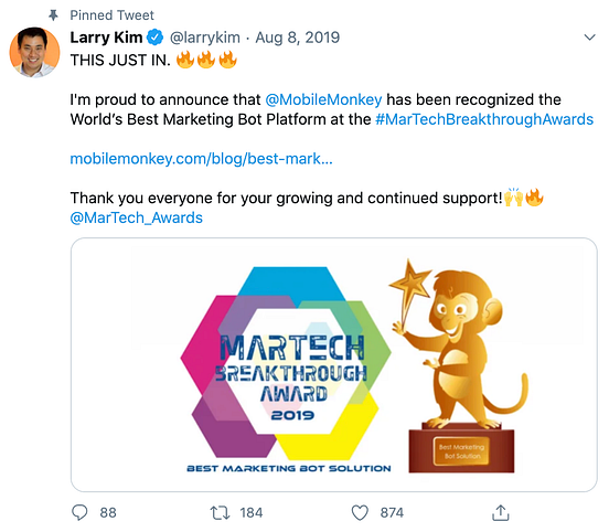
Larry Kim’s Twitter Account

Do you have an awesome Tweet you want all of your followers to see? You can pin tweets to your profile that will remain on the top of your page until you removed the pin.

  • Pin a Tweet that has an eye-catching image to boost retweets by 35%.
  • A pinned tweet is similar to an ad, except you don’t have to pay for it. Take advantage of this free advertisement by having a strong call to action.
  • Include a URL in your pinned tweet to receive 86% more engagement.

By now, we all know that using images in tweets will increase engagement, but what about adding an image without any links? A standalone graphic is an image that gives useful information on its own without needing a link back to something.

Official Twitter Account of HubSpot

Research shows that posting a standalone graphic with a quote increases retweets by 19%.

  • Use a graphic with text that gives quick information to your followers.
  • Grab small pieces of information from your blog posts to put in your standalone graphic.
  • Use tools like Canva to create a standalone graphic.

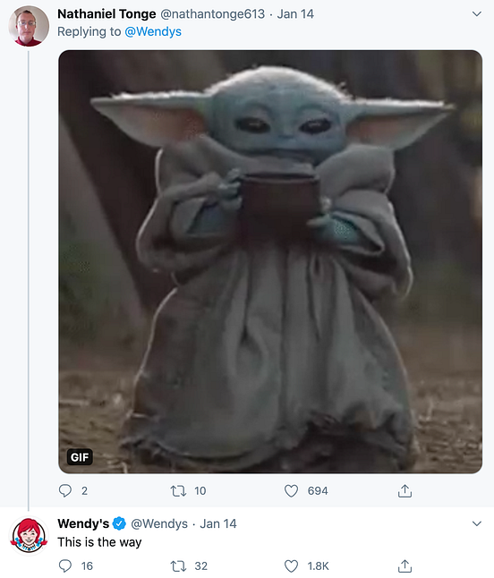
Wendy’s Twitter Account

Research shows that “customer emotions become permanent with time. It’s best for an effective intervention to take place as close to the experience as possible,” says Baba Shiv, Stanford Professor of Marketing at Stanford’s Graduate School of Business.

When users respond to your posts on Twitter or mention your business name, respond quickly. If you don’t, then it’s going to seem like you’re not very active on your own Twitter page, or you simply don’t care.

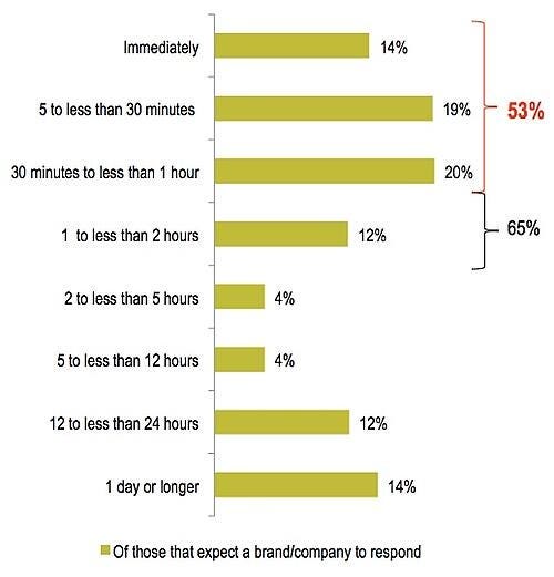
It’s been found by Search Engine Watch that 65% of surveyed Twitter users expect a response from brands they reach out to on Twitter, and of those users, 53% want that response in under an hour so it’s your priority to respond as fast as possible.

Image Source
  • Your followers will be much more likely to post comments if they know that you are reading them and that you will respond to them in a helpful manner.
  • Use first names when you are responding. Addressing your followers in this way makes them feel more appreciated, not to mention that people love to be acknowledged. Small gestures like these help to build loyalty.
  • If you respond right away, there’s a chance that the conversation will continue since they may still be on your page.

Official Twitter Account of Better Marketing

Are you only tweeting your own content? Sharing the content of others is one of the best ways to show that you’re not all about you and that you value the work of others enough to share it on your own Twitter feed.

One report found that 82% of marketers curate content. Curating content is a widely known tactic for a reason because it works. Over 50% of marketers that curate content indicate that it has increased their brand visibility, thought leadership, SEO, web traffic, and buyer engagement.

Next time you post on Twitter, mix in a few curated pieces along with your usual content to increase engagement among your followers to expand their experience.


Official Twitter Account of Heinz Ketchup

Twitter didn’t invent the hashtag (#), but it certainly popularized it with the masses.

According to Quicksprout, hashtags are proven to double your engagement rate and help users to easily search for a topic or trend on Twitter.

Image Source

Hashtags identify the subject of your content, making it easier for Twitter users to stumble across your page when searching for similar subjects.

Because of this, using hashtags is an incredible way to boost social media engagement among both followers and non-followers since you’re making your content more visible.


Tasty’s Official Twitter Account

While images perform better than text, Twitter users love videos, especially on mobile. According to Research Now, The majority of Twitter users (82%) watch video content on Twitter and most watch on a hand-held screen.

Twitter users value discovering video content. Twitter is all about discovering relevant and interesting content at the moment. So it’s not surprising that 41% of users believe that Twitter is a great place to discover videos.

People also turn to Twitter to be in the know. In fact, Twitter users are 25% more likely than the average consumer to discover video first among their friends.

An analysis found that native video on Twitter drives more overall engagement than third-party videos shared on Twitter: 2.5x replies, 2.8x Retweets, and 1.9x Favorites.


The number of people you engage with is directly related to followers viewing your tweets. In order to maximize engagement, you must post at the best possible times.

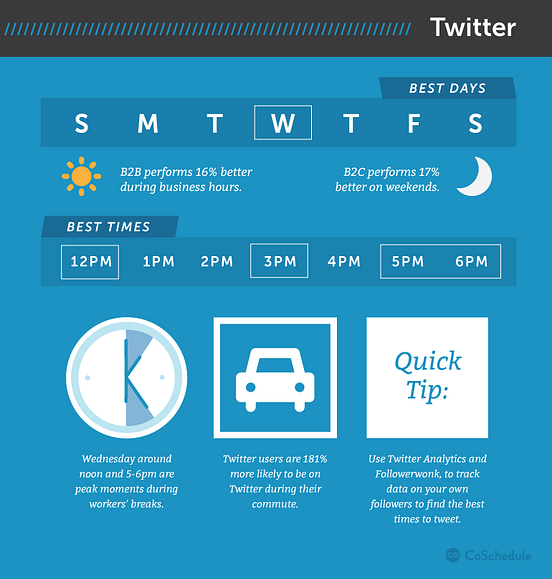
According to Coschedule’s research, the best times to post on social media, studies show a few ways to make every tweet get a little more engagement:

Image Source

Use these times as a guideline. Test out different times and find out when your audience is the most active on Twitter. You can also check out Twitter Analytics to see when your specific audience is most active.


When you interact with a major player in your industry, it can help get some eyes on you. On Twitter, even talking about or tagging an industry leader or peer can be enough to get extra eyes and engagement on your post.

Image Source

Whether you start a conversation with them directly or just write a post and tag them in it (in a way that makes sense, like by sharing their content or saying you liked their product), they may notice and engage. Especially if they respond or retweet your content, you can continue to get higher levels of engagement if their audience is active.

Again, this can also help build relationships with big names in your industry, and they could be more inclined to share some of your content or posts later on, likely helping you to get more engagement when they do.


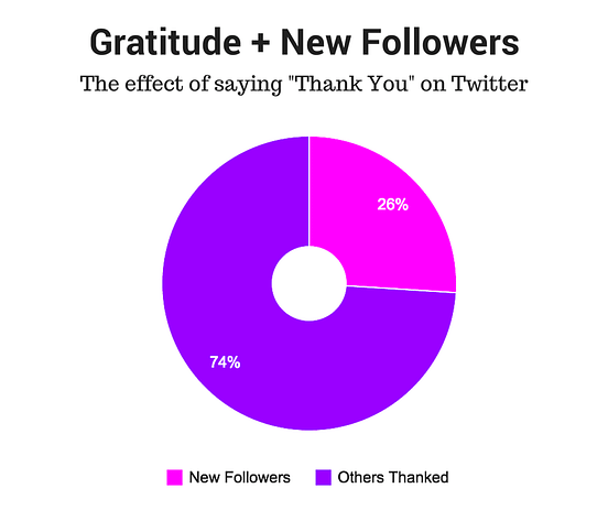
The research found that one in four of those you thank will follow you back. But there’s more to it than that: gratitude also boosts your Twitter engagement exponentially.

Buffer’s research found the following, based on their 50 “thank you for sharing” tweets:

  • 26% (13/50) of the people they thanked, favorited their tweet (recognized their thanks)
  • 30% (15/50) of the people they thanked replied to them
  • 26% (13/50) of the people they thanked followed them
  • 24% (12/50) of the people they thanked engaged with them in more than one way (both replied and followed them, both favorited and followed them, etc.)

Image Source

What does this data show? Basically, if you look for people who are sharing your content, and offer them a simple “thanks” or express your gratitude, you have a better chance of them following you.


Since Twitter only has so many characters, it only makes sense to use abbreviated, shortened links to the content you’re posting. You don’t need your whole website address to be listed as long as users are clicking.

Image Source

Using shortened links will give you more characters, your Tweets will look cleaner, and it can increase retweets.


Coca Cola Official Twitter Account

Instead of having a plain block of text, consider breaking up the text with an emoticon. Emoticons show a certain element of playfulness that provides your brand with a bit of personality.

In fact, statistics show that using emoticons will boost the share and comment rate of your posts, and can help increase favorites by as much as 57%.

  • Choose one or two emoticons per tweet. “Think of emojis as the ultimate elevator pitch for your business: you have one or two symbols to let people know exactly what value you’re bringing them with every tweet.”
  • Use emoticons when responding to your followers to add a personal touch and show appreciation.
  • Emphasize specific parts of your tweet with a correlating emoticon to intensify engagement.

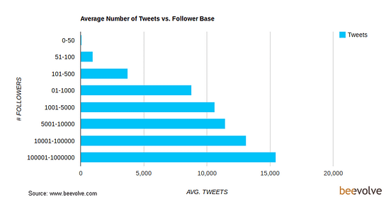
This one might fall under the title of “common sense” for many of you, so it’s great to see that there’s data to back up the claim. Social media analytics company Beevolve analyzed 36 million Twitter profiles and 28 billion tweets to find the correlation between tweet frequency and twitter followers. The results (as you might have guessed): Those who tweet more have the most followers.

Specifically:

  • A Twitter user who has sent 1 to 1,000 tweets has an average of 51 to 100 followers
  • Users who have tweeted more than 10,000 times are followed on average by 1,000 to 5,000 users
  • It’s estimated that a person with more than 15,000 tweets has between 100,000 to 1 million followers

Image Source

I think it’s important to keep a few things in mind with this data:

  • Lots of tweets equal lots of activity. And the more active you are on social media, the more likely you are to gain followers, make connections, and build relationships.
  • Lots of tweets equal lots of experience. As you tweet more, you get better at tweeting.
  • Lots of tweets equal longevity. It makes sense to think that that the longer you’re around on social media, the more time and opportunity you’ll have to grow your followers. Posting 10,000 updates would mean a years’ worth of 27 posts daily. You’d deserve all the followers you get at that awesome pace!

All of these strategies are free, and only require a little extra time and an adjustment to the content you may already be creating for Twitter.

There are 300+ million monthly active users, after all, you just have to find the right strategies to get them to interact with you and your content.

Look at engagement as a stepping stone that leads followers to view your website, subscribe to your newsletters, and purchase your product. Without engagement, you will be tweeting to a black abyss. Building a strong relationship with your Twitter followers will bring forth high engagement.

Although data and studies can help steer you in the right direction, the best way to figure out what works best for you and your audience is to test out new strategies and tactics. Remember, all audiences are different. Try out different images, texts, A/B tests, and make data-driven changes.

from Medium https://medium.com/better-marketing/14-data-backed-strategies-to-boost-twitter-engagement-8950d77017e1

Bayesian A/B Testing: A More Calculated Approach to an A/B Test

What are some of the reasons you run an A/B test?

When I think of the benefits of A/B testing, I think of one of the most popular and concrete ways to experiment with ad designs that are effective for target audiences. I think of how changing one simple element can be the deciding factor for customers, and that running a test will help me figure out the preferred design.

Up until recently, I thought that there was only one kind of A/B test. After all, the definition itself is pretty straightforward.

Then, I came across a different kind of A/B test. This method still involves testing variants to discover the preference of an audience, but it involves more calculation, and more trial and error.

This method is called Bayesian A/B testing, and if you want to take a more specific, tactical approach to your ad testing, this might be the answer.

But first, let’s talk about how Bayesian A/B testing is different from traditional A/B tests.

Bayesian A/B Testing

There are two types of A/B tests: Frequentist and Bayesian.

Every A/B test has the same few components. They use data, based on a metric, that determines variants A and B. For example, a metric can be the amount of times an ad is clicked. To determine the winner, that metric is measured statistically.

Let’s apply this to an example of using the frequentist, or traditional, approach. In this scenario, you would design two ads and change one variable, such as the copy of the ad. Then, pick the metric, like the amount of times an ad is clicked.

The winner of the frequentist A/B test in this example would be which ad was clicked the most by your target audience based solely on results from that experiment.

If you were to illustrate these components in a Bayesian A/B test, you would approach the test using different data.

That definition can sound a little difficult to visualize without an example, so let’s go over one.

If your previous ad on Facebook drew 867 unique visitors and acquired 360 conversions, earning a 41% conversion rate, you would use that data to inform an expectation. If you were to figure that your next Facebook ad reached 5,000 unique visitors, you could infer that you’d earn 2,050 conversions based on that prior experience. This would be variant "A."

Let’s say you look at a similar Facebook ad’s performance and ultimately earned a 52% conversion rate. This is variant "B." What you have done by collecting the data from the two variants is to calculate the posterior distribution, and the previous tests you’ve run have now become the ground for your Bayesian test.

If, before calculating the posterior distribution, you had inferences about conversion rates earned from each variable, you can now update them based on the data you’ve collected. You can ask hypothetical questions about your test, such as "How likely is it that ‘B’ will be larger than variant ‘A’?" In this case, you can infer that the answer to this is 9%.

Then, the trial and error portion begins.

Bayesian methodology makes decisions by doing some inference. You can calculate expected loss by the rate your metric decreases when choosing either variable. Set a boundary, such as 2%, that the metric should drop below. Once you have collected enough data to support that a variant dropped below 2%, you’ll have your test winner.

Because your inferred loss for a variant is the average amount of what your metric would decrease by if you chose said variant, your boundary should be small enough to comfortably suggest making a mistake that large.

The methodology suggests that you are more willing to make a mistake of a certain amount, then move on to a more refined experiment instead of wasting time on a mistake that dropped below that threshold.

If you were to run two experiments, they would stop when the expected loss is below that 4% boundary. You would use the values of your variants to calculate your average loss. Then, you would begin the test again using these values as your prosperity distribution.

Bayesian A/B testing proves that you can make a business decision that won’t fall below that boundary you set. You can use the data you’ve collected to continuously run tests until you see metrics increase with each experiment.

When you use Bayesian testing, you can modify the test periodically and improve the results as the test runs. Bayesian A/B testing uses constant innovation to give you concrete results by making small improvements in increments. You don’t have to use inference as a result, but instead, use it as a variant.

If you’re running A/B tests on software or different channels, you don’t have to change them to run a Bayesian A/B test. Instead, you can look at the tools you have at your disposal in that software to give you more calculated results. Then, you can continuously run those tests and analyze them to pick your winners.

You might use a Bayesian A/B test instead of a traditional A/B test if you want to factor in more metrics into your findings. This is a really good test to calculate a more concrete ROI on ads. Of course, if you have less time on your hands, you can always use a frequentist approach to get more of a "big picture" conclusion.

Whichever method you choose, A/B testing is popular because it gives you an inference that can be useful for you in future campaigns.

from Hubspot https://blog.hubspot.com/marketing/bayesian-ab-testing

Kinetic Typography with Three.js

Kinetic Typography may sound complicated but it’s just the elegant way to say “moving text” and, more specifically, to combine motion with text to create animations.

Imagine text on top of a 3D object, now could you see it moving along the object’s shape? Nice! That’s exactly what we’ll do in this article, we’ll learn how to move text on a mesh using Three.js and three-bmfont-text.

We’re going to skip a lot of basics, so to get the most from this article we recommend you have some basic knowledge about Three.js, GLSL shaders, and three-bmfont-text.

Basis

The main idea for all these demos is to have a texture with text, use it on a mesh and play with it inside shaders. The simplest way of doing it is to have an image with text and then use it as a texture. But it can be a pain to figure out the correct size to try to display crisp text on the mesh, and later to change whatever text is in the image.

To avoid all these issues, we can generate that texture using code! We create a Render Target (RT) where we can have a scene that has text rendered with three-bmfont-text, and then use it as the texture of a mesh. This way we have more freedom to move, change, or color text. We’ll be taking this route following the next steps:

  1. Set up a RT with the text
  2. Create a mesh and add the RT texture
  3. Change the texture inside the fragment shader

To begin, we’ll run everything after the font file and atlas are loaded and ready to be used with three-bmfont-text. We won’t be going over this since I explained it in one of my previous articles.

The structure goes like this:

init() {
  // Create geometry of packed glyphs
  loadFont(fontFile, (err, font) => {
    this.fontGeometry = createGeometry({
      font,
      text: "ENDLESS"
    });

    // Load texture containing font glyphs
    this.loader = new THREE.TextureLoader();
    this.loader.load(fontAtlas, texture => {
      this.fontMaterial = new THREE.RawShaderMaterial(
        MSDFShader({
          map: texture,
          side: THREE.DoubleSide,
          transparent: true,
          negate: false,
          color: 0xffffff
        })
      );

      // Methods are called here
    });
  });
}

Now take a deep breath, grab your tea or coffee, chill, and let’s get started.

Render Target

A Render Target is a texture you can render to. Think of it as a canvas where you can draw whatever is inside and place it wherever you want. Having this flexibility makes the texture dynamic, so we can later add, change, or remove stuff in it.

Let’s set a RT along with a camera and a scene where we’ll place the text.

createRenderTarget() {
  // Render Target setup
  this.rt = new THREE.WebGLRenderTarget(
    window.innerWidth,
    window.innerHeight
  );

  this.rtCamera = new THREE.PerspectiveCamera(45, 1, 0.1, 1000);
  this.rtCamera.position.z = 2.5;

  this.rtScene = new THREE.Scene();
  this.rtScene.background = new THREE.Color("#000000");
}

Once we have the RT scene, let’s use the font geometry and material previously created to make the text mesh.

createRenderTarget() {
  // Render Target setup
  this.rt = new THREE.WebGLRenderTarget(
    window.innerWidth,
    window.innerHeight
  );

  this.rtCamera = new THREE.PerspectiveCamera(45, 1, 0.1, 1000);
  this.rtCamera.position.z = 2.5;

  this.rtScene = new THREE.Scene();
  this.rtScene.background = new THREE.Color("#000000");

  // Create text with font geometry and material
  this.text = new THREE.Mesh(this.fontGeometry, this.fontMaterial);

  // Adjust text dimensions
  this.text.position.set(-0.965, -0.275, 0);
  this.text.rotation.set(Math.PI, 0, 0);
  this.text.scale.set(0.008, 0.02, 1);

  // Add text to RT scene
  this.rtScene.add(this.text);
 
  this.scene.add(this.text); // Add to main scene
}

Note that for now, we added the text to the main scene to render it on the screen.

Cool! Let’s make it more interesting and “paste” the scene over a shape next.

Mesh and render texture

For simplicity, we’ll first use the shape of a BoxGeometry together with ShaderMaterial to pass custom shaders, time and the render texture uniforms.

createMesh() {
  this.geometry = new THREE.BoxGeometry(1, 1, 1);

  this.material = new THREE.ShaderMaterial({
    vertexShader,
    fragmentShader,
    uniforms: {
      uTime: { value: 0 },
      uTexture: { value: this.rt.texture }
    }
  });

  this.mesh = new THREE.Mesh(this.geometry, this.material);

  this.scene.add(this.mesh);
}

The vertex shader won’t be doing anything interesting this time; we’ll skip it and focus on the fragment instead, which is sampling the colors of the RT texture. It’s inverted for now to stand out from the background (1. - texture).

varying vec2 vUv;

uniform sampler2D uTexture;

void main() {
  vec3 texture = texture2D(uTexture, vUv).rgb;

  gl_FragColor = vec4(1. - texture, 1.);
}

Normally, we would just render the main scene directly, but with a RT we have to first render to it before rendering to the screen.

render() {
  ...

  // Draw Render Target
  this.renderer.setRenderTarget(this.rt);
  this.renderer.render(this.rtScene, this.rtCamera);
  this.renderer.setRenderTarget(null);
  this.renderer.render(this.scene, this.camera);
}

And now a box should appear on the screen where each face has the text on it:

Looks alright so far, but what if we want to repeat the text many times around the shape?

Repeating the texture

GLSL’s built-in function fract comes handy to make repetition. We’ll use it to repeat the texture coordinates when multiplying them by a scalar so it wraps between 0 and 1.

varying vec2 vUv;

uniform sampler2D uTexture;

void main() {
  vec2 repeat = vec2(2., 6.); // 2 columns, 6 rows
  vec2 uv = fract(vUv * repeat);

  vec3 texture = texture2D(uTexture, uv).rgb;
  texture *= vec3(uv.x, uv.y, 1.);

  gl_FragColor = vec4(texture, 1.);
}

Notice here that we are also multiplying the texture by the uv components so that we can see the modified texture coordinates visually. This helps us figure out what is going on, since there are very few resources for debugging shaders, so the more ways we can visualize what’s going on, the easier it is to debug! Once we know it’s working the way we intend, we can just comment out, or remove that line.

We’re getting there, right? The text should also follow the object’s shape. Here’s where time comes in! We’re going to add it to the x component of the texture coordinate so that the texture moves horizontally.

varying vec2 vUv;

uniform sampler2D uTexture;
uniform float uTime;

void main() {
  float time = uTime * 0.75;
  vec2 repeat = vec2(2., 6.);
  vec2 uv = fract(vUv * repeat + vec2(-time, 0.));

  vec3 texture = texture2D(uTexture, uv).rgb;

  gl_FragColor = vec4(texture, 1.);
}

And for a sweet touch, let’s blend the color with the the background.

This is basically the process! RT texture, repetition, and motion. Now that we’ve looked at the mesh for so long, using a BoxGeometry gets kind of boring, doesn’t it? Let’s change it in the next final bonus chapter.

Changing the geometry

As a kid, I loved playing and twisting these tangle toys, perhaps that’s the reason why I find satisfaction with knots and twisted shapes? Let this be an excuse to work with a torus knot geometry.

For the sake of rendering smooth text we’ll exaggerate the amount of tubular segments the knot has.

createMesh() {
  this.geometry = new THREE.TorusKnotGeometry(9, 3, 768, 3, 4, 3);

  ...
}

Inside the fragment shader, we’ll repeat any number of columns we want just to make sure to leave the same number of rows as the number of radial segments, which is 3.

varying vec2 vUv;

uniform sampler2D uTexture;
uniform float uTime;

void main() {
  vec2 repeat = vec2(12., 3.); // 12 columns, 3 rows
  vec2 uv = fract(vUv * repeat);

  vec3 texture = texture2D(uTexture, uv).rgb;
  texture *= vec3(uv.x, uv.y, 1.);

  gl_FragColor = vec4(texture, 1.);
}

And here’s our tangled torus knot:

Before adding time to the texture coordinates, I think we can make a fake shadow to give a better sense of depth. For that we’ll need to pass the position coordinates from the vertex shader using a varying.

varying vec2 vUv;
varying vec3 vPos;

void main() {
  vUv = uv;
  vPos = position;

  gl_Position = projectionMatrix * modelViewMatrix * vec4(position, 1.);
}

We now can use the z-coordinates and clamp them between 0 and 1, so that regions of the mesh that are farther from the screen get darker (towards 0), and those closer to the screen, lighter (towards 1).

varying vec3 vPos;

void main() {
  float shadow = clamp(vPos.z / 5., 0., 1.);

  gl_FragColor = vec4(vec3(shadow), 1.);
}

See? It sort of looks like white bone:

Now the final step! Multiply the shadow to blend it with the texture, and add time again.

varying vec2 vUv;
varying vec3 vPos;

uniform sampler2D uTexture;
uniform float uTime;

void main() {
  float time = uTime * 0.5;
  vec2 repeat = -vec2(12., 3.);
  vec2 uv = fract(vUv * repeat - vec2(time, 0.));

  vec3 texture = texture2D(uTexture, uv).rgb;

  float shadow = clamp(vPos.z / 5., 0., 1.);

  gl_FragColor = vec4(texture * shadow, 1.);
}

Fresh out of the oven! Look at this sexy torus coming out of the darkness. Internet high five!


We’ve just scratched the surface making repeated tiles of text, but there are many ways to add fun to the mixture. Could you use trigonometry or noise functions? Play with color? Text position? Or even better, do something with the vertex shader. The sky’s the limit! I encourage you to explore this and have fun with it.

Oh! And don’t forget to share it with me on Twitter. If you got any questions or suggestions, let me know.

Hope you learned something new. Till next time!

References and Credits

The post Kinetic Typography with Three.js appeared first on Codrops.

from Codrops https://tympanus.net/codrops/2020/06/02/kinetic-typography-with-three-js/