Why AR, not VR, will be the heart of the metaverse


Join gaming leaders, alongside GamesBeat and Facebook Gaming, for their 2nd Annual GamesBeat & Facebook Gaming Summit | GamesBeat: Into the Metaverse 2 this upcoming January 25-27, 2022. Learn more about the event. 


This article was contributed by Louis Rosenberg, CEO, and chief scientist at Unanimous AI

My first experience in a virtual world was in 1991 as a PhD student working in a virtual reality lab at NASA. I was using a variety of early VR systems to model interocular distance  (i.e. the distance between your eyes) and optimize depth perception in software. Despite being a true believer in the potential of virtual reality, I found the experience somewhat miserable. Not because of the low fidelity, as I knew that would steadily improve, but because it felt confining and claustrophobic to have a scuba mask strapped to my face for any extended period.

Even when I used early 3D glasses (i.e. shuttering glasses for viewing 3D on flat monitors), the sense of confinement didn’t go away. I still had to keep my gaze forward, as if wearing blinders to the real world. There was nothing I wanted more than to take the blinders off and allow the power of virtual reality to be splattered across my real physical surroundings.

This sent me down a path to develop the Virtual Fixtures system for the U.S. Air Force, a platform that enabled users to manually interact with virtual objects that were accurately integrated into their perception of a real environment. This was before phrases like “augmented reality” or “mixed reality” had been coined. But even in those early days, watching users enthusiastically experience the prototype system, I was convinced the future of computing would be a seamless merger of real and virtual content displayed all around us.

Event

The 2nd Annual GamesBeat and Facebook Gaming Summit and GamesBeat: Into the Metaverse 2


Learn More

Augmented Reality Research 1992 (USAF - L Rosenberg)

Cut to 30 years later, and the phrase “metaverse” has suddenly become the rage. At the same time, the hardware for virtual reality is significantly cheaper, smaller, lighter, and has much higher fidelity. And yet, the same problems I experienced three decades ago still exist. Like it or not, wearing a scuba mask is not pleasant for most people, making you feel cut off from your surroundings in a way that’s just not natural.

This is why the metaverse, when broadly adopted, will be an augmented reality environment accessed using see-through lenses. This will hold true even though full virtual reality hardware will offer significantly higher fidelity. The fact is, visual fidelity is not the factor that will govern broad adoption. Instead, adoption will be driven by which technology offers the most natural experience to our perceptual system. And the most natural way to present digital content to the human perceptual system is by integrating it directly into our physical surroundings.

Of course, a minimum level of fidelity is required, but what’s far more important is perceptual consistency. By this, I mean that all sensory signals (i.e. sight, sound, touch, and motion) feed a single mental model of the world within your brain. With augmented reality, this can be achieved with relatively low visual fidelity, as long as virtual elements are spatially and temporally registered to your surroundings in a convincing way. And because our sense of distance (i.e. depth perception) is relatively coarse, it’s not hard for this to be convincing.

But for virtual reality, providing a unified sensory model of the world is much harder. This might sound surprising because it’s far easier for VR hardware to provide high-fidelity visuals without lag or distortion. But unless you’re using elaborate and impractical hardware, your body will be sitting or standing still while most virtual experiences involve motion. This inconsistency forces your brain to build and maintain two separate models of your world — one for your real surroundings and one for the virtual world that is presented in your headset.

When I tell people this, they often push back, forgetting that regardless of what’s happening in their headset, their brain still maintains a model of their body sitting on their chair, facing a particular direction in a particular room, with their feet touching the floor (etc.). Because of this perceptual inconsistency, your brain is forced to maintain two mental models. There are ways to reduce the effect, but it’s only when you merge real and virtual worlds into a single consistent experience (i.e. foster a unified mental model) that this truly gets solved.

This is why augmented reality will inherit the earth. It will not only overshadow virtual reality as our primary gateway to the metaverse but will also replace the current ecosystem of phones and desktops as our primary interface to digital content. After all, walking down the street with your neck bent, staring at a phone in your hand is not the most natural way to experience content to the human perceptual system. Augmented reality is, which is why I firmly believe that within 10 years, AR hardware and software will become dominant, overshadowing phones and desktops in our lives.

This will unleash amazing opportunities for artists and designers, entertainers, and educators, as they are suddenly able to embellish our world in ways that defy constraint (see Metaverse 2030 for examples). Augmented reality will also give us superpowers, enabling each of us to alter our world with the flick of a finger or the blink of an eye. And it will feel deeply real, as long as designers focus on consistent perceptual signals feeding our brains and worry less about absolute fidelity. This principle was such an important revelation to me as I worked on AR and VR back in the early ’90s that I gave it a name: perceptual design.

As for what the future holds, the vision currently portrayed by large platform providers of a metaverse filled with cartoonish avatars is misleading. Yes, virtual worlds for socializing will become increasingly popular, but they will not be the means through which immersive media transforms society. The true metaverse — the one that becomes the central platform of our lives — will be an augmented world. And by 2030 it will be everywhere.

Louis Rosenberg is CEO & Chief Scientist at Unanimous AI.

DataDecisionMakers

Welcome to the VentureBeat community!

DataDecisionMakers is where experts, including the technical people doing data work, can share data-related insights and innovation.

If you want to read about cutting-edge ideas and up-to-date information, best practices, and the future of data and data tech, join us at DataDecisionMakers.

You might even consider contributing an article of your own!

Read More From DataDecisionMakers

from VentureBeat https://venturebeat.com/2021/12/28/future-augmented-reality-will-inherit-the-earth/

UX design principles that improve both usability and accessibility

Design principles are commonly referenced for providing better usability, but some can also improve accessibility.

Panoramic drawing of a diverse range of people.
Illustration by goodstudio

User experience designers are responsible for ensuring a product’s usability and accessibility. Unfortunately, accessibility is often overlooked. Content and features should be accessible, easy to understand, and efficient to use for a broad audience with a diverse range of abilities.

Accessibility is often touted as being beneficial for the 15% of the world’s population that has permanent disabilities. While that is true, it’s a bit short-sighted as 100% of the world’s population has temporary and situational disabilities that limit our ability to interact with our technical devices for short periods of time. And as we age, our abilities tend to decrease in vision, hearing, mobility, and cognition.

A few examples of temporary or situational disabilities include misplaced glasses, musculoskeletal injuries, poor lighting while viewing a screen, and loud environments while trying to hear audio.

Accessible designs benefit everyone. There’s a variety of situations in which people without permanent disabilities benefit from accessibility; curb cuts are a perfect example.

This list discusses a few design principles we commonly hear about for improving usability and points out how they also improve experiences for low vision, physical and cognitive disabilities.

Low vision

Low vision refers to visual disabilities other than total blindness, which includes impairments from aging, diabetes, contrast sensitivity, and color blindness. By designing with the figure-ground principle in mind, we can improve experiences for low vision.

Figure-Ground Principle

This is one of Gestalt’s Principles, which states that when we perceive something visually, our mind attempts to distinguish the foreground (figure) from the background (ground). When neither the foreground nor background stands out prominently, it causes visual tension. And this can be an even greater challenge when someone has low vision.

Apply Figure-Ground principle for low vision:

  • Use a contrast checker to ensure you provide sufficient contrast between foreground and background elements. For most text, the contrast ratio should be 4:5:1 or higher. For text that’s 24px and larger or bolded text that’s 19px and larger, the contrast ratio should be at least 3:1.
  • Note that too much contrast can be challenging for people with dyslexia, so avoid pure opposing colors for text and background combinations, such as pure black text against pure white background. Use pure black text on light gray backgrounds or dark gray text on pure white backgrounds.
Shows the black text on white background vs light gray background and dark gray text on white background.
Use pure black text on light gray background or dark gray text on pure white backgrounds to improve readability for people with dyslexia.

Von Restorff Effect

This principle states that when multiple similar items are presented, the one that differs from the rest in size, color, shape or other characteristics will more likely be remembered. It’s important to properly apply this principle to improve experiences for people with visual impairments.

Apply Von Restorff effect for low vision:

  • Color blindness can degrade the ability to distinguish between certain color combinations and cataracts allows less light into the eye, causing colors to be less vivid. To draw attention to an item, don’t rely on color alone. Change another characteristic as well, or add text.
Left shows 11 teal squares and 1 gray square. Right shows 11 teal squares and 1 gray circle.
Use more than color to distinguish similar items.

Physical Disabilities

Physical disabilities include limited mobility, involuntary movements and painful movements to include: arthritis, amputations, repetitive stress injuries, tremors and physical injuries. By designing with Fitt’s law in mind, we can improve experiences for physical disabilities.

Fitt’s Law

How long it will take to access a target depends on the target’s size and distance. So, it takes longer to reach buttons and links when they are smaller in size or farther away from the starting position. This can be a greater challenge and take longer when someone has a physical disability.

Apply Fitt’s Law for physical disabilities:

  • Properly size buttons for touch screens. Ensure the touchable area for buttons is a minimum of 44px in width and 44px in height, or larger.
  • Keep in mind that on handheld touch screen devices, the edges of the screen are easier and faster to access.
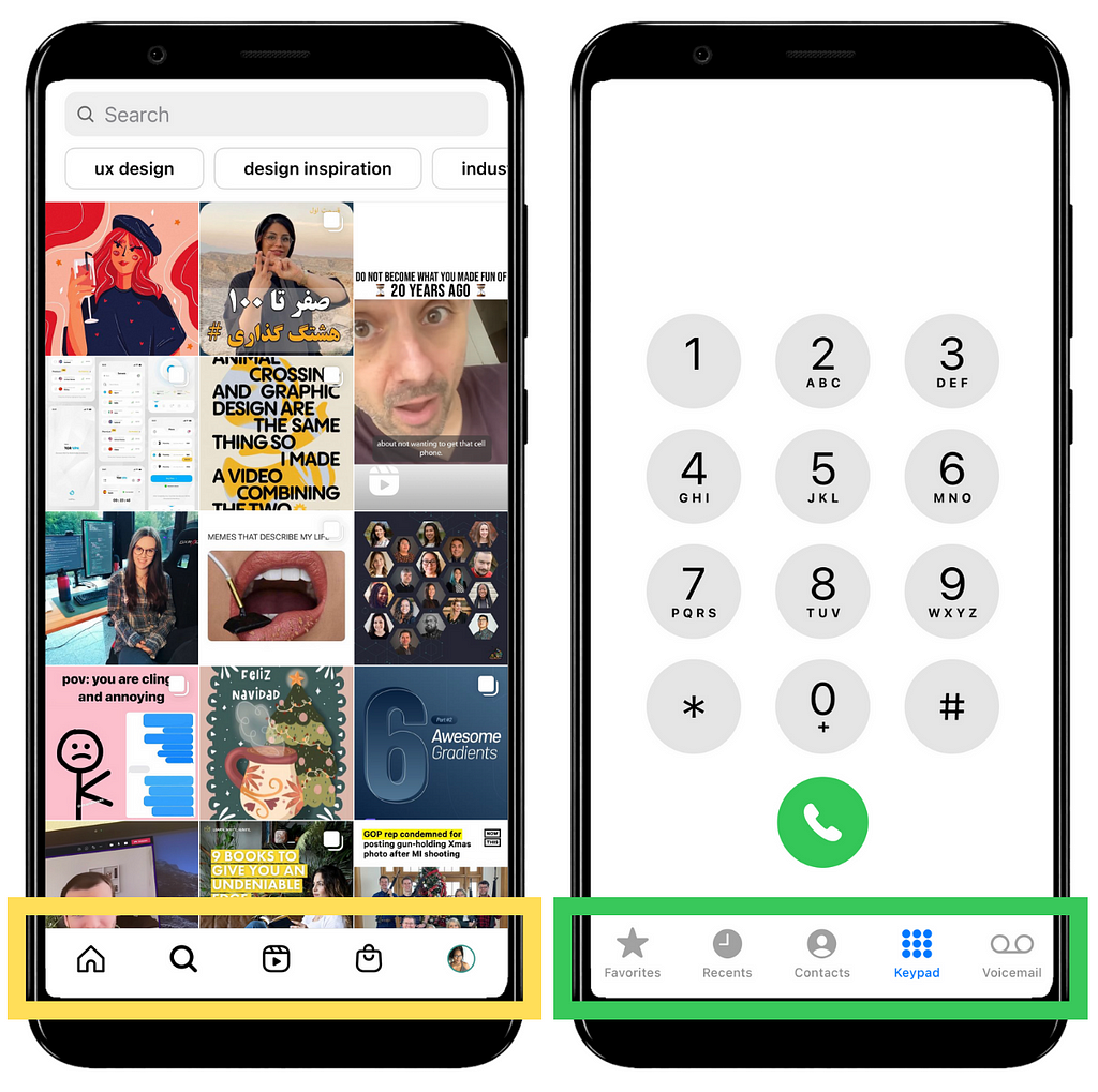
  • When an icon is used as a button include a label, whenever possible. This not only provides clarity of what the icon represents, it also increases the touchable area.
Screenshot of a mobile app with icons that have no label and a mobile app with icons that have labels.
Include labels with icons for increase to increase touchable areas.

Cognitive Disabilities

Cognitive and learning disabilities include neurodiversity, intellectual disabilities, autism, Alzheimer’s disease, and ADHD (attention deficit hyperactivity disorder). By designing with Miller’s law and Fitt’s law in mind, we can improve experiences for cognitive disabilities.

Miller’s Law (Magic Number 7+/- 2)

The capacity of our short-term memory’s is 7 chucks of information, plus or minus 2. This is why phone numbers and credit card numbers are not one long string of digits, instead they are “chunked” for memorability. Here’s an example of numbers divided into chunks versus grouped together:

Left shows 14 digits divided into 5 chunks and left shows the string of 14 digits in one group.
“10–326–448–751–462” is easier to remember than “10326448751462”

Apply Miller’s Law for cognitive disabilities:

  • Provide instructional content in concise bulleted lists and highlight or bold keywords so information is easier to memorize.
  • We are actually better at recognizing than recalling information so minimize the need to remember information from one part of a website or application to another. For examples: provide tooltips instead of separate help documentation and keep people informed of their progress.
“Create new password” screenshot with checkmarks next to each password requirement as it is met.
By displaying progress towards meeting password requirements, people don’t have to remember.

Hick’s Law

The more choices people have, the longer it will take to make a decision. This can also be applied to the amount of information people have to process in order to find information and complete tasks.

Hick’s law and Miller’s law may seem similar, but Miller’s law is about “chunking” content for short-term memory, while Hick’s law is minimizing options to faster decision making and decreased time to complete tasks.

Apply Hick’s Law for cognitive disabilities:

  • Limit options to minimize overwhelm.
  • Group content into sections and use descriptive headings so people can easily scan to find what they are looking for.
  • Provide sufficient time for people to access content and complete tasks. If there are is a time limit, provide an option to extend the time.
Time limit screenshot, informing users that their time is about to expire and that they can click ‘Continue’ for more time.
When there is a time limit, allow people to extend their time.

Final Thoughts

Products should be designed to add value to people’s lives, not create barriers. To accomplish that, designers must consider a broad range of abilities and use cases. For more accessibility guidance, you’ll want to visit WCAG’s Quick Reference guide or WebAIM.

If you’re a UX designer, I hope this is helpful as you design for diverse abilities.

References

Thank you

Found this article helpful? Don’t forget to applaud, follow, and share.

If you’re not already, consider becoming a Medium member. It will give you access to all Medium articles and support my writing, as I will receive a small commission.


UX design principles that improve both usability and accessibility was originally published in UX Collective on Medium, where people are continuing the conversation by highlighting and responding to this story.

from UX Collective – Medium https://uxdesign.cc/ux-design-principles-that-can-improve-both-usability-and-accessibility-2bac92c455fa?source=rss—-138adf9c44c—4

8 Mobile App Design Examples

Top 7 Mobile App Designs 1

We’re going to explore our top 8 mobile app design concepts to give you some design inspiration for your next project.

Are you still using vector-based tools for mobile app design? Step into the future of UX design with UXPin’s advanced code-based design tool. Sign up for a free trial to experience how one tool can revolutionize your product design workflows.

Top 8 Mobile App Design Examples

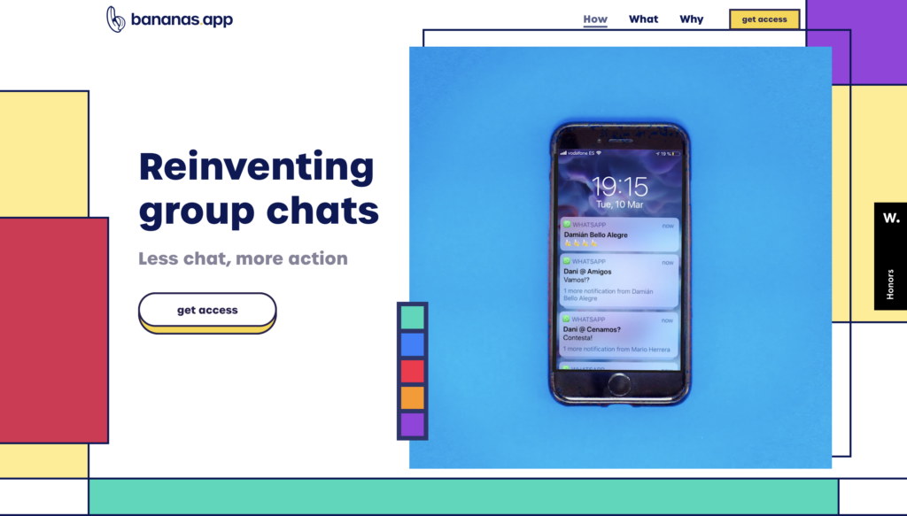
1. Bananas App

bananas app screenshot which is one of the best mobile apps designs

Are you looking for less talk and more action? Bananas App is “reinventing group chats” with a swipe or pick idea-sharing concept for friends. 

The goal? To turn endless group chats into actionable activities friends can enjoy together–like going for a drink, playing frisbee in the park, or going on a spontaneous road trip. When you swipe right, you enter a chat group where those attending can discuss details like times, where to meet, carpooling, etc.

The Bananas App’s designers went with an 80s retro user interface design with bold typography and exciting colors, aligning with the product’s fun concept. The app’s use of energetic microinteractions and animations creates an immersive user experience that’s fun and engaging. The minimalist, intuitive layout makes it easy for users to add a new activity with just a few clicks.

The Bananas App is a fantastic example of how designers can create a balance between technology and real-world engagement.

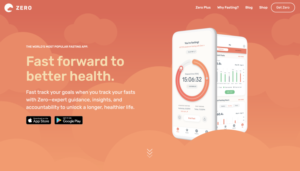
2. Zero

Zero app is one of of the best mobile app UI and it is a screenshot of it

Zero is an app designed to track your fasting habits with advice and coaching from medical experts. Get insights on health markers like weight, resting heart rate, and sleep to see how they evolve with your fasting practice. There’s also a journal where you can use emojis to quickly tell the app how you feel during fasting.

Zero’s designers have done a fantastic job maintaining a minimalist UI while presenting an abundance of content with detailed insights and analytics. The app uses a vibrant green and orange color scheme to draw users to important call to action buttons and information.

The primary footer navigation provides users with four links to the app’s core features, making it easy to quickly find what you’re looking for. The app has over 345k reviews on the iOS App Store, with an average score of 4.8, showing how much people love the product and user experience.

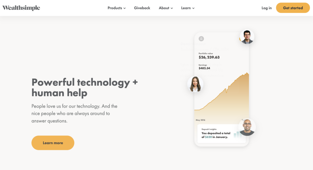
3. Wealthsimple

one of the best mobile UI designs is Wealthsimple app

Wealthsimple offers users a way to manage their wealth based on risk and investment goals. Weathsimple takes the hassle out of learning about stocks and diversification by recommending a portfolio to invest in your future.

Because this is a financial services app, Wealthsimple needs a lot more personal information than regular apps. Designers have done an excellent job carefully breaking up the onboarding flow to avoid cognitive overload and keep users engaged.

Waelthsimple’s intuitive mobile app UI design is easy to navigate and displays only the information necessary to view your portfolio or add funds to your investment account.

4. Sleepist

A screenshot of Sleepiest which has one of the most beautifully designed UI

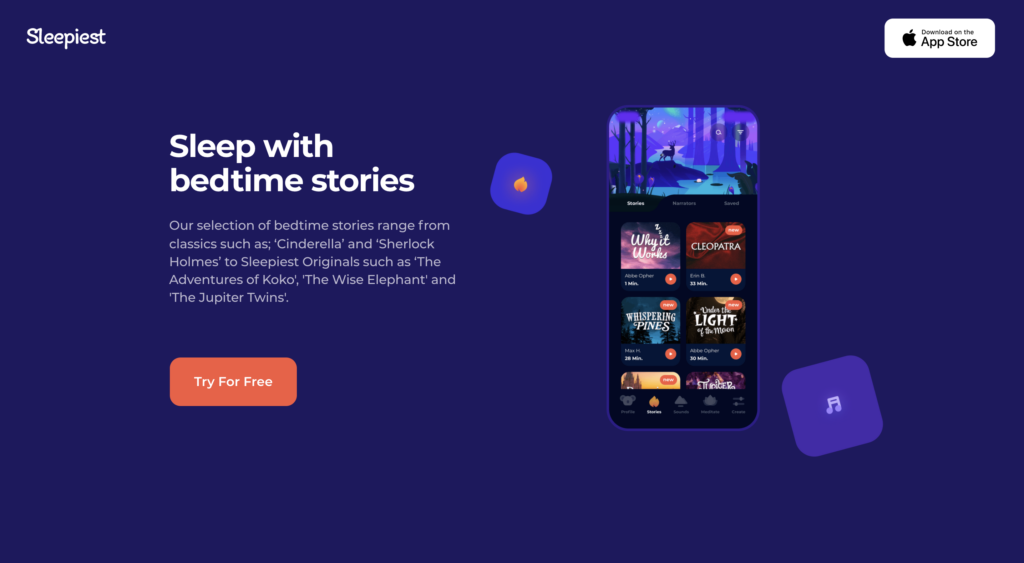
People who have Insomnia will love Sleepist, a meditation and sleep app designed to help you fall asleep! Choose from bedtime stories, sleeping soundtracks, or bedtime meditations to help relax you for a better night’s rest.

Designers have gone with a dark theme UI design to minimize the blue light impact, which adversely affects sleep. Bright orange CTAs allow users to quickly find what they’re looking for to reduce screentime. Users can also set a timer for the app to set everything for the night and not have to look at their phone again before drifting off.

5. Tumblr

Screenshots of Tumblr UI design

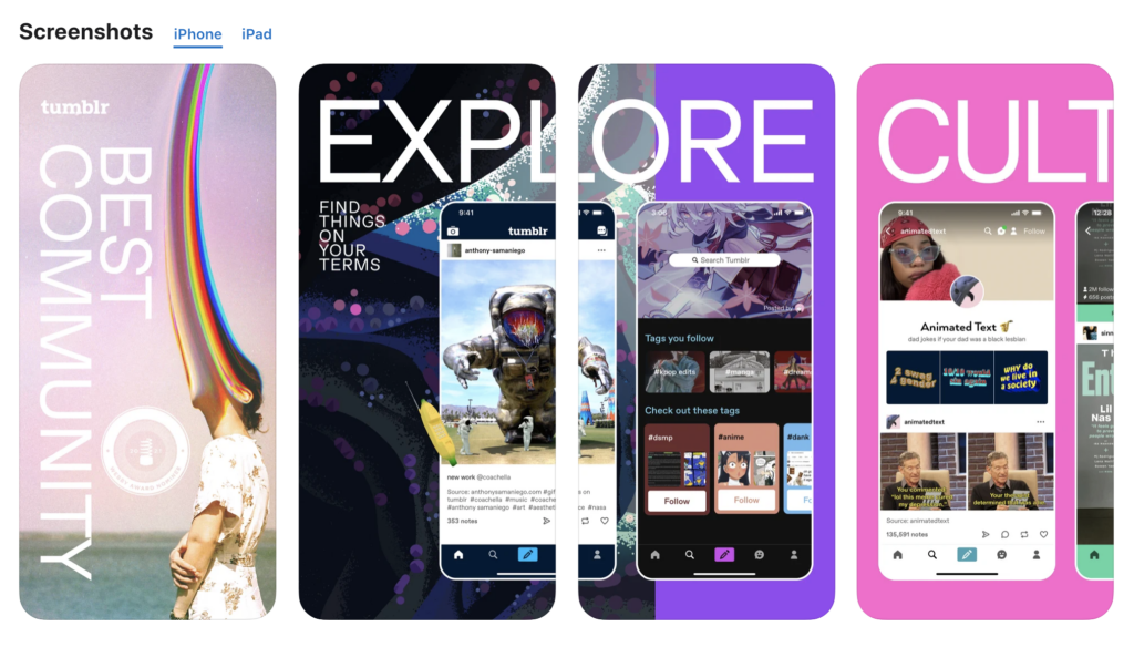
Tumblr is one of the world’s biggest social media platforms popular with youth and students. It’s a fantastic platform to discover art and pop culture trends among young people, where you’ll find some of the internet’s best memes and GIFs.

Tumblr’s designers have designed a mobile app experience that mirrors the platform’s content and community. They’ve created a fun and immersive user experience with a vibrant color palette, intuitive buttons, and simple navigation.

6. Alive by Whitney Simmons

Mobile App UI for Alive App

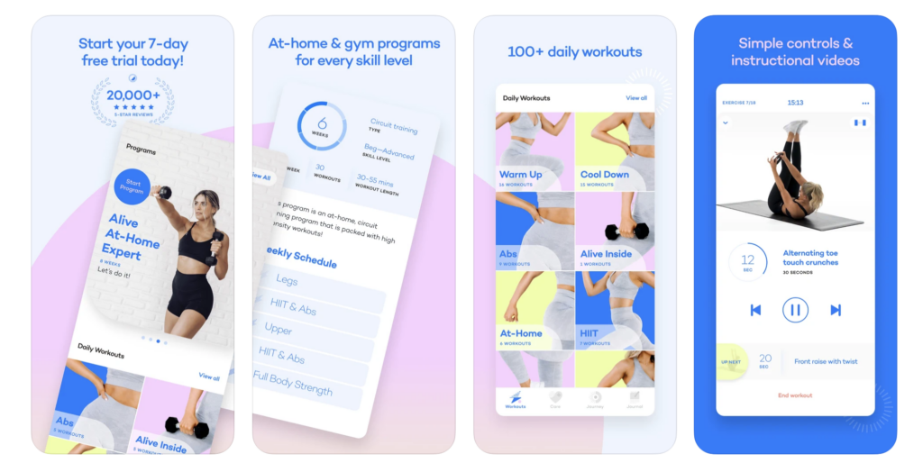
Alive by Whitney Simmons is a home wellness and fitness app to help women achieve their health goals. The goal was to make health and fitness easy and accessible, so busy women can form the habit effortlessly.

Designers have done well to mirror that concept with a simple and intuitive UI that makes it easy to find their desired workout. The soft color palette and minimal layout allow users to focus on the product’s content rather than getting sidetracked by unnecessary features and design elements.

Alive by Whitney Simmons has over 18k reviews on the iOS App Store with a 4.9 out of 5, showing just how much users appreciate the product and content. The Webby Awards recognized the app as a 2021 honoree for Best User Interface.

7. Evernote

Best Mobile App Design Screenshot of Evernote

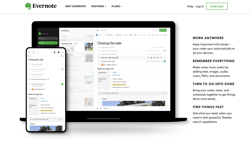
Evernote is the world’s biggest note and productivity platform, with hundreds of millions of users globally. The company has successfully simplified capturing, categorizing, storing, and sharing notes to maximize productivity.

Apple lists Evernote as one of its “Editor’s Choice” and is a regular Webby Award winner under the Work & Productivity Apps and Software category.

Evernote’s mobile application design is as comprehensive and intuitive as the desktop version. Even with tons of features and options, UX designers have done well to ensure users are only one or two taps away from taking a note or creating a to-do list. The home screen Scratch Pad allows users to take notes without clicking any buttons! The signature “Evernote green” makes prominent CTAs easy to identify in both light and dark modes.

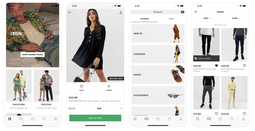
8. ASOS

One of the best Apps UI design that is Asos app

ASOS is a popular eCommerce platform for 20-somethings seeking the latest fashion trends. The platform features more than 850 brands and over 85,000 products, including clothing, shoes, and accessories.

ASOS has recognized that their primary target market of young professionals is highly active on mobile devices. As a result, ASOS has one of the best mobile eCommerce apps with minimalist UI and high-quality images.

Designers only use color when highlighting CTAs to funnel shoppers to the checkout as fast as possible. ASOS also offers Apple Pay (iOS) and Google Pay (Android) for express checkouts on mobile devices. The ASOS app is optimized for speed and efficiency to ensure customers have minimal pain points when completing a purchase.

9 Principles for Better Mobile App Design

Now that you’ve seen some excellent mobile app design examples, it’s time to explore 9 mobile app design principles to build user-friendly experiences for your customers.

  1. Make it Easy: Be aware of UX design psychology to avoid overloading people with content and information. Make sure directions are clear and break big tasks into digestible steps–as we saw with Weathsimple’s onboarding sequence.
  2. Make the navigation of your app predictable: Follow the “3-click rule,” where users can access any part of your application in three clicks or less. Also, make sure your mobile application experience mirrors the desktop and tablet versions. Wealthsimple, Evernote, Tumblr, and ASOS are all fantastic examples of this principle.
  3. Follow the basic laws of app navigation: Use globally accepted trends for mobile app navigation to minimize your product’s learning curve.
  4. Have a great, clear, and prioritized page design: Ensure your app has a clear content hierarchy with a layout that’s easy to digest. Label icons, features, and options clearly so users know exactly what tapping a link or button will do.
  5. Have brand image consistency: Keep your app’s UI on brand with consistent content and color palettes. Use the same navigational links for your mobile app as you do for the desktop and tablet versions.
  6. Minimize input and commitment from the user: Allow users to explore your mobile app without completing time-consuming onboarding forms. Offer things like Apple Pay/Google Pay, location tracking, credit card scanning, and other services to prefill forms and inputs. You can get app users to where they want to go much faster by reducing typing, thus creating an effortless user experience.
  7. Loading should be fast and well communicated: Communicate system tasks like loading and processing, so users know what’s happening at all times. Using percentage indicators or a countdown timer can further manage users’ expectations to reduce frustration.
  8. Optimize your app for mobile and diverse mobile users: Make sure content is easy to read on mobile devices and place links and CTAs apart to prevent users from accidentally clicking the wrong one.
  9. Do app design for humans: Mobile apps must meet accessibility guidelines so that users with visual impairments and disabilities can use your product too. UXPin’s built-in accessibility features include a contrast checker and color blindness simulator so designers can check their work to ensure it meets WCAG standards.

Improve Mobile App Design With UXPin

UXPin’s code-based design editor allows designers to build advanced mobile app prototypes to improve usability testing and reduce errors.

Use Iinteractions to create immersive mobile app user experiences. UXPin offers an extensive list of triggers for mobile apps, including tap/double-tap, swiping, scrolling, press hold, release hold, and focus, to name a few. Interactions can trigger all sorts of actions and animations to make your app interactive and engaging.

You can also create Javascript-like Conditional Interactions with “if-then” or “if-else” conditions, allowing you to create dynamic outcomes based on user and system triggers.

Unlike vector-based prototyping tools, UXPin’s code-based prototypes allow you to use Variables to capture user inputs and take actions based on the information they provide. For example, personalizing a welcome message after signup or confirming someone’s credit card details for a checkout sequence.

Set multiple States for elements and components, so your prototypes look and function like the final product. Designers can also use UXPin’s States to build complex components like drop-down menus, accordions, carousels, and more!

Ready to start building better mobile apps for your next design project? Sign up for a 14-day free trial to experience the power of UXPin’s code-based design tool.

The post 8 Mobile App Design Examples appeared first on Studio by UXPin.

from Studio by UXPin https://www.uxpin.com/studio/blog/mobile-app-design-examples/

Tesler’s Law. This is why you cannot make UX any simpler.

Law of conservation of complexity

Tesler’s Law

So far we have covered various UX principles and we only had one prime agenda for the experience of our users — To make their life as simple as possible. But what if I tell you that you can only do this to a point. After that point, you run into a pitfall called oversimplification.

Who was Tesler?

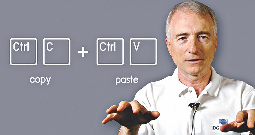
Do you remember this powerful functionality of copy-paste in our devices? Larry Tesler is the co-creator who worked at Apple, Xerox, Amazon, Yahoo and played a significant role in the early graphical interfaces.

(Larry Tesler)

Though he was a computer scientist, he specialised in human-computer interaction and gave us this very law of conservation of complexity. Respect!

What is the Tesler’s Law?

In simple words, it is very similar to the law of conservation of energy. You know that energy can neither be created nor be destroyed, it can only be transferred from one system to another. In a similar fashion, complexity is also conserved.

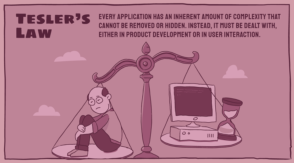
Every application has an inherent amount of complexity that cannot be removed or hidden. Instead, it must be dealt with, either in product development or in user interaction.

Now we know that there exists some amount of complexity that cannot be reduced. So the question is — who would deal with this complexity? It has to be assumed either by users or the product.

(Credits-Shopify UX team)

Tesler argues that an engineer should spend extra time reducing complexity on the application instead of making users spend more time on the task they’re trying to perform.

Paradox of Simplicity

It’s no surprise that we all want our life to be simple. We all want our products to be simple. But at the same time, we don’t want to sacrifice our options and other capabilities.

Now, this is a tricky situation. We can’t have both. It is not possible to have simplicity and complexity together.

If you provide our users with all the cool features, you tend to make the product complex and it is not simple anymore.

So what do we do in such a situation?

Don Norman in his book — Living with complexity, explains that what we really mean by simplicity is the need to have a better conceptual model.

A conceptual model is the underlying belief structure held by a person about how something works.

Conceptual models help us organize and understand other complex things. One good example of that would be how we see files and folders on our devices. It fits our conceptual model.

(Windows)

These files and folders don’t exist on our devices. It would get stored across multiple locations.

Whether something is complicated is in the mind of the beholder — Don Norman

The first time somebody would use Photoshop to edit and create illustrations, a novice would find it extremely complex. But a professional would need all those options to quickly achieve any task in mind. Not providing them with all these powerful features would make their life more complex, not simpler.

So understanding the conceptual model becomes important for the users you are going to create product for.

Why did we make the UX complex?

We have been talking a lot about Tesler’s Law and I know that you would like to see the examples now to understand it better.

Let me give you one incident from my experience while working with Expedia, an online travel platform.

To make life simple for our travelers, the moment they started giving us origin and destination for flights, we ran a background API call to fetch the results even before they clicked on Search button.

The moment they clicked on Search button, without any wait time, the results were already there. To our surprise, this actually resulted in higher exit rates from the search results page.

Expedia App

After a deeper analysis, we figured out that travellers thought our system isn’t doing any work to fetch the best results as there was no wait time.

We actually had add an artificial delay of two seconds to make them trust the Expedia application. It fit their expectations. We had to add the complexity here to improve the UX.

Things don’t always need to be incredibly simple for users

Similarly, banking applications aren’t expected to transfer the amount in a split second as our customers aren’t accustomed to that. Make everything automated and incredibly simple, you run the risk of customers not trusting your bank.

Complexity for Emergency

What if you make the plane completely automated without the need for experienced pilots in the cockpit?

Imagine a case of an accident where you need the pilot to take control of the plane and land it safely. In such a situation, pilots would panic for they haven’t been practicing flying the plane for long and systems are completely automated.

(Hudson river)

That is why you would add some complexity here so that these pilots would have to intervene regularly during their daily flights for the time when things break.

Perceived Simplicity vs Operational Complexity

It has been a recent trend where to make things simple, we move towards minimalism. One should not misinterpret minimalism as simplicity.

Perceived simplicity is not at all the same as simplicity of usage: operational simplicity. Perceived simplicity decreases with the number of visible controls and displays — Norman

What is more important for customers is operational simplicity. The goal to finish a task. Removal of necessary controls and functionalities for the sake of perceived simplicity could add to operational complexity.

References

Shopify UX blogs

fs blog

Living with complexity — Don Norman


Tesler’s Law. This is why you cannot make UX any simpler. was originally published in UX Collective on Medium, where people are continuing the conversation by highlighting and responding to this story.

from UX Collective – Medium https://uxdesign.cc/teslers-law-this-is-why-you-cannot-make-ux-any-simpler-d4c0706686a5

Optional Fields You Should Remove on Your Form

It’s no secret that fewer form fields lead to higher conversion rates. Reducing them not only makes a friendlier first impression, but it decreases error rates and completion time. Therefore, you should remove as many unnecessary optional fields as you can. Many apps use optional fields as an opportunity to gain knowledge about the user […]

The post Optional Fields You Should Remove on Your Form first appeared on UX Movement.

from UX Movement https://uxmovement.com/forms/optional-fields-you-should-remove-on-your-form/

Quantifying UX Improvements: A Case Study


Quantitative UX metrics allow us to track the quality of experiences over time, and see how they improve. They help UX professionals gauge the quality and impact of their work, and communicate that impact to others.

The process of UX benchmarking involves choosing one or more metrics that represent important aspects of the experience and then tracking those metrics to see how design interventions impact them.

The following case study illustrates how one team used a UX metric to evaluate the impact of its work and to demonstrate it to their client.

In an interview, I spoke with four members of the Marketade team:

  • John Nicholson, principal
  • Sonya Badigian, UX researcher
  • Nora Fiore, UX writer
  • Emily Williams, UX researcher

Case Study: Marketade for Baileigh Industrial

Marketade is a small, long-established, and fully remote user-research company with expertise in turning user insights into better experiences. Its clients include GEICO, McDonald’s, Herman Miller, the United Nations, and Stanford University.

One of its clients, Baileigh Industrial, is a Wisconsin-based top manufacturer of industrial metal and woodworking machinery. The company sells through distributors and directly to customers through Baileigh.com. Due to the nature of their products, individual sales on Baileigh Industrial’s site can be huge — often over $15,000 each.

Baileigh.com sells valuable, complex B2B products, such as computer-programmable rotary-draw benders, which range in price from USD $11,000 to $80,000.

Sales-Representative Interviews Reveal a Major Problem

Marketade began its work with Baileigh by conducting qualitative interviews with sales representatives. Sales and customer-service departments are great places to start looking for potential experience problems. People who regularly interact with customers are likely to know their top issues and concerns.

“At Marketade, we’re dedicated to talking with our stakeholders as much as we can before we launch the research process. We really want to understand the context that they have. In this case, we also spent time learning about the machinery and technical jargon.” 

Emily Williams, UX researcher

major pain point among the sales representatives was that customers were frequently calling because they could not find the information they needed on the website. Because they were flooded with simple inquiries, expert sales reps did not have time to answer complex questions. The website richly documented information about small-value items, whereas some large-value items could only be bought through sales representatives due to the level of specialization. For example, representatives might spend 20 minutes answering questions about a $716 hand bender instead of working to find a unique solution that might result in the purchase of a $130,000 laser table. 

When the Marketade team spoke to senior management, they heard the same complaint. The researchers realized that improved self-service on Baileigh’s website would free up sales representatives to focus on people who needed their expertise and would enable them to spend most of their time on high-value sales. 

Understanding the Problem Through Qualitative Research

Marketade then moved on to qualitative usability testing to understand why so many customers were reaching out to the sales representatives. They discovered a critical barrier to self-service: customers often struggled to find the product or even the product category that they wanted. They repeatedly wasted time going down the wrong path using the site’s navigation.

Before: Baileigh’s PRODUCTS megamenu. Participants in qualitative usability testing struggled to find the products they wanted. The original global navigation offered a huge number of choices.

To take a baseline measurement of the navigation’s performance and to determine which areas of the navigation structure needed improvement, Marketade conducted a tree test using Optimal Workshop’s Treejack. The team recruited 64 participants for the test, using ads in Baileigh’s email newsletter and social media pages.

The test consisted of eight possible tasks, each one focusing on a different top-selling product category ­— for example, You need to precisely bend some quarter-inch sheet metal into a V shape on a vertical plane. Where would you look?

After the study, Treejack scored ­­Baileigh’s tasks on various findability-related metrics, resulting in an average overall score of 4 out of 10. Based on this result, the Marketade team decided that the information architecture could be substantially improved, hopefully leading to a decrease in unnecessary sales calls.

Screenshot from Marketade’s tree-testing analysis. For this example task, the overall score was 3 out of 10. Only 34% of participants went down the correct path to find the answer.

Building a Better Information Architecture

For the results of each task, Marketade researchers looked at the most common incorrect paths. Across all tasks, they found some themes:

  • Too many top-level product-category choices, leading many users down the wrong path from the start
  • Navigation hierarchies that overlapped and were not intuitive to users
  • Similar or misleading subcategory names, causing many users to pick the wrong targets

The Marketade team then conducted a card-sort study to understand how Baileigh’s customers think about and categorize their products.

The result was a new information architecture that:

  • Broadened categories so that users have an easier first choice and are not funneled away from their target by a single wrong click
  • Reevaluated and reworded problematic subcategory names to prevent confusion
  • Included context for tools’ functionalities where possible
After: Baileigh’s METALWORKING megamenu. Marketade’s new information architecture resulted in a global navigation that was narrower and more scannable compared to the original.

By narrowing the global navigation, Marketade reduced the number of options that Baileigh customers had to consider initially. Customers could choose a category and then view a product-category page. The product-category pages contained details about the different product options available, helping customers who were unfamiliar with the domain — all without requiring any involvement from the sales team.

After: Baileigh’s Press Brakes category pageBaileigh customers could choose a category (in this example, Press Brakes) and then view a product-category page, which contained additional details about the product options. 

Quantifying the Results

The team conducted a second tree test using the new information architecture (IA). To get a benchmark comparison, they reused the original tasks (with minor wording tweaks to account for new navigation labels) and recruited a fresh group of  participants.

In the first tree test with the original IA, the overall score was 4.0 out of 10 across eight tasks. In the second tree test with the revised IA,  the overall score was 7.4 out of 10 across those same eight tasks — an 85% increase in product findability.

The original IA failed to score above a 5 out of 10 on any of the 8 tasks. The revised IA scored a 7 or higher on 6 of the 8 tasks. 

The client team was thrilled. In the following months, Baileigh’s revenue and leads increased substantially. 

“Since launching the new site, the company’s web revenue and leads are up by large margins. While it’s not possible to isolate the architecture’s contribution to this growth, follow-up analysis through Google Analytics suggests a significant ROI from our human-centered overhaul of the company’s IA.” 

John Nicholson, principal at Marketade

The average improvement in UX metrics from a UX-driven redesign was 75% across our recent research. Obviously, hitting this exact average is rare, and some projects will be better and some worse. Why did this team realize a bigger improvement (85% instead of 75%)? There are many possible factors, and we can’t know for sure. One possible explanation is that this was a complex design problem for a specialized domain, as is common in the B2B space. Paradoxically, the harder the design problem, the larger the opportunities for UX improvements can be, because there are so many possible design dimensions to explore.

For More Information

Marketade’s case study represents an ideal synthesis of qualitative research (for issue discovery and solution development) and quantitative research (for assessing and tracking performance). This case study is just one excerpt from a set of 44 real-life case studies detailed in our 297-page report, UX Metrics and ROI. The case studies include a wide variety of product types, UX improvements, and quantitative metrics. The report also includes more details from the Marketade interview, as well as interviews with 8 other UX teams.

For help developing your own quantitative benchmarking plan, check out our full-day seminar on Measuring UX and ROI.

To learn more about common findability problems, as well as how to identify and solve them, check out our full-day seminar on Information Architecture.

from NN/g latest articles and announcements https://www.nngroup.com/articles/quantifying-case-study/

How Storyboards Help You Solve Project Problems

How Storyboards Help You Solve Project Problems

You know that you have a long road ahead of you when you start a new project. Unfortunately, the journey rarely takes a direct path. Instead, you find yourself veering off of the planned course when you encounter unexpected problems. Storyboard benefits can help you predict some of those problems, making it easier for you to plan a more efficient path between the beginning and conclusion of your projects.

What is a storyboard?

The term “storyboard” comes from the movie industry. Long before producers, directors, and writers start filming scenes, they take time to create a shot-by-shot vision of the movie. Years ago, they would draw the scenes on pieces of paper and attach them to large boards. Today, most movie studios use software to make storyboards.

A good movie storyboard may look simple, but it tells teams a lot of information, including:

  • The right camera angle to use during a scene.
  • Where actors will move throughout a scene.
  • What special effects they need.
  • The movie’s entire plot.

When you look at the entire storyboard, you get an early version of what the film will look like upon completion. Why bother doing so much work instead of building sets, gathering actors, and turning the cameras on? Because it takes a lot less time and money to plan ahead instead of jumping into a project without thinking everything through.

You get the same storyboard benefits during design projects.

How storyboards benefit design projects

Storyboarding forces teams to think through every step of a project. During the process, people will notice potential problems that could arise while building the product. The process also encourages colleagues to raise questions about how they will reach specific goals.

Some questions teams might ask while storyboarding include:

  • Do we have the right tools to include that feature in our product?
  • How will these features interact with each other?
  • Does this navigation menu make it obvious where links lead?
  • Will new users find this design intuitive?
  • Where should we add forms to generate leads?
  • How often should we use popups to encourage specific actions?
  • Do these steps follow a logical structure?
Storyboards 01

When you see every step of a project in front of you, unknown problems tend to reveal themselves. Don’t assume that you can get the same results from mental exercises. Running through scenarios in your head keeps you inside your head, where cognitive bias can influence your decisions. Once you create physical representations of each step, you and your team gain a more realistic perspective.

Other storyboarding benefits for product designers

Other storyboard benefits for product development teams include:

  • Improved collaboration—knowing every task in the project makes it easier to assign jobs to teammates.
  • Saving money—you spend less money when you can discover potential problems before you start designing a product.
  • More efficiency—you avoid delays when you know what tools your designers will need to complete tasks.
  • Better accountability—having a step-by-step storyboard holds everyone accountable for their assigned tasks.
  • More realistic milestones—you can’t set realistic milestones until you take an objective look at how a project will progress. Unreasonable expectations will only hurt morale, create stress, and disappoint stakeholders eager to see results.
  • Process improvements—not every storyboard will progress as planned. With each attempt, you learn how to improve your process. Perhaps you’ll never find the perfect process, but you will get closer over time.
  • Avoid legal issues—when your team sees designs, they might recognize similarities that could lead to intellectual property disagreements.

Storyboards play roles in popular approaches to project management

Storyboards benefit workflows so much that they have become essential elements in some of the most popular project management methods.

Agile

Potential the most popular project management method, Agile encourages teams to revisit their storyboards to reevaluate processes and expectations. Key features of Agile include:

  • Small tasks that contribute to larger objectives.
  • Prioritizing tasks that must get completed before others.
  • Taking regular breaks to reflect on project progress to improve outcomes.
  • Adapting to changing requirements as the project progresses.

Kanban

Teams typically use Kanban storyboards after they have made larger storyboards that provide project overviews. The Kanban board can frequently change to show progress within a project. A Kanban storyboard has three columns:

  • Planning—tasks that have not been started yet.
  • In-progress—tasks that someone are working on.
  • Done—completed tasks.

Project leaders can customize Kanban storyboards by breaking tasks into smaller steps and including the names of people responsible for completing tasks.

Scrum

In Scrum, you break storyboards into four columns that contribute to the project’s overall success:

  • Stories: a high-level element that colleagues can use to identify compartmentalized parts of a project.
  • Task Status: shows the current state of a task, such as whether it’s planned, in-progress, or completed.
  • Swim Lane: a visual representation of a parent story and its subtasks.
  • Individual Stories: stories that fall outside of the swim lane.

Get more storyboard benefits with UXPin

Adopting the right prototyping tool can make it easier for you to benefit from storyboarding. UXPin gives you several features that will contribute to planning projects, improving efficiency, and testing ideas before committing a lot of time and money to them.

Create a storyboard with UXPin

UXPin’s wireframing feature makes it easy for you to create digital storyboards that you can share with every member of your design team. 

Build a design system creates guardrails for decision making

You want your designers to use their creativity, but you need them to stay within guardrails so the team can build a coherent product. UXPin lets you build a design system that creates guardrails for decision making. Once you create your project’s design system, everyone will know:

  • What assets they can use.
  • Appropriate sizes for images and text.
  • Approved typographies.
  • Colors for buttons, backgrounds, and other design elements.

The more questions you answer upfront, the more efficiently your team can work.

Test interactive features in prototypes

UXPin lets you use real data when you design and test features. You don’t have to rely on Lorem ipsum anymore. Instead, you can make sure that a feature works correctly by adding real data to your prototypes interactive features.

Try UXPin today to see how it can boost your storyboard benefits

Choosing a reliable approach to project management storyboards helps ensure that your team creates a successful product. You also need to give designers the right tools to reach their goals.Start a UXPin free trial today to see how it contributes to your team’s process. You don’t have to supply a credit card number to start your free trial, so you get to experience UXPin’s features without any risks or obligations.

The post How Storyboards Help You Solve Project Problems appeared first on Studio by UXPin.

from Studio by UXPin https://www.uxpin.com/studio/blog/storyboard-benefits/

A different urgency

For many people, work consists of a series of urgencies. Set them up and knock them down. Empty the in-box, answer the boss, make the deadline.

Over the next few weeks, there may be fewer urgencies than usual. That’s the nature of coming back from a break.

What if we used the time to move system deficiencies from the “later” pile to the “it’s essential to do this right now” pile?

Improving a system returns our effort many times over.

Fix your supply chain. Dig deep into your communication rhythms. Figure out the priority list. Quit the tasks that are holding you back. Walk away from dead ends. Add rigor to your processes. Understand the difference between the things that feel urgent and those that are truly important.

None of this works if you do it temporarily. The point is to create and fix systems with finality. Identify a class of projects that your team will do instead of you and then never do them again. Reorganize your data archiving approach and then stick with it. Build a system for lifelong learning and then maintain the commitment.

In any given moment, an urgency that feels like an emergency gives us the permission to abandon our systems and simply dive in and fix it, as only we can. And this permission is precisely why we get stuck, precisely why the next urgency is likely to appear tomorrow.

Resolutions don’t work. Habits and systems can.

Most of us are so stuck on the short-cycles of urgency that it’s difficult to even imagine changing our longer-term systems.

Amazingly, this simple non-hack (in which you spend the time to actually avoid the shortcuts that have been holding you back) might be the single most effective work you do all year.

from Seth Godin https://seths.blog/2020/12/a-different-urgency/