Augmented reality (AR) is a promising new technology that has applications in domains ranging from ecommerce to education and gaming. However, AR also comes with relatively complex interactions as it is trying to realistically combine a virtual scene or artifact with the user’s physical space.
Our Research
To understand the user experience of mobile apps that use augmented reality, we ran a usability-testing study involving 11 participants; 7 sessions were held in person and 4 were remote. This study included a diverse group of applications from areas such as education, health, fitness, art, history, ecommerce, and entertainment. The goal of the study was to see if any progress had been made since our last AR study involving ecommerce apps and to investigate how AR is used in other domains beyond ecommerce.
AR Still Unfamiliar to Most Users
Many people still have no idea what augmented reality is: most of our participants did not know much about AR or were not at all familiar with the term. When asked “How would you describe the AR technology to someone who might not know anything about it?” eight participants confused AR with virtual reality. For example, one participant stated: “I have seen AR in demos at the store, where you put the head set on, but I don’t have anything like that in my possession. So, it [my experience with AR] has been pretty limited.” Three participants had used AR before once and just one participant had used it twice.
AR Onboarding: Tips and Walkthroughs
While extensive help and tutorials are generally not needed for mobile apps, some onboarding can increase users’ awareness of new, unfamiliar technologies such as AR. AR presents users with novel interaction patterns, many of which are still lacking in both usability and functionality. Hence, many AR experiences will benefit from some form of education or onboarding.
There are two types of instructional content commonly used in mobile apps:
Contextually relevant tips are brief instructions or hints that are related to the user’s goal. They are generally the more effective method of providing help — usually, because users are motivated to pay attention to them. AR-related tips can highlight key parts of the UI, tell people how to interact with the AR object, alert them of additional options, or give them feedback about how to correct certain actions (e.g., during calibration).
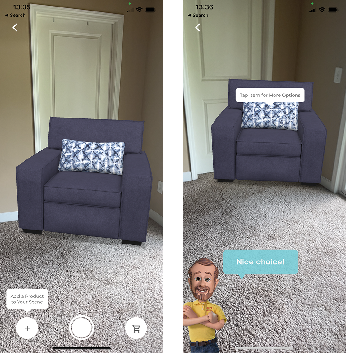
Instructional walkthroughs are generally more complex and teach users about how to interact with the application. While their use in mobile apps is not generally recommended (since most mobile apps are fairly simple and don’t need explanations of the UI), instructional walkthroughs do have a place in AR-based applications due to the novelty of AR and AR-related patterns. Thus, AR walkthroughs can provide step-by-step onboarding and teach users the key components and functionality for completing the task by guiding them through a series of actions in an AR experience.
While both tips and walkthroughs can successfully assist novice users throughout an AR experience, this article focuses on onboarding walkthroughs.
AR-Related Walkthroughs
Walkthroughs are not a substitute for the poor interface design. AR-related instructional walkthroughs should generally have two goals:
- Increase awareness of the AR feature and show its potential.
- Guide users through the novel interactions of a simple AR experience so they can learn how to use the AR feature.
If the primary functionality of the app is AR-related, the app may combine both these goals into a single walkthrough that is presented upon launch, If, however, AR is just a supporting feature for your app, don’t flood the user with AR instructions when the app is first launched. Often, users tend to dismiss lengthy or complex walkthroughs that are shown when they first use an app, especially if they consider them irrelevant for their immediate goals. Instead, show an interactive, instructional walkthrough when the AR feature is first used. Awareness of the AR technology can be created through a tip on those pages that include the AR feature.
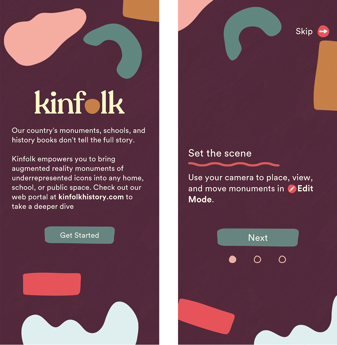
In our study, the most used type of walkthrough was the deck of cards. While this onboarding style provided an overview of the AR features and set users’ expectations for the feature, it often caused cognitive overload and strained the user’s working memory. Participants couldn’t fully remember what they had read and had to refer to the help menu or relaunch the experience to review the deck of cards one more time.
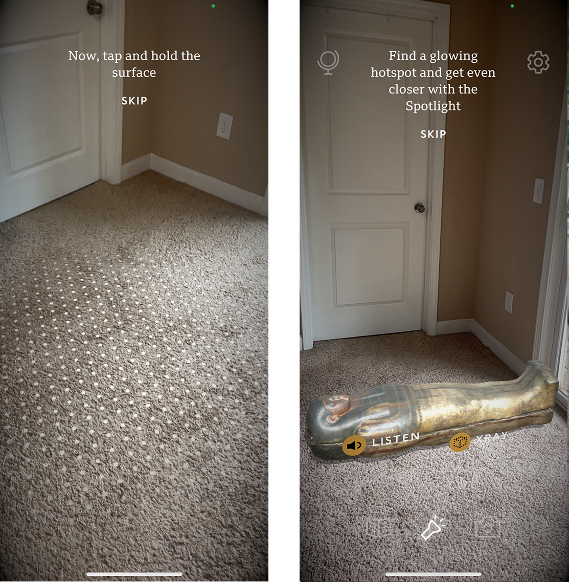
Interactive walkthroughs were generally more effective than static walkthroughs, as they gave users a chance to practice a small-scale AR activity. Participants were generally appreciative when they could see detailed instructions about how to work with the AR feature and felt delighted when they were able to easily complete a first AR task within the app.
One participant using the JigSpace app was pleased with the detailed instructions that guided her through her first AR interaction within the app: “It’s easier than most apps, because it actually gives you [instructions] at the bottom of the screen that actually tell you what you can do and what you can’t do. Tells you ‘just swipe it,’ ‘spin it’ — pretty straight forward.”

AR-Walkthrough Components
In addition to highlighting the core functionality of the UI, being aware of some of the main challenges that users face in their first interactions with AR features can help app designers set the stage for a successful AR experience. In particular, an AR walkthrough should be brief and touch upon the following key considerations for getting started with the AR feature:
- What to expect from the AR experience
- How to handle the device
- How to prep the environment.
What to Expect from the AR Experience?
When landing on the homepage of an app, many users had no idea about how AR was used. Sharing an overview of the AR experience and its goal clearly and in a descriptive way will help the users prepare for the next steps.
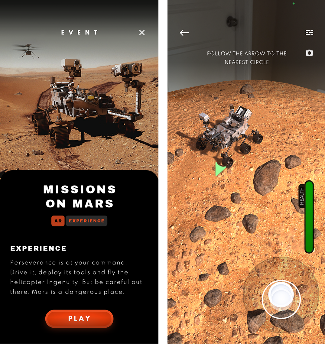
Focus first on the high-level purpose of the AR feature (e.g., see how a piece of furniture will look in your room, create interactive 3D presentations, drive a Mars Rover in your own environment) and, once that is clear, present users with low-level instructions such as how to use the specific controls in the interface.

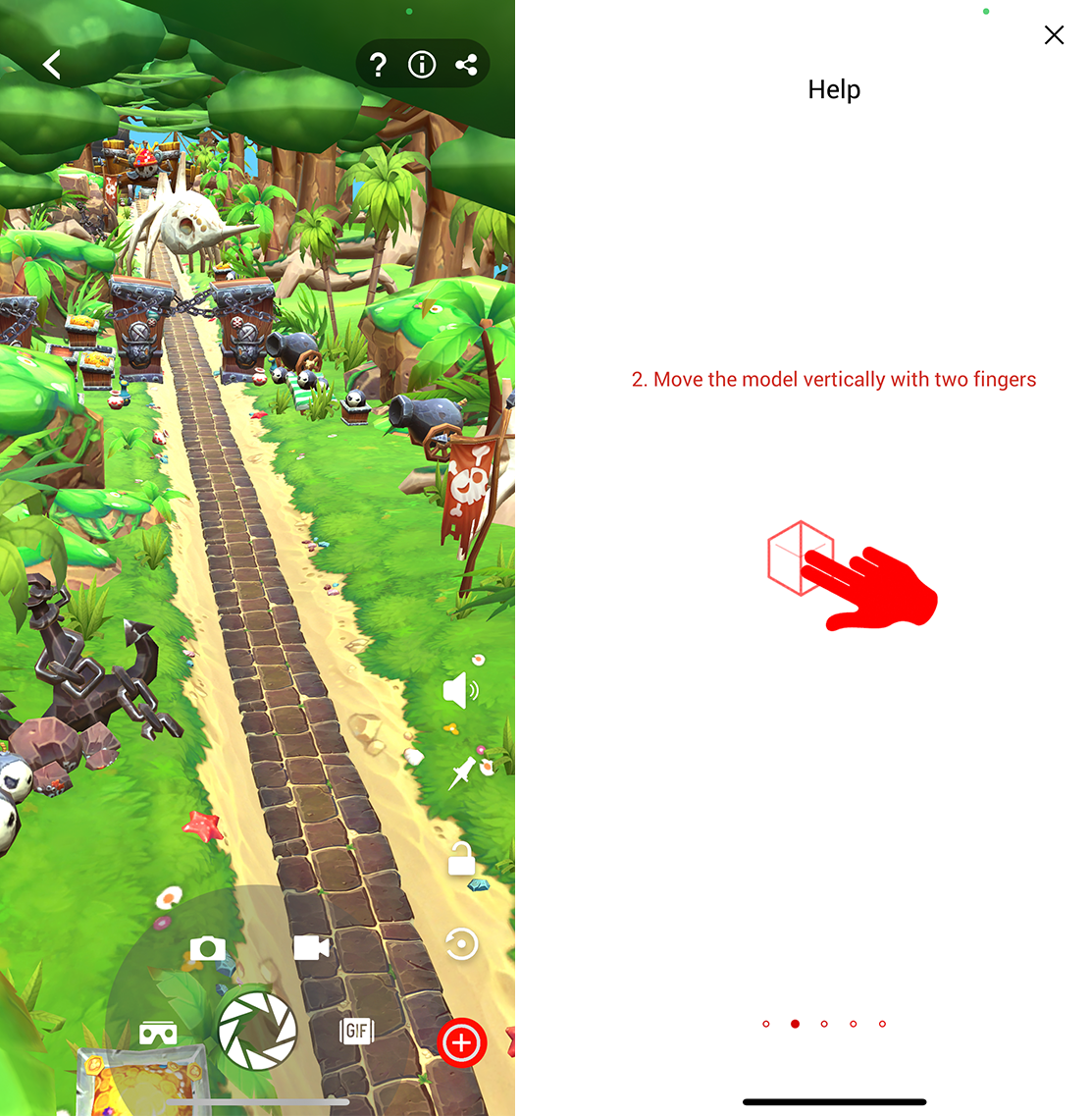
A participant trying a game in the ARLOOPA app could not understand the goal of the game and what she should expect from the AR experience. She stated: “I don’t know how to play it. I’m just going to try a different game. I did not understand that one. […] So, I push Help because I don’t know how to do it.”
Unfortunately, using the Help menu did not resolve the issue, as it provided low-granularity information about interacting with the AR object and did not mention the goal of the game. The participant said: I don’t understand how to play this game at all. This is where I get frustrated.” She added: “It would have been helpful to get a better description of ideas or directions, I guess. This seems really weird. Even though I don’t understand how to play the game, I am inside the game because it’s so zoomed in, but it doesn’t help because you don’t even know what you’re doing. So, this needs to be described better.”
The Mission to Mars app showed an initial walkthrough with some basic instructions about interacting with the AR object. However, the objective of the AR experience was unclear. Hence, the participant later struggled to understand the hints and tips as she was using the app. Clarifying the purpose of the AR experience ahead of time could have helped her see the bigger picture and resolved potential confusion. She said: “I don’t know what ‘follow the arrow to the nearest circle’ means. It seems like, it’s supposed to be a game. Cause it has a green thing that says like health, which I associate with game and staying alive. […] Oh, what’s that? Oh, I can drive it. […] So, there’s really no direction as to what I’m doing. I didn’t know I could drive it, but I sort of figured it out with this white circle thing. I’m backing it up. I don’t know. It seems sort of awkward, but actually it’s cool. […] I didn’t know what the Mars Rover looked like. Oh, I guess I was supposed to navigate this guy to this green area.”
How to Hold the Mobile Device
Due to the participants’ unfamiliarity with the AR technology, they often were unaware that the device’s camera would be used to take advantage of the AR feature. For instance, upon launching BBC’s Civilizations AR app, a participant was confused when she received instructions in text format but could not see any other visuals on the screen. Initially, she assumed that the AR feature had failed; it took her a couple of minutes to realize that the problem occurred because she had placed the phone on the table and the desk was blocking the camera view. She said: “Well, ‘cause I had my phone on the table, the camera was on already. So, it was already going. I didn’t really realize that. So, I thought it was just black and I was waiting for the tutorial to tell me what to do. So now I want to go back in the tutorial and find out what it was telling me. I don’t want to skip the tutorial.”
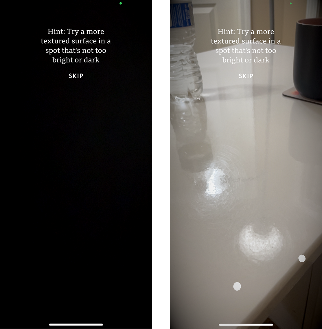
Let users know how they should hold their phone: whether they should keep it in their hands, at a specific height, angle, or orientation (portrait or landscape). Inform users that the camera should not be covered and should be directed towards an empty area. This information will prevent mistakes such as placing the phone on the table or leaning it against the wall.
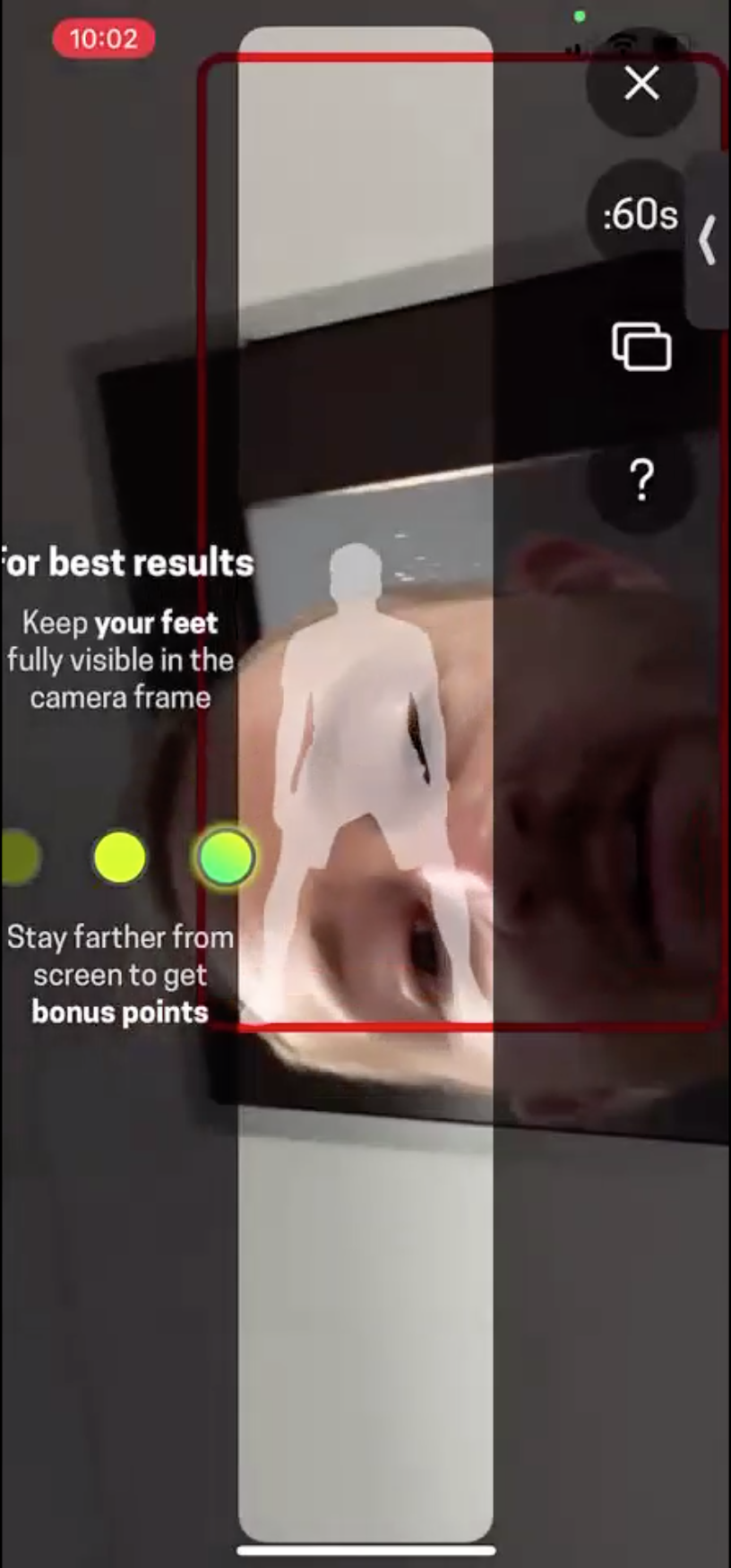
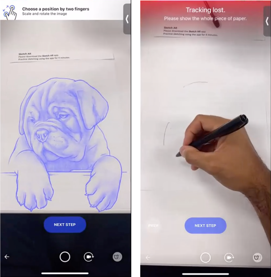
Furthermore, the handling of the device should take into account physical limitations and should not conflict with accomplishing the primary task. For instance, participants struggled with drawing in the SketchAR app. The app “projected” an image onto a piece of paper and the user could trace the lines in that image to make their own drawing. To draw the selected image, the user had to hold the phone very still with one hand above the paper and draw on the paper with the other hand, while looking at the screen so they could replicate the image on the paper. Moving the phone could cause the user to lose their work.
A participant who attempted this task commented: “I have to hold the phone […] in place without moving. So, in this case it seems pretty difficult to keep it up, [it] keeps losing the paper. […]. [It’s frustrating] that it keep losing the paper, but, more than that, it is that I’m holding my phone with my left hand, looking at it without trying to move it. Because I feel like if I move it, then it’s going to lose track of the paper. […] I’ve lost it. […] Is it because the table is white as well and it’s losing it or is it because I’m just moving around so much?”
How to Prep the Environment
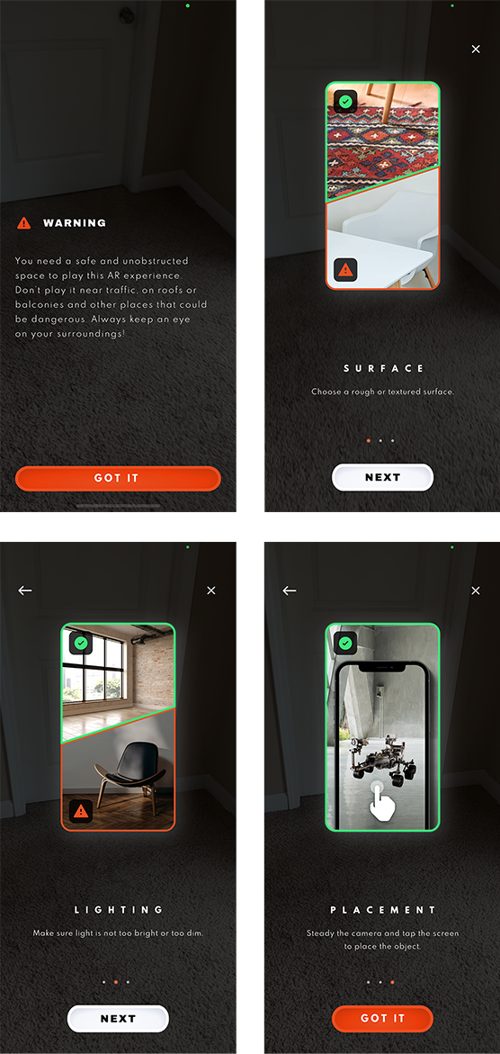
Preparing the physical environment can be another hurdle that users need to overcome as they interact with an AR feature. Users should receive timely and contextually relevant step-by-step instructions regarding requirements such as lighting, surface quality, and space size. For example, some applications will perform better when viewed outdoors or in a particular location.
One participant who was using the Smartify: Museum and Art Guide app received no clear instructions regarding the preferred size of the space where she should place an AR artifact; hence she had difficulty fitting and adjusting it in her room. She said, “So, it should have told me, you know, ‘the object is going to be three-by-three-feet size;’ then, I would have scanned or chosen the location accordingly so that there wouldn’t have been this confusion of, you know, ‘more light, move your phone, and all that.’ […] If they would tell me ‘this particular art item would need this much space. So, scan accordingly’ — that would be helpful.”
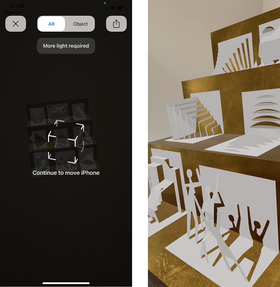
The Augmented Berlin app did give some instructions regarding the requirements of AR experience, but the instructions were not detailed enough. A study participant said, “It was good that it gave me a tip like that it would require more space and lighting, but, you know, it didn’t tell me how much. More — could be any amount. So having the exact space that it would require, like saying it would require a 10-by-10-feet wall, […] would have been helpful for me to choose the right space, because now I can hear the audio and the audio says ‘here, it happened something, something happened here’ [but I don’t see anything].”

Additionally, the instructions should not be overwhelming or too complicated. The Best Buy app asked the user to attach four stickers to the environment to calibrate the AR feature. One study participant felt it was too much and skipped this part: “It’s getting difficult for me to, you know, project it because it needs particular things, but I think I [will] just try to place and I tap it. […] It says your TV was placed but I can’t see the TV. Yeah, [..]’ it’s a little difficult, it’s not very […]’’ user friendly. It’s asking so many specifications to be, like, perfect.”
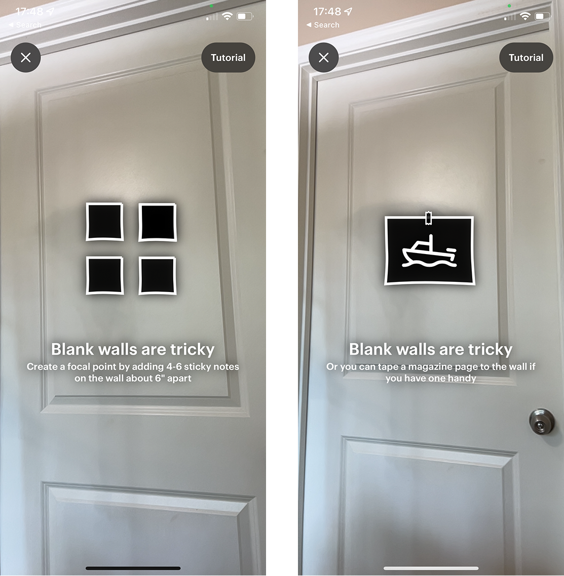
Many users won’t bother to go through a complicated process to view an item in the room, especially if their primary goal is not interaction with the AR object. In such cases, the AR feature is useful only if it adds extra value with minimum effort.
Another critical aspect of the AR experience is users’ safety. Many AR interactions involve moving around the physical environment while looking at the phone screen. Hence, users might disregard their environment or miss potential hazards such as slippery surfaces, sharp objects, or obstacles. Tell users to find a safe place away from all these potential risks before beginning the AR experience.
Conclusion
AR is an exciting new technology that has plenty of potential. Many of our study participants were delighted when they were able to go through an experience successfully. For example, after using the MauAR — Berlin Wall app, one participant said, “I think it’s cool! I will probably hang on to this [app] after this [session]! I would probably like [to] run through it and finish it out. I’ve never seen anything like it! […] It’s like an education application that is a little more immersive…”
However, AR-related patterns (as well as the meaning of AR) are unfamiliar to most users. To help people take advantage of AR in your apps, consider developing contextual tips and instructional walkthroughs that set the stage and help users prepare for the interaction.
Make sure that your walkthroughs describe the purpose of your app and how the AR functionality fits in. Then clearly explain to users how they are supposed to handle their device throughout their experience and how their space should be chosen for an optimal, safe interaction.
from NN/g latest articles and announcements https://www.nngroup.com/articles/ar-walkthroughs/
