How materials, moods, and mediums affect the output of a simple circle
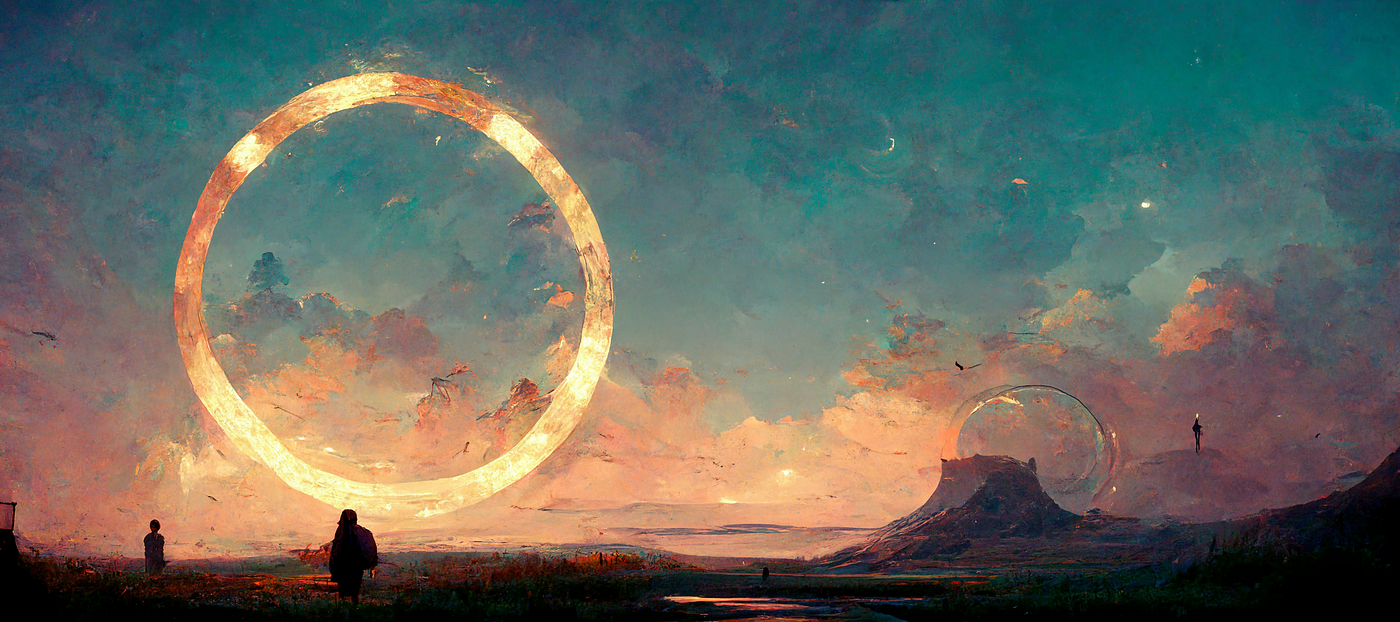
Midjourney is an AI image generation tool that take inputs from a human (usually through text prompts and parameters, but also other images) and uses a machine learning algorithm trained on a huge amount of image data to produce unique images.
Like most machine-learning models, Midjourney can be a bit of a black box. It’s so complex that it’s difficult to explain to a layperson what happens between the system receiving a text prompt and it producing an image.
What we can do, is explore the output we get based on the inputs we give, and look for patterns and make assumptions. This won’t necessarily get us a better understanding of how the system works, but it can help us learn how to use it better.
Note: I will frequently anthropomorphize Midjourney here. I understand it doesn’t actually think, imagine, like/dislike, or feel anything.
To best represent the detail of Midjourney’s output, the images below have large file sizes. Proceed with caution if you’re on a slow or metered mobile connection.
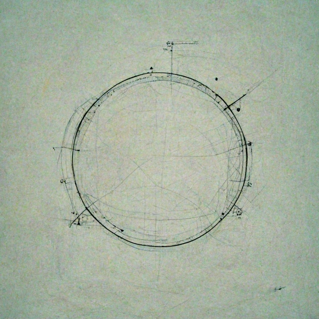
If you asked a random person in your life to draw you a circle they would probably find a blank sheet of paper, maybe a notepad with lines, pick up a pen or a pencil, and draw an outline of a circle.
But what happens when we ask the same thing of Midjourney?
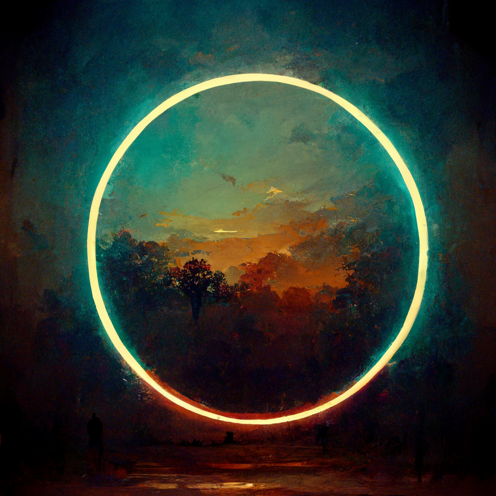
You can see with simple prompts, Midjourney fills in a LOT of gaps with what boils down to weighted dice-rolls, on aspects of an image which a human would typically leave blank. Run a prompt like this through the system ten times and you’ll probably get 6–8 fairly different images with different aspects, and a lot of similar traits. Without stylistic or color descriptors, it leans heavily into the cinematic teal-and-orange look by default, as you can see here. It LOVES clouds. You can see it has quite a specific painterly look, which it also favors by default.
We can try to dial it back through more specific text prompts to get it to something resembling what a human would make.
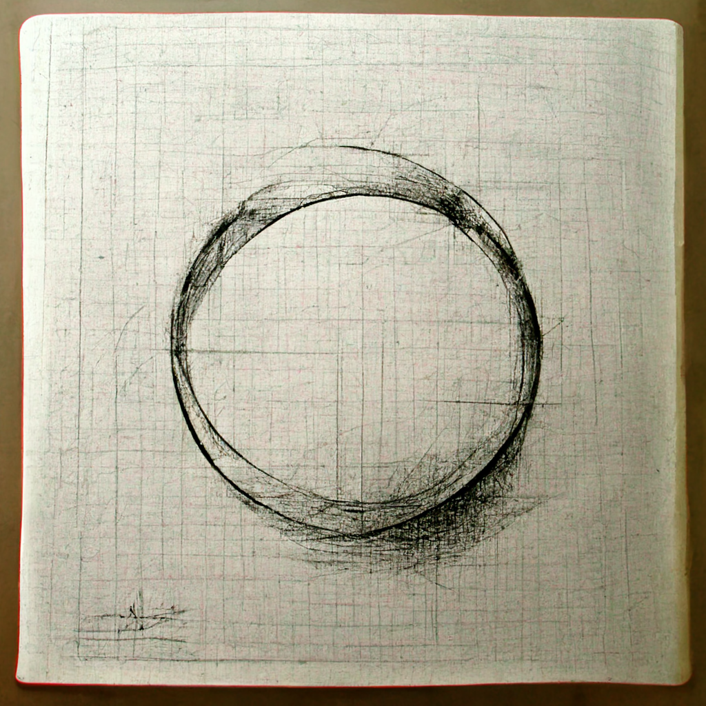
Even still, it’s far more detailed than we’d expect from a human and still takes a lot of trial and error to simplify.
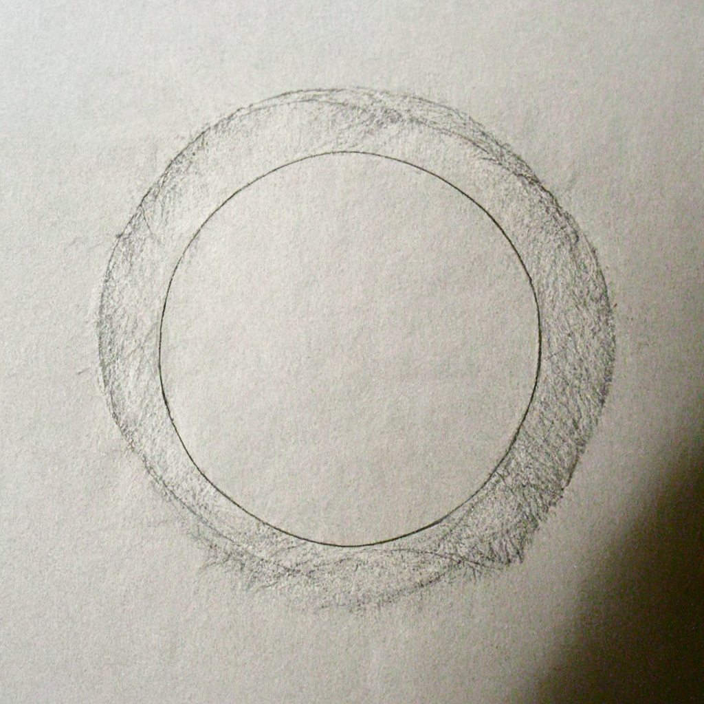
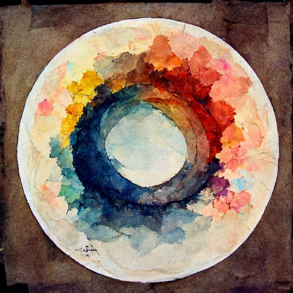
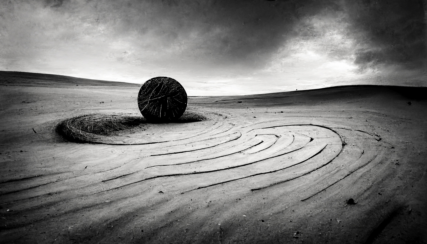
Midjourney is exceptionally good at simulating different types of materials. It usually understands the basic properties, forms, or colors of many interesting materials, and we get some interesting results playing with these.
Materials and colors will help add flavor to your prompts. Experiment with combinations, both expected and odd. Pay attention to materials in your surroundings. Around me right now I see crinkled paper, black plastic, brushed aluminium, grey woven cotton, and blue foam. Let your environment inspire you.
Midjourney does very well with poetic descriptions and adjectives, but only if you’re not after something highly specific and prefer to simply invoke a mood.
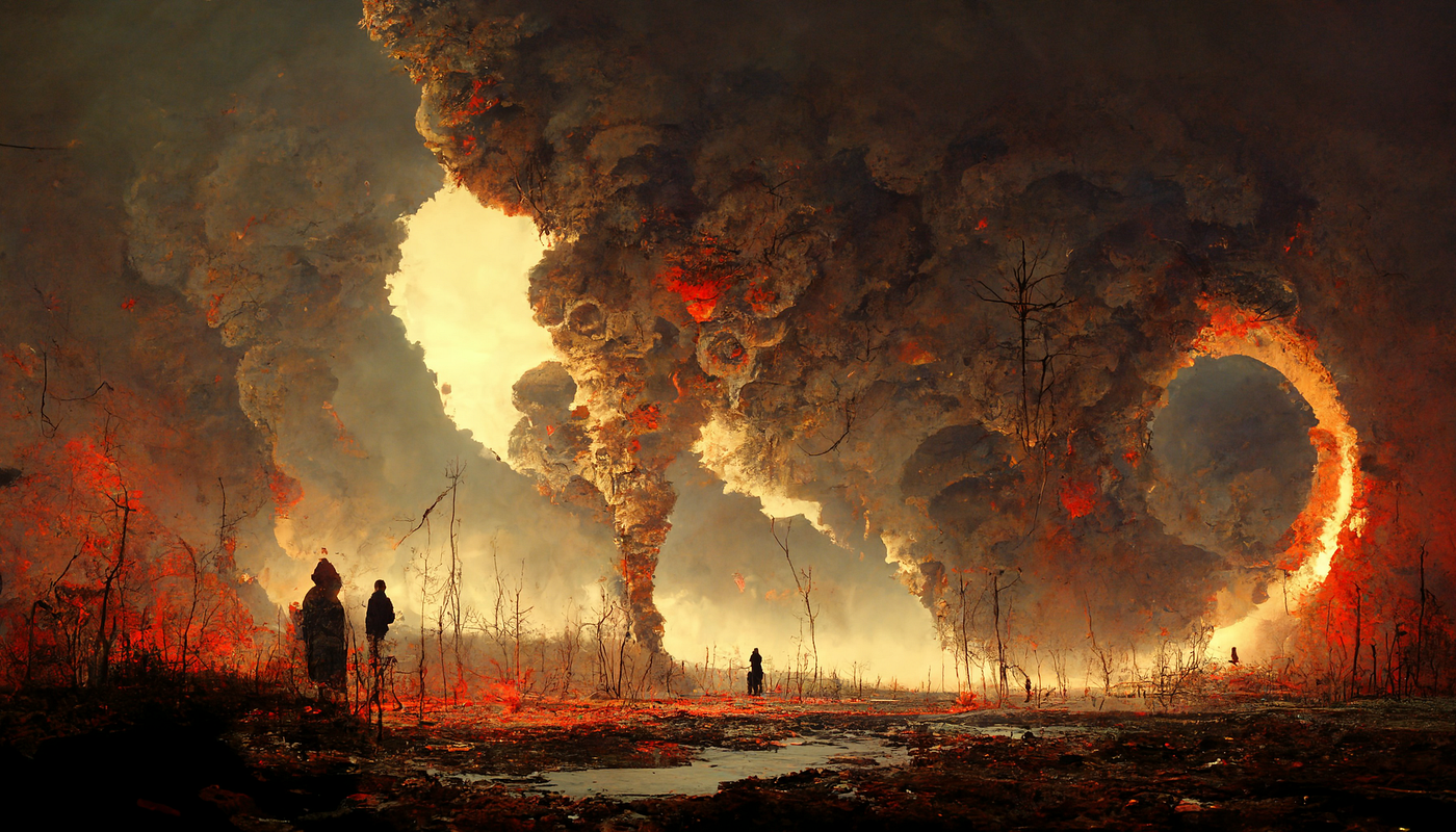
The best way to use it is to leave a lot of room for interpretation and just sort of roll the dice. You’ll notice certain moods favor certain color schemes (blues for melancholy, reds for horror), but often that teal and orange will still creep in.
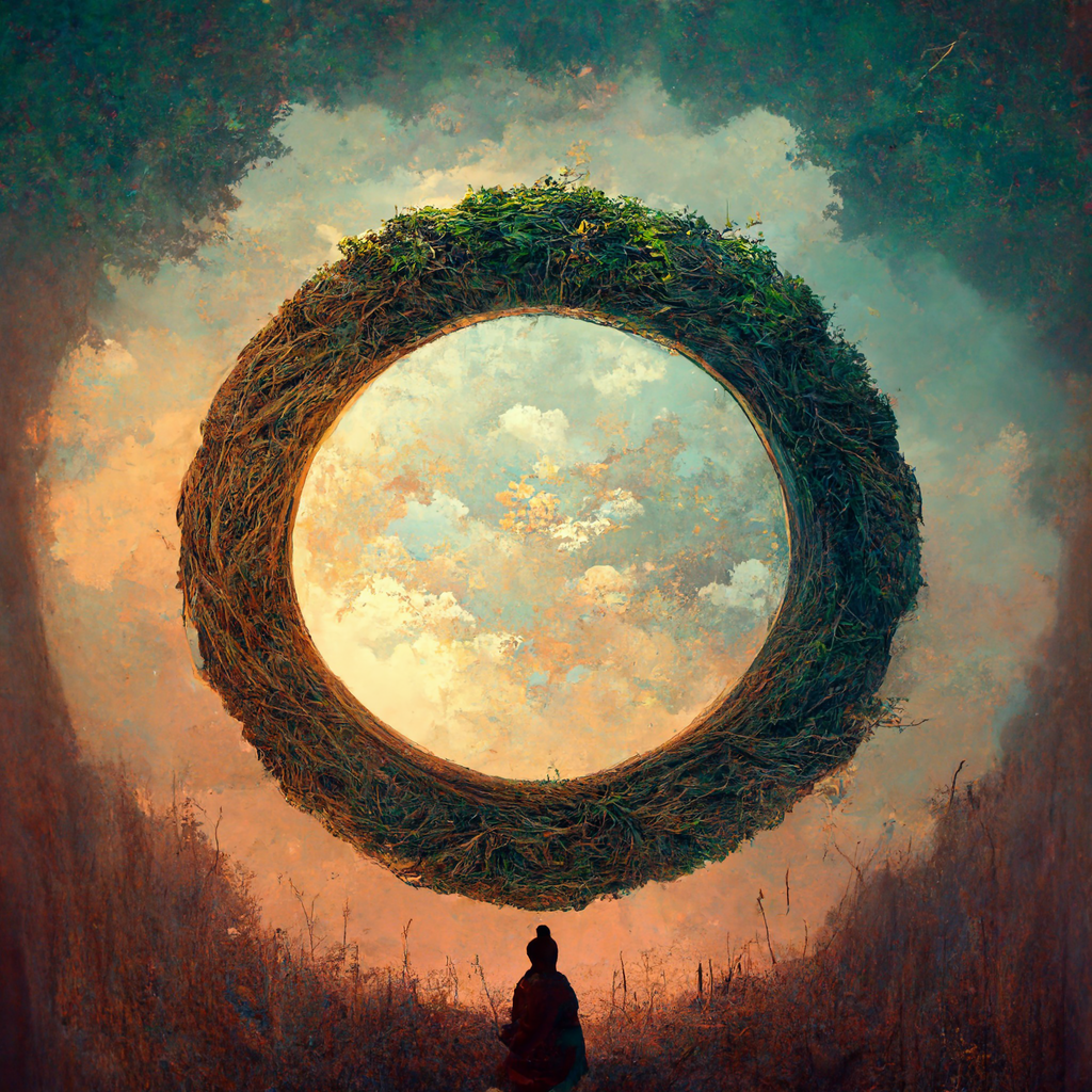
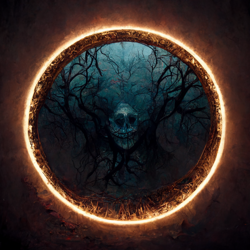

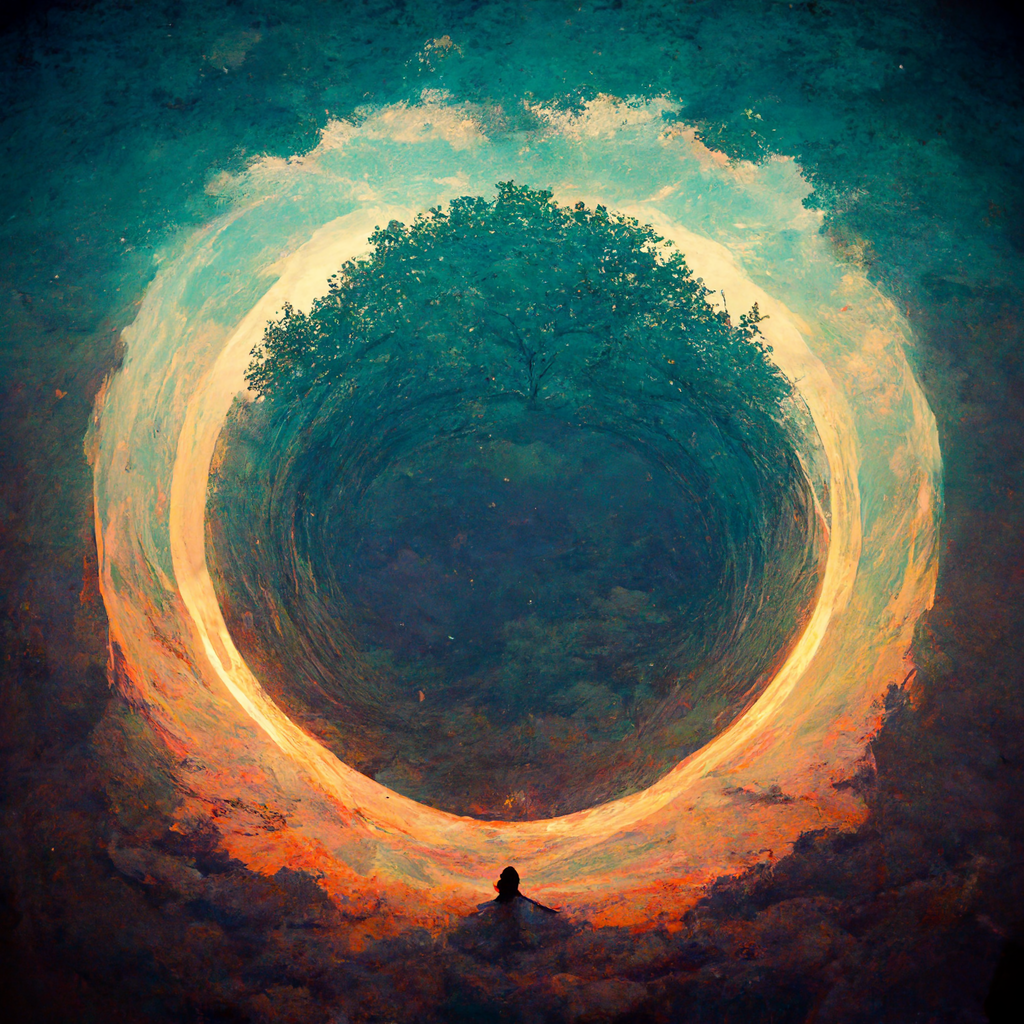
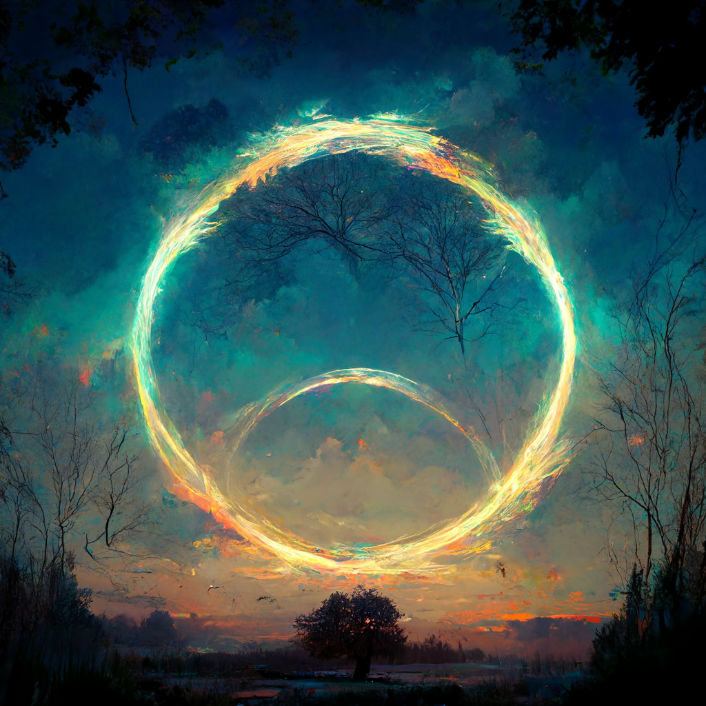
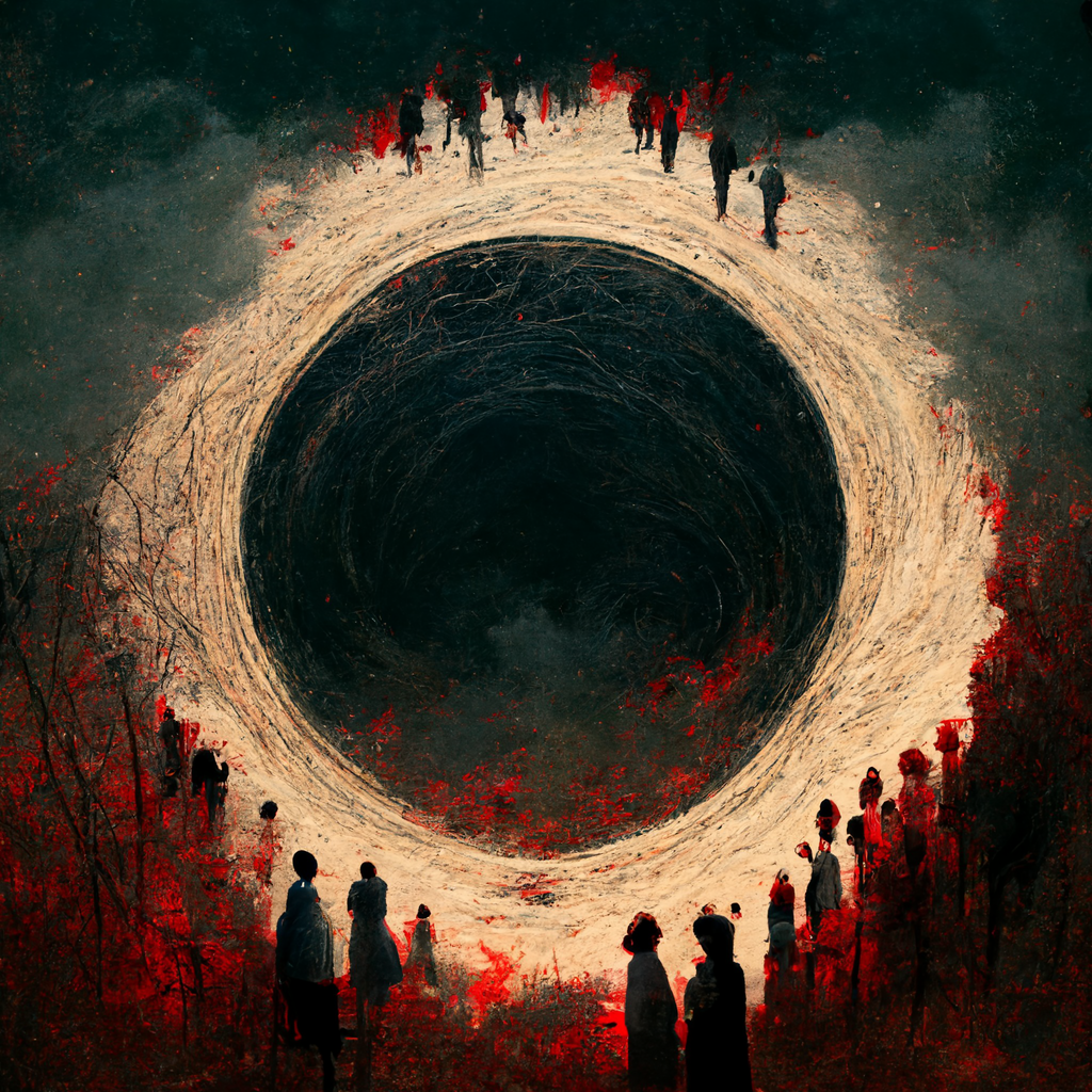
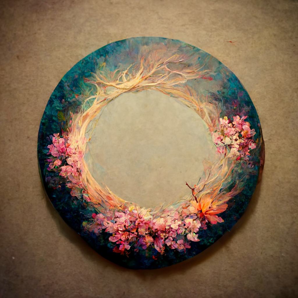
The default “midjourney painting” style can be overridden by invoking certain styles using specific keywords or parameters. Whether you want a specific painting style, a 3D render, a clay sculpt, or a specific style of photography or illustration, there’s a good chance Midjourney has a basic understanding of it.
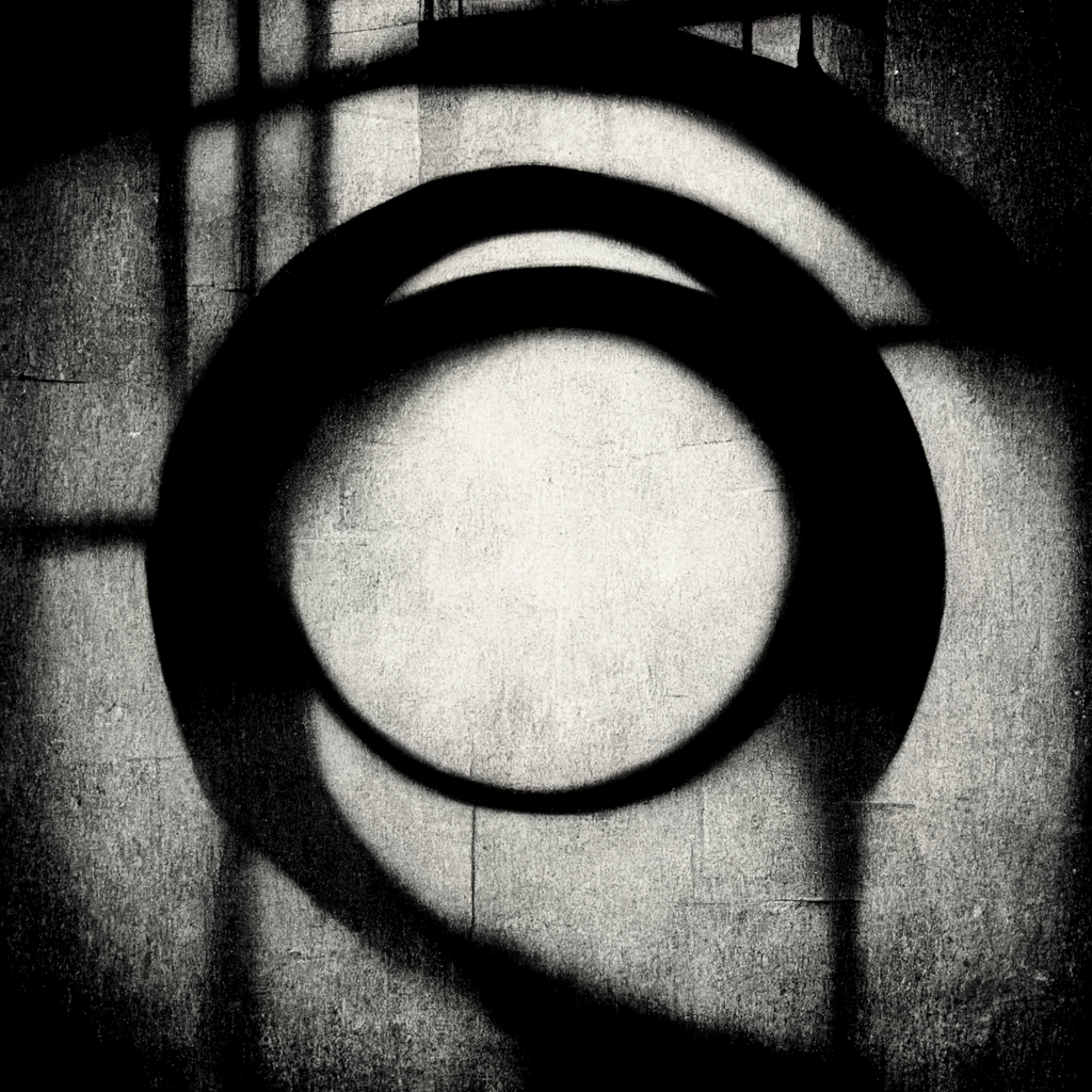

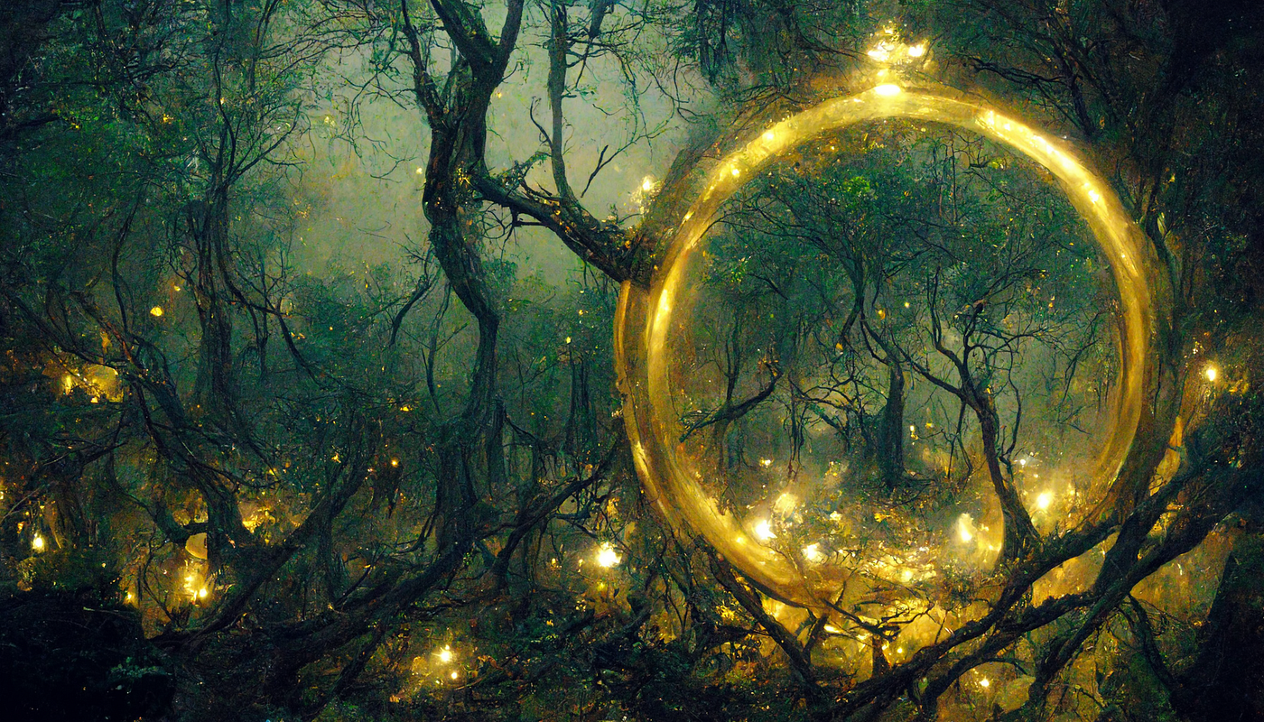
Octane is a rendering tool for digital 3D work, designed primarily to render things with realistic physical properties and accurate lighting. You’ll see it frequently used in Midjourney pieces aiming for a specific look. You can see aspects of this in the way the ring of light is lighting the ground.
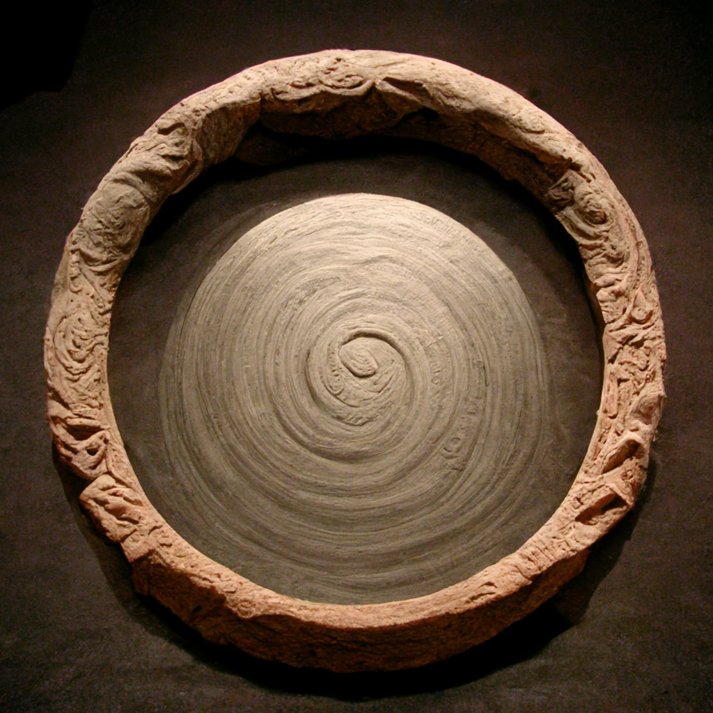
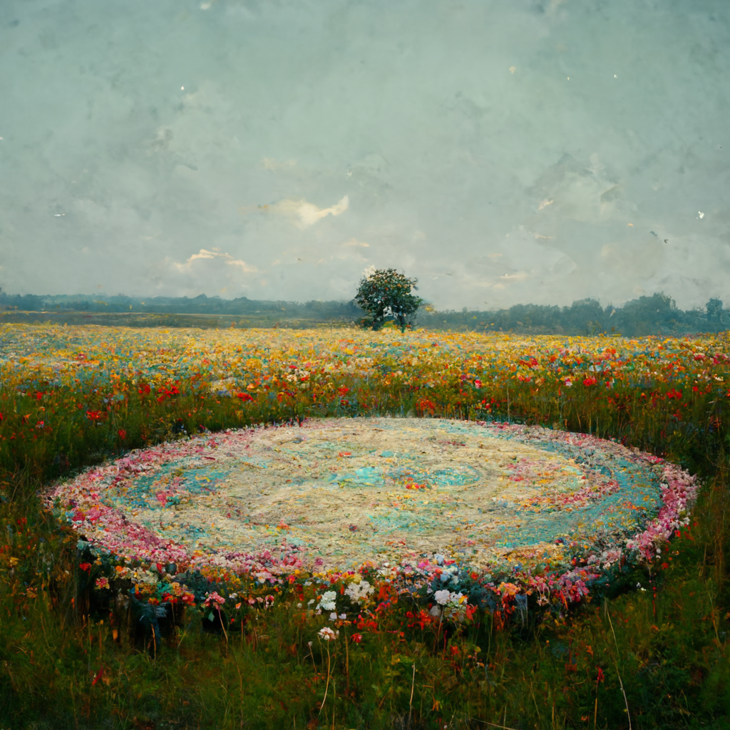
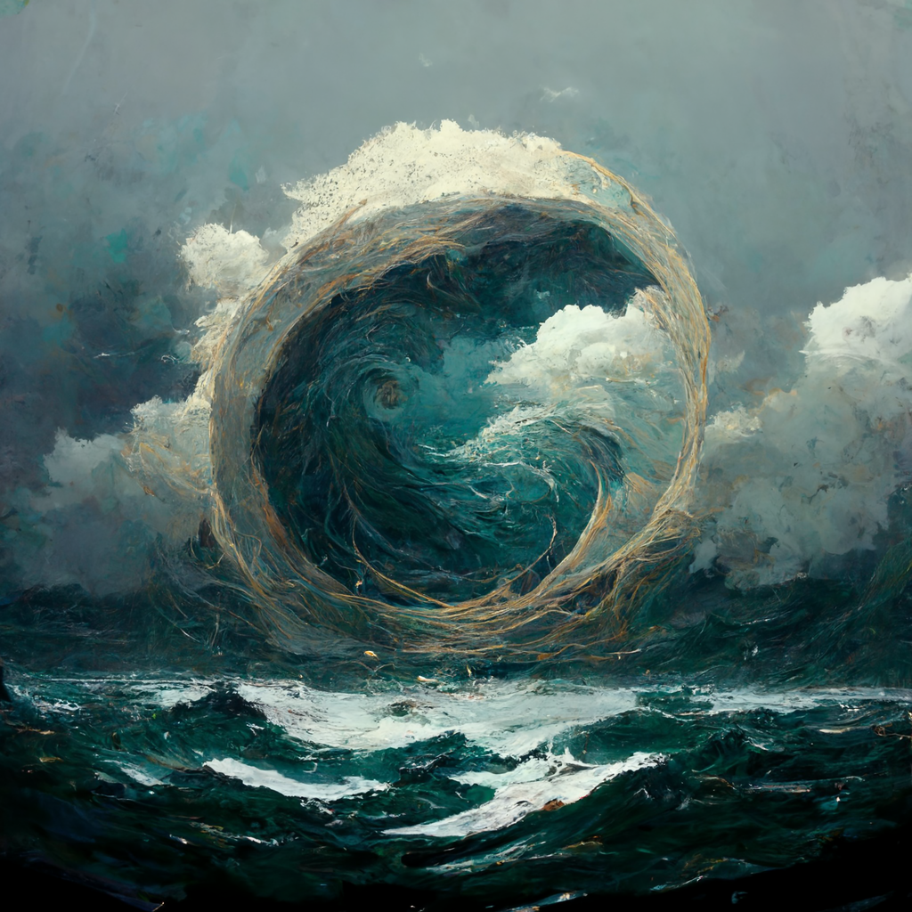
While simply stating “A circle” in our prompt makes it the subject by default, things can change a bit when we start describing the environment our subject is in. As you’ll see, given a lack of subject detail the environment can shape the subject in interesting, sometimes unexpected ways.
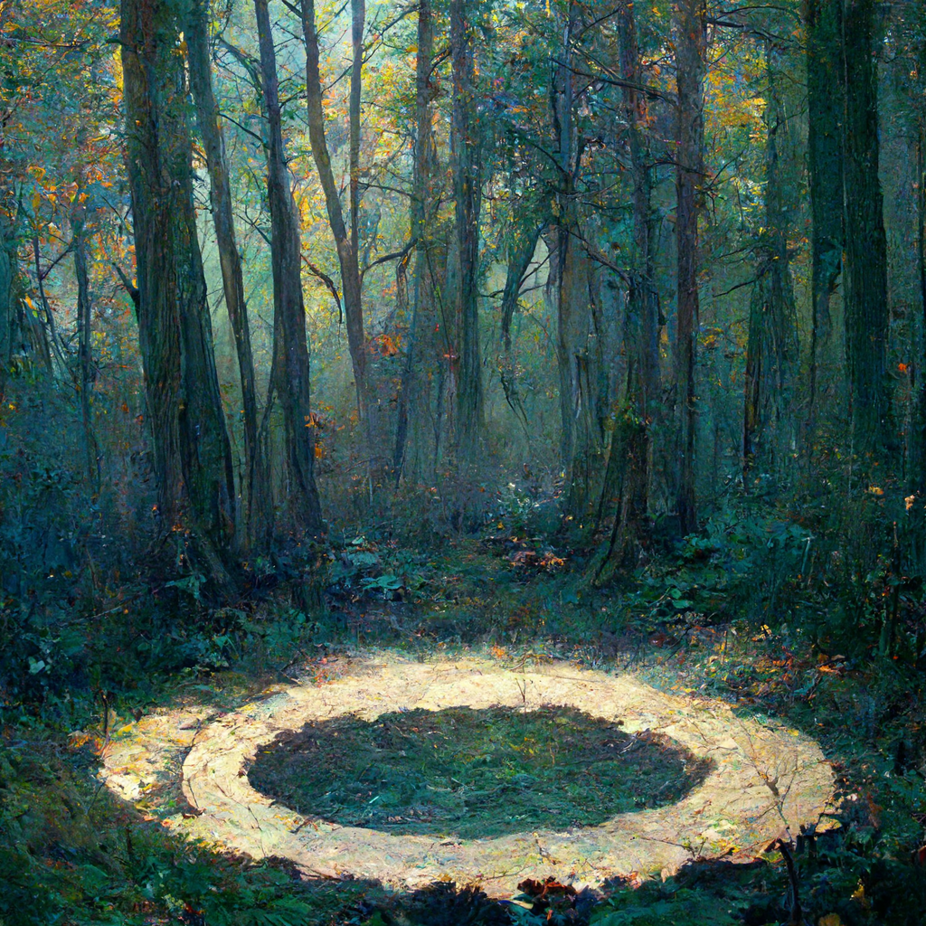

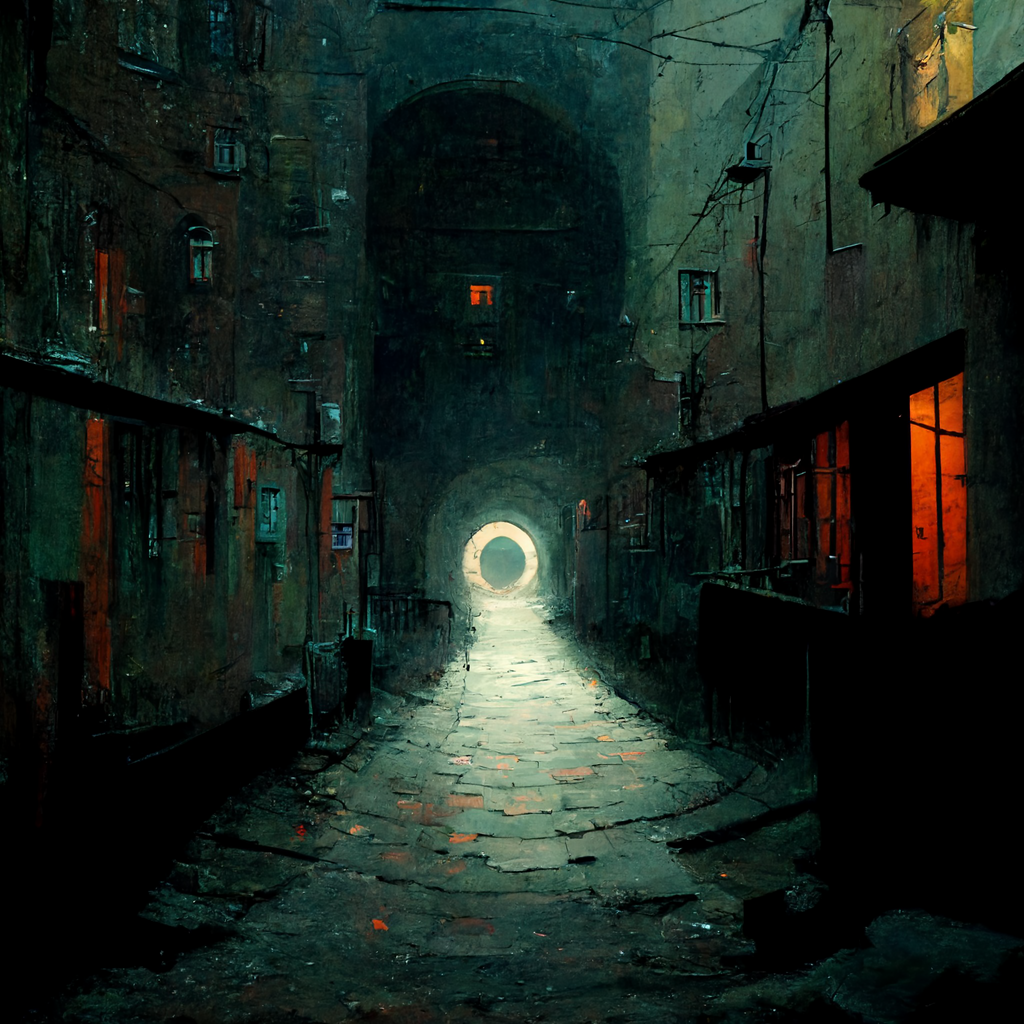
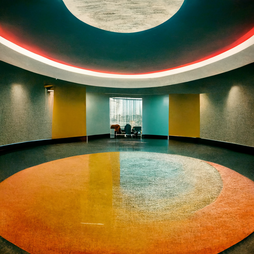
Aspect ratios can also drastically effect the type and compositions of images created. If you ever want to print something on a standard poster size, or use something as a phone or desktop wallpaper, get familiar with the aspect ratio parameter and use it accordingly, as it’s exceptionally hard to reformat a square image that you’ve decided you like.
Midjourney can attempt to evoke the style of a particular artist. This is one of the more ethically controversial ways to use AI in art, especially when dealing with any sort of commercialized work. While humans can and do also copy the style of others, the grey area is substantial when it’s an AI model doing the copying. This is especially (and understandably) a concern for working artists, and anyone well known enough for the system to recognize. The works are still unique in any legal/copyright sense (as of today), but it could still be frowned on by the community.
Similarly grey is the popular “trending on Artstation” descriptor, which will broadly approximate not one specific artist, but much of the type of work and styles that are frequently seen on Artstation.com, which is hugely popular with artists working in film, games, concept art, and illustration.
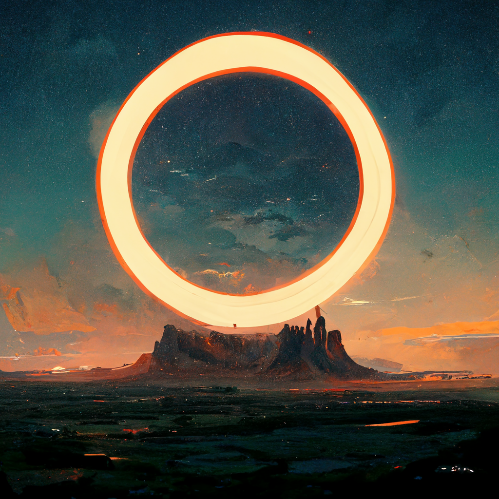
This article just scratches the surface. The infinite possibilities and real power of systems like this come from your (human) experimentation, direction and taste, combining all the concepts above and more to create unique works that may inspire and delight yourself and others.
Thanks for reading. You can follow my AI-generated art experiments on Instagram. If you get value from stories like this and want unlimited access to all the content on Medium, consider becoming a Medium member. It only costs $5 a month, and that money will help support me, this publication, and other writers you read on Medium.
from Medium https://towardsdatascience.com/exploring-midjourneys-art-style-using-circles-a461a78e7196
