

from Design Systems on Medium https://medium.com/coburb/a-design-system-for-residential-development-d38c4fa4995
Month: August 2023
Mastering Design Consistency: The Role of Design Tokens Explained
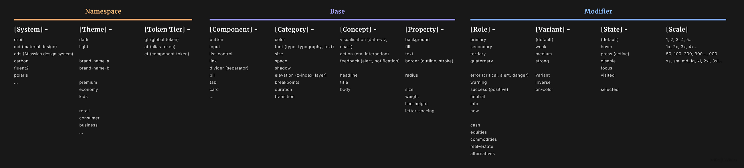
Design Tokens play a pivotal role within design systems, ensuring consistency in design elements, enhancing collaborative efficiency, and…
from Design Systems on Medium https://medium.com/uxcircles/mastering-design-consistency-the-role-of-design-tokens-explained-23096be79ba5
ML System Based on Light Could Yield More Powerful, Efficient LLMs
By MIT News
August 25, 2023
Comments

With the new system, the team reports a greater than 100-fold improvement in energy efficiency and a 25-fold improvement in compute density over state-of-the-art digital computers for machine learning.
Credit: Ella Maru Studio
A team led by researchers at the Massachusetts Institute of Technology has developed a light-based machine learning system that could surpass the system behind ChatGPT in terms of power and efficiency, while also consuming less energy.
The compact architecture is based on arrays of vertical surface-emitting lasers developed by researchers at Germany’s Technische Universitat Berlin.
The system uses hundreds of micron-scale lasers and the movement of light to perform computations.
The researchers said it could be scaled for commercial use in the near future, given its reliance on laser arrays commonly used in cellphone facial identification systems, and for data communication.
They found the system to be 100 times more energy efficient and 25 times more powerful in terms of compute density than current state-of-the-art supercomputers used to power existing machine learning models.
From MIT News
View Full Article
Abstracts Copyright © 2023 SmithBucklin, Washington, D.C., USA
No entries found
from Communications of the ACM – Artificial Intelligence http://cacm.acm.org/news/275783-ml-system-based-on-light-could-yield-more-powerful-efficient-llms
Stakeholder management for design systems
Why should you care about stakeholders?
Stakeholders, by definition, have an interest in your project and some kind of influence to impact its success.
Some stakeholders will have a higher impact on your project than others. However, the impact is not always tied to the position or power an individual has within an organization.
For example, a developer can convince her PM that using the design system will slow down the project. If this happens multiple times, it drastically reduces your adoption rate. This has a big impact, even though the same developer may be low in your company’s org chart.
Stakeholders can influence your project in different ways. For example, by providing or withdrawing resources like budget or people. Or by cooperating with your team or blocking all cooperation. Advocating for your design system is another way in which a stakeholder can support your success.
A design system changes the way people do their work. But most people are afraid of change. This poses a problem as a design system must be accepted and used to be successful.
As a consequence, a huge part of creating a successful design system is working with the…
from Design Systems on Medium https://uxdesign.cc/stakeholder-management-for-design-systems-3841edfdb136
Google Lets Businesses Add Social Media Links To Profiles via @sejournal, @MattGSouthern
Google has introduced the ability for businesses to add social media profile links directly in their Google Business Profile.
This new option enables companies to showcase their social media presence alongside other information in Google Search and Maps.
By having social media links accessible on their Google Business Profile, businesses can provide customers with more ways to connect, acquire information, and resolve issues.
New Feature Rollout
A new Google support page explains businesses can now control which social media links are displayed on their Google Business Profile.
Businesses can add one link per social media platform to their Business Profile. The supported platforms include Facebook, Instagram, LinkedIn, Pinterest, TikTok, X (formerly Twitter), and YouTube.
This feature is being rolled out gradually and is available in specific regions.
How To Use the New Feature
To add a social media link to a Google Business Profile, businesses need to access their profile, click ‘Edit profile,’ then ‘Business information,’ and finally, ‘Contact.’
Under ‘Social profiles,’ they can select the social media platform they wish to link and enter the web address.
Editing or removing the link follows a similar process.
To edit a link, businesses must update the web address field for the designated social media link. To remove a link, click on the ‘Trash’ icon next to the social media profile that needs to be deleted.
Occasionally, Google automatically adds social media links to eligible Business Profiles. To modify these auto-added links, businesses can add a new link for the same social media platform following the same steps.
What This Means for Businesses
The ability to add social media links provides another way for local business owners to optimize their presence across Google’s ecosystem.
Consumers today expect to find social media and website links alongside local search results. Small to medium-sized businesses can now keep up with chains in providing that seamless experience.
While businesses can add the same social media link to multiple Business Profiles, they cannot add various links from the same platform to a single profile.
This feature can be managed per business on Search or Maps or via the API to manage multiple locations simultaneously.
Note that Google doesn’t provide performance metrics such as click rates for these social media links.
Featured Image: The Image Party/Shutterstock
from Search Engine Journal https://www.searchenginejournal.com/google-lets-businesses-add-social-media-links-to-profiles/494061/
What is Typesetting?
Typesetting is the most important part of typography, because most text is meant to be read, and typesetting involves preparing text for reading.
Article Continues Below
You’re already great at typesetting. Think about it. You choose good typefaces. You determine font sizes and line spacing. You decide on the margins that surround text elements. You set media query breakpoints. All of that is typesetting.
Maybe you’re thinking, But Tim, I am a font muggins. Help me make better decisions! Relax. You make better decisions than you realize. Some people will try to make you feel inferior; ignore them. Your intuition is good. Practice, and your skills will improve. Make a few solid decisions; then build on them. I’ll help you get started.
In this chapter, I’ll identify the value of typesetting and its place within the practice of typography. I’ll talk about pressure, a concept I use throughout this book to explain why typeset texts sometimes feel awkward or wrong. I’ll also discuss how typesetting for the web differs from traditional typesetting.
Why does typesetting matter?#section2
Typesetting shows readers you care. If your work looks good and feels right, people will stick around—not only because the typography is comfortable and familiar, but also because you show your audience respect by giving their experience your serious attention (Fig 1.1).

Sure, you could buy the “it” font of the moment (you know, the font all the cool people are talking about). You could use a template that promises good typography. You could use a script that spiffs up small typographic details. None of these things is necessarily bad in and of itself.
But when you take shortcuts, you miss opportunities to care about your readers, the text in your charge, and the practice of typography, all of which are worthwhile investments. Spending time on these things can feel overwhelming, but the more you do it, the easier and more fun it becomes. And you can avoid feeling overwhelmed by focusing on the jobs type does.
Imagine yourself in a peaceful garden. You feel the soft sun on your arms, and take a deep breath of fresh, clean air. The smell of flowers makes you feel happy. You hear honeybees hard at work, water trickling in a nearby brook, and birds singing. Now imagine that this garden needs a website, and you’re trying to find the right typeface.
Sorry to spoil the moment! But hey, if you do this right, the website could give people the same amazing feeling as sitting in the garden itself.
If you’re anything like me, your first instinct will be to recall sensations from the imaginary garden and look for a typeface with shapes that evoke similar sensations. But this is not a good way to choose among thousands upon thousands of fonts, because it’s too easy to end up with typefaces that—as charming as they may seem at first—don’t do their jobs. You’ll get disappointed and go right back to relying on shortcuts.
Finding typefaces that are appropriate for a project, and that evoke the right mood, is easier and more effective if you know they’re good at the jobs you need them to do. The trick is to eliminate type that won’t do the job well (Fig 1.2).

Depending on the job, some typefaces work better than others—and some don’t work well at all. Detailed, ornate type is not the best choice for body text, just as traditional text typefaces are not great for signage and user interfaces. Sleek, geometric fonts can make small text hard to read. I’ll come back to this at the beginning of Chapter 3.
Considering these different jobs helps you make better design decisions, whether you’re selecting typefaces, tending to typographic details, or making text and layout feel balanced. We’ll do all of that in this book.
Typesetting covers type’s most important jobs#section3
Typesetting, or the act of setting type, consists of typographic jobs that form the backbone of a reading experience: body text (paragraphs, lists, subheads) and small text (such as captions and asides). These are type’s most important jobs. The other parts of typography—which I call arranging and calibrating type—exist to bring people to the typeset text, so they can read and gather information (Fig 1.3).

Let’s go over these categories of typographic jobs one by one. Setting type well makes it easy for people to read and comprehend textual information. It covers jobs like paragraphs, subheads, lists, and captions. Arranging type turns visitors and passersby into readers, by catching their attention in an expressive, visual way. It’s for jobs like large headlines, titles, calls to action, and “hero” areas. Calibrating type helps people scan and process complicated information, and find their way, by being clear and organized. This is for jobs like tabular data, navigation systems, infographics, math, and code.
Arranging and calibrating type, and the jobs they facilitate, are extremely important, but I won’t spend much time discussing them in this book except to put them in context and explain where in my process I usually give them attention. They deserve their own dedicated texts. This book focuses specifically on setting type, for several reasons.
First, typesetting is critical to the success of our projects. Although the decisions we make while typesetting are subtle almost to the point of being unnoticeable, they add up to give readers a gut feeling about the work. Typesetting lays a strong foundation for everything else.
It also happens to be more difficult than other parts of typography. Good type for typesetting is harder to find than good type for other activities. Good typesetting decisions are harder to make than decisions about arranging type or calibrating type.
Furthermore, typesetting can help us deeply understand the web’s inherent flexibility, which responsive web design has called attention to so well. The main reason I make a distinction between typesetting, arranging type, and calibrating type is because these different activities each require text to flex in different ways.
In sum, typesetting matters because it is critical for readers, it supports other typographic activities, the difficult decisions informing it take practice, and its nature can help us understand flexibility and responsiveness on the web. A command of typesetting makes us better designers.
Why do some websites feel wrong?#section4
It’s not hard to find websites that just feel, well, sort of wrong. They’re everywhere. The type they use is not good, the font size is too small (or too big), lines of text are too long (or comically short), line spacing is too loose or too tight, margins are either too small or way too big, and so on (Fig 1.4).

It’s logical to think that websites feel wrong because, somewhere along the line, a typographer made bad decisions. Remember that a type designer is someone who makes type; a typographer is someone who uses type to communicate. In that sense, we are all typographers, even if we think of what we do as designing, or developing, or editing.
For more than 500 years, the job of a typographer has been to decide how text works and looks, and over those years, typographers have made some beautiful stuff. So if some websites feel wrong, it must be because the typographers who worked on them were inexperienced, or lazy, or had no regard for typographic history. Right?
Except that even the best typographers, who have years of experience, who have chosen a good typeface for the job at hand, who have made great typesetting decisions, who work hard and respect tradition—even those people can produce websites that feel wrong. Websites just seem to look awful in one way or another, and it’s hard to say why. Something’s just not quite right. In all likelihood, it’s the typesetting. Specifically, websites feel wrong when they put pressure on typographic relationships.
Typographic relationships#section5
Have you ever chosen a new font for your blog template, or an existing project, and instinctively adjusted the font size or line spacing to make it feel better?

Those typesetting adjustments help because the typeface itself, as well as its font size, measure (a typographic term for the length of lines of text), and line spacing all work together to make a text block feel balanced. (We’ll return to text blocks in more detail in Chapter 3.) This balance is something we all instinctively notice; when it’s disrupted, we sense pressure.
But let’s continue for a moment with this example of choosing a new font. We sense pressure every time we choose a new font. Why? Because each typeface is sized and positioned in unique ways by its designer (Fig 1.6).

In Chapter 2, we’ll take a closer look at glyphs, which are instances of one or more characters. For now, suffice it to say that glyphs live within a bounding box called the em box, which is a built-in part of a font file. Type designers decide how big, small, narrow, or wide glyphs are, and where they are positioned, within this box. The em box is what becomes our CSS-specified font size—it maps to the CSS content area.
So when we select a new typeface, the visible font size of our text block—the chunk of text to which we are applying styles— often changes, throwing off its balance. This means we need to carefully adjust the font size and then the measure, which depends on both the typeface and the font size. Finally, we adjust line spacing, which depends on the typeface, font size, and measure. I’ll cover how to fine-tune all of these adjustments in Chapter 4.
Making so many careful adjustments to one measly text block seems quite disruptive, doesn’t it? Especially because the finest typographic examples in history—the work we admire, the work that endures—commands a compositional balance. Composition, of course, refers to a work of art or design in its
entirety. Every text block, every shape, every space in a composition relates to another. If one text block is off-kilter, the whole work suffers.
I’m sure you can see where I’m headed with this. The web puts constant pressure on text blocks, easily disrupting their balance in myriad ways.
There are no “correct” fonts, font sizes, measures, or line heights. But relationships among these aspects of a text block determine whether reading is easier or harder. Outside forces can apply pressure to a balanced, easy-to-read text block, making the typesetting feel wrong, and thus interfering with reading.
We just discussed how choosing a new typeface introduces pressure. The same thing happens when our sites use local fonts that could be different for each reader, or when webfonts fail to load and our text is styled with fallback fonts. Typefaces are not interchangeable. When they change, they cause pressure that we have to work hard to relieve.
We also experience pressure when the font size changes (Fig 1.7). Sometimes, when we’re designing sites, we increase font size to better fill large viewports—the viewing area on our screens—or decrease it to better fit small ones. Readers can even get involved, by increasing or decreasing font size themselves to make text more legible. When font size changes, we have to consider whether our typeface, measure, and line spacing are still appropriate.

Changes to the width of our text block also introduce pressure (Fig 1.8). When text blocks stretch across very wide screens, or are squeezed into very narrow viewports, the entire composition has to be reevaluated. We may find that our text blocks need new boundaries, or a different font size, or even a different typeface, to make sure they maintain a good internal balance—and feel right for the composition. (This may seem fuzzy right now, but it will become clearer in Chapters 5 and 6, I promise.)

We also experience pressure when we try to manage white space without considering the relationships in our text blocks (Fig 1.9). When we predetermine our line height with a baseline grid, or when we adjust the margins that surround text as if they were part of a container into which text is poured rather than an extension of the balance in the typesetting, we risk destroying relationships among compositional white spaces— not only the white spaces in text blocks (word spacing, line spacing), but also the smaller white spaces built into our typefaces. These relationships are at risk whenever a website flexes, whenever a new viewport size comes along.

Typesetting for the web can only be successful if it relieves inevitable pressures like these. The problem is that we can’t see all of the pressures we face, and we don’t yet have the means (the words, the tools) to address what we can see. Yet our natural response, based on centuries of typographic control, is to try to make better decisions.
But on the web, that’s like trying to predict the weather. We can’t decide whether to wear a raincoat a year ahead of time. What we can do is get a raincoat and be ready to use it under certain conditions. Typographers are now in the business of making sure text has a raincoat. We can’t know when it’ll be needed, and we can’t force our text to wear it, but we can make recommendations based on conditional instructions.
For the first time in hundreds of years, because of the web, the role of the typographer has changed. We no longer decide; we make suggestions. We no longer choose typefaces, font size, line length, line spacing, and margins; we prepare and instruct text to make those choices for itself. We no longer determine page shape and quality; we respond to our readers’ contexts and environments.
These changes may seem like a weakness compared to the command we have always been able to exercise. But they are in fact an incredible strength, because they mean that typeset text has the potential to fit everyone just right. In theory, at least, the web is universal.
The primary design principle underlying the web’s usefulness and growth is universality.
We must now practice a universal typography that strives to work for everyone. To start, we need to acknowledge that typography is multidimensional, relative to each reader, and unequivocally optional.
Read the rest of this chapter and more when you buy the book!
from A List Apart https://alistapart.com/article/flexible-typesetting/
Assistive technology shouldn’t be a mystery box
Web developers nowadays have full insight into how browsers work. The engines are open source, and you have programmatic access to almost anything they do. You even have in-built developer tools allowing you to see the effects your code has. You can see what the render engine does and how much memory gets allocated.
With assistive technology like screenreaders, zooming tools and voice recognition you got nothing. Often, you even don’t have access to them without paying.
Closed source stalled the web for years
For years, closed browsers held back the evolution of the web platform. When I started as a web developer, there was IE, Netscape and Opera. The DOM wasn’t standardised yet and it was a mess. Your job as a web developer was to 90% knowing how which browser failed to show the things you tell it to. Another skill was to know hacks to apply to make them behave. Starting with layout tables and ending with hasLayout and clearfix hacks.
It is no wonder that when Flash came about and promised a simpler and predictable way to build web applications, people flocked to it. We wanted to build software products, not fix the platform whilst doing that.
This has been an ongoing pattern. Every time the platform showed slow-ish improvement due to browser differences, developers acted by building an abstraction. DHTML was the first bit where we created everything in JavaScript detecting support where needed. And later on jQuery became the poster child of abstracting browser bugs and DOM inconvenience away from you, allowing you to achieve more by writing less.
Open source browsers are amazing
Fast forward to now where every browser is based on some open source engine or another. Developers get more insight into why things don’t work and can contribute patches. Abstractions are used to increase developer convenience and to offer more full stack functionality than only showing a page. The platform thrives and there are new and exciting innovations happening almost every week. Adoption and implementation of these features is now in a several months timeframe rather than years. A big step here was to separate browsers from the OS, so you don’t need to wait for a new version of Windows to get a new browser version.
Assistive technology is amazing, but we don’t know why
And then we look at assistive technology and things go dark and confusing. If you ask most web developers how screenreaders work and what to do to enable voice recognition things get awry quick. You either hear outdated information or that people haven’t even considered looking at that.
Being accessible isn’t a nice to have. It is a necessity for software and often even a legal requirement to be allowed to release a product.
At Microsoft, this was a big part of my job. Making sure that our software is accessible to all. And this is where things got annoying quick.
There are ways to make things accessible and the best thing to start with is to use semantic HTML. When you use a sensible heading structure and landmarks, people can navigate the document. When you use a button element instead of a DIV, it becomes keyboard and mouse accessible. At least that’s the idea. There are several browser bugs and engine maker decisions that put a spanner in the works. But on the whole, this is a great start. When things get more problematic, you can use ARIA to describe functionality. And hope that assistive technology understands it.
I’ve been blessed with a dedicated and skilled team of people who bent over backwards to make things accessible. The most frustrating thing though was that we had a ton of “won’t fix” bugs that we could not do anything about. We did all according to spec, but the assistive technology wouldn’t do anything with the information we provided. We had no way to fix that as there was no insight into how the software worked. We couldn’t access it to verify ourselves and there was no communication channel where we could file bugs.
We could talk to the Windows Narrator team and fix issues there. We filed bugs for MacOS Voiceover with varying success of getting answers. We even submitted a patch for Orca that never got merged. And when it came to JAWS, well, there was a just a wall of silence.
Ironically, assistive technology isn’t very accessible
Every accessibility advocate will tell you that nothing beats testing with real assistive technology. That makes sense. Much like you can simulate mobile devices but you will find most of the issues when you use the real thing. But assistive technology is not easy to use. I keep seeing developers use a screenreader whilst looking at the screen and tabbing to move around. Screenreaders have complex keyboard shortcuts to navigate. These are muscle memory to their users, but quite a challenge to get into only to test your own products.
Then there’s the price tag. Dragon natural speaking ranges from 70 to 320 Euro. JAWS is a $95 a year licence in the US only, or a $1110 license for the home edition or $1475 professional license. You can also get a 90 day license for $290. So, I could use a VPN to hack around that or keep resetting my machine date and time, much like we did with shareware in the mid-90s?
I’ve been to a lot of accessibility conferences and kicked off the subject of the price of assistive technology. Often it is dismissed as not a problem as people with disabilities do get them paid by their employers or government benefit programs. Sounds like a great way to make money by keeping software closed and proprietary, right?
Well, NVDA showed that there is a counter movement. It is open source, built by developers who also rely on it to use a computer and responsive to feedback. Excellent, now we only need it to be cross-platform.
When you look at the annual screenreader survey, JAWS has 53.7% of the market, followed by NVDA at 30%. The assistive tools that come for free with the operating system are hardly used. Voiceover on MacOS is 6.5% of the users and Microsoft Narrator even 0.5%.
The reason why these newer tools don’t seem to get as much adoption is that people used JAWS for a long time and are used to it. Understandable, considering how much work it is to get accustomed to it. But it means that I as a developer who wants to do the right thing and create accessible content have no way to do so. If JAWS or Dragon Natural Speaking doesn’t understand the correct markup or code I create, everybody loses.
Access needs to me more transparent
I really would love open source solutions to disrupt the assistive technology market. I’d love people who can’t see getting all they need from the operating system and not having to fork over a lot of money just to access content. I want Narrator and Voiceover and Orca to be the leaders in innovation and user convenience. NVDA could be an open source solution for others to build their solutions on, much like Webkit and Chromium is for browsers.
But there is not much happening in that space. Maybe because it is cooler to build yet another JavaScript component framework. Or because assistive technology has always been a dark matter area. There is not much information how these tools work, and if my experience as a developer of over 20 years is anything to go by, it might be that this is by design. Early assistive technology had to do a lot of hacking as the operating systems didn’t have standardised accessibility APIs yet. So maybe there are decades of spaghetti code held together by chewing gum and unicorn tears people don’t want to show the world.
from Christian Heilmann https://christianheilmann.com/2023/08/05/assistive-technology-shouldnt-be-a-mystery-box/