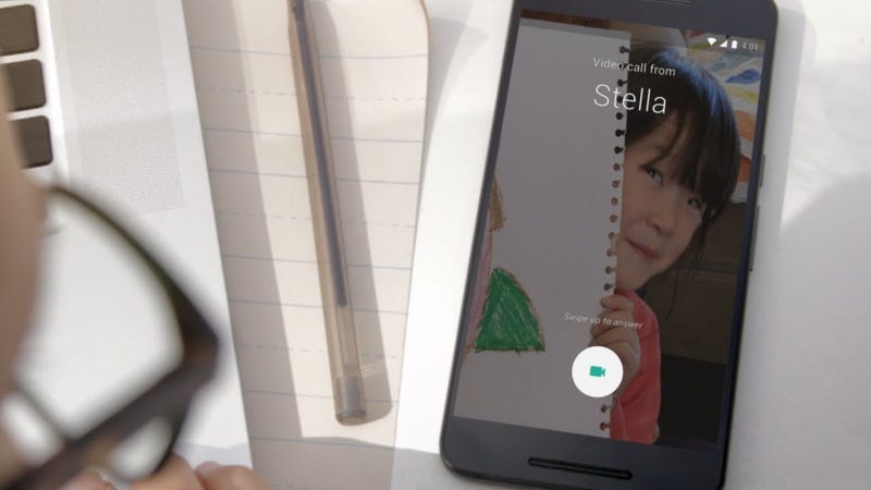
Google Starts Rolling Out Duo, Its Super Simple 1-to-1 Video Messaging App

Android/iOS: Earlier this year, Google announced a couple new messaging apps (like it does every year, it seems). One of them is a 1-to-1 video chat app called Duo. Now, it’s finally rolling out to users.

Google pitches the app as the most dead simple video calling around. All you need to make a call to someone is a phone number. It seems to be aimed at competing with Facetime, with the added benefit of working across both iOS and Android. The app is currently rolling out over the next few days. If it’s not available for you from the source links below, sit tight and wait out the week.

Duo | Google Play Store via Google

Duo | iTunes App Store

from Lifehacker http://lifehacker.com/google-starts-rolling-out-duo-its-super-simple-1-to-1-1785336507

What This $79 Billion Industry Can Teach You About Selling

True confession: I own a timeshare. I know, it’s horribly embarrassing, but I was young and got lured in by the promise of a lifetime of cheap vacations. Many years of trying – and failing – to sell said timeshare, I’ve come to accept the fact of life as a timeshare owner. As a new parent, it’s actually worked out well for our family this summer. We used it to go to the beach (at our home resort) and had a really nice time. I also got to witness (once again) the selling techniques that keep this industry thriving.

Now, I’m guessing many of you know how the timeshare industry works: they invite you on a short vacation that’s either cheap or free (and usually comes with extra perks), and in exchange, you agree to attend a 90-minute presentation where they will share with you the benefits of “vacation ownership” also known as: a sales presentation.

If you haven’t attended one personally, you’ve probably seen it depicted in sitcoms. The process is typically this: you attend a presentation (which may or may not include entertainment and/or food), then you sit down with a “vacation consultant” whose job it is to bond with you, discover what you love about vacationing, and convince you that the best and cheapest way to live the life you’ve always dreamt of, is by “investing” in “vacation ownership.” The most convincing part is when they add it all up for you. They show you – with clear, easy math – how much money you’ll save by buying a deeded piece of real estate. And everyone knows real estates investments are great, right?

The problem is of course, that once you own one, you’re stuck paying the ever-increasing annual maintenance fees. Yes, you can rent your timeshare, trade it, and of course, use it yourself, but those are all typically complicated options that do cost you time and money. This is why the American Resort Development Association reports that the industry is currently worth $79.5 billion (according to a study conducted by Ernst & Young).

Timeshare salespeople have the reputations of used car salesmen – pushy, misleading (if not downright dishonest), and only interested in their own commissions. Most of us aren’t interested in selling that way or chancing our reputations with shady sales techniques.

There’s one technique that really is gold though, and can be used to your advantage, no matter what you’re selling. Most small businesses cannot afford to buy their prospects theater tickets, iPads, or other gifts, but you don’t have to spend a lot of money and strong-arm people you want to sell to.

It is: sell to your existing customers.

On our vacation, they invited us to an “update presentation” which was basically a way to sell us upgrades. Now, it didn’t convince us to spend any money, but I was curious to see their techniques (and I don’t mind getting a free tablet and gift card). Any sales course worth its salt will tell that it is easier to sell to people who have already said yes to you once. They’ll also tell you that you want to start off by getting little yeses. (“Are you enjoying your vacation?” “Yes, I am, thanks.” Do you like the beach?” “Yes, I do, thanks.” “Do you like free stuff?” “Yes, of course I do!” “If I told you there was a way to basically vacation for free, would you want to do that?” “Yes, I’d be a fool not to!” etc..)

The statistics are numerous and this article compiles a large variety of them from different sources. For example:

  • 40% of an ecommerce store’s revenue comes from 9% of its customers;
  • after 1 purchase, a customer is 27% more likely to buy from you again, but after 3 purchases, a customer is 54% more likely to buy from you again;
  • average ecommerce conversion rates range from 1-3%, but repeat customers are 60-70% more likely to convert;
  • after 2 purchases, a customer is 9x more likely to convert than a new customer.

The statistics go on and on. Repeat customers spend more money, are more loyal, and are more likely to share their love of you via social media. You may not think the timeshare industry is one you want to model your business on, but their numbers certainly show they know how to sell.

The bottom line is this: if you are not offering your version of an “update presentation” to your past clients, you’re missing out on low-hanging fruit (meaning, easy to pick). Reach out to past customers and give them the opportunity to say yes to you again. Chances are it’ll be worth your time.

from Inc.com http://www.inc.com/ariana-ayu/what-this-79-billion-industry-can-teach-you-about-selling.html

9 Ways to Profit From Your Passion

Get the working capital your business needs from Entrepreneur Lending, powered by CAN Capital. Learn More »

I’d rather be a failure at something I love than a success at something I hate. — George Burns

We’re all passionate about something in our lives. But how can you actually turn a profit off of that passion? Here are nine ways that you can make your dream come true.

1. It takes more than just passion.

Passion is a great place to start when thinking about business ideas, but don’t let that enthusiasm blind you from reality. Ask yourself if you’re willing to put in the hard work and if there is a market for you to tap into. Even if it’s just talking to some of the regulars at your favorite restaurant or bar, their feedback can be priceless.

Related: 10 Things I Wish I Knew Before Becoming An Entrepreneur

Make sure that you’re actually good at what you do. Your passion could be playing the guitar, but are you skilled enough to give lessons or repair the instrument when it’s broken? And don’t forget that as a business owner, you’ll be responsible for paying bills, invoicing customers, reporting taxes and marketing your business. Are you up for all those tasks?

2. How can you make something better?

Again, let’s say that your passion is playing the guitar. What void can you fill in that marketplace? For example, if you can repair guitars and realize that there isn’t a repair shop anywhere else around, that could be a business opportunity.

You also need to ask yourself how you can make the industry better? Is this venture where your true entrepreneur spirit is set free?

Let’s say that your passion is cooking. What makes your meals unique? Why are they better than the other cooks in town? Maybe it’s because you only use farm fresh ingredients and pick out the produce and meats yourself every morning. That’s definitely more appealing for customers than driving up to a fast food restaurant’s window.

When I started my invoice company, I had used several competitors. I knew what made them great, but I also knew what I wanted that they didn’t offer. I knew I could easily make the product and service better. I built it — and here we are!

3. Brainstorm a variety of ways to monetize each passion.

Sit down and think of all the various ways that you can actually make money off your passion. This may include:

  • Selling an actual product, such as jewelry, clothing or furniture, online or in a brick and mortar store.
  • Sharing your knowledge about your passion by blogging, writing books or filming videos. Between affiliate links, sponsors and subscribers, you could make a decent living. For example, the father and son behind EvanTubeHD combined their passion of film and toys into a YouTube channel that reviews toys. They’re are now earning more than $1.4 million.
  • Offering advice as a consultant in anything from accounting to gardening.
  • Becoming an investor in an idea that you’re willing to financially support.
  • Inventing a gadget or software that makes life easier for people. For example, if you were a guitar instructor, is there an app to better instruct students or a new type of tuner that could make tuning the guitar easier for newbies?
  • Building an event around your passion, such as a festival or community organization.
  • Finding ways to preserve or maintain items that people enjoy, such as an alteration or tailor shop for fashion lovers.

4. Don’t be a perfectionist.

While you should have some sort of experience or skills to offer, there’s always room for you to learn and grow. For example, the guitar repair shop owner may have mastered repairing acoustic guitars, but still needs to work on repairing electric guitars. Don’t wait to start your business until after you’ve mastered that craft. You will continue to hone your skills all along your journey.

Related: How Perfectionism Is Sabotaging Your Business

The longer you wait, the higher probability that someone else will come in and start profiting from your passion.

5. Get outside of your comfort zone.

Starting a business requires you to step outside of your comfort zone every now and then. Maybe you have a fear of public speaking. You will have to overcome that when creating an instructional video on YouTube.

My friend Michael Gasiorek always tells me “Find techniques that can not only help you get outside of your comfort zone, but also work on improving your weaknesses. You don’t have to become a guru. Just familiar enough in that area so that you’re more comfortable and can deliver what people need and want.”

6. Make fun a priority.

It’s difficult to maintain your passion as you attempt to grow a legitimate business. Eventually, you forget exactly why you started the business in the first place.

To prevent that from happening, always make fun and passion a priority. This means hiring people who are equally passionate as you are about your idea or product, creating policies and branding that reflect your passion, and building a company that feels the same way to others.

7. Build your skills.

Author Malcolm Gladwell says that it takes 10,000 hours to become a master at something. While this one is hard for me — I think it’s hard to spend 10k hours doing one thing — my friend and financial expert Tom Drake says “Why many skills may take that long, don’t let those hours discourage you from moving ahead with your plan. Who knows, it may not take you that long. Never stop practicing on perfecting your skills. And don’t forget to ask for feedback for what you are doing and to track your progress.”

8. Overcome roadblocks.

Roadblocks are all of the factors that are preventing you from following your dreams. Instead of letting roadblocks actually block you, overcome these obstacles so that you can move forward with your business.

For example, if you’re not familiar with coding or programming, but require a website, then hire a coder. If you’re concerned that there isn’t a market for your idea – conduct market research. If you believe that your passion won’t be profitable then look for alternative ways to monetize your passion by being flexible.

Related: Watch Our 8-Episode Crash Course on Crowdfunding

9. Get creative with money.

If you need money to help scale your business, or even just to get it started, you have more options than ever before. Instead of going to your local bank or searching for investors. I’ve even event crowdfunded my idea on Kickstarter, but there are other great choices like Indiegogo and GoFundMe as well. Not only are these sites able to raise the funds you need, they can also be used to test your product idea.

Another option would be to use peer-to-peer-lending sites like LendingTree where you can get matched with like-minded people directly in your business area.

from Entrepreneur https://www.entrepreneur.com/article/280658

Enterprise UX Case Study: Improving Usability Under Tight Deadlines

image02

A cloud-based project management system, Liquidplanner needed to help users create dashboards more quickly.

The old process required creating dashboards, and all the widgets within, completely from scratch. Since more dashboard use correlated with higher customer engagement and lifetime value, the product team set out to create a new dashboard template feature.

The team’s goal was creating a “one-click solution” where the user could create a useful dashboard right away without any configuration.

In four months, LiquidPlanner shipped a new dashboard template feature, impressed their most valuable customers, and saw significant adoption rates and business results.

Below, you’ll see exactly how they did it.

image02

Photo credit: LiquidPlanner

The following is an excerpt from The Project Guide to Enterprise Product Design. The free guide explains best practices based on real projects.

Setting the Context

Before getting into the actual process, let’s examine the user groups and project goals.

1. Primary Personas

LiquidPlanner serves three primary user groups:

  • Product Managers — The champions of the product, the people that “live and breathe LiquidPlanner.” These decision-makers ensure the team uses the product to track time, collaborate, and use the features that help them.
  • Functional Manager — The other decision-makers, such as a UX Manager, that hold sway over the team and keeps them accountable.
  • Frontline Contributors — People who use the product the most. These project contributors may not have chosen LiquidPlanner themselves, but they use it every day for their projects.

2. Project Goals

The following quantitative and qualitative goals would define project success for the dashboard template feature:

  • Increase usage of dashboards within 30 days of release. Using Heap to track in-app events, they discovered the friction in creating dashboards was holding the whole product.
  • Grant immediate access to project critical information. It wasn’t just about quality, it was about speed. LiquidPlanner needed to streamline access to data.
  • Finish the project in 3 months. Starting in Jan. 2016, the launch was set for early April, giving the team a compressed timeline to craft the right solution.

Stage One: Discovery & Concepting

(early Jan 2016)

Before the actual legwork started, the PM team gathered for a brainstorming/sketching session. The lead program manager, UX manager, and UX designer Edward Nguyen were all present.

Examining in-app patterns from Heap, the team categorized the most commonly-created dashboards:

  • Project Dashboards
  • Team Dashboards
  • Portfolio Dashboards.

image04

From there, they sketched out their ideas on the whiteboard. These mostly involved user flow charts, drawing out the pace of the experience screen by screen. The user flows formed the foundation that would eventually grow into the perfect solution for the dashboard problem.

Stage Two: Creating & Testing Mid-Fidelity Flows

(early Jan 2016)

Immediately following the whiteboard session, Edward used Adobe Illustrator to create mid-fidelity versions of the white board sketches. These mid-fi flows become the key to the intermediary stage of internal testing before hi-fi prototyping and testing with users.

image05

For initial, early-stage feedback, Edward showed the mid-fi user flows to 5-10 coworkers outside of the product team. He administered these casual tests individually, explaining the problem and collecting feedback on the proposed redesign for the dashboard creation process..

The informal testing also gave him a chance to answer his own personal questions and concerns. Ultimately, the tests proved successful: the absence of bad feedback is still good feedback.

Stage Three: Hi-fi Prototyping

(mid-Jan – Feb 2016)

Building on the mid-fidelity user flows and internal feedback, the team was ready to create a functioning version of their design.

1. Creation

A wireframe or user flow shows how the product might work. A prototype is how it works.

Since the goal of creating a prototype is to test your design decisions, the first step was outlining desired insights in a usability testing plan. This document prioritized test goals for the most important user actions:

  • Validate that people know how to create a new dashboard.
  • Validate the 3 default testing templates are useful options (Project, Portfolio, Team)
  • Validate that created dashboards are discoverable from within the project.
  • Determine what default widgets are most useful in a dashboard template.

The usability testing plan also included sections such as the test script and a list of user tasks (i.e., “Can you make a project dashboard from the Project template for Project A?”).

At this stage, the team then did some data mining to inventory and tally which widgets to include in which templates. This made the first prototypes closer to the final product.

image01

Hi-fi prototype of the first screen in the flow for creating a dashboard template.

When it came time to build the actual, interactive prototypes, Edward used UXPin “because it helps us simulate real-world customer scenarios.” In his own words, “It’s powerful and simple enough to let me quickly create and test complex interaction models. I can prototype on Monday, test it Tuesday and Wednesday, and show results on Thursday.”

Since the new design needed to be intuitive without confusing current users, Edward actually chose a left-handed tabbed format versus the multi-step process the team initially sketched. He realized the choice was simpler for his team to implement while also benefiting users.

Designers wouldn’t need to create playful icons, developers wouldn’t need to build a multi-step wizard, and users could select their dashboard type faster with fewer steps.

As Edward demonstrates, while designers don’t need to know how to code, they should always understand the technical implications of their design.

2. Usability Testing & Iteration

The team conducted remote, moderated usability tests with 14 people through Join.me.

Edward moderated the testing sessions, while another team member observed and took notes. They tested two main scenarios: creating a dashboard, and finding an existing dashboard in the project.

Test results were quickly iterated into the following version, which was then likewise tested and the results reiterated, until the team came up with the proven, ideal design.

“A user even mistook one of my hi-fi prototypes as the real deal, telling me to thank our dev team.” said Edward.

image00

Hi-fi prototype users believed was already fully developed.

Usability testing revealed the design worked well as a system:

  • Users found the tabbed layout easy to use and understand when creating dashboards from templates.
  • Users mentioned the default testing templates were useful and matched their needs.
  • While most users found the default widgets useful, some mentioned how they’d prefer different widgets due to personal preferences. For example, some users didn’t find the “Remaining Work” linechart widget useful. Others wanted the ability to save their customizations to the templates.
  • Users did experience some difficulty in accessing a dashboard once created.

Edward spent considerable time with the program manager to map out the patterns of feedback to consolidate insights. It’s a skill in itself to separate one-off, outlier comments from generally-applicable and actionable feedback.

To improve findability of newly-created dashboards, Edward decided to increase negative space around the “View Project Dashboard” label inside their details panel view.

image06

Further improvements, such as the ability to save widget edits, were earmarked for later testing, since they were fell outside the scope of the MVP.

Stage Four: Development and Live Launch

Feb – April 2016

Following the Agile process, development sprints immediately followed the design sprints.

Even as Edward’s team was still testing prototypes, developers were already building the validated iterations. “The collaborative hi-fi prototypes and testing insights gave our developers enough confidence to implement our design decisions directly in code,” Edward said.

Communication within the team improved with daily standups, where Edward reported any new usability testing insights to developers.

Because the new feature tested well, LiquidPlanner launched the dashboard template feature live to users without beta testing.While the team runs beta tests for larger features, they needed to get the feature out the door since dashboard creation was so difficult before.

Thanks to efficient hi-fi prototyping and close collaboration, the team launched the new feature on April 9, 2016 on schedule and within scope. The initial results are promising:

  • Of the 17,000 dashboards ever created in LiquidPlanner, 1700 (10%) were created 2 weeks after launch.
  • The template feature is responsible for 75% of new dashboards created in the app.
  • A majority of large enterprise customers already use and enjoy the new feature, as it facilitates their large, complex projects.

“I was blown away by the numbers,” said Edward. “It was great to see that something I worked on was this popular with users.”

Takeaways

Based on LiquidPlanner’s success, keep in mind these learnings for your own product design process:

  • Don’t get overambitious on redesign projects. The new design needs to feel consistent enough for old users while also appealing to new users. To achieve this delicate balance, keep everything as simple as possible.
  • For the sake of efficiency, going straight from sketches to user flows and hi-fi prototyping is fine as long as you test thoroughly. For an existing product, hi-fi prototypes carry less risk since visual design standards are already validated.
  • On a compressed timeline, make sure designers work one sprint ahead of developers.
  • Maintain scope discipline in your MVP. As Edward did with a “Save Widget Edits” feature, don’t be afraid to table new ideas discovered during testing for after launch.
  • With detailed hi-fi prototypes and close collaboration, developers can implement changes in code with less risk of misinterpretation.

For more best practices based on case studies, download the free Project Guide to Enterprise Product Design.

image03

The post Enterprise UX Case Study: Improving Usability Under Tight Deadlines appeared first on Studio by UXPin.

from Blog – Studio by UXPin https://www.uxpin.com/studio/blog/enterprise-ux-case-study-improving-usability-tight-timeline/
Free Advice: Use the Very First Hour of Your Day for Creative Work

Photo: H. Armstrong Roberts

So you are trying to write a book. Or a screenplay, or a personal essay, or, I don’t know, a sonnet. The point is: If you are trying to do some kind of creative work in addition to your regular work, you know how hard it is to find time.

And so you may, as I did, find encouragement in an essay recently published in Science magazine, of all places. “I simply could not find time in my day for undistracted writing,” writes Jeffrey J. McDonnell — a professor in the School of Environment and Sustainability at the University of Saskatchewan. (He’s talking about writing academic papers, but the spirit of his complaint resonates beyond academia.) “And when I did find the time after an extended stretch away from writing, the warm-up period to get back into the paper was often long, further slowing my progress.”

In reaction to that frustration, McDonnell began a new routine. “I wake up early, make an espresso, and write until I’m spent — or until distractions like email or the day’s deadlines and meetings start to intrude,” he writes. “This is usually about an hour, some days a little less and some days more.” If you are not a morning person, you could schedule your own little power-hour for the evening, or late at night — the time of day may matter less than this point: It’s when he feels like he has control over his own time.

Then again, there may be something to this first-thing-in-the-morning business. In a recent interview, comedian Mike Birbiglia said that’s how he wrote his film Don’t Think Twice: in a coffee shop beginning at 7 a.m. His morning fog-brain felt more like freedom from inhibition, allowing him to write before his inner critic woke up. Also: Those mysterious people who exercise first thing in the morning, every morning, often say they do it because it’s how they turn their good intentions into action — it protects their workout from other unexpected demands on their time that inevitably pop up later in the day.

The afterglow of accomplishment doesn’t hurt, either. “Instead of the frustration that frequently plagued me early in my career,” McDonnell writes, “now — no matter how work proceeds after I’ve completed my writing time — I go home at the end of the day with the satisfaction of having accomplished something.” If nothing else, do it for the smugness.

from scienceofus http://nymag.com/scienceofus/2016/08/use-the-very-first-hour-of-your-day-for-creative-work.html?mid=full-rss-scienceofus

Google is working on a new operating system named Fuchsia

Here’s a puzzle: Google appears to have started work on a completely new operating system, but no one knows quite what it’s for. The project’s name is Fuchsia, and it currently exists as a growing pile of code on the search giant’s code depository and on GitHub too. The fledgling OS has a number of interesting features, but so far Google has yet to comment on its intended function. All we really know is that this looks like a fresh start for Google, as the operating system does not use the Linux kernel — a core of basic code that underpins both Android and Chrome OS.

So what is Fuchsia for? There have been a number of suggestions. Some people think it could be used to "unify" Chrome OS and Android into a single operating system (a plan that was first rumored last year, with the new OS said to be scheduled for a 2017 release), while others say it could be used to power hardware like Google’s OnHub router or third-party internet of things devices.

Fuchsia’s core code is designed to be lightweight

Looking into Fuchsia’s code points gives us a few clues. For example, the OS is built on Magenta, a "medium-sized microkernel" that is itself based on a project called LittleKernel, which is designed to be used in embedded systems (computers that have a specialized function and often don’t need an actual operating system, like the software in a digital watch). Similarly, both of the developers listed on Fuchsia’s GitHub page — Christopher Anderson and Brian Swetland — are experts in embedded systems. Swetland is a senior software engineer at Google and Anderson has previously worked on the company’s Android TV and Nexus Q projects.

But the OS also "targets modern phones [and] computers"

However, the Magenta kernel can do a lot more than just power a router. Google’s own documentation says the software "targets modern phones and modern personal computers" that use "fast processors" and "non-trivial amounts of RAM." It notes that Magenta supports a number of advanced features, including user modes and a "capability-based security model." Further evidence that Fuchsia is intended for more than just Wi-Fi-connected gadgets include the fact that Google already has its own IoT platform (the Android-based Brillo), and the fact that the new OS includes support for graphics rendering. Some users of Hacker News have even suggested that Fuchsia could be use for augmented reality interfaces.

This is just speculation for now, and the only real description we have of Fuchsia is what it says at the top of the GitHub page: "Pink + Purple == Fuchsia (a new Operating System)." The question of why the project would be revealed in this way is also confusing, although when pressed on the subject during an IRC chat, Swetland reportedly said: "The decision was made to build it open source, so might as well start there from the beginning."

Well, we’ve certainly got the beginning of Fuchsia, but where it goes next isn’t clear. From what we can see, it’s currently being tested on all sorts of systems. Swetland says it’s "booting reasonably well" on small-form factor Intel PCs (NUCs) as well as an Acer Switch Alpha 12 laptop ("although driver support is still a work in progress"), while another Google developer involved in the project, Travis Geiselbrecht, says they’ll soon have support for the Raspberry Pi 3. At this rate, it looks like Fuchsia will be popping up all over the place.

from The Verge http://www.theverge.com/2016/8/15/12480566/google-fuchsia-new-operating-system

Hierarchy of Opportunity

Reactionary Solution

Humans employ many subconscious techniques to avoid acknowledgement of problems. When issues materialize, our subconscious jumps to solutions to pacify our unease. This only masks the pain, which will come back in other forms.

Simply thinking of a solution isn’t necessarily a bad thing. If fact, thinking about the solution that bubbles up from your subconscious is the first step to getting to the right answer. Reframe the solution into a problem statement, and investigate its root. Make sure you really understand what you are addressing, and always search for clarity.

If you think you have an answer, think of its consequences. Extrapolate the solution’s effects into the future. What will happen if this solution is implemented? Then what?

Take time to let the solution sink into your mind. Collect and bucket other related ideas. Look for patterns. Break big issues into smaller ones. This will expose the path to the root problem.

Emotions: prideful, skeptical, insecure

from uxdesign.cc – User Experience Design – Medium https://uxdesign.cc/hierarchy-of-opportunity-16a50db78b5a?source=rss—-138adf9c44c—4

Google Has A Solution For The UX Design Education Gap: Google

As a profession, "designer" is constantly evolving. Fifty years ago, chances are you’d either be a graphic designer, industrial designer, or furniture designer. In five decades, you might be an artificial organ designer, a cybernetic director, or fusionist, according to some futurecasting pros. But today, one of the most in-demand jobs is that of the user experience (UX) designer—a by-product of our increasingly digital world, where a strong user experience is essential to remain competitive.

One challenge for this relatively new job title? There hasn’t been a clear path toward acquiring the skills. Likewise, discovering employees with the right set of talents is difficult for employers. That’s according to Google, which along with the Savannah College of Art and Design (SCAD) has developed a BFA in User Experience Design, one of the first four-year undergraduate degrees to be offered in the field. The partnership came about naturally—as Google was familiar with SCAD’s diverse design course offerings—SCAD is willing to experiment with its approach, and both felt like there was "gap" in design education that needed to be filled.

A corporation taking a heavy hand in education raises some eyebrows with respect to potential conflicts of interest. Who’s profiting from the arrangement—the corporate sponsor, the university, or the students? Is receiving a degree with Google’s seal of approval the digital design equivalent of getting certified in entrepreneurship from Trump U or in burger chefing from Hamburger University?

Not quite (thankfully).

Mike Buzzard, a UX design manager at Google, is working closely with SCAD’s leadership and professors to develop the curriculum and argues that the rationale behind the course isn’t to turn SCAD into a feeder school. "Its teachings are more general to the UX profession at large," he says. "We’re really trying to create a pipeline that’s larger than Google’s needs."

Here’s how the tech giant and the design school are shaping the curriculum.

While the new degree might be focused on an emerging type of design, Google and SCAD mined the existing course catalog to form the interdisciplinary curriculum. It includes foundational studies in drawing, color theory, and the basics of design. From there, students move to more advanced classes in typography, logic, art history. anthropology, math, programming, and information architecture, to name a few. Students learn the basics—but from many different fields.

Of the 34 required classes students must complete to earn the degree in UX design, five are brand-new courses developed by Google and SCAD: studios on research, ideation, prototyping, communication, and a sponsored collaboration.

The program aims to equip students with the foundation they need enter the UX design job market—whether their potential employer is Google or another entity. Google serves on the steering committee for the major and will continue to tweak the curriculum as it evolves. Though the Silicon Valley tech giant has lent its name and expertise to the program, it receives no financial kickbacks. Moreover, it costs the same for students as any other undergraduate field of study. (Total full-time tuition for one academic year is $35,190.)

Jason Fox, chair of the graphic design department at SCAD, has been leading the strategy from the university’s side of things, along with deans from the School of Digital Media, School of Design, and School of Communication Arts. To him, teaching scientific methods alongside more traditional creative pursuits is the strength of the program.

"When you think of teaching someone visual design, it’s about the aesthetics and the understanding of visual trends that compel people to act," Fox says. "But in the digital world, the interactions become critically important. The immersive experiences that Google, Facebook, and Twitter are creating require anthropological understanding of how behavior informs decisions."

To Buzzard, using research to guide and inform decision-making is essential for user experience design (UXD). For example, the most obvious problem might only be evidence of a much larger issue. "You can teach craft, but there’s a break between decorating and designing and we have to teach students about finding the primary problems and how to respond," he says.

Students learn about human behavior, how to conduct user testing, and other research methods to sleuth user insights.

While research is the foundation for UXD, interpreting that information and developing solutions using design fundamentals is critical to executing a product well. "It does not do any good to make decisions that defy the laws of physics," Fox says.

Another essential part of the program is making students comfortable with leaning on the expertise of others, since the complexity of digital problems often involves calling upon experts from different fields—programming, visual design, marketing, etc.—and synthesizing what they have to say.

"We want to teach the students confidence in collaboration," Buzzard says.

James Simmons entered SCAD as a graphic design student, and though he liked the classes he was taking, he wasn’t sure if they had enough breadth. When he learned of the UX program, which was introduced in November 2015, he liked the multidisciplinary approach and switched majors. In addition to learning from professors in different departments, he also works with students who come from different backgrounds.

Recently, he worked on a group project that involved coding and visual design to make a better program. Seeing how everyone approached the problem and used the research to inform solutions was enlightening. "The most influential part of the team was that none of us were specifically designers or developers. We all had multiple hats," he says.

Collaborating with other students is one half of the lesson; learning how to work within companies is another. To that end, Google is sponsoring a course in SCAD’s Collaborative Learning Center, an internship-like program in which outside companies—like BMW, HP, Microsoft, and Adobe—provide a problem as a case study for students to solve. This gives students insight into how companies think, and companies get a fresher perspective on what they’re tackling. (Depending on how you value "experience" and résumé building, this also treads into the murky area of young designers essentially giving away their work unpaid.)

While Google is still deciding upon the "problem" that it wants to solve during its fall CLC program, students can expect to have direct access to employees at the company.

"The major shift here, which is university-wide but the UX program really encapsulates, is [an emphasis on] industry partnerships," Fox says. "It’s saying ‘I’m ready’ as opposed to saying, ‘I have a foundation, now teach me your process.’ Students in CLC-sponsored classes sometimes leave with texting-level relationships with people at companies. These are classes where you work with someone for 10 weeks, and it’s so immersive that you begin to know each other on a personal basis. That’s invaluable in this industry. Even if you don’t get a job [at the company who sponsored the CLC class], you might get recommended for another."

The UXD program was introduced in November 2015, and there are about 26 students currently enrolled, most of whom will be sophomores in the 2016-2017 school year. Google hopes that the framework that it set up serves as an open-source model that other universities can replicate or augment if they so desire. You can see the rubric of classes that compose the degree here.

"We’re trying to understand how we can open source something like this so other schools can figure out their own recipe and influence and provoke each other," Buzzard says. Eventually he’d like to build up an alumni network that can bring the program to other universities. "We’d like to share what has worked, what hasn’t worked, and what the solid building blocks are. We don’t want to be overly prescriptive, but share what we believe to be essential."

The UX designers of the future don’t necessarily need SCAD and Google to become great—just as any degree from any institution is never a golden ticket—but the road the two organizations are paving is one way to get there. The cachet of Google is big right now, but who knows what the future holds. If the program does what it intends—arming students with the foundation to become independent thinkers—they should be equipped to evolve along with the industry, even if Google is no longer the industry darling.

"Everything will change," Simmons says, "and you need to learn the fundamentals to be comfortable with change."

[All Photos: courtesy SCAD]

from Co.Design http://www.fastcodesign.com/3062640/google-has-a-solution-for-the-ux-design-education-gap-google?partner=rss

Saudi Millennials Don’t Use Their Phones Like We Do

Fifteen minutes before Lauren Serota’s Lufthansa flight landed in Riyadh, the female passengers stood and moved to the bathroom. Most had been wearing Western clothes — jeans, blouses, and gold jewelry. They returned in black abayas and head scarves (hijabs), some wearing face coverings (niqabs). The context switch was dramatic and immediate. Serota pulled her own hijab up over her head as the plane hit the tarmac, and she resolved to pay attention.

This was her first visit to Saudi Arabia. On the ground, she met up with Jan Chipchase, her partner on an immersive 21-day assignment to figure out how Saudi youth relate to their phones. Serota, 32, and Chipchase, 46, are both designers with Studio D, a consultancy Chipchase launched in 2014. They had been hired by Saudi Telecom Company (STC), which planned to launch a new brand to target Saudi youth. But first, it had to figure out what Saudi youth might want.

There are as many approaches to market research as there are markets to research, but in the past decade, the type of human-centered design research that Studio D practices has grown increasingly popular. For many large companies attempting to seed new businesses, it has become synonymous with listening to customers. It’s a method Chipchase deserves some credit for helping create. Well before design had entered the lexicon of most business schools, he was, as principal scientist of Nokia Research, documenting the way people used their cell phones in remote parts of Africa and Asia. Former Frog Design president Doreen Lorenzo calls him “the Indiana Jones” of research. He has written three books on the topic, with titles like Hidden Within Plain Sight and the forthcoming The Field Study Handbook.

The trouble is, Chipchase thinks many companies approach research all wrong. He believes the problem lies in their intent: Instead of entering new markets with an open mind, they approach with a strategy in place and then look for the people who prove their theories right. “The only thing worse than not asking the questions, is not paying attention to the answers that don’t fit into their world view, because it’s inconvenient,” says Chipchase.

I’ve known Chipchase for close to a decade, and we started talking about this regularly last January, when I was writing about Facebook’s efforts to get more people online through Internet.org. Facebook had launched a Free Basics service in India that provided free access to a select number of apps. Indian activists accused the social network of violating net neutrality by giving preference to those appmakers. As the debate escalated over the course of 2015, Mark Zuckerberg took a direct stance, publishing a Times of India op-ed in which he wrote about a farmer named Ganesh, who used Free Basics to look up weather information and commodity prices and was able to get better deals. Instead of appeasing critics, Zuckerberg’s opinion fueled the growing backlash. In February, in a big setback to Internet.org, India’s telecom regulator blocked the service altogether.

Chipchase calls Facebook’s flop in India “a watershed moment” for large Western companies trying to launch products and services in the emerging world. He criticizes Facebook for relying on the Ganesh example in its strategic communications on why Free Basics should exist, while at the same time not listening to the Indians who were online, voicing their opinions. Says Chipchase, “Organizations love to talk about bringing the user’s voice into the conversation, yet if it’s just to retrofit an existing growth strategy, it’s morally bankrupt, and in a connected society, a very poor strategy.”

What does it really mean to listen to the people who will use the technology you develop? Chipchase thinks that design research practiced correctly can offer some answers. Six months after our discussion, he got in touch to show me the research he’d just finished in Saudi Arabia, which he’d conduct with Serota. He believes it offers a powerful counterexample: they embarked upon their assignment with broad questions. The insights they gleaned are instructive, but the methods they used to conduct their research are even more so.

Saudi Arabia is a country of walls, where privacy is the norm

The Saudi Arabia project kicked off in the fall of 2014, when Chipchase got an email from Ash Banerjee. Banerjee had just been hired as chief brand officer at Jawwy, a startup within STC that endeavored to launch a new mobile brand for young digitally native Saudis. As a middle-aged Indian executive who lived mostly in Dubai, Banerjee needed to figure out what would appeal to Saudi youth. “I’d read Jan’s blog for years,” Banerjee told me. “I thought he’d help us understand the market in a way we couldn’t otherwise.”

There were many things that he and Serota already knew about Saudi Arabia. It’s a young country; 65% of its inhabitants are less than 30 years old. Most of them are wealthy enough to have a phone, and many have several. Women have a male guardian — a father, husband, or another male family member who takes responsibility for them. Beyond shopping malls, there are few public places in the country. The cities are built to emphasize privacy, with high walls surrounding living compounds, where often there are separate entrances and places to socialize for men and women. Chipchase and Serota took on the assignment because they believed it had inherent social value: in such a closed society, digital devices had the potential to provide a degree of freedom that Saudi youth, particularly women, might not experience in other places.

Upon working out an agreement with Banerjee, the pair began by priming their personal networks. Chipchase had traveled to Saudi Arabia once before on a personal trip, and he reached out to his contacts from that time. A Saudi friend’s younger sister, who lived in the United States, helped with preliminary logistics and contacts. They reached out to other people cold on social media sites like Twitter and Instagram.

Serota in her abaya

To work in the country, Serota faced a second challenge: Women weren’t able to apply for business visas. She was instead granted a five-year visa for temporary residents. To complete the application, she had to get a letter from STC in which an STC employee acted as her “mahram,” or male guardian.

Within a week of signing their contract with Jawwy, they’d pieced together a group of local contacts who agreed to help out, and had their plane tickets and visas sorted.

The defining characteristic of Studio D’s approach is that the researchers endeavor to allow subjects — users, customers, people — to speak for themselves. Chipchase and Serota started in Jeddah, and then visited the more conservative Riyadh and finally a university town called Al Khobar. In each location, they assembled mixed-gender teams of locals who worked with them as part of a “pop-up studio.” This is the term they’ve coined for their approach, in which they live and work in close quarters. (In other countries, Chipchase and Serota invite the team to live with them; in Saudi, most of the team went home every evening.) They conducted interviews during the day, and then spent long evenings attempting to make sense of the material that emerged — alongside many of the people they’d interviewed.

Their local researchers were people like Saman Sohail, who had started chatting with Chiphcase over Twitter when he visited the country a year earlier. When I asked him what motivated her to take several days off from her job as a graphic designer and help with the project, he suggested I ask her myself. Sohail, who is 29, lives in Al Khobar, but she was on vacation in London when we spoke by phone. She is from a Pakistani family, and grew up all over the Middle East. Over Twitter, she offered Chipchase advice on the project. “At first, they were just going to Jeddah and Riyadh, but I convinced them to come to Al Khobar,” she told me. “It’s small but influential because it’s near Bahrain. The youth is a bit more independent.” He and Serota asked if she wanted to help out.

Serota waiting in a restaurant to meet a woman for an interview

When Sohail first agreed to be part of the pop-up studio, she didn’t know what company was employing Chipchase and Serota, only that they were doing market research for a new startup that would soon launch. This interested her. She also felt motivated to be represented accurately. “There’s a big misconception about what it’s like to be a female in Saudi,” she told me. Too often, she explained, people see only what is on the outside. They see women, in particular, as covered and quiet, and they miss the eclectic, opinionated interactions that happen in private, where women experience more freedom to express themselves.

Sohail helped set up interviews with local people, many of whom were her friends. She accompanied Serota on the interviews with women, and sometimes translated for her. They visited a pair of sisters in their home, and by the end of a several-hour conversation, Serota found herself bellowing out karaoke lyrics alongside the younger sister. Another interviewee was Haifa Al Owain, a public relations consultant who also ran a book club that encouraged women to read and think critically about texts.

“Why was she interested in sharing her opinions with you guys?” I later asked Chipchase.

“Well,” he replied. “You should really ask her.”

On a Sunday morning in July, I skyped with Al Owain. It was late afternoon in Al Khobar, and she spoke to me from a cafe. She told me she’d agreed to participate in the research because Sohail was a friend. “Also, if companies don’t have correct information, they can’t create good services,” she said.

She also said the Studio D interview style was unique. She met Serota and Sohail in a coffee shop, and they chatted for more than an hour. “They didn’t seem condescending,” she said. “You know how some people sometimes say big words and then laugh at you for not understanding them, or talk too simple, assuming you are not well educated? They didn’t do that.”

In all, the team conducted 38 of these interviews, divided equally among genders. Most of the time, Chipchase spoke with men, while Serota spoke with women. In a few cases, they interviewed groups of men and women together. Whenever they could, they met their subjects in familiar contexts — at their homes, or places where they socialized. By day 17, they’d put together a 120-page report sketching out the contemporary experience of the Saudi millennial.

The point of the report, to be very clear, was not to land on a new product or service for Jawwy to develop. The company had hired 14 consultancies to work on this challenge; Studio D was just one, and it would take another 18 months for Jawwy to develop a new offering and bring it to market. Chipchase and Serota were employed to create a contemporary sketch of the modern Saudi twenty-something.

These insights were broad: The report included things like the allowance the government paid university students ($264/month) and the local minimum wage ($1413/month for Saudis; $666/month for non-Saudis). It described their living situations; both men and women live at home until they are married. It included diagrams that explained what types of coverings women wore, and when they were appropriate, as well as what socials apps people preferred (Skype, Instagram and Path are popular; Facebook and BBM are fading out). Not surprisingly, it also revealed that while mobile devices were important to Saudi men, they were absolutely critical for women. Instead of hiring a full-time driver, which might be prohibitively expensive and require planning ahead, for example, they could use on-demand services like Careem, for which they paid roughly $650/month.

from Sidebar http://sidebar.io/out?url=https%3A%2F%2Fbackchannel.com%2Fthe-human-codebreakers-ddb4ca9b2dff%23.tb235vv0d

What is millennial branding, and why should you care?

In 2016, we’re living in an age of information saturation. At each turn we are bombarded with images and messages; everything we could ever want to know is at our fingertips (literally). With two thirds of us owning smart phones, and each of us checking our devices 85 times a day we are finally at the stage where enough is enough.

We want simplicity back. This can be seen throughout the design world where distilled versions of logos are being created in order to cut through the noise of millennial living.

Minimalism is often thought of as cold and callous, but this does not have to be the case. Simple design, when used correctly, can articulate the most important part of a brand’s message. So, what simplistic logo designs are emerging in 2016?


UI-friendly typography

We’re interacting with multiple screens more than ever, and brands are realizing their logos must be scalable so they look great no matter what platform they’re viewed on. A great example of this was Google rebrand last September. Their logo was modernized to a sans-serif font. The product management Vice President of the company explained the change:

We think we’ve taken the best of Google (simple, uncluttered, colourful, friendly), and recast it not just for the Google of today, but for the Google of the future.


Ombré

The traditional color gradient is now being replaced with stepped color increments. A gentle path is formed from A to B, and from a distance the logo looks like the colors flow from one color to the next. Ombré logo design allows for texture and pattern to be introduced to the design and helps define edges.


Negative Space

This has been popular for many years, though it fell out of favor recently. In 2016 we see this trend re-emerging. Negative space designs traditionally incorporate subliminal messages. Negative space creates balance, in the design and adds a secondary dimension to help communicate the brand’s message to the customer without the use of words.


Linked

Logos are great metaphors for what your brand stands for; using linked imagery describes your brand in an instant ad strong and connected. The visual representation a linked logo gives is extremely powerful. Today we are more linked than ever with others through the power of the internet, and brands are rightly using this analogy to strengthen their logos.


Corners

The psychology of shapes is powerful, and audiences are influenced by the shapes we see. Squares and rectangles create an inner tranquillity. This is thanks to their natural conformity that we in society crave. These right angles show further that simplicity has returned. Four corners symbolizes unity of an organization, whereas a standalone corner can represent a house, an arrow encouraging movement from the user. Corners can be used in a manner of ways to express unique messages from brands.


Line art

Line art was huge in 2015 and can still be seen today. Monoline designs use one solid line throughout the logo and they appear playful in nature as they echo days of childhood drawings. For 2016 the monoline logo has evolved into line dash design. These lines create a sense of motion and add a secondary dimension to the logos of 2015. Of course, in the days of technology designers must be careful when scaling these designs so as not to reduce the visible detail.


Bars

Users engage with designs that incorporate rhythm well, as in our daily lives we seek rhythm so as to create meaning in the chaos. Logos that incorporate pattern bars connect with the customer as it gives them a sense of control; they know what is following. Much like the corner trend, the rectangular shapes of bar logos connote the solid structure of the organization.


The 2016 logo landscape

Today’s consumers need logos to be designed ASAP—As Simple As Possible. Cut through the clatter of 21st century living with inspiring designs, that communicates your brand’s message clearly. Simplistic design is not about taking away design aspects, but rather clear messages through extremely considered choices.

By Melissa Lang

Melissa is freelance writer from Glasgow, Scotland. Melissa has a keen eye for all things design and is currently working with business branding experts and

Professional Logo Designer

, Repeat Logo.

More articles

by Melissa Lang

from Webdesigner Depot http://www.webdesignerdepot.com/2016/08/what-is-millennial-branding-and-why-should-you-care/