Pop-Ups Vs. Usability, Conversions And Bounce Rates

Pop-Ups Vs. UX, Conversions And Bounce Rates

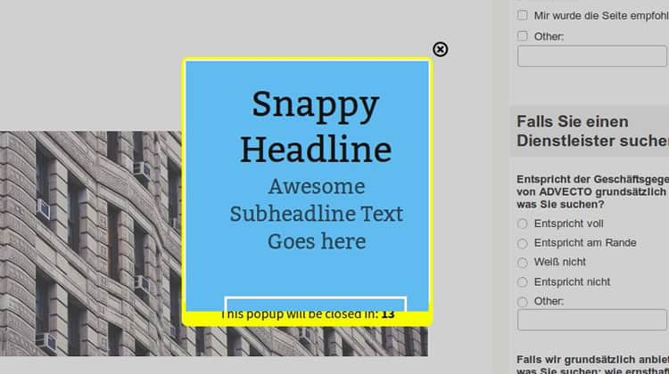
They go by many names – modal windows, dialog boxes, modal pop-ups – but whatever you call them, pop-ups have a reputation for being divisive when it comes to usability. Judging by the frequency of pop-up use on the average web page, UI designers and developers love these little guys.

However, users seem less enamored. Indeed, pop-ups certainly have a bad rap among the majority of users and a fair proportion of UX practitioners. So why are they still so prevalent? Over here at Justinmind we decided to do some investigation, canvas some user opinions and get the skinny from our in-house designers. Here is what we found out about the modal pop-up window and, more importantly, the best alternatives out there.

The Rise of the Modal Pop-up

Stripping things right back to basics, the attraction of the pop-up window in terms of raw functionality is not hard to grasp. As a graphical control element, the pop-up conveys to the user information that is related, yet subordinate to the main page content, blocking access to the main window until users interact with it. Aimed at temporarily interrupting user workflows, pop-ups are simple and effective at first glance; you want to communicate something to the user, you do it, ask them to respond and then everyone goes on their way, right?

The pop-up has a variety of uses, from delivering irrelevant pop-up spam to relevant content suggestions and confirmation calls. For UI designers the pop-up window quickly came to represent the “gift of newfound space“, according to UX Mag – a way to cater for last-minute additions or prune existing page content.

Looks like the modal pop-up is the answer to all your UI design real estate prayers, right? Problem is, according to usability and UX-perts, this is far from universally true.

Pop-up windows typically have a mixed reputation among both users and designers

The Popup Positives

Before addressing all the reasons why pop-ups so often find themselves in ‘most-hated UI element’ lists, the positives cannot and should not be dismissed. After all, when Justinmind carried out an online survey into ‘Are pop-ups here to stay?’ 21% of respondents replied in the affirmative, defending the power of the pop-up against the 23% who thought they were the devil’s design pattern and the 56% of fence-sitters. So let us look at some of the upsides to this UI element.

1. C is for Conversion Rates

First up, The Big C. Conversions. Most online content producers are looking for one thing above all – conversions. Whether that is in the form of email sign ups, downloads or purchases.

As far as raw statistics go, the conversion-focused pop-up takes some beating. Take for example the expansive claims made by Appsumo, who say their ListBuilder pop-up plug-in helped sites using the widget collect 110,313 emails in 30 days. Or Steven McDonald’s claims in User Testing.com, where he identifies his pop-ups as “the third biggest lead generator on the site.”

Why does this matter so much for e-commerce? In an online world where, according to Ott Niggulis in ConversionXL, 99% of site visitors don’t ‘buy’ on their first visit to your site but 75% intend to return to do so in the future, the modal pop-up seems like an irreplaceable tool for collecting follow-up email contacts. Why? It is all thanks to the power of ‘persuasion’, or interruption marketing.

Interruption marketing works, as anyone who has ever experienced tele-marketing or TV ad campaigns knows. It works in the sense that users have to stop what they are doing and deal with the marketing message presented to them. This is particularly true of modals because, to continue browsing a webpage, you have to interact with them and their message, even if it is just by clicking ‘close’.

The results of using conversion-focused pop-ups can be compelling. The University of Alberta had witnessed an increase in newsletter sign-ups when they introduced the sign-up form via a pop-up: from 1-2 sign ups a day they rose to 12-15 – still tiny numbers, but nonetheless a potent percentage increase.

Pop-ups boost conversion rates, but snooty microcopy can put users off

2. B is for Bounce Rates

But surely if you are interrupting your users all the time and diverting their navigation flows with pop-ups, they are going to bounce from your site, right? According ConversionXL, wrong. In the two examples cited by Niggulis, WPBeginner and Backlinko, the introduction of modal pop-up windows had zero effect on site bounce rates. Zero.

From a purely conversion perspective, pop-ups seem to work.

The Negatives

1. Big Numbers, Zero Engagement

So far, so awesome when speaking only about raw conversion stats. But sometimes numbers can be deceptive. Let us take a closer look at those ‘incredible’ newsletter sign-up rates. Mauro d’ Andrea found that engagement from subscribers garnered through pop-ups is significantly lower than that of autonomous sign-ups. So yes, you might boost your subscriber list, but be aware that those very same subscribers might never open your marketing mails, much less click through and convert.

2. Brand Credibility

In fact, pop-ups may be doing your brand harm even as they simultaneously boost conversions. Nielsen Norman Group, in their piece on ‘needy design patterns’, and more specifically exit-intent pop-ups (pop-ups that try to make you carry out an action before leaving the web page), identify that “needy patterns like the please-don’t-go popover … chip away at the presentation of a professional, confident website. They also damage users’ perceptions of credibility.”

Do not rely on users letting you know they are TO-ed with your pop-up: as Jon Reed points out, complaining is time-consuming, and “If you had a box on your site saying “do you hate our pop-ups,” I would have clicked “yes”.

It could be that the era of interruption marketing in general, and pop-ups in particular, is drawing to a close. Inbound marketing shows no signs of releasing its grip in the digital era, and in an increasingly crowded online marketplace, users are freer than ever to choose to which brands they pledge loyalty to. As Jon Reed says in his round rebuke to pop-ups, B2B audiences in particular are “looking for long-term relationships with experts they can trust.” If your product or content is good, chances are users will find their way to it without a pop-up.

Exit intent pop-ups can increase subscriber lists but can also make brands seem ‘needy’

3. User Experience and Usability

Let us get down to the nuts and bolts – how users feel about pop-ups. What is it like to experience a pop-up in the wild? Are users left frothing at the mouth at having useful content held hostage behind an intransigent pop-up?

Justinmind’s in-house UXer Sergi Arevalo points out that the answer is more complex than it you might first assume: “Despite pop-up windows having a variety of different functions and some applicable contexts, they can still be aggressive.” That is backed up by our online survey, in which numerous variations on “it depends on the context” to “devil’s design pattern” captured some of the ambivalence felt by users when faced with pop-ups they found unhelpful.

It seems context is king when it comes to pop-ups. In terms of advertising, the stats are enlightening: 70% of US users are annoyed by pop-up ads, and according to SearchEngineLand, the primary reason for blocking a site is annoying ads. Of course, not all pop-ups are ad pop-ups, and some pop-ups add value. As Sergi points out, “they’re ideal if you want to show related content while keeping the user on the same page, and for a designer they’re a great way to add focused value within a reduced area.” Pop-ups – it is complicated.

4. Mobile Modals

There might be one clear case however when pop-ups are persona non-grata. Way back when the pop-up first appeared on interfaces, most of us were interacting with desktop devices by pointing and clicking. It is fairly easy to close an annoying pop-up with a mouse gesture. But we are now living in the mobile era, and pop-ups have failed to morph with the times.

Pop-ups are a tough call for designers of mobile UIs. Different operating systems require different designs. The usual top-right close button is way out of the thumb zone and tricky to hit accurately, and all too often mobile pop-ups fail to resize adequately, leaving users scrolling around desperately looking for the ‘close’. Basically, as UX Mag points out, modal pop-ups “just don’t work well on tablets and mobile devices“.

So Can a Pop-up Ever Make for Good UX?

If you listen to Jon Reed then the answer is definitely no: “pop-ups, by definition, ruin user experience.” But despite its aforementioned negative aspects, in certain web apps or desktop interfaces the pop-up can be a welcome addition.

On our Justinmind survey, respondents pointed out that modal pop-ups could be vital when used to guide users through a potentially confusing process, or provide necessary information. UXmag points out that in programs or apps that require user confirmation or certain actions, modal pop-ups are an unbeatable way of focusing user attention before irreversible actions are carried out.

If you are designing this kind of software our UXer Sergi recommends running A/B tests on how best to communicate with users. It might be that your interactively prototyped pop-ups actually go down better with users if they see the true value of the interruption.

However, be aware that A/B tests between two pop-ups will only give you the best of two worlds. Run an option without pop-ups to see what kind of experience users truly value.

How to do Pop-ups Right

If you do eventually incorporate a modal pop-up into your UI, it is probably wise to establish some best practice guidelines. Our survey revealed that users were willing to accept a pop-up if it:

  1. Forced them to confirm an action or decision at a crucial moment in the workflow
  2. Gave them useful feedback or advice
  3. Focused them on a single, relevant piece of content (‘relevant’ is important here)

Users probably are not going to fall in love with your pop-ups even if done impeccably, but they might not abandon your site and curse your brand name.
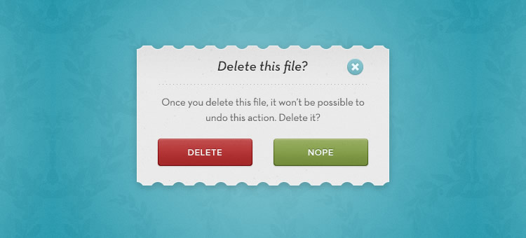
Users will accept a pop-up if its objective is to confirm workflow decisions

Here is some advice fresh from the Justinmind design team:

  • Despite what ConversionXL claims, resist the temptation to be a smart-ass when it comes to copy, because no one likes belittling microcopy, really. Instead, positive calls to action and microcopy that genuinely add value to the user, not just to your brand, are important.
  • Track your pop-ups with cookies so you do not show the same users the same cookie repeatedly. Of course, you are assuming the same user will access your site with the same browser from the same device all the time. On a side-note, HubSpot should really do this: every time I go to their blog they ask me if I want to sign up for updates, something that I did months ago.
  • Offer users valuable content and incentives, not junk. And do not just ask them for their contact details – that makes for creepy UX. How about user-friendly pop-ups which do not ask for jack, and instead send readers to a free resources page? A welcome interruption for many.
  • Think carefully about timing and position. SumoMe found that the best (ie most conversion friendly) time to introduce a pop-up was after a user had been on a site 5 seconds, but in terms of UX this is probably way mistaken. Why would a user want to engage with your brand or content if they have not even had time to evaluate it? Do not hold your users hostage to your conversion rates.
  • If you are designing for mobile, follow UX Mag’s advice and place the ‘touch = targets’ where users can reach them based on usage scenarios (and thumb zone). Place the close tab in the lower right corner and do not ask users to scroll around the pop-up.
  • Most importantly, every time you design a pop-up, ask yourself the question “Do my users really need this interruption?” Most often they will not. Like one of our survey respondents said, “only use a hammer when you need a hammer.”

The Take-Away

Evaluating the user experience impact of modal pop-ups is, as seen, a complex business. While it may seem intuitive to assume that pop-ups automatically ruin the usability of a web or mobile app, the statistics shed light on a more a complex landscape in which users implicitly understand the importance of context.

They are not going to throw their arms around you in gratitude for designing an interface with full-screen SIGN UP HERE pop-ups and patronizing microcopy, but then again they probably (probably!) will not abandon your site.

They will thank you, however, if you work in a pop-up that elucidates rather than obfuscates, that prioritizes their needs rather than your conversion desires. You may need to play the long-game, but judicious use of pop-ups and, as always, a focus on usability, will win users’ respect and ultimately, their loyalty.

(Lead image source: Cory Doctorow – Creative Commons)

from UsabilityGeek http://usabilitygeek.com/pop-ups-vs-usability-conversions-bounce-rates/

A Psychological Approach to Designing Interfaces

A Psychological Approach to Designing Interfaces

Do you ever get that feeling when you’re in a supermarket, looking at a sea of different types of toothpaste and you have no idea what to get?

The reason why you get overwhelmed by these excessive options has to do with, you guessed it, psychology. British psychologist William Edmund Hick and his American colleague Ray Hyman discovered that the greater the number of potential choices, the longer it will take to make a decision.

What this means for us designers is that we have to be mindful with the amount of information or options we provide to our users. Too much of it and it will overwhelm the user or create analysis paralysis, in which they will overthink the situation. This is why most websites or apps take on a “less is more” approach. By reducing clutter and focussing on small single tasks, we can optimize the flow and overall experience.

The A/B Test

A few weeks ago we set out to A/B test designs for our mobile ecommerce app. Version A, the first version, has all the categories and subcategories available as a carousel on the landing screen. Making it easy for the user to find what they are looking for right away, eliminating the amount of steps and providing an overview of all the available options.

Version B forces you to first select the category and then the subcategory, guiding you through the funnel. This approach gives our users an extra step to take first, but narrowing down the options and choices they have to make.

The result was surprising. Version B performed much better and enabled our users to decide much faster and not get lost in a sea of options. This shows that Hick’s theory can be applied here and that even though this means adding an extra step, the decision is easier to make.

Imagery and Emotions

Images are a great way to evoke emotions and a powerful way to tell a story. It has the ability to move people in different ways.

Neuroscientists at MIT have found that the brain can identify images in as little as 13 milliseconds. This means that images are much easier to process than text and indicates that this is something the brain does all day — trying to understand what we’re looking at. By using images in a certain way we can improve the experience and user engagement on our website or app.

This is why we’re focussing on a product first approach. We’re eliminating the distractions and letting you decide by focussing on the visual representation of our product.

Netflix recently released an interesting study that examines the use of imagery on their platform. People are very visual creatures and respond to certain visual cues. We’re hardwired to respond to faces and other people and the results even showed that an expressive facial emotion that aligns with the title drives even more engagement.

Another example is that we also tend to respond better to images that have a limited amount of information. Instead of showing 10 people or a range of objects, we tend to prefer images that focus on a single person or object.

Especially on smaller screens, it’s easier to process and identify images that don’t have too many distractions.

Conclusion

Using these techniques can help us optimize the experience of our app or website. There is still lots to discover about human behavior and driving engagement. But that’s the cool thing, we can figure these things out by user testing our designs and looking at the data. Because it usually shows we can’t assume anything and there’s still lots to learn. Stay hungry.

from uxdesign.cc – User Experience Design — Medium https://uxdesign.cc/a-psychological-approach-to-designing-interfaces-c94b2d43eaa3?source=rss—-138adf9c44c—4

Project Bloks: Creating a development platform for tangible programming

Kids naturally play and learn by using their hands, building stuff and doing things together. One of the benefits of tangible programming is that it makes code physical, so kids can play with it.

Ultimately, our goal is to enable kids to develop computational thinking (a set of foundational problem-solving skills) from a young age through coding experiences that are playful, tactile, and collaborative.

Creating an open platform for designers, developers and researchers will remove the technical barriers that get in their way: so they can focus on innovating, experimenting, and creating new ways to help kids develop computational thinking.

The project is inspired by previous academic work in the field and is still in active research.

For more in-depth information, read the Research section.

from Sidebar http://sidebar.io/out?url=https%3A%2F%2Fprojectbloks.withgoogle.com

8 Ways My Ego Killed My Business

Years ago I had a successful startup that I sold for a lot of money. I thought because I did this that I could do anything. I let me ego run my life. I started a new venture and acted like I was “the bomb” and nothing could stop me. This destroyed my business. It wasn’t the company, product or people behind the business… it was 100% me that killed this company. As a result, I lost almost everything I owned.

As a business, having a healthy ego can be a great thing. It’s your ego that can give you the self-respect and the self-confidence to take the risks it will take to start a business in the first place. However, when it’s not kept in check, your ego can run rampant and actually be detrimental to your business, like it was with mine.

Here are eight ways that my ego killed my business.

1. My ego wouldn’t recognize how much I needed to learn.

When I started my blog, I wrote three posts a day for most of a year without making a dime before I asked for help. Six months later I was making more than I had with my full time job.

A lot of leaders think they have every answer out there, therefore admitting they could improve by learning something new is admitting weakness. That’s their ego lying to them because it couldn’t be further from the truth. Admitting you need to learn is not a weakness.

Don’t be afraid you’ll be judged badly if you ask questions and accept opportunities to learn from others. Ask employees and friends what their ideas are for something you are working. That on keeps your head in the (innovative) game and reminds your ego that you still want and need help. Learning by asking questions helps keep your ego in its place.

2. Made me ignore opportunities.

You would think that the ego would make you push toward the “biggest and the best” of everything for your business. but ego is complacent and resists change. My ego was telling me, “you are so incredible, you’ve already thought of and done everything that must be done, period.” Because of this, my ego prevented me from seizing innovative and beneficial opportunities that could have helped my business move forward and succeed.

Take Gary Vaynerchuk, for example. If he didn’t embrace social media platforms early-on, such as his video podcast Wine Library TV in 2006 and Twitter in 2007, his VaynerMedia wouldn’t have become the empire that it is today. When there’s an opportunity, don’t hesitate to leap onto the possibilities and become a pioneer.

Related: 4 Ways To Push Through Adversity and Failure Without Ego

3. I over-estimated my abilities.

When I started my payments company around a year ago, I thought I was smart enough to figure out everything needed to make it work. HA! Life seemed to laugh at me. While business owners like myself are expected to wear multiple hats, don’t kid yourself that you need to wear every hat.

Look, having self-confidence is important but as your business grows, you have to bring in people more talented than you at what they do. Don’t let your ego tell you that you are a master at everything in your business. I was unafraid to tackle the books and learn some accounting basics, but I learned the hard way that I didn’t know every tax deduction, code and regulation related to my small business. I ended up letting go of my ego and hiring someone who actually knows what they are doing with bookkeeping and accounting. It turned out that I needed several people like this person.

You can’t do it all, so stop trying. Let go of your ego. Learn enough to get started, then be humble enough to know when you need to hire a specialist.

4. I micromanaged.

I have really struggled with this over the years. I feel like I have to control everything, which leads to micromanaging every aspect of my business. Obviously you want to care about the details regarding your business. Here’s the thing though. You and your team aren’t perfect. There will be times when expectations aren’t met. And, that should perfectly acceptable. But, instead of being overbearing, critical and constantly watching your team, you’re creating a culture where your team believes that you don’t trust them. Furthermore, science has found that people actually perform at lower level.

In other words, micromanagement doesn’t work. Back off a little and give your team the freedom to shine on their own.

5. My ego wouldn’t let me ask for help.

We’ve all read the stories of successful entrepreneurs. One topic that isn’t as heavily discussed is the assistance that these entrepreneurs have had along the way. Jobs had Wozniak. Gates had Allen. My billionaire mentor, Phil, showed me what my ego wouldn’t let see, that without these people companies like Apple and Microsoft wouldn’t have grown into the juggernauts they are today.

Phil told me that, even with all his wealth, he still has mentors. I thought it strange that a 76-year-old guy who is retired, much less one who is among the richest people alive, had a mentor.  He told me having a mentor has allowed him to learn from the experience of other people.”

“There are things you’ll never understand until you have experience it,” Phil said. “I have never once in my life been without a mentor. They are the people who help me become confident in my decisions.”

Whether it’s bringing in a partner, seeking out a mentor or coach, or polling your team, don’t let your ego prevent you from asking for help when you need it.

Related: Former Apple CEO John Sculley: You Learn From Your Mistakes, Not Your Successes

6. Every decision revolved around me.

Just because your favorite color is red does not mean red is the best possible color for your logo (but maybe the walls in your office). That color may not fit your brand’s voice. Red might just be too stimulating for your accounting firm. But, because it’s your business and red is your favorite color, you won’t budge. It’s not actually about the color – it’s about the mindset that won’t allow other ideas to be suggested or considered. The ego problem we’re talking about here is the mindset that remains inflexible.

My business isn’t about me. It’s about my customers and how I can enhance their lives. If I’m not listening to their wants and needs, they won’t continue to support me and my business. Focus on your customers.

7. I couldn’t back down, I had to ‘win.’

Your ego wants you to always be right. This means that when you get into a discussion or argument on ways that you can make your business grow, you won’t back down until you’ve gotten your way. Instead of looking for ways to make your business stronger, you fight for something that won’t help your business succeed.

My friend Zac Johnson always says “You’re just fighting to fight because you can’t stand being wrong. True leaders know when the battle is over.” This hits home with most people like myself!

Related: 10 Truths We Forget Too Easily

8. I set impossible goals.

Finally, thanks to my ego, I set impossible goals. The worst part about this? I then beat myself up when I didn’t reach those goals.

I’ve been here 1000x. I’ve set my alarm to wake up at 5:30 countless times to go to the gym. It’s not going to happen and I’m only sabotaging myself by setting an impossible goal. Just like in the business world. I won’t set a goal to reach $1 million recurring revenue in my first month of business because it’s not possible.

As a business owner, it’s important that you set goals that are attainable and realistic. Set goals that you can reach wit a step-by-step plan. When your mind is clouded with unrealistic expectations problems arise and you actually accomplish less.

from Entrepreneur https://www.entrepreneur.com/article/278901

Buffer for Instagram is Here: 8 Ways to Get Your Best Instagram Marketing Results with Buffer

Instagram has fast become one of the largest, most lucrative social networks: 300 million people use the app every day and Instagram’s users spend more in purchases than any other major social network.

That’s a huge audience and a huge opportunity!

We’re thrilled at the chance to help you succeed there.

There are many different tactics and strategies for finding success on Instagram—timing, consistency, hashtags, links, and more. Being able to act on these strategies and to do so in a streamlined way alongside your other social media marketing can be a huge difference maker as you seek results on Instagram.

We’re so excited to announce today that we’re setting out to help you achieve this with the launch of Buffer for Instagram!

As you may know, Instagram does not allow outside apps to post directly to Instagram. So while Buffer can’t do the posting for you, we’re excited to help you at every step. Buffer for Instagram works by sending a notification to your phone when it’s time to post.

get-started-with-buffer-instagram

buffer-for-instagram

1. Find your best time to post to Instagram

Like most other social networks, two of the most important factors for success with Instagram content are …

  1. When you’re posting
  2. How consistently you’re posting

With Buffer for Instagram, you can make good on both (read more about consistency in point #2 below).

Here’s how to find your best time to post to Instagram, with Buffer:


  1. Visit Buffer’s Analytics section for your Instagram profile
  2. Click on the Posts tab
  3. Click to sort your Instagram posts according to the Most Popular (a combination of likes and comments)

The sorting works just like Buffer’s support on our paid plans (Awesome & Business) for networks like Facebook and Twitter. With Buffer for Instagram, you can sort every post by the most popular, most likes, and most comments. You can also select any custom timeframe or choose from presets like 7, 30, or 90 days.

buffer-instagram-stats

Once you’ve sorted, do you notice any trends?

If the same time keeps coming up on your top posts, you can feel confident knowing this might be a time to focus on with your future posts. This tip works great when you test multiple times, say a best practice like 8:00 to 9:00 a.m. Eastern plus an outlier like 9:00 p.m.

Using this method, we’ve found that our best time at Buffer is 11:00 a.m. Pacific.

2. Post consistently to Instagram

After timing, the next consideration to make is how to post consistently.

What feels best for a consistent rhythm on Instagram?

Union Metrics put together data on brands and Instagram (note: data came prior to the change to an algorithm), finding that most brands post 1 to 2 times a day on Instagram (the actual average was right in the middle, 1.5), and — this was really interesting — that there was no correlation between increased frequency and lower engagement, meaning brands that posted more than twice per day didn’t see any ill effects.

The takeaway: Post often on Instagram. Brands that get in a regular flow with Instagram posts tend to see the best results.

To post consistently with Instagram, we schedule Instagram reminders in Buffer. Here’s the process:

  1. Find, edit, and upload a beautiful picture to Buffer. Add a caption with hashtags, @-mentions, and emoji. Schedule for the ideal time.
  2. Receive a push notification from the Buffer mobile app at the scheduled time.
  3. Open the notification, select Open in Instagram. This loads the photo into Instagram, with the caption saved to the phone’s clipboard, ready to be pasted.
  4. Make any final edits (filters, geolocation) and share from the Instagram app.

The Instagram API doesn’t quite allow scheduling, so Buffer has made it possible to plan in advance by adding a post through the Buffer dashboard on web or mobile and having a reminder pop up on a user’s phone when it’s time to send it out.

buffer-instagram-how-to

Here’s a look at how things appear from the web dashboard:

instagram-product-web@2x (1)

And this is the look from a mobile device:

instagram-product-android@2x (1)

To see the effect of a consistent Instagram presence, you can dig into the advanced analytics for your Instagram account in Buffer (available on our paid plans). Here’s how:

  1. Visit Buffer’s Analytics section for your Instagram profile
  2. Click over to the Analysis tab
  3. View Posts Per Day plus Likes or Followers

buffer-instagram-analysis-tab

The combination of these stats can help you judge the effect of a consistent schedule on important Instagram metrics like likes and followers. If the spikes in engagement match the spikes in posting, you can have visual evidence of a strong correlation between the two.

3. Track and sort through your Instagram history

Right now, when you connect an Instagram account to your Buffer, all of your past Instagram posts will appear in your analytics dashboard, giving you loads of great data on what’s working best for you on Instagram.

Then each successive time you share to Instagram, all your stats will be integrated directly into the Buffer dashboard where you can sort, compare, and analyze.

What this means: You don’t have to wait until a week from now to start analyzing what’s been working for you on Instagram.

You can get insights, today, on what’s worked well yesterday, last week, last month, and beyond.

When I connected my Instagram account, the first thing I did was visit my analytics and sort my past photos to see my most popular Instagram posts. Having that knowledge helped me prep and plan for the next one (in my case, hashtags proved quite key).

Speaking of hashtags …

4. Add a hashtag (or 11) to your caption

Buffer for Instagram cannot post directly to the app for you — but it can get you 95% of the way there!

You can plan nearly every detail from the Buffer dashboard, including the full caption you wish to use with your photo. And as part of this caption, we’ve found that hashtags work extremely well on Instagram.

Hashtags have become a uniform way to categorize content on many social media platforms, especially Instagram. Hashtags allow Instagrammers to discover content to view and accounts to follow.

Research from Track Maven found that posts with over 11 hashtags tend to get more engagement.

To find your best hashtags, we recommend a tool like hashtagify.me, which ranks and analyzes all sorts of different hashtags. This is what we typically look for:

  • Hashtags used by others in your industry
  • Hashtags that are the most popular (by volume of posts)
  • Hashtags that are the most active (trending)

When you’ve chosen your hashtag, you can add it to your caption and set your Instagram notification in Buffer. Later, when it’s time to post, you can open the reminder notification from your phone to have your photo automatically added to Instagram and your full caption copied to your phone’s clipboard.

5. Include emoji in your caption

Along with hashtags, you can also include emoji in your captions (there’s even a bonus 3rd thing you can include, if you keep reading).

Why might you go with an emoji? Well, they’re popular, they’re expressive, and they might just be the new way we communicate online.

Plus, they’re a key part to the language of Instagram, so much so that Instagram itself commissioned an emoji study on their network. What Instagram found is that many popular emoji have meanings in-line with early internet slang and have been adopted as a way to replace these words.

Here are a few emoji and the slang Instagram found them to represent:

  • 😂 : lolol, lmao, lololol, lolz, lmfao, lmaoo, lolololol, lol, ahahah, ahahha, loll, ahaha, ahah, lmfaoo, ahha, lmaooo, lolll, lollll, ahahaha, ahhaha, lml, lmfaooo
  • 😍: beautifull, gawgeous, gorgeous, perfff, georgous, gorgous, hottt, goregous, cuteeee, beautifullll, georgeous, baeeeee, hotttt, babeee, sexyyyy, perffff, hawttt
  • 👍: #keepitup, #fingerscrossed, aswell, haha, #impressed, #yourock, lol, #greatjob, bud, #goodjob, awesome, good, #muchlove, #proudofyou, job, #goodluck

If you’re keen to get emoji into your next Instagram caption, we have a couple quick ways to do it from a desktop:

  • Cmd+Ctrl+Space on a Mac
  • Windows touch keyboard on a PC

6. Reference the link in your bio

There’s only one place on Instagram where you can add a link: in your bio.

The way that savvy marketers have skirted this limitation is by changing that bio link often, and referencing the bio link in the caption of new photos. It’s as simple as writing a caption like this:

“… Click the link in our bio to read more.”

“…Check out the link in our bio!”

(or the super short Gary Vaynerchuk method)

“… Link in bio.”

This tip works even better if you use a shortened URL with tracking information as the bio link. Tools like bitly let you shorten a URL that contains UTM parameters: you can track the links to your bitly URL and also analyze the UTM information in Google Analytics for deeper insights.

We manage all this via Buffer for Instagram by using the “link in bio” language in the captions that we compose. The Buffer app notification to post also serves as a reminder to update our bio!

7. Post the same picture + native content to each network

Many brands choose to post natively to Instagram, opening the app each time they wish to send a message.

This was the way we had done it for quite some time at Buffer, too.

We’re happy to be using a more streamlined workflow now. All of our Instagram posts begin in the Buffer dashboard, right alongside our posts for Facebook, Twitter, Pinterest, LinkedIn, and Google+.

One key benefit we notice from this: We have a coordinated presence on all networks while also being free to honor the individuality of each.

Let’s say we have a team photo that we’d love to share with our social media followers. We can share it to Facebook, Twitter, and Instagram all from the same dashboard without needing to log in to any extra places. We can coordinate the time so it all posts in sync. Plus, we’re able to create custom messages on each network, speaking in Instagram’s language (hashtags + emoji) on Instagram, speaking Twitter on Twitter (brief + 140 characters), and Facebook on Facebook (personal + fun).

8. Mention other users

A lot can happen in an Instagram caption, and we’re excited to let you do it all. In addition to hashtags and emoji, another key inclusion for growing your Instagram marketing is to use @-mentions in your caption.

Every time you @-mention a brand or person (for example, @buffer or @kellybakes), they receive a notification. This has a number of neat effects:

  • It feels good to be mentioned! When you’re acknowledging a contributor, partner, or friend in your feed, you’re passing along a bit of social media karma.
  • It might help your post spread! There’s a bit of viral “pay it forward” when it comes to @-mentions. Many influencer strategies start by mentioning the influencer in a post.

To add an @-mention to your Buffer for Instagram caption, simply type it as you would any other text, and when pasted into Instagram’s text field on your device, Instagram will recognize it as a mention.

Questions and Answers on Buffer for Instagram

Is this for all users or is it a paid feature?

This feature is for everyone! Any user can connect one Instagram account. The Awesome plan and above lets users connect more than one account.

What happens if I miss a reminder?

If for whatever reason you miss a notification, you will be able to find the posts you missed by clicking on the “View past reminders” link in your Buffer dashboard, and you’ll still be able to share them on Instagram or reschedule them from there.

How can I access Instagram reminders?

This feature has been rolled out to everyone! If you are already a Buffer user, you can head to your Buffer dashboard here, and if you haven’t yet signed up, you can do so here. Composing a post for Instagram is available on the Buffer web app, as well as Android and iPhone apps.

How do I add a post?

You can add an Instagram Reminder from within the Buffer dashboard on the web (https://buffer.com) or from any mobile device. Since Instagram is a mobile-first social network, to complete the process of posting to Instagram, you’ll need to have a mobile device with the Buffer app (for receiving reminders) and the Instagram app (for posting).

Any restrictions on content?

The content shared to Instagram through Buffer still needs to comply with both our own terms at Buffer, and Instagram’s own terms around content.

Get Buffer for Instagram! Start amplifying your Instagram marketing today

With Buffer for Instagram, we’re excited to be giving you the power to manage your social media marketing from one central location, and we’re eager for you to have the tools you need to plan, track, and amplify your Instagram marketing.

get-started-with-buffer-instagram

We’d love to hear what you think!

We’ll be hanging out in the comments here to answer any questions, and you can get in touch with us any time at hello@buffer.com.

Happy Instagramming!

from Social https://blog.bufferapp.com/buffer-for-instagram-how-to

The 3-Step Guide to Erasing Your UX Debt

money-card-business-credit-card-50987-medium

If your product suffers from inconsistent behavior or performance, you’ve probably made long-term sacrifices for short-term gains. You’ve accumulated UX debt.

For example, it’s not uncommon for a company to release a “critical mass” of features to gain market share. The team worries first about quick user acquisition, scheduling the cleanup work for later sprints.

When it comes to UX debt, you won’t know all the answers immediately. And you probably won’t fix it all by the next release. But that doesn’t mean you should give up. If you can create a plan that doesn’t give product management a heart attack, you will eventually eliminate your debt.

Roll up your sleeves. We can do this.

Step 1: Create and Validate a UX Debt Inventory

Whether you’re at the receiving end of an incoming product acquisition or joining as a new hire, corralling UX debt starts with discovering what you’re up against. And that means conducting an inventory.

Let me walk you through the process.

First, sit down and use the product. You want to do this yourself to highlight anything you find unintuitive or confusing. Keep notes as you go, or ask someone to write down your comments as you use the product—then switch places.

image03

UX debt spreadsheet used by my team

Another collaboration option entails using a spreadsheet (like this one) in your team’s cloud folder while evaluating the heuristics together. As the creators Susan Rector and Kim Dunwoody suggest, review the system based on criteria in the following categories:

  • Findability
  • Accessibility
  • Clarity of Communication
  • Usefulness
  • Credibility
  • Learnability
  • Overall Aesthetics
  • Persuasive Design

You can create a solid snapshot of UX gaps by involving the whole team. Completing the evaluation will definitely take more than a week. Be sure to block out a manageable timespan to slowly chip away at it (e.g., 1-2 months).

Remember that while this exercise is highly informative, at the end of the day, you’re not the intended user.

Now that you’ve conducted a UX debt inventory, it’s time to validate your findings by observing and talking with actual users and subject matter experts (read more on that in Rian van der Merwe’s free guide Practical Enterprise User Research).

This will help you better prioritize the work with product managers for the payback sprints or the backlog.

Step 2: Prioritization

Once you’ve revealed all the debt, you must prioritize so that it can be addressed in realistic stages.

Severity & Impact

How big is the issue? Is it keeping users from doing their work? Is it creating a safety or security risk? Is it causing a potential customer to turn around and look to a competitor’s product?

As explained in the free guide Eliminate UX Gaps In Your Product I wrote with UXPin, these are all relatively severe effects that suggest the issue is a high priority.

But don’t just consider the negatives. How big an improvement will the user see? Will the improvement save hours of time in the course of a month? Will it reduce errors? If so, it may be worthy of high prioritization, even if it isn’t currently considered to be a big problem.

If you have a lot of products, you may consider employing a UX Maturity Model as the basis for prioritization.

Estimated Time to Address

How long is it going to take to fix?

If all you have to do is tweak the CSS, you might slip it into the next build. On the other hand, if it’s going to require a significant amount of development or will have to be thoroughly regression tested, it may make sense to hold off until it can be resolved with other issues requiring similar treatment.

Responsible Party

Who will be tasked with addressing the issue?

If it falls primarily on the UX team, and they currently have a light workload, it may be given a high priority. If it requires the attention of a specific developer who is already assigned to other high-priority work, then it will have to wait.

Step 3: Schedule

After prioritizing your debt, the next step is to work with product management to get it into your release schedule.

Agile is so popular these days that it seems like any process that isn’t Agile is labeled “waterfall.” I find that to be a bit dismissive. There are degrees of being Agile, and you can have an effective, iterative process that doesn’t involve stories, scrums, and sprints.

For our purposes, however, I’ll address all non-Agile processes at once. Then I’ll make suggestions for Agile teams.

If You Aren’t Agile

Your work is likely planned based on a release cycle. Your organization decides what will go into the next release based on criteria such as how long the development effort will be; how badly a feature is needed by customers; what will sell; what bugs exist and how bad they are; and so forth.

I recommend handling UX debt issues as bugs. The real benefit of this approach is that debt items can be entered and tracked using the same tools and business processes as bugs. This will ensure that they get reviewed and treated equally. A representative from the UX team on the issue review board should prioritize items, ensuring that usability issues get the full weight they deserve.

Ideally, a representative from the UX team will also work closely with product management when releases are scheduled.

When a particular part of the application is being scheduled for work, check it for UX debt. Would it add much effort to address the debt at the same time? Often, there will be savings simply because the code is already being updated by developers. Even if it’s a low-priority item, take advantage of the opportunity to pay down some debt.

If You Are Agile

A company that employs a healthy Agile process shouldn’t have any problem prioritizing debt with other types of work, assigning it story points, and fitting it into sprints.

Find the rhythm

In my own experience, however, Agile has been embraced as a way to get more work done faster, rather than as a method of iterative improvement.

In such situations, you may have a harder time scheduling UX debt because (as management sees it) there’s not enough time to fit in everything they aim to wrap up, so there certainly isn’t time for all those trivial corrections you’re asking for.

image01

Photo credit: Laura Kershaw. Design process at Kaplan Test Prep for UX Design in Action.

If you find yourself in such an environment, your goal should be to find a rhythm for addressing debt.

Propose a certain number of story points per sprint (or every other sprint). Or, perhaps a sprint could be devoted to addressing debt at some regular interval (payback sprint). This should be done at least until the backlog of historic debt—your debt inventory—has been handled. Then it should become easier to keep up with new debt that crops up without that regular schedule.

Try a “Cheese Day”

For even tighter schedules, consider holding a Cheese Day to knock out as much debt as possible. Management is almost always receptive to a one-day workshop every 60 days where you knock many items off the debt list.

The following procedure suggested by Roy Man is both realistic and effective:

  • About 2-4 weeks before Cheese Day, create the project in your app of choice (Asana, Trello, Basecamp, etc) and encourage everyone from customer support to developers and designers to briefly describe product annoyances.
  • Prioritize the cheese list based on the advice in the below chart. Separate the “Quick Wins” from the “Nice-to-Haves”.

image00

Photo credit: Joe Natoli

  • Schedule 6-8 hours for the Cheese Day, inform everyone of the date, then dive right into the “Quick Wins”. Everyone will feel productive, and you’ll have progress to show management at the end.

Conclusion

Most importantly, we address UX debt through collaboration.

UX debt should be understood as the responsibility of the entire organization—not just the UX group. It takes a good working relationship with your entire team to ensure that UX debt is given the attention it deserves.

And of course, the best way to eliminate UX debt is always avoiding it in the first place.

If you found this article useful, get more advice by downloading the free e-book Eliminate UX Gaps In Your Products.

image02

The post The 3-Step Guide to Erasing Your UX Debt appeared first on Studio by UXPin.

from Studio by UXPin https://www.uxpin.com/studio/blog/3-step-guide-erasing-ux-debt/

The Future of Browser History

The Future of Browser History

I am really unsatisfied with the current state of Browser History. I think that this is the most underestimated feature of every modern web browser. Let’s take the most popular browser as an example.

Before we talk about browsers history, we need to understand how we tend to browse nowadays.

Sometimes I want to know how to convert 1 foot to centimeters.

Sometimes, on the other hand, I want to know why and how things happen.

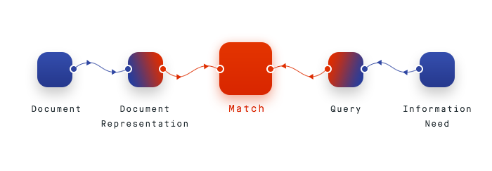
For the second kind of search, the standard pattern of match retrieval does not really cut it.

Problem

I can search for the term in Google, but I’m not going to get a single result that answers my question. Rather, I’m going to get a lot of results, and all of those results will have bits and pieces of information that are relevant to me.

Then I’m going to go exploring through the internet, collecting lots of tabs along the way. Some of those tabs will be duds, so I close them.

Some of those tabs will be relevant and will have twenty more links, so I open them all, and in this way I keep crawling.

Then after a while I have a cloud of pages in my head that I visited and the answer is more or less complete.

But if I try to revisit this later, it’s impossible. I can remember what I found, but it wasn’t a linear progression, therefore my browser history is useless.

Despite living in a data-driven society, as more and more databases are brought online, the complex and varied information available to be discovered is dependent on how well we can search.

In formal ways, we have transitioned from the Classic Retrieval Model, to what is called, Berrypicking Search.

Classic Retrieval Model

The query is satisfied not by a single final retrieved set, but by a series of selections of individual references and bits of information at each stage of the ever-modifying search.

In other words, we do not usually search for something that leads to a single result that answers our question, rather we search for terms and then explore the internet, connecting bits and pieces of the answer as we read through the web of tabs that our search starts for us.

Berrypicking Search

Our search needs, and in turn our browser history, are not being met with single query anymore. We move through a variety of sources with every new piece of information giving us new ideas and directions to follow. Without us ever knowing it, our search queries are constantly fluctuating.

Current Google Chrome History

Unfortunately, our current solution to finding a not-bookmarked webpage, is to retrace own steps through different links.

It demands that users have enough information to decipher the desired page from all others by recognizing headers, obscure URLs or timestamps.

Our browser’s history should reflect our behaviour in the internet and help us understand the process behind it. It is crucial to actually understand and question the way we use the Internet, and without the suitable tools, it is not possible.

Solution

I find answer in maps.

On top there is a timeline, positions are still displayed chronologically, but users can also see connections.

Not only is this a different approach to browsing our own content, it is now possible to see patterns of my search queries and behaviors. In this way, our browser history does not only perform a retrieval function, but also writes a narrative.

I will finally understand why I ended up reading about the influence of plants on soil properties, when I started with texas bbq query.

With this method, I am able to see at a glance how different pieces of information are connected, how they relate to each other and how I formed conclusions. I see how I actually cognized things that are relevant. It is not only about the goal, but also about the journey.

In the proposed interface, with a simple hover action I receive essential pieces of information. I am able to understand my thought process and points of interest. It is also easier to actually remember the page thanks to particular color schemes and meta sections.

Let’s say I already found what I was looking for and I’m satisfied with my information retrieval process.

How many times have I visited this website? How much time have I spent using it? When did I see something interesting? How often do I visit it? How does my generated traffic look like, from perspective of particular page?

Delete dropdown

They say to never trust a person with an empty history.

Google is one of the best search engines available and yet, in Browser History there is not even a place for autosuggestion. How come?

I’d love to search by topic, dates, colors.

In order to re-create our experience or to just see the overall topics of our interests I think it is highly useful, to provide users with a list of past searches. Once you click a particular search result, it expands with visited links based on that very query and would redirect you to the map with the highlighted path.

Currently, I am really missing the analytics screen. It is crucial to be able to understand one’s own behavior, especially as there is no distinction between offline and online anymore. Filter Bubble shows that information we see is selective, we become separated from information that disagrees with our viewpoint. Users are more and more comforted in their own domain, we have stopped questioning.

I want to see how much time I spend browsing Internet, how I collect information and how I form my views.

We live in times when understanding your browse behaviors and search patterns is becoming crucial in cognitivism process.

I suppose it is tempting, if the only tool you have is a hammer, to treat everything as if it were a nail.

from Designer News Feed https://www.designernews.co/click/stories/71598

How To Design A Perfect Form With Validation?

Sometimes designers tend to forget basic ways to achieve usability in designs. And, one of the most common is form validation. Generally, users fulfill the action of completing web forms with required information successfully. But it is seen that they make mistakes while trying to fill the fields. So, the trouble is how to handle these errors? Well, thanks to web form validation, this can be sorted. The aim of web form validation is to keep a check on the necessity and formatting of the information that is essential for successful completion of an operation. The feature ideally gives a validation and points out when the user is wrong while entering information. Web-form sees to the entry of the details and passes it only if it is correct.

As a matter of fact, validations serve the purpose of having conversations with the users and help them during errors and certainty. You don’t have to wait for the entire page to reload in order to check that the form was filled with the right data or not. For instance, if the field mentions email address, the form will run the control to ensure that the text entered is a valid email address. Thus, a simple visual reminder to the user about an error in filling field can turn the irritation of guessing wrong entries to mere delight in successfully filling the form. Here, in this post we shall discuss not only validation but also explore various error feedback approaches that are of great use.

1. The Purpose

The main objective of good form validation is to talk to the user and communicate when the information entered is incorrect. Incorporating validation in web designs isn’t a big challenge but it is usually seen that the designers tend to get laid back with it and leave it onto developers to work at the last stage. This leaves UX at major risk because the developers don’t even know or bother about form validation. Neglecting form validation can actually leave users frustrated and this lack of attention can harm the website a lot.

2. The Methods

It is possible to validate user’s input both on the server and client. So, we have server-side as well as client-side validation. We will explain the positives and negatives of each.

3. Server-Side Validation

Server-side-validation

In this type of validation, the server receives the info and validates it with the help of one of server-side languages. However, if the validation fails, the response is reverted back to the client and the page that consists of the web form is refreshed and a feedback is made visible. This validation is safe as it is workable even if JavaScript is turned off in the browser and doesn’t grant easy access to malicious users. On the flip side, users are bound to fill in the information without getting a response until they submit the form.

This leads to a slow response from the server. Note that the exception to this type is validation using Ajax. Just as you type, the Ajax calls can do the validation and therefore, give immediate feedback. It majorly applies to validating rules such as username availability.

4. Client-Side Validation

Client-side-validation

Server-side validation is sufficient in itself for successful and secure form validation. But if you want to enhance user experience, you can go for client-side validation. Here the validation is done on the client with the aid of script languages such as JavaScript. Script languages enable validation of user’s input as they type. This leads to a more responsive and visually stimulating validation. In this type of validation, form doesn’t reach submission if the validation fails. The JavaScript methods that you devise take care of validation and the users get instant feedback if the validation is improper. The demerit of client-side validation is that it is too dependent on JavaScript.

If users disable JavaScript, they can easily bypass the validation. This is the main reason why validation should be integrated on both the client and server. By amalgamating both the server-side and client-side methods, we can get the best package, that is, quick response, safe validation and super user experience.

5. The Target Areas

Now the question arises, what all can you validate? The answer is necessary fields, right format and confirmation fields.

6. Necessary Information

Asterisk-form-input

Well it is a no brainer that the information that should be validated first is necessary information- the one without which operation cannot seek completion. The validation has to be particular that the user fulfills the criteria of providing required details in the web form and it has to object if at least one of the fields is not filled in. The requisite field should be properly marked so as to guide the users on which information has to be filled in up front. A common way to achieve this is to use an asterisk (*) symbol besides the required fields. But the problem is not everybody is aware of the meaning of an asterisk sign. Beginners and old users are most likely to assume the meaning of an asterisk symbol.

That is why it is important to include a note above the form that mentions that all fields marked with an asterisk are necessary to be filled in or put required field markers, whichever suits you. However, if the form has all the fields that are mandatory then you should save yourself the trouble of placing asterisks or markers in the form. A clear message that all the fields are necessary will serve the purpose.

7. Right Format

Right-format-form
Apart from regulating the submission of required information, validation has to take care that the users fill in the info in the right format. This includes various cases like email address, URL, dates, phone numbers and others. If the information fails to comply with the correct format then the users must be told about it and guided with the right format. Generally the simplest way to validate correct formatting is to utilize regular expressions. Remember that it is always better to not force the users to stick with a set input pattern and allow them to enter text in a variety of formats and syntaxes and then let the application understand it intelligently.

The user is usually concerned with getting something done, not about including correct formats or operating difficult UIs. Give the user the freedom to type whatever he wants and if it can be passed, make the software do the right changes with it. This style of design is also called forgiving format UI design pattern.

8. Confirmation Fields

Confirmation-fields
While using significant data for the system, it is preferable to allow the users confirm their input with the use of additional confirmation fields. This will ensure the users that the information they have entered is correct. Usually confirmation field is employed for passwords, but it can be created for other cases like an email address. A confirmation field must be included next or below the main field. It should clearly explain the motive of the field such as ‘confirm your password’. If two values are not identical then the user should be immediately told. In this scenario, you can also use a success indicator if the values are identical.

9. The Feedback

Form-validation-feedback
In case of failure in validation, the system should immediately inform the users through a direct and clear message and provide ways to rectify errors. As it is required for the users to take note of an error message immediately, place it at the top of a web form, above all the other fields. This will give leverage to the screen readers to easily read the message. The message should be tried to be displayed in red as it is the color that everyone relates to errors and the icon must be sized properly so that it catches more attention. It is better if the icon is globally recognizable like red circle with white cross.

This will assist users with visual impairments recognize the meaning of the message. Furthermore, users will know about the input fields that require accuracy. Besides error message and a list of invalid fields, the system must highlight the fields that are invalid. This can be achieved through-

  • By creating red inline messages or markers adjacent to every invalid field
  • By altering the background color or border color of wrong fields to red
  • By varying the color of field labels
  • By supporting error tips close to each field

If you go for giving error tips or help, make sure to be short, crisp and to the point. For instance, if date does not match the right format, give the users information on how to change it correctly- ‘the date should be in dd-mm-yyyy format’. Giving these hints as the initial value of your input fields can also be a nice approach. Here, the user’s eye will be caught by the hint inside the input box first and then when he/she will start entering the details, it will disappear.

10. Validation Upon Submit

Form-validation-feedback
The standard way to perform validation is when the users confirm his data by hitting submit button. The validation begins and if any fault is detected, feedback is given immediately to the user. This will encourage the user to fill in the particulars of the form without any interruptions. That said, it can cause inconvenience too as the users will be able to rectify the errors only when they have submitted the form and then get the response back from the server. This is quite the preferred approach for server-side validation, but can be used for the client side as well.

11. Real-Time/Instant Validation

Real-time-form-validation
Quite opposite to the previous approach, real-time validation informs the users during the process of filling the form. This doesn’t imply that validation is conducted on every single key press but during the time when the field loses focus. Through this users get immediate notification about their input, for instance, if a username is unique or if a date supports right format. And of course, instant validation performs during typing in an input field or after the input field goes vague. Generally, it is accompanied by a text message, tip or a status icon. Instant validation must be applied with care and only in cases where it is required as it can pose a lot of distraction if overused or misused.

12. Errors to Avoid

There are two mistakes which you should take special care while designing form validation. Firstly, single error pages are a big no-no. Single error page implies that the users are taken from the web form that they filled to a page that displays some feedback. Here, users are under compulsion to browse back so that they can rectify errors. When they go back, they have to retain the information you mentioned in the error message and this is when the problem arises. Sam is the case with feedback messages in popup windows. Apart from causing annoyance, popups when closed keeps no track of feedback.

13. Keep a Check

Keep--check
Besides pure validation, there are various methods that enable users make lesser errors. That said, not all these methods can be regarded validation. They channelize the users and help them to avoid mistakes.

14. Help Hints

Help-hints
If a web form needs complex data, then help hints can serve the purpose very well by helping the users in the task of filling the correct information. By explaining them how to enter right info, you enable them to fill the form quicker and prevent common validation mistakes. Help hints are displayed as simple text adjacent or above the input field. Remember the design of help hints must vary from the design of form labels. It is generally displayed in smaller, grayed text. The major merit of help info is that it is always available to the visitor even if the JavaScript option is turned off.

15. ToolTips

Tooltip
Contrary to help hints, tooltips at first hide the information and then display it on demand. They are usually fuelled by an icon with a question mark. Help information is given by keeping on help icon or selecting it. Once the mouse goes far from the icon, the tooltips vanishes. These can effectively help in reducing clutter especially when the help text is lengthy.

16. Dynamic Tips

Dynamic-tips
Just like tooltips technique, dynamic tips do not appear initially in front of the users. Once the user gives input, related tip becomes visible. Through this, tips are highlighted without creating any clutter any such in the form. Tips should be displayed in a manner that they don’t hide other information present in the form. They are generally placed adjacent to input fields, but you must try to keep them on the right side of the fields as that causes less distraction.

17. The Human Proof

The-human-proof-captcha
A pivotal part of web form validation is Captcha. It is important in validation as it detects whether the user of a system is human or a bot. In its simplest set, captcha comprise of an image with text, numbers or an expression and a field that requires content of the image as input. Nowadays, most spam bots can easily identify the text embedded in a simple captcha image, so it is better to use some question that only humans could answer correctly like ‘what color does the Sun have?’ with correct answer ‘yellow’ in all its variations; ‘YELLOW’, ‘yellow’,’Yellow’. A method called Honeypot Captcha can also be used if you want to create hidden form elements and then confirm on the server side that they remain empty.

Blind, visually impaired or dyslexic face problems or even find it impossible to complete the web form with Captchas. But now there are types like ReCaptcha that enables audio support for users with disabilities. All said, it is a fact that users hate captchas as it causes too much time for the users to read and fill the form. But note, captcha is for site owners not users. So, if you can avoid captchas, go ahead and grant the users more accessibility.

Final Word

Filling forms takes up time and effort. Correct the users through appropriate error messages and save them from unnecessary trouble of fixing mistakes. Implement effective form validation in your design so as to make your users stick to your website. There are various techniques to execute form validation, but not all are suitable in enhancing user experience. The above article mentions various methods to aid you in web form design; choose the ones that grant solution and lead to successful form completion rates for your site.

Summary

Article Name

How To Design A Perfect Form Validation ?

Author

Description

Good form validation designing is a important part of designing process. form validation is to ensure that the user provide necessary information properly.

The following two tabs change content below.

For 12+ years I have designed, developed and marketed websites / apps startups in New York, California, Florida and in India. Always focused on great User Interface is key.

Latest posts by Prince Pal (see all)


Subscribe To Our Newsletter

Join our mailing list to receive the latest UI/UX Design news and updates from our team.


You have Successfully Subscribed!


from Designer News Feed https://www.designernews.co/click/stories/71223

8 principles of bot design

Despite plenty of excitement it’s still unclear how conversational UIs can be made to work in a practical sense.

But opinionated design principles can help us push past the hype, and design something real people will want to use every day.

We’re not lacking for self-assured sermons on how conversational UIs are the future. Much less is written about the practicalities of actually designing chatbot interactions.

Yet it seems like this is precisely what we now need. Early attempts at chatbots have fallen flat in their execution, mostly because they have relied too much on natural language processing or A.I. capabilities that simply don’t yet exist. Others have jumped on the bandwagon and tried to shoehorn unsuitable use cases into this new pattern.

In all the excitement of diving into this new technology most of us seem to have forgotten about the most important actor in this enterprise: the human being who is expected to talk to the bot.

So how do we go about designing bots? When are they useful? Should they be friendly and simple like Slackbot, or fake yet smart like Facebook M? Should they allow for free text input or create IVR-like options? These are not insurmountable questions, but the truth is we’re still exploring how to use this new medium to build great experiences.

Situations like these call for strong opinions, weakly held. When you’re tackling a domain like chatbots that are still very much in flux, it’s essential to be guided by clear design principles.

(This post was first published on Inside Intercom, where we regularly share our thinking on design, startups and product management)

What are design principles?

All great, category-defining products are opinionated. Design principles lock these opinions in place upfront.

At their simplest, design principles are a list of strongly-held opinions that an entire team agrees on. They force clarity and reduce ambiguity, and represent a north star for everyone to aim for.

There’s an art to coming up with good design principles. They can’t be mere truisms. If they are, everyone will simply nod in agreement, but they won’t help you to make actual decisions.

For example, “We don’t make our designs too complex” is a terrible principle — nobody would realistically argue the opposite position. Truisms cannot guide your decision-making in any meaningful way.

We favor simplicity over power”, on the other hand, is a great design principle. The opposite principle could also be argued — “We add complexity so our users can do cool things”. Opinionated principles like these will help you make consistent decisions throughout your design process.

With that in mind, let’s lay out some principles that will allow us to make progress on designing conversational UIs.

Principles of bot design

1. Don’t pretend to be a human

Playing bait-and-switch with a user can make them feel that they have been duped, or that they don’t understand how a system works; both are bad user experiences. Don’t pull the rug out from under your users. This means not using “is-typing” indicators or artificial delays to make it seem more human. On the contrary, bot messages should be styled differently and be clearly labeled in a way that communicates they are not human. This doesn’t preclude us from giving the bot personality.

2. Keep it incredibly simple

Bot conversations should be bounded to very particular subjects and follow linear conversation routes; we avoid complicated branching paths. We’re not trying to create a general, self-aware A.I. here. It’s okay to expose and explain limitations. BASAAP. Individual bot designers shouldn’t have to account for tricky failure cases. Users will tire of complicated passages of dialogue.

3. Respect the chat medium

One advantage of smart messaging apps is that we can strip away a lot of apps and interface and reduce the interaction to a simple chat UI. It would therefore be pointless to turn around and drop an entire app directly into a conversation. Keep everything native to the conversational back-and-forth. Every bot interaction is about call and response, with the bot publishing comments into the chat thread and the end user responding in the reply area. Bots can’t modify conversations in ways that humans can. At the same time, make use of conventions: rather than printing out an ungainly URL in a bot response, show a nicely-formatted card previewing the linked page.

4. Optimize for the end user

Bots should be used to improve the end user experience, not just to make life easier for customer support teams. A designer should ask themselves: would a human be better for the end user? If the answer is yes, you shouldn’t be using a bot. Bots should not attempt to replace what humans are good at; rather they should attempt to improve what humans are slow at. Machines should work; people should think.

5. Use sparingly

Bot interactions should be short and precise. It should be impossible to get into a protracted back and forth conversation with a bot; anything above two inputs feels laborious.

6. Provide an escape hatch

Always have a human fallback option, allowing the user to express “I’d rather wait and talk to a real human, make this robot thing go away”.

7. Use structured input when possible

The more alleyways a conversation can go down, the greater the potential for dead ends. Don’t place users in a situation where they need to guess the correct incantation required to proceed. Custom soft keyboards permit a limited range of input and can save a bunch of typing. For example, rather than asking the end user to type “yes” or “no,” show them two mutually exclusive buttons. Or validate structured text like email addresses before sending. In this way you can keep responses on track and sidestep the complications of parsing unpredictable plain text input.

8. Everyone sees the same thing

Bots don’t only appear to the end user. The humans behind the bots need a record of the conversation’s context too — how a bot replied and how end users responded accordingly. Common or lengthy bot messages may be displayed in a collapsed state in the admin view for the sake of neatness. Cases in which bot messages are private to an admin and are only internally visible are an exception.

Obey the principles without being bound by them

It’s important to note that these principles will almost certainly evolve, due to new technical possibilities or the simple fact that some of them were misguided. We should allow for both.

But having them in place makes things so much simpler from here. We’ve got a stake in the ground. Now we just need to apply these rules consistently and methodically. Without principles you’re just randomly firing ideas in any direction and hoping you’ll hit something that works.

Hero image credit: Shawna X

Written by Emmet Connolly, Director of Product Design at Intercom. This post first appeared on the Inside Intercom blog, where we regularly share our thoughts on product strategy, design, customer experience, and startups.

Intercom is a platform that makes it easy for web and mobile businesses to communicate with their customers, personally and at scale.

Want to read more articles like this?

from Sidebar http://sidebar.io/out?url=https%3A%2F%2Fmedium.com%2Fintercom-inside%2F8-principles-of-bot-design-51f03df1d84c%23.2wrmh5i2l