Test & create the perfect typography setup for your website or app

It’s always good to use real words

Lorem ipsum changes the way copy is viewed. It reduces text-based content to a visual design element — a shape of text — instead of what it should be: valuable information someone is going to have to enter and/or read. Dummy text means you won’t see the inevitable variations that show up once real information is entered. It means you won’t know what it’s like to fill out forms on your site. Dummy text is a veil between you and reality.

You need real copy to know how long certain fields should be.

The easiest way to get to Odense from abroad is by plane to Copenhagen International Airport. From the airport trains frequently depart towards Odense and it is around a one hour commute. A small trick would be to use journeyplanner.dk to plan your journey when you arrive to the Airport.

Sure, it’s easier

.. to just run down the forms and fill the fields with garbage (“asdsadklja” “123usadfjasld” “snaxn2q9e7”) in order to plow through them quickly. But that’s not real. That’s not what your customers are going to do. Is it really smart to take a shortcut when customers are forced to take the long road?

Get the code

Oh no, we’re sorry but this awesome project serves no meaning on smaller devices, please visit from a computer instead

– Best regards team typeanything

from Designer News Feed https://www.designernews.co/click/stories/71106

7 ways to prepare for cross-cultural usability testing

It’s a diverse world we live in. Around 13% of the population in both the US and the UK was born overseas, jumping to 25% of the population in Australia. Technology and online communication continue to make geographical separation less relevant.

But while geography may be less relevant in the digital age, culture hasn’t lost its significance. If you’re conducting usability testing in a cross-cultural setting, it’s important to be prepared. After all, in an ever-globalising world, chances are that cross-cultural usability testing will crop up at some point in your career.

I learnt about cross-cultural usability testing the hard way when I was working on a project which involved a significant Japanese audience. I had never been to Japan or had the opportunity to get to know their culture in-depth.

The first round of testing for my project didn’t go well, which was a surprise. I thought I had set clear expectations with the group about speaking thoughts aloud. The findings were confusing, and I didn’t get a good sense of mutual communication, despite good rapport and good participation.

I discovered afterwards that I had made a few assumptions that led me astray. I didn’t realise that Japanese people tend to communicate implicitly, or indirectly via signals like body language and facial expressions. A think-aloud method was a big leap from their usual communication style.

Once I realised this, I changed my program to better accommodate those cultural differences. This led to far better results in the sessions that followed.
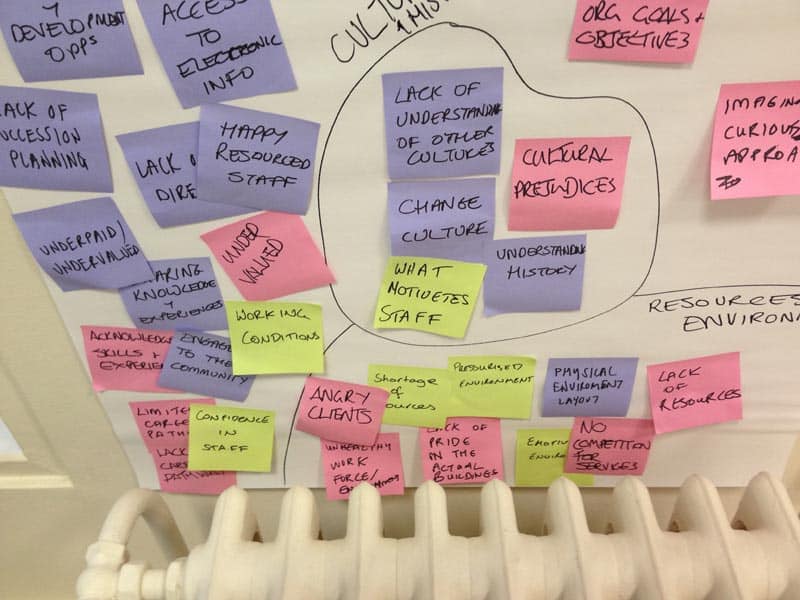
cultural-differences

Here are a few important lessons I picked up along the way, which will come in handy if you find yourself about to embark on cross-cultural usability research.

1. Establish rapport and trust from the beginning

When there’s an obvious cultural difference, it’s even more important to build trust early on. Pay more attention than usual to addressing concerns and questions of each participant at the outset.

2. Avoid stereotypes and assumptions

Assumptions can lead you astray in any usability testing scenario. In cross-cultural testing, it’s even more important to leave assumptions at the door and create a non-judgemental space.

Avoid stereotyping, which is easier to fall into when you’re floundering in new contexts. Suspend any judgements that aren’t specifically related to the research.

3. Be sensitive to cultural differences

Be mindful of cultural taboos, inappropriate topics and the way race, gender and class might affect things.

For example, while Americans wouldn’t bat an eyelid at pointing to someone, a Thai person would find this offensive, instead using their chin to indicate the person. Equally, there might be topics your group isn’t comfortable discussing.

Be sensitive to cultural differences in communication, etiquette, customs and body-language.

Be sensitive to cultural differences in communication, etiquette, customs and body-language.

4. Define the boundaries

You can use a simple exercise to understand what people are happy to talk about. With my Japanese group, I created hand-drawn index cards with the interview topics written on them. We then played a sorting ‘game’ where they put them in two piles, of either ‘private’ or ‘public’ and had the ability to comment on their choices.

Any topics in the ‘private’ pile that I could live without, I discarded. The other ‘private’ ones I was very careful when asking amongst the other topics during the interview. I raised some others gently towards the end, after explaining why I needed to know, and only when I felt I had established a harmonious relationship with the participant.

5. Create cultural bridges

While understanding and acknowledging cultural differences is important, so is finding things you have in common.

I used a whiteboard to take turns playing another simple ‘game’ that acknowledged our different cultural backgrounds. We used this opportunity to figure out what we had in common, creating cultural ‘bridges’ throughout the session which helped establish rapport.

usability-testing

6. Be sensitive to language barriers

If language is an issue, make sure you communicate to participants as simply and clearly as you can.

Use straightforward language. Avoid metaphors, proverbs and colloquialisms, which are likely to confuse non-native English speakers. Be mindful that verbal and non-verbal cues are likely to be different.

Don’t forget to allow extra time. Most people might translate the English into their native language to understand better before responding.

7. Get a second set of eyes and ears

Given the increased potential for misreading signals or behaviour, the need to have a second person scribing notes is even more important than usual. A second perspective might help pick up things you miss.

A cross-cultural element in your usability testing adds an extra layer of complexity. But a little cultural sensitivity and preparation will go a long way to help you get meaningful results.

Do you have experience with cross-cultural usability testing? Share your tips in the comments.

The post 7 ways to prepare for cross-cultural usability testing appeared first on UX Mastery.

from UX Mastery http://uxmastery.com/7-ways-to-prepare-for-cross-cultural-usability-testing/

Design Insights for Virtual Reality UX

Enrich with the Right Senses

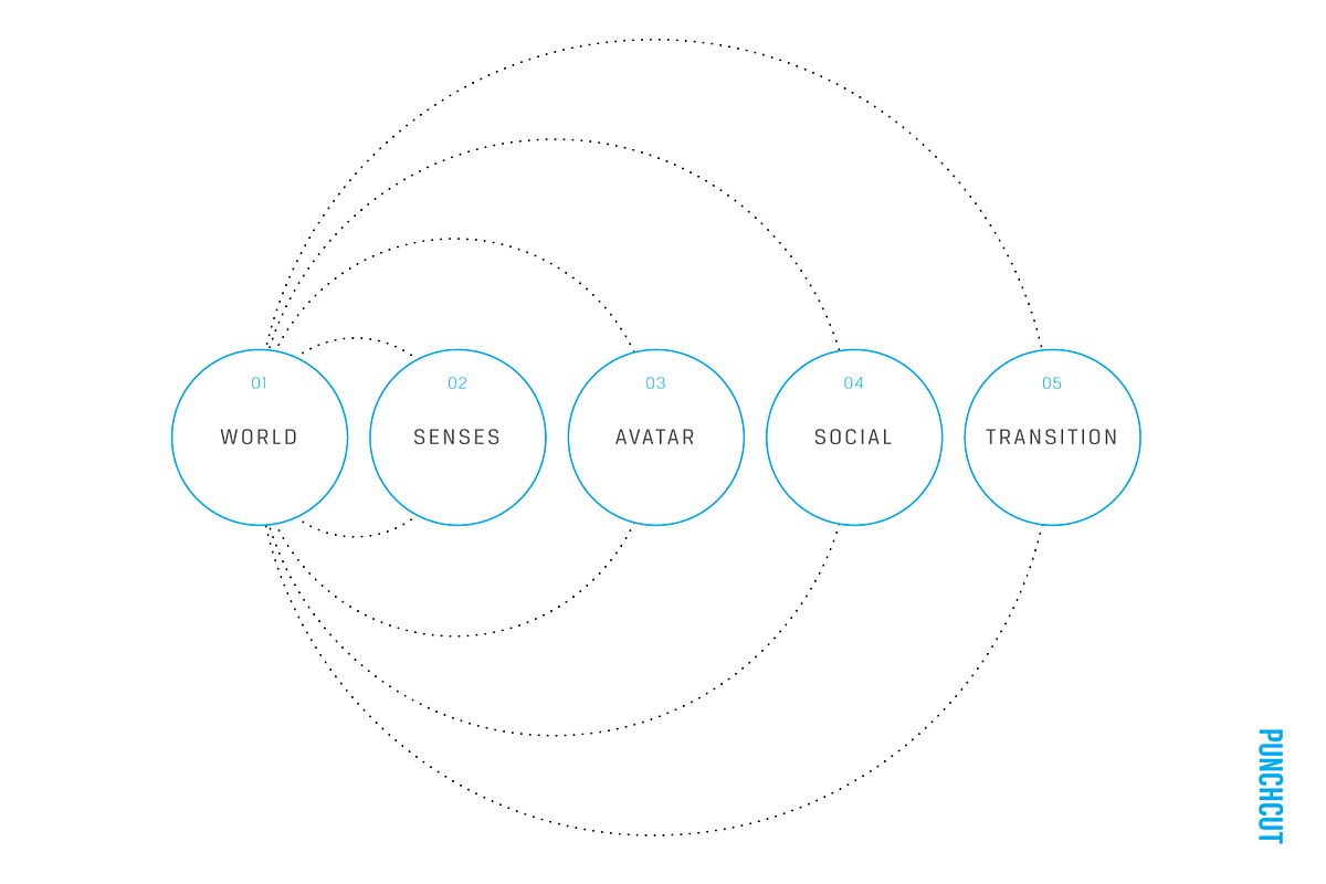
A virtual reality designer is a director orchestrating the senses. When a user has the freedom to look in any direction within a large world with seemingly limitless options, being able to focus the user’s attention towards the next objective or narrative moment is key. Providing this focus imbues the user with a sense of purpose (to explore, to act, to witness, etc), which leads to greater immersion and a more seamless experience.

One challenge with design for virtual reality today is the variety of input options that must be considered when creating a virtual experience. Some hardware solutions rely on sight alone, others allow for hand movement or game controllers, and others take advantage of a free range of motion. Virtual experience designers must consider a “responsive” solution to gracefully downgrade for user’s available sensory inputs and outputs.

In designing responsive experiences, the goal should be to keep a users look movement free and not rely on head movement to navigate or select. If all you have at your disposal is sight and sound, consider voice as a “killer app” for virtual experiences. For varying hardware configurations, the pairing of sight, audio and voice as a minimal requirement would still make for a very compelling experience.

When we think about touch, we need to broaden our thinking to account for in-game tactility, feedback from game controllers, and the incidental feel of the floor under our feet. Haptic feedback serves to orient the user, alerting them of changes in the environment. In addition, consider thermoception (temperature) or mechanoreception (vibration). Game experiences like The Void in Lindon, Utah give users a powerful sense of immersion as they sense sources of heat as they pass, or the vibration under foot as they activate lifts from one level to another. Paired with in-experience visuals, the smell of something burning in the air may lead participants forward if such were a relevant clue in the narrative.

The Void bills itself as a “hyper-reality” experience, blending the real world with the digital.

That said, virtual experiences also need to account for senses we don’t often think about. Consider vestibular senses (balance) and proprioceptive senses (the orientation of body position and movement of limbs). When experiences fail to consider these, the user experience greatly suffers.

As a best practice, orient the experience to the user when beginning a VR experience. They should never put on the headset and realize they’re looking at the wrong field of view and have to move their chair/body position to make the experience “work.” Physical comfort is key. For seated experiences, placement of story points and objectives should be within a comfortable angle to a user’s field of view. This also becomes a useful tool in creating meaningful moments pushing a user to look behind them or to feel lost in a space.

With all of these options available to VR designers as methods for directing users through their experience, the art is really in the combination and composition (even exclusion) of these senses to seamlessly move the user through the experience and evoke the desired response.

In Gallery: Call of the Starseed, the user gets haptic, sound and visual clues to solve puzzles throughout the game. For example, the player hears the repetitive sound of breaking glass before looking around to see items being thrown in the air. Seeing a glass fuse in the air, she realizes she needs to catch it before it breaks. Haptics let her know when she’s caught one.

from uxdesign.cc – User Experience Design — Medium https://uxdesign.cc/design-insights-for-virtual-reality-ux-7ae41a0c5a1a?source=rss—-138adf9c44c—4

Designing for Content-Heavy Websites

Even though minimal website design is the trend right now, it is not always possible to summarize our information into succinct blurbs that fit nicely on the page. Some websites need robust content…

from UsabilityGeek http://usabilitygeek.com/designing-content-heavy-websites/

Inline validation in forms: designing the experience

Designing the default UX

At the end of this research, my conclusion is the following:

Nobody knows what they’re doing, humanity is doomed and our only hope is the colonization of Mars.

Ok, it’s not that bad. But, we still have some serious problems:

  • There is no consensus on the default validation handling
  • Differences between the sites are huge, we can’t expect users to be familiar with any of the presented approaches
  • A lot of solutions are bug ridden, which is a good indicator of how hard it is to implement a good inline validation

Let’s recap the questions stated before the research:

  • When should the field be marked as dirty?
  • When should the errors be shown?
  • When should the field be validated?

If we can find the right answers to these questions, we can assure that the validation UX will be at least good. Validation UX is determined by the timeliness of the reaction, so let’s define the correct timing for each of those cases.

When should the field be marked as dirty?

In the research, you could see both approaches:

  • mark field as dirty as soon as the user focuses the field
  • mark field as dirty after the user entered some data in it

Facebook and JotForm mark the field as dirty immediately after you focus them. In my opinion that feels janky and aggressive. It felt much better when the field was marked as dirty after I had interacted with it. And I’m not counting focusing of the field as an interaction.

Also, when the user clicks the “Submit” button, all fields in the form should be considered dirty, and should be immediately validated.

When should the errors be shown?

This is another question where the research hasn’t given any clear answers. We’ve seen all of the possible combinations:

  • errors that are always shown
  • errors that are only shown when the user is interacting with the field
  • errors that are not shown only when the user is interacting with the field

None of these feel like the best answer, but my vote goes to the errors that are always shown. They do add some visual noise, and might feel redundant, but at least we can avoid the confusion where errors are disappearing on (seemingly) random occasions.

When should the field be validated?

To reiterate, we can validate the field either during the data entry or after the data entry.

In my opinion both of these approaches have timing issues.

Forms that perform the validation during the data entry punish the users as soon as they start entering the data. It is most apparent with the email fields. On the other hand, forms that perform validation after the data entry are not informing the user that they fixed the error soon enough.

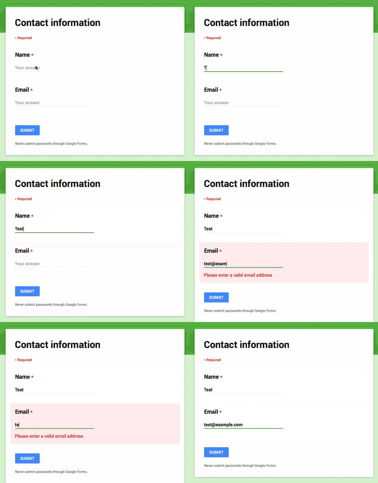
For the default behavior I propose a hybrid — reward early, punish late — approach:

  • If the user is entering the data in the field that was in a valid state, perform the validation after the data entry
  • If the user is entering the data in the field that was in an invalid state, perform the validation during the data entry
Hybrid — reward early, punish late — approach

Combining these two approaches feels like a pretty good compromise. Remember, we are looking for the best default behavior possible, different forms will have different needs, so make sure to adjust the approach as needed.

Notice how this implementation is not suffering from the email confirmation bug present in the Facebook registration form.

The implementation

If you are using ClojureScript, you should try out the Keechma Forms library because it definitely has you covered. That’s what I used to build the example (check out the code).

I don’t know of any other validation libraries that support this kind of customization (if you do, please send me the link to include it here), so I’ll just write down how to implement it:

  • The validation library must keep track of the dirty fields.
  • If the field was in a valid state, perform the validation on the blur event
  • If the field was in an invalid state, perform the validation when the field value is changed (using the combination of onchange, onblur and onkeypress events)
  • When the field goes from the invalid to valid state, treat it like a valid field

You should also make sure that the validation functions can check the current data of the whole form. For instance, email confirmation validation should be able to check what’s the current value of both the email and email confirmation fields. This way you can avoid bugs like in the Facebook registration form.

In my opinion (and implementation) the validation should not be defined on the input components. Validations should be always performed on the data, never on the fields itself.

Conclusion

I thought that the live validation is a solved problem, but after doing this analysis, it seems that every team has a different approach. I’m also pretty sure that most of these sites (they are some of the biggest sites in the world, after all) are doing extensive A/B testing on their forms, which left me pretty confused about the best approach.

In the end I’m pretty satisfied with the defaults, and I hope you found this article useful. Please let me know if you have any feedback, I’m very interested in your thoughts about this topic.

from Sidebar http://sidebar.io/out?url=https%3A%2F%2Fmedium.com%2Fwdstack%2Finline-validation-in-forms-designing-the-experience-123fb34088ce%23.r7k4cj34h

VSCO 5.0 launches

Description

Create, discover, and connect on VSCO®.

Create
Shoot and edit your images with our superior mobile presets and advanced camera controls.
Publish images and journals, or curate others to your VSCO profile.

Discover
Explore content from the people you follow, curated work from the community, and exclusive editorial content from VSCO Originals.

Connect
Join the VSCO community. Find and follow friends and people from around the world.

What’s New in Version 5.0

This version includes the following updates:
– New in app navigation – featuring gesture-based UI that allows for quick navigation between your personal space and a feed with updates from the people you follow and VSCO Original content
– Redesigned personal space – create, edit and publish images and journal posts to your profile
– Improved image capture and search
– Improved app speed and functionality
– Take a selfie with the front facing camera and find a surprise 🙂

If you encounter any issues or require further assistance, please contact support at support@vsco.co

from Designer News Feed https://www.designernews.co/click/stories/70363

6 UX Design Trends To Follow In 2016

Last year, we have experienced a great revolution in the domain of UX design. As we had stated back then, the most significant trends in UX design are here to stay and are assumed to be followed this…

from UsabilityGeek http://usabilitygeek.com/ux-design-trends-follow-2016/

The Best UX Articles of May 2016

It’s that time again, where we take a look back at the best UX articles of the previous month: May, you’re up! These are a collection of the most popular articles from our social media community as well as some of our personal favorites. Any others we missed? Let us know in the comments below or tweet us @usabilla

How to run better UX and co-design workshops

UX codesign workshops - Usabilla

This post pretty much does what it says on the tin! It gives step-by-step, actionable advice for running workshops on UX and co-design. It covers everything from room setup to research. If you’re thinking of running (or attending) a workshop anytime soon, it’s worth a read.

UI vs. UX: What’s the difference between user interface and user experience?

Facebook Product Design - Usabilla

Another article trying to tackle the years-old debate about the difference between UI and UX. It gives clear and concise descriptions as well as some examples to put things in context. A must-read if you’re still confused about the distinction (or great to send to someone else who is).

UX: Infinite Scrolling vs. Pagination

Infinite Scroll vs Pagination - Usabilla

Choosing between infinite scroll and pagination is often a tough call for UX and web designers; this post looks at the argument for and against each one. What’s your preference?

An Open Letter to Product Managers: From a UX Designer

how-ux-designers-want-to-work-with-product-managers

An honest and frank account of one UX designer’s experience and what he hopes for the ongoing and future collaboration between product managers and UX designers. An interesting and insightful read for members of either profession.

An Introduction To Heuristic Evaluation

heuristic evaluation - Usabilla

A thorough, detailed look at the process of Heuristic evaluation and how you can go about implementing the basics in your own process. It looks at Jakob Nielsen’s “10 Usability Heuristics For User Interface Design” in detail and gives a fantastic overview of each concept.

The UX of Learning UX is Broken

UX of UX learning is broken

What happens when the process of learning UX undermines the very principles of the discipline itself? It’s a pretty interesting concept and it’s the one this post explores by looking at what’s currently wrong with how UX is taught and what could be done to improve it.

How to drive UX with interactive storytelling

Interactive storytelling - Usabilla

Storytelling remains a huge trend in UX design, as users continue to expect more than mere functionality with every digital interaction. This post takes a look at some particularly good examples of interactive storytelling and the different ways it can be incorporated into the design of your website. Have you seen any other noteworthy examples?

That concludes our round up of the best UX articles of May 2016; which was your favorite? Let us know in the comments or tweet us @usabilla 🙂


UX Fundamentals: The Concepts, Process and Proving the Value

The post The Best UX Articles of May 2016 appeared first on Usabilla Blog.

from Usabilla Blog http://blog.usabilla.com/best-ux-articles-may-2016/

Icon Font Generator

Speedy Gonzales!

Include only the icons you need, reducing loading times, by combining all your icons into a single font file.

Take control

Quickly change how icons look using good old, reliable CSS. Rescale, recolor, add a drop shadow to or animate them.

Only the best

We’ve collected the best icons on the web, with more than 9,000 icons ready to instantly use in your projects.

Fun and fast

Wary of changing old tactics? With Fontastic, creating an icon font couldn’t be simpler, or quicker. Time to leave PNGs in the dirt.

from Designer News Feed https://www.designernews.co/click/stories/70146