The UX Fund: Investing $50,000 in 10 companies, 10 years later

The 10 year anniversary of the inception of the UX Fund was this month. I took some time and began to look back in a little more detail. A lot has happened in the last decade in the design industry.

It was FASCINATING for me to look back at this. I told a friend as I was writing it: “Holy shit, this was a golden year for design. Apple’s iPhone, Google Maps, Docs, Gmail… streaming fucking Netflix… they all came out then!!!”

These are still some of the most influential and successful products and services of our generation.

The highlights of the holdings below show where these companies were that year, how we felt about them at the time, and how that investment would have played out had we really played the long game and kept the fund for a decade.

1) Netflix

In 2006, Netflix was still heavily focused on the DVD business. They found themselves in a price war with Blockbuster. It appeared as if they’d chosen to position themselves as a commodity and just lower their prices. It translated to a pretty poor year for them in the markets. In my look back I found something we glanced over that turned out to be a watershed moment for the company. In January of 2007, Netflix announced that they’d be offering a streaming service to subscribers. We barely mentioned this in our recap. At 1,000 films, the streaming launch library was small, and it meant you didn’t have the movie locally. in 2007, having a local, offline digital copy of movies was more of the norm. This just seemed like a half-assed response to Apple and Amazon — two companies that had made much bigger strides in downloadable movies and the markets felt the same.

Another interesting highlight was the Netflix Prize. They offered a $1,000,000 prize to the first developer of a recommendation algorithm that could beat its existing algorithm.

So in 2006/07, Netflix seemed paralyzed. It felt as if they didn’t have much of a response to downloadable movies—but that clearly wasn’t the case. They were taking it seriously, it was just really difficult to see. So much so for us that when we wrote the wrap-up post, we stated that Netflix was one of the stocks we said we would have sold if we allowed ourselves to rebalance the portfolio. While that may have made sense over a one year hold, this would have been the biggest regret of the bunch over a decade. That $5,000 investment in 2006 would now be worth over $150,000.

NFLX Profit (Loss)
Original Investment: $5,000
1 Year: -4.8% | ($239)
10 Year: 3064.7% | $152,365

2) RIM (Blackberry)

This is the inverse of the Netflix story. Blackberry, or RIM as it was referred to at the time, was our big winner in ’06-’07. It more than doubled in value over that year. A decade later, it’s lost nearly all of its value.

In the early-to-mid-2000s, RIM dominated the corporate world. That year, they had started to release a few consumer focused handsets like the Blackberry Pearl. The Pearl had a unique modified QWERTY keyboard layout on a 4-row, 5-column keypad, with a proprietary predictive input algorithm called SureType. I switched to it from my Palm Treo and tried convincing myself it was good for a few months (it wasn’t). Thankfully, the iPhone came out (more on that later).

Also that year, RIM announced they’d be bringing their product to China and were coming to the market with a solution aimed at small to medium sized businesses. Despite Apple’s news of the iPhone, RIM continued to be a market leader in their category. The next decade would prove just how important the consumer market would be — and RIM just chose never to focus there.

BBRY Profit (Loss)
Original Investment: $5,000
1 Year: 208% | $10,387
10 Year: -93.9% | -$4,697

3) Jet Blue

This was our biggest one year loss. This may seem like a strange stock for the portfolio, but if you were traveling back then, this company was ahead of the times.

We were doing some product design work for various airlines at the time. As a result, we became pretty familiar with the state of the industry. Jet Blue had rethought the so much of the experience of air travel, including their website, which was best in class. That said, their performance that year was atrocious thanks to things like Valentine’s Day 2007. Over a period of 2 days they canceled nearly 250 flights. Some of these flights were on the runway for nearly 8 hours. The weather was a factor, but it wasn’t the real problem. JetBlue got by in the past with sub-standard communication systems, limited staff and experience. When a crisis of this magnitude arose they just didn’t have the systems, people or experience to properly deal with it — and though they’re actually up 39% in the long run, they definitely paid the price over that year.

JBLU Profit (Loss)
Original Investment: $5,000
1 Year: -29.4% | ($1,476)
10 Year: 39.1% | $1,964

4) Google

Perhaps an obvious choice in retrospect, but Google wasn’t top of mind when you thought about companies that valued design—they valued engineering. However, when you point great engineers at huge, real problems what comes out the other end are some great experiences—even if the design of the pixels wasn’t perfect.

That year, Google introduced new search features, a new homepage, and continued to develop out more applications launching them in their Labs section. Labs created some of the best Web applications of the time, including Gmail, which was fully available to the public in 2007. Google Maps which launch in 2006 and Google Docs. A decade later, these applications are still staples in many people’s lives.

Google also made their share of purchases that year, including DoubleClick, Feedburner and of course, YouTube.

GOOG Profit (Loss)
Original Investment: $5,000
1 Year: 47% | $2,248
10 Year: 228.3% | $10,912

5) Apple

The poster child of a company that values design. An easy pick. The only interesting story here, aside from how well this stock did (and has done since), is the fact that the iPhone came out during this time. I’m going to quote my wrap-up of owning Apple stock from Nov. ’06 — Nov ’07:

Perhaps this stock was an obvious choice. Apple has always been at the forefront of creating great experiences that bridge hardware and software. During our hold, Apple released new iPods, iMacs and the iPhone. They redesigned their Web site as well as their dotmac services. Recently, they launched a new OS (Leopard). Leopard launched late due to Apple pulling QA resources onto the iPhone. Early usage of Leopard has revealed quite a few bugs and oddities that need to be rectified, likely as a result of the on-again, off-again QA of it. Apple will need to be careful in the coming year not to neglect it’s core offering — the OS. — Me, in 2007.

Reading this made me remember that we didn’t really know just how transformational the iPhone would be. I only mention its release after iPods and iMacs, and I talk about Leopard bugs being a result of Apple putting all hands on deck for iPhone.

AAPL Profit (Loss)
Original Investment: $5,000
1 Year: 131.8% | $6,608
10 Year: 882.9% | $44,263

from Sidebar http://sidebar.io/out?url=https%3A%2F%2Fmedium.com%2Fhabit-of-introspection%2Fthe-ux-fund-investing-50-000-in-10-companies-10-years-later-6fc65bd35e7a%23.yskd8ctao

Why a Chatbot was the hardest thing I’ve ever designed, Part 1

I’ve been reading about chatbots since the beginning of the year and have been building for the past several months. In that time I’ve built, or helped build, 5 bots and have connected with other teams building around the world to trade insights.

I’ve also been blessed to be surrounded by the world class talent that builds for R/GA, along with the incredible minds at Google. There’s no doubt the group of creators I’m surrounded with every day has helped immensely.

But no matter how many smart people I talk to or how much reading I do, there’s nothing that can supplement building, testing, failing, and iterating until the problem is solved.

I hope this series will help accelerate your process, but at the end of the day I really hope it helps you get to building. And if you have questions, please feel free to reach out!

The Power of Chatbots

The incredible potential of chatbots lies in the ability to individually and contextually communicate one-to-many.

That’s a loaded sentence. What does it mean? Let’s break it down.

One-to-Many Communication

There are plenty of tools out there that allow us to communicate one-to-many at this point in history. These tools, including everything from basic mailers to email marketing to social media platforms, make it easy to reach a large audience and target groups all at the same. But, for the most part, these tools do not allow us to communicate with people on an individual level.

Many of these tools have become ubiquitous to the point that they’ve become white noise in our life. They’re embedded with what most people will tell you are ‘spammy’ marketing messages. They don’t often bring meaningful value anymore and usually frustrate people more than anything. We don’t really interact with these messages, we generally trash them.

One-to-many communication tools are still an option, but they’re becoming obsolete more and more every day.

Individual Communication

Reaching mass amounts of people at the individual level is something that hasn’t been around for very long. The most popular way to do so right now is through cookies or programmatic advertising but, ultimately, reaching the individual in a meaningful way takes a lot of work and analytic knowhow if you want to do it right.

The benefit of individual communication tools is that the value of the message is much greater. The message people receive isn’t a blanket message put to blast out to millions of people, regardless of who they are. The message is more specific and, while it may still end up reaching millions, it feels much more like the message was made for the recipient.

The downfall of these tools is that they typically come in the form of a banner ad or email that was sent based on a site the user had visited or an item the user had recently viewed/purchased. This sounds great to a business, but it sounds (and feels) creepy to the person receiving the message.

Contextual Communication

We do this every day when we talk to someone. It’s unconscious behavior for most people.

When someone asks you “Should I bring a jacket?” you don’t ask them what day they were thinking about bringing a jacket, you just know that they’re asking if they should bring a jacket right now. You unconsciously (or maybe consciously, by checking your weather app) recognize the weather and give your best response based on the conversation you’re having and your current environment.

I believe contextual communication (a form of dynamic intelligence) is what will make chatbots the revolutionary technology everyone is promising.

What contextual communication will allow us to do is create messaging and interactions similar to what people experience through individual communication channels like programmatic advertising. However, instead of a message blast sent based on analytics, the communication will occur in the context of a conversation. By doing this in the context of a conversation, it doesn’t feel so weird and creepy to get such a specific message.

Right now contextually communicating with bots isn’t something that’s reasonable to ask across the board but there are a few that are doing it well, and I believe this type of interaction will be the standard in the future.

Why Chatbots are Disrupting UX

Aside from the reasoning we just walked through, there’s also the fact that humans are innately wired to have conversations. It’s part of our daily lives, and we rely on our devices to help us communicate every day.

We’ve been selling goods, learning new skills, and building relationships through conversation for millenniums. Messaging apps just happen to be the newest and most popular way to do it right now.

Statistics from Buffer and Business Insider

It’s only natural that we begin to see businesses build where their users are active — messaging platforms — instead of trying to create and onboard users to new ecosystems they’ve created. Not only is it easier and more cost effective, it’s also a more natural form of communication.

What this means for you

It’s easier to continue a conversation than it is to start a new one. It’s time to stop wasting money trying to pull people into your ecosystem and instead push your content where your users are already active.

“Over 2.5 billion people have at least one messaging app installed. Within a couple of years that will reach 3.6 billion, about half of humanity.” — The Economist

Use messaging apps to build relationships with your audience in a way that feels organic and natural.

Next in this Series

While chatbots are still in their infancy in terms of creative potential, it’s still a very exciting time for creatives trying to understand the best way to use this new technology and how to build the best bot possible.

This first article was a quick read, written to prime you on the current state of chatbots. But moving forward we’ll be getting into the meat of building great chatbots.

Each article in this series will be able to stand on it’s own, but together the series will represent a comprehensive dive into the technology and set you up for success as we move forward in the space!

The upcoming articles in this series will cover:

Part 2: Signifiers and Affordances within Chatbots

Although the elements are fairly standardized, there are a variety of platforms and each has it’s own unique set of capabilities. But where should you start and what should you be aware of?

This article will help you understand the technology at it’s fundamental core so you can easily decide between the available tools based on what you need to get done.

Part 3: How, when and why to personify your bot

A conversation is highly emotional and if we don’t meet the needs of our users we’ll never keep them coming back, no matter how effective our product is.

This one will help you learn about the conversational issues involved with personifying your bot and help you decide how to visually personify your bot to match.

Part 4: Writing for a chatbot

Writing is something we’ve all been doing since kindergarten. But writing for a chatbot is so much different than what they’ve taught you in school.

This article will teach you best practices when it comes to writing for your chatbot.

Part 5: What tools you can use to start building today

There are a variety of tools out there that will allow you to start building a bot today with very little effort, but how do you choose which one is best for you and your needs?

We’ll talk about the best products on the market and what each of them is good for.

In the Book

If you like what you’re reading but want more bot knowledge that will put you far ahead of everyone else, I’m also writing an eBook that will cover everything from this series in greater depth, plus take a deep dive into:

1. Psycholinguistics (the Psychology of Language) and how to guide a conversation

Writing for your chatbot is difficult enough, but what do you need to know to prepare for this new age of anticipatory design? How do you put bumpers on an experience that is invisible until it’s not?

We’ll dive into how to design a conversation that allows freedom for your users while still guiding them where you want them to be

2. How to structure, set up, and analyze bot analytics

Analytics for bots is like nothing you’ve ever seen before. We’ll dive into best practices of structuring these analytic triggers and how to interpret the feedback that is received.

3. How I believe the technology will evolve in the future and how you can put yourself ahead of the curve

Conversational interfaces are the future. There’s no doubt about that. But how will they manifest themselves once we have billions of data points and our understanding of language advances to extraordinary levels?

We’ll take a dive into the future of conversational interfaces and how you can prepare for what’s going to come.

If you like what I’ve written so far, you should consider signing up for the email waitlist — The book will be even better, I promise. And if you liked this article, please❤️ it so other people stumble upon it as well!!

from uxdesign.cc – User Experience Design – Medium https://uxdesign.cc/why-a-chatbot-was-the-hardest-thing-ive-ever-designed-part-1-7b3af745a4e5?source=rss—-138adf9c44c—4

Your product is already obsolete


Part One

The relentless march of technological improvement means that by their very nature technology businesses fail.

That’s why as founders, product people, marketer – or whatever our role is – we need to be acutely aware of all the different technological shifts happening in the industry and consistently ask ourselves if and how these things actually affect us? This is not just some dry strategic exercise. If you don’t do it your business could die an awful lot quicker than you expect.

des-video
I delivered a version of this post as a talk on the 2016 Inside Intercom world tour. Watch part one above, and check back soon for part two.

It is the nature of our industry, it is the nature of technology, that every product dies. That’s a very morbid thought, but if you don’t believe me on that, page me, or fax me, or write me up something on your typewriter. They were all epic businesses once upon a time, but they are no more.

Death is on my mind for a lot of reasons. It is the nature of every technology to die. It is the nature, therefore, of a lot of technology businesses to die, which leaves you with an eternal question – how can we stay alive?

I wasn’t always so morbid. When myself and my cofounders Eoghan, David and Ciaran signed Intercom’s incorporation papers in San Francisco in 2011, we were pretty optimistic back then. Intercom has been something of a roller coaster. But a very good roller coaster – real Six Flags stuff.

birth

Above is a graph of one of our metrics – homepage traffic. There’s been a few different phases at Intercom, and the ones I can roughly identify are the phase when the product is being born, the phase where we had to then go and grow the product, and lastly the phase where we have to survive. The latter is where we’re thinking: “Okay, we’ve made something. How do we stay relevant in technological cycle after cycle after cycle?”

Put another way, we have to make it work, we have to make it grow, and then we have to keep it relevant. We have to give folks a reason why they should continue to use Intercom. Today we have more than 15,000 customers, tens of millions of dollars in revenue, and $116 million raised. All of these things should be cause for celebration, but the reality is we’ve never felt more vulnerable. We spent so long hoping something could come along and exist, that when it began to exist we were like, “Holy shit, what if it goes away?”

I get that sense in part because I’ve put a seventh of my life into Intercom (which makes me 35, I’ll save you the math). That’s a significant chunk of time to work on anything, and of course the idea that it might one day no longer be around is terrifying.

The weird things is, this isn’t what we were sold – when we read all the books about startups, and heard how it’s supposed to work. I was always thought the deal with startups was like The Shawshank Redemption. You crawl through 100 yards of shit, and you ’re free. But what it actually is more like is you crawl through 100 yards of shit, and then your options are, much like Andy Dufresne said, “Get busy living or get busy dying.” How do you stay relevant? How do you stay alive?


Why only the paranoid survive

When you look at all the literature, all the advice, all the blog posts, the articles, the podcasts, the conference talks, it’s all about creating and starting. Because everyone wants to do that, that’s what people write about. At Intercom we’ve added our own content and talks to that along the way. But in reality none of this matters if you’re ignoring existential threats. If there’s some reason, some ticking bomb or a train coming down the tracks, and you don’t care because you’re too busy navel-gazing, you’re going to be in trouble. On that note, I really like this quote from Andy Grove, when he says, “Any degree of success will breed complacency. Any degree of complacency will breed failure. Therefore only the paranoid survive.”

I recently shared these thoughts with a friend who is also a startup founder. The conversation went something like this:

Friend: “Well the thing you have to realize is that the present is the past.”
Me: “I don’t do drugs, so you know …”
Friend: “No no no, listen to me, listen to me. Your product’s already obsolete.”
Me: “What do you mean by that? People like it.”
Friend: “Well, the thing is, people like what’s out there today, but what’s out there today is actually already history. It’s been documented, there are “changes” pages updated, but it’s live, it’s now a part of history. The thing you should be worrying about is that there’s probably going to be a newer, faster, quicker way for your customers to achieve what they want to do in this world, and that it doesn’t involve you.”
Me: “Ooh, that kind of stung.”

The way he described it to me, it’ll feel like you’re on solid ground and everything’s going great. You’ll feel a couple of trembles here, and a competitor there, and a couple of different shifts. But you’ll be saying, “We got this, we got this, we’re good at product.” At some point you realize something’s actually changing, so you start trying to react. But by the time you actually realize it you’re too late. The ground has been torn out from under you, and the worst part is you don’t feel it. It’s purely asymptomatic. If you don’t believe that it can happen, even when times are good, let me put it to you this way: Wasn’t 2007 a great year to be a satnav manufacturer?

graph1

Things could not have been better. We were all buying them and putting them in our cars, and they were shit devices, but we didn’t care. Then, somewhere in the Moscone Center in San Francisco, someone waves a new thing around, and poof…business no more.

graph2

Both Garmin and Tom Tom have not restored their former value since the introduction of the iPhone – at best they’re a sixth of their peak. It’s a fun version of history to presume they were all literally asleep at the cash register, totally ignoring all these new threats. The reality is I’m sure they watched the keynote and panicked. I’m sure they ran straight to their whiteboards. They probably pulled the product team in on weekends. I’m sure they fired up JIRA, and when it loaded up they’ said, “All right, let’s go and start writing some tickets.” But customers don’t wait around while you’re writing up JIRA tickets. The world will move on, with or without you.

Another simple example: In the graph below, the light-green line represents a product called SMS. Aside from exorbitant roaming charges, SMS was a phenomenal technology. SMS is the only way telcos make money. It’s like liquid profit.

graph3

Then 30 engineers got together and built a different thing called WhatsApp. Within the space of two years they’d basically obliterated the majority of the growth in the most profitable part of telcos. Now, it’s important to say I am talking about growth here, because businesses can’t survive on stagnation. They need to grow, because ultimately, on a long enough time frame, all their customers will die, so you do need new customers. You can’t flatline as a business. Flatline actually means you’re going down.

graph4

The way this plays out typically is a new threat emerges and the incumbent typically says, “Oh yawn, someone started a product, who cares?” Eventually WhatsApp puts out a press release saying, “We’ve just got our 100,000th user,” and the telcos are like, “Hahaha, 100,000 users, what a joke.”

Then at some point WhatsApp puts out a press release saying, “We have our 100 millionth user,” and the telcos think, “Oh.” Then by the time they decide to fight it is literally already a done deal, and there’s no turning back. If that framing sounds familiar to you, it’s because it’s the words of Gandhi, who’s obviously got a lot of great quotes and isn’t necessarily a product manager. One of the points he made was this idea that, “At first you’ll ignore them. Then you’ll laugh at them. Then you’ll fight them, and then they will win.” That tends to be people’s attitudes towards new products.


Know your place in the technology constellation

If you want to see the best example of what it means to first laugh at something, a new threat, I really like Steve Ballmer’s reaction to the iPhone.

If all that the mobile revolution, the new Android and iOS things, did was kill Windows Phone, that’d be fine. Windows Phone wasn’t a huge thing for Microsoft, it was a part of their Windows Everywhere strategy. But mobile didn’t actually kill Windows Phone. It attacked the whole entire desktop concept, which scares the hell out of Microsoft because that was their core.

It wasn’t obvious that a phone could be really, really bad news for a desktop operating system, but it turned out to be. The realization here is best summed up for me by this quote from Steve Sinofsky, who is ex-Microsoft and is now at Andreessen Horowitz: “No technology is the center of a system, but rather a constellation of bodies under the influence of each other.”

“No technology is the center of a system, but rather a constellation of bodies under the influence of each other.”
STEVE SINOFSKY

He makes the point that all these technologies just intertwine with each other. It’s not clear that a phone was going to destroy a satellite navigation company. It’s not clear that messaging software would destroy a telecoms company. It’s not clear that a phone would disrupt desktop. But what happens in technology are these tectonic shifts, literally the plates slide from under you, and if you’re not aware of all of them and how they interact, you’re in big trouble.

To go back to Intercom for a second, we didn’t come this far to only come this far. How do we actually keep going? How do we make sure that we don’t get caught up in one wave and then finish up?

Technology will continue to spit out innovation after innovation after innovation. The question you have to consistently train everyone to ask: does this new technology that’s happening or that’s being released make it in any way cheaper, faster or easier for our customers to make progress in their lives? That’s the repetitive question you have to ask, whether you see Bluetooth or WiFi or cloud or mobile or touch or voice or audio or messaging or bots. You name it. Because if it does make it cheaper, faster or easier for customers to make progress, they’ll go there, and you’ll be busy writing up JIRA tickets.


Needs don’t change, even when technology does

Connected with this is that the things we need to do in our lives rarely actually change. But the ways we can do them will always change. There are very few new behaviors in life. To give you some random examples, for as long as there have been kids in schools there have been kids passing notes to each other. Protocol with notes is that you make sure no one else can see it, you rip it up or you eat if the teacher catches it, but you just get rid of the thing. The idea that this was a disposable message that can be passed between two people for their eyes only, has gone on today, and we know it best as SnapChat. One of its core purposes is that exact job.

Those of you who are closer to my age probably had a box that you put photos in under your bed. These photos, curiously, are not on a shelf for everyone to see. They’re specifically for you, and you only want them at certain times. Today we use technologies like iPhoto or Dropbox’s Carousel, when it was around, to do this exact same job. The need has not changed, but the tool has.

If you’re renovating a house, in the old days you’d have a scrapbook with all the stuff you can’t afford. Today you do it with Houzz, or Pinterest. The need doesn’t change. The ways you can do it always change.

ooda

The way  to stay relevant is  to pay attention to what is called the OODA loop. Can you Observe, can you Orient, can you Decide, and can you Act? If your OODA loop is fast enough that you can keep up with the industry, you will always be in a great position. However if you are slower than the industry then you’ll be in trouble.

If you’re faster, every time the industry spits out something new – cloud, for instance – you can release something that works with cloud. You can release many iterations, and you can consistently evolve and build new stuff. The very second mobile comes out, you can build mobile straight away, because you can move as fast as the industry, or faster. That’s really, really important.

But the very second this arrow changes direction, and you find yourself moving slower than the industry, it’s game over. They’re spitting out technology after technology after technology, and your team is still talking in years and Q4 2018 and stuff like that. As the technology changes, you then find yourself being the company who in 2016 says, “We’re now available online.”

What that looks like is what Marshall McLuhan described as walking backwards into the future. You are moving into the future whether you like it or not, but your vision hasn’t changed. You’re still trying to force old-world ideas into a new world. That’s why it constantly comes back to this question: every time something changes, can we be cheaper, faster, or easier?


Coming soon – Part Two

Join over 40,000 subscribers and get
the best content on product management, marketing and customer support.

The post Your product is already obsolete appeared first on Inside Intercom.

from The Intercom Blog https://blog.intercom.com/your-product-is-already-obsolete/

Making Time for Side Projects: A Daily Habit

With so many other commitments to deal with, it can be hard to find time to work on side projects. In this article, I discuss the need for carving out a chunk of time to get work done – each and every day.

When I read Brian’s Be Kind story, I immediately subscribed to his Monday Mailer newsletter. A while later I asked him if he’d be interested in writing something for Pony Foo, which he kindly agreed to. In this article, he writes about side projects. How to do more — when you already do so much?

Enjoy!

Side projects are a great way to grow as a developer, both personally and professionally. They let get out of your comfort zone, learn new skills, and exercise your creative muscles. But it can be hard to get anything done while juggling a day job, kids, friends, family, and countless other commitments. In the past, I’ve tried to cram side project work into the cracks between other items in my calendar. It was frustrating at best; completely ineffective at worst. I constantly felt like I was shortchanging the projects I was most passionate about.

Over the last two months, I’ve taken a different approach. I’ve been cultivating a daily side project habit. Each and every morning, I do something to push my side projects forward – even if I only have 15 minutes to spare. I’ve seen great results, so far. And I’ve learned that a small, focused task, done daily, beats a sporadic effort every time.

1. It’s easier to get started

It’s hard to gather the energy to start a new project – and even harder to re-start one after an extended absence. Working just a little bit, every day, means you never lose momentum. It’s easy to pick up where you left off because everything is still fresh in your mind.

2. The pressure is off

If you work on just one task a week, it’s easy to feel like it has to be perfect no matter what. I’ve fallen into that trap with my weekly newsletter, the Monday Mailer. If I wait until the weekend to start writing, I spend the first hour freaking out. But when I work at a steady pace, writing something every day, it’s a lot easier.

Once you have a daily side project habit, the pressure’s off. If you have a bad day – and you will – it’s okay. There’s always tomorrow. I’ve become more relaxed which, unsurprisingly, has improved the quality of my work overall.

3. You stop relying on motivation & inspiration

You don’t need to get ramped up; everything is still fresh in your mind from the day before. You don’t need to remind yourself where you left off, or what you need to do next. It biases you toward taking action, making it possible to be productive even when you’re short on time.

You see yourself making progress each day, making it easier to have the confidence to do the work the next day. It cuts down on procrastination and self-doubt. You get over the idea that doing a good job requires waiting for a magical moment of inspiration to strike.

It’s up to you

Of course, a daily side project habit won’t change anything if you spend that time scrolling through your Twitter feed. Don’t sabotage yourself. It’s up to you to carve out the time your side project deserves. Find a quiet room, silence your phone, close Facebook, and get down to work.

After a few days, you’ll be surprised how much you can accomplish.

from Pony Foo https://ponyfoo.com/articles/making-time-for-side-projects

IKEA/Economist Group (EIU) study focuses on the new ‘American Dream’ today

ikea_program_head_1600x400

Press release – September 21, 2016

Discovering the New American Dream, an Economist Intelligence Unit (EIU) report sponsored by IKEA US shows that the American Dream, which was once outlined by owning a home with a ‘white picket fence,’ having a comfortable amount of money, and ‘keeping up with the Joneses,’ is now transitioning into ‘living life on one’s own terms.’ The new dream is defined by quality of life experiences; 57% of Americans say the dream is more about quality of life, as opposed to 20% citing material possessions. More than half (57%) cited spending time with family and friends as the way they are currently living the American Dream.

The EIU report also shows that Americans continue to believe in the value of hard work to achieve success, but the measurement of this success is now based on one’s personal goals, not necessarily those set by society.

  • 65% believe ‘the American Dream’ is more personal today, less about society’s goals
  • 76% believe the expression of the American Dream is as diverse as the people in America
  • 72% of Americans believe they are in some way living the American dream today, while 76% think the dream is a journey and not an end goal

Alex, a 28-year-old woman who lives on a farm co-op in Madison, Wisconsin, embodies this new view of living on one’s own. “Having the freedom to do what I want, take on projects that I want, and to make a difference is really important to me. I can’t be happy in a job that doesn’t allow me to do these things—regardless of the pay check. I live in a co-op because I need that human connection and sense of collaboration,” Alex said. “My favorite parts of any day are spontaneous adventures with the people I love.”

It’s not just what defines the American Dream that is marking this transformation, but rather what people are striving for overall. With regard to the pervasive challenges to success, the EIU study cites:

  • The recession of 2008 changed people’s expectations of the ‘American Dream’ according to seven in ten Americans. This is felt more strongly in the middle income bracket ($50,000–$75,000), where 74% believe this, compared with 63% of those in the lowest income bracket and 70% of those in the highest.
  • The majority of Americans also agree that “the cost of living today makes it harder to see how one can achieve the American Dream” (78%) and that “college is no longer a guarantee to living the American Dream” (72%).
  • Some Americans have fears about “being able to retire comfortably” with fewer than half (42%) believing it’s possible. Those in the lowest income bracket see it as even less achievable (32%).

“It’s confirming to know that the new American Dream is about ‘living life on your own terms,’ because we have always embraced this mindset. We believe all homes are created equal, and we are committed to the many people by producing well-designed, quality, functional and affordable home furnishings that accommodate their diverse lifestyles and wallets. Everyone deserves a home that they love, that is sustainable, looks good and works well – and where they can live happily with family and friends. We understand cost of living hikes and that college tuition is sky high, but no matter what the dream, we want to help our customers achieve it,” stated Lars Petersson, IKEA US president.

“The American Dream can seem very diverse, and today the dream and definitions of success takes many forms, but at the core there is a similarity: to be happy. The means of acquiring the American Dream is the biggest change. For example, more than 70% no longer see college as a guarantee to the American Dream, so we see people are developing new workarounds and goals,” commented Rebecca Lipman, editor of the Discovering the New American Dream EIU report.

On the upside, 77% believe technology has opened new doors for people to achieve their American Dream. A little over half (53%) believe the sharing economy will open up more opportunities for Americans to reach financial prosperity.

These foundational elements of the America Dream today are shared to varying degrees across income levels, generations, political affiliations, and genders. Looking ahead, a majority (62%) of Americans believe being treated equally regardless of one’s background and the freedom to live as they choose will define the American dream for future generations. As time has passed, generations have shaped the American Dream based on the current state of the country, but at its core, it has remained steadfast in the right to ‘life, liberty and the pursuit of happiness.’ What defines happiness is what has truly changed.

This report captures the perspectives of Americans of all different backgrounds to explain what the age-old term, American Dream, means to today’s society and how it will continue to evolve. It is based on a survey of 2,050 individuals from all regions of the country of varying ages, ethnicities and incomes, providing a balanced representation of the U.S. as a whole.

> A New York Times article published on October 30 describes how IKEA US implemented these insights in offerings, positioning and advertising.

The post IKEA/Economist Group (EIU) study focuses on the new ‘American Dream’ today appeared first on Putting people first.

from Putting people first http://blog.experientia.com/ikeaeconomist-group-eiu-study-focuses-on-the-new-american-dream-today/

AI Writes Intense Sci-Fi Movie Script

http://arstechnica.com/the-multiverse/2016/06/an-ai-wrote-this-movie-and-its-strangely-moving/

from WebdesignerNews http://arstechnica.com/the-multiverse/2016/06/an-ai-wrote-this-movie-and-its-strangely-moving/

The ultimate guide to chatbots

The incredible potential of chatbots lies in the ability to individually and contextually communicate one-to-many.

Let’s break that down.

One-to-many communication: There are plenty of tools out there that allow us to communicate one-to-many at this point in history. These tools, including everything from basic mailers to email marketing to social media, make it easy to reach a large audience and target groups within that audience all at the same. But, for the most part, these tools do not allow us to communicate with people on an individual level.

Individual communication: Reaching mass amounts of people at the individual level is something that hasn’t been around for very long. The most popular way to do so right now is programmatic advertising but, ultimately, reaching the individual in a meaningful way takes a lot of work and analytic knowhow if you want to do it right.

Contextual communication: We do this every day when we talk to someone. It’s unconscious behavior for most people.


“In the future, chatbots will be the standard type of interaction.”

When someone asks you “Should I bring a jacket?” you don’t ask them what day they were thinking about bringing a jacket—you just know that they’re asking if they should bring a jacket right now. You unconsciously (or maybe consciously, by checking your weather app) recognize the weather and give your best response based on the conversation you’re having and your current environment.

I believe contextual communication (a form of dynamic intelligence) is what will make chatbots the revolutionary technology everyone is promising.

Right now contextually communicating with bots isn’t something that’s reasonable to ask across the board, but there are a few that are doing itwell, and I believe this type of interaction will be the standard in the future.


While chatbots are still in their infancy in terms of creative potential, it’s still a very exciting time for creatives trying to understand the best way to use this new technology and how to build the best bot possible.


Why chatbots are disrupting UX

Aside from the reasoning we just walked through, there’s also the fact that humans are innately wired to have conversations. It’s part of our daily lives, and we rely on our devices to help us communicate every day.

It’s only natural that we begin to see businesses build where their users are active—messaging platforms—instead of trying to create and onboard users to new ecosystems they’ve created. Not only is it easier and more cost effective, it’s also a more natural form of communication.


“Your users would rather have you integrate your services into an app they already use.”

The average person only uses 4–6 apps every day

Although the average smartphone owner has 27 apps on their phone, they typically only use 4–6 of those apps every day. And at the end of 30 days, only 3% of all apps retain their new users.

“Over 2.5 billion people have at least one messaging app installed. Within a couple of years that will reach 3.6 billion, about half of humanity.”

 –The Economist

The effort required to download a new app and test it out to see if it could be the next to join our top 6 just isn’t worth the download anymore. Your users would rather have you integrate your services into an app they already use than download another app.

What this means

Stop wasting money trying to pull people into your ecosystem. Push your content where your users are already active.


Messaging apps have taken over

We’ve been selling goods, learning new skills, and building relationships through conversation for millenniums. Messaging apps just happen to be the newest and most interesting way to do it.


“When we send out broadcast messages to our Kik chatters, usually with links to new videos, we see conversion rates as high as 10%.”

–Patrick Starzan, VP of Funny or Die

The top 4 messaging apps have more monthly active users than the top 4 networking apps. They also see longer periods of activity. WhatsApp users average almost 200 minutes of conversation every week.

What this means

It’s easier to continue a conversation than it is to start a new one. Use messaging apps to build relationships with your audience in a way that feels organic and natural.

Statistics from Buffer and Business Insider.

Statistics from Buffer and Business Insider.


Signifiers and affordances

Right now, and for the foreseeable future, bots are fairly limited in what you can output to users. This lack of signifiers and affordances is both the challenge and benefit of creating a bot.

It’s a challenge because you have to figure out how to creatively use these fundamental elements to solve the problem.


“Push your content where your users are already active.”

It’s a benefit because it will force you to strip your experience to the most raw, meaningful experience possible.

Every interaction should have meaning and provide value.

Text elements

The foundation of conversational interfaces is text. Some platforms allow for buttons or quick responses to accompany your textual elements, but this is not globally established at this point in time and, until SMS conforms to the needs of the chatbot economy, it probably won’t be global.


chat-guide-3

Media elements

You’re currently allowed to use images on every bot platform, including SMS. Accepted formats include JPEG, PNG, and GIF. Some platforms allow you to send videos and audio, but that’s about as far as you’re going to get and that’s only on the bleeding edge of bot platforms.

The platforms that allow you to send video include Messenger and Telegram but these more advanced media types have to be sent through a custom code base.

Building with template bot platforms like motion.ai, Chatfuel, and other similar platforms do not allow video and audio to be sent yet.


chat-guide-4

Bot building best practices

Although chatbots are familiar to most people in the tech industry, they’re still a novelty to a majority of the world.

I went home to Nebraska in September and when I told everyone what I was working on I got responses like: “You mean like those things that you could talk to on AOL when you were bored?”

I laughed, but this is a reality. There are a lot of people that will have no idea what you’re talking about so it’s important that you keep that in mind as you build.

Here are 9 best practices that will help you make your bot user friendly:

1. Don’t lie to your users

People aren’t dumb. If you over promise or tell them your bot is something that it’s not, they’ll figure it out eventually.

For now, bots should handle logic and things that robots would be good at. They should not take over the role of a human being.


“Let users know up front they’re talking to a machine.”

Obviously you want your bot to feel as human as possible, but if you try to convince your users it’s not a bot and they get suspicious, they’ll probably leave. Earning their trust back will be more difficult than just telling them up front that they’re working with a bot.

People are more comfortable and forgiving if you let them know they’re talking to a machine with limitations.

What you should do

  1. Let users know up front they’re talking to a machine
  2. Let your users know the capabilities and limitations of your bot so they don’t try to use your bot for anything and everything
  3. Admit when things get messed up because of your bot’s capabilities


chat-guide-5

2. Onboard with conversation

Although AI bots like Siri, Alexa, and Google have been around for a while now, most people aren’t familiar with speaking or texting with an inanimate object to get what they want. We’re still used to navigating WYSIWYG interfaces to get what we need.

It’s your job, as the bot designer, to tactfully teach your users how easy a conversational interface can be.

What you should do

  1. When available, use buttons to ease your users into the experience with something familiar. (Some platforms like SMS don’t let you create buttons yet, so use actionable commands instead.)
  2. After a few button clicks, make your users type a response to move forward in their experience to get them comfortable with typing. Do this by giving your users an actionable command.
  3. Make all buttons and commands actionable


chat-guide-6

3. Design for human emotion

Talking to a robot is boring. While it may be efficient and meet the objective of the product, it won’t be something people enjoy coming back to. And it’s not something we’re used to.

If you don’t give your bot a personality, users will—so plan for that by projecting the personality you desire. This is something you should already be doing as a brand, but it’s even more important now.

Designing for human emotion is just as, if not more, important with chatbots as it is with any other experience. The emotion is the bot, and the bot is the experience.


“The emotion is the bot, and the bot is the experience.”

What you should do

  1. Use friendly, inclusive language when speaking to your users to make them feel like they’re chatting with a friend or someone familiar
  2. Repeat inputs back to users to check for understanding. This will make your users feel comfortable and help you gain their trust
  3. When users start to play games with your bot (i.e. asking the same question over and over to test it), don’t be afraid to be sassy and show users that your bot is listening


chat-guide-7

4. Conversation is limitless

Language is one of the most powerful tools on this planet. In college, I minored in English—language has always fascinated me. But building a chatbot that has AI behind it was one of the hardest things I’ve ever done.

Speaking—the way we form our sentences and the words we choose—becomes an unconscious behavior at a certain point in life. However, to build a bot with AI I had to deconstruct my unconscious model of language in order to teach a computer what I know.

You’ll drive yourself crazy thinking about the variety of ways someone (or some thing) could be addressed, what syntax structure is most representative of the way your users talk, what words are most likely to be misspelled and how they could be misspelled.


chat-guide-8

Most children in the United States go through 12 years of English classes to learn the language, and they’re still usually not that great at it.

Computers may learn faster but it still takes time, and there’s not much you can do to accelerate the process besides pushing loads of data at it.

What you should do

  1. Front load your user base with people that like breaking things to test your system. Onboarding the right people up front is crucial.
  2. Use an SEO typo generator to plan for common misspellings and errors
  3. Accept that building your AI is going to take time and that initially it’s not going to work well. The only way it gets better is when it breaks. Plan for this and create boundaries to limit breaks.

5. Create boundaries

We’re used to websites, apps, and digital devices that have a limit to the width of the screen, the length of the page, the number of buttons we can press, and so on. We are comfortable with these limitations and guiding elements.

Conversations are limitless—if you let them be.

To keep people engaged we need to create limits and pathways for users so it feels familiar. Users won’t tell you because they don’t know it yet, but they’ll appreciate it.

What you should do

  1. Prompt users with actionable statements and buttons to guide the conversation
  2. Use buttons to make it feel more like interactions users are used to from their experiences in websites and apps
  3. Create content blocks to catch mistakes and reroute the conversation back to a safe place
  4. Teach your bot foundational conversation interactions and build triggers to resolve these common threads


chat-guide-9

6. Let them down easy

Unless your bot is completely templated and only experienced through button clicks, your bot is going to break at some point or another. There’s no way around it.

Conversations are limitless and you probably won’t have connections to everything your users are going to want for months or years after building your bot. Even then your bot will still struggle at times.


“Your bot is going to break at some point. Plan for it.”

Plan for this by making the broken experience as painless as possible.

What you should do

  1. Show that you understand their pain
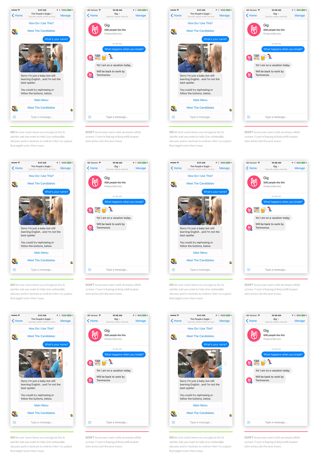
  2. Offer options on how to handle the situation and reroute users to safe areas within your system
  3. Offer human intervention
  4. Do NOT leave users with empty white space without reason


7. Every interaction is meaningful

There’s no need for analytics software to be hooked on when every click or input means something. The task of understanding users behavior becomes less difficult, but maintaining focus may become more difficult.

It’s important to realize that not everything your users want is part of your product and maintain focus through all the noise.

What you should do

  1. Properly label all your content blocks so they’re easy to interpret
  2. Track down the content blocks/inputs that you’re seeing the most users leave from, figure out why, then change them


Most analytics platforms will show you what blocks and buttons have been clicked, and what users have input into your system, along with lots of other data.

Most analytics platforms will show you what blocks and buttons have been clicked, and what users have input into your system, along with lots of other data.

8. Help users help you

You can’t possibly anticipate everything your users will want at this point in time. A conversation is limitless.

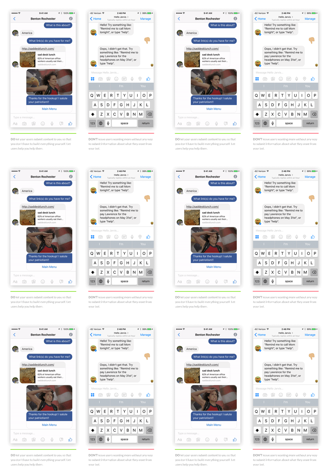
Instead of trying to infer user needs or asking them to fill out a survey, build hooks that allow users to give you feedback directly through the bot during an interaction that feels natural.

What you should do

  1. Let users submit articles when they ask for something your bot doesn’t know about
  2. Ask users if the results your bot gave them are what they were looking for, and if they’re not, let them tell you what they want


9. Identify and target user sentiments

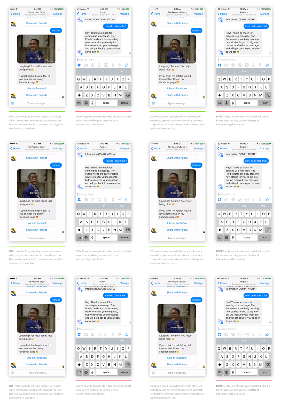
A conversation is filled with so much more emotion than an interface. Instead of asking your users for feedback, they’ll give it to you whether they realize they’re doing it or not.

Use your knowledge of user’s sentiments to trigger content blocks to extend and improve the experience at the most appropriate time.

What you should do

  1. Take advantage of positive sentiment to promote your product or get users to do some promoting for you
  2. Identify negative sentiment and do what you can to save face


It’s time to create the future

Bots are a powerful tool when they’re created properly. And they’re only going to get more and more powerful as time goes on.

Take advantage of being ahead of the curve and start building your own today!

If you’d like to chat about anything related to this article, what tools I use, or anything else, get in touch.

Read more posts about chatbots

Joe Toscano
Experience designer for R/GA‘s Google team in San Francisco, CA. Joe plans to change the world with a smile, design and some code. If you want to keep up with what he’s doing outside of InVision, follow him on Twitter or Medium!

from InVision Blog http://blog.invisionapp.com/guide-to-chatbots/

Chat-Bots vs. Google Search

Chat-bots are probably the most hyped thing right now in the valley. As evidence, we can see WeChat blowing, Slack becoming one of the biggest and most loved companies in the world, and Facebook coming up with their new messenger platform for businesses. Companies of all types work hard and spend a lot of money to see how they can take advantage of this new channel and reach more customers.

When I interacted with a chat-bot for the first time, I thought it was funny and cool. During the second time, I still thought it’s an interesting concept, but since then I had conversations with dozens more, and now when I interact with one, I tend to think:

Do I really need this service to live as a chat-bot?

The need for micro-services is clear. Simple services, such as checking the weather, should be available in a really fast way, from the screen you’re already in.

I embrace Android Instant Apps announced in Google I/O, Slack’s store is pretty cool, both Google and Bing offer simple service apps in their search results, and this trend should definitely continue. But who says micro-services are better off with chat interfaces? Actually, the chat interface requires plenty of taps for typing the letters, and usually the brain behind them is not even smart enough to know what I have to say.

So I thought it will be cool to compare famous chat-bots with Google. Here’s what I learned about three use-cases.

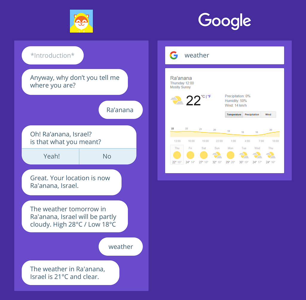
1. Checking the Weather

In case you didn’t know, typing “weather” in google gives the weather for today and the rest of the week in your location, with great UX and a timeline. Poncho might tell me the current weather in a nicer, more personal way, but it’s definitely not as easy and doesn’t yield better results.

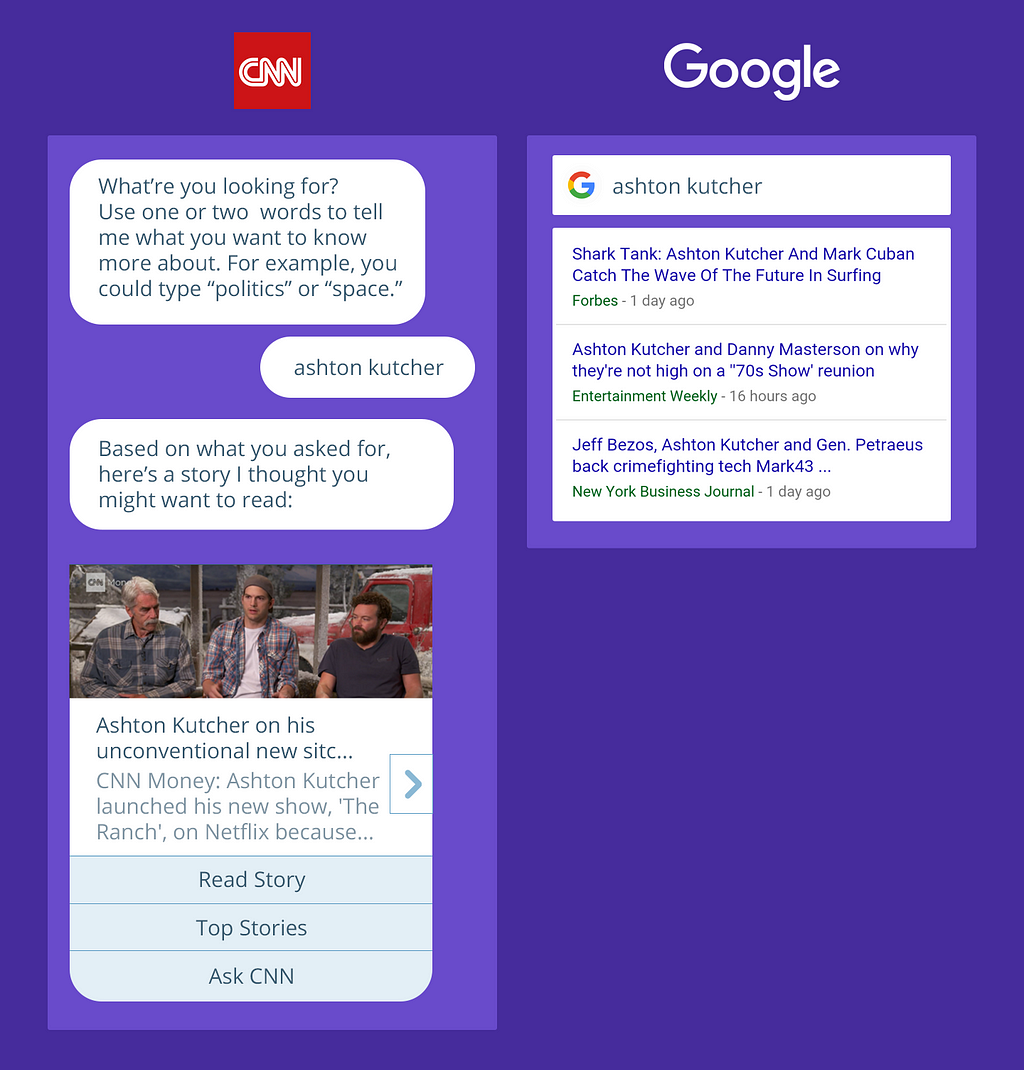
2. Reading the News

Google the title you were looking for and you’ll get trending articles across the web for it. CNN’s relatively new chat-bot is just another way for them to send you push notifications, with a pretty terrible browsing experience for loyal users.

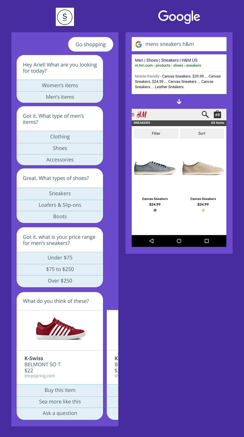
3. Shopping for Clothes

Try Spring’s chat bot, and you’ll see it’s not even a chat rather than an interface that asks you many different 3 options questions in order to get you some specific content from their website. Google exactly what you need to get much more accurate results. Not in spring though, because of SEO problems (isn’t it more important than a chat-bot?), so I used H&M for the example. Needless to say, Browsing is much easier inside the website, rather than inside the messenger.

Chat-Bots are not necessarily worse

Bots can actually come in handy, but we still have a long way before we get there. I believe the main advantage for a bot will be personalization. As long as it feels natural, a chat is a great way for a service to collect data from the user, and by that improve the accuracy of the offers and the language. But right now many of the bots are not better than filling a long and exhausting form.

So do I think bots are the future of everything? Maybe, but probably not. Google, Apple, Facebook and Microsoft already know so much about me, and they can offer me services and answers in interfaces much simpler than a chat. But aren’t bots pretty damn cool? Of course they are, I even built one myself. It’s really smart.


Chat-Bots vs. Google Search was originally published in The Startup on Medium, where people are continuing the conversation by highlighting and responding to this story.


Read the responses to this story on Medium.

from The Startup — Medium https://medium.com/swlh/chat-bots-vs-google-search-b44d11a53f14?source=rss—-f5af2b715248—4

The Original Emoji Set Has Been Added to The Museum of Modern Art’s Collection

We are thrilled to announce the addition of NTT DOCOMO’s original set of 176 emoji to the MoMA collection. Developed under the supervision of Shigetaka Kurita and released for cell phones in 1999, these 12 x 12 pixel humble masterpieces of design planted the seeds for the explosive growth of a new visual language.

From left: 1999 NTT DOCOMO emoji; 2016 iOS emoji

From its founding in 1991 by the Japanese national carrier Nippon Telegraph and Telephone, NTT DOCOMO was at the forefront of the burgeoning field of mobile communications. In keeping with Japan’s longstanding pioneering role in technological adoption, Japanese tech companies, and NTT DOCOMO in particular, were ahead of the curve in incorporating mobile Internet capabilities into cell phones. Early mobile devices, however, were rudimentary and visually unwieldy, capable of receiving only simple information about weather forecasts and basic text messaging. For the revolutionary “i-mode” mobile Internet software NTT DOCOMO was developing, a more compelling interface was needed. Shigetaka Kurita, who was a member of the i-mode development team, proposed a better way to incorporate images in the limited visual space available on cell phone screens. Released in 1999, Kurita’s 176 emoji (picture characters) were instantly successful and copied by rival companies in Japan. Twelve years later, when a far larger set was released for Apple’s iPhone, emoji burst into a new form of global digital communication.

Emoji tap into a long tradition of expressive visual language. Images and patterns have been incorporated within text since antiquity. From ancient examples to, more recently, the work of creative typesetters, these early specimens functioned as a means of augmenting both the expressive content of the text and the overall aesthetic quality of the printed page — and in some cases the icons were the language. With the advent of email in the 1970s and the subsequent evolution of concise, almost telegraphic correspondence, the conveyance of tone and emotion became both harder and more urgently important. Beginning in the 1980s, computer users in the West began composing emoticons to create simple faces out of preexisting glyphs — the ubiquitous smiley face 🙂 is an example. In Japan, the larger character set necessitated by the language allowed for even more complicated images, giving rise to kaomoji, or picture faces, such as the now common shruggy: ¯\_(ツ)_/¯. When combined with text, these simple images allow for more nuanced intonation. Filling in for body language, emoticons, kaomoji, and emoji reassert the human in the deeply impersonal, abstract space of electronic communication.

The transition from desktop to mobile platforms necessitated a further rethinking of the customs long associated with written correspondence. This was especially true in Japan, where the cultural necessity of exacting salutations and complex honorifics made early devices’ impractical for widespread adoption. Emoji were an ingenious shortcut around this and other problems. The release of NTT DOCOMO’s emoji contributed to a radical alteration in the way the Japanese communicated through mobile phones.

Working within the software and hardware limitations of the late 1990s, Kurita created his emoji on a small grid of 12 x 12 pixels. Drawing on sources as varied as manga, Zapf dingbats, and commonly used emoticons, Kurita designed a set of 176 emoji that included illustrations of weather phenomena, pictograms like the ♥, and a range of expressive faces. While successful, emoji remained a largely Japanese concern until 2010, when they were translated into Unicode. This development meant that a user in Japan could send an emoji to a user in France with the same basic image being represented on both ends. Google included emoji in its Gmail as early as in 2006, but it wasn’t until 2011, when Apple added emoji functionality to its iOS messaging app, that the emoji explosion began.

Shigetaka Kurita’s emoji are powerful manifestations of the capacity of design to alter human behavior. The design of a chair dictates our posture; so, too, does the format of electronic communication shape our voice. MoMA’s collection is filled with examples of design innovations that radically altered our world, from telephones to personal computers to the @ symbol. Today’s emoji (the current Unicode set numbers nearly 1,800) have evolved far beyond Kurita’s original 176 designs for NTT DOCOMO. However, the DNA for today’s set is clearly present in Kurita’s humble, pixelated, seminal emoji.

Emoji continue to grow in use across the world. To get a sense of just how rapidly they’re enmeshing themselves in contemporary discourse, check out Matthew Rothenberg’s bewildering emojitracker, which documents emoji use on Twitter in real time. Or head to San Francisco for the first ever Emojicon, a celebration of all things emoji (at which I will be speaking). Lastly, a forthcoming installation at MoMA, opening in early December, will further elaborate on the evolution of emoji and give visitors an opportunity to see them in a new light (and no doubt inspire a few selfies).

This acquisition was the work of many people both at MoMA and at NTT DOCOMO. First and foremost I must thank the indefatigable Paola Antonelli, our fearless advocate for expanding an appreciation of the field of design to new realms, who initiated this project. I also thank our Chief Curator, Martino Stierli, A&D Curatorial Assistant Michelle Fisher, Alexis Sandler of the MoMA General Counsel office, Betty Fisher in the Exhibition Design department, and the Junior Associates of the Museum of Modern Art who generously sponsored the forthcoming exhibition. And I commend and send thanks to NTT DOCOMO’s large team, who exhibited tremendous patience, flexibility, and an adventurous spirit well in keeping with their company’s great heritage.

from Sidebar http://sidebar.io/out?url=https%3A%2F%2Fmedium.com%2Fmoma%2Fthe-original-emoji-set-has-been-added-to-the-museum-of-modern-arts-collection-c6060e141f61%23.yyb8mh48i