Aquestion on X validated led me to wonder at the point made by Christopher Bishop in his Pattern Recognition and Machine Learning book about the MLE of the Normal variance being biased. As it is illustrated by the above graph that opposes the true and green distribution of the data (made of two points) against the estimated and red distribution. While it is true that the MLE under-estimates the variance on average, the pictures are cartoonist caricatures in their deviance permanence across three replicas. When looking at 10⁵ replicas, rather than three, and at samples of size 10, rather than 2, the distinction between using the MLE (left) and the unbiased estimator of σ² (right).
When looking more specifically at the case n=2, the humongous variability of the density estimate completely dwarfs the bias issue:
Even when averaging over all 10⁵ replications, the difference is hard to spot (and both estimations are more dispersed than the truth!):
To leave a comment for the author, please follow the link and comment on their blog: R – Xi’an’s Og.
The book and some of its principles have been adopted by some traditional studios, and have been referred to by some as the “Bible of animation.” In 1999 this book was voted number one of the “best animation books of all time” in an online poll.
I read a ton of articles on these and these principles are being used by some of the best companies around the world for engaging their users. Here are the principles :
1. Squash and Stretch
The squash and stretch principle is the first principle which creates an illusion of physical characteristics of mass and volume to any character/object when they move. This is achieved simply by compressing and stretching the object/character.
After the stretch, they get back into their original shape like jello. This works with the audience as the gravitational impact is felt on the characters. It can be seen at all stages from a bouncing ball to a moving person.
2. Anticipation
This is the principle which helps you to tell your audience that some action is going to take place in a moment. It is the preparation for the main action. It can be seen in many examples: Can you imagine throwing a ball without pulling your arm backward?
In the same way, your animations would seem lifeless when the movements in the animations do not involve a flicker of anticipation.
3. Staging
This principle is based on Theatre and Film, which mentions the importance of directing the audience’s attention to the most important elements of the scene. This is often ignored or overlooked but it can create wonders when properly executed.
Few things under staging include the placement of the camera, the actor’s location and actions. Always use motion design to guide the user’s eye and draw their attention to the vital elements without losing focus.
Also, do not confuse the user with too many actions happening at the same time in the scene. Background and animation should work together as a pictorial unit in a scene.
4. Straight ahead action and pose to pose
There are two ways to handle drawing animation: straight ahead and pose to pose. Each has its own benefits, and the two approaches are often combined. Straight ahead action involves drawing frame-by-frame from start to finish. If you’re looking for fluid, realistic movements, straight ahead action is your best bet.
With the pose to pose technique, you draw the beginning frame, the end frame, and a few keyframes in-between. Then you go back and complete the rest. This technique gives you a bit more control within the scene and allows you to increase the dramatic effect of the motion.
5. Follow-Through and Overlapping Action
Whenever a character in a scene tends to come to a stop, not everything associated with the character stops. There are few elements which are still in motion for a few seconds after the character stops.
You might observe this frequently in animated movies when someone runs and stops, their hair still is in a wavy motion after they stop. Here the secondary elements are following the primary action. This helps in making your animation look more realistic.
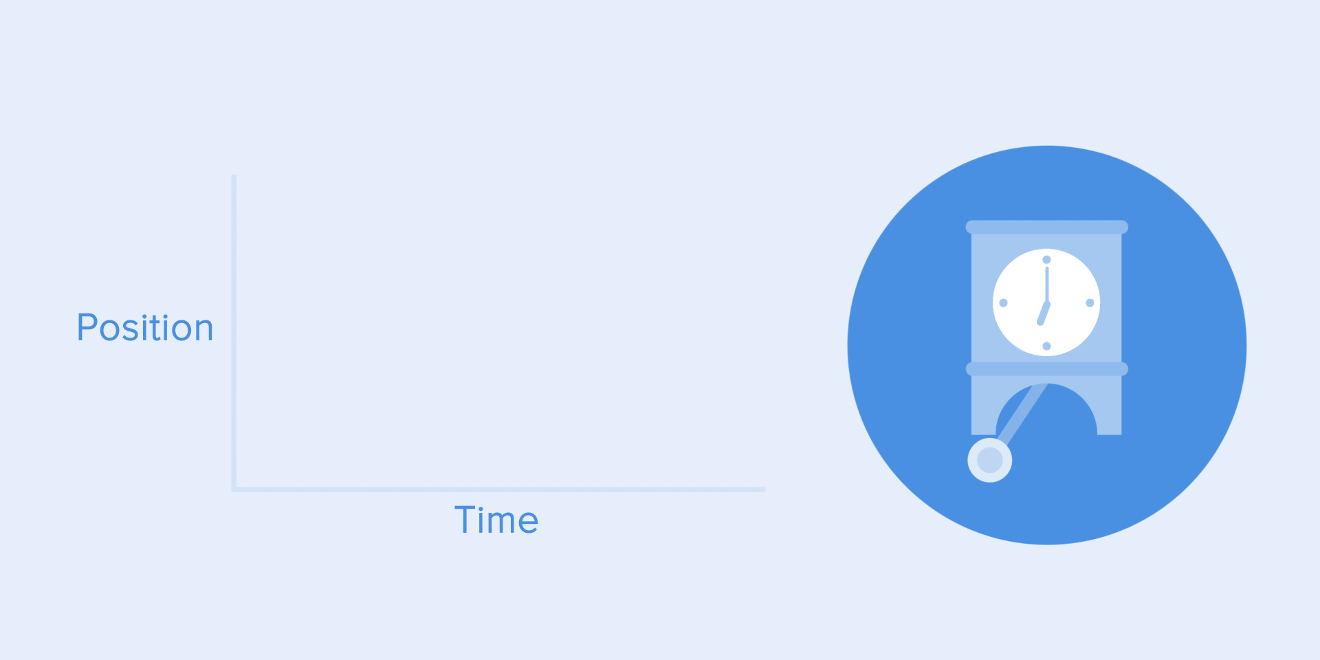
6. Slow-In and Slow-Out
This is also famously called as ease-in and ease-out effect which is mostly used in motion design. This has been originated from the functioning of a pendulum, which moves slowly at the ends and faster during the remainder of the journey.
This can also be explained using an example of a car. When you start your car you don’t get to 60mph right away, you slowly gain acceleration from 0–15–30–60 and then attain a steady speed.
7. Arc Motion
Almost every element including humans moves in circular paths rather than in straight lines. This principle revolves around that notion. When a head moves or an arm is turned it always has an arc motion attached to it. The speed of the arc is important, sometimes negligible but sometimes easily noticeable. This is mainly done to increase the grace factor of the animation.
8. Secondary Action
All the gestures which are added to support the main/ primary action are called secondary actions. This improves the personality and the adds dimension to the character by giving more insight into what they are thinking or doing. Here Bolt’s mouth and carrot are supported by a secondary action of its leg movement.
9. Timing
Let’s go back to the laws of physics again for this principle. After all motion design is based on that. Each scene can be broken down into multiple timeframes and the timing of the frame’s arrival is vital to animation. Even milliseconds slower or faster can ruin a scene completely. Some animations might be twice as engaging when they are delayed by 2–3 seconds. This can also help to control the reactions and mood of your characters.
10. Exaggeration
Too much realism can sometimes ruin the overall animation and the scene. To spice things up, add some surreal elements to the scene. This can be done in various ways such as face distortion, character movement, etc., Push the limits for your characters and your animation will pop.
11. Solid Drawings
This principle encourages animators to be mindful of the fact that while forms may be presented in 2D, they should strive to look 3D. In this example, despite being drawn in 2D, through the animation choices we as an audience feel that Zeus has weight and is three-dimensional.
12. Appealing
Obviously, not every character should be appealing. But this principle posits that animators should strive to create images that will be interesting and compelling to audiences.
And there you have it! The 12 essential principles that make animated films so magical! There’s no doubt that animation would not be what it is today without these twelve pieces of wisdom. I can’t wait to see how future Disney animators use and innovate on these principles in their works to come!
Need some geometric fonts for your next project? Get inspired!
For some years now, geometric fonts have been a consistent trend when it comes to brand and interface design. Good examples include AirBnB’s Cereal, Google’s Product Sans, even Spotify uses a geometric font called Circular.
If you start working on a new design project and want to use something geometric as well, you will have to search through a nearly unlimited range of different fonts. This makes it difficult to find the right one that fit your needs.
To help you with your search, I’ve made a pre-selection to make your decision a bit easier. All five are excellent choices and great alternatives. Each represents an exceptional combination of the geometric foundation built with modern details. The clarity and minimalist forms give each design a rational but nonetheless friendly feel. Let’s dive into it.
1. Gordita
Gordita is a geometric typeface with modern details designed by Australian designer Thomas Gillett. It was published through Type Atelier in 2016 and is a well-kept secret because it’s not used very often.
The design was significantly influenced by Futura and Gotham but features a quite warmer character than those typefaces. General forms have been optically compensated to appear natural and purely geometric. Ink traps and tapered joints support good legibility, even if some of the apertures are quite small. So—pay particular attention when using Gordita in small sizes.
Gordita is available in seven weights — thin, light, regular, medium, bold, black and ultra — and each has matching italics. This makes the font a real workhorse and designers have the opportunity to use them in a variety of ways.
2. Circular
Circular is a geometric sans-serif typeface created by Swiss designer Laurenz Brunner and released through Lineto in 2013. Since Spotify emerged in 2016 with the announcement of using Circular as the primary typeface for their brand and products, it has become quite famous and is widely used.
Although the design is based primarily on geometric forms, Circular has quirks that give it a friendly feel. The lowercase a and t are especially distinct. They make Circular easy to identify compared to other geometric sans-serifs.
Amazingly, Circular is only available in four weights — book, medium, bold and black — each with matching italics. This limitation puts the challenge on designers to get the most out of the existing weights. But on the other hand, it ensures a well thought-out use—which is good.
3. Sailec
Sailec is a geometric typeface published by Swiss foundry Type Dynamic in 2014. According to Nico Inosanto—the creator of Sailec–it was influenced by the international typographic style.
With a more rational and neutral character, it feels like a more grown-up variant of Gordita or Circular. Details like the small apertures give it a very special and compact character.
Sailec is available in seven weights — hairline, thin, light, regular, medium, bold and black — each with matching italics. Designers thus have a range of possibilities to use this typeface in a variety of ways.
4. GT Walsheim
GT Walsheim is a geometric typeface designed by Noël Leu and released in 2010 through Swiss foundry Grilli Type. Swiss designer Otto Baumberger’s poster lettering inspired the design.
A lot of interesting characteristics and quirky details, such as the bar on the uppercase G, makes GT Walsheim a real highlight. Plenty of different stylistic alternatives for certain letters maks it an excellent choice.
GT Walsheim is available in eight weights — ultra light, thin, light, regular, medium, bold, black and ultra bold — each with matching italics. A big plus is the suitable condensed version.
5. Brown
Brown is a geometric typeface designed by Aurèle Sack and released through Lineto in 2011. Its closeness to Johnston Sans, which shapes the appearance of the London Underground, is unmistakable.
Interestingly, Brown includes multiple stylistic variants and a reclining version that slopes backward. If you are looking for a very outstanding look and feel, this might be your choice.
Brown is available in four weights — thin, light, regular and bold — each with matching italics. As with Circular, designers must limit themselves to what they have.
5+1. Futura
There can’t be a top list without including the mother and origin of all geometric fonts—Futura. Published in 1927 and designed by the German type designer Paul Renner, it is still the most influential source for all contemporary geometric typefaces these days.
Since its release almost 100 years ago, it has remained consistently famous and successful. It has been used by designers and typographers worldwide and is also the preferred typeface of directors Wes Anderson and Stanley Kubrick. Both have incorporated it into many of their works.
Futura has been steadily expanded over the years and today has an almost unmanageable number of cuts, weights, and variations. It is, therefore, a real workhorse, which can be used in many ways. If you want to find out more about Futura and how to use it properly in UI design, just have a look at one of my other reads.
Thanks for reading so far. I hope this list can inspire you and give a feel for contemporary geometric sans-serif typefaces. Now I’d like to hear your recommendations. What would your choice be? Let me know and leave a comment — and thanks for making a clap.
Top 5 geometric fonts for 2019 was originally published in UX Collective on Medium, where people are continuing the conversation by highlighting and responding to this story.
from UX Collective – Medium https://uxdesign.cc/top-5-geometric-fonts-for-2019-4c34a405bd97?source=rss—-138adf9c44c—4
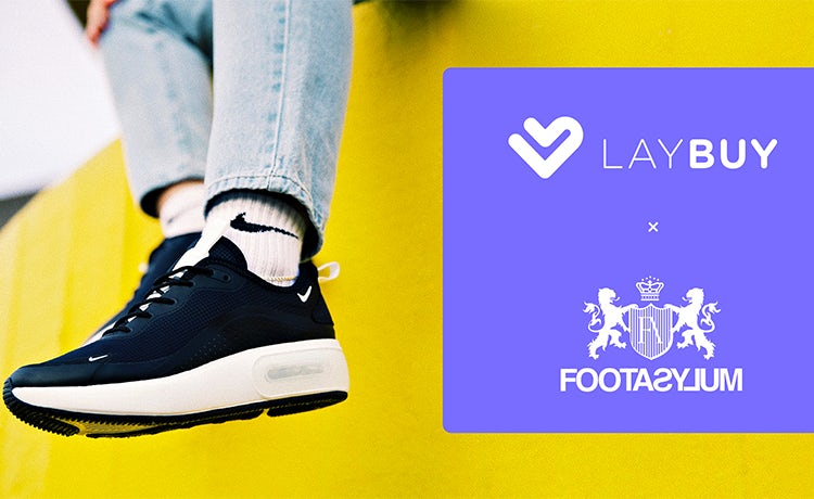
Laybuy aims to offer a transparent, interest free payment option.
The ripple effect emanating from the 2008 global financial crisis continues to be felt in 2019. A decade on, 66% of British people say they do not trust financial institutions to work in the best interests of UK society, according to YouGov Omnibus research carried out last year.
Fear persists to the point that 63% of respondents are worried the banks could cause another financial crisis.
Just as trust in traditional banking has broken down, the fintech revolution has revved up several gears as consumers embrace the chance to manage money at their fingertips.
Over the past 12 months, 32% of people have used a banking app to make a mobile payment or transfer money, rising to 48% among those aged 15 to 34, according to Ipsos Mori data. Some 11% of those surveyed have used an app from an online-only or mobile-only bank.
This wider shift to managing money online has fuelled a desire for clarity and transparency in payments and investments. No longer closed off and opaque, these sectors are being opened up by digital players focused on transparency and prioritising customer choice.
This approach resonates with millennial and Gen Z consumers, because they do not care about the old ways of doing things, insists Gary Rohloff, co-founder and managing director of payment platform Laybuy. He argues the millennial market in particular has shifted away from credit cards after seeing what debt did to people during the recession.
We ask ourselves, would a bank do this? And if the answer is yes, we don’t do it.
David Sandström, Klarna
“The global financial crisis shook the world and there’s still a hangover. Young people who have lived through that are very sceptical about the whole finance sector as a result,” Rohloff states.
“Plus, we’re all busy and we want control over what’s happening with our money, because it’s hard won and if I’m having to pay people for stuff I don’t really understand that gets me into trouble. It’s just not right.”
This is the premise behind Laybuy, an interest free payments platform which spreads the cost of purchases online or in-store across six instalments. The consumer pays the first instalment upfront and then can choose which day of the week they want the subsequent five payments to come out of their account over the remaining weeks.
Based on the internal strapline ‘making the desirable affordable responsibly’, Laybuy has been designed with transparency at its heart. Consumers, for example, receive a notification saying the payment will be coming out of their account the day before the due date. If the payment is missed they have a 24-hour grace period to make the payment, otherwise their Laybuy account is suspended and a £6 late payment fee incurred.
In March Laybuy signed up footwear retailer Footasylum.
While the priority is improving the experience for shoppers, Rohloff, who has 18 years’ experience as a retail CEO, hopes Laybuy will also cut waste within the supply chain and help retailers move away from an aggressive discounting culture by making full price products attainable for consumers.
Launched in Rohloff’s native New Zealand in May 2017, the family-run business is currently being offered by 4,500 merchants across Australasia to more than 500,000 consumers. Officially rolled out to the UK in March, Laybuy now has 320 merchants signed up, including footwear retailer Footasylum.
While retailers pay an average 4% commission, Rohloff believes this is a fair trade-off given that offering Laybuy drives average order values by 60%, online and in-store conversion rates typically increase by 50% and retailers experience a 30% rise in customer acquisitions.
Attack the category
Gaining greater clarity over finances in a way that fits modern life is a global trend, according to David Sandström, CMO of payments provider Klarna. He argues that historically the power lay within the old banking structures, but the banks have failed to keep up with the “complete digitisation” of people’s lives.
“The old banks want to keep the power with them, keep the data with them and I don’t think consumers are having that anymore,” says Sandström.
“Why in a digitalised world would a consumer want to pay up front for a thing they haven’t seen and don’t know the real quality of? Why would they take the risk of all the logistics and potential hassle of returning stuff in a digitalised world? Why would a consumer be that disempowered?”
Working with high street retailers such as Topshop and Asos, Klarna offers consumers a variety of payment options. They can choose to pay later, which gives them 30 days to pay for their online order, pay in three equal interest-free instalments, or opt to ‘slice’ the cost of the payment from six months to 36-month payments.
Klarna says it is focused on improving the “post-purchase experience” and replicating the fun of shopping, which Sandström argues banks and other fintechs fail to do because they operate on a “different wavelength” to their consumers.
“We ask ourselves, would a bank do this? And if the answer is yes, we don’t do it. This is all about not acting like a stiff, old bank, but actually attacking the category in a completely new way,” Sandström states.
He explains that communities and subcultures are the most important part of Klarna’s media mix. The ‘Get Smooth’ campaign in January, celebrating US rapper Snoop Dogg securing a minority stake in Klarna, was all about engaging different communities. So while Snoop’s name change to ‘Smooth Dogg’ was directed at the Hip Hop community, the news about the investment resonated with the financial community.
The tie-up with Snoop generated “many hundred million impressions” for Klarna and Sandström is proud of the fact this partnership has longevity as he is an investor and not just an influencer who will disappear once the campaign is over.
Millennial market
While new services are offering consumers payment transparency and flexibility, a host of digital-only players are also shaking up the investment market.
The idea is that removing the high barriers to entry will encourage more people to invest and statistics show there is room for growth. Only 3% of consumers have used an app for tracking and managing investments, or trading stocks and shares, over the past 12 months, according to Ipsos Mori data.
Of this number, 4% were men and 1% women, while young people aged 15 to 34 were twice as likely (4%) to invest via an app compared to those aged 35 and over (2%).
Wealthify was founded to bring down these barriers to entry, such as high minimums and hidden fees. Investors can start with just £1 and are able to sign up within 10 minutes.
First, investors are asked to define their investment style according to five personality traits – cautious, tentative, confident, ambitious and adventurous. Using the ‘try this’ function, they can view what the projected value of their investment would be according to their risk profile. Investors can also opt for an ethical fund, which only invests in socially responsible companies. Users can then cash out at any time for no fee.
CMO Sally Allan explains that most people using Wealthify would never previously have got into investments due to the high minimums needed. Millennials aged 18 to 34 are the largest proportion of users, followed by the 35 to 54 age group.
There is often a pensions gap, because [women] take maternity leave, so we wanted to address that
Daniella Camilleri, Plum
Allen explains that while trust in financial institutions has been shaken, the digital migration of the investment sector has also been fuelled by the mass adoption of online banking. For Wealthify the key to success is simplifying the experience to appeal to first timers.
“Everything about it has been de-jargonised and simplified in order to give people that reassurance and help them to feel comfortable about what they’re doing ,” she states. “We want to be the most approachable and straightforward of the investment advice propositions.”
Fellow investment platform Nutmeg has seen the typical age of its investors dropping year-by-year as the appeal grows among people in their 20s and 30s.
“The early Nutmeg investors were older and probably slightly more traditional investors who thought this is interesting and new,” explains brand and customer marketing director, Grant Warnock.
“As we got the message out there, pushed it through digital channels to younger investors, we reached this whole new generation who were completely ready for something that looked like apps already on their phone.”
Warnock is aware that competition for digital wealth management is hotting up. He points to the fact there was an unprecedented amount of outdoor and tube advertising for digital investment products last tax year.
Nutmeg’s new campaign, released in March across outdoor, digital and TV, aims to cut through the noise by tapping into the feeling that in uncertain times it is easy to do nothing with your money, but that’s not always the best idea.
The TV campaign is performing well, having already achieved 55% brand awareness in London. Warnock believes TV is a great medium to reach a non-traditional investing audience who may not see the outdoor commuter media or perhaps are not located in the capital.
“If you believe you’ve got a message for quite a wide audience, which we do, then TV is still fantastic,” he adds. “Of course, all digital targeting and use of commuter media is really effective because it’s so intense, but you can’t equal TV if you really believe you’ve got a product with a wide audience.”
The marketers at eTorro, a multi-asset platform for cryptocurrencies, stocks, indices and commodities, agree that barriers need to be broken down for a new generation to develop a passion for investing.
The very fact consumers are so invested in brands gives them an advantage as they understand which companies are resonating within their community, states UK head of marketing, Stephanie Wilks-Wiffen.
“As a consumer we’ve got our ear to the ground and we are more aware of what’s going to trend and be successful than analysts sitting in big corporations trying to work out what the next investment should be,” she explains.
“Millennials are only going to invest in brands and companies they believe in and trust, and so it’s about trying to find that synergy between people and investing in stocks, rather than seeing it as something that is quite opaque, boring and stale.”
Built on a community of 10 million users, in many cases millennials who joined after the cryptocurrency surge of early 2018, eToro enables first time investors to automatically copy the portfolio of successful traders. Investors can follow the success of their trades in real time and stop copying their chosen traders at any point.
To help build exposure nationwide, in August 2018 eToro splashed out on sponsorships of seven Premier League clubs – Tottenham Hotspur, Crystal Palace, Brighton, Leicester City, Newcastle United, Cardiff City and Southampton.
“We wanted to build brand awareness, but we paid for the sponsorship deal in Bitcoin as we wanted to start showing how crypto can be used to revolutionise different sectors, such as the Premier League,” Wilks-Wiffen explains.
Having built its reputation in the crypto-space, eToro’s latest outdoor campaign, ‘We’re not just about the C word’, is aimed at showing potential users that the platform offers more than just cryptocurrencies.
For fintech chatbot Plum, the focus of its latest campaign is to encourage more women to invest. Community and product marketing manager, Daniella Camilleri, believes perceptions need to shift to show not all investors are “Wolf of Wall Street-style men in suits”. This is important given women make up 60% of Plum’s wider user base, but only 40% of its investors.
“There is often a pensions gap, because [women] take maternity leave, and so we wanted to address that and show, if anything, investing is more appropriate for women than it is for men. But we didn’t want to do it in a patronising ‘pink-ified’ way,” says Camilleri.
The campaign shows women discussing their initial concerns, as well as the opportunities of being a first-time investor. To help further widen the investing pool, Plum offered men and women fee-free investments for a year if they posted #InvestwithPlum on social media before 6 April.
Six months on from launching its investment product, Plum has grown to 375,000 active users. Interested investors are encouraged to join Plum’s 15,000-strong Facebook community or engage with the Investment Academy, which outlines the basics of investing. Plum also routinely hosts socials so its members can catch up in real life.
Camilleri explains that creating a community helps people feel reassured that it is normal not to understand everything about investing from day one.
“Being a bit kinder to yourself and realising everyone could do with learning a bit more is really helpful, because it just removes all those barriers and helps people feel more confident,” she adds.
from Marketing Week https://www.marketingweek.com/2019/04/25/fintech-brands-democratising-payments-investments/
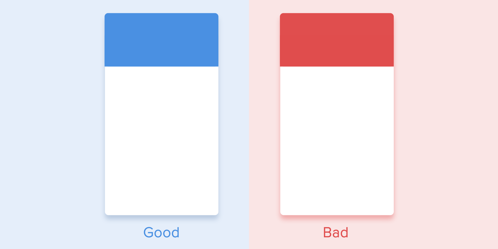
Nowadays it’s hard to impress or even surprise with an interface animation. It shows interactions between screens, explains how to use the application or simply directs a user’s attention. While exploring the articles about animation, I found out that almost all of them describe only specific use cases or general facts about animation, but I haven’t come across any article where all rules concerning animation of interfaces would be clearly and practically described. Well, in this article I won’t write anything new, I just want to collect all the main principles & rules in one place, so that other designers who want to start animating interfaces don’t have to search for additional information.
Duration and speed of the animation
When elements change their state or position, the duration of the animation should be slow enough to give users the possibility to notice the change, but at the same time quick enough not to cause waiting.
Use proper duration in your animation. Don’t make it too fast and don’t leave the user enough time to yawn
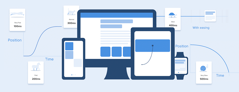
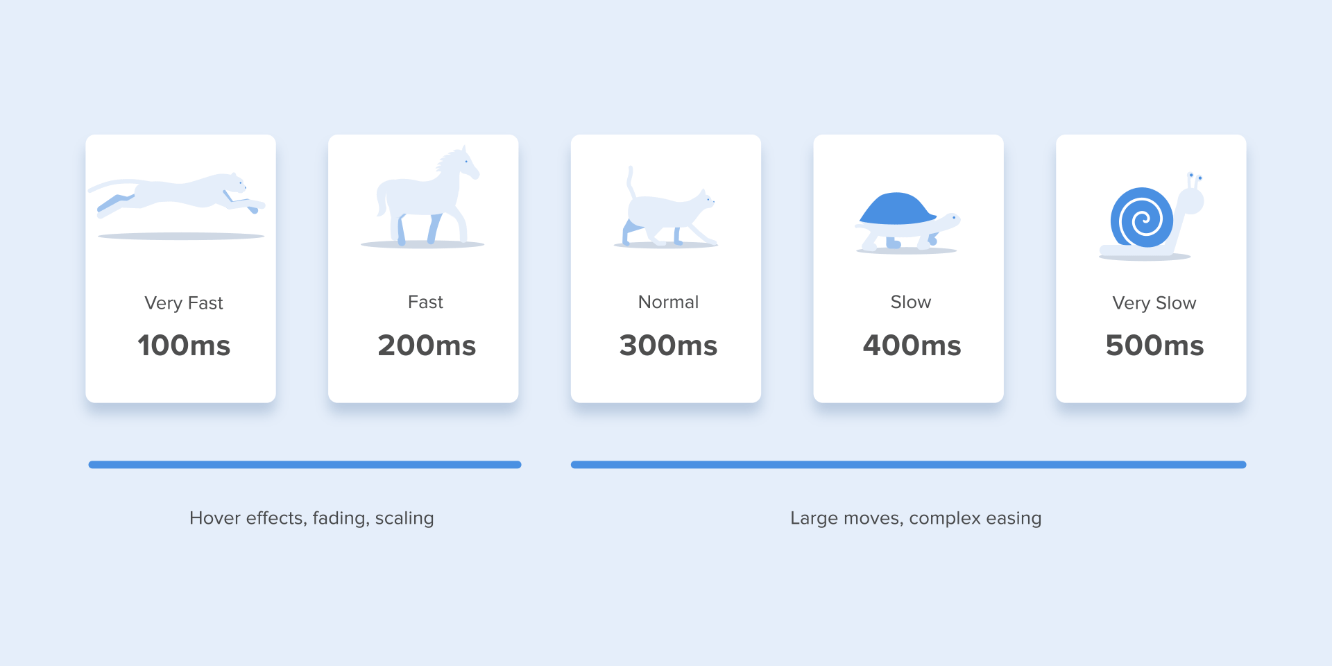
Numerous researches have discovered that optimal speed for interface animation is between 200 and 500 ms. These figures are based on the particular qualities of the human brain. Any animation shorter than 100 ms is instantaneous and won’t be recognized at all. Whereas the animation longer than 1 second would convey a sense of delay and thus be boring for the user.
Duration of the animation you should better have in your interfaces
On the mobile devices, Material Design Guidelines also suggests limiting the duration of animation to 200–300 ms. As for tablets, the duration should be longer by 30% — around 400–450 ms. The reason is simple: the size of the screen is bigger so objects overcome the longer path when they change position. On wearables, the duration should be accordingly 30% shorter — around 150–200 ms, because on a smaller screen the distance to travel is shorter.
Size of mobile devices affects the duration of the animation
Web animation is treated in a different way. Since we are accustomed to an almost instant opening of web-pages in a browser, we expect to transit between different states quickly as well. So, the duration of web transitions should last about 2 times shorter than on mobile devices — between 150–200 ms. In other cases, the user will inevitably think that the computer freezes or has troubles with the internet connection.
But. Forget about these rules if you are creating a decorative animation on your website or trying to attract the user’s attention to certain elements. In these cases, animation can be longer.
Large screen of computer = Slow animation? No way!
You need to remember that regardless of the platform the duration of the animation should depend not only on the traveled distance but also on the size of the object. Smaller elements or animation with small changes should move faster. Accordingly, the animation with large and complex elements looks better when it lasts a little longer.
Among the moving objects of the same size, the first one to stop is the object that has passed the shortest distance.
Small objects in comparison with large objects are moving slower since they make bigger offsets.
Duration of the animation differs depending on the size of the object and the traveled distance
When objects collide, the energy of collision must be evenly distributed between them according to physical laws. So, it’s better to exclude the bounce effect. Use it only in exceptional cases when it makes sense.
Avoid using the bouncing effect since it distracts attention
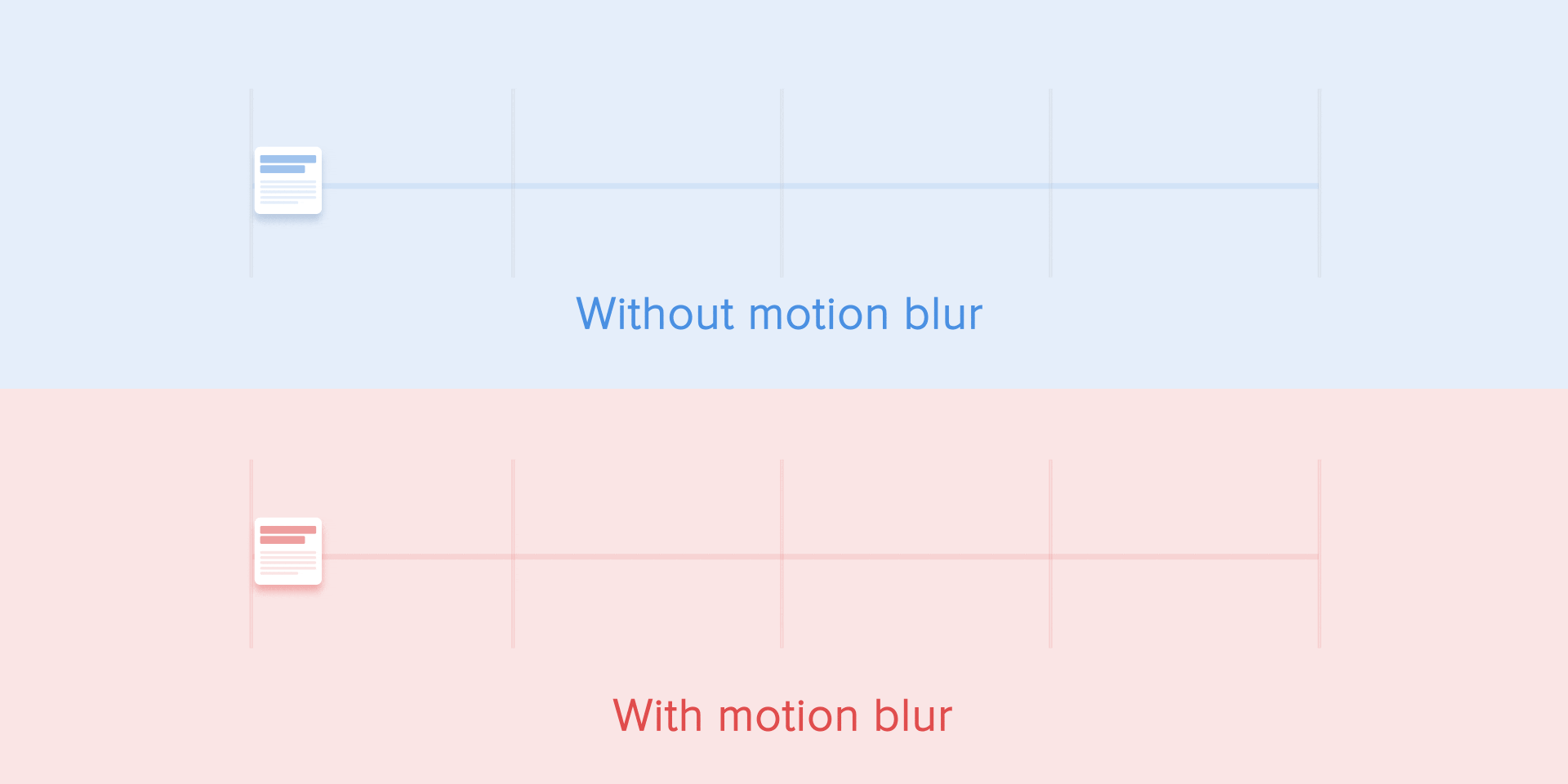
The movement of the objects should be clear and sharp so do not use motion blur (yes, After Effects users, not this time). It is difficult to reproduce the effect even on modern mobile devices and it’s not used in interface animation at all.
Do not use the blur effect in your animation
List items (news cards, email lists, etc) should have a very short delay between its appearance. Each occurrence of the new element should last from 20 to 25 ms. The slower emergence of elements may annoy the user.
Animation for list items should last 20–25 ms
Easing
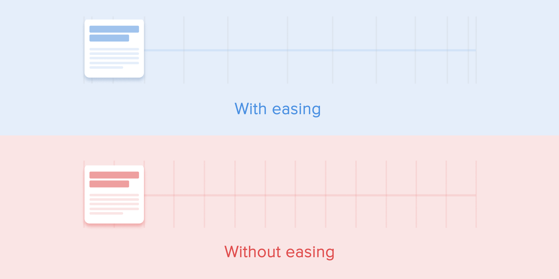
Easing helps to make the movement of the object more natural. It’s one of the essential principles of the animation, which is thoroughly described in the book The Illusion of Life: Disney Animation, written by two key Disney animators — Ollie Johnston and Frank Thomas.
For the animation not to look mechanical and artificial, the object should move with some acceleration or deceleration — just like all live objects in the physical world.
Animation with easing looks more natural compared to the linear one
Linear motion
Objects that are not affected by any physical force move linearly, in other words with constant speed. And just because of this fact they look very unnatural and artificial for the human eye.
All applications for animation use the animation curves. I will try to explain how to read them and what they mean. The curve shows how the position of the object (y axis) changes during the same time intervals (x axis). In the current case, the movement is linear, so the object travels the same distance at the same time.
The curve of linear motion
Linear motion can, for example, be used only when the object changes its color or transparency. Generally speaking, we can use it for the states when an object does not change its position.
Ease-in or acceleration curve
We can see on the curve that at the beginning the position of the object changes slowly and the speed increases gradually. That means the object is moving with a certain acceleration.
Acceleration curve
This curve should be used when the objects fly out of the screen at full speed. Those can be system notifications or just cards of the interface. But keep in mind that such type of curve should only be used when the objects leave the screen forever and we cannot recall or return them.
Acceleration curve for throwing the card out of the screen
The animation curve helps to express the right mood. At the example below, we can see that the duration of movement and the distance for all objects is the same, but even small changes in the curve give you the possibility to influence the mood of animation.
And of course, by changing the curves, you can move the object as similar to the real world as possible.
Same duration and distance but different moods
Ease-out or deceleration curve
It’s opposite to ease-in curve, so the object quickly covers long distance then slowly reduces the speed till it finally stops.
Deceleration curve
This type of curve should be used when the element emerges on the screen — it flies up on the screen at full speed, gradually slows down until it completely stops. This can also be applied to different cards or objects that appear from the outside of the screen.
Deceleration curve for a nice show-up
Ease-in-out or standard curve
This curve makes the objects gain speed at the beginning and then slowly drop it back to zero. That type of movement is the most frequently used in interface animation. Whenever you doubt what type of motion to use in your animation, use standard curve.
Standard curve
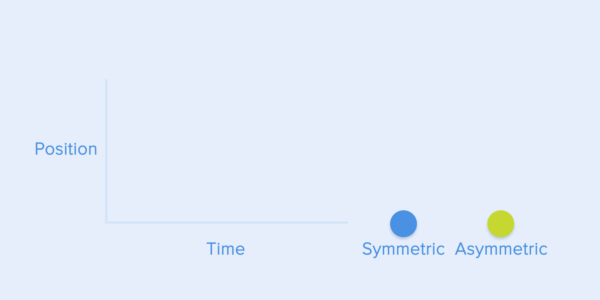
According to Material Design Guidelines, it is better to use an asymmetric curve to make the movement look more natural and realistic. The end of the curve must be more emphasized than its beginning, so that the duration of acceleration is shorter than that of slowing down. In this case, the user will pay more attention to the final movement of the element and thus to its new state.
See the difference between symmetric and asymmetric standard curve
Ease-in-out is used when the objects move from one part of the screen to another. In such case, animation avoids the eye-catching and dramatic effect.
The movement of the card on the screen and the corresponding asymmetric curve
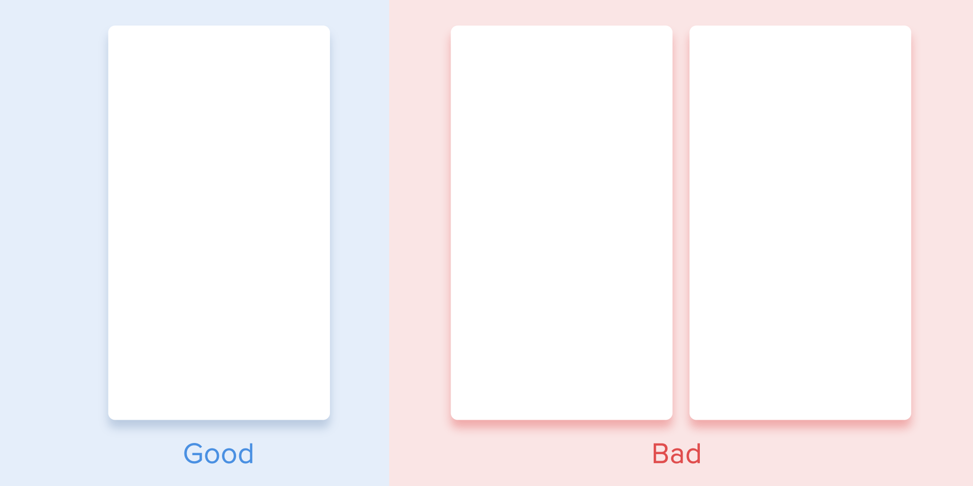
The same movement type should be used when the element disappears from the screen but the user can return it to the previous place at any time. It concerns the navigation drawer, among others.
The navigation drawer hides from the screen with the standard curve
From these examples follows a fundamental rule that many beginners neglect — the beginning animation is not equal to the ending animation. As in the case with the navigation drawer — it appears with deceleration curve and disappears with the standard curve. Besides, according to Google Material Design, the time of the object’s emergence should be longer to attract more attention.
The appearance and disappearance of the side menu is fulfilled with deceleration and standard curve correspondently
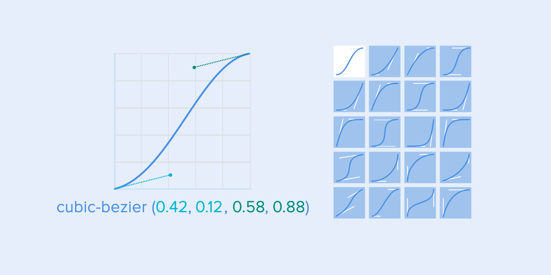
A function cubic-bezier() is used to describe the curves. It’s called cubic because it’s based on four points. The first point with coordinates 0;0 (bottom left), and the last one with coordinates 1;1 (top right) are already defined on the graph.
Based on that we need to describe only two points on the graph, which are given by four arguments of the function cubic-bezier(): the first two are the coordinates x and y of the first point, the second two are the coordinates x and y of the second point.
To simplify your work with curves I suggest using sites easings.net and cubic-bezier.com. The first one contains the list of the most frequently used curves, parameters of which you can copy to your prototyping tool. The second source gives you a possibility to play with different parameters of the curve and immediately see how the objects will move.
Different types of curves and their parameters for the function cubic-bezier ()
Choreography in interfaces animation
Just like in ballet choreography, the main idea is to guide the user’s attention in one fluid direction during the transition from one state to another.
There are two types of choreography — equal and subordinate interaction.
Equal interaction
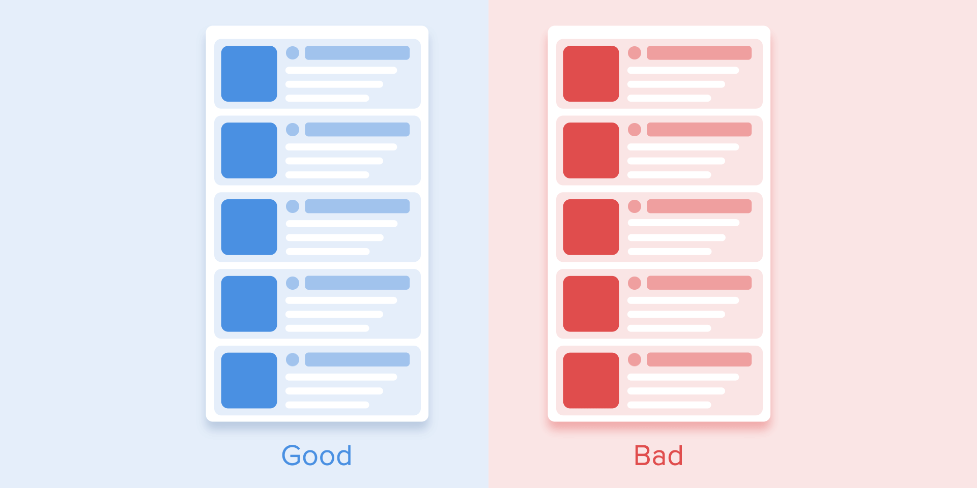
Equal interaction means that the appearance of all objects obeys to one particular rule.
In that case, the appearance of all cards is perceived as one flow that guides user’s attention in one direction, namely from the top to down. If we don’t follow the order, the user’s attention will be scattered. The appearance of all elements at once would look bad as well.
User’s attention should be guided in one fluid direction
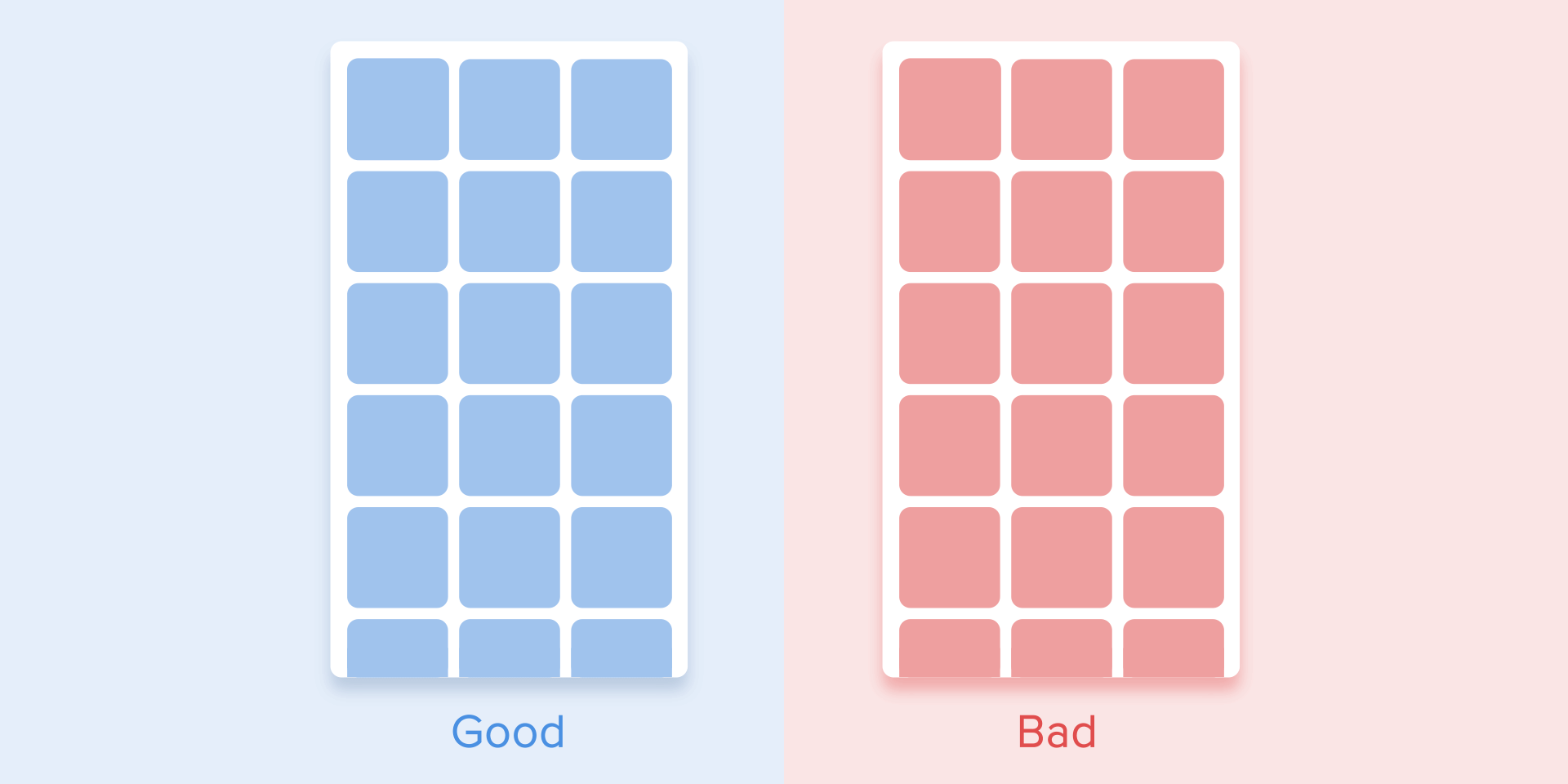
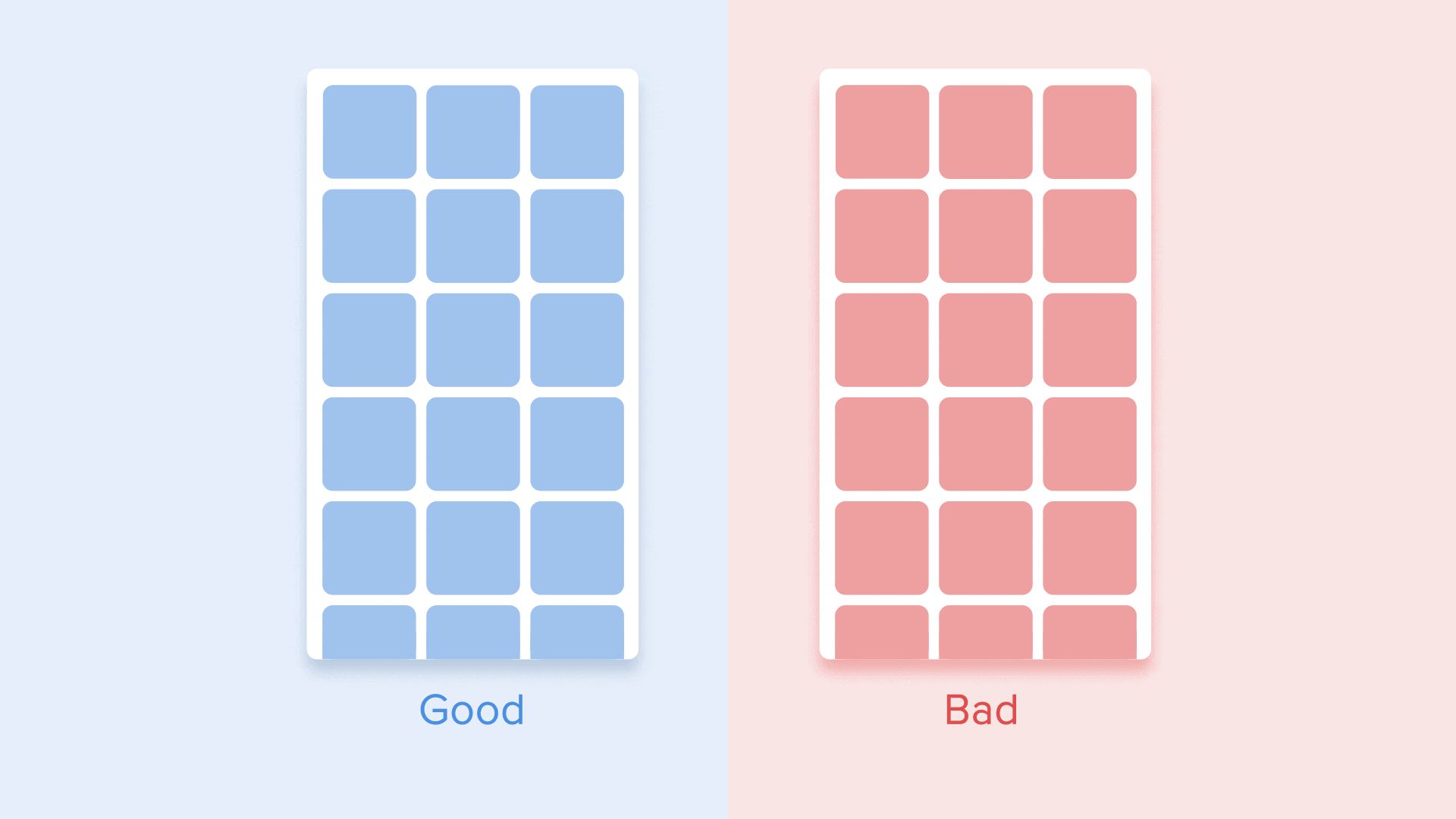
As for the tabular view, it’s a bit more complicated. Here the user’s focus should be directed diagonally, so showing elements one by one is a poor idea. Revealing each element one by one will make animation excessively long, and the user’s attention will be zigzag-like, which is wrong.
Diagonal appearance for the tabular view of cards
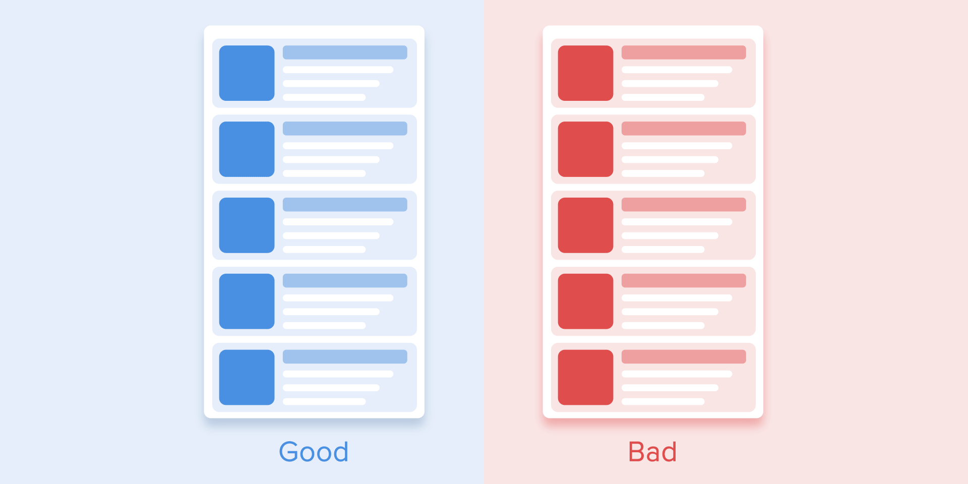
Subordinate interaction
Subordinate interaction means that we have one central object which attracts all user’s attention, and all other elements are subordinate to it. This type of animation gives the sense of order and draws more attention to the main content.
In other cases, it would be very difficult for the user to know which object to follow so his attention would be dispersed. Therefore, if you have several elements that you want to animate, you need to clearly define the sequence of their motion and to animate as minimum objects as possible at one time.
It is worth animating only one central object and all the rest subjecting to it. Otherwise, a user wouldn’t know what object to follow
According to Material Design, when the moving objects transform their size disproportionally, they should move along the arc rather than in a straight line. It helps making the movement more natural. By “disproportionally” I mean that the change of height and width of the object by increase/decrease is carried out asymmetrically, that is with different speed (for example, a square card turns into a rectangle).
The motion of an object that disproportionately changes its size should be arranged along an arc
The movement along the line is used when the object changes its size proportionally. Since the implementation of such movement is much easier, the rule of disproportional arc movement is often neglected. Looking at the real examples of applications, you’ll see the domination of the linear movement.
Proportional change of the size is fulfilled in a straight line
The motion on the curve can be achieved in two ways: the first called Vertical out — object starts moving horizontally and ends with a vertical movement; the second — Horizontal out — object begins to move vertically and ends with a horizontal motion.
The path of the object’s movement along the curve must coincide with the main axis of the scrolling interface. For instance, on the next image we can scroll interface up and down and accordingly the card unfolds in a Vertical out way — at first to the right and then down. The reverse movement is done in the opposite way — that is the card first rises vertically and ends up moving horizontally.
The direction of unfolding/folding the card should coincide with the axis of the interface
If the paths of the moving objects intersect one another, they cannot move through each other. The objects should leave enough space for the movement of another object by slowing down or accelerating their own speed. Another option — they just push away other objects. Why that? Since we assume that all objects in the interface lie in one plane.
During movement, objects shouldn’t pass through each other, but leave space for the movement of another object
In another case, the moving object can rise above other objects. But again no dissolving or movement through other objects. Why? Since we believe that the elements of the interface behave in accordance with the laws of physics, and no solid objects in the real world are capable of doing that.
Objects can rise above other objects and then move
Conclusions
So, if we sum up all of the above-mentioned rules and principles, the animation in the interface should reflect the movements that we know from the physical world — friction, acceleration, etc. Imitating the behavior of objects from the real world we can create a sequence that allows users to understand what to expect from the interface.
If the animation is built correctly, then it is unobtrusive and does not distract the users from their goals. If it does, you either need to soften it or even remove at all. That means that the animation shouldn’t slow down the user or prevent from performing the task.
But do not forget that animation is more of an art than science, so it’s better to experiment and test your decisions on users.
If you enjoyed this post, click on the applause button to help other people find it.
It was 8 PM and I was at Toronto’s Sony Center waiting for the start of what was being called the “debate of the century” between Slavoj “I found this shirt” Žižek and Jordan “Why would I leave a good tip if the service was bad” Peterson when I overheard some terrible news.
“Excuse me,” I asked a kindly usher, "did you just say the debate is going to last two hours and 40 minutes?” He nodded.
As a look of horror washed over my face, he tried to comfort me, “Since it’s starting late, they might skip some parts so it’s done by 10:15, but it is scheduled for 2 hours and 40 minutes.”
Two hours and 40 minutes! Was this a Ken Burns documentary about ruining parties? There were people in the audience of this thing who have had sex for less cumulative time than this talk would take. Specifically, I am talking about the young guy a few rows back from me dressed in a MAGA hat and a Joy Division t-shirt who was giving off serious “I got kicked off of Reddit” vibes.
Damnit, I had a plan. I wanted to catch Žižek/Peterson Mind Derby 2019 (officially titled “Happiness: Capitalism vs. Marxism”) because I wanted to see Peterson fandom in its element. Who are these guys? What do they get out of listening to the aggrieved meanderings of the dark prince of YouTube? Are their sideburns wild and untamed or curt and efficient? At the same time, my brother was in town visiting and my beloved Raptors, whose playoff run is currently my emotional ballast, were playing. I was thinking the talk would be like an hour. I could swoop in, do a brief character sketch of somebody who spends his days playing Axis & Allies, make fun of Žižek’s slovenliness, and rejoin my brother for the end of Raptors game and grow our familial bond by screaming at lanky millionaires.
Discovering this talk was going to be longer than Infinity War (but thankfully shorter than Endgame) was not my first disappointment of the evening. I had been expecting freaks in attendance; squirrelly-eyed weirdos sporting t-shirts emblazoned with right-wing manifestos and deluded loners with wispy chin-straps and embarrassing necklaces. And sure, there were a couple of delightfully cargo-panted, amateur magician-types roaming the venue, but the actual makeup of the crowd was distressing for a different reason: they were completely normal.
As an acquaintance I ran into described it, “Everyone here just looks like us.” This was a hip, young crowd dressed for a goddamn night out. Clear-framed glasses, nice haircuts, shiny shoes, baristas I recognize—this could have been a War on Drugs concert. There was also a surprising amount of dates. I listened to one as I waited in line; him imploring her to at least keep an open mind. There were fancy old couples, moneyed vampires recharging their cultural cache. This was not a gathering of scuzzy commies or crazed alt-righters, no, this was what passed for the Toronto elite: the beautiful, the educated, the privileged.
This isn’t to say there wasn’t something sinister in the air. As I was entering, a group of beefy dudes started wondering if there were going to be any agitators. One of them kept taking quick glances to see what I was writing in my notebook. While a fair chunk of the audience was there due to intellectual or, at least, ironic curiosity, the Peterson fans began to stand out. A huge tell, a friend noticed, was of course posture: ramrod straight as if they had just been rapped across the knuckles by a grumpy nun. A strange phenomenon is how many dressed like him; tie and a blazer, skinny dress pants or dark-washed jeans ending in nice, pointy shoes. Peterson and his flock all dressed like I did the first time I went to a wedding after making a little bit of money, like, “Look at me, I can dress nice now, look at my pointy shoes.”
While many people were laughing and jovial, there was also a troubling seriousness amongst Peterson’s followers. It was in the eyes, equal parts flat but vulnerable. They were filled with a hollow anticipation, a readiness to be filled with purpose and action. Maybe they unnerved me because it was the first time I was witnessing what a believer looked like.
I took my seat. I had to ask a duo of men, the most common arrangement of people I see tonight to let me through. They were polite. In front of me there was a couple, his arm draped around her in an almost violent fashion, as if he was trying to absorb her. An announcement went over the loudspeaker informing us that any hecklers will be removed immediately. It was met with a roar of approval from the audience, the polite duo beside me bellowing along. I could only imagine the beefy dudes I met earlier cracked their knuckles at the thought of removing the agitators.
A man named Stephen Blackwood, a philosopher, defender of the private sphere, and potentially an aristocratic werewolf came out to introduce the pair. Calling them, “towering figures,” Blackwood promised us, “Real thinking about hard questions,” and that’s exactly what we got, if by “real thinking” you mean “ego-driven meanderings” and by “hard questions” you mean Peterson not knowing what books Žižek was talking about. Throughout the debate, Peterson seemed like the kind of guy who purchases many an impressive tome, lies about reading them, and actually rereads Game of Thrones.
Outside of the reference gap, the contrast between the two could not have been more stark. Dressed like a John Wick cosplayer, Jordan Peterson sat in front of an open laptop and a field of San Pellegrino bottles, his legs crossed and fingers splayed across his chin, in a pose that seemed to say, “I’m thinking so hard right now.” When he spoke, he paced and bounded around his podium, his fingers constantly poking at and prodding at the air, or he would hunch over, his face pained with torment as if the marvels of his ideas were just too much for a man to bear.
Žižek, meanwhile, had all the grace and style of a 90s sitcom dad. Grouchy and slouched, a pale white calf permanently exposed at the bottom of his pants, I would bet money that there was a toothpaste stain somewhere on his person. He was also undeniably charismatic and charming in a way that Peterson is not (Peterson admitted as much, fawning over him at one point, by saying, “You are a character… it’s what makes you attractive” to titters from the audience around me). As his tongue darted from his mouth like some sort of mad ferret, Žižek won over the audience thanks to a wily combination of Slovenian dad jokes, self-deprecation, and irreverence. The largest applause breaks and laughs belonged to him throughout the night.
There wasn’t really a debate. That would require points being made. Instead Žižek free-wheeled and riffed around a variety of hazily related ideas: the Chinese social model as a synthesis of tyranny and capitalism; how belief in God or a higher project or morality allows men to do the evilest things; the occasional Himmler quote; how happiness should never be a goal; the coming ecological crisis that may also not happen because Europe has more forest than ever now; the scourge of political correctness as a sign of the weakness on the left; the cowardice of optimism and insurmountable inner evil of man. Žižek was less a cognizant thinker and more a pathological sacred cow tipper. His main goals seemed to be to provoke and get applause breaks.
But at least he said things that were interesting. Peterson, meanwhile, was completely vacuous. He played his greatest hits: hierarchies are natural; Judeo-Christian values and myths represent fundamental truths; capitalism is making things better for poor people; one of the West’s biggest obstacles is divorce rates going up. It was like getting an Economics 101 lesson from a man who tried peyote exactly once. He made ludicrous claims like no one has ever gotten power through exploiting people (this after boasting about tickets for the event being scalped for higher than Leafs tickets). He lightly denied climate change by saying the crisis, “…is dismal but not as dismal as the people saying it is.” He said profit is an excellent motivator because it discourages people from acting stupid, to a room of people that had paid for tickets (I saw some resale tickets that were over $400) to hear him speak. He excoriated Marx for ignoring the glorious labor that managers do. At one point, he said, 100 percent sincerely: “To reassure the sheep, you invited the dragon into the house.” Will somebody get this guy a sword collection so he will leave us alone?
The biggest thing I took from Peterson, though, is that this guy is emo as hell. For Peterson, human suffering is not a product of society or economics. No, it is our inherited state of being. We are born into it; to be human is to constantly be warring with the evil that resides within us all and the pain that exists outside of us. Again and again he brought up the evil we must overcome. He continually reiterated a vision of life as a slog of sadness and misery. It was all very My Chemical Romance, I would not be surprised if he had a “Life Is Pain” tattoo somewhere.
Beyond everything, I think it is this Bert McCracken-approved theory of life that draws people to Peterson—why he has become the bard of the reactionary elite. If you are one of the privileged, Peterson is here to protect your glorious suffering from any agitators that would question it. He values your pain, it is as valid as anybody else’s. For Peterson, the only political struggle that matters is against your own personal demons. This view of life flattens everything and scrubs out injustice. Oppressor or oppressed, poor or rich; these are meaningless categories. All that matters is your reckoning with your beautiful, mythic suffering. It’s the most important thing, certainly more important than asking if you are part of the problem.
I guess this is all to say, I should’ve just hung out with my brother and yelled at sports. If I’m going to suffer it might as well be fun.
In order for messages to be clearly transmitted, many factors play an important role. Depending on the type of communication, factors such as stuttering, poor grammar, bad alignment of letters, incorrect use of punctuation marks, mumbling, and others set apart unclear and clear messages. In oral speech, diction, proper intonation, a calm tempo of spoken words, the intensity of the voice are all skills that anyone who wants to be a good communicator has to achieve. In written speech, readable caligraphy, correct alignment of letters, words, sentences, and paragraphs, will make any text accessible to the reader.
Why are all these important? Designers have a major responsibility to make the latter type of communication possible without any obstacle. There are a few notions any designer should be familiar and able to work with: Kerning, Leading, and Tracking.
What is Kerning?
Kerning: Definition
Kerning is the stylistic process that made you read the first word of this sentence “KERNING” and not “KEMING”. You’ve probably already guessed it. Kerning is the act of adjusting the space between two letters in order to avoid the irregular flow of the words and to improve legibility.
Machine learning libraries are becoming faster and more accessible with each passing year, showing no signs of slowing down. While traditionally Python has been the go-to language for machine learning, nowadays neural networks can run in any language, including JavaScript!
The web ecosystem has made a lot of progress in recent times and although JavaScript and Node.js are still less performant than Python and Java, they are now powerful enough to handle many machine learning problems. Web languages also have the advantage of being super accessible — all you need to run a JavaScript ML project is your web browser.
Most JavaScript machine learning libraries are fairly new and still in development, but they do exist and are ready for you to try them. In this article, we will look at some of these libraries, as well as a number of cool AI web app examples to get you started.
Brain is a library that lets you easily create neural networks and then train them based on input/output data. Since training takes up a lot of resources, it is preferred to run the library in a Node.js environment, although a CDN browser version can also be loaded directly onto a web page. There is a tiny demo on their website that can be trained to recognize colour contrast.
FlappyLearning is a JavaScript project that in roughly 800 lines of unminifed code manages to create a machine learning library and implement it in a fun demo that learns to play Flappy Bird like a virtuoso. The AI technique used in this library is called Neuroevolution and applies algorithms inspired by nervous systems found in nature, dynamically learning from each iteration’s success or failure. The demo is super easy to run — just open index.html in the browser.
Probably the most actively maintained project on this list, Synaptic is a Node.js and browser library that is architecture-agnostic, allowing developers to build any type of neural network they want. It has a few built-in architectures, making it possible to quickly test and compare different machine learning algorithms. It also features a well-written introduction to neural networks, a number of practical demos, and many other great tutorials demystifying how machine learning works.
Thing Translator is a web experiment that allows your phone to recognize real-life objects and name them in different languages. The app is built entirely on web technologies and utilizes two machine learning APIs by Google — Cloud Vision for image recognition and Translate API for natural language translations.
Land Lines is an interesting Chrome Web experiment that finds satellite images of Earth, similar to doodles made by the user. The app makes no server calls: it works entirely in the browser and thanks to clever usage of machine learning and WebGL has great performance even on mobile devices. You can check out the source code on GitHub or read the full case study here.
Another library that allows us to set up and train neural networks using only JavaScript. It is super easy to install both in Node.js and in the client side and has a very clean API that will be comfortable for developers of all skill levels. The library provides a lot of examples that implement popular algorithms, helping you understand core machine learning principals.
DeepForge is a user-friendly development environment for working with deep learning. It allows you to design neural networks using а simple graphical interface, supports training models on remote machines, and has built-in version control. The project runs in the browser and is based on Node.js and MongoDB, making the installation process very familiar to most web devs.
Framework for building AI systems based on reinforcement learning. Sadly the open-source project doesn’t have proper documentation but one of the demos, a self-driving car experiment, has a great description of the different parts that make up a neural network. The library is in pure JavaScript and made using modern tools like webpack and babel.
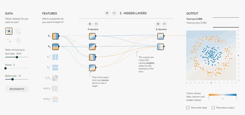
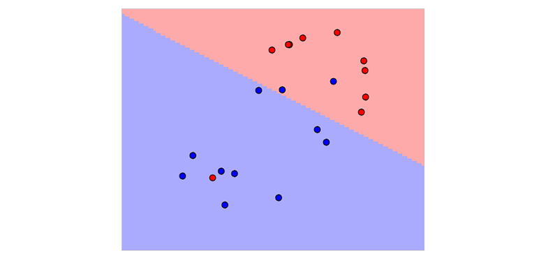
Educational web app that lets you play around with neural networks and explore their different components. It has a nice UI that allows you to control the input data, number of neurons, which algorithm to use, and various other metrics that will be reflected on the end result. There is also a lot to learn from the app behind the scenes — the code is open-source and uses a custom machine learning library that is written in TypeScript and well documented.
from UX Collective – Medium https://uxdesign.cc/simple-tools-and-extensions-to-perform-web-accessibility-testing-effectively-1ee006cbfd5e?source=rss—-138adf9c44c—4
While Artificial intelligence (AI) is used mainly for predicting human actions based on data analytics and interpretation, the User Experience (UX) principle also focuses on anticipating the course of user behavior. So, they have a connection, right? When both try to anticipate human behavior, they can work hand in hand in different contexts. This is why in the context of mobile user experience, AI is playing an important a role.
AI can really shape the user experience in more ways than one, and when doing so, it can positively impact business branding. Here we are going to explain how this is happening.
Having an In-Depth Understanding of the User
The earlier version of AI was algorithms that on the basis of user data and rules of dealing with them could make choices and work to reduce the load of repetitive works. These algorithms that were pretty precise and performance driven used to run on a preconceived Logic, and they were incapable of adjusting to any new contexts and new inputs. But as the algorithms became intelligent and more capable of applying understanding to draw insights based on previous user data, the true Artificial Intelligence (AI) came to replace human involvement not just for the legwork but for crucial decisions and expert output as well.
Just think of an AI-powered system building a whole website following the demands of the target audience and competition and integrating the most effective and trending design concept and appropriate technologies. Well, the advancement of AI is really making us hopeful for such robust output without human intervention.
Personalizing the UX
Though AI-powered tools as of now could not be as capable as to build a complete website to perfection without human intervention, at least the role of AI is increasingly getting prominent with the personalization of the user experience (UX).
An AI-powered tool can take into consideration various data points ranging from the source of the users, their demographics, user behavior, their session length and frequency, the triggers they are responding to, etc. By analyzing all these factors, an AI-powered tool can quickly churn out insights about the users and their preferences. Now the user experience can be designed, built or tuned to these presences validated by AI. Thus AI proves to be an invaluable technology for the app developers and marketers when they try to address precise customer needs.
Thus the AI can draw relevant insights to deliver user experience likely to be enjoyed by users. AI can also help the designers and app developers to create room to address individual preferences with UX design. Personalization obviously leads to more relevance of the app in the real-life contexts of users.
It Takes a Lot of User Data to Draw Insights
Apart from the so-called user data that are generated from the app uses, there are several other facets of data that help to understand the user context with more certainty and precision. A user having not enough footprint and engagement with an app can be tracked and analyzed with different types of data from other contexts and facets of life. Today, data analysis opened this vast scope to utilize large volume if user data to draw relevant insights and understand user preferences, likes and dislikes.
Let us have a look at the few things that data analysis can do for an app:
• Knowing where an app or software product needs optimization • Understanding the effective ways to optimize the apps in design, features or overall look and feel. • Understanding the user journey and potential triggers and repulsive aspects. • Understanding the impetus to go for in-app purchases.
AI-based Design Pushing the Business Branding
Finally, it is time to understand the all-round effect of AI into business branding. A business brand primarily focuses on creating a reputation as a customer-focused company, whether in terms of products, innovations, services or in terms of the research and development input to make the user experience better over time. The user experience is particularly important for an app to carry forward this reputation as a customer-focused company. On the other hand, the role of artificial intelligence (AI) is to fine-tune this user experience. So, the impact of AI in shaping business branding is quite obvious.
The personalization of the user experience is the critical aspect that AI promised for the modern app user experience. The personalization of the user experience whether in terms of design elements or performance, helps a business brand enjoying user appreciation and enhanced engagement resulting in business conversion. Apart from personalization, AI by detecting the pain points and the relative areas of excellence can also help to boost the functional output of any app. Obviously, the enhanced performance thanks to AI play a significant role in building brand reputation.
Conclusion
From the explanation mentioned above, it is quite clear that AI-powered development and design can really play a significant role in pushing the reputation of a business brand. AI by augmenting the user experience of applications and software solutions makes positive impacts on the public appreciation of a business brand.
About the Author: Juned Ghanchi is a co-founder and CMO at IndianAppDevelopers, a professional company to hire mobile app developers in India for Android and iOS platforms. Juned is digital strategist with extensive experience with both business and social marketing.


 When looking more specifically at the case n=2, the humongous variability of the density estimate completely dwarfs the bias issue:
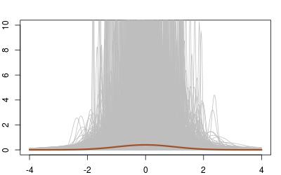 Even when averaging over all 10⁵ replications, the difference is hard to spot (and both estimations are more dispersed than the truth!):