
Need some geometric fonts for your next project? Get inspired!
For some years now, geometric fonts have been a consistent trend when it comes to brand and interface design. Good examples include AirBnB’s Cereal, Google’s Product Sans, even Spotify uses a geometric font called Circular.
If you start working on a new design project and want to use something geometric as well, you will have to search through a nearly unlimited range of different fonts. This makes it difficult to find the right one that fit your needs.
To help you with your search, I’ve made a pre-selection to make your decision a bit easier. All five are excellent choices and great alternatives. Each represents an exceptional combination of the geometric foundation built with modern details. The clarity and minimalist forms give each design a rational but nonetheless friendly feel. Let’s dive into it.
1. Gordita
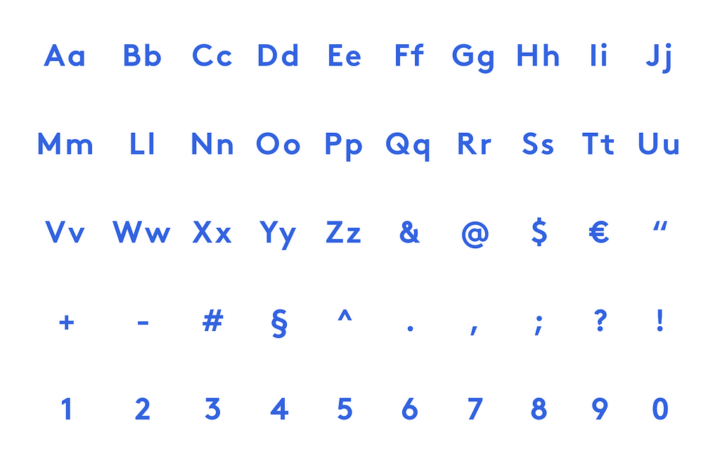
Gordita is a geometric typeface with modern details designed by Australian designer Thomas Gillett. It was published through Type Atelier in 2016 and is a well-kept secret because it’s not used very often.
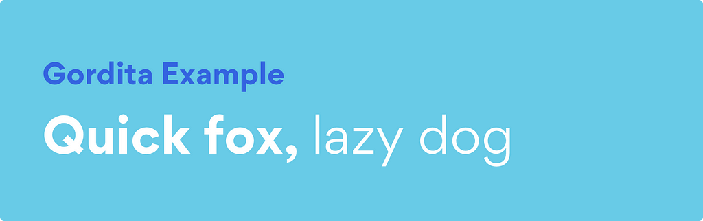
The design was significantly influenced by Futura and Gotham but features a quite warmer character than those typefaces. General forms have been optically compensated to appear natural and purely geometric. Ink traps and tapered joints support good legibility, even if some of the apertures are quite small. So—pay particular attention when using Gordita in small sizes.

Gordita is available in seven weights — thin, light, regular, medium, bold, black and ultra — and each has matching italics. This makes the font a real workhorse and designers have the opportunity to use them in a variety of ways.
2. Circular
Circular is a geometric sans-serif typeface created by Swiss designer Laurenz Brunner and released through Lineto in 2013. Since Spotify emerged in 2016 with the announcement of using Circular as the primary typeface for their brand and products, it has become quite famous and is widely used.

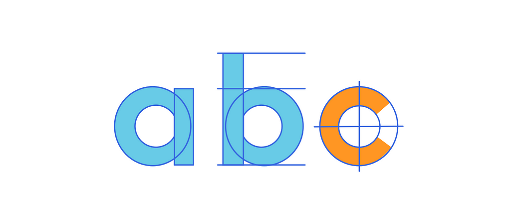
Although the design is based primarily on geometric forms, Circular has quirks that give it a friendly feel. The lowercase a and t are especially distinct. They make Circular easy to identify compared to other geometric sans-serifs.
Amazingly, Circular is only available in four weights — book, medium, bold and black — each with matching italics. This limitation puts the challenge on designers to get the most out of the existing weights. But on the other hand, it ensures a well thought-out use—which is good.
3. Sailec
Sailec is a geometric typeface published by Swiss foundry Type Dynamic in 2014. According to Nico Inosanto—the creator of Sailec–it was influenced by the international typographic style.
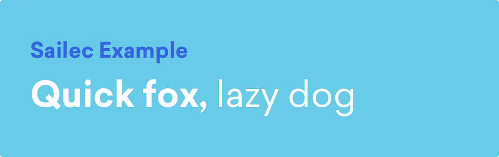
With a more rational and neutral character, it feels like a more grown-up variant of Gordita or Circular. Details like the small apertures give it a very special and compact character.
Sailec is available in seven weights — hairline, thin, light, regular, medium, bold and black — each with matching italics. Designers thus have a range of possibilities to use this typeface in a variety of ways.
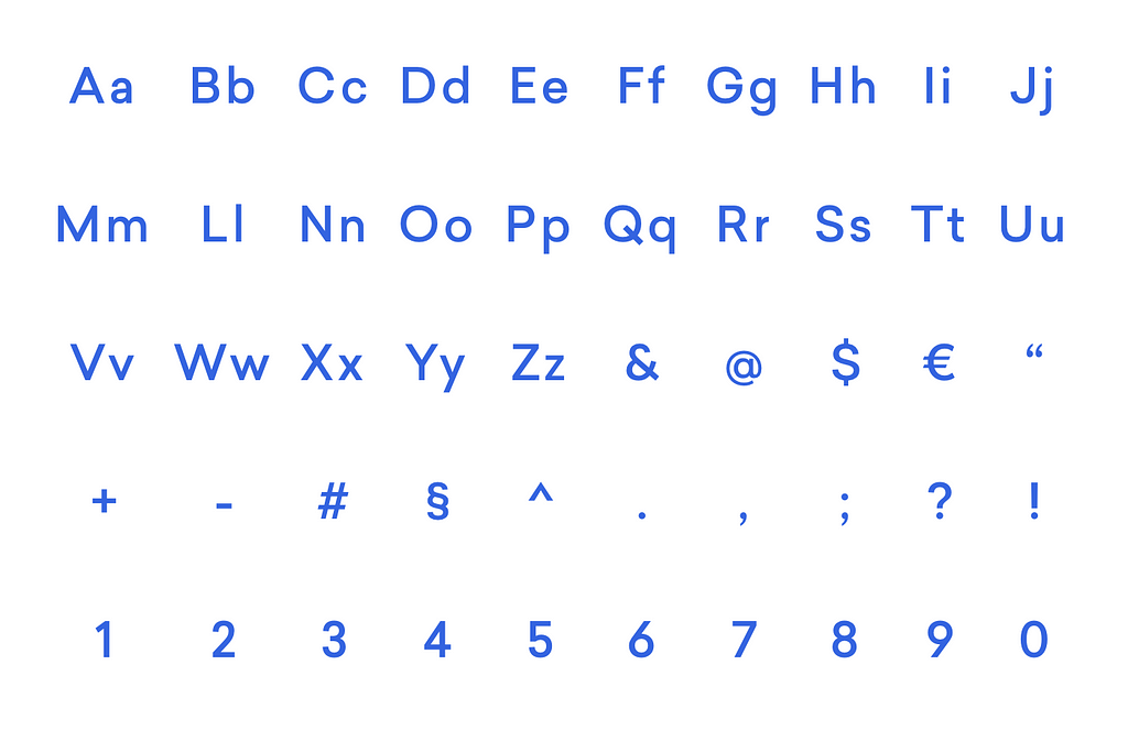
4. GT Walsheim
GT Walsheim is a geometric typeface designed by Noël Leu and released in 2010 through Swiss foundry Grilli Type. Swiss designer Otto Baumberger’s poster lettering inspired the design.
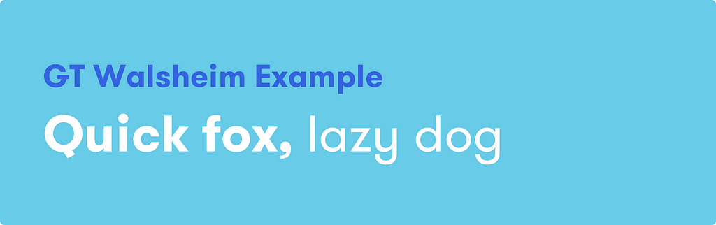
A lot of interesting characteristics and quirky details, such as the bar on the uppercase G, makes GT Walsheim a real highlight. Plenty of different stylistic alternatives for certain letters maks it an excellent choice.
GT Walsheim is available in eight weights — ultra light, thin, light, regular, medium, bold, black and ultra bold — each with matching italics. A big plus is the suitable condensed version.
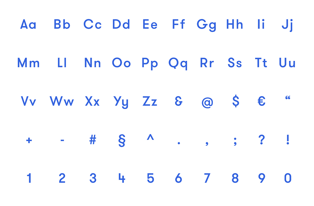
5. Brown
Brown is a geometric typeface designed by Aurèle Sack and released through Lineto in 2011. Its closeness to Johnston Sans, which shapes the appearance of the London Underground, is unmistakable.
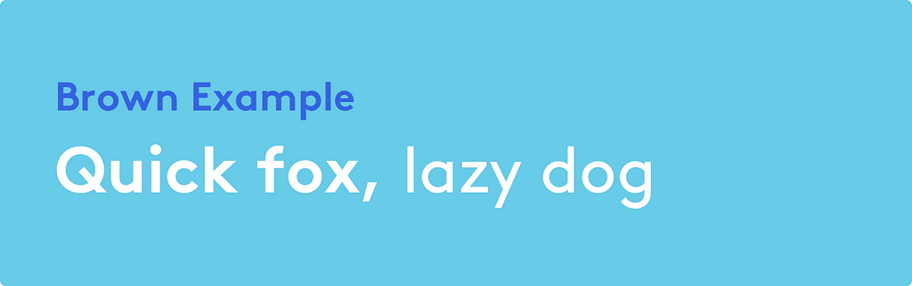
Interestingly, Brown includes multiple stylistic variants and a reclining version that slopes backward. If you are looking for a very outstanding look and feel, this might be your choice.
Brown is available in four weights — thin, light, regular and bold — each with matching italics. As with Circular, designers must limit themselves to what they have.
5+1. Futura
There can’t be a top list without including the mother and origin of all geometric fonts—Futura. Published in 1927 and designed by the German type designer Paul Renner, it is still the most influential source for all contemporary geometric typefaces these days.

Since its release almost 100 years ago, it has remained consistently famous and successful. It has been used by designers and typographers worldwide and is also the preferred typeface of directors Wes Anderson and Stanley Kubrick. Both have incorporated it into many of their works.

Futura has been steadily expanded over the years and today has an almost unmanageable number of cuts, weights, and variations. It is, therefore, a real workhorse, which can be used in many ways. If you want to find out more about Futura and how to use it properly in UI design, just have a look at one of my other reads.
Getting Futura right in UI design
What is your choice?
Thanks for reading so far. I hope this list can inspire you and give a feel for contemporary geometric sans-serif typefaces. Now I’d like to hear your recommendations. What would your choice be? Let me know and leave a comment — and thanks for making a clap.
Other Reads
- Start using real quotation marks in UI design
- Getting Futura right in UI design
- Designing type: a HackWeek diary
Top 5 geometric fonts for 2019 was originally published in UX Collective on Medium, where people are continuing the conversation by highlighting and responding to this story.
from UX Collective – Medium https://uxdesign.cc/top-5-geometric-fonts-for-2019-4c34a405bd97?source=rss—-138adf9c44c—4