Microsoft wants everyone to follow its lead with its new mobile design

Nearly a decade ago, Microsoft launched its Windows Phone platform with the promise that its software would free users from their phones. The first big ad campaign showed people engrossed in their devices at clubs, restrooms, and even on a roller coaster, while frustrated bystanders asked, over and over: “Really?

Windows Phone would answer those frustrations, said Microsoft. It was “designed to get you in and out, and back to life” with the help of the company’s striking tile-based Metro user interface. Microsoft envisioned a world in which apps would talk to each other seamlessly and content flowed freely. Despite some great design principles, Windows Phone didn’t work out, but Microsoft never gave up on the idea of improving mobile productivity.

Today, Microsoft is reviving some of these ambitions by bringing what it calls its Fluent Design system to its mobile Office apps, a simplified set of principles designed, just like Windows Phone, to speed things up on the go. It’s even letting third-party app developers embrace these design elements with toolkits to prettify their own apps. This will have the benefit of making Microsoft’s mobile apps feel more consistent, but the end goal is the same as Windows Phone’s was: to get users in and out of their apps quicker and back to life again.

“When we look at the mobile market, we feel like no one has done an amazing job of nailing productivity on phones across voice and visual systems in a sort of microtasking kind of way,” explains Jon Friedman, corporate vice president of design and research at Microsoft, in an exclusive interview with The Verge. “We feel like it’s our birth right and duty to help people in the world accomplish their goals, so that’s why we’ve been super focused on this.”

Microsoft has spent years researching exactly how people use their phones on a daily basis in markets like China, India, Europe, and the Americas. More than 40 designers and researchers across Microsoft “have collaborated to rethink and redesign how we approach mobile and mobile productivity,” reveals Friedman. “Not just the apps themselves, but how they all connect together and work together; and to build a common design system to extend Fluent to be a truly mobile-first design system.”

This unified mobile design system borrows a lot from the work Microsoft has been doing on Outlook in recent months, with improved iconography, identical file lists, updated typography, new splash screens, and a focus on dark mode.

Apps like Word, Excel, PowerPoint, Outlook, and OneDrive will now all share common design elements and look far more similar. Even Yammer, Teams, and Planner are getting new versions, too. You’ll soon notice a brand-colored header at the tops of these apps (like what exists in Outlook) and a simple bottom bar with Microsoft’s new Fluent design icons. Just like how Microsoft created a new dedicated mobile Office app to focus on tasks people do on the go, these separate apps have been simplified with the same goal in mind.

”The thing we learned in all of our research is that people spend about 4 hours a day on their phone, but the average session time of doing something is between 20 and 30 seconds long,” explains Friedman. That’s an extremely short burst of time to get something done on the go, and Microsoft is trying to improve its own apps, and others, to simplify those tasks with a design that makes it more familiar and less jarring when you switch apps.

That doesn’t mean every Microsoft app will look the same on iOS and Android, as the company is still trying to feel at home and native on these platforms. It means things like search should be in a similar place, and iconography will be reused so things feel more familiar. It’s these very subtle changes that can add up to improvements over time, and it’s a big part of Microsoft’s open design approach internally.

It’s not been an easy journey to get all Microsoft designers on the same page, but things like buttons, patterns, and file lists are now being reused freely in the company. “That took us some time to really get everyone involved and contribute,” says Benedikt Lehnert, director of product design for Microsoft 365 mobile experiences, in an interview with The Verge. “Now we have a really thriving community of mobile designers across the company that’s literally every week making the system better.”

A lot of this work has started off in small and subtle ways, but recently, Microsoft launched a new “Play My Emails” feature for Outlook that uses Cortana to read out emails and even calendar invites when you’re driving to work, cooking, or commuting. This feature was born out of designers wanting to design email for people who are visually impaired. Microsoft formed a relationship with the Washington State School for the Blind and spent time studying what it’s like to live in a narration experience.

“Listening to the entirely of a UI… is highly fatiguing for your brain,” explains Friedman. Microsoft added audio bumpers between emails, thanks to its research, allowing everyone to ignore things that aren’t important and stop listening. This is a feature that was designed around accessibility, which is a big focus for Microsoft, but that actually ends up being useful for everyone using it.

Beyond these subtle changes today, Microsoft has broader ambitions to impact iOS and Android further and push dual-screen experiences ahead. “Building this foundation of a Fluent mobile system that works across iOS and Android has been an awesome experience in designing dual-screen experiences as well,” reveals Friedman. “So when we work on Surface Duo and work on iPad side-by-side experiences, having a common system helps our apps align and have a cognitive connection across them with shared components and it makes the foundation of the dual-screen experience way better.”

Microsoft obviously faces big challenges here because the company doesn’t own or control the platform on which it’s trying to build apps. To counter this, the answer seems to be close partnerships with Samsung, Google, and others. Microsoft only vaguely hinted at its Google partnership for dual-screen Android experiences during the Surface Duo unveiling earlier this year, but it looks like this will go a lot deeper soon. Gmail, Google Drive, and Calendar are coming to Outlook.com, and Microsoft is testing ways to let people use their Google accounts to sign into a number of the company’s services.

“We have designers from Samsung, Google, and Microsoft sitting in rooms together designing together,” reveals Friedman. That’s a surprising turn of events, given the history of Samsung holding back on Windows Phone and Google’s bitter rivalry with Microsoft. Things have started changing, though. Microsoft and Google are also collaborating on Chromium, and now we’re starting to see some collaboration on Android. “It’s really about how do we make that experience better for our customers. That gives us a direct line of communication between designers on how we improve Microsoft experiences, how do we help Samsung improve its experiences, and how do we help Android improve its experience,” explains Friedman. “Those collaborations are awesome, it feels great to be part of an industry where we can actually work together on these things to make the products better.”

Microsoft is now leaving it up to developers to decide whether they want to use Fluent design elements in their own apps that plug into Office or even ones that are entirely separate. “If developers decide to build entire apps with these toolkits we’ll be really excited to see that, too, since they represent the best in class patterns from our perspective,” says Lehnert.

It’s fair to say that Microsoft’s previous Metro design system really helped push iOS and Android forward, and the company has been quick to adopt other design trends that the industry has implemented. “We’re in an interesting time when it comes to UI, things are converging more and more,” says Friedman. “I like to think that back in the Metro design days we started with this idea of simplification… and that’s gotten friendlier over time, which we’ve embraced with round people, rounded corners, and subtle drop shadows, and dark mode. I think generally speaking when we look at Android, iOS, the web, Windows, and Mac, there is a common DNA from a visual design perspective we’re starting to feel.”

Microsoft’s fresh approach to mobile design will be interesting to follow in the year ahead and beyond. Combined with the company’s promises for Fluid Framework, it feels like Microsoft is truly embracing mobile and the web as the foundations of its future. As Satya Nadella said recently, “the operating system is no longer the most important layer for us.” For Microsoft, it’s all about apps and services and building useful features that help people get work done on the go just that little bit quicker.

from Sidebar https://sidebar.io/out?url=https%3A%2F%2Fwww.theverge.com%2F2019%2F12%2F5%2F20996748%2Fmicrosoft-fluent-design-mobile-office-apps-new-updates-features

Why user onboarding is the most important part of the customer journey

The statistics don’t lie. User onboarding is the most important part of the customer journey by 2.6X. Getting users hooked, keeping them engaged, and retaining them in the long term all depend on delivering a great first-time user experience.

from The Appcues Blog https://www.appcues.com/blog/user-onboarding-customer-journey

10 Powerful User Nudges Illustrated

Theory

Small, individual tasks are far less daunting than big ones. The way in which tasks are presented and broken down affects how motivated we are to start and finish them.

Example

Companies like Ryanair offer the entire purchasing process in chunks. They offer you a low ‘seat price’, and the lock you in the process. Getting you excited about your trip. Then, once you have decided where to go, you begin to form a mental commitment. Once this happens, it’s very unlikely that you’ll change your mind about the purchase.

And at this moment they start to add the extra charges in ‘chunks’. By the time you get to the full cost of your flight, you have put so much effort into the booking process, and are so attached to the idea of the holiday, that you would rather complete the purchase at a cost significantly higher than the initial seat price than write off the investment of your time and emotion.

from Sidebar https://sidebar.io/out?url=https%3A%2F%2Fuxplanet.org%2F10-powerful-user-nudges-illustrated-540ce4063f9a

3 best practices for SaaS customer onboarding

If you work in SaaS, chances are you’re familiar with the enablement gap that exists between the signing of a customer contract and their successful adoption. Since adoption is a key metric for successful onboarding, the priority is to close that gap quickly. 

Many companies have created dedicated teams tasked with driving one-to-one touchpoints with customers and getting their teams up-to-speed and enthusiastic about using the product they just acquired. By helping customers take ownership of the tools, we can set a direct course for their first value moment via tech-touch or human-touch interactions. 

While the onboarding specialists provide only one part of the full customer onboarding experience, we’re often a uniquely human interaction along the way. Therefore, it’s critical that we make the most of the opportunity to represent the product and bring it to life for the customer.

At UserTesting, the Customer Onboarding team has spent the past two years designing and iterating on its programming to increase successful product adoption. Today, we want to share the three best practices that we’ve learned along the way:

1. Strike while the iron’s hot

As onboarding facilitators, we often get to provide customers with their first impressions of the product. This is our chance to make the most of their enthusiasm and get users in the product early. Depending on how much of your product enablement is automated (in-product cues, tutorial videos, etc.), make the most of your human-to-human time by collaborating in the product and workshopping on real projects. Keep up the momentum by encouraging teams to try out the tailored use cases you’ve discussed.

2. Have everyone in the room (at just the right times)

Of course, we want everyone to love our product as much as we do, but some conversations are going to be more relevant to certain team members than others. Ensure value for your customers by inviting just the right people to the appropriate touchpoints. Design targeted workshops for your different user groups, including managers and execs. Adoption rises when everyone understands the role they play in the tool.

3. Make space for conversation, collaboration, and contrarians

If you want to facilitate engaging conversations, design your onboarding program for interaction and collaboration. Build working sessions and encourage the customer team to lead the way on their real-world projects. While video tutorials and help center articles are a necessary component for onboarding, discussing questions and concerns in-person will increase the likelihood of retention.

Empathy in onboarding leads to more successful adoption

Whether you work in a dedicated customer onboarding function or in a longer-term customer success role, you have the opportunity to leave a lasting, positive impression of your product by providing a thoughtful, targeted human touch for your customers. 

Allow your marketing campaigns and smart product triggers to drive autonomy, but don’t forget the value of hands-on relationship-building in the early stages of customer onboarding. The connections you make with customers through the onboarding experience may be the difference between successful adoption and renewal or inactivity and customer churn.

Insight for the Experience Economy

Get our best human insight resources delivered to your inbox every month. As a bonus, we’ll send you our latest industry report, The rise of the Experience Economy!

Thank you!

Get ready for some great content coming to your inbox from the team at UserTesting!

About the author: Sean Treiser is one of UserTesting’s Onboarding Specialists—helping to train customer teams across a variety of industries, shapes, and sizes in user research best practices. Outside of the office, you’ll find him riding bike trails, patronizing sushi bars, and attending just about every concert around Atlanta.

from UserTesting Blog https://www.usertesting.com/blog/3-best-practices-saas-onboarding/

A Guide to MLA Format and Annotations | CloudApp

At one time another, whether for a college writing assignment, to publish a groundbreaking research paper, or when working in a professional environment, you may be asked to write something in the MLA format.

Not sure what the MLA format is? Don’t worry, that’s what this article is about! Keep reading to learn all about this writing structure, how to use it successfully, and how CloudApp can help.

What is MLA Format?

The MLA format is a document organization structure that was developed and popularized by the Modern Language Association; a collection of American scholars that “promotes the study and teaching of literature.”

The MLA format was first introduced in 1951 as a way for all researchers, scholars, students, and others in the fields of language and literature to structure their research papers and assignments. By adopting one uniform approach to structure, the Modern Language Association hoped to make the consumption of information as easy and streamlined as possible.

The MLA format style guide was most recently updated in 2016. This is the eighth version published by the Modern Language Association since the format was first developed.

How to Do MLA Format

Now that we have a shared understanding of what the MLA format is, we can begin discussing how to use it. The following nine simple steps will teach you how to craft a document using this formatting structure — no matter which word processor you choose to use.

  1. Set your document’s page margins to one inch if they aren’t set to this figure already. One inch is standard for all MLA formatted documents.
  2. Choose “Double” for the line spacing of your document. This addition of white space is used to make the consumption of content easier.
  3. Select a clear and easily legible font such as Times New Roman and make sure to set it to size 12, the standard font size for all MLA formatted documents.
  4. Create an appropriate header that includes your full name, your instructor’s name (if applicable), the course name (if applicable), and the date. You’ll also want to ensure that each page is automatically numbered in the upper right-hand corner.
  5. Below the header, type the title of your document and center it. You should use sentence case, which means only the first word of your title and all proper nouns are capitalized.
  6. As you write, be sure to indent each new paragraph ½ inch, leave one space after periods and other punctuation points, and only use italics when absolutely necessary. Do not use bold letters or underline your words.
  7. You should also know that MLA format in text citation is” done via parenthetical citations and is the same regardless of container (i.g. book or article.)” Each MLA format citation should include the author’s name and the page number.
  8. The Modern Language Association also has strict guidelines when it comes to works cited. Fortunately, the good folks at bibme have created an extensive guide. We suggest viewing and following it to the letter.
  9. Finally, once your document is written and structured in the MLA format, you can distribute it. Depending on the purpose of your paper, you may be able to do this digitally. But if a hard copy is needed, use white paper (not off-white or ivory) and choose a high-quality, non-cardstock version for printing purposes.

There you have it! Follow these nine easy steps and you’ll be able to submit all of your research papers, class assignments, and other documents in a perfect MLA format.

MLA Format Examples

It can be difficult to grasp the MLA format without seeing it first hand. With that in mind, we’ve included a couple of MLA format examples for you to view below. Notice how each of the elements previously discussed is included.

Purdue University

Source: Purdue.edu

BibMe (Works Cited Page)

Source: bibme.org

These two examples clearly illustrate what documents in the MLA format should look like. If you’re new to this formatting style, we suggest comparing your final paper to them to ensure you’ve formatted your work in the correct way.

MLA Format Annotations

Now, let’s switch gears a little bit and talk specifically about MLA format annotations. Annotations are important elements of many research papers and other documents that regularly use the MLA format.

In the next few sections, we’ll explain what annotations are, how to use them in the MLA format, and a handy annotation tool you can use to make the entire process smooth and painless.

What is Annotation

Before we get too far ahead of ourselves, we’ll take a quick minute to define what an annotation is. According to ThoughtCo., an annotation is:

“A note, comment, or concise statement of the key ideas in a text or a portion of a text and is commonly used in reading instruction and in research.”

There are many different ways to annotate a document and different best-practices depending on the kind of document being annotated. In the next section, we’ll cover how to annotate in the MLA format that we discussed earlier in this article.

Annotation in MLA Format

The MLA format, unsurprisingly, has specific requirements for annotation. In most cases, these annotations will occur in the bibliography section of any research paper or report you happen to be working on and will be used to cite books, articles, and other resources necessary for research purposes.

There are two types of annotations to be aware of:

  1. Summary Annotations: A summary annotation is exactly what it sounds like: an annotation that summarizes the source cited. These annotations should include the author and topic of the document, its purpose, the date is was published, and how it was made available for public consumption.
  2. Evaluative Annotations: An evaluative annotation includes all the aspects of the summary annotation but also includes an assessment of the work’s accuracy, its relevance to the report, and its overall quality. These kinds of annotations help readers learn whether the document will be useful to them or not.

When writing annotations in the MLA format, there are a few things you’ll want to keep in mind, beyond the type of annotation you’re creating.

  • Annotations should be written in the third person, double spaced, and about three to six sentences long, or 150 – 250 words.
  • If the paper in question required a large amount of research and there are many works that need to be cited, feel free to organize them by topic.
  • Be as objective as possible. If you must share an opinion, explain it. That way the reader can understand where you are coming from.

Here’s one of our favorite annotation techniques examples from Columbia College:

Follow these basic rules and guidelines and you’ll be able to easily write annotations in the MLA format and properly cite the works you used to craft your paper or report.

Annotation For the Future of Work: CloudAppBefore we let you go, we want to address one more thing. Namely, how CloudApp can make the crafting of annotations in the MLA format much more convenient.

Before we let you go, we want to address one more thing. Namely, how CloudApp can make the crafting of annotations in the MLA format much more convenient.

If you’re not familiar with CloudApp, it’s a revolutionary visual communication tool that combines webcam and screen recording, GIF creation, and image annotation features in one powerful and easy to use package that’s sure to boost your productivity. Plus, it’s free to use!

When it comes to modern annotation methods — especially as they pertain to the MLA format — there isn’t a better tool than CloudApp. Keep reading to learn how our tool can be used.

How to Annotate With CloudApp

Annotating your work with CloudApp couldn’t be simpler. Just follow these directions and you’ll be up and running in no time!

For Mac Users

Are you part of the Apple faithful? The following four steps will allow you to easily annotate just about anything — images, reports, research papers… the list goes on!

  1. Download CloudApp and create your free account. Then navigate to the upper right-hand corner of your screen (in the menu bar) and click the CloudApp icon.
  2. In the drop-down menu that appears, select the “Annotation” option. Then, either take a screenshot of your screen, or upload the document you want to add annotations to.
  3. Next, choose the type of annotation you’d like to add. CloudApp has arrows, lines, circles, and emojis available. But to adhere to MLA format guidelines, you’ll want to stick with the text box option.
  4. Annotate your image or document to perfection. When you’re done, click the blue “Save” button and your work will be uploaded to the cloud automatically . From there, you’ll have the ability to email it, send it in Slack chats, attach it to Trello cards, and more.

For Windows Users

If you’re a windows PC user, you can use CloudApp also. The process is largely the same as described above. But we’ve included a separate set of instructions for clarity:

  1. Download CloudApp and create your free account. Then navigate to the lower right-hand corner of your screen (in the Quick Launch icon tray) and click the CloudApp icon.
  2. In the drop-down menu that appears, select the “Annotation” option. Then, either take a screenshot of your screen, or upload the document you want to add annotations to.
  3. Next, choose the type of annotation you’d like to add. CloudApp has arrows, lines, circles, and emojis available. But to adhere to MLA format guidelines, you’ll want to stick with the text box option.
  4. Annotate your image or document to perfection. When you’re done, click the blue “Save” button and your work will automatically be uploaded to the cloud. From there, you’ll have the ability to email it, send it in Slack chats, attach it to Trello cards, and more!

And that’s it! Whether you use a Mac or Windows computer, you can use CloudApp to quickly annotate your work in the MLA format — or any other format you might like to use.

In Conclusion

The MLA format is an important writing structure to understand for anyone publishing research reports or completing class assignments. It’s even used in professional environments from time to time. Fortunately, you now know everything you need to know to use MLA successfully.

What is MLA Format?

The MLA format is a document organization structure that was developed and popularized by the Modern Language Association; a collection of American scholars that “promotes the study and teaching of literature.”

The MLA format was first introduced in 1951 as a way for all researchers, scholars, students, and others in the fields of language and literature to structure their research papers and assignments. By adopting one uniform approach to structure, the Modern Language Association hoped to make the consumption of information as easy and streamlined as possible.

The MLA format style guide was most recently updated in 2016. This is the eighth version published by the Modern Language Association since the format was first developed.

from CloudApp: The Future of Work https://www.getcloudapp.com/blog/mla-format-guide

13 Mind-Blowing Things Artificial Intelligence Can Already Do Today

By now, most of us are aware of artificial intelligence (AI) being an increasingly present part of our everyday lives. But, many of us would be quite surprised to learn of some of the skills AI already knows how to do. Here are 13 mind-blowing skills artificial intelligence can already do today.

13 Mind-Blowing Things Artificial Intelligence Can Already Do Today

Adobe Stock

1.           Read

Is one of your wishes to save time by only having to pay attention to the salient points of communication? Your wish has come true with artificial intelligence-powered SummarizeBot. Whether it’s news articles, weblinks, books, emails, legal documents, audio and image files, and more, automatic text summarization by artificial intelligence and machine learning reads communication and reports back the essential information. Currently, SummarizeBot can be used in Facebook Messenger or Slack and relies on natural language processing, machine learning, artificial intelligence, and blockchain technologies.

2.           Write

Would you believe that along with professional journalists, news organizations such as The New York Times, Washington Post, Reuters, and more rely on artificial intelligence to write? They do, and although this does include many "who, what, where, when, and how" formulaic pieces, AI is able to expand beyond this to more creative writing as well. Many marketers are turning to artificial intelligence to craft their social media posts. Even a novel has even been generated by artificial intelligence that was short-listed for an award.

3.           See

Machine vision is when computers can “see” the world, analyze visual data, and make decisions about it. There are so many amazing ways machine vision is used today, including enabling self-driving cars, facial recognition for police work, payment portals, and more. In manufacturing, the ability for machines to see helps in predictive maintenance and product quality control.

4.           Hear and understand

Did you know artificial intelligence is able to detect gunshots, analyze the sound, and then alert relevant agencies? This is one of the mind-blowing things AI can do when it hears and understands sounds. And who can refute the helpfulness of digital voice assistants to respond to your queries whether you want a weather report or your day’s agenda? Business professionals love the convenience, efficiency, and accuracy provided by AI through automated meeting minutes.  

5. Speak

Artificial intelligence can also speak. While it’s helpful (and fun) to have Alexa and Google Maps respond to your queries and give you directions, Google Duplex takes it one step further and uses AI to schedule appointments and complete tasks over the phone in very conversational language. It can respond accurately to the responses given by the humans it’s talking to as well. 

6. Smell

There are artificial intelligence researchers who are currently developing AI models that will be able to detect illnesses—just by smelling a human’s breath. It can detect chemicals called aldehydes that are associated with human illnesses and stress, including cancer, diabetes, brain injuries, and detecting the "woody, musky odor" emitted from Parkinson’s disease even before any other symptoms are identified. Artificially intelligent bots could identify gas leaks or other caustic chemicals, as well. IBM is even using AI to develop new perfumes.

7. Touch

Using sensors and cameras, there’s a robot that can identify "supermarket ripe" raspberries and even pick them and place them into a basket! Its creator says that it will eventually be able to pick one raspberry every 10 seconds for 20 hours a day! The next step for AI tactile development is to link touch with other senses.

8. Move

Artificial intelligence propels all kinds of movement from autonomous vehicles to drones to robots. The Alter 3 production at Tokyo’s New National Theatre features robots that can generate motion autonomously. 

9. Understand emotions

Market research is being aided by AI tools that track a person’s emotions as they watch videos. Artificial emotional intelligence can gather data from a person’s facial expressions, body language, and more, analyze it against an emotion database to determine what emotion is likely being expressed, and then determine an action based on that info.  

10. Play games

It’s not all serious business with artificial intelligence—it can learn to play games such as chess, Go, and poker (which was an incredible feat)! And, turns out that AI can learn to play these games plus compete and even beat humans at them!

11. Debate

IBM’s Project Debater showed us that artificial intelligence can even be successful at debating humans in complex subjects. Not only is it able to research a topic, but it can also create an engaging point of view and craft rebuttals against a human opponent.

12. Create

Artificial intelligence can even master creative processes, including making visual art, writing poetry, composing music, and taking photographs. Google’s AI was even able to create its own AI “child”—that outperformed human-made counterparts.

13.   Read your mind

This is truly mind-boggling—AI that can read your mind! It can interpret brain signals and then create speech. Impressive and life-changing for those with speech impairment, but a little bit unnerving when you consider the mind-reading aspect of the skill. It’s no surprise that some of the biggest tech giants, including Facebook and Elon Musk have their own projects underway to capitalize on AI’s mind-reading potential.

Now imagine if these 13 mind-blowing skills were all combined into one super artificial intelligence! Frightening or exhilarating? That’s up to you to decide, but I think we can all agree, it would be mind-blowing!

from Forbes https://www.forbes.com/sites/bernardmarr/2019/11/11/13-mind-blowing-things-artificial-intelligence-can-already-do-today/

8 Tips for Perfect Dark Theme UI

Is Dark Mode just another trend or something we need to implement on designs as soon as possible?
The idea of using Dark modes is to conserve mobile phone and tablet energy by asking screen pixels to fire less brightly and to reduces eye strain for users, that’s true just not entirely true.

1⃣ Google claims that black requires far less power to display on-screen than white and that might be true but when it comes to user-experience that really depends on the product and conditions:

2⃣ According to some studies (white text/black background vs white background/black text) by Susanne Mayr “participants were better performing in the positive polarity condition”.

3⃣ Another study from Sally Augustin shows that: “..brightness and colors can definitely provoke emotion, so muting out an app’s appearance can make it harder to connect with users.”

So what’s the thing with Dark Modes, with other words we like it, it’s refreshing, looks clean, different and new.

Should products include dark mode:
-Yes, users are asking for it so why not catch up with this “trend”.

Which is the best way to implement Dark Mode:
-Dark Mode can be automatically activated on night hours
-Dark Mode should always be provided as an option

The benefits are:
-It is good for tired eyes
-It is visually appealing
-Feels refreshing

🔼 When to use it:
-When dark goes along with brand colors
-To reduce eye strain
-To support visual hierarchy
-To save energy, on pages that are used for long periods of time

In my opinion, for a better understanding try to compare Light/Dark Mode with the lights on your room, sometimes turning the light feels relaxing, but there is always a switch to turn it back on.

Here is a great summary for a Redditor:
-Night is dark. Screen is bright. Eyes hurt.
-Night is dark. Screen is dark. Eyes not hurt.

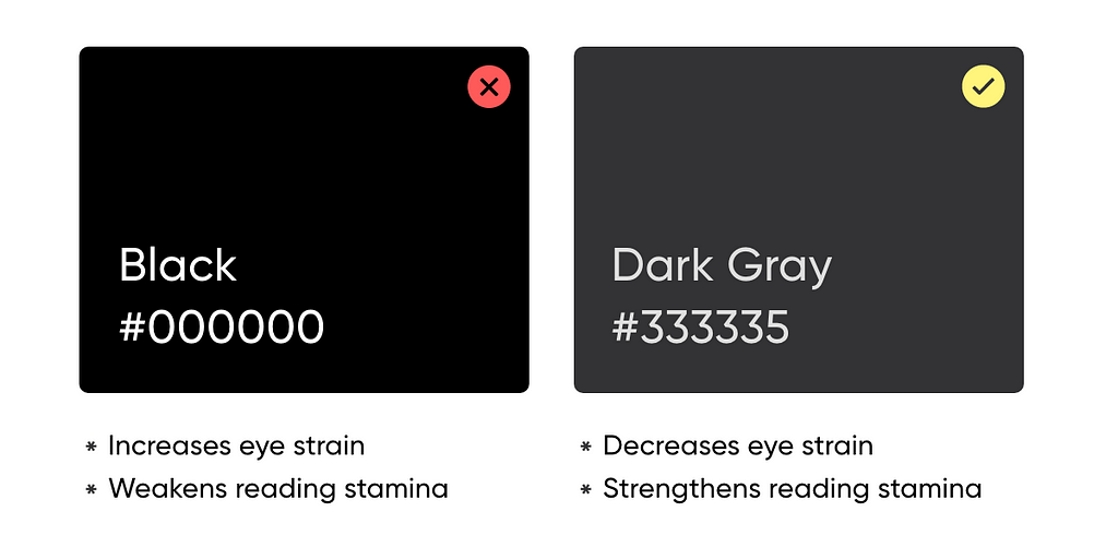
1. Avoid Pure Black/White

100% color brightness and black have 0% color brightness causes the user’s eyes to work harder to adapt to the brightness.

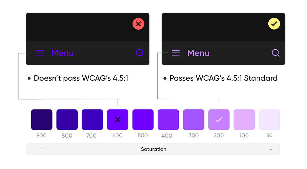
2. Avoid Saturated Colors

Saturated colors don’t pass WCAG’s accessibility standard. Less saturated colors from your color palette improve legibility and reduce visual vibration.

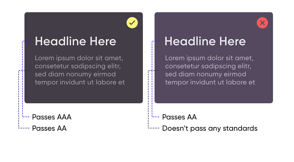
3. Accessibility and Contrast

Dark theme surfaces must be dark enough to display white text, ensuring that body text passes WCAG’s AA standard.

4. Communicate depth

The more elevated the surface is, the stronger and brighter the overlay becomes.

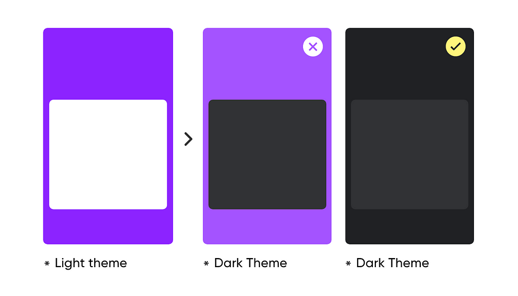
5. Don’t convert Light to Dark

Just converting colors from the light to the dark variants doesn’t produce a good result. Large surfaces use a dark surface color.

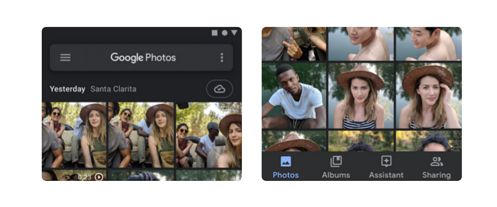
6. Low-Contrast grays on Imagery Products

Use dark gray rather than pure black, because that saturation contrasts well against bright pixels to better express colorful photos.

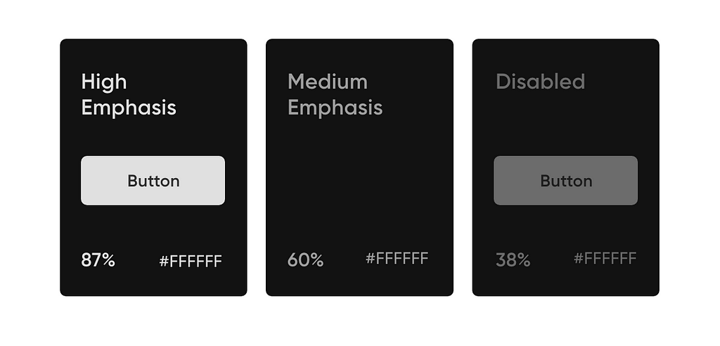
7. Text Opacity = Emphasis

  • The high-emphasis text should have an opacity of 87%
  • Medium emphasis text is applied at 60%
  • The disabled text uses an opacity of 38%.

8. Avoid Shadows

Shadows on dark themes don’t serve the same purpose as they do on light themes, also they don’t look good.

“Writing articles for people who are in a rush, I value your time, and probably like me, you like reading on the go. Keeping it short so you don’t have to skip any paragraph.”

❓Do you have any questions? Let me know:
Instagram — Linkedin — Behance — Dribbble


8 Tips for Perfect Dark Theme UI was originally published in Prototypr on Medium, where people are continuing the conversation by highlighting and responding to this story.

from Prototypr https://blog.prototypr.io/8-tips-for-perfect-dark-theme-ui-5aa34784784e?source=rss—-eb297ea1161a—4

The power of framework design

This map was not created to introduce a waterfall process. Rather, it was a powerful anchor throughout the project. Files touch every part of Dropbox, so we needed to work across the organization. Our roadmap artifact provided transparency in our approach. At any given moment, we could pinpoint where we were in our process. That helped set expectations and build trust with our collaborators.

It also held us, as designers, accountable for diverging and exploring before we settled on ideas. By scoping a timeline to do so, we carved out the space we needed for high-quality work.

Model before mocks

With any platform project, it’s important that UX and technical planning happen together. So before we got into pixels, we tackled a model that would ground both design and engineering.

Expert Hugh Dubberly defines a model as a hypothesis for how a system could work. At their core, “models describe relationships: parts that make up wholes; structures that bind them; and how parts behave in relation to one another.”

A good model will inform a strong design opinion, because, as Dubberly writes:

Models are not objective. They leave things out. They draw boundaries between what is modeled and what is not; between the system and its environment; and between the elements of the system.

Framing a system—defining it—is editing. What we think of as natural boundaries, inside and outside, are somewhat arbitrary. The people making the model choose what boundaries to draw and where to draw them. That means, they have to agree on the choices.

To start, we diverged on key questions that we wanted our model to answer. Where should our solution live on a spectrum of automatic vs. user-controlled? What core value will our solution offer to end-users? How might we organize a rules-based system that could handle a variable number of file types and jobs to be done?

We grappled with different ways to answer these questions with models. Doing so led to rich discussions that informed a shared point of view about our core elements:

  • Modes: There were too many jobs required of our single file viewer. An all-in-one solution would lead to too much product complexity. Our model would introduce the concept of modes—different views for different jobs.
  • Attributes: There were many details about a file that we needed to account for—things like extensions and types, states of collaboration, visibility settings, and beyond. These details would grow in volume as our technology became more sophisticated. Our model would need to support infinite attributes.
  • Controller: Previews should be contextually aware—smart enough to show the right tools at the right times. We needed technology to determine the right mode to show a user based on attributes. To start, we could set heuristics for our controller to follow. In the long term, our logic would become more elegant with machine learning.

Here’s how we represented these core elements and their relationships at a high level:

from Sidebar https://sidebar.io/out?url=https%3A%2F%2Fdropbox.design%2Farticle%2Fthe-power-of-framework-design