
Is Dark Mode just another trend or something we need to implement on designs as soon as possible?
The idea of using Dark modes is to conserve mobile phone and tablet energy by asking screen pixels to fire less brightly and to reduces eye strain for users, that’s true just not entirely true.
1⃣ Google claims that black requires far less power to display on-screen than white and that might be true but when it comes to user-experience that really depends on the product and conditions:
2⃣ According to some studies (white text/black background vs white background/black text) by Susanne Mayr “participants were better performing in the positive polarity condition”.
3⃣ Another study from Sally Augustin shows that: “..brightness and colors can definitely provoke emotion, so muting out an app’s appearance can make it harder to connect with users.”
So what’s the thing with Dark Modes, with other words we like it, it’s refreshing, looks clean, different and new.
▪ Should products include dark mode:
-Yes, users are asking for it so why not catch up with this “trend”.
▪ Which is the best way to implement Dark Mode:
-Dark Mode can be automatically activated on night hours
-Dark Mode should always be provided as an option
▪ The benefits are:
-It is good for tired eyes
-It is visually appealing
-Feels refreshing
🔼 When to use it:
-When dark goes along with brand colors
-To reduce eye strain
-To support visual hierarchy
-To save energy, on pages that are used for long periods of time
In my opinion, for a better understanding try to compare Light/Dark Mode with the lights on your room, sometimes turning the light feels relaxing, but there is always a switch to turn it back on.
Here is a great summary for a Redditor:
-Night is dark. Screen is bright. Eyes hurt.
-Night is dark. Screen is dark. Eyes not hurt.
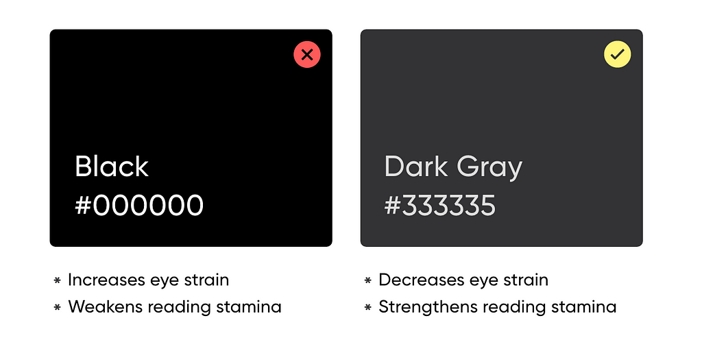
1. Avoid Pure Black/White
100% color brightness and black have 0% color brightness causes the user’s eyes to work harder to adapt to the brightness.
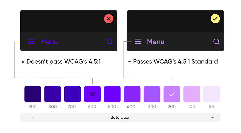
2. Avoid Saturated Colors
Saturated colors don’t pass WCAG’s accessibility standard. Less saturated colors from your color palette improve legibility and reduce visual vibration.
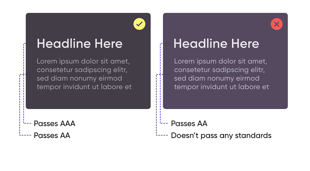
3. Accessibility and Contrast
Dark theme surfaces must be dark enough to display white text, ensuring that body text passes WCAG’s AA standard.
4. Communicate depth
The more elevated the surface is, the stronger and brighter the overlay becomes.

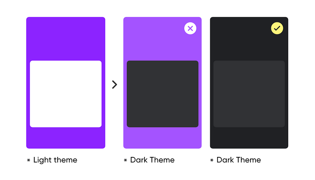
5. Don’t convert Light to Dark
Just converting colors from the light to the dark variants doesn’t produce a good result. Large surfaces use a dark surface color.
6. Low-Contrast grays on Imagery Products
Use dark gray rather than pure black, because that saturation contrasts well against bright pixels to better express colorful photos.

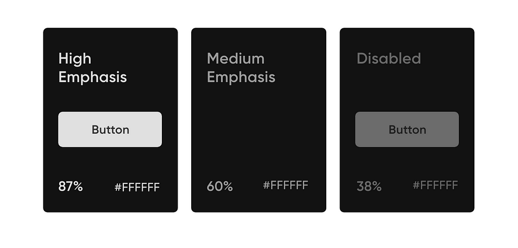
7. Text Opacity = Emphasis
- The high-emphasis text should have an opacity of 87%
- Medium emphasis text is applied at 60%
- The disabled text uses an opacity of 38%.
8. Avoid Shadows
Shadows on dark themes don’t serve the same purpose as they do on light themes, also they don’t look good.

“Writing articles for people who are in a rush, I value your time, and probably like me, you like reading on the go. Keeping it short so you don’t have to skip any paragraph.”
❓Do you have any questions? Let me know:
Instagram — Linkedin — Behance — Dribbble
8 Tips for Perfect Dark Theme UI was originally published in Prototypr on Medium, where people are continuing the conversation by highlighting and responding to this story.
from Prototypr https://blog.prototypr.io/8-tips-for-perfect-dark-theme-ui-5aa34784784e?source=rss—-eb297ea1161a—4