How Capital One designs their online forms

Developing effective online forms is something lots of companies struggle with; while it’s a great opportunity for engagement, it also leads to plenty of customer problems. In a recent InVision DesignTalk, Capital One designer Sara Walsh came in to explain how companies can utilize forms to create conversation and solve user issues.

Sara taught us that when designing customer interactions via a form, designers have to ask themselves a few basic questions:


  • What is the customer trying to do?
  • How does this experience fit into the user’s world?
  • Does the language feel human and real?


These are real-life excerpts from Sara’s team’s process for online form design. Read on for more about the step-by-step approach to forms that has helped her team figure out customer needs and develop their messaging strategy.

Step 1: Figure out the conversation


Designing online forms

Sara’s team gets started by nailing down the kind of conversation they want to have with their customers, starting with a simple task like opening a new account. From here, the team is able to put together some scenarios, like a customer talking to a bank representative, that give them an idea of what actual client interactions sound like—thought bubbles and all.


“This isn’t about the ‘fanciest’ way to design a form: it’s about figuring out the conversations you need to have with your customers, and using that as the foundation

for your form design project.”


Designing online forms

Once they’ve done this, team members can review what they wrote and come up with an action plan for their new form designs. It’s not just helpful for identifying knowledge gaps and coming up with new ideas: this process helps the designers create copy in their users’ language. This isn’t about the “fanciest” way to design a form: it’s about figuring out the conversations you need to have with your customers, and using that as the foundation for your form design project.


Step 2: Identify the problems

The second step in this process is identifying the problems you’ll be addressing in the new form.

Let’s use the team’s example of opening a new bank account. The main problem here that Sara’s team was solving was helping small business owners open online checking accounts with Capital One. The instructions on the existing forms weren’t clear so potential customers weren’t providing required information, didn’t have enough context to properly answer questions, and weren’t sure what they needed to do in order to apply. It was so frustrating that only 26% of users ended up actually completing the form.


Designing online forms

Sara’s team realized they were addressing customers like they were a risk to the company, which was definitely not what they wanted to convey. To get past this, the team went deep into researching problems with the form using data, customer feedback, and competitor research—and realized their copy didn’t support their story, the progress bar wasn’t helpful, and the tooltips were hiding important information. Yikes.


Step 3: Write the conversation

Once your team is clear on the problems, you can start writing conversations. This step is crucial to developing an outline for the new forms: something Sara describes as similar to a game of Mad Libs, as they give the customer a framework to complete their story.


“Once your team is clear on the problems, you can start writing conversations.”


Designing online forms

By writing a conversation based on what your customer is trying to accomplish, your team can discover your product’s natural information hierarchy—something that will help your team understand the most effective way to organize the form. For example, in Capital One’s case, the conversation revolved around signing up for an online business account—so it needed to include a greeting, a CTA, some questions about the process, and options to review and submit the application.

Step 4: Develop a form field strategy

The next step is to develop a form field strategy based on the conversations your team wrote. It’s important to remember that every field has a purpose: each space needs a reason to being on the form, and forms should follow the flow of an actual conversation.


Designing online forms

Designing online forms

Sara also provided some insight into what goes into the different form fields and how to get the most mileage out of them. You can see above that the field label lets you know what goes into the box—think name, street address—and whether or not it’s required. Anything else can be added or changed based on your company’s specific needs: something like field captions or hint texts.

Design teams should be aware that designing forms isn’t always a one-team show, and there’s a chance they’ll find themselves collaborating with developers.

Step 5: Create error messages that move customers forward

Even the most exceptional form design has to come with some error messages (that will help you solve problems and keep customers moving). Sara explained that natural, down-to-earth language is a great way to hit these goals, as well as presenting customers with options and identifying with their emotions. Helpfulness and empathy are key here: no one likes an error page, but by addressing customer frustration you can hopefully win them back and motivate them to keep going forward.

“Helpfulness and empathy are key here: no one likes an error page.”


Designing online forms

This new process helped Sara’s term develop a hyper-effective online application form, with 92% of users finishing the application (up from 26%!) and a major decrease in calls to customer support. Users were able to complete entire pages in 3-4 minutes—which used to be enough time for them to finish one question.

Don’t get too excited, though: Sara’s team spent almost three months developing this process! This kind of research isn’t quick or simple, and you’ll see there’s going to be lots of design iterations along the way. With that being said, Sara believes that by following these steps and being persistent, design teams everywhere can create exceptional and successful online forms.

Watch the recording of Sara’s DesignTalk

If you weren’t able to attend the event, no sweat—you can watch the recording here, along with the other three webinars that were a part of this series on UX copy.


Did you like this? Then you’ll like these too:


Tara Malone
Tara Malone is a professional freelance copywriter who specializes in writing long-form blog content for tech companies.

from InVision Blog https://www.invisionapp.com/blog/designing-online-forms/

Baroque Underwater Photography by Christy Lee Rogers

“A Dream Dreamed in the Presence of Reason”. All photos © Christy Lee Rogers

Photographer Christy Lee Rogers produces luminous scenes of swirling figures swathed in colorful fabrics. She creates a painterly quality in her large-scale images not by using wet pigments, but rather by completely submerging her subjects in illuminated water and photographing them at night.

The works shown here are part of Rogers’ most recent series, titled ‘Muses’, which were in response to a year of personal loss. She shared in an interview that “these final images represent a soft and peaceful place that I imagine exists, where you can be free to let go and experience the beauty surrounding you.”

Rogers grew up in Hawaii and continues to shoot there, though she now lives in Nashville. Her works are exhibited widely, alongside video installations, one of which can be viewed below.  The photographer recently had a solo show at Art Labor Gallery, who will also be representing her work at PHOTOFAIRS | Shangai, opening on September 21, 2018. You can see more from Rogers on Facebook and Vimeo. (via Booooooom)

“Our Hopes and Expectations”

“Love Live”

“Awaken”

“Alive”

“Cloud Nine”

“Rhapsody”

“Harmony”

“Apparition”

“Evolution”

from Colossal https://www.thisiscolossal.com/2018/08/baroque-underwater-photography-by-christy-lee-rogers/

The Left-Handed Struggle Is Real and Oreos Has Got Your Back

04d32908-4806-49ad-874a-98421f0b907c-left-handed-oreo-cookies.png

By: Rudy Sanchez

Being a leftie means living in a world not designed for you. Writing means getting your palm full of pencil or ink smudges. Thankfully, we use a keyboard for most of our writing, but everything from baseball gloves to guitars must be specially designed for southpaw use. Sure, Ned Flander’s Leftorium remote control is a bit of a stretch, but there’s an overwhelming need for ambidextrous or left-handed designed items.

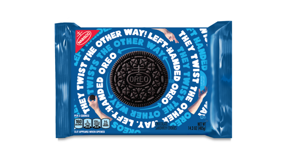
In support of International Left-Handers Day, a day founded and first observed in 1976 by the Lefthanders Club every year on August 13th, Oreos released a special-edition package designed just for lefties.

The package plays on the general way the cookie is eaten as the graphics twist counter-clockwise, and that’s you know, to the left. The opening flap is now moved over to the right side, making it easier for a left-handed person to open the package.

Lefties are merely 10% of the population but represented fully by some of the most impressive overachievers in any field like Barack Obama, Bill Gates and Oprah Winfrey. Unfortunately, so was Osama bin Laden and Jack the Ripper, and, likely, the mad titan Thanos.

Is it something about having to struggle in a world designed for the right-handed that makes lefties rise above righties, or is there something inherently special about lefties beyond their hand preference? Whatever the case, special leftie Oreos takes the sting out of having to live in a world full of smudged ink, hard-to-use scissors and can openers.


Rudy_Headshot.jpg

Rudy Sanchez

Rudy Sanchez is a product marketing consultant based in Southern California. Once described by a friend as her “technology life coach,” he is a techie and avid lifelong gamer. When he’s not writing or helping clients improve their products, he’s either watching comedies on Netflix, playing the latest shooter or battle royale game or out exploring the world via Ingress and Pokémon Go.

from The Dieline http://www.thedieline.com/blog/2018/8/16/the-left-handed-struggle-is-real-and-oreos-has-got-your-back

The 4 UX Problems When Designing Blockchain-Based Smart Contract

As a designer and a tech enthusiast, I have a massive passion for solving problems that can change how people live and work.

Recently, I had the opportunity to design blockchain-based smart contract experience for one of my clients, bitjob.

If you’re not familiar with peculiar terms such as smart contracts or blockchain technologies, that’s fine. I wasn’t familiar with these terms too.

The one thing you need to know is that blockchain technology can minimize the amount of trust required from any single actor in the system.

Say what now?!

The people of the blockchain ecosystem call it “Trustless technology”.

Since, it’s already difficult to build trust with middle men like banks, realtors or even digital platforms such as Airbnb or Fiverr, blockchian technology aim to eliminate the trust factor.

Smart contracts that rely on blockchain technology help us to exchange money, property, shares, data or anything of value in a transparent, conflict-free way while avoiding the services of a middleman.

Let’s simplify it:

In this world of blockchain-based, decentralized apps there wouldn’t be a middleman to deduct commissions and the all thing is going to be trustless.

It’s about the right place at the right time

Before new products and technologies become a household name, revolutionary design concepts always have something to do with teaching the market how to incorporate the products and technologies into daily life.

For example, Raymond Loewy, considered the “Father of Industrial Design,” made the 20th century beautiful as one of the first modern designers.

Raymond Loewy standing on a train

Historians often talk about Loewy as the designer of the modern world, thanks to innovations like the Coke bottle and Lucky Strike pack.

But one of the most important things about Loewy is that he was designing in the right place at the right time, he leveraged the innovation and technology at any single moment to enhance the experience of the people he was designing for.

Today, blockchain technology is talked about almost everywhere.

When applied in our society, blockchain technology could, for the first time, change the way we perceive the concept of trust with other human beings.

It could change the way we rent cars,buy real estate and even vote.

We need forward-thinking design to get there.

But challenges lie ahead. When trying to design optimal user experiences for blockchain technology and smart contracts, I’ve identified four major hurdles:

1. Inconsistent design of smart contracts and crypto wallets.

A smart contract requires paying with cryptocurrency. But to date, there is no solution that hosts all the main currencies at once (even the top 30). Imagine getting a different browser for every site, or a different remote control for every TV channel.

That’s the current challenge when trying to host the world’s major currencies.

This is a huge problem.

User interfaces are designed differently and applications vary in the capabilities they offer.

As a result, users must re-learn how to do things each time they use a different wallet or payment processing system.

Think about how weird it would be if someone had to re-learn how to use a credit card every time they used a different card or tried to pay at a different store, and you get an idea of the blockchain world as it is today.

2. Smart contracts require knowledge of cryptocurrency.

Using money does not require knowledge of minting and circulating bills. But to use smart contracts, users need to know a lot about cryptocurrencies before utilizing blockchain technology.

Users need to know about their private wallet key, what a blockchain is, how long it takes to confirm transactions, and how much transaction fees cost.

Because cryptocurrencies are decentralized and users in essence become their own bank, I don’t know whether users can avoid this responsibility.

“Sometimes we feel nobody gets us.”

For example,

when someone sends you crypto coins over the blockchain, they’re sending them to a hashed version of what’s known as the “Public Key.”

There is another key hidden from users called the “Private Key.”

Basically, you give people that want to send you money your public key, but don’t tell outsiders about your private key (even not to your grandma).

The concept of managing keys can be complex and requires a high learning curve before diving deep into the world of cryptocurrency.

Smart contracts require extra effort because they place the workload on the user who has to download a cryptocurrency wallet application before making purchases.

Receiving and sending transactions also require user work.

3. Slow and tiring transactions

What I have come to realize is that crypto currency is a poor payment network,

but it’s a revolutionary breakthrough as an arbiter.

Crypto currency transactions, even at the very beginning, have always been unreliable and in comparison to credit card or PayPal.

“wait for meeeeee”

Let’s take bitcoin for example,

Even very early on, when fees were bitcoin transactions always were more expensive for the user than nearly every major centralized alternative.

Today, the bitcoin average transection fee is as high as $0.575, which is more expensive for the user than nearly every major centralized alternative.

On-chain transactions never have been well suited for in-store purchases and only work reasonably well for online purchases, sometimes.

4. Lack of regulations

Unlike regular contracts, governmental entities haven’t found a proper way to enforce the legal use of blockchain-based, decentralized apps and cryptocurrencies.

As a result, it’s a Wild, Wild West out there.

“Do you feel lucky, cyberpunk? Well do ya?”

Instead of creating the future of commerce systems, some people are using the system poorly or fraudulently.

Cryptocurrencies and blockchain technology without regulation offers a snapshot of what the days before banking looked like.

You probably ask yourself, is that even a UX problem?

Well, yes.

Since it’s a new and unregulated market, many hackers lure uneducated users to send their info such as the private key to take all of their money or even steal their identity.

Also, uneducated users can do all kind of crazy mistakes like sending their money to the wrong address, so it disappears.

Smart contract’s UX designers would have to find, using the given technology, solutions that would ensure and secure it users.

Otherwise, your grandma is going to send her smart contract will to the wrong heir.

What can designers do about it?

The people that are working to solve this kind of problems today are developers, cryptographers and mostly people with a technical background.

Which remind me of the early days of the Internet.

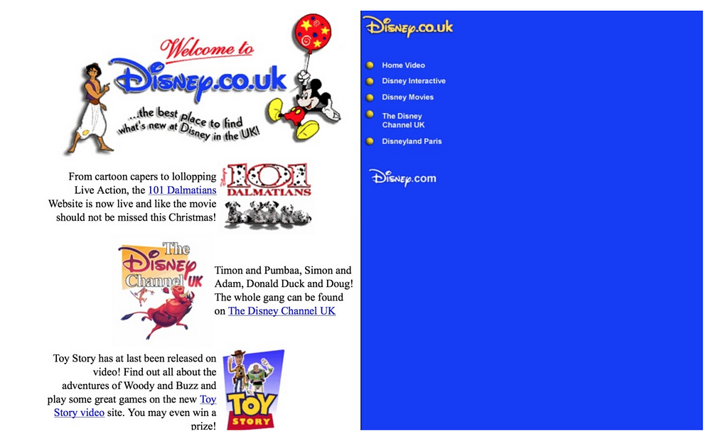
The 97 look of Disney’s website

It took more than two decades for UX designers to create a tailor-made experiences for its users.

Till then, the focus of creation the product was on the techie side of the team, designers was asked to make stuff look pretty, not functional and easy to operate.

Let’s avoid from making the same mistake again,

To solve the fundamental problem I mentioned in this post, we would have to involve UX designers in the process of creating blockchain and smart contracts products.

Just like Raymond Loewy, designers would have to educate their users on the possibilities of micro-transactions, being your bank, and other things that aren’t possible with cash or credit cards.

It’s the right place at the right time for designer to transform how users can experience trustless systems using blockchain technology.

Currently, my team is working hard to create the best design solutions for smart contract with bitjob as our client

If you want to share your ideas about UX and blockchain, join my new community of Blockchain UX.


The 4 UX Problems When Designing Blockchain-Based Smart Contract was originally published in Prototypr on Medium, where people are continuing the conversation by highlighting and responding to this story.

from Prototypr https://blog.prototypr.io/the-4-ux-problems-when-designing-blockchain-based-smart-contract-d37ee4c8c64b?source=rss—-eb297ea1161a—4

8 Design Mistakes That Spell Disaster


Just like anything else, product design can be done well, and it can be done poorly. When a product is designed well, users don’t notice it. But when a product is designed poorly, users not only notice, but also complain.

In this article, I want to share five the most common things that lead to bad product design.


1. Adding Too Many Features to a Product

All too often designers think about features as a synonymous with value. They believe that the more features they add to the product, the more valuable it adds for the user. As a result, a lot of products are designed with too many unnecessary features which detract from the product’s primary purpose. This effect is known as feature creep—a continuous addition of new product features beyond the original scope.

Here are two tips that will help you avoid this common pitfall:

  • When designing a product, it’s important to focus on its core value. Identify what’s most important and prioritize it. Cut any feature or content that doesn’t drive towards this value.
  • Ask ‘why’ instead of ‘how.’ When starting working on a new product, the biggest question should be not how we design a particular feature but why need to design it.


2. Skipping the Prototyping Phase

‘Why we need to create a prototype when we can create a real product and test it on the market?’ By thinking in this way, designers put the maximum effort on creating a high fidelity design that they ship on the market. Unfortunately, after the market release product team often realize that some parts of the design need to be changed. And the cost of the change often will be significant because the team will need to modify the real product, not a paper or digital prototype.

Prototyping helps product teams to test product design prior to market release. Testing can be done with real users. According to the NNGroup, testing with five users identifies 85% of usability problems. That’s why the results of the testing will make it clear whether the design works for users or not.


3. Becoming too Attached to a Design

It’s not that rare when designers fall in love with a design they create. When designers become too attached to design elements, it’s difficult to redesign or get rid of them. It becomes extremely hard to comprehend the critiques—designers start to take it personally. As a result, design decisions become too biased. The effect is known as confirmation bias—when designers search for, interpret, favor, and recall information in a way that confirms their preexisting beliefs.

It is possible to minimize the effect of confirmation bias by inviting designers into user testing sessions. Nothing can be compared with a feeling when you see a real person interact with a product you’ve designed. It helps designers realize that they design for their users, not for themselves. As a result, it becomes much easier to adjust design according to the user needs.


4. Making Assumptions instead of Conducting Proper Research

Almost everybody who designs digital products had a moment when they say “I am a user too, so I know what is good or bad for users.” After that designers come up with assumptions—assumptions about what can make the user live better.

It’s great when designers have personal feelings, but it’s wrong when designers allow personal feelings take over the process. Every design decision, no matter how it was arrived at, still needs to be verified. It’s excellent when design decisions are a result of user research. It’s much better when you clearly understand what your users need and then design based on that.


5. Not Involving Users in the Design Process

No matter whether a team is refining an existing product or designing a brand new product, it’s always essential to harness users in the process of knowledge exploration. Bad design is often a result of not thinking adequately about end users’ needs.

UX practitioners should not only gather knowledge about users, but they also share this information with stakeholders. It will help to create a shared understanding of real user needs.


6. Thinking about Design as a Linear Process

Some product teams believe that product design is a linear process which starts with ideation and ends with a product release. Following this process, they establish a goal at the beginning and strive to ship a product that is designed according to the goal.

In reality, product design is a highly iterative process—to release a product with excellent user experience, designers have to try a lot of different approaches before selecting the one that will be the best for their users. They might even adjust the goal, when they see that it’s required.


7. Not Building a Collaborative Environment

In a team that has a problem with collaboration, designers and developers don’t have a shared understanding of what they want to achieve. As a result, designers and developers stay in their silos.

Focus on creating a close collaboration between design and technical team members. Instead of design and development being sequential, these two activities should go in parallel.


8. Trying to Reinvent the Wheel

‘It’s boring to do something that everyone else is doing.’ With such idea, many designers have a temptation to try and reinvent the wheel — to design something new, something that nobody tried before. But what designers forget is that there are many solutions on the market, and each demands our time. With each product that has different interactions, users need to learn it. In our fast-paced world, users often don’t have to learn how to use a new product.

Before reinventing the wheel, designers have to evaluate the effort required from the users’ side. In most cases, the effort will be significant. As a result, it’s much safer to design familiar—creating a design that will be familiar for the majority of users.


from Webdesigner Depot https://www.webdesignerdepot.com/2018/08/8-design-mistakes-that-spell-disaster/

Before your idea dies, try the Disney way

Best ideas come as jokes. Make your thinking as funny as possible — David Ogilvy

Recently, I was participating in discussions with a group of people who ideate new concepts for the next big product visions.

The presenters were not able to articulate their ideas as expected. They had cool things to show but ideas remained fragile and not really taken shape.

Every attempt were immediately attacked by mixed opinions and rejections by an audience with different perspectives and characters types.

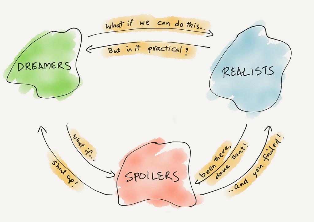
As an experiment, I tried to mentally group the participants based on their why-not and why-you-can’t-do-this arguments into the famous Disney’s Dreamers, Realists and Spoilers categories (which I’ll explain soon). And guess what, they all fell in place very nicely.

the lesson is..

If we put everyone in one room, Dreamers are the first one to die. Realists survive momentarily but eventually spoilers will not let both Dreamers and Realists talk.

This is exactly what I witnessed how the interactions happened

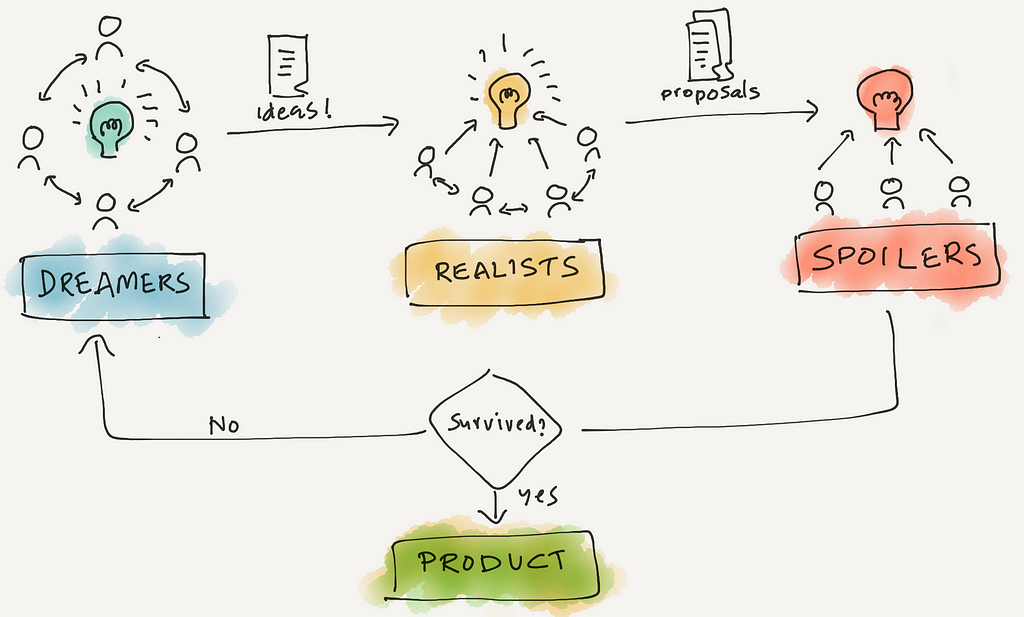
Here is the Disney way of ideation.. which would have worked for us

Different rooms for different groups.

Dreamers (Why not)

Ideas are the key focus. All ideas are welcome. No one criticise each other. Separate room. Chairs arranged in circle and all face each other. Document everything and take it to the Realists.

Realists (How to do)

Validate how practical are those ideas. Use experience to propose a solution on how to do it. Chairs arranged in semi-circle with ideas in front of them. Face each other but still get to work on solutions. Document everything and send to the Spoilers.

Spoilers (Why cannot)

Battle test. Ideas are criticized to the core. Find weaknesses and tell why this cannot be done. Each member has their own perspective and given a chance to punch holes in to the proposal. Chairs arranged in flat rows, each facing directly on the proposal.

This way, fragile ideas are super-strong before they reach the critics who test how strong the ideas were, and realists in the middle makes sure good ideas don’t die.

Not sure if it was really practices in Disney studios. But the process makes a lot of sense.


Before your idea dies, try the Disney way was originally published in UX Collective on Medium, where people are continuing the conversation by highlighting and responding to this story.

from UX Collective – Medium https://uxdesign.cc/when-your-idea-dies-follow-the-disney-way-a88cc8fef245?source=rss—-138adf9c44c—4

The 6 Types of Product Teams You’ll be Working In


When I get an offer to join a product team, I spend the following days or even weeks considering many different parameters. I see it as a really important decision, which will greatly affect my life.

The first thing I usually consider is the vision — the company’s long-term mission. The second thing is usually the team — the personality, ambition and skills of my future partners.

The third most important thing for me when considering an offer is my short-term missions — the KPIs for each sprint or quarter. What drives the team? What can the team achieve in the following year that would mean success? What does the team discuss the most in the internal meetings? And how does it all align with my personal goals and ambition?

I found it interesting that most teams are very different in the way they work and think. Each team evaluates short-term success differently. I’ve decided to do a small break-down of the characteristics of each type of team, to help myself and others make better choices in the future.

1. User-Centered Team

Press the button. It will improve your life

A user-centered team is a team who puts its users above all other KPIs. User Experience Design is a major value in the company. A lot of time and effort is put into coming up with the solutions that will be the most delightful for the users. The team is very aware of its users, their needs, their pain points, and most of the team’s “fuel” is used to improve the overall satisfaction and make the users love the product more. New features are carefully examined, and only added if they bring enough value to the users.

Examples: Medium, Duolingo

Pros: Good user satisfaction may help with word-of-mouth growth and retention.

Cons: When working this way, success is sometimes hard to measure. Even if many users love the product, it doesn’t mean that the product is profitable, and it may eventually shut down because of that.

2. Growth-Centered Team

Only 9 hours left to press the button!

A growth-centered team is a team who’s looking mostly on numbers. The open sprint meetings will talk a lot about terms like Acquisition, Conversion, Engagement and Retention. The roadmap prioritises tasks with higher chances to impact the numbers, and not necessarily the best things for the users. It could be done by improving the product and adding value, but also by adding promotions, push notifications, and in the some cases even dark patterns. The employees are rewarded mostly according to their success in making an impact on the numbers.

Examples: Booking.com, LinkedIn

Pros: If the company succeeds to grow, the new resources could help with hiring talented employees and it will assist with building better products and moving fast in a later stage.

Cons: User satisfaction could decrease, and it will make it easier for a more user-focused competitor to take over the market.

3. Features-Centered Team

Look at all of these buttons we’ve built for you.

A features centered team is a team who has many new ideas it wants to build. The roadmap has deadlines for each feature, and the team’s focus is on shipping the discussed feature on time. The features usually come from users’ requests, stakeholders’ demands, or the sales team that wants specific features to use as a selling point.

Examples: Wix, Atlassian

Pros: Adding features may help the sales team bring a new audience.

Cons: Having many features may take away from the product’s usability. Also, when the team is always working on new features, it may forget about improving other aspects of the product.

4. Design-Centered Team

Introducing: Button X. Our best button yet.

A design-centered team is a team who prioritises the beauty and the luxury of its product above everything else. Its focus is on shipping impressive products. The designers are highly regarded, and spend a lot of time researching, ideating and sketching.

Examples: Apple, Nike

Pros: The users could turn into power users, or ‘fans’, and become very loyal to all current & future releases by the company.

Cons: Good design is often not cheap. If the mass does not adopt the design — the company may fail. Also, beauty may come at the expense of usability, which will decrease the user satisfaction.

5. Technology-Centered Team

Once you press the button, our AI algorithms will do its magic

A technology-centered team is a team focused mostly on improving and maintaining the technology of the company. It could spend a lot of time on refactoring the code, fixing bugs, switching to a better framework and sometimes on researching, and pushing the boundaries of new technologies.

Examples: Amazon, Google AI

Pros: Fast and stable products can lead to better user satisfaction. Also, sometimes these companies help change the world.

Cons: Spending a lot of time on writing better code for simple products who are ‘good enough’ could slow down the team.

6. The Naive Team

Well… We’ve built a button. It kinda works. Now what?

A naive product team is a team working on a product or a feature without a clear short-term KPI. Someone brought up an idea that was adopted by the team, and now people are working on making it work. Not much time is spent on research, design or development. It is often a common practice for validating ideas, or for a team who can allow itself to work on creative things without a clear goal in mind.

Examples: hackathon projects, early stage startups

Pros: The team can be creative and move faster. The idea can bring value to many – and can be monetized and improved in later stages.

Cons: The result could be something that people don’t need, or be a low quality product that will need rethinking in the future.


So, which team should you join?

The answer is not black & white. As a product designer, I would probably be pretty happy in a User-Centered or a Design-Centered team, and many developers would probably prefer a Technology-Centered team. Does it mean that you shouldn’t join teams who are not obsessed about your passion? No. Teams can, and need to change according to the stage it’s in. I think usually a good balance between UX, Design, Tech and Growth is important and can be achieved with the right people, with the biggest focus being on the most important thing for the company at the current stage.

In addition to that, as team members, we have the power to influence others. For example, even if my biggest passion is User Experience, and I join a team who cares mostly about technology — as the designer in the team I can use my communication skills and experience to demonstrate the values of being more user-centered.

The more interesting question to ask, in my opinion, is not what type of team is it, but who are the people you’ll be working with every day, and will they be attentive to the things you find important.


Thanks for reading! If you’ve liked it, you might also enjoy:

A/B Test Case Study: iOS App Purchase Screen

The problem with ‘roadmap first’ teams

Send me problems, not wireframes

This story is published in The Startup, Medium’s largest entrepreneurship publication followed by 344,974+ people.

Subscribe to receive our top stories here.

from Sidebar https://sidebar.io/out?url=https%3A%2F%2Fmedium.com%2Fswlh%2Fthe-6-types-of-product-teams-youll-be-working-in-e6f6e300834d

5 Things To Do Differently About Your Product’s UX


What else can we do better?

We designers, have the chance to make an impact if we take responsibility for what we put out in the world. Small and daily decisions will add a minor drop to the ocean, but will make a big difference in the long run. And if all of us will design with a human-centred approach in mind, we can create better products that may have an impact. So here are five thoughts on what we can do better about the user experience of our products:

1. Create a classic, not a bestseller

Creating a great product is a marathon, not a sprint. The extra time dedicated to research, improvements, polishing the details, testing, editing will make a big difference. In the long run, companies who did cut corners will slowly become obsolete or easily replaced and people will forget about them.

It starts by wanting to create a classic — Robert Greene

Take the construction on La Sagrada Família in Barcelona, which broke ground in 1882 yet whose completion is slated for 2026 — the hundred-year anniversary of the architect’s death. The months and years and decades fall away.

It took decades for Apple to achieve a market cap as today. Edison’s famous line that he failed 10,000 times before he found the perfect solution for his lightbulb. And this type of innovation takes time and effort and it can’t be rushed. Otherwise you will get a messy and clunky end product.


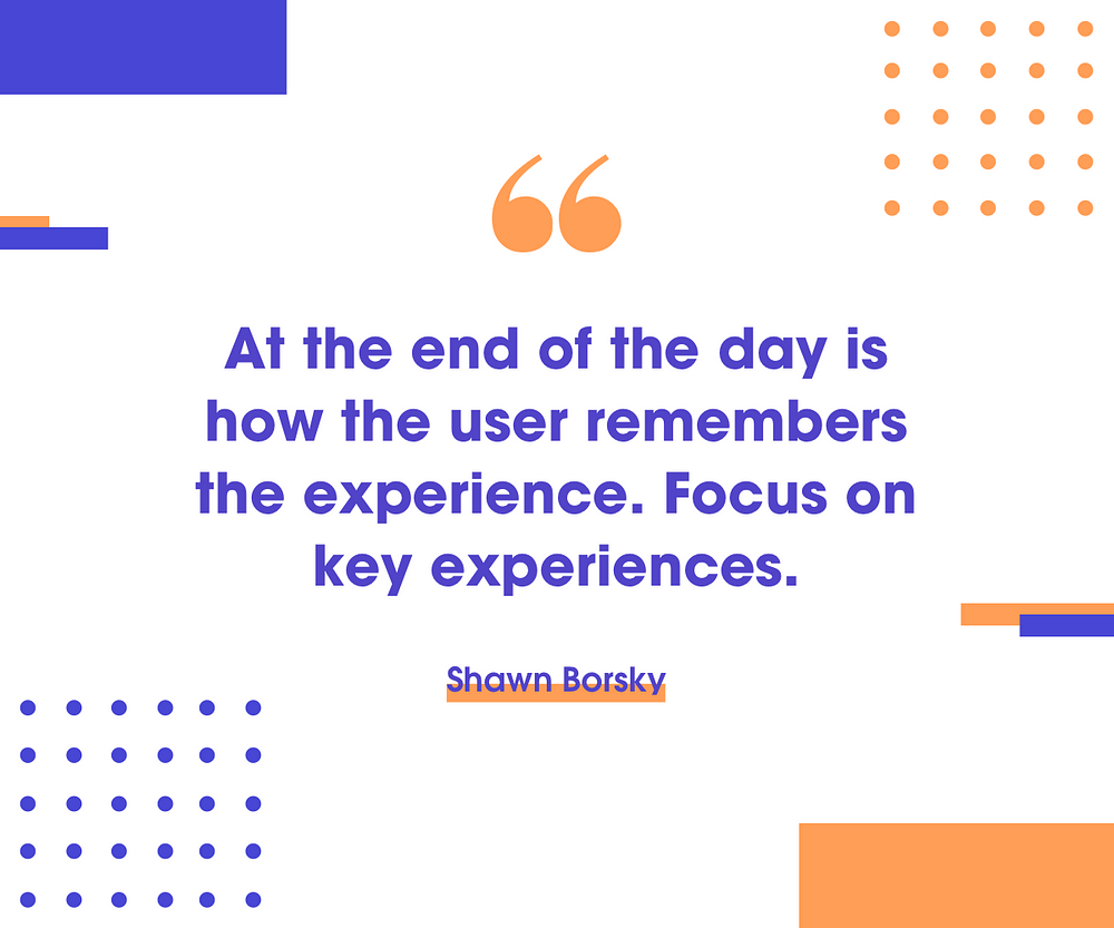
2. Focus on key experiences

The total experience of a product covers much more than its usability. It covers aesthetics, pleasure, fun, and business goals which play a critical role. So don’t overcomplicate the journey with useless “delights”, animations or “funny illustrations”. Your user is there to do a task, and he does not have all the time in the world to analyse your delightful moments. Focus on one essential experience and make everything around it the best.

A great product anticipates what you need and is one step ahead of you. It also gets out of its own way and has a wink, 10% of surprise and delight that makes it feel more human and less technological.

Also, when working on the critical experience, don’t forget to design for stress moments. User testing is broken. Test via real-time usage and not in the lab. If you want to get real about how people use your product, exhaust them, bring them only bad news for the entire day then at the end give them to test the product. Let them perform a task under a short amount of time. What you will see or receive as an answer is real feedback of how the entire experience did go.

Story time

I worked once in a startup that shared the office building with a phone company which manufactures sustainable modular phones. Their phones can be easily recycled, they do not use child labour and all their workers are paid fair salaries. You could probably think “Hey, this is a great cause and we should all buy this kind of phones. It has a purpose, helps people in poor countries and can change the world”. But if we leave that aside and focus on the product itself, I would like to show you how it failed a stress moment.

I was going home after work and waiting for my tram. When it arrived, I got inside and took a seat across a guy who was unpacking a new phone. The tram had to go three more stops before everyone would leave it. And it takes on average 5–10 minutes to arrive at its final destination.

As a designer, I was enjoying this moment. Why? Because it’s always interesting to see how people interact with a product for the first time when nobody can see or judge them. From his face, I could see he was very excited. By coincidence, he was unpacking the phone of that specific company I just mentioned above.

He got the phone out and took all the papers aside. The excitement level on his face was increasing with every breath. After a brief moment, he got his old phone out and took out the sim card. He wanted to start using the new one and make a phone call. I could see the excitement on his face. He couldn’t wait to start using his new product. The guy was in the heaven of excitement.

The tram was already at the second station, so we got 3–5 more minutes to get to the final destination. He could not figure out where to insert the sim card. Being used that all the phones use the card slot outside, apparently this phone had it inside. He tries to remove the back side of the phone and guess what. He accidentally takes a part of the phone out. Why? Because it’s freaking modular. Meanwhile, the tram is slowly arriving at the final station. And the guy starts to hurry up because he wants to insert the sim before he gets out.

He desperately tried to fit in the back part. And at one moment he succeeds. The tram arrives at the destination, and people start getting out. The feeling of tension increases and you could see how blood goes up to his cheeks. Seeing that he can’t find the spot and insert a sim card into his new phone, frustrated, he throws it into the backpack. Then he takes his old phone out, opens the slot, inserts the sim, closes it and gets out of the tram.

That was, what I call, “you fucked up” moment of as a company. The phone company had every chance to prove to that guy that not only he got a great product but it’s also easy to use. He could be proud of his new acquisition. He could have gotten out of that tram, do the first call on a new phone and boast about his new phone. But no, they fucked up. Bad. Really bad. And this is UX under stress moments.


3. Offer less options

Difficulties arise when we do not think of people and machines as collaborative systems. Instead, we assign whatever tasks can be automated to the devices and leave the rest to the people. And with that, we start believing that we need a lot of features, and the more you have is better for the end user. But that’s wrong. In this case, we will have to deal with a choice overload which is a cognitive process where people have a difficult time making a decision when faced with many options.


4. Don’t allow envy to drive your decision making

Envy and jealousy are two out of the ten commandments. Those of you who have raised siblings you know about envy. Warren Buffet said many times

It’s not greed that drives the world, but envy.

For example, we as humans don’t need a lot of money, big houses or 20 cars. We buy them or want more because we see other people who have them and all the attention they get. So it creates envy and jealousy feelings in our brain.

These feelings operate, to a considerable extent, on the subconscious level. Anybody who doesn’t understand it is taking on defects he shouldn’t have. Same applies to business, design and anything else in life. Whenever you see big companies doing something, and they are successful, you want the same thing. That’s why you see so many copycats, and there are very few original and successful businesses.


5. It’s simple, until you make it complicated

Whenever you have a new cool feature in mind for your product, ask yourself this question: “Is there a life situation where it will be useful for our customer and will solve a meaningful problem for them?” This is where most of the ideas fail.

Every time you want to add something to your product, remember that every feature is like adopting a child. You have to grow it and take care of him. You have to take that feature through all the stages of iterations and see where it stands in the grand vision of your product.


from Sidebar https://sidebar.io/out?url=https%3A%2F%2Fuxplanet.org%2F5-things-to-do-differently-about-user-experience-cc66cdfedc49

Yes, Alan, There Is An ROI For UX Design


Alan Cooper recently wrote that the value of design should be obvious to everyone in the organization. If someone is asking you to explain design’s value, it’s because they can’t see it. He said:

“If your boss is asking you to quantify the value of your work, you need to understand that your work indeed has no value. Not at that company. Not with that boss.”

That was harsh. Alan goes on to suggest there are only two alternatives for this situation:

“So when your boss asks you “What is the value of your work?” you have only two valid courses of action: 1) Accept that you and your situation are a valueless combination; or B)[sic] Go some place where your work is valued. Go somewhere that doesn’t ask the value of your work, but instead values your work!

For me, this hit home. Back in 2011, I said something very similar. After explaining a couple ways to get stakeholder to start investing in UX, I suggest:

“…maybe it’s time for you to find someplace else to work. Someplace where the executives are already convinced and want to make the investment.”

“Go Somewhere Else” Is Privilege Talking

It’s been years since I originally wrote that. I now realize that’s a very privileged point-of-view. Not everyone is in a position to switch up jobs and move to a new job where the management appreciates design more.

While the demand for designers is currently the highest it’s ever been, it’s not evenly distributed. There are places where designers struggle to find opportunities. Walking away from their current job, no matter how unappreciated, may not be an option.

Alan’s recent post reminded me we need to talk about viable alternatives for those who need to stay where they are. It’s unfair for Alan or me — two middle-aged white dudes — to tell others finding a new job is their only option.

Not All Design Work Has Value

I think Alan is correct when he says some design work produces no value. A designer could feel that just by tweaking colors, cleaning up typography, or making a set of screens look consistent, they are making a design better.

But just making a design feel better doesn’t mean it’s more valuable to the customer or user. It may be designing for design’s sake.

That said, I don’t think Alan is correct when he suggests that when someone is questioning the value of design, it’s always because the design work has no value. It might be because the value hasn’t been discovered. Not all value is obvious.

Not All Valuable Design Work Is Of Equal Value

The value that comes from good design is incremental. Thousands of small decisions, thoughtfully made, with a focus on the users’ experience is what makes design valuable.

Not all design decisions have the same value. For example, in the initial release of a recent new design tool, the design team didn’t include a way to store work files in folders. Every designer’s files needed to be in the same collection with everyone else’s, with no way to divide up the work by project or design portion. This wasn’t an issue for small projects, but designers using the tool for large projects found the missing folder functionality frustrating.

In user interviews, no designer would tell you that folder support is a feature they’d pay extra for. Yet, when it was left out, it devalued the design tool. Several of their early adopters gave up using the tool because they couldn’t make it work well for their projects.

Someone on the product team decided to leave that functionality out. There’s any number of reason why that might have happened.

They might’ve run out of time or decided it wasn’t necessary. It might not have been part of a bigger decision to focus on the design-related functionality and not the file storage capability. Maybe they didn’t think of it at all.

By leaving out the folder functionality, they missed a basic expectation for many of their users. Adding it back in is valuable. Is it as valuable as, for example, a feature that could cut hours out of building animations? Not all valuable design work is of equal value.

In UX Design, ROI Is Often About Eliminating Poor Design

Return on investment isn’t as complicated as everyone makes it out to be. It can feel difficult to calculate, but that’s because we often look in the wrong places. Not because it requires some fancy financial wizardry.

For UX Design, ROI is about finding an improvement to the organization’s bottom line. (“Bottom line” refers to the design of a Profit and Loss Sheet, a standard finance tool where the organization lists all of the money coming in and all the money going out over a time period. The bottom line is the report’s last line, where we subtract the total expenses from the total income. When we improve the bottom line, we’re making the organization more profitable.)

The obvious place designers go when trying to calculate the bottom line is to ask the question, If I change the design, how much more income could we generate? But there’s another way design can help: reducing the costs.

A much-overlooked portion of design’s value is that poor design is very costly to an organization. Poor design generates costly support calls. It causes lost sales or dropped subscriptions. Poor design can increase development costs through rework and waste.

When we start looking for where poor design hurts our organization, we can talk about how much money we’d save. We make it easier to calculate the return to our investment for making better design decisions. (If this intrigues you, I wrote more about this in A Proven Method For Showing The Value of Good UX.)

Design Leaders Know Poor Design’s Cost To Their Organization

This is why I disagree when Alan says your design has no value if your boss asks you about it. I believe your boss might be asking you about the value of design because they think of you as a potential design leader.

If you are reading this, it’s very likely you either are a design leader or will become one soon. One responsibility of a design leader is to demonstrate the value of design to the organization.

It’s likely your boss wants to help you make the products or services better but hasn’t learned how to describe it’s value yet. They’re looking to you to help make that case. They’re looking for you to be the leader your organization needs.

A design leader is ready when their organization comes asking about value. That means researching where poor design costs your organization money.

If it’s a big enough amount of money, you don’t even need precise numbers. Sometimes, it’s good enough to just point to large pain the organization is feeling.

For example, say you get many support calls because the design doesn’t do something the users expect. That’s a high cost due to a poor design decision. If it’s easy, you could ballpark a number. (Number of calls x average support call cost.) You may not need the math if everyone agrees that’s likely expensive. High value doesn’t always need to be quantified; it just needs to be seen.

Design Leaders Promote The Value of Good Design

A design leader finds where poor design is costing the organization money and pain. They start documenting it and put together ideas around what the design team could do differently to reduce those costs.

When the boss comes to ask, the design leader will be ready with answers for them. They can tell their boss which poor designs cost their organization and how they believe they could fix it.

Good ROI happens when the cost of fixing a problem is less than the ongoing costs of letting the problem continue. By having a ready plan, they’ll have the perfect starting point to discuss the ROI of design.

However, here’s the trick: smart design leaders don’t wait until their boss asks them. Smart design leaders are pointing out costs and how good design would reduce them before their boss even thinks to ask. When they can, smart design leaders start decreasing costs without being asked at all.

Smart design leaders prove the value of good design in advance of being asked. Their bosses don’t ask what design’s value is, because they already see why the organization should invest in it. They’ll know why they are investing in the design leader.

Smart design leaders aren’t in the position Alan describes, where their only options are to stay somewhere that doesn’t understand the value or leave for another place that does. They’re right where they should be. Providing value to their organization by doing the right thing.

Originally published on UIE.com


Uncovering and promoting the value design brings to your organization is a major topic we discuss during the Creating a UX Strategy Playbook workshop. We look at proven strategies for showing design’s contribution to everyone in the organization, and how this contributes to making the organization more design mature. Explore how your team can surface your design’s value within your organization.

from Stories by Jared M. Spool on Medium https://medium.com/@jmspool/yes-alan-there-is-an-roi-for-ux-design-bef06dbc9c77?source=rss-b90ef6212176——2

11 Secrets of Actionable UX Reports

When designers and developers work on projects, they have a lot of questions: What do our users expect to see on this screen? How are users supposed to interact with our product? What should our onboarding feel like? These questions are commonly asked during product development.

Every team wants to reduce the risk of incorrect design decisions and as the complexity of products increases, the digital product design industry puts usability practitioners in high demand. Usability practitioners are people who help product teams make informed decisions. In most organizations, the primary role of usability experts is design validation—making sure that a product is usable.

But many usability practitioners (particularly those who are new to the field) complain that product teams don’t act on their research results. While this could be due to many different issues, most often it is due to poor usability reports; if product teams have trouble understanding findings, or don’t know what to do with the findings, they’ll simply ignore them.

That’s why it so important to make reports actionable. In this article, we’ll share eleven tips that help usability practitioners to reach this goal.

1. Know Key Business Objectives

Most companies have a clear understanding of what their business goals are. The reason companies invest money in usability analysis is that they believe that it will help them reach their goals.

It’s possible to put more weight into usability reports by creating a direct connection between solving usability issues and reaching business goals. Thus, usability experts should take enough time to figure out what the key business objectives are and make sure that the usability insights are aligned with them.

2. Be Specific When Presenting Findings

Imagine when someone opens a usability report and sees a sentence like: “The process of purchasing a product was hard,” without any additional details. With a high probability, they will consider such a finding as too vague. Vague findings don’t give product teams many insights. A lack of detail can, at best, leave teams wondering what the problem was. But at worse it can lead to an unfavorable outcome—when a product team misinterprets findings they can start solving a wrong problem.

That’s why all findings in a report need to be specific. It’s essential to write usability findings in a clear way that helps the team identify the cause of a problem and work toward a solution. Thus, instead of saying “The process of purchasing a product was hard,” provide a clear context for the issue. Say why the process was hard. Were too many steps involved? Were field labels in forms unclear? Make it clear in your report!

3. Never Blame Users

Describing findings in relation to users is a relatively common problem of many studies. “The user had to do this” or “Unfortunately, a user was unable to …” Although such statements sound innocent, they can cause significant damage to your reports. Such language switches the focus from a design and puts the blame on the user. It becomes a user problem, not a product problem. When team members and stakeholders read such findings, they might think “Well, this user wasn’t experienced. Maybe we should conduct another testing session with more experienced testers?” and can dismiss the issue.

One of the purposes of a research study is to generate empathy for the end user. Good UX practitioners always start usability testing session with words “We’re not testing you, we’re testing our product.” The same attitude should be used in usability reports.

4. Don’t Lose Sight of the Wood for the Trees

A famous Charles Eames quote: “The details are not the details. They make the design” is a bad joke for some usability professionals.

All too often they become too focused on the details, so they forget to notice huge issues. For example, when analyzing specific user flow, it’s easy to be focused on providing concrete recommendations on how to improve user experience (e.g. changing the size of the buttons, renaming labels, etc.), but forgetting to notice that the entire flow doesn’t match user expectations or doesn’t meet their needs. If users have trouble at every step, perhaps it’s the overall flow that’s to blame, rather than separate details along the way.

5. Add Redesign Recommendations to Usability Reports

The goal of user research and usability testing is not only in finding issues and defects; it’s also proposing solutions to those problems. Too frequently usability practitioners conduct usability testing, track all issues, but don’t provide recommendations on how to fix the problems. Recommendations play an essential role—they help determine next steps and make the results actionable.

Usability practitioners are the right people for writing recommendations because they have unique expertise in thinking about design solutions. They run lots of usability tests and have first-hand knowledge of what works and what doesn’t work for users.

Writing useful and usable recommendations is a skill that all usability professionals should master. Here are a few things that should be taken into account when writing recommendations:

  • Avoid vague proposals: Vague recommendations such as “Make the error message clearer” doesn’t say enough for people who’ll read reports. It’s essential to make recommendations constructive by providing sufficient details.
  • Avoid biased recommendations: Stay away from assumptions. Reference studies and best practices in your report.
  • Discuss your usability recommendations: Talk with designers, developers, sales and marketing teams to learn what works and what doesn’t work both from a business and technical point of view. The wisdom of the crowd can help you to come up with better solutions.
  • Write recommendations in the readers’ language: The readers of recommendations are not necessary usability specialists. Thus, avoid usability jargon such as “508 compliant” when providing recommendations.
  • Visualize your recommendations. A picture is worth a thousand words and this rule applies to recommendations. Visualizing recommendations doesn’t mean that usability specialists should create high-fidelity interactive prototypes. Creating a quick sketch to illustrate a point is totally acceptable.

6. Involve Teams and Stakeholders in Usability Testing

Work closely with the design and development team, rather than simply delivering a report and walking away from the project. Make team members and stakeholders contribute towards study designs.

Here are a couple of tips to take into account:

  • Ask designers, product managers, marketers about their expectations before conducting testing. By asking a simple question “After we conduct this research, what results would you expect?” you build interest to the upcoming test session.
  • Invite team members and stakeholders to watch usability testing sessions. Nothing beats watching how users interact with a product. Seeing how users struggle when working with a product will make stakeholders understand the value of session.

7. Keep Your Reports Short and Focused

Readers of usability reports are busy people, and it’s relatively easy to overwhelming them by putting too much information in a report. Long lists of recommendations are less likely to be read and acted upon. Remember that with each additional issue mentioned in a report, you decrease a chance that readers will reach the final page of your report. Thus, keep the report short and focused.

8. Rank Findings

No one team has infinite time to solve all possible issues which were found during usability testing. It’s vital to understand that every issue that was discovered through usability testing is not equally important. Usability practitioners should prioritize all findings and put a focus on the most important ones. Ranking findings as low, medium or high severity helps the team understand what critical issues the usability study exposed

But before assigning a priority, it’s essential to work with a product team and stakeholders to build a consensus around what is considered as a high priority usability issue vs. what is recognized as a low priority.

9. Make Your Reports Sound Human

Don’t just list your findings and recommendations; describe them in a format of a story—a story of interaction users with a product. Usability reports are the most impactful when they illustrate problems using video clips of test participants and when they contain participant quotes recorded during testing sessions.

10. Customize Your Report for Different Audiences

It’s worth creating a few versions of usability reports for different audiences. For example, when it comes to writing a report for developers, you can provide more technical details, but for stakeholders, you may only skim an executive summary of prioritized issues.

11. Actively Promote Your Findings

It’s not enough to conduct testing, send a report as an email attachment and believe that team members will read it and act upon it. Usability practitioners should actively market their findings—make sure every person who needs to know, is familiar with your report.

Add Realistic Chalk and Sketch Lettering Effects with Sketch’it – only $5!

Source

from Webdesigner Depot https://www.webdesignerdepot.com/2018/06/11-secrets-of-actionable-ux-reports/