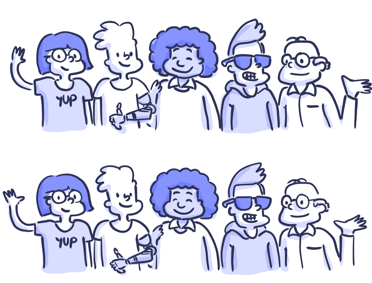
Designing for accessibility is not that hard


Seven easy-to-implement guidelines to design a more accessible web ❤️

Digital accessibility refers to the practice of building digital content and applications that can be used by a wide range of people, including individuals who have visual, motor, auditory, speech, or cognitive disabilities.

There’s a myth that making a website accessible is difficult and expensive, but it doesn’t have to. Designing a product from scratch that meets the requirements for accessibility doesn’t add extra features or content; therefore there shouldn’t be additional cost and effort.

Fixing a site that is already inaccessible may require some effort, though. When I used to work at Carbon Health, we checked the accessibility of our site using the AXE Chrome Extension. We found 28 violations that we needed to solve on the home page alone. It sounded complicated, but we discovered that these problems were not that hard to correct; it was just a matter of investing time and research to solve them. We were able to get to zero errors in a couple of days.

I want to share with you some of the simple steps we took so you can also make your sites more accessible. These principles focus on web and mobile accessibility.

But before we get started, let’s talk about why that’s important.

Why designing for accessibility? 🤔

As designers, we have the power and responsibility to make sure that everyone has access to what we create regardless of ability, context, or situation. The great thing about making our work accessible is that it brings a better experience to everyone.

There are over 56 million people in the United States (nearly 1 in 5) and over 1 billion people worldwide who have a disability. In 2017, there were 814 website accessibility lawsuits filed in federal and state courts. These two pieces of data alone should convince us of the importance of designing for accessibility.

There is also a strong business case for accessibility: studies show that accessible websites have better search results, they reach a bigger audience, they’re SEO friendly, have faster download times, they encourage good coding practices, and they always have better usability.

These seven guidelines are relatively easy to implement and can help your products get closer to meet level AA of the Web Content Accessibility Guidelines (WCAG 2.0), and work on the most commonly used assistive technologies — including screen readers, screen magnifiers, and speech recognition tools.

1. Add enough color contrast 🖍

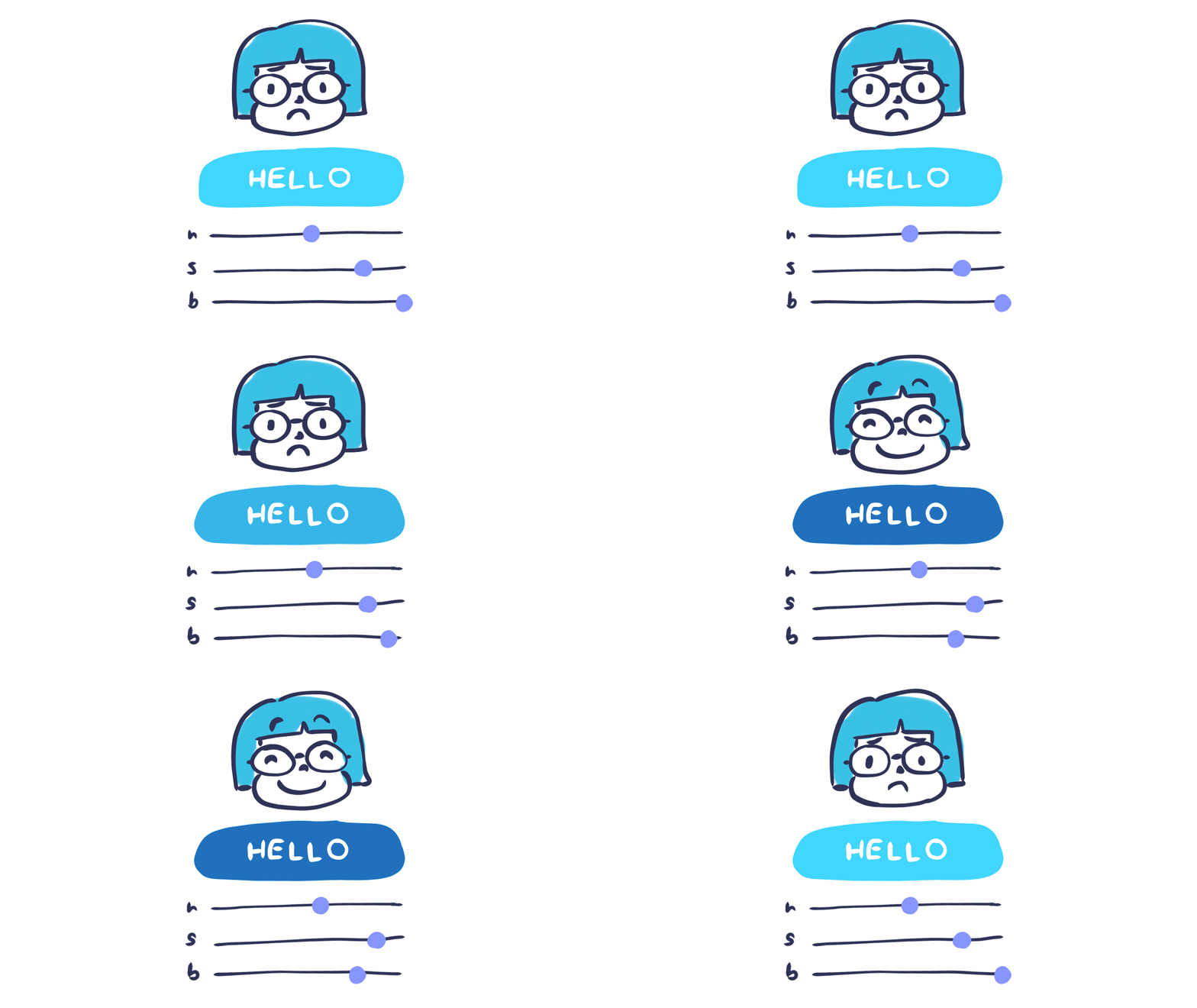
Buttons with good color contrast are easier to read for Guadalupe.

Color contrast is an often overlooked web accessibility problem. People who have low vision could find it difficult to read text from a background color if it has low contrast. In a fact sheet on visual impairment and blindness, the World Health Organization (WHO) estimates that there are 217 million who have moderate to severe vision impairment. So, it is critical to consider the sufficient contrast between text and backgrounds.

According to the W3C, the contrast ratio between text and its background should be at least 4.5 to 1 (conformance level AA.) The ratios become more forgiving with larger and heavier fonts since they’re easier to read at lower contrast. If your type is at least 18 px or 14 px bold, the minimum contrast ratio drops to 3 to 1.

Some tools will help you check this quickly. If you use a Mac, I recommend getting the Contrast app, with this tool you can instantly check contrast using a color picker. If you want to get a more detailed score, I recommend entering your color values onto the WebAIM color contrast checker. This tool will calculate the score for both regular and larger text sizes in different conformance levels (A, AA, AAA.) You can change the color values and see the results in real time.

Source: WCAG Visual Contrast

2. Don’t use color alone to make critical information understandable 💈

René gets happy when graphs are colorblind friendly!

When you’re communicating something important, showing an action, or prompting a response, don’t use color as the only visual cue. People with low visual acuity or color blindness will have a hard time understanding your content.

Try to use an indicator other than color such as text labels or patterns. When showing errors on the screen, don’t rely on colored text alone, add an icon or include a title to the message. Consider adding a visual cue such as font weight or underline text style to linked text in a paragraph, so the links stand out.

Elements with more complex information like charts and graphs can be especially hard to read when you only use color to distinguish the data. Use other visual aspects to communicate information like shape, labels, and size. You can also try incorporating patterns into your fills to make the differences more apparent. A great example of this guideline is Trello’s colorblind mode. When turned on, labels become more accessible by adding texture.

A good trick is to print your graph in black and white and see if you can still understand everything in it. You can also use an app like Color Oracle, which shows you in real time what people with common color vision impairments see. These tips help you make sure that the information in your site is color-agnostic.

Source: WCAG Visual Contrast Without Color

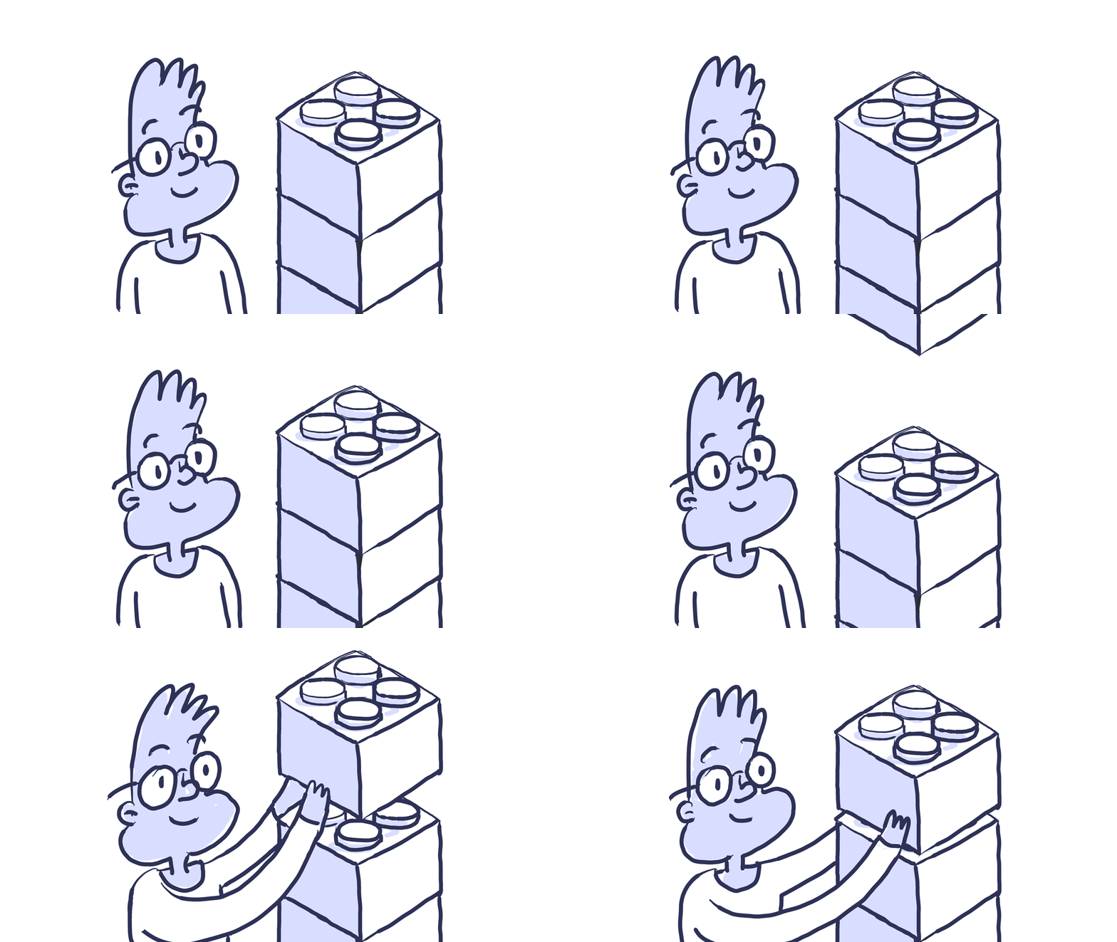
3. Design usable focus states 👀

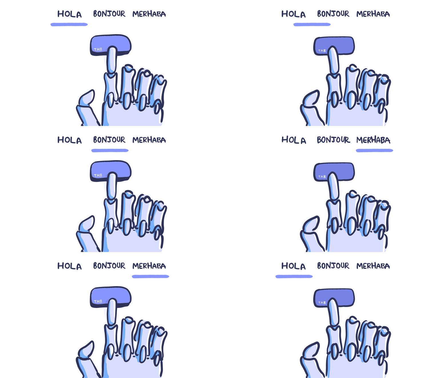
Focus states are easy to navigate with Tyler’s prosthetic hand.

Have you noticed the blue outlines that sometimes show up around links, inputs, and buttons? These outlines are called focus indicators. Browsers, by default, use a CSS pseudo class to show these outlines on elements when they’re selected. You might find these default focus indicators not very pretty and be tempted just to hide them. However, if you get rid of this default style, be sure to replace it with something else.

Focus indicators help people know which element has the keyboard focus and help them understand where they are when navigating your site. These are used by people who are blind and require screen readers, individuals with limited mobility, individuals who have suffered injuries like carpal tunnel, and power users who prefer this type of navigation. Oh, and some of us use the keyboard as their primary way of navigating the web!

The elements that should be focusable are links, form fields, widgets, buttons, and menu items. They need to have a focus indicator that makes them look different from the elements around them.

You can design focus indicators that fit the style of your site and goes well with your brand. Create a state that is highly visible, with good contrast, so it stands out from the rest of the content.

Source: W3C Focus Visible

4. Use labels or instructions with form fields and inputs ✏️

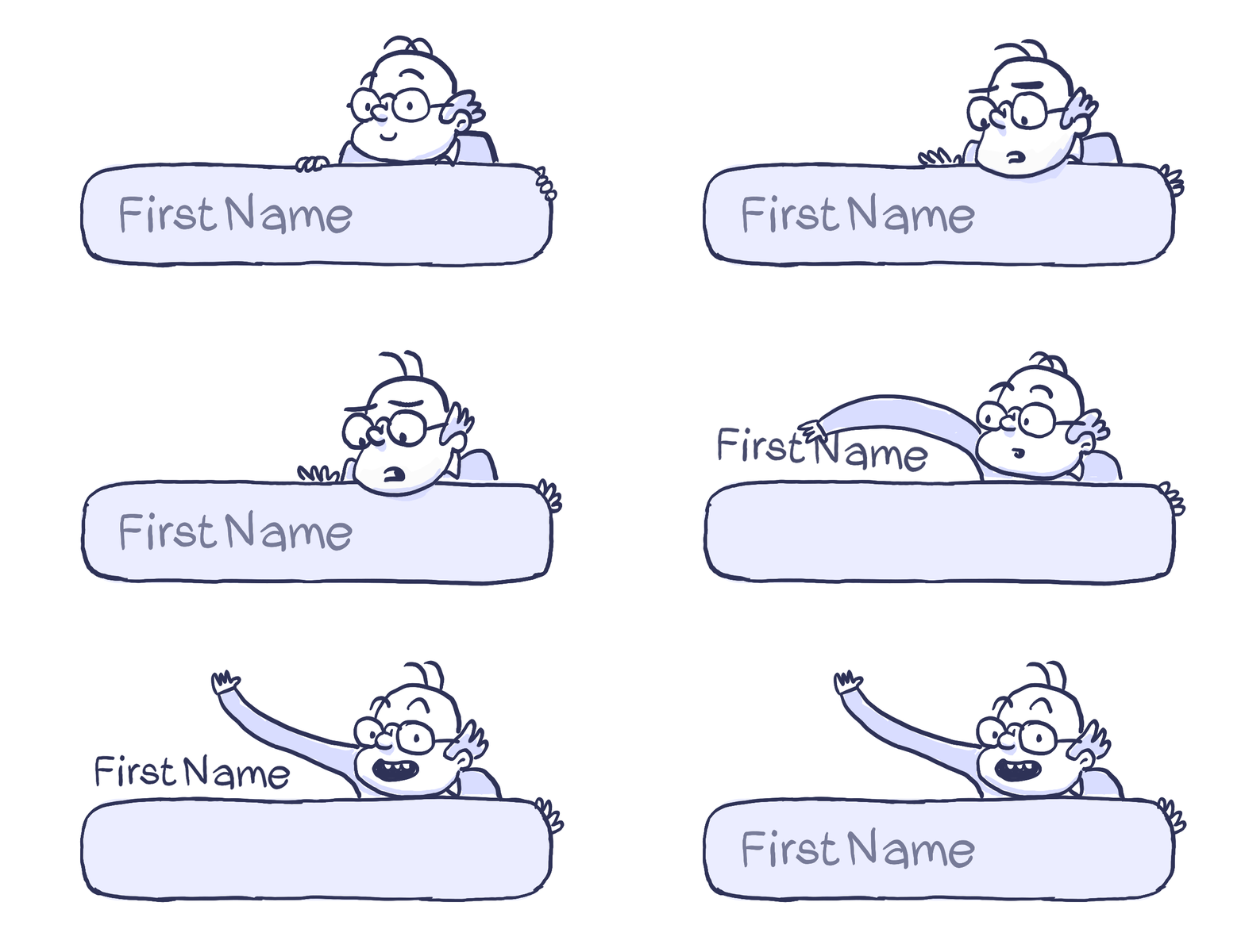
Mr. López keeps trying to turn a placeholder text into a label.

Using placeholder text as labels are one of the biggest mistakes when designing a form. We might be tempted to go with this trend when real estate is limited or want to make our design more simple and modern—don’t. Placeholder text is usually gray and has low contrast, so it’s hard to read. If you are like me, you usually forget what you’re even writing, so it’s hard to know what the fields are about once the label is gone.

People who use screen readers usually navigate through a form using the Tab key to jump through the form controls. The <label> elements are read for each form control. Any non-label text, as placeholder text, is usually skipped over.

Always help people understand what they should do and write in a form. It’s best if labels don’t go away, even when the person is filling an input; people should never lose context with what they’re writing. When designers hide descriptions or directions in their forms, they’re sacrificing usability in favor of simplicity.

This practice doesn’t mean that you have to clutter your design with unnecessary information, just make sure to provide essential cues. Too much instructional text can be just as much of a problem as too little. The goal is to confirm that the individual has enough information to complete their tasks without friction.

Source: WebAIM Creating Accessible Forms

5. Write useful alternative text for your images and other non-text content 🖼

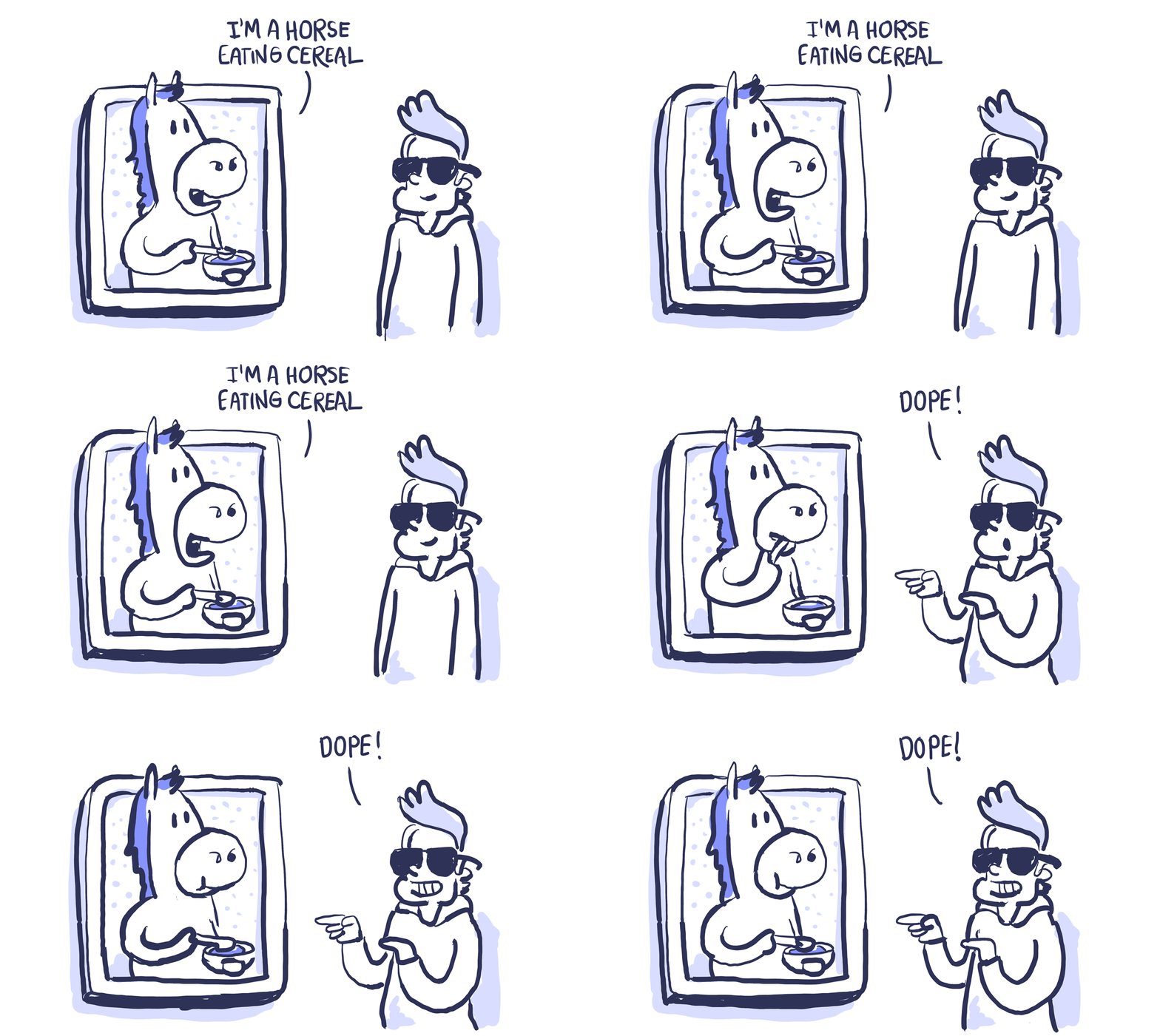
Robin found a new friend in a picture.

People with low vision often make use of screen readers to “hear” the web. These tools convert text to speech so that the person can hear the words on a site.

There are two ways that you can present alternative text.

  • Within the <alt> attribute of the image element.
  • Within context or surroundings of the image itself.

Try to describe what’s happening in the image, and how it matters to the story, rather than just saying something like “picture,” context is everything.

If the image is purely decorative or if it creates redundancy because the surrounding context already explains the content. Then adding an empty <alt> attribute will make screen readers skip it. If you don’t write any alt text, some screen readers will read the file name to the individual. That’s the worst experience you can provide.

Google is working on an image captioning AI that can describe photos with 94% accuracy. This model is open sourced and still in research — hopefully, we’ll start seeing it used in different products. In the meantime, we should manually provide text that describes the meaning and function of the images in our content.

Source: W3C Using Alt Attributes

6. Use correct markup on your content 🏗

Noah always wanted to be an architect.

Headings mark where the content starts — they’re tags given to text to define its style and purpose. Headings also establish the hierarchy of the content of the page.

Titles with big font sizes help a reader understand the order of the content better. Likewise, screen readers also use heading tags to read content. This way, people with low-vision get an overview of the page by reading each heading in a hierarchal flow.

It’s important to use proper structural elements when you develop a site. HTML elements communicate to the browser what kind of content they contain and how the browser should render or treat that content. The components and structure of a page are what arranges an accessibility tree. This tree is what powers screen readers which are used by people who are blind so they can “listen” to a page.

Not using markup correctly affects accessibility. Don’t use HTML tags for a style effect only. Screen readers navigate web pages by heading structure (true headers, not just text that is styled big and bold) hierarchically. The people that use your site can listen to a list of all of the headings, jump the content by types of titles, or navigate directly to top-level headings <h1>.

Source: WebAIM Semantic Structure

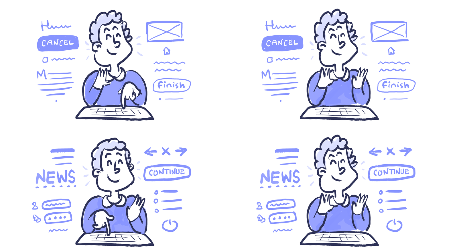
7. Support keyboard navigation ⌨️

Gael navigates with a keyboard while “hearing” the web.

Keyboard accessibility is one of the most critical aspects of web accessibility. People with motor disabilities, blind people that rely on screen readers, people that don’t have precise muscle control, and even power users are dependent on a keyboard to navigate content.

If you’re like me, you’ll typically use the Tab key on your keyboard to navigate through interactive elements on a web page: links, buttons, or input fields. The focus state that we discussed before provides a visual indicator of the component that is currently selected.

As you navigate through a page, the order of the interactive elements is essential, and the navigation must be logical and intuitive. The tab order should follow the visual flow of the page: left to right, top to bottom — header, main navigation, content buttons and inputs, and finally the footer.

A good practice is testing your site only using a keyboard. Use the Tab key to move through links and forms. Test using the Enter key to select an element. Verify that all the interactive components are predictable and in order. If you can navigate through all your site without a mouse, you’re in a good spot!

Last, but not least. Be careful with the size of your navigation — this includes the number of links and the length of the text. Tabbing through long menus may be demanding for people with motor disabilities. And listening to lengthy links can be cumbersome for people that use screen readers—try to be concise. Providing ARIA landmarks or HTML5 structural elements like <main> or <nav> will make navigation easier.

Source: W3C Keyboard

Beyond these guidelines 🙌🏾

These seven guidelines are a great start, and if you want to do more to make your product more accessible, I encourage you to

  • Get an Accessibility Audit. Use an audit service to find out if your product works with assistive technologies and meets WCAG 2.0 level AA. Use the audit results to fix problems and do another test.
  • Appoint an Auditor. You can appoint someone in your company to do recurrent accessibility audits. This could be someone in your QA team. If you don’t have someone with the experience, you can hire an external supplier.
  • Make accessibility part of your design research. When doing research verify if your assumptions concerning accessibility were right and if there are any potential opportunities to improve. Recruiting people with disabilities requires a bit more work. Don’t hesitate to contact associations, and communities—people are willing to help.

Conclusion 👏🏽

That’s it. Seven guidelines that will help you make your web design get closer to meet level AA of the Web Content Accessibility Guidelines.

Designing for accessibility is something that I’m still trying to improve. I’m working on practicing what I preach. I used to think that it was too hard and not that important. I was mistaken. I invite you to consider these guidelines as part of your process and continue the conversation on why accessibility matters.

As designers, it is our responsibility to champion accessibility. With it, we make technology usable to all people regardless of their abilities, economic situation, age, education, or geographic location.

Design responsibly. Thank you.


Reading resources 📚

Useful tools 🔭

  • WebAIM Color Contrast Checker: Great contrast color checker that gives you results in real time for regular and large text.
  • Inclusive Components: A pattern library in the form of a blog, with a focus on inclusive design. Each post explores a common interface component and comes up with a better, more robust and accessible version of it.
  • Color Oracle: A free color blindness simulator for Windows, Mac, and Linux. It shows you in real time what people with common color vision impairments see.
  • Vox Product Accessibility Guidelines: A comprehensive checklist for designers, engineers, and project managers.
  • AXE Google Chrome Extension: Test any site for accessibility violations using the Chrome inspector.
  • Contrast: A macOS app for quick access to WCAG color contrast ratios.

Hola, amigxs. I’m Pablo Stanley, designer at InVision Studio.

I write a comic series called The Design Team and I post design-related stuff on Twitter. You can also check out my YouTube channel, Sketch Together, where you’ll find tons of design tutorials.

Que tu día este lleno de momentos memorables.


Special thanks to Courtney M. Sawyer, Raúl Martín, Matthew Zuckman, Gabriel Valdivia, and Lex Roman for all their help writing this post ❤️

from Sidebar https://sidebar.io/out?url=https%3A%2F%2Fuxdesign.cc%2Fdesigning-for-accessibility-is-not-that-hard-c04cc4779d94


Why Design Thinking is failing and what we should be doing differently


Image source: https://goo.gl/3nLKhq

I have and always will be an avid supporter of the design thinking methodology. I have held talks and workshops about Design Thinking & Lean UX on adapting the methodology in our work. There is nothing wrong with the methodology itself; however the past few years have irritated me insanely as I have witnessed the process be quite abused in practice. Our industry has ended up creating many mediocre and expensive design solutions as a result. I recently attended a Finn Tech conference in London where almost every app looked the same. There was extremely little uniqueness and differentiation from over 100 services. The same “copycat” trends and standardization seem to be everywhere.

I saw Natasha Jen, Partner/ Designer at Pentagram, talk about why Design Thinking is bullshit and I completely resonate with her frustrations. Fredrik Matheson from IxDA Oslo and Lene Renneflott from Grafill have taken up the issue as well with their chronicle The Emperor’s new designer clothing (in Norwegian). They address the strengths with Design Thinking and talk about why the awakening of design in organizations is generally a good thing, of which I completely agree. However there is a darker force at hand and I do want to share the perspective I have attained over the past few years, on why Design Thinking might be doing more harm than good.

What’s going on?

As designers we want to grow and learn from other talented creatives, push boundaries and practice our skill. However the reality is that Design Thinking has encouraged the democratization of design where a solo creative is often mixed in with employees and clients that have very little experience with design in a fast-paced and multi-tasking environment. We are creating environments that deteriorates a creative’s skills when we should be enhancing the practice of critical problem solving, combined with imagination and elegant execution through design, implementation and testing. Our expectations should be pushed to want more, however we often settle at “this is good enough”.

Graphic design, motion and emotional design is usually an undervalued ingredient that gets cut short time and time again in Design Thinking, as most of the process gets spent on functional needs. The irony is that graphic design is extremely vital to success and getting that unique position in the market.

The downfall of co-design and collaboration in Design Thinking

Design thinking can basically be summed up by: collaboration, insight, problem solving, building and testing. This generally can be assumed to be a great process. Co-design and collaboration is a highly valued strength where several experts work together to ideate and iterate. The problem however is that critical problem-solving and design skills seem to evaporate when there are too many team-members and/or stakeholders involved in the process. Co-design with many stakeholders also takes a lot of time. Once a team thinks they have discovered gold together, they are only at the tip of the iceberg — but they often rush into the development without further maturity. At this point, many development phases are also cut dry and production is rushed.

Co-design and group brainstorms often fail because our minds are limited to the knowledge we know at that point.

A conceptual workshop lasts usually between a few hours to a day, but the deep work has only started and needs maturity and testing. It is first now that the real ideation and exploration phase begins with dedicated practitioners that are able to explore and share insight from several sources, building off of each other and their expertise. The deeper the exploration through design, development and testing with an intimate team of creatives, the greater the chances become for a unique product-market fit and incredible experience.

The main source of the problem

Design Thinking often involves huge teams of stakeholders that want to be immersed and included in the whole design and development process. The creatives have to spend a great amount of time involving their team in the process, which can greatly take away from the actual design and production work.

Teams are also often satisfied with discovering the tip of the iceberg. So much time and money has already been used up in the discovery and ideation phase, that we find ourselves rushed to create mediocre solutions. This over time can be a killer in motivation for any creative trying to establish a sense of meaning to their work.

Designers and creatives are only as good as the team they are surrounded by. If a talented designer has to spend 80% of their time teaching others or constantly explaining every decision in a rational way to stakeholders — they might not be such a talented creative in a few years. Their craft deteriorates.

I have witnessed to many unexperienced designers left with the client and their team alone without any experienced mentors, having to spend days doing non-design work. The art of problem-solving, thinking outside of the box and craftsmanship is dying in certain areas of the digital arena.

Design Thinking is a methodology that sells innovation and mind-blowing discoveries but the truth is that we are training designers and non-designers to be happy with half-ass work that uses a lot of time and money.

Great design solutions take time, deep flow and a dedicated team of creatives constantly pushing each other. Exploration and testing while ideas are maturing are crucial. The creative culture and bond is important to increase motivation and a sense of meaning.

An alternative approach to Design Thinking that balances the traditional design process with collaboration

We need to turn up the volume of the “black room” ideation and design process where skilled practitioners are trusted to develop their ideas, combined with a healthy balance of collaboration and iteration. New ideation is vital. We need to break out of what people expect, and surprise them with something much better. Innovation happens with deep problem solving and design skills that are allowed time, talent, testing and iteration to mature.

What I propose should be happening, and what I believe the best agencies still do, is practice trust by letting a team of experts become devoted and deeply committed to the concept and development. This team includes experts in communication, interaction design, graphic design and creative development with a project manager/ product owner that can filter away any distractions. The client and team should trust the experienced practitioners and creatives to take the insight and go further. Stakes and expectations should be raised. The team of experts should continue to collaborate with others, but only in-between flow-sessions. Brilliant execution craves deep flow and creative juices.

The more a team of talented creatives are left to work on their trade, the more likely the outcome will turn out to be a great solution, for the same price or less. The difference is that they have spent less time rationalizing every decision to involved stakeholders.

The right skills with the right environment

Problem solving and design are vital skills we should be enhancing, not deteriorating. They take years of practice and maturity to master. Creatives should be pushed to practice the art of exploration and simplification into clear and unique concepts, followed by the ability to break these down into details with beautiful execution.

One’s talent is only as good as their environmental pressures. Putting creatives into the wrong environment will get you mediocre results. We need to push boundaries in explorative environments where creatives are trusted to pursue their craft together.

A great design process involves experience, insight, imagination, simplification and brilliant execution through tested iterations. I believe the more we get back to basics and actually let skilled practitioners create, the more we are able to develop sophisticated and brilliant solutions for less than the cost of the mediocre solutions we see far to often today.

Photo by OVAN from Pexels

from Sidebar https://sidebar.io/out?url=https%3A%2F%2Fuxdesign.cc%2Fwhy-design-thinking-is-failing-and-what-we-should-be-doing-differently-c8842f843b44

The user experience of choosing the simplest possible words


Are you creating a “cross-channel conversational engine powered by machine-learning technology”, or simply “a chatbot that learns with the users”?

Photo by Roman Mager

“On this screen, we have added a photo gallery. You can clearly see how it is inspired by Don Norman’s first level of visceral design, and how it utilizes some foundational Gestalt principles, helping achieve our graceful degradation strategy for pre-webkit browsers. It’s very gestural, intuitive, designed for millennials.”

Or:

“On this screen, we added a photo gallery. It anticipates what I’ll see in the next photo, and the fact it has rectangular edges makes it compatible with older browsers like Internet Explorer. Just by seeing a sneak peek of the next photo, I know I can swipe to browse through.”


/ the accessibility of words

I know two types of UX professionals: the ones who make things accessible, and the ones who protect their position of specialists by using excessive technical terms and jargon. I’m not underestimating the capacity of a non-designer to understand our design lingo. But just the fact unnecessarily complex words are part of the designer’s vocabulary in the first place, can leave a layperson out of the conversation.


There are two types of UX professionals: the ones who make things accessible, and the ones who protect their position of specialists by using excessive technical terms and jargon.


/ starting with the wrong assumptions

One of the problems of using UX jargon in a conversation is assuming everyone in the room will understand what “graceful degradation” means in that context, or that they have read the same Don Norman book you have. If they don’t understand what you are referring to, they will not always interrupt you to ask. Most people feel embarrassed to confess what they don’t know. And this can bring catastrophic consequences for your project.


“…a heuristic evaluation combined with ethnographic research…”


/ protecting your specialist position

In many cases, the use of jargon is merely accidental — sometimes terms like “UI” or “parallax” will naturally come up as designers present the work to clients who have no idea what that means.

In other cases, it’s a defense mechanism. Using complex words make people sound smart; make them sound like the perfect specialist in that topic. Which then enables them to charge more to solve the problem.

Using plain English to explain each piece of the system you’re creating helps keep us honest and strips away unnecessary complexity. As a result, the interface itself becomes more honest, simpler. So does the user’s experience while interacting with your product.


“I didn’t have time to write a short letter, so I wrote a long one instead.” — Mark Twain


/ the endless cycle of jargon

But our industry requires designers to sell themselves as specialists. In certain places, simple, accessible language can be seen as ignorance. The corporate world gets excessively excited with the jargon it creates, and loses track of what is natural or unnatural to say.

As a new technical term comes out, hundreds of courses, talks, e-books and blog posts start to pop up — claiming to teach you everything you need to know about [buzzword goes here]. You spend tons of money trying to catch up (“early bird tickets for only $999!”). When you finally overcome your impostor syndrome and feel confident enough to repeat that term out loud, the first thing you do is to update your Linkedin profile with that keyword — eventually fueling that same anxiety in other people.

We spend hours trying to solve the problems we create for ourselves.


“…and the React Native framework will create cognitive dissonance with Hick’s Law…”


/ how you communicate is also UX

The best UX designers I know can not only design interfaces that are simple to understand and use, but can also communicate in a simple and human way. They are thoughtful enough to simplify what they are saying or writing, simply because they care about the people receiving the message.

At some point in your career, creating great experiences to other people becomes more than a habit; it becomes a mission. And it ends up spreading to every single aspect of your life.

from UX Collective – Medium https://uxdesign.cc/the-user-experience-of-choosing-the-simplest-possible-words-90628a3c4a44?source=rss—-138adf9c44c—4

Ambient contextuality, the next big game-changer in technology interface

Jim Hunter, chief scientist and technology evangelist at Greenwave Systems, predicts in TechCrunch that the next big game-changer in technology interface is ambient contextuality.

“Ambient contextuality hinges on the idea that there is information hidden all around us that helps clarify our intent in any given conversation. Answering the simple questions of who, what, where and when is now easier than ever as IoT continues to mine and mind the data of our lives. I once sketched out a derivative needs pyramid for IoT devices using the example of Maslow’s hierarchy of needs pyramid to chart a course for “thing-actualization,” whereby our technology could use analytics, learned logic and predictive behavior to establish groups and networks of things and enable other more “complex” things. The voice interfaces and natural-language processing technology on display in interactive speakers such as Amazon’s Alexa or Apple’s Homepod are examples of this actualization in action — predictive analytics and machine learning imbued into objects and interfaces to technology that collect data and collectively power progressively complex functions, often in real time.

But it is still not conversation. There is a new, nascent communications triangle between people, processes and things that fuels usability, and it still has a bit of its own growing up to do.

Deeper questions like how and why are also key to conversation for humans.”

Hunter points out privacy issues with devices that constantly collect information about us, but concludes that “the challenge now is to make our machines ‘speak’ human — to imbue them with context and inference and informality so that conversation flows naturally.”

The post Ambient contextuality, the next big game-changer in technology interface appeared first on Putting people first.

from Putting people first http://blog.experientia.com/ambient-contextuality-the-next-big-game-changer-in-technology-interface/

Tide Banking’s Vertical Card Design Reflects ‘How People Use Cards Today’

Banking service start-up Tide has revealed its new logo and a vertical card design that steers away from the traditional landscape aesthetic.

In a press release, Caitlin Rich, Head of Design at Tide’s in-house creative team, explained, “We’ve been studying the way that people interact with their banking cards, and we believe that this new design reflects how people actually use cards today.”

“How we insert them into ATMs when withdrawing cash, how we slot them into terminals when making payments and how many of us carry our cards in a holder in the back of our mobile phones. And of course, our new cards still slip nicely into your purse or wallet.”

The card, which sports a clean, minimalist look, has the cardholder’s name and other details on its back face, while the brand’s logo sits in the center of its front face.

According to Rich, “This keeps the front clean, and helps improve security as personal data is hidden and harder to copy. It also works with any card scanning apps.”

The deep blue color was chosen for being “refined” and “understated.” Rich elaborates that “the surfaces have a matt cello finish to help minimize scratches, and give a premium feel.”

The logo, made by creative agency Article, comprises a circle enclosing a swell to symbolize “the ebbing and flowing of time.”

“The word ‘tide’ is from the Old Saxon ‘tīd’,” says Rich, “which means ‘time’: something Tide saves businesses every day.”

Old logo

Posted by Tide Banking on Thursday, December 22, 2016

New logo

The current account that gives business owners their time back

Posted by Tide Banking on Monday, March 19, 2018

Posted by Tide Banking on Monday, March 19, 2018

We save businesses time so they can focus on doing what they love.

Posted by Tide Banking on Tuesday, March 20, 2018

[via Design Week, images via Tide]

from TAXI Daily News http://www.designtaxi.com/news/398919/Tide-Banking-s-Vertical-Card-Design-Reflects-How-People-Use-Cards-Today/

“I Made a Decision to Stop Complaining. About Anything.”

Interview: Geneen Roth.

Geneen Roth is a bestselling writer of many books who, in her work, examines the relationships among identity, food, spirituality, body image, money, and other aspects of our everyday lives. That is, some of the most some complex and charged issues within the larger subject of happiness.

She has a new book that has just hit the shelves: This Messy Magnificent Life: A Field Guide.

I love the idea of a "field guide" to life.

I couldn’t wait to talk to Geneen Roth about happiness, habits, spirituality, and productivity.

Gretchen: What’s a simple habit or activity that consistently makes you happier?

Geneen: When I wake up every day, within the first five minutes, I counter [what I fondly call] my marriage to negativity by asking myself: What’s not wrong right now? Then I list five things. They could be as simple as: “I woke up today. It’s another day on planet earth! I have eyes to see, ears to hear, a partner sleeping next to me, an irrepressibly silly dog”…and I make sure to not just list those things but to take them in, to feel them, to experience the goodness of them so that I’m not just reciting a checklist. Then, as silly as this sounds, I remind myself to smile right there, right then, not at anything or anyone but just because — and I notice how that amplifies joy. It always amazes me that the littlest things make the biggest difference.

Gretchen: What’s something you know now about building healthy habits or happiness that you didn’t know when you were 18?

Geneen: That happiness is not meant for a special few (of which I am not one). That it is possible to cultivate happiness and joy, and that if one’s nervous system is geared toward vigilance about sensing danger instead of noticing beauty or what’s good, it is still possible to develop the capacity for everyday joy. But/and, building a new habit takes consistency and willingness to do it, even when I don’t feel like it. When I want to whine or muck around in how awful it all is, I have to be (and most of the time, I am) willing to stop myself in the middle, to remember what I want more than I want to whine, and to live as if what I’m aiming for—joy, in this instance—is already true. Sometimes living as-if is the best I can do. And that’s good enough.

Gretchen: Do you have any habits that continually get in the way of your happiness?

Geneen: My default orientation to what’s wrong. And so, many times a day—after I do the five minutes in bed as described above—I ask myself, “Am I okay right now?” And since the answer is almost always yes, my nervous system and hyper-vigilance relax. Over and over, for as many times as it takes. As an extension of this habit of focusing on wrongness, I’ve also noticed that I blame myself when things don’t go as planned—or when, according to my mind, they have gone wrong. I have a friend who says he wakes up every day with this mantra: “Something’s wrong and who’s to blame!” I have to pay close attention to this in myself as well. Attention changes everything for me because it makes a separation between what I am seeing and who I am. When I see something, I immediately realize that that which is doing the seeing is not the pattern itself. I realize there is something bigger that exists than this poor, little moi—that I am not my history, but am instead the awareness that is noticing my history–and this cheers me up immensely.

Gretchen: Which habits are most important to you?

Geneen: When I am writing a book, the habit of getting to my studio every day is crucial. Otherwise, I putter around in the house, procrastinate, call friends and schmooze on the phone. So I have a sign in my kitchen (since I walk out the kitchen door to my studio) that Nora Roberts has on her desk: Ass in chair. And even though I am dragging and kicking and feeling sorry for myself as I open the kitchen door and head to my studio (because I am certain that all my friends are making plans to go out to lunch at pretty restaurants with potted red geraniums), I am resolute about getting my ass in the chair.

There are other habits, other routines or disciplines I follow almost every day because I find that structure (i.e., habits) are helpful to my somewhat chaotic mind. (Okay, very chaotic mind). I go to bed by 10 pm, I move my body every day, preferably outside, and I remember, many times a day, to come out of my mind and into my body. To sense my arms and legs, feel my feet on the floor, and to look up and around me. To be, as the Tibetans say, “like a child, astonished at everything.”

Gretchen: Have you ever managed to break an unhealthy habit?

Geneen: The hardest habit to break has been to stop listening to what I call “the crazy aunt in the attic:” the voice that blares continually, day in and day out, about how I’m not good enough, did it wrong, should have done better. When I notice that I suddenly feel small, diminished, incapable, disappeared, I’ll track back and ask myself what triggered it and what I am telling myself. I’ve gotten very good at seeing that the crazy aunt is having her way with me. Then, I tell her to go out on the lawn, drink tequila and leave me alone. Or simply, that I am walking out of the attic and into the rest of the house (that is my body, my life) and so she can keep blaring on but I am not listening to her. I disentangle myself from her clutches and realize that she is not telling the truth.

The second hardest habit that I have broken, and I realize you only asked about one, but I can’t help myself from mentioning this, is complaining. When I realized two years ago that most of my conversations were (very nice) rants against what was happening that I didn’t want to be happening (i.e, the weather, what someone just said, the politicians, being tired or sick, etc) and that there was nothing to do about it since it already happened, I made a decision to stop complaining. About anything. I gave myself three choices: accept the situation, leave the situation, or do something to change the situation, period. Although I often wanted to complain about not complaining, the truth is that my resolve has had a profound affect: there was an unexpected and almost magical lightness to the days. And there still is.

Gretchen: Have you ever been hit by a lightning bolt, where you made a major change very suddenly, as a consequence of reading a book, a conversation with a friend, a milestone birthday, a health scare, etc.?

Geneen: When we lost every cent of our savings in 2008, my immediate reaction was terror and self-blame, fear and hopelessness. My husband and I were never going to get back the money we’d made from thirty years of being self-employed, and I felt despair, shame and totally overwhelmed. Luckily, I had good friends who told me that “Nothing of any value has been lost,” and although I responded that “this was not the time to be spiritual," I realized that if I was going to make it through the night without being frozen with fear, I was going to have to be vigilant NOW about re-focusing my mind on what I did have, not what I didn’t have. On what I could find, not what I had lost. And I realized, almost instantly, that there was goodness and beauty, love and chocolate in abundance. These things had always been there to see, take in, but that I had been disregarding them as I went through the regular day-to-day activities. Within a week, I was happier than I’d ever been. This process taught me something I will never forget: that no situation, no matter how awful it first appears, is unworkable. And just as important, that it is not the situation itself that is causing my suffering, but the stories I am telling myself about it. Radical.

from The Happiness Project http://gretchenrubin.com/2018/03/geneen-roth-messy-magnificent-life/

Why Facebook’s logo is blue – a designer’s guide to color and emotion

We’re able to see different colors because of our retina’s innate ability to differentiate frequencies of light waves.

Certain colors or shades evoke different sentiments in people. In this post, I want to give a quick introduction to color theory, ways to combine colors, and tools for designing with color — that you as a designer can benefit from to make your designs delightful.

Let’s start!

Different moods are attributed to different colors and you can use these different colors to achieve different ends.

  1. Red has been traditionally associated with Love, Energy, and Intensity. So a lot of car ads, or anything related to love are some shade of red.
  2. Yellow tends to be used for things to convey Joy, Attention, Intellect. Yellow is an incredibly attention-grabbing colour. However, yellow is not a good choice for the background of your app or as the main interface. Yellow can cause attention fatigue. It’s an excellent choice for app icon design or app screenshot design.
  3. Green has been associated with Freshness, Safety, and Growth. This is why you’ll see most nature, healthy food, related companies use green for their branding.
  4. Blue — Stability. Trust. Serenity. No surprise why both Facebook and Twitter are blue.
  5. Purple stands for royalty. Wealth. Feminity. Purple tends to be used for women-targeted products. And luxury products.

To see these theories in action, start analyzing advertisements. After all, ads are really well thought-out experiments in persuasion and manipulating human psychology.

Next time you see an ad, try to see what techniques or design principles they’re using to make their design look beautiful and what emotion they’re trying to evoke.

Choosing a color palette is not all about advertising and attention-grabbing, though. It’s also about selling your product and appealing to certain instincts or desires that people have.

So the next time you’re designing an app/website, the first thing to think about is what emotions you want to evoke and ideas you’re trying to convey to the user and pick a colour palette accordingly.

Read this to learn more.

How to combine colors to create color palettes

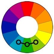
Now, of course you’re not going to use the same color everywhere in your app. You’re going to need combinations of color that go well with each other and are pleasant to look at.

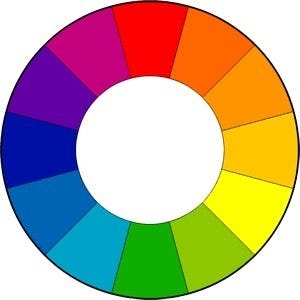
To combine colors, artists and designers often use a tool called color wheel.