How Silicon Valley wants to fuck with our brains

Introducing his students to the study of the human brain Jeff Lichtman, a Harvard Professor of Molecular and Cellular Biology, once asked: “If understanding everything you need to know about the brain was a mile, how far have we walked?” He received answers like ‘three-quarters of a mile’, ‘half a mile’, and ‘a quarter of a mile’.

The professor’s response? “I think about three inches.”

Last month, Lichtman’s quip made it into the pages of a new report by the Royal Society which examines the prospects for neural (or “brain-computer”) interfaces, a hot research area that has seen billions of dollars of funding plunged into it over the last few years, and not without cause. It’s projected that the worldwide market for neurotech products — defined as “the application of electronics and engineering to the human nervous system” — will reach as much as $13.3 billion by 2022.

So, despite our admitted lack of understanding, it seems the brain is a new and significant frontier for tech-pioneers looking to reinvent — and perhaps irreversibly influence — the way we interact with the world.

The Royal Society report speculates:

Mental health conditions could be treated by using interfaces to target relevant parts of the brain, bringing relief to the hundreds of millions worldwide who have depression. Even Alzheimer’s disease, which has proved resistant to conventional therapies, might be halted or reversed.

Outside of medical use:

People could undergo ‘whole brain diagnosis’ to identify their unique talents and challenges. Today’s ‘brain training’ computer games, whose impact is debated, might give way to demonstrably effective ‘brain cleaning’ or ‘mind gym’ sessions to keep minds sharp and creative.

Neural interfaces offer myriad possibilities to enhance everyday life. We could use our minds to open doors, turn on lights, play games, operate equipment or type on computers.

Then there are opportunities to enhance or supercharge the brain itself. Implants, helmets, headbands or other devices could help us remember more, learn faster, make better decisions more quickly and solve problems, free from biases…

Mood, knowledge and memory could be securely and confidentially backed up or uploaded to a digital cloud.

I know, it’s a lot. And I’ve omitted the references to telepathy, the potential merging of humans with artificial intelligence, and the option to hook your neural interface up to that of another animal, like a bird.

To a sci-fi nut, this must all sound like manna from heaven. To the rest of us, it’s likely to be a little bewildering (to say the least). So, is this a real proposition? Or just the (fairly creepy) wishlist of some over-ambitious Silicon Valley nerds?

The truth is that it’s difficult to tell what the long-term trajectory for brain-computer interfaces will be but, to a degree, they are already here. Though still fairly elementary, we currently have drones and artificial limbs that can be controlled using the brain alone, as well as headsets that boost concentration and memory. Some of these technologies are invasive, but many are not. Some record and react to brain activity, some stimulate it, and some do both.

Reassuringly, it’s non-invasive technologies that look to be headed for commercial distribution. Most of these are re-imaginings of the electroencephalogram (EEG), a system that monitors and records electrical impulses in the brain. One of the leaders in the commercial space, CTRL-Labs, specifically focuses on what it calls ‘intention capture’. Their product is a electromyogram (EMG)-based wristband, which can respond to electrical signals as they activate in a user’s arm muscle. At the moment, the company’s demo has a player controlling a simple game using only this impulse detection and no physical movement (take a look).

If you’re cynical about how far this could go, you should know that Facebook acquired CTRL-Labs last month, and just a couple of weeks ago leaked transcripts from Mark Zuckerberg’s internal meetings reinforced the firm’s keen interest in brain-computer interfaces.

Giving his thoughts on Elon Musk’s Neuralink project, Zuck says:

I am very excited about the brain-computer interfaces for non-invasive. What we hope to be able to do is just be able to pick up even a couple of bits. So you could do something like, you’re looking at something in AR, and you can click with your brain. That’s exciting… Or a dialogue comes up, and you don’t have to use your hands, you can just say yes or no. That’s a bit of input. If you get to two bits, you can start controlling a menu, right, where basically you can scroll through a menu and tap. You get to a bunch more bits, you can start typing with your brain without having to use your hands or eyes or anything like that. And I think that’s pretty exciting. So I think as part of AR and VR, we’ll end up having hand interfaces, we’ll end up having voice, and I think we’ll have a little bit of just direct brain.

If a little bit of “direct brain” doesn’t bother you, it’s worth looking ahead to the possibilities that extend beyond basic control of an elementary system.

For example, we already have neural systems that can read moods and emotions. Last year, The South China Morning Post reported that this kind of technology had been deployed by Chinese firms looking to monitor employees for signs of anger, anxiety or depression using devices built into headwear and hats. And perhaps even more impressively (or disturbingly), researchers at Kyoto University in Japan have been able to use a deep neural network to convert brain signals from an fMRI scan (used to map neural activity) into an image that contains many of the shape and color characteristics as one viewed by the subject of the scan.

This is all just to say that these types of systems are unlikely to cease development once they provide the capabilities to click or scroll in Mark Zuckerberg’s AR hellscape.

The Royal Society report makes sure to flag some early concerns. Most rational-thinking people won’t be too far behind them: What would it mean if an external company or government could gain access to our moods, or even our thoughts? How might human privacy — and indeed autonomy — be protected in if these technologies became ubiquitous? How can we ensure that they wouldn’t be weaponized by bad actors or governments to influence and control entire populations? (And is it okay if they only want to subliminally coax us to eat more healthily or respect the rules…?)

It’s not hard to think of governments that will be watching the progression of this technology very keenly.

Though it’s only fair to weigh risks against benefits before eagerly ringing the alarm bell, even here there is ambiguity. The benefits of commercializing this technology seem extremely limited, at least on the face of it. Gameplay? Fitness? Hands-free navigation of augmented or virtual reality environment? None of these feel like strong arguments for selling access to our brains.

But what about neural interfaces that could improve memory or concentration, making us super productive in life and work? Presumably, one could make the case that this is a worthwhile trade? Well, incidentally, completely separate research released just after the Royal Society report should urge caution around attempts to enhance such functions.

A new journal in Science published findings that appear to affirm the long-held theory that there is an active “forgetting mechanism” which kicks in while we sleep. The study found that when researchers suppressed neurons that produce the naturally occurring hypothalamic melanin-concentrating hormone (MCH) in mice, their memory performance actually increased. In other words, without this unnatural suppression these hormones act very deliberately to impair — or “modulate” — our memories.

This is a biological addition, not some kind of “lack” that we must compensate for with technology. We might safely assume that it serves some worthwhile evolutionary purpose.

Indeed, there is good reason to believe that if we didn’t forget we would live in a perpetual state of confusion, our brains awash with confusing superfluous information. One curious story that speaks to the chaos of the ever-remembering mind is that of the man who became known as subject S; a young Moscow-based journalist (later identified as Solomon Shereshevsky) who approached neuropsychologist Dr. Alexander Luria in 1929 with a very peculiar problem: he could not forget.

According to Luria’s reports, subject S. was able to remember foreign poems, scientific formulas, and enormously long strings of words and numbers decades after he had been told them. He recited them to perfection every time Luria tested him.

Great asset, eh? To never forget a name at a cocktail party, miss a birthday, fail a test on a fact or formula you already learned? To remember your own human life with crystal clarity rather than with the foggy haze that tends to wash over even our dearest memories?

Not so. According to the New York Times:

S.’s ability to remember was also a hindrance in everyday life. He had a hard time understanding abstract concepts or figurative language, and he was terrible at recognizing faces because he had memorized them at an exact point in time, with specific facial expressions and features. The ability to forget, scientists eventually came to realize, was just as vital as the ability to remember.

Who knows what psychological or neural confusion could eventually be brought on by using brain-computer interfaces to optimize evolutionary facets…

But we probably shouldn’t run screaming for the hills just yet. These systems are in their infancy, and there have been incredible breakthroughs in the research that should yield great benefits for people with mental and physical impairments. Nevertheless, The Royal Society are right to get ahead of the ethical and moral dilemmas that will accompany the commercialization of this type of technology. It is unfamiliar terrain, and allowing a system to intervene on our physical and mental capacities is an unprecedented encroachment that could easily turn sour. Certainly if we are to judge by the ways technological intelligence and surveillance have been wielded so far.

For now we should keep a close watching brief on how this technology develops, as well as any-and-all proposals for its use. One thing seems to be true, if we thought society had already reached its technological saturation point, we “ain’t seen nothin’ yet.”

This article was originally published on Towards Data Science by Fiona J. McEvoy, a tech-ethics researcher and founder of YouTheData.com. She examines the use of technology, A.I., and data in our society.

from The Next Web https://thenextweb.com/syndication/2020/01/02/how-silicon-valley-wants-to-fuck-with-our-brains/

Understanding the Four Types of Artificial Intelligence

Machines understand verbal commands, distinguish pictures, drive cars and play games better than we do. How much longer can it be before they walk among us?


Photo Courtesy of Shutterstock

The common, and recurring, view of the latest breakthroughs in artificial intelligence research is that sentient and intelligent machines are just on the horizon. Machines understand verbal commands, distinguish pictures, drive cars and play games better than we do. How much longer can it be before they walk among us?

The new White House report on artificial intelligence takes an appropriately skeptical view of that dream. It says the next 20 years likely won’t see machines “exhibit broadly-applicable intelligence comparable to or exceeding that of humans,” though it does go on to say that in the coming years, “machines will reach and exceed human performance on more and more tasks.” But its assumptions about how those capabilities will develop missed some important points.

As an AI researcher, I’ll admit it was nice to have my own field highlighted at the highest level of American government, but the report focused almost exclusively on what I call “the boring kind of AI.” It dismissed in half a sentence my branch of AI research, into how evolution can help develop ever-improving AI systems, and how computational models can help us understand how our human intelligence evolved.

The report focuses on what might be called mainstream AI tools: machine learning and deep learning. These are the sorts of technologies that have been able to play “Jeopardy!” well, and beat human Go masters at the most complicated game ever invented. These current intelligent systems are able to handle huge amounts of data and make complex calculations very quickly. But they lack an element that will be key to building the sentient machines we picture having in the future.

We need to do more than teach machines to learn. We need to overcome the boundaries that define the four different types of artificial intelligence, the barriers that separate machines from us – and us from them.

How Many Types of Artificial Intelligence are There?

There are four types of artificial intelligence: reactive machines, limited memory, theory of mind and self-awareness.

1. Reactive machines

The most basic types of AI systems are purely reactive, and have the ability neither to form memories nor to use past experiences to inform current decisions. Deep Blue, IBM’s chess-playing supercomputer, which beat international grandmaster Garry Kasparov in the late 1990s, is the perfect example of this type of machine.

Deep Blue can identify the pieces on a chess board and know how each moves. It can make predictions about what moves might be next for it and its opponent. And it can choose the most optimal moves from among the possibilities.

But it doesn’t have any concept of the past, nor any memory of what has happened before. Apart from a rarely used chess-specific rule against repeating the same move three times, Deep Blue ignores everything before the present moment. All it does is look at the pieces on the chess board as it stands right now, and choose from possible next moves.

This type of intelligence involves the computer perceiving the world directly and acting on what it sees. It doesn’t rely on an internal concept of the world. In a seminal paper, AI researcher Rodney Brooks argued that we should only build machines like this. His main reason was that people are not very good at programming accurate simulated worlds for computers to use, what is called in AI scholarship a “representation” of the world.

The current intelligent machines we marvel at either have no such concept of the world, or have a very limited and specialized one for its particular duties. The innovation in Deep Blue’s design was not to broaden the range of possible movies the computer considered. Rather, the developers found a way to narrow its view, to stop pursuing some potential future moves, based on how it rated their outcome. Without this ability, Deep Blue would have needed to be an even more powerful computer to actually beat Kasparov.

Similarly, Google’s AlphaGo, which has beaten top human Go experts, can’t evaluate all potential future moves either. Its analysis method is more sophisticated than Deep Blue’s, using a neural network to evaluate game developments.

These methods do improve the ability of AI systems to play specific games better, but they can’t be easily changed or applied to other situations. These computerized imaginations have no concept of the wider world – meaning they can’t function beyond the specific tasks they’re assigned and are easily fooled.

They can’t interactively participate in the world, the way we imagine AI systems one day might. Instead, these machines will behave exactly the same way every time they encounter the same situation. This can be very good for ensuring an AI system is trustworthy: You want your autonomous car to be a reliable driver. But it’s bad if we want machines to truly engage with, and respond to, the world. These simplest AI systems won’t ever be bored, or interested, or sad.

2. Limited memory

This Type II class contains machines can look into the past. Self-driving cars do some of this already. For example, they observe other cars’ speed and direction. That can’t be done in a just one moment, but rather requires identifying specific objects and monitoring them over time.

These observations are added to the self-driving cars’ preprogrammed representations of the world, which also include lane markings, traffic lights and other important elements, like curves in the road. They’re included when the car decides when to change lanes, to avoid cutting off another driver or being hit by a nearby car.

But these simple pieces of information about the past are only transient. They aren’t saved as part of the car’s library of experience it can learn from, the way human drivers compile experience over years behind the wheel.

So how can we build AI systems that build full representations, remember their experiences and learn how to handle new situations? Brooks was right in that it is very difficult to do this. My own research into methods inspired by Darwinian evolution can start to make up for human shortcomings by letting the machines build their own representations.

3. Theory of mind

We might stop here, and call this point the important divide between the machines we have and the machines we will build in the future. However, it is better to be more specific to discuss the types of representations machines need to form, and what they need to be about.

Machines in the next, more advanced, class not only form representations about the world, but also about other agents or entities in the world. In psychology, this is called “theory of mind” – the understanding that people, creatures and objects in the world can have thoughts and emotions that affect their own behavior.

This is crucial to how we humans formed societies, because they allowed us to have social interactions. Without understanding each other’s motives and intentions, and without taking into account what somebody else knows either about me or the environment, working together is at best difficult, at worst impossible.

If AI systems are indeed ever to walk among us, they’ll have to be able to understand that each of us has thoughts and feelings and expectations for how we’ll be treated. And they’ll have to adjust their behavior accordingly.

4. Self-awareness

The final step of AI development is to build systems that can form representations about themselves. Ultimately, we AI researchers will have to not only understand consciousness, but build machines that have it.

This is, in a sense, an extension of the “theory of mind” possessed by Type III artificial intelligences. Consciousness is also called “self-awareness” for a reason. (“I want that item” is a very different statement from “I know I want that item.”) Conscious beings are aware of themselves, know about their internal states, and are able to predict feelings of others. We assume someone honking behind us in traffic is angry or impatient, because that’s how we feel when we honk at others. Without a theory of mind, we could not make those sorts of inferences.

While we are probably far from creating machines that are self-aware, we should focus our efforts toward understanding memory, learning and the ability to base decisions on past experiences. This is an important step to understand human intelligence on its own. And it is crucial if we want to design or evolve machines that are more than exceptional at classifying what they see in front of them.

The Conversation

This article was originally published on The Conversation

from www.govtech.com https://www.govtech.com/computing/Understanding-the-Four-Types-of-Artificial-Intelligence.html

7 laws of UX design (with illustrations)

Designing UX is important, even by following the rules. (Photo by Daniel Korpai on Unsplash)

User Experience is how the user interacts with your product through usability, accessibility, and desirability. But sometimes your design can be a total waste because there are laws of UX design that you didn’t follow. So here are laws you need to follow for an efficient product.

Von Restorff Effect

Also known as the Isolation Effect, predicts that when multiple similar objects are present, the one that differs from the rest is most likely remembered. In design, you can make that important information or key actions more distinctive than others.

Hick’s Law

This is where how long to make a decision depending on how many and how complex the choices are. For example, too many choices might take the user a long time to choose. So try to simplify these things out, try not to make overwhelming users by highlighting the recommended options. Additionally, use progressive onboarding to minimize cognitive load. To simplify, keep it simple.

Fitts’s Law

Fitt’s Law is like Hick’s Law but it measures how long is the target will take to acquire based on its distance and size of the target. You can shorten the time by making it huge enough and placed on the bottom to make it easy to reach.

Zeigarnik Effect

The Zeigarnik effect states that incomplete or interrupted tasks are most likely to be remembered. You could help the users remember certain uncompleted tasks by adding a simple progress bar.

Serial Position Effect

This effect states that the first and the last terms are most likely remembered. Placing the least important items in the middle of the list and the key information on the first and last series is a good rule of thumb.

Law of Common Region

Elements can be grouped together, right? Well, the Law of Common Region expresses that elements are grouped together when they share an area with a clear boundary between them. Consider adding a border to an element or define a background behind an element to create a common region.

Law of Proximity

Objects that are near or proximate tend to be grouped together. Proximity establishes relationships and it helps users understand and organize information faster and more efficient.

After reading this article, you will be able to design beautiful products, fast and efficient and good for the users and beta testers (I don’t know if there are beta testers in UX). If this seems interesting to you, then maybe a few claps will do. Thank you for reading.

Sources:


7 laws of UX design (with illustrations) was originally published in UX Collective on Medium, where people are continuing the conversation by highlighting and responding to this story.

from UX Collective – Medium https://uxdesign.cc/7-important-laws-of-ux-design-fdda087b4f9d?source=rss—-138adf9c44c—4

Intelligent Apps For a Promising Future

Early mobile users were content with basic apps such as the Calendar, Calculator, and Clock, but, with the advent of smartphones came an abundance of apps to assist us in every way possible. Today, you have an app for everything and anything, so businesses need to focus on providing a user-friendly experience rather than just maintaining a mobile presence. Next came the shift in trends towards intelligent applications, technologies such as artificial intelligence (AI) and machine learning (ML) have become growth stimulators in various industries. With the integration of more and more systems and devices, AI has become the mediator between machines and humans. 

The era of intelligent applications dawned when application developers succeeded in integrating AI into software applications. The rise in demand for advanced analytical tools, and an improvement in technologies such as big data and analytics, has led to the growth of the intelligent apps market. Intelligent apps are no longer considered as an innovation, but a necessity that organizations must provide in order to stay competitive. 

What are Intelligent Apps?

The long-gone Microsoft Office assistant ‘Clippy’ could be seen as the humble beginning which would eventually evolve into today’s intelligent apps. Simply put, intelligent apps are applications that leverage historical and real-time data gained from user interactions to deliver relevant, personalized and adaptive user experiences. Intelligent apps use AI-powered algorithms to differentiate between relevant and irrelevant information. Putting this remarkable trait to good use, companies can make real-time changes to their services to improve their position in the market. 

Applications of Intelligent Apps

Intelligent applications use all the data they can to respond to changing circumstances and formulate favorable outcomes. Companies can leverage this to bring about digital transformation and deliver rich customer experiences. Large industries are using intelligent applications that collect and process data from a variety of sources and provide real-time experiences using technologies such as machine learning and artificial intelligence. 

Coming up are some sectors where intelligent applications are used:

  • Finance: Today’s financial institutions are being expected to transform services using advanced technology. With many start-ups taking their claim of the market, more customers are demanding ease of engagement. The evolution of intelligent apps has transformed the financial sector. Intelligent apps have helped institutions improve their efficiency and consumers can better understand and manage their finances through the use of intelligent apps.
  • Business: Smart apps have the potential to increase operational excellence in the B2B as well as B2C sectors. This next generation of applications can help employees to carry out their work in an efficient manner, for example an organization could develop an intelligent app to alert employees to respond quickly to emails that require an immediate response. Since smart apps deliver highly personalized and contextual information, employees can quickly filter and streamline information on the basis of their needs. Thus, intelligent apps can be used to enhance output and reduce turnaround time. 
  • Energy: With the emergence of decarbonization and decentralization, electric utilities and other energy companies are actively exploring effective ways to reduce the imbalance in supply and demand through the use of renewable energy sources in power generation. AI-powered intelligent apps possess tremendous potential to transform the energy and utility sectors. Smart apps can be used to analyze large amounts of data, identify patterns and trends, detect anomalies and make accurate predictions of power requirements. Using predictive analysis, intelligent apps can provide us alerts that help us to improve the equipment O&M and predict downtime, which ultimately enhances the efficiency of the system.
  • Media: Today’s media has shifted from traditional broadcast and cable television to real-time streaming. Self-learning, self-controlling and self-communicating standalone intelligent applications have enabled an entirely different aspect of media viewing in recent years. With virtual reality creating totally new environments, coupled with the user’s ability to interact with virtual spaces, intelligent apps powered by machine learning and AI are set to replace various aspects of the industry.

The Future of Intelligent Apps

  • Evolutionary Apps: We have already seen that intelligent apps combine customer, product and operational insights to create a more compelling user experience. Thus, the future belongs to intelligent apps. IDC states that “by the end of this decade, more than half of the apps developed will have some cognitive services embedded in them”. People have experimented with neural nets that can look at codebases and dynamically change the user interfaces themselves. Thus, AI-powered apps would be able to think, act and evolve. We already have apps that show functions pertaining to the user, thus offering a more personalized user experience.
  • Invisible Apps: One pain that many users experience with apps today is that they have to input a lot of information. For example, when using a normal fitness app to keep track of your daily calorie count, you have to input all the details of whatever you eat (like quantity, ingredients, restaurants). However, the combination of conversational AI and cognition with analytics allows users to input information using voice. Thus, instead of typing everything that you ate, you can simply tell the app, “I had a Big Mac from McDonald’s”. This creates more dynamic user experiences, which customers appreciate. Organizations that plan to develop or that already have apps should take this into consideration.

How can you be future-ready?

As we are gradually moving towards a world with driverless cars, smart homes and everything around us turning smart, intelligent apps are definitely the future. We have come a long way from the basic apps that came with the early generations of mobiles. Even if we do not always see it, at some level, AI is proving to be a potentially useful and promising concept in technology. Organizations using AI have grown from 4% in 2018 to 14% in 2019. (Gartner’s 2019 CIO Agenda Survey). 

Along with increasing adoption of AI-powered enterprise applications, specific infrastructure resources need to grow and evolve alongside to ensure high success rates. Instead of pushing for deep machine learning, organizations need to understand how to apply simple machine learning techniques to address their business problems. 

CIOs should ensure that their software providers outline proper roadmaps depicting how they incorporate AI to add business value using advanced analytics to advance user experiences. With the widespread use of intelligent applications for business and personal use, companies need to stay up to date on these exciting possibilities.

Author Bio:

Tony Joseph - I believe in building technology around processes, rather than building processes around technology. I specialize in custom software development, especially in analyzing processes, refining it and then building technology around it. I work with clients on a daily basis to understand and analyze their operational structure, discover key improvement areas and come up with technology solutions to deliver an efficient process.

from Awwwards – Blog https://www.awwwards.com/intelligent-apps-for-a-promising-future.html

13 product and behavioral analytics tools to help you understand your users

Knowledge may be power, but do you know what’s even better than knowledge? Insight. It’s good to know things. It’s better to understand them. 

When you know why something is the way it is, you have the information you need to make more effective decisions about how to manipulate and influence that thing. You can change outcomes.

Delivering insight is the whole purpose of product analytics. At a high level, product analytics helps you understand who your users are, what they are doing, what they need, and—most importantly—what you need to do to convert and retain them. The insights gleaned from product analytics empower you to deliver a better user experience that, in turn, helps you improve the KPIs that drive your business.

Getting set up to incorporate product analytics into your operations can seem a bit daunting, both from an implementation perspective and in terms of cost. However, according to a report from McKinsey, companies that take advantage of advanced product (or customer) analytics typically earn twice the profits of companies that do not employ these technologies. Seems worth the effort, if you ask us. 

Companies in the market for the best analytics tool will quickly find that there’s no lack of choices out there, and many of the options seem to offer the same basic feature set. But, there are some nuances that can help you differentiate one from another. 

In this post, we’ll go over some of the most popular product analytics and behavioral analytics tools so you can get a sense of your options.

What product analytics tools do and why it matters

Product analytics tools have 2 main functions: data tracking and data analysis. The first captures information about users and their actions. The second takes all that information and translates it into actionable insights delivered via visualizations, dashboards, and reports. 

Product analytics software are used to track and collect a wide array of data from multiple sources. Analytics platforms help with user profiling and segmenting by capturing user data including details like location, device, age, entry points, referring links, and so forth. They also capture behavioral data by tracking user activity. Most product analytics solutions offer features such as session recordings, heat maps, on-page/in-app surveys, event tracking, and so forth. 

All of this data is aggregated and then analyzed to provide detailed insights into how specific flows and funnels work (or don’t), usage trends, user profiles and paths, cohort analysis, conversion triggers, segment behavior, intent, and many other aspects of user engagement. 

Ultimately, these data-driven insights help you answer questions that are critical to improving your product, your user experience, and your most essential KPIs. Analytics tools can help you answer questions like:

  • Which marketing channels bring in the most customers?
  • Which marketing channels bring in the most profitable customers?
  • What are the most effective drivers of conversion?
  • Who are your power users, and what attributes do they share?
  • How are your customers using specific features?
  • Which features do customers use the most/least?
  • How did the latest release affect user engagement?
  • Where are users encountering friction in the conversion funnel/onboarding process/daily tasks?
  • What percentage of users are successfully completing key actions?
  • How many users return to your produce on a daily/weekly/monthly basis?

As you can imagine, the answers to these questions provide can be spectacularly valuable and can help you make better decisions about how to improve your product, successfully influence and guide your users, enhance your buyer and customer experiences, and generally know your customers more intimately so that you can serve them more effectively.

Mixpanel vs. Amplitude vs. Heap

As we’ve already said, there are a lot of product analytics tools out there. Which one is right for you depends on exactly what you’re trying to accomplish, the investment you’re willing and able to make, how much technological complexity your team can manage, your reporting preferences, and so on. 

It would take much more than a single blog post to cover all the available options in great detail, but even a high-level overview can be really helpful when you’re on the fence. To begin with, let’s look at 3 of the market leaders—companies that represent the “big players” in the product analytics space. 

Each of these top-tier products offers a complete range of features and functionality. Most review sites rank these three quite closely in terms of overall functionality and user satisfaction.

Mixpanel

Mixpanel started life as a mobile app analytics platform, but has since evolved to be a very strong all-in-one player that integrates with other platforms, is able to send a variety of notifications (via email, SMS, push notifications, and in-app), and also includes a suite for marketing automation and CRM. 

Like any event-based analytics platform, it requires that you define specific actions and events up front before you can collect and analyze your data. Mixpanel’s technical implementation difficulty level is on par with its closest competitor, Amplitude. 

In addition to having unique notification features, Mixpanel also has a very robust SDK for their mobile analytics platform (including iOS and Android platforms). 

They also have a more flexible and (often) less expensive pricing model than Amplitude. Mixpanel’s pricing tiers are based on a combination of event and user plans. 

  • Free starter plan: includes all features, accommodates 1,000 monthly tracked users, provides unlimited accounts for employees, and includes 90-day data history
  • Growth plan: starts at $779 per year for 1,000 MTUs, includes 12 months of data history and the ability to run 10 predictions at once (Pricing varies based on volume of MTUs, which can range up to 25,000.)
  • Enterprise plan: (custom pricing) includes upgrades such as customizable data history, single sign-on, roles and permissions, and group/B2B analytics

Mixpanel could be an especially good fit for organizations that:

  • Are looking for an all-in-one tool
  • Have substantial notification needs
  • Are focused on analyzing mobile apps
  • Are building a CRM or need to integrate with one
  • Need a comprehensive solution, but don’t have super deep pockets

Amplitude

Another event-based solution, Amplitude also requires initial set up as a first step in accessing the benefits of their platform. Amplitude launched as a product analytics tool, and that is still their primary focus. Unlike Mixpanel, they aren’t interested in being everything to everyone. 

While their free plan is generous in terms of volume (10 million actions per month), it does not include many of their unique features such as Compass (a feature designed to help identify behaviors that are predictive of retention or conversion) or their SQL integration. Those are only available with a subscription. 

Amplitude’s strength is in its focus on uncovering the aha moments that represent key milestones in the user journey. Their product is an excellent tool for digging deep on feature adoption, real-time performance, funnels, and user behavior. While both Amplitude and Mixpanel offer many of the same reports, there are a few—Personas, Lifecycle, and Impact—that are only available from Amplitude.

Like Mixpanel, Amplitude offers 3 pricing tiers:

  • Free plan: includes core analytics, unlimited data retention, unlimited user seats, and tracking for up to 10 million actions per month
  • Growth plan: (custom pricing) adds in behavioral reports, predictive analytics, advanced collaboration tools, custom solutions and event volume, dedicated customer success, and more 
  • Enterprise plan: (custom pricing) adds in monitoring and automated insights, advanced data governance, single sign-on and authentication, customer user permissions and roles, premier customer success with SLA, and more 

Amplitude could be an especially good fit for organizations that:

  • Want to focus on discovering their product’s aha moments
  • Have larger teams and a need for sharing information
  • Have the ability to support a more expensive subscription

Heap

Unlike Mixpanel and Amplitude, Heap doesn’t require you to set up specific actions and events. Instead, they take a unique approach by automatically capturing data without needing any upfront configuration. Their focus is on agility and giving users the ability to iterate quickly. 

To this end, they provide a more flexible data model than their top competitors. Using Heap, users (even non-technical ones) have the ability to create virtual events that they can then use in funnels, cohorts and other types of analysis. These virtual events can be modified or replaced at any time with minimal effort. 

Like Amplitude, Heap’s free plan is somewhat limited, but they do offer 2 other pricing tiers with more complete functionality:

  • Free plan: targeted at “young businesses and side projects,” this plan includes up to 5,000 sessions per month, 3 months of data history, 1 user license, 1 project, and Silver support
  • Growth plan: (custom pricing) only available to startups with 20 or fewer employees, this plan allows for up to 125,000 sessions per month, 1 year of data history, 10 user licenses, 5 projects, and Gold support 
  • Enterprise plan: (custom pricing) designed for business that rely heavily on customer data and behavioral analytics, this plan offers custom session volume, a minimum of 1 year data history, custom user licenses, custom projects, and Platinum supports and services 

Heap could be an especially good fit for organizations that:

  • Prefer a plug-and-play approach
  • Are primarily concerned with speed and agility
  • Need a platform that can run without engineering support
  • Want a flexible approach that allows for on-the-fly changes to the structure of analytics

more tools to consider

Mixpanel, Amplitude, and Heap may be the front runners on most comparison lists, but there are plenty of other options out there—some that have been around for a while, others that are new on the scene. Here’s a quick overview of some of the more popular and promising in the field. 

4. FullStory

FullStory is on a mission to help their customers create better digital experiences through experience analytics. Features include on-the-fly conversion funnels, advanced search capabilities, video-like replay of real user sessions, and robust debugging and developer tools. They do not require event instrumentation. FullStory also offers strong data analysis, robust collaboration tools so you can share your insights, and a wide range of integrations. 

Fullstory pricing (as of December 2019):

  • Free plan: up to 1,000 sessions per month
  • Enterprise plan: (custom pricing) built for high-volume businesses
  • Business plan: (custom pricing) free trial available

5. Sherlock

Sherlock is as a product engagement scoring platform that translates all in-app actions into a definitive ranking of your most (and least) engaged users. If you have instances of multiple users on a single account, it also provides scores at the account level. Their goal is to help you identify how engagement is trending, which features drive the most engagement, and other key insights that help you prioritize sales, marketing, and product efforts. 

Sherlock pricing (as of December 2019)::

  • Watson plan: $129 per month, up to 1,000 monthly active users (MAUs)
  • Mycroft plan: $221 per month, up to 5,000 MAUs
  • Sherlock plan: $399 per month, up to 20,000 MAUs 

6. Tableau

Committed to providing a revolutionary new approach to business intelligence, Tableau focuses on making databases and spreadsheets accessible to ordinary people in order to unleash the power of your data and the potential of your people. Their platform allows you to quickly connect, visualize, and share data in a seamless cross-device experience that requires no programming skills. 

Tableau pricing (as of December 2019):

Tableau offers to deployment options—Tableau Server (on-premise or public cloud) and Tableau Online (fully hosted by Tableau). Pricing varies (and additional add-ons may apply). 

License options include:

  • Creator: each deployment requires at least one Creator license ($70 per user per month, billed annually).
  • Explorer: minimum of 5 Explorers required, $35 per user per month, billed annually with Tableau Server, $42 per user per month, billed annually with Tableau Online
  • Viewer: minimum of 100 Viewers required, $12 per user per month, billed annually with Tableau Server, $15 per user per month, billed annually with Tableau Online

7. Geckoboard

Keep your metrics top-of-mind for everyone on the team with customized TV dashboards that are easy to create and manage. Geckoboard allows you to pull in metrics from 60+ code-free integrations, or freestyle with spreadsheets and their datasets API. Choose the metrics you want to show, and fine tune them using visualizations and filters and their intuitive drag-and-drop assembly tool. The result is secure, powerful, real-time access to clear dashboards that anyone can understand at a glance. 

Geckoboard pricing (as of December 2019):

  • Basic plan: $31 per month, up to 2 dashboards sent to 1 TV, 1 user, Geckoboard branding
  • Team plan: $127 per month, up to 5 dashboards sent to unlimited TVs, unlimited users, custom branding, database integration, sharing links, mobile access, and priority support
  • Team Plus plan: $199 per month, same features as Team plan for up to 10 dashboards 
  • Company plan: $479 per month, same features as team plans for unlimited dashboards sent to unlimited TVs plus a dedicated rep and manual invoicing

8. Smartlook

Smartlook’s qualitative analytics solution for web and mobile (iOS, Android, Unity, and Metal) helps you understand user behavior at the micro level with always-on visitor recordings, heatmaps, automatic event tracking, event statistics, and funnels connected to recordings. 

Smartlook pricing (as of December 2019)::

Smartlook offers 2 sets of pricing for websites and native mobile apps. Each set has 3 tiers. Prices vary depending on session volume and data history needs. 

Websites

  • Free plan: does not include always-on recording, limited features, up to 1,500 sessions per month, 1 month data history 
  • Starter plan: starts at $19 per month
  • Power plan: starts at $79 per month

Native apps

  • Free plan: 5,000 sessions per month, 1 month data history
  • Starter plan: starts at $52 per month
  • Power plan: starts at $108 per month

Custom pricing packages also available

9. VWO

In addition to providing product analytics features, VWO also offers a wide variety of testing capabilities including A/B, multivariate, split URL, server side, and mobile app testing. They offer a way to embrace multi-channel experimentation that goes beyond emails to leverage automated marketing campaigns that use web push notifications, Facebook Messenger, and other channels. 

VWO pricing (as of December 2019)::

  • Experience Optimization Essentials: $467 per month, includes VWO Testing, VWO Insights, and VWO Engage
  • Conversion Optimization Essentials: $368 per month, includes VWO Testing and VWO Insights

10. Hotjar

Using heatmaps, session recordings, and surveys, Hotjar helps you uncover the “why” behind page traffic and drop-off rates. It complements traditional web analytics tools like Google Analytics, offering a user-friendly way to gain a better understanding of your user behavior.

Hotjar pricing (as of December 2019):

Personal plans

  • Basic: Free forever, collect data from up to 2,000 pageviews per day, limited reports, unlimited users, 365-day data storage
  • Plus: for low-traffic sites and early-stage startups, $29 per month, collect data from up to 10,000 pageviews per day, unlimited reports and users, 365-day data storage, 15-day free trial

Business plans

  • Pricing ranges from $89 to $589 per month depending on the volume of daily page views

Agency plans

11. Crazy Egg

One of the original analytics solutions, Crazy Egg lets you visualize your website’s visitors through snapshots, heatmaps, and recordings. Their platform requires no hardware, almost no IT involvement, and no long-term commitments. They also offer A/B testing to test content placement, color, image, copy, etc., and their Crazy Egg Editor allows you to modify content without the need for developer support.

Crazy Egg pricing (as of December 2019):

Request a demo

12. Flurry

Focused on mobile consumer behavior, this Yahoo company offers analytics for both iOS and Android apps—for free. Flurry helps you easily track key usage metrics (new users, active users, sessions, and more), and also offers additional insights through dashboards, retention metrics, instant analyses of specific user groups and actions, crash analytics and reporting, in-app revenue analytics, app audience metrics, event tracking, user segmentation, push notifications and messaging, and more.

Flurry pricing (as of December 2019):

Free

13. Segment

Segment allows you to collect, unify, standardize, and activate your first-party customer data in more than 200 marketing, analytics, and data warehouse tools, all with a single API. This foundational tool allows you to integrate first-party data across your entire marketing and analytics stack, prevent bad data by enforcing common standards, and achieve better visibility into data (while ensuring it meets privacy standards). From connection to data governance to audience management, Segment helps companies unify user history across different channels, identify preferences, and personalize experiences.

Segment pricing (as of December 2019):

  • Free plan: 1,000 MTU, 2 sources, unlimited destinations
  • Team plan: $120 per month base, 10,000 MTU, unlimited sources, unlimited destinations
  • Business plan: (custom pricing) custom MTU volume, unlimited sources, unlimited destinations, historical data replay, data filters and controls, protocols and personas available

Time to get started

With all the available tools, there’s really no excuse to put off getting to know your users better. No matter which of these product analytics solutions you choose, you will gain valuable insights into who your users are and what they want from you. You will be able to build a better product, create a better user experience, and—in the process—improve the KPIs that propel your business forward and set it up for long-term success. 

The data is out there. You just need to make good use of it.

from The Appcues Blog https://www.appcues.com/blog/product-behavioral-analytics-tools-guide

Thinking forward: experience design trends for 2020

2019 was a year marked by reflecting on design ethics, dark mode becoming part of most of the products, personalization no longer being a buzz word and Figma seriously competing with Sketch. Taking into account some of this year’s strongest revelations and scanning what seems to be on top of the industry’s mind at the moment, here is a forecast of what I see as the 10 strongest trends for 2020.

image by Anatolii Babii

1. Voice interface, clear and definitely here.

In 2020 we will see the growth of voice search. The recent studies show that using voice as interaction is becoming the standard in daily life. Voice technology is getting smarter and adapting to the natural conversational language, bringing a new way of interaction that a text search never could.

image by Anton Tkachev for UI8

2. Minimalism Interface. Rediscovering information architecture.

The time of complex applications, full of interactive elements, call-to-actions, and useless animations will become things of the past (I hope at least). Today the majority of users navigate through several pages at the same time and on different devices, while attention to content decreases more and more. As a solution, minimal design will help to guide the user to gain a better, clearer and faster understanding about your product.

image by Tolik Nguyen for Fireart Studio

4. Dynamic User Experience.

Continuing with the topic of having structures full of complexity and interference, e.g. links opening in new tabs and pop-ups appearing, again and again, distracting the user from his actual goal and shifting their focus to things that are unnecessary.

One good reference is google with Gmail allowing users to access the google calendar while reading email at the same time, dividing the screen into 2 parts, allowing the user to view both at the same time without needing to switch between tabs. In 2020 we will see a growth of similar behaviors, delivering to the user what they are looking for instead of pushing things that we might think the user might like.

image by Anatolii Babii

5. Device Synchronisation.

Device synchronization is the latest trend. Whether its smartphone, a watch, a laptop — the user demands dynamic capabilities across all devices. Today the interaction is associated with the achievement of booking a cab or hotel, buying things online or control the home — as all of these can be done via the internet.

Deliver the right experience in every touchpoint.

Uber is the best example to take into consideration, as it has fully implemented an independent hardware approach. If you have used Uber, you might know that you can start the trip with voice command and end it with the help of a mobile application or watch. So, a single continuous operation can be performed on different platforms with uninterrupted action.

image by Anatolii Babii

5. Time to understand AI.

AI won´t stop the evolution and in 2020 I expect to see more brands embracing it. For some years AI started to be everywhere, from google search, online shopping recommendations, social media feeds adapting to user behaviors, etc. As AI technology grows it is becoming more developed and sophisticated but at the same time it will become more present everywhere.

In the next year, we will see new ways and forms how to use AI´s new methods for creative solutions, video / image-driven, and smarter products.

One good example is Ogilvy’s recent social media ad campaign for Deutsche Bahn, which aimed to encourage people in Germany to vacation in their home country rather than abroad. Using AI, Ogilvy put images of destinations in Germany next to almost-identical images of landmarks around the world. It wouldn’t have been possible without AI, and it drove a 6.61% conversion rate and a 24% increase in revenue.

image by Anatolii Babii

6.Services Over Products.

In the next year and beyond, we’ll see a move from selling products to selling services around products. Many consumers, particularly young people, will become more conscious about what they buy taking a step away from consumerism. Creating new products or finding new ways to sell consumer’s new versions of products they already have is no longer a promising business.
An example is in the smartphone and fashion industry where we see the sales numbers having a drop due to the fact that there is no need to replace a perfectly working older phone or jacket that still looks good. Is a generational attitude and consciousness, showing that people are buying less, moving toward investing rather in experience than things. People are more aware of what they buy.
Companies will have to rethink many of their business models and focus more on finding solutions that really help their customers instead of creating new products. For example, younger consumers may not want to buy their own car, but they’ll pay a monthly fee for access to a shared car. The same goes for services like streaming media, vacation rentals, and food delivery. It’s about the service that surrounds the products instead of the actual products themselves.

image by Anatolii Babii

7. Mindful Designing.

Good design is the one that is centered around users and supports them to complete an action in the most intuitive and simplest way. Mindfulness focuses on being clear, honest, without distractions and respecting the user providing meaningful experiences.

Mindful Design is a human-centered approach to create products which respect user’s privacy, time and attention as well as enhance the state of optimum human experience.”
Sandra Mileikyte

8. From copywriting to UX Writing.

We saw last years a gap in how text is adapted to the product with the purpose to benefit the user. Google has created a page to describe what its UX writers do in UX writing. On the page, Google described them as advocates for Google design and how they help to shape product experiences by crafting copy that empowers users to complete the task at hand.

“They set the tone for content and drive cohesive product narratives across multiple platforms and touchpoints. As the resident wordsmiths, they work with a variety of UX design-related jobs including researchers, product managers, engineers, marketing, and customer operations to help establish connective language and a unified voice.”

UX writer will be the storyteller, technical writer and editor of the company, housed within the UX team. While we see companies constantly improving their products and services’ appearance, feel and interaction design, it is intriguing that there will finally be changes to the words too.

Sources:

https://uiuxtrend.com/what-is-ux-writing/
https://design.google/jobs/ux-writer/
https://elespacio.net/articles/
https://e27.co/
https://uxdesign.cc/mindful-design-and-interaction-b5c96d968a2b
https://mailchimp.com/features/behavioral-targeting/
https://mailchimp.com/integrations/behavioral-track-trigger-suite-for-mailchimp/
https://www.aspireiq.com/blog/10-influencer-marketing-statistics-2020


Thinking forward: experience design trends for 2020 was originally published in UX Collective on Medium, where people are continuing the conversation by highlighting and responding to this story.

from UX Collective – Medium https://uxdesign.cc/thinking-forward-experience-design-trends-for-2020-1c375622bc82?source=rss—-138adf9c44c—4

How I used app store optimization to get my game downloaded 2M times

A couple of years ago, I wanted to turn my theoretical app store optimization (ASO) knowledge into a working skill.

So I decided to develop a mobile game. My goal was to validate the hypothesis that in the super-competitive mobile gaming market, you can launch a product that will grow into something large solely through organic traffic.

Let me say right away that I validated this hypothesis: a mobile game we created over the weekend ended up amassing over 2 million downloads, and received over 30,000 new users per day at its peak, all through organic traffic.

But the path to success looked nothing like the original plan. Here is the story of how the project evolved and how one small change increased the number of downloads by 200 percent.

What product should I create?

I immediately decided that I wanted to make a game. At the time, it had almost been a year since I had quit Zeptolab (the developer of Cut the Rope series, King of Thieves, and CATS) and I really missed the thrill and joy of game development. This was an opportunity to revisit this old hobby.

I spent two weeks identifying and studying popular game niches in app stores. I explored the space, picking out potential competitors with whom I would have to compete for first place in the search results.

Following my analysis, I decided to build a truck simulator. Without going too much into the details, here are the reasons why I chose this niche.

  1. It was a niche with a lot of organic traffic, and most importantly, it was growing. Top games were getting millions of downloads per month (I used Sensor Tower for the analysis).
  2. Even though there were clear leaders in this segment, there were also many apps with more than 100k installs per month, which indicated the games were getting organic traffic in various ways.
  3. Most games were low-quality and monetized through ads. This meant their users’ lifetime value (LTV) was low, and they could not afford paid user acquisition. This was good news, because I could not afford it either.
  4. These apps didn’t acquire users through paid ads, and they were not featured in app stores. They survived purely on organic traffic from search and app store recommendations.

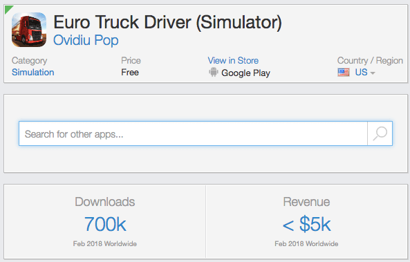
Here is an example of one of the most popular truck simulators that was downloaded over 700,000 times within a month on Google Play alone:

The original plan to win organic traffic in the truck simulator niche

Here’s what my initial plan looked like:

1. Make an arcade game about trucks.
2. Launch it on Google Play. Search and recommendations work much better on Google Play than on the Apple App Store, which is why I made this choice for the experiment.
3. Transform theoretical knowledge about ASO into applied skills using $1,000 for the product’s launch and its promotion.
4. Make some money (if I’m lucky).

Here is what actually happened…

Making the game

I made the game with a friend (he wished to remain anonymous, but in many ways, he deserves equal merit for the success of this project). It took us about a week to come up with a concept.

In the end, we decided to make a game based on a famous Volvo commercial. In this ad, Jean-Claude Van Damme did a split on the side windows of two moving trucks. We thought it would be fun for players to try being the driver of the right truck.

The goal of the game was to go as far as possible while keeping Van Damme from falling down. The task was complicated because the left truck acted unpredictably. It could accelerate and switch lanes. The player driving the right truck needed to adapt to the left truck and keep Van Damme standing. The gameplay became challenging when the trucks reached road billboards, because Van Damme had to do the splits every time the trucks would go under one. It was a casual arcade game with fun hardcore gameplay that drove some of the players mad.

We developed the game on Unity over a weekend. We spent another week creating the copy and material for the app store, testing on different devices (Android was a real pain), and implementing ad monetization to the game (keeping in mind point 4 in our plan — “earn some cash if we’re lucky”).

Here’s the trailer of the game:

The game’s launch and “advanced” ASO practices

We launched the game on May 15, 2016. On the day of the launch, there weren’t too many new users aside from us and a couple of friends. It was time to start learning how to get organic traffic through ASO tactics.

Our first target was organic search traffic in the app store. We had $1,000 to outpace our competitors and capture search traffic. I realized there was no chance to win the top keywords right away. Therefore, at the start, we aimed at low and medium competition search queries.

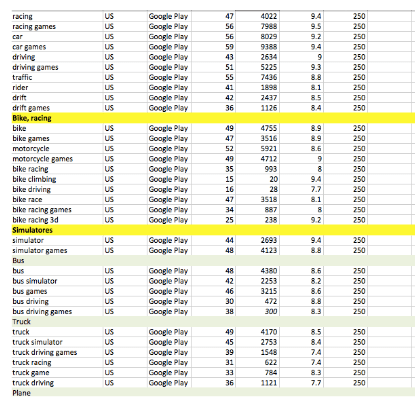
A detailed analysis of the semantic core using ASOdesk allowed us to identify three high-priority search queries that had reasonable competition and just enough traffic.

We used the following process to get to the top ranking for keywords from our target list:

  1. We changed the name of the game so it would contain the keyword we were competing for. The presence of the search phrase in the title maximized chances to rank high for this keyword in search results.
  2. We launched an ad campaign and acquired traffic in Russia only, but due to the Google Play algorithms, this affected the app’s positions in search results of the targeted keyword in other countries as well.

The promotion campaign for each search keyword lasted several days (depending on the time it took to reach top positions). Some keywords that could be simultaneously placed in the title were promoted together. After reaching the top-three positions for a specific keyword on Google Play, we changed the name of the app, so that a new keyword appeared in it, and then conducted a similar campaign.

At the end of the campaign for the first search keyword, the organic traffic outside Russia reached 40 downloads per day (right Y axis on the graph). After the paired campaign for the second and the third keywords, the downloads outside Russia reached 70 per day, and in Russia itself there were as many as 500.

If we had more money for the promotion, we could have continued to consistently win more and more high-frequency keywords, while maintaining positions for the old ones.

But due to the limited budget, I decided to go all-in and spend the remaining money on one powerful search query that might have taken the game to the top. This query was “eurotruck simulator 2.” This was the name of a popular game that was available on Steam, so people were looking for it in mobile app stores very often, even though it wasn’t there. As part of this campaign, we also promoted the query “euro truck simulator” to influence both search queries.

The bid lost. The game only climbed as high as seventh position in the United States under “euro truck simulator 2” search query and up to the 5th position in “euro truck simulator.” In some other countries, the game landed an even lower position.

We received some organic traffic, but there was no money to support our position in search results for this keyword. Epic Split Truck Simulator’s ranking began to gradually decline in search results for all the keywords we had used. The downloads dropped too.

After a couple of weeks, the game stabilized at 50 downloads per day. We exhausted our entire budget, we earned some experience, and we froze the project. But we still let the game stay in Google Play.

Unexpected twist

The turning point came at the end of November (six months after the launch), when Epic Split suddenly began to grow significantly (mainly in Russia and CIS countries).

Finding out the reason behind the sudden growth was not easy. The app wasn’t featured in the app store, the search query positions remained the same, and the game did not appear in curated lists such as ‘top apps’ on the app store. After some research, I didn’t find a single mention of the game in any tech publication or blog.

To find out where the users came from, I began writing to everyone who left a review, asking them to contact me and tell me how and where they learned about the game.

It turned out that the game had somehow found its way into the student community. After discovering Epic Split, these users started to compete and tried to beat each other in the game.

Epic Split began to spread through word of mouth. This gave the app a powerful starting push on Google Play, which then helped the game to clinch top positions for relevant search queries in the app store. It also made sure the product was picked up by the app stores’ recommendation systems.

Google Play’s recommended app mechanisms cannot be considered a part of featuring. They are personalized for each user. That’s why it was so difficult to identify them.

Changing the approach for ASO optimization

After finding out the mechanism that helped Epic Split grow, we began to experiment with the game and build on its success. One of the changes we made was to the game’s icon, which had a very unexpected effect on product growth.

On the right is the original icon. On the left is the new icon we designed for the game.

Here’s what happened:

  • On January 20, we launched a new icon (left) for 100 percent of users.
  • After that, the number of downloads increased dramatically (almost threefold), and we decided to check whether this had anything to do with the icon or not.
  • On January 26, 50 percent of Google Play visitors were presented with the old icon, while the other 50 percent saw the new one.
  • On January 27, we stopped the experiment because it had a negative effect on the number of downloads.

According to the results of the experiment, it turned out that with the new icon, the conversion to download was 80 percent higher. But at the same time, the impact on the number of downloads was significantly greater (+200 percent). Why?

Number of downloads by day:

Number of downloads by hour:

The reason was that the main traffic source for Epic Split was coming from the recommendations collection presented on the main page of the app store. The new icon had a higher CTR, and this had an impact on the acquisition funnel on several levels, which ultimately had multiple effects:

  • Conversion from displaying the app’s icon in the recommendation section into clicking on the recommendation unit on the Google Play homepage increased. As a result, more users came to the app page.
  • App page conversion rate also increased thanks to the new icon.
  • Consequently, the overall increase in conversion (from being shown in recommendation into download) became equal to the product of improving conversion rates in the two previous steps.
  • The above factors caused Google Play to recommend the game more often and rank it higher among recommended apps, since it was more likely to be converted into a download.

So one small change in the icon led to a threefold increase in the number of app downloads.

Building up the success

We continued to engage in ASO optimization of the app page, working on the icon and screenshots. The effect of this work was much greater than direct attempts to win over the top search results.

Over the next month, in almost all the key countries, the page conversion rate of Epic Split became noticeably above the industry average for similar apps. As a result, Google Play continued to expand the pool of users who were shown the game in their recommendations boxes. The growth that started in CIS countries gradually spread to others.

Consequently, the number of downloads increased dramatically. We had over 30,000 new users on our best day. Then for several months, the number of new users stabilized at 5,000 per day, then fell to 1,000, and gradually returned to 100 downloads per day.

The decline was strongly correlated with the decreasing conversion of the app page. I assume that as the game continued to grow, there were fewer and fewer new users who were interested in installing the game. The conversion rate sank, which made Google Play promote the game less.

Summing it up

  • Make games over the weekends — sometimes they shoot for the stars. Epic Split had almost 2 million downloads, and the ad monetization helped us rake in over $15k in revenue.
  • The game was aimed at a large niche and was unique, which provided it with a sufficiently large target audience. We managed to reach out to this audience through various Google Play mechanisms.
  • ASO is not simply about winning search traffic, but also about optimizing all the key steps of a funnel along the user’s path to downloading an app. In this case, the effect of such optimization turned out to be significantly higher than the effect of campaigns targeted at specific search keywords.
  • Doing research, exploring the target market and coming up with a marketing plan is a good idea. However, after launching your game, you should be ready to change your plan and act according to new information you obtain. For example, I thought it would be very easy to unseat the dominant truck simulator games from top search results positions. But even in the heat of Epic Split Truck’s wild growth, we found it impossible to get a foothold in the top results.
  • Organic traffic and app store optimization must be considered when developing game growth channels. We made a simple arcade game, which had only a 15 percent Day 1 retention rate, and our LTV was less than $0.02 per user. But if we had a high quality game with, say, a $0.20 LTV, we could have made good money.
  • Marketing is an essential part of building a new product. Keep that in mind.

This article was originally published on Medium by, Oleg Yakubnekov. He was in charge of analytics at MSQRD, a selfie filter app. The company was acquired by Facebook in 2016. After the MSQRD acquisition, Oleg joined Facebook, where he worked on Workplace, one of the fastest growing SaaS products in history. Workplace reached 2 million paid users in less than 2.5 years. Oleg helped develop the services of API.AI (now Dialogflow) as a product director. 

Read next:

How do you teach a car that a snowman won’t walk across the road?

from The Next Web https://medium.com/ironsource-levelup/aso-optimization-in-practice-how-a-game-i-made-over-the-weekend-amassed-2-million-downloads-32a7d13b093d

55 of the most actionable ways to scale design

If you prefer bullet points to lengthy prose, you’ll enjoy this comprehensive summary of advice from various design leaders.

Illustration by Daina Lightfoot

This post first appeared on the Abstract blog.

In the spirit of reflective summaries and reducing your FOMO on reading everything on the Design Internet, we’ve curated this collection of 55 nuggets of actionable advice from a year’s worth of Abstract editorial. Some of the stand-out themes include ways to future-proof your design career, orient around impact and solutions, and what it means to be a design leader in the Golden Age of Design.

As we head into the 2020s, we’re looking forward to diving into more top-of-mind topics including effective design processes, the latest innovations in design systems, developer integration (as opposed to the baton-pass handoff), sophistication of design ops, and more.

Without further ado, let’s walk down memory lane…

How to understand your impact in the brave new world of product design

If you design products, you have more power and influence than you realize. This is a call for awareness and change in a time when Everything is Design.

By Josh Taylor

  • In order to have great impact in product design, we must collaborate with people who work in a wide variety of disciplines, many of whom don’t understand design at all.
  • Be honest with yourself about the actual impact your designs have on the world.
  • Research how people use your product and how it affects their lives. Many products have unintended consequences. Look at outside metrics that affect your company — like happiness or screen addiction. Really listen to people — not just what you want to hear.
  • If you don’t have a lot of resources for research, lean on research that already exists.
  • If your platform allows strangers to talk to each other, understand what could go wrong. Get feedback from people who have experienced hate and discrimination and consider limiting channels for vitriol (comments, DMs, etc.), even if it hurts engagement numbers.

Generous design is the way forward: 3 keys to transparency

To build superior products at scale, combine a classic business toolset with a design-thinking mindset.

By Scott Welliver

  • To make the way forward with your teams, a central theme of generosity tends to align the misaligned.
  • Make design less about “magic.” Showing your design work to other stakeholders within your organization is the best thing for a design team to do when struggling with proving trust.
  • “Mix the classic business toolset with the design-thinking mindset and incorporate behavior change and deliberate practice theories.”
    Ryan Rumsey, formerly of USAA, Apple, and Comcast
  • To be the change you want to see in the world, embrace problems. To make change in your organization, start with not only a spirit but a practice of openness in your collective work.
  • “Choose the workplace where success comes from making others successful.” — Adam Grant, organizational psychologist

Expect change in your design career. Choose growth.

No one works in a future-proof field, designers included. But if you recognize that change is coming and help others along the way, you can future-proof yourself.

By Tim Van Damme

  • Our human instinct is to fight change, but the sooner you accept and lean into change, the better. Because change is inevitable and growth is optional, design your life and career wisely.
  • Raise your “design babies” with your team. If you hire and collaborate with the right people, they become co-parents of your design babies, and they can do a better job than you can with parts of the work.
  • Do your research before jumping into a new role that you think you’re supposed to take just because you’re older and wiser. Nothing against management roles, but sometimes people become managers for the wrong reasons.
  • Lean into the tumultuousness of the product design world. The most resilient design professionals know how to leverage their skills into different roles when the going gets tough.
  • Keep an eye on trends — where they’re moving, what works, and what doesn’t. Product design is like fashion. Trends appear and disappear seemingly in the blink of an eye.
  • Take care of yourself. The thing that changes throughout your career is you. Your career path can have a big impact on your life, but life outside of work has an equal effect on your career. It’s OK to have a bad day or a bad week, but if you have a bad month, you might need to address what needs to change to solve the issue.
  • Hone your basic design skills. Every product designer needs a solid understanding of user experience, white space, typography, and design systems. You need this understanding to do your job no matter what tools you use.
  • Mentor others. “Through mentorship, mentors can develop critical skills, like providing guidance and teaching, or grow close professional relationships with more people.” — Liana Dumitru of Dropbox
  • Work for your team’s collective success. Taking an inclusive and egalitarian approach can help you build better products, grow personally and professionally, and help junior team members flourish much faster than they could alone. At a company level, this approach isn’t just “nice,” it makes business sense, too.

5 ways to build a more impactful product design team

The future will be defined by those who bridge the gap between design and development. Here are actionable steps to get there without burning out.

By Kevin Smith

  • Create a landscape where ideas flow by removing bottlenecks between design and development.
  • Don’t point fingers. Singling out certain people or teams leads to even more problems and toxic culture. The only way to overcome bottlenecks is to recognize that they exist, talk about them, and start working on solutions together.
  • Clearly articulate problems. The better you define and align on the problem with your team, the easier it is to fix. Effective designers and developers are not only good at their respective disciplines, they’re also skilled at communicating the problems they intend to solve. They’re able to identify the biggest risks and constraints they’re working against within a specific problem set.
  • Define expectations and outcomes for how you work together. Avoid confusion by communicating expectations about who’s doing what, when, and how. Use the DACI method to identify the Driver, Approver, Contributors, and Informed participants to provide structure in group decision-making.
  • Proceed with a purposeful process. If you want to scale design and move big ideas forward, faster, you must develop frameworks and infrastructure that reinforce an intentional process.
  • Eliminate surprise and exasperation by sharing your work early and often. It goes without saying that the tech industry has to move quickly, but moving quickly without a record of decisions and steps along the way is a recipe for unwanted surprise. Proactively sharing and discussing progress of work throughout the design-development process allows teams to remain agile.

8 critical skills of effective design leaders

In an increasingly collaborative design world, hard and fast rules don’t necessarily apply. But traits like emotional intelligence, future-obsession, and ability to trust rise to the top.

By Amy Cuevas Schroeder

  • Avoid micromanagement and trust your team to solve problems. “We should never prescribe solutions, unless the thing you want is a very specific illustration of a cat holding a wrench, but aside from that, trust them to solve the brief.”
     — Linda Eliasen, Head of Design, HelpScout
  • Invite team members of all levels to help solve big problems — and then listen to their ideas.
  • Strive for progress over perfection. Recognize that everyone has to start somewhere and that many people have unrealized potential that needs to be developed. A strong design leader is able to bring out individuals’ talents and steer the team in the right direction.
     — Anthony Armendariz, Head of Design at Funsize
  • “Don’t treat your reports like they’re machines. They’re a lot squishier than that.” — Linda Eliasen
  • Obsess about the future. In order to innovate, you have to think about what’s missing from the present and what’s likely to happen in the years ahead — in technology, business, and how people will live their lives.
     — Anthony Armendariz

The accidental product designer: How I stumbled into my dream job

An Abstract product designer shares her winding career path, discovering her love of problem-solving, and why more designers should talk about their struggles and triumphs.

By Sara Zhang

  • Exercise your empathy skills. Putting yourself in the user’s shoes is among the key aspects of effective product design.
  • Learn how to articulate why something is working, or isn’t, a fundamental of product design.
  • Lean into working intensely with many people, most of whom are not like you. Learn how to navigate people’s wildly different personalities and skill sets.
  • Embrace your progress. “Think about when you wanted to have what you have now.” — Chloe Park, design at Lyft

7 ways to lean into an open design process

From ditching silos and workarounds to embracing purple squirrels and remote work, here’s how to navigate the changing world of modern design.

By Amy Cuevas Schroeder

  • Invite feedback. Open design is about inviting criticism early on to steer a clear path forward. Sharing increases the likelihood of getting buy-in and allows us to explore low-fidelity concepts that can or cannot be implemented.
  • Step out of walled gardens and into the open courtyard. For its recent design system, Fluent design, Microsoft is pulling ideas from across the company and keeping employees in the loop with shared principles and guidelines.
  • Invest in inclusivity and personal growth. Closed-door corporate ways of working are becoming so outdated that some giants like Capital One are actively trying to replicate disruptive, nimble cultures. Similarly, more companies are establishing “nontraditional” work methods such as work-from-anywhere “offices,” flexible schedules, and purposeful inclusivity. The philosophy is rooted in sourcing innovation from happy employees and honest-to-goodness collaboration.
  • Become a “purple squirrel”. The lines between designer, developer, and product manager are already blurred, and job descriptions for hybrid roles are on the rise.
  • Focus on design, not work-arounds. In this new world, many tedious tasks have been replaced by auto-updates in sophisticated software. To embrace the new ways of design, we have to unlearn the ingrained assumption that busy-ness = productivity.

Stop dwelling on being design-led: Focus on the user

To build more powerful products, no one function should play a supporting role.

By Heather Phillips

  • Create an equal playing field instead of figuring out who has the power.
  • Don’t call it a “developer handoff.” We’re moving toward bringing design and development closer together. And by opening up design to stakeholders earlier, we’re introducing a different kind of relationship to the work. One that is based on mutual understanding, transparency, and a common language.
  • Scrap the “one-team-first” thinking. If design is to help a company maintain its competitive advantage, it can’t play a supporting role to other functions. We shouldn’t think about being design-first, or development-first. Instead, we should think about how we can bring our paths closer together. Every business function — including design — should be thinking about the user, first and foremost. This work should not be silo’d in product, marketing, or design.
  • Aim to be design-integrated, not design-led. Our work should be focused on making an impact, and our challenges often come from a lack of collaboration with functional counterparts that can help us move our work forward, faster — and truly change an experience for our customers.

How open source technology inspired a modern design workflow

The value of design ultimately hinges on process. If we can improve the workflow, we can improve the output and perceived ROI.

By Josh Brewer

  • To inspire trust, create a shared language and workflow with developers. In addition to understanding design language, learn the languages your engineers and support team speak. Understanding their vocabulary allows you to obtain information you need in order to create the best design you can.
  • Preserve your process — the heart of your work depends on it. This may take more upfront care and consideration, but long-term, you gain speed, intuition, and an ability to think big and small.Be intentional with your work and your communication. By working in a version-controlled way, you are deliberately communicating what you’re doing, and why.
  • Value your process. Without a transparent process, design is a commodity, not a human-driven craft. I’m always asking, “How can we imbue design work with meaning, so we can remember the richness of the history of the explorations and future-proof what we’re making?” We want to be able to retain the backups, the thought process, the context, and institutional knowledge.

The end of the celebrity designer

A more open approach to design helps build better products and demystifies the process for the rest of the company.

By Tim Van Damme

  • Don’t design alone. As design plays an increasingly central role in organizations, the monoculture associated with celebrity designers is becoming obsolete. It just can’t scale. As we build products for a wider range of communities, on a broader set of devices, we’d be doing ourselves a disservice to not work in this more open way.
  • Encourage less seasoned designers to make the first move. For design to become more egalitarian, we have to create a dialogue. If you’re reading this and you’ve been on the fence about reaching out to someone you respect, just do it.
  • Respect people and they will respect you. “Great leaders do not tolerate an environment where people belittle, demean, or humiliate each other. Rather, they promote and provide honest criticism (constructive, objective, and useful) and challenge people to reach beyond what they believe they can achieve.”
     — Abstract co-founder Josh Brewer in The Manual
  • Use this three-step approach to feedback:
  1. When you have positive feedback, acknowledge people openly, and celebrate big wins.
  2. Before launching into negative feedback, pause and dig into the why.
  3. Reach out privately, particularly when feedback is constructive.
  • Use “and” instead of “but” when giving feedback. For example, “This was a really creative approach to this particular problem, and I see an opportunity to…” as opposed to “This was a really creative approach to this particular problem, but I see an opportunity to…”
  • Highlight everyone’s contributions, regardless of level. Make sure to actively reach out to people who’ve done a really good job on various projects with positive feedback. For example, I’ll ping my teammates, and thank them for pushing me on good ideas that I wasn’t sure about. The more specific, the better.

Embracing open design in 2019

Automation is killing the tedium in design, but our jobs are
about to get more exciting.

By Heather Phillips

  • Take time to create a thoughtful design system. By implementing design systems, forward-thinking companies will not only have an efficient codebase and consistency across platforms and products, but they’ll be able to get more from their design teams; to unlock their true potential to dig into tough problems, where they were previously spending cycles recreating existing UI.
  • Invest in Design Ops. By eliminating more of the “work around work,” we’re seeing a new focus on the emergence of DesignOps, or the practice of optimizing individuals and teams, and setting conditions for excellence.
  • To design the future, start with redesigning how you show up in the now. “The most successful design leaders are investing in personal growth, helping them scale themselves and their teams. They’re challenging assumptions about how organizations work and creating the way for more healthy, inclusive teams to thrive,” says Mia Blume, founder of Design Dept. and former design leader at Pinterest and Square.

Originally published at https://www.abstract.com on December 16, 2019.


55 of the most actionable ways to scale design was originally published in UX Collective on Medium, where people are continuing the conversation by highlighting and responding to this story.

from UX Collective – Medium https://uxdesign.cc/55-of-the-most-actionable-ways-to-scale-design-36f052cbf8eb?source=rss—-138adf9c44c—4

Reimagining Design Systems at Spotify

from Sidebar https://sidebar.io/out?url=https%3A%2F%2Fspotify.design%2Farticles%2F2019-12-16%2Freimagining-design-systems-at-spotify

Microsoft wants everyone to follow its lead with its new mobile design

Nearly a decade ago, Microsoft launched its Windows Phone platform with the promise that its software would free users from their phones. The first big ad campaign showed people engrossed in their devices at clubs, restrooms, and even on a roller coaster, while frustrated bystanders asked, over and over: “Really?

Windows Phone would answer those frustrations, said Microsoft. It was “designed to get you in and out, and back to life” with the help of the company’s striking tile-based Metro user interface. Microsoft envisioned a world in which apps would talk to each other seamlessly and content flowed freely. Despite some great design principles, Windows Phone didn’t work out, but Microsoft never gave up on the idea of improving mobile productivity.

Today, Microsoft is reviving some of these ambitions by bringing what it calls its Fluent Design system to its mobile Office apps, a simplified set of principles designed, just like Windows Phone, to speed things up on the go. It’s even letting third-party app developers embrace these design elements with toolkits to prettify their own apps. This will have the benefit of making Microsoft’s mobile apps feel more consistent, but the end goal is the same as Windows Phone’s was: to get users in and out of their apps quicker and back to life again.

“When we look at the mobile market, we feel like no one has done an amazing job of nailing productivity on phones across voice and visual systems in a sort of microtasking kind of way,” explains Jon Friedman, corporate vice president of design and research at Microsoft, in an exclusive interview with The Verge. “We feel like it’s our birth right and duty to help people in the world accomplish their goals, so that’s why we’ve been super focused on this.”

Microsoft has spent years researching exactly how people use their phones on a daily basis in markets like China, India, Europe, and the Americas. More than 40 designers and researchers across Microsoft “have collaborated to rethink and redesign how we approach mobile and mobile productivity,” reveals Friedman. “Not just the apps themselves, but how they all connect together and work together; and to build a common design system to extend Fluent to be a truly mobile-first design system.”

This unified mobile design system borrows a lot from the work Microsoft has been doing on Outlook in recent months, with improved iconography, identical file lists, updated typography, new splash screens, and a focus on dark mode.

Apps like Word, Excel, PowerPoint, Outlook, and OneDrive will now all share common design elements and look far more similar. Even Yammer, Teams, and Planner are getting new versions, too. You’ll soon notice a brand-colored header at the tops of these apps (like what exists in Outlook) and a simple bottom bar with Microsoft’s new Fluent design icons. Just like how Microsoft created a new dedicated mobile Office app to focus on tasks people do on the go, these separate apps have been simplified with the same goal in mind.

”The thing we learned in all of our research is that people spend about 4 hours a day on their phone, but the average session time of doing something is between 20 and 30 seconds long,” explains Friedman. That’s an extremely short burst of time to get something done on the go, and Microsoft is trying to improve its own apps, and others, to simplify those tasks with a design that makes it more familiar and less jarring when you switch apps.

That doesn’t mean every Microsoft app will look the same on iOS and Android, as the company is still trying to feel at home and native on these platforms. It means things like search should be in a similar place, and iconography will be reused so things feel more familiar. It’s these very subtle changes that can add up to improvements over time, and it’s a big part of Microsoft’s open design approach internally.

It’s not been an easy journey to get all Microsoft designers on the same page, but things like buttons, patterns, and file lists are now being reused freely in the company. “That took us some time to really get everyone involved and contribute,” says Benedikt Lehnert, director of product design for Microsoft 365 mobile experiences, in an interview with The Verge. “Now we have a really thriving community of mobile designers across the company that’s literally every week making the system better.”

A lot of this work has started off in small and subtle ways, but recently, Microsoft launched a new “Play My Emails” feature for Outlook that uses Cortana to read out emails and even calendar invites when you’re driving to work, cooking, or commuting. This feature was born out of designers wanting to design email for people who are visually impaired. Microsoft formed a relationship with the Washington State School for the Blind and spent time studying what it’s like to live in a narration experience.

“Listening to the entirely of a UI… is highly fatiguing for your brain,” explains Friedman. Microsoft added audio bumpers between emails, thanks to its research, allowing everyone to ignore things that aren’t important and stop listening. This is a feature that was designed around accessibility, which is a big focus for Microsoft, but that actually ends up being useful for everyone using it.

Beyond these subtle changes today, Microsoft has broader ambitions to impact iOS and Android further and push dual-screen experiences ahead. “Building this foundation of a Fluent mobile system that works across iOS and Android has been an awesome experience in designing dual-screen experiences as well,” reveals Friedman. “So when we work on Surface Duo and work on iPad side-by-side experiences, having a common system helps our apps align and have a cognitive connection across them with shared components and it makes the foundation of the dual-screen experience way better.”

Microsoft obviously faces big challenges here because the company doesn’t own or control the platform on which it’s trying to build apps. To counter this, the answer seems to be close partnerships with Samsung, Google, and others. Microsoft only vaguely hinted at its Google partnership for dual-screen Android experiences during the Surface Duo unveiling earlier this year, but it looks like this will go a lot deeper soon. Gmail, Google Drive, and Calendar are coming to Outlook.com, and Microsoft is testing ways to let people use their Google accounts to sign into a number of the company’s services.

“We have designers from Samsung, Google, and Microsoft sitting in rooms together designing together,” reveals Friedman. That’s a surprising turn of events, given the history of Samsung holding back on Windows Phone and Google’s bitter rivalry with Microsoft. Things have started changing, though. Microsoft and Google are also collaborating on Chromium, and now we’re starting to see some collaboration on Android. “It’s really about how do we make that experience better for our customers. That gives us a direct line of communication between designers on how we improve Microsoft experiences, how do we help Samsung improve its experiences, and how do we help Android improve its experience,” explains Friedman. “Those collaborations are awesome, it feels great to be part of an industry where we can actually work together on these things to make the products better.”

Microsoft is now leaving it up to developers to decide whether they want to use Fluent design elements in their own apps that plug into Office or even ones that are entirely separate. “If developers decide to build entire apps with these toolkits we’ll be really excited to see that, too, since they represent the best in class patterns from our perspective,” says Lehnert.

It’s fair to say that Microsoft’s previous Metro design system really helped push iOS and Android forward, and the company has been quick to adopt other design trends that the industry has implemented. “We’re in an interesting time when it comes to UI, things are converging more and more,” says Friedman. “I like to think that back in the Metro design days we started with this idea of simplification… and that’s gotten friendlier over time, which we’ve embraced with round people, rounded corners, and subtle drop shadows, and dark mode. I think generally speaking when we look at Android, iOS, the web, Windows, and Mac, there is a common DNA from a visual design perspective we’re starting to feel.”

Microsoft’s fresh approach to mobile design will be interesting to follow in the year ahead and beyond. Combined with the company’s promises for Fluid Framework, it feels like Microsoft is truly embracing mobile and the web as the foundations of its future. As Satya Nadella said recently, “the operating system is no longer the most important layer for us.” For Microsoft, it’s all about apps and services and building useful features that help people get work done on the go just that little bit quicker.

from Sidebar https://sidebar.io/out?url=https%3A%2F%2Fwww.theverge.com%2F2019%2F12%2F5%2F20996748%2Fmicrosoft-fluent-design-mobile-office-apps-new-updates-features