At CES 2019, bendy and tiny screens evolved from concepts to exciting tech


Having attended Consumer Electronics Shows since well before the name was officially shortened to CES, I’ve come to expect major TV set announcements every year — and had almost zero interest in them until last week’s show.

For years, the theme at CES was “bigger,” a competition between brands to show off gargantuan screens that no regular person could afford, all in the service of being the first company to hit some arbitrary diagonal measurement. On occasion, the pitch shifted to “better,” with signs pointing you to the deeper blacks, richer colors, or extra fine details that you mightn’t have noticed on your own.

If I had to sum up this year’s theme, it would be “convenience.” For some companies, that meant displaying screens that could hide away or be linked together to fill any space; for others, CES was about showing off 4K screens that could fit in your pocket or on your face. More importantly, these technologies didn’t look like research projects or early prototypes; they appear ready to hit actual stores in the foreseeable future.

Here’s what caught my attention, and should be on your radar over the next year.

Flexible screens

If the days of flat screens aren’t officially “over,” that’s only because the transition to curved displays won’t be either abrupt or complete, but rather gradual and partial. CES 2019 demonstrated conclusively that consumers should not expect screens to keep looking like 16:9 picture frames — instead, they’ll start to take different shapes all over the place.

LG’s examples were the most provocative. At the entrance to its booth, throngs of people stood transfixed under “The Massive Curve of Nature,” a wave-shaped array of flexible OLED screens displaying videos of water, deserts, and light. Other TV makers showed more seamlessly-stitched displays, but LG’s example was all about showing off flexibility.

Several companies offered smaller-scale examples of the technology. Japanese smartphone maker Sharp showed off a collection of traditional devices next to this flexible screen, noting that the same display could be used in either flat or dramatically curved configurations. While it’s hard to picture such a strongly curved handset fitting comfortably in a pocket, we’re getting closer to the point where phones (and watches) will casually use whatever organic, ergonomic shapes make sense to their designers — a decade-old vision that’s finally set to come true.

This year will certainly see flexible OLEDs make their way into convertible smartphone-tablets. Samsung and Huawei are both reportedly months away from officially introducing devices that unfold from “large smartphone” form factors to become small tablets. They technically were beaten to market by Royole’s FlexPai, a kludgy first-generation device, but it’s fair to assume that the better-known companies will soon offer more polished implementations of the idea.

Other applications of flexible displays were also compelling. Automakers showed off curved car cockpits with screens that could be used for entertainment, navigation, and voice assistant interactions.

LG showed off a flexible display that automatically rolled up into a table, becoming invisible when not in use, and seemingly completely rigid and flat when upright. The rolling mechanism was fully mechanized and seemingly silent, while using the OLED screen to provide a much better visual experience than the prior alternative — projector TVs.

Micro displays

The other compelling step forward at CES was tiny displays — high-definition screens so small that they’ll fit inside glasses. A company called Syndiant was showing off what it said were the world’s first 4K near-eye displays, bringing big screen TV technology into a form factor that people can wear.

The following image doesn’t do justice in color or detail to what’s inside the tiny Syndiant glasses, but it was as much as I could quickly capture using a camera. I saw a wide, colorful, high-definition image that looked far more like a modern TV than anything I’ve seen in lower-resolution headsets. Syndiant apparently is working with LG on the technology, and was using its 4K video footage to demo the displays.

It was established ahead of 2018’s Display Week event that 4K near-eye displays like this were coming soon, with the next goal to reach 8K resolutions that exceed the human retina’s ability to perceive individual pixels up close. Actually seeing a tiny 4K image look this good is enough to make one wonder whether the future of screens is in physically large displays, or in micro-sized ones that just look big to their viewers.

Many small companies with names you’ve never heard of before are working on similar technologies, as are larger players ranging from Apple to Google and Samsung. Patents suggest that the eventual goal is to move computing as we know it into a virtual, augmented, or mixed reality space, such that your “laptop” or “tablet” will become little more than a virtual object inside a lightweight pair of goggles. These high-def screens will be a major factor in making that happen.

Less exciting but still cool: 8K displays

It wouldn’t be CES without plenty of super-large displays that average consumers won’t be purchasing any time soon, if at all, and this year’s show certainly didn’t disappoint in that regard. As was the case in past years, virtually every major TV maker showed up with big 8K TVs, apparently to demonstrate continued readiness for the day when consumer 8K video broadcasts commence, 8K optical discs become available, or 8K game consoles are released. (Most companies are still trying to wrap their heads around 4K, so don’t hold your breath.)

The key thing about 8K TVs is that viewers cannot see the improvements over 4K TVs unless the screens are very large — think 75 inches or more, bigger than most sets sold today — and people are standing or sitting close, which they tend not to do with big screens. But if both of those criteria are met, you can witness an incredible level of detail: the Sharp display above offers 33 million pixels with a 120Hz refresh rate.

Rather than cropping the first 8K image above, I quickly moved closer to this 8K screen to grab a second shot from three inches away. Check out the tiny circles in those tiles — they look completely round rather than blocky, even at a short distance away from a large screen.

High-resolution displays of various sorts are going to rank fairly high on the “transformative technology” scale over the next five years, as screens are going to start appearing in shapes, sizes, and levels of quality that once seemed all but impossible. Questionable advances like 3DTVs have made CES screen announcements easy to tune out in recent years, but the latest technologies are set to make displays worth watching again.

from VentureBeat https://venturebeat.com/2019/01/15/at-ces-2019-bendy-and-tiny-screens-evolved-from-concepts-to-exciting-tech/

How to design website layouts for screen readers


Go to the profile of Ben Robertson

It’s easy to think about a layout as being a primarily visual concern. The header goes up top, the sidebar is over here, the call to action is in an overlay on top of the content (just kidding). Grids, borders, spacing and color all portray valuable visual data, but if these hints to the structure of a page are only visible, some users may find your content unintelligible.

You can experience this first hand if you try using a screen reader on the web. When I fired up VoiceOver on my Mac and took it out for a test drive, I realized that to a screen reader user, a lot pages are just a big heap of ‘content’, missing helpful organizational cues.

The experience can be kind of like listening to a long rambling story without any indication to what details are important or related to the main thread of the story. Halfway through the story, you aren’t sure whether it’s worth it to keep listening because you don’t know if you’ll even find what it is you’re looking for.

In the context of a website, your screen reader might be halfway through reading you a list of 50 sidebar links when you start wondering if there is any valuable content on the site at all.

Experiences like this are caused by websites that are built with layouts that are only visual. Ideally, however, our visual layouts should point to an underlying organizational model of our content. They should be visual indicators for a conceptual model. The visual indicators are just one way of revealing this model. The Web Accessibility Initiative’s ARIA (Accessible Rich Internet Applications) project provides alternative indicators to users who may need them.

I’ll walk through how to make use of these indicators to make a simple web page easy to use, navigate and read for users of assistive technology. All the example code is available on Github.

Want to up your accessibility game? Checkout my free email course: 
 ✉️
Common accessibility mistakes and how to avoid them.

Initial Layout

Here’s an example of a page with a pretty simple layout. We’ve got a header at the top containing a logo and navigation, some body content, a sidebar off to the right with a related posts list and a list of social media sharing links, a search box below the content, and a footer containing the contact info of our business.

Screenshot of the initial layout.

Visually, the content is pretty well divided, using a simple grid and background colors to distinguish the different elements. If you fire up VoiceOver on this page, you can navigate through the page pretty well using the next element command. The order of elements in the markup pretty much follows the visual order of elements. First we read the header, then the body copy, then the sidebar, then the search box, then the footer. That’s pretty good. If I press CAPS + U to pull up the VoiceOver menus, I can get a list of all the headers on the page and all the links, and navigate directly to them.

VoiceOver will display a navigable list of all headings on a page.
VoiceOver will also display a navigable list of all links on a page.

Just by using well-structured HTML, simple grouping with <div> elements and a good use of heading tags we’ve got a decent experience. It’s better than the rambling story websites I mentioned above, but it could be even better.

First we’ll add a skip-link as the first item of the page. A skip link is a very common accessibility feature that allows users to skip past lengthy lists of links and other information repeated on every web page directly to the main content of the current page.

It’s a link that is the first element in the tab order of the page. It is typically visually hidden, but when focused, it appears on-screen. To visually hide the link, we’ll add the following CSS:

.skip { 
clip: rect(1px, 1px, 1px, 1px);
position: absolute !important;
height: 1px;
width: 1px;
overflow: hidden;
word-wrap: normal !important; /* Many screen reader and browser combinations announce broken words as they would appear visually. */ }
/* Display the link on focus. */ 
.skip:focus {
background-color: #fff;
border-radius: 3px;
box-shadow: 0 0 2px 2px rgba(0, 0, 0, 0.6);
clip: auto !important;
color: #888;
display: block;
font-weight: bold;
height: auto; left: 5px;
line-height: normal;
padding: 15px 23px 14px;
text-decoration: none;
top: 5px;
width: auto;
z-index: 100000;
}

The link location of the skip link needs to be an id pointing to the main content of the page. In our case, I added id="main" to the <div class="content"> section and gave the skip link a url of href="#main".

If you visit the skip link page and hit your Tab key, the link should display. If you fire up VoiceOver and start navigating through the page, the skip link should be the first thing you come across, and clicking it should trigger VoiceOver to start reading the main content of the page.

WCAG Techniques Used

With this step, we’ve allowed users to skip straight to the meat of our page, but beyond easily accessing the main content, they still don’t have a good conceptual map of the rest of the page.

ARIA Roles and Landmarks

One way to provide users with a conceptual map of the page is by using semantic HTML5 elements like <header>, <nav>, <main>, <section>, and <aside>. These elements have built in data associated with them that is parsed by browsers and screen readers. They create landmarks on a web page. By using these elements judiciously in place of <div> elements, we can provide extra information to assistive technology devices and help the user build a conceptual map of our page.

I’ve maintained the same layout as before, but I’ve swapped some divs for some semantic HTML5 elements. I’ve also added a role attribute to the search component. Alternatively, you could keep all the divs and add a role instead of swapping them out for the new HTML5 elements. (See the w3 guidelines for ARIA roles)

Here are the key changes:

  • <div class="header"> becomes <header class="header">
  • <div class="main-navigation"> becomes <nav class="main-navigation">
  • <div class="content"> becomes <main class="content">
  • <div class="sidebar"> becomes <aside class="sidebar">
  • <div class="related-posts"> becomes <section class="related-posts">
  • <div class="search"> becomes <div class="search" role="search">

Now when I fire up VoiceOver and press CAPS + U, I get a new Landmarks menu. Inside this menu you can see the following elements:

  • banner
  • navigation
  • main
  • complementary
  • search
  • content information

Selecting any of these menu items takes the user straight to that element, so they can easily navigate through the different elements of a page. If they are at the bottom of the page, they can easily get back to the main navigation in the header via the Landmarks menu.

WCAG Techniques Used

We’ve dramatically increased the navigability of our page and provided an initial map to our users, but we’re missing a few things to make this experience really awesome. First, the names of our site sections are fairly generic. We aren’t exactly sure just from listening to the menu what might be in any of the elements. Second, some elements aren’t easily navigable. For instance, our sidebar components are all grouped under the label ‘complementary’.

We can add some well-thought out ARIA labels to make this experience even better.

Using Appropriate ARIA Labels

By peppering in some ARIA labels we can give the user an even more detailed conceptual map of our layout.

In this next iteration, I’ve added the following labels:

  • <nav class="main-navigation"> now has an aria-label of Primary Navigation.
  • <main class="content"> now has an aria-labelledby attribute of main-title and its <h1> has an id of main-title.
  • <aside class="sidebar"> now has an aria-labelledby attribute of sidebar-title and its <h2> has an id of sidebar-title.
  • Both <section> elements in the sidebar now have an appropriate ARIA label.

Let’s fire up VoiceOver again and pull up our Landmark menu with CAPS+U. Now we see that the ARIA labels we provided display next to each of our generic menu items. We also have a few extra menu items, because the <section> elements we provided labels for (Related Posts, Share Links), now have their own menu items.

The VoiceOver landmarks menu now shows detailed information about each of the sections on our page, including the aria-labels that we provided.

Now an assistive technology user has an equal (and maybe even better) conceptual map of the content and actions they can take on this website compared to a non-assistive technology user. They can get a quick overview of everything on the site, easily navigate to the section of the page they want, and quickly find what they are looking for.

WCAG Techniques Used

Wrap Up

With a combination of well-structured HTML markup, thoughtful use of ARIA roles and a careful labeling of site sections using ARIA labels, we’re able to create a user experience for assistive technology users that rivals the experience of non-assistive technology users. We were able to take the conceptual map that was implicit in our visual layout and expose it to assistive technology.

You may find holes in your conceptual map or sections that unnecessarily have the same function. The process can help you clarify your designs, identify areas that might not make sense conceptually or visually, and improve your design for all users of your site.

Want to dive deeper into building accessible websites? Join my free email course: 📨 Common accessibility mistakes and how to avoid them. 30 days, 10 lessons, 100% fun! 😀 Sign up here!


Originally published at www.upandup.agency.

from freeCodeCamp https://medium.freecodecamp.org/how-to-design-website-layouts-for-screen-readers-347b7b06e9cc?source=rss—-336d898217ee—4

Can UX Metrics Predict Software Revenue Growth?

Does better usability lead to more revenue?

What about positive word of mouth? Is it tied to revenue growth?

Are UX metrics for usability and intent to recommend able to track future revenue growth?

Many UX researchers who work for software companies or on software products collect UX metrics. In fact, we strongly advocate for it. As part of implementing a plan to improve UX, you need to start with UX metrics.

But is there any evidence that UX metrics are tied to business metrics such as revenue growth in the software industry?

SUS and NPS

To look for a relationship between UX metrics and growth in the software industry, we started with two of the most popular UX metrics: the System Usability Scale (SUS) and the Net Promoter Score (NPS). Both metrics are widely collected and reported, which make them good candidates for looking for a relationship with what UX teams measure (usability and likelihood to recommend) and what the business cares about (revenue growth and future revenue growth).

NPS Predicts Revenue Growth in Some Industries

I’m not aware of any studies associating SUS scores with revenue. We have examined the relationship between the  NPS and future revenue growth. We found that using the original NPS data reported by Reichheld was a good predictor of growth within the industry. Across the seven industries studied we found the NPS can predict around 38% of future revenue growth.

However, this likely represents a “best case” scenario for the predictive ability of the NPS as it was pre-selected to make the case for the NPS as a proxy for growth in 2003. Those industries included rental cars, life insurance, airlines, and grocery stores where experiences are often a mix of service, product, and company interaction. Does the same relationship apply in the software industry where the focus is often dominated by a product experience?

Finding SUS & NPS Data

As we did in our NPS replication study, we needed to go back in time far enough to examine future growth rates. For NPS data we used two data sources: a 2014 software report purchased from Satmetrix (12 products) and our (MeasuringU) NPS benchmark report. For SUS data we also used our 2014 software benchmark report (20 products).

There were some differences between how the data was reported and what products were included in both reports. SUS scores were only collected from the MeasuringU report. Also, in the MeasuringU report we broke out NPS and SUS scores by product, even when the product was part of a suite. Satmetrix reported only the NPS for MS Office and Adobe Creative Suite, while we provided NPS and SUS scores by product; Word, Excel, PowerPoint, and Photoshop.

To see how similar these independently collected sources of NPS data were, we needed to find the products in common. We approximated MS Office scores by averaging together Word, Excel, and PowerPoint scores but only had one of the products (Photoshop) in the Adobe Creative Suite. Satmetrix also included ride-sharing services Uber and Lyft, which we didn’t consider software and didn’t collect, so they aren’t included in this analysis.

Together that left us with four products in common:

  • TurboTax
  • Microsoft Office
  • McAfee Antivirus
  • Mint.com

Despite the small number of products, we still found a strong correlation between our NPS scores and the Satmetrix NPS scores (r = .84) suggesting that despite the different data collection methods and sources we have good agreement. This is an encouraging point of corroboration.

SUS Strongly Correlates with NPS

We’ve consistently seen a strong relationship between the SUS and NPS across many data sets. Typically, attitudes toward usability as measured by the SUS explain between 30%–50% of likelihood to recommend scores (the NPS). We also see that strong relationship with this data. The correlation between the 20 product SUS scores and NPS scores in the MeasuringU benchmark report is r = .81, meaning attitudes toward usability explain a substantial 66% of the variability in consumer software NPS. While these two concurrently collected attitudinal metrics have a strong correlation, do either of these predict revenue growth for their product?

Finding Growth Rates

To look for a relationship between metrics and growth we used a similar approach to our NPS analysis. With the 2014 NPS and SUS data, we collected financial data for the immediate years to predict growth (2014, 2015, and 2016). We again combed through financial statements of consumer software companies to find growth rates (not the easiest task).

Not all products have clear revenue because they’re free (e.g. Adobe Reader, Google Calendar, iTunes, Google Docs) or we had insufficient or no SUS data (e.g. Adobe Creative Suite, Google Docs, Norton Antivirus), or the revenue was not reported or associated to the product that we could find (e.g. Webex, Mint.com, Google Drive). We were able to find clear financial data for eight products (linked to sources of financial data so you can replicate):

UX Metrics Predict Growth

We found a strong positive correlation between the SUS and NPS for both 2014–2015 and 2014–2016 future growth years. The correlations using 2014 NPS and 2014–2015 revenue were strong (r = .65; p = .08) as well as with 2014–2016 revenue growth (r = .74; p = .03). The magnitude of the correlations is similar to what we found with Reichheld’s data, where NPS correlated r = .62 with immediate two-year revenue growth.

For SUS we also found a strong positive correlation between 2014 SUS scores and 2014–2015 revenue growth (r = .59; p = .12) and between 2014–2016 revenue growth (r = .74; p = .04).

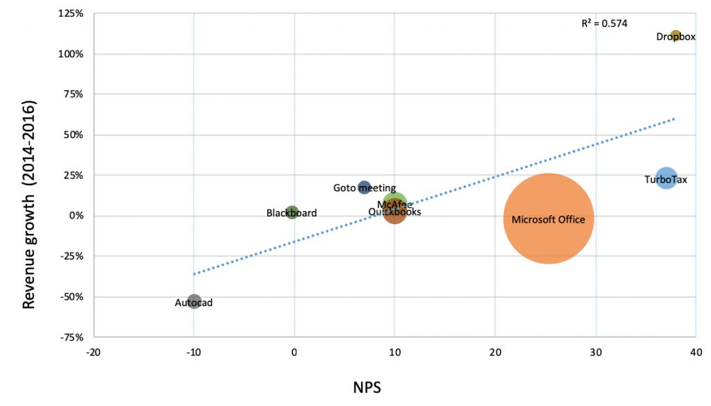
Visualizations of the relationship between SUS and NPS can be seen in Figures 1 and 2. On average we’re seeing that attitudes toward usability (SUS) and users’ likelihood to recommend (NPS) are able to explain (predict) at least 50% of two-year future revenue growth rates. This is even larger than the relationship we found at the company level from Reichheld’s data.

Figure 1: Relationship between 2014 SUS scores and 2014–2016 revenue growth.


Figure 2: Relationship between 2014 Net Promoter Scores and 2014–2016 revenue growth.

When conducting a regression analysis, especially with a small sample size, one data point can have a large influence on the statistical relationship—either making or masking the underlying correlation.

In both figures we can see Dropbox had a high growth rate and corresponding high NPS and SUS scores. In contrast, AutoCAD had a low SUS score and lower growth for this period. Both products have a large influence on the regression equation and correlations. To see how robust the relationship is between these metrics and growth rates, we removed both products and reran the correlations. Encouragingly, even after removing both products, the correlations remained for SUS (r = .64) and NPS (r = .40). Not surprisingly though, with only six products, neither correlation was statistically significant—again illustrating the challenge of looking for relationships with only a few data points. Only very large correlations will be significant, but the non-significant correlations are still meaningful as part of a meta-analytic approach across studies and industries. This finding is nonetheless quite impressive as it shows a clear link between something that’s relatively easy to collect (user attitudes toward usability and recommending) and something that’s hard to collect, but important (future revenue growth). We’ll look to continue to corroborate these findings with future datasets and analyses.


Summary & Takeaways

In this article, we looked at the relationship between common consumer software UX metrics (NPS and SUS) and future revenue growth. We found:

Attitudes toward usability and likelihood to recommend explain (predict) future revenue growth. We found both SUS scores and Net Promoter Scores collected in 2014 had strong correlations to the revenue growth in the immediate year and two years (2014–2016).

Attitudes correlate with outcomes. Given the similar correlations for both the NPS and SUS and future growth, it’s likely that other attitudinal measures (e.g. satisfaction, UMUX-Lite, TAM) aggregated at the product level will correlate with future revenue. Future research should examine other measures with future revenue growth to see whether the SUS and NPS are “special” or just one of many attitudinal measures that companies can track.

UX metrics are valid leading indicators: This analysis suggests tracking common UX metrics such as the SUS and NPS in the consumer software industry may be good leading indicators of revenue growth. This is encouraging because many organizations already collect this data for their products. It’s also encouraging that popular UX metrics that measure customer attitude (which are easy to collect) are tied to future business outcomes (that are often hard to measure).

Free and bundled software may mask relationships. It’s quite challenging trying to isolate both attitudes toward products and then associate those attitudes to financial metrics. There’s a lot of free and bundled software (e.g. G Suite) that makes it hard to isolate the relationship between attitudes and business outcomes. A future analysis can include examining more success metrics for software that doesn’t have clear financial data.

Additional analysis is needed (always). If you’ve read my articles you know I’m a big fan of corroborating data. The more independent data sources that are able to replicate findings, the stronger the claims should be. I’m not aware of other data sets that have attempted to find the relationship between UX metrics and revenue and encourage others to look for this relationship (please share with us). We’ll be sure to keep investigating the relationship and post our findings.

from MeasuringU https://measuringu.com/uxmetrics-growth/

Video: UI animation trends for 2019

[invDropcap]A[/invDropcap]nimation is not just a “nice to have” in product design. Whether it’s UI animations to guide the user along their journey or videos for marketing, animation brings your product to life and gives a tangible experience to your users.

So, what animation trends should we be trying out more this year? Watch the video below to find out, or scroll down for a quick summary.

UI animation trend #1: Delightful onboarding

Delight your users before they even accomplish a single thing. First impressions are important, and this is a fantastic way to lead them into getting the most out of your product—and build a lot of character for your brand.

[invTip title="The 8 most important UI animations of all time" thumbnail="https://s3.amazonaws.com/www-inside-design/uploads/2019/01/aol-screen.jpg" url="https://www.invisionapp.com/inside-design/the-8-most-important-ui-animations-of-all-time/" /]

Headspace does this so well. Their animations start right when you open the app, and it’s really delightful, super cute, and relevant to their brand. I haven’t done a single meditation with Headspace yet, but I can’t wait to sign up and get started. And that’s just because of their animations at the beginning.

UI animation trend #2: Parallax scrolling

No, parallax scrolling isn’t the newest thing on the block, but there are many more ways to do this than just on a homepage.

Lyft does a nice job of subtle horizontal parallax scrolling between their ride options. Why is this important? Two reasons: When people touch that new tab, or scroll to the side and see how this… effects that… there is a sense of control. And who doesn’t like to feel like you’ve got a bit of control? It also helps with the discoverability within the app—when you’re swiping left and right and see the tabs moving changing, maybe you realize you can touch the tab instead of swiping. It lets someone know there are two different ways to perform the same task.

[invTweetSA author="Austin Saylor, Motion Designer"]“Animation is not just a ‘nice to have’ in product design.”[/invTweetSA]

UI animation trend #3: Feedback

There’s nothing more frustrating than not knowing what’s going on. Animation is a great way to clue the user in to things like incorrect passwords where the form field shakes, numbers animating up as your balance increases, or a creative loader spinner with helpful or even humorous—but most importantly on-brand—messaging.

UI animation trend #4: Feature discovery

Drawing attention to new features in a product is a great use of animation. Sure, you can bury new features and update text or try to reach people with email, but why not put it in your product itself?

This could be as simple as a pop-up speech bubble near the feature, or it could be as involved as what Relax Melodies did with their brand-new sound breathing feature. This was such a delightful way to learn what their new feature does, and it’s really got me considering purchasing the full version of their product.

Remember that animation, just like design, isn’t something you just tack on at the end. It’s not just a “for fun”—this is something that can help your users understand your product, help them get from A to B much faster and easier, and it’s a way to delight them and build brand presence.

So keep this in your design cycle—animation is awesome.

Read more about motion design

  • How I learned—and mastered—the fundamentals of motion design
  • Meet the illustrator behind Duolingo’s crying owl
  • 10 microinteractions that will inspire your next project
  • [invAd title="Meet InVision Studio" thumbnail="https://s3.amazonaws.com/www-inside-design/uploads/2018/07/Studio2x.png" url="http://www.invisionapp.com/studio" label="Download Now" /]

    The post Video: UI animation trends for 2019 appeared first on Inside Design.

    from Inside Design https://invisionapp.com/inside-design/video-ui-animation-trends-for-2019/

    Dissecting the intricacies of typography anatomy (with infographic)


    Go to the profile of Micah Bowers

    You’re a creative professional. You’ve been peering into a laptop all day, and while your eyes and mouse-fingers are fitter than ever, the rest of your body feels like a crumpled can of cola. So, you head to the local gym, shuffle over to the free-weights, and encounter a conversation between some muscle dudes:

    MD1: “Sup, bro. What’re you working today?”

    MD2: “Delts, traps, and tris. You?”

    MD1: “Dang, bro. It’s leg day. Quads and glutes.”

    MD2: “Go get it!”

    To the uninitiated, this exchange might as well be uttered in an Elvish tongue, but for those with prior exposure to the world of bodybuilding, it’s understood that these brawny gentle-bros are discussing which parts of the physical anatomy they plan to sculpt.

    In like fashion, designers have their own obscure nomenclature related to letter anatomy. Letter anatomy? Yes, the characters used to construct our written languages have anatomical features and classifications. In fact, letterform composition can be quite complex.

    Still, some may wonder, “If letters have anatomy, is there any practical value that comes with knowing what all the little parts are called?”

    There certainly is. Here are four examples that show how knowledge of letter anatomy is useful to professional designers:

    1. Conversations with Clients

    Most clients won’t have a clue what to call different letter parts. Instead, they’ll say things like, “That little arch connecting the ‘c’ and ‘t’ looks weird to me.” Because you’ve learned letter anatomy, you’ll know exactly what they’re referring to — Gadzook!

    Gadzooks come in a wide variety of styles, as evidenced by typefaces Geneva (left), Hoefler Text (middle), and Palatino (right).

    2. Diagnosing Design Issues

    Letterforms are responsible for all kinds of confounding design issues. Whether in logotypes, section headers, or navigation menus, sometimes letters just don’t look right. Knowing letter anatomy will allow you to quickly pinpoint the problem, understand why it exists, and find a solution. “That ‘e’ looks bad because the finial is too thick. Let’s add a bit more taper.”

    3. Enhancing Legibility

    Letter anatomy can actually hinder or improve legibility. For instance, fonts with ample counters (the negative space inside of letters like ‘p’ and ‘o’) and a tall x-height (the height of lowercase letters) are typically considered easier to read.

    This example compares the legibility of Poplar Std Black (left) and Muli Regular (right). Thanks to large counters and ample x-height, Muli is much easier to read at a smaller size.

    4. Letters are Everywhere

    If you’re a designer, there’s no escape — letters dominate our physical and digital environments. With ample letter knowledge, you’ll have access to more solutions when attempting to solve a wide array of visual design problems.

    Learning Lesser-Known Typography Anatomy

    In actuality, there are a ton of letter anatomy terms, and unless you’re a type designer, you probably don’t need to learn them all. Some are obscure and rarely implemented in the letters we encounter on a regular basis (ball terminal, diacritics, gadzook, etc.), and others are almost universally recognized (x-height, ascender, descender, etc.).

    With that in mind, we present a collection of commonly used — yet lesser known — letter parts that every designer should be aware of.

    Download a PDF version of this infographic.

    • • •

    Originally published at www.toptal.com.

    from UX Collective – Medium https://uxdesign.cc/dissecting-the-intricacies-of-typography-anatomy-with-infographic-a85e29c6ed5c?source=rss—-138adf9c44c—4

    Detailed Portraits of Animals Combine Intricate Layers and Decorative Flourishes


    The newest series by Manila-based paper artist Patrick Cabral (previously) features three white  animals detailed with elements of black and gold. A pink nose serves as a stylistic outlier for a  whiskered tiger, while the long and narrow trunk of Cabral’s elephant is completed with a dazzling linear adornment in gold. The animal’s design is similar to a previous elephant iteration Cabral created out of paper in 2017. However, the newer piece’s radial patterns on its forehead and symmetrical ears provide a distinct contrast in composition. To support their more permanent display, the artist used MDF to form each intricate layer.

    These works, in addition to a quetzal with wide-spread wings, were commissioned by Starbucks for a new Reserve location in Manilla, Philippines. You can learn more about how these sculptures came to fruition on Instagram.


    from Colossal https://www.thisiscolossal.com/2019/01/animals-patrick-cabral/

    30 Web Scraping Can Turn Data into Information, and Information into Insight

    It’s no secret that data is growing fast. A study by IDC titled Data Age 2025 predicts that worldwide data creation will grow to an enormous 163 zettabytes (ZB) by 2025. And if this does not give you the picture of how fast data grows, according to IBM, we create 2.5 quintillion bytes of data a day and 90 percent of the world’s data (that’s 90 percent of all the data ever created) had been created in the last two years (for the year 2016) . Just when we are experiencing such a massive explosion of data, have you ever thought about how data can be used to benefit your business or work role?

    Embracing Big Data may sound complicated but it need not be. Web scraping (aka. web crawling, web data extraction, web harvesting, screen scraping, etc) is a technique used for acquiring large amounts of data from the web, such as social media, news portals, government reports or forums and turn it into structural dataset such as Excel, CSV, or database. This data can then be analyzed or processed for various purposes. Despite that web scraping is really nothing new, not many of us are aware of the web scraping activities happening around us every day. So in this article, I want to share the ways real businesses are using web scraping to achieve their strategic goals. If you are lucky, you may be enlightened by some of these ideas.

    1. Content Aggregation

    Collect articles of any topics from UGC platforms such as Quora or Medium conveniently. Broaden the scope of your original content by including other’s people’s perspectives.

    2. Competitive Monitoring

    Stay tuned of what your competitors are doing, their events, product developments, pricing strategies, and marketing campaigns. Knowing what those competitors are up to can help you stay ahead of the game and always be ready to fight back.

    3. Sentiment Analysis

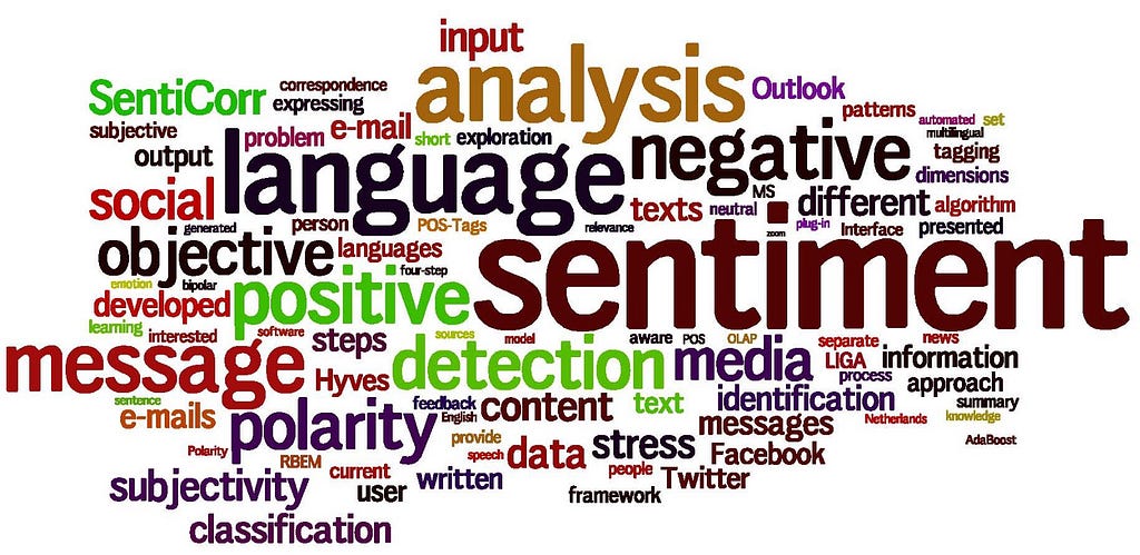
    Understand customer sentiment and feedback by extracting reviews from E-commerce portals and other public sites.

    Know your customers better and how they are perceiving the products and services offered by your business. Depending on the specific industry, Yelp, Amazon, Trip Advisors and the other dozens of rating and review sites are great places to explore.

    4. Lead Generation

    Simply find a website where your prospective buyers can be found, fetch the information you need such as phone numbers, emails, addresses. Web scraping can help you collect thousands of leads within minutes. If you are not sure where to look, check this article 88 Resources Tools to Become a Data Scientist. I am sure there will be one you can use.

    5. Gather real estate listings

    Scrape property details and agent contact details from real estate websites (eg. Zillow, Realtor, etc)

    Use Octoparse to scrape hotel/real estate data

    6. Market Research

    Turn any data you find online into structured data and analyze them using any BI tools. Custom analysis can effectively reflect public demand and behaviors that are important for any businesses.

    7. Create product catalogs by scraping product information (price, images, rating, reviews etc) from retailer/manufacturer/E-commerce websites (eg. Amazon, eBay, Alibaba etc.)

    8. Find out what’s trending in the market by collecting data from different social media websites (eg. Twitter, Facebook, Reddit, etc)

    9. Fetch video, including titles and subtitles from YouTube and other similar video hosting sites.

    10. Machine Learning

    Crawl all the data you need, let it be data points, images, or files for training your bots from the largest repository of data, the web!

    11. Search Engine Optimization

    Scrape metadata (eg. title/description/etc) from any websites or crawl internet search engine results for Search Engine Optimization monitoring.

    12. Price Intelligence (Competitive Price Monitoring)

    Use web scraping to monitor what your competitors are offering in real time. Learn about your competitors’ pricing strategies and increase your profits.

    13. Build a job board by scraping job pages on company websites or jobs sites (eg. Indeed, Glassdoor, etc).

    Use Octopasre to scrape job information

    14. Content curation

    Crawl forums and communities to extract data including posts and authors.

    15. Scrape regulatory or statistical information from Government websites.

    16. Extract hotel data, compare data such as pricing or review rating to stay competitive or aggregate this data to build your own platform.

    Use Octoparse to scrape hotel/real estate data

    17. Build News aggregation sites by crawling news data from different news portals.

    18. Identify best-selling products on Amazon

    Scrape product information with Octoparse

    19. Build your own price comparison site for all kinds of products and services.

    20. Scrape insurance coverage from providers’ websites.

    21. Brand Monitoring/Online Reputation

    If you have a brand that people talks about via different channels, such as social media, forums or others, you might want to set up an automatic mechanism to fetch those data relevant to your interest and implement sentiment analysis for better decision marking.

    22. Detect fake reviews

    Use web crawling to filter out fake reviews (shillings) for more accurate analysis.

    23. Target audience in advertising

    Scrape customer profiles for accurate ad targeting. Understand your customers better by analyzing their comments or reviews, such as their genders, age groups, spending habits even hobbies to make better-targeted ads based on the observed patterns. If available, use profiles information for accurate ad targeting.

    24. Scrape health physicians or doctors including their contact information from the various directory or hospital/clinic websites

    25. Scrape historical judgments report as case reference for legal purposes

    26. Scrape restaurant menu

    27. Extract financial data in real time, such as stock and fund prices

    28. Extract medical information, such as medicine details from Pharmaceutical Websites

    29. Fetch sports data from different sport portals

    30. Scrape car data or vehicle parts information from the web

    As Carly Fiorina, former executive, president, and chair of Hewlett-Packard Co. had said, “the goal is to turn data into information, and information into insight.” Having the World Wide Web around means having the world’s largest and unbiased database, creating unprecedented business opportunities. Act now and stay ahead of the game.

    Originally published at www.octoparse.com.


    30 Web Scraping Can Turn Data into Information, and Information into Insight was originally published in Hacker Noon on Medium, where people are continuing the conversation by highlighting and responding to this story.

    from Hacker Noon https://hackernoon.com/web-scraping-for-business-9a3a5496cc6f?source=rss—-3a8144eabfe3—4

    The Ultimate Guide on How to Build Alexa Skills


    Voice assistants provides a lot more than we think, whether it is setting up quick reminder or ordering food, users can get things done a lot faster and easily than a mobile app, and hence Voice technology is going to be next big thing. Amazon Alexa lead it and have 73% market share in 2018. There is lot more you can do with Alexa, here is list of Top 10 things you can try with your Alexa device. In various predictions we see that by 2020 50% of all searches will be Voice Search. Each year Alexa is setting high selling records on Amazon. It also becomes #1 Top Free app on Google Play and Apple App Store, as it requires mobile app to setup Alexa first time. Not only echo devices but various other smart home devices that are in top selling list are Alexa enabled devices.

    6 reasons why voice will be next big thing:

    1] It has capability to do almost everything and anything that can be done using Mobile app: As it has capability to develop custom skills, we can develop skills and can connect it to our existing database and with code we can perform almost any operation that can be done with website or mobile app.

    2] Quickest way of choosing any internal option for example: if user wants to check his next day’s meetings schedule, he will not need to go through any options/tap one by one. Instead user can directly access by single voice command.

    3] Handsfree experience and multitasking: User can get things done while doing other task like operating something, cooking, reading, exercising, cleaning, driving car etc.

    4] It gives user option to perform task and be away from screen, it is beneficial for eyes, eyes conscious people prefer voice assistants over screen based devices.

    Image from Optimum Technical Labs LLP (Alexa Skills Development Company)

    5] Most natural way of communicating with computers: old age people who find it difficult to learn to use smart phone, voice command prove to be easiest thing, as it is most natural way communicating.

    6] The best choice over smartphone for Blind and Hand disabled people: As we are discussing voice assistants can perform any task that smartphone does and hence it is best for blind and hand disabled people they do not need to struggle or try for using screen based device for getting any info and various other tasks.

    There are more almost 70,000 Skills published on Alexa Skills Store and increasing. Top popular skills have approx. 10,000 Reviews and receiving approx. 15 reviews daily, that is only reviews, imagine its usage.

    Going to build Alexa Skill?

    Work on your idea: So you have an amazing idea and want to build Alexa Skill for it. Now time is to start work on it. Most important thing to take first step and move ahead step by step. First we need to identify need of skill. and start creating document to list out major points.

    Check out your competitors: Go through Amazon Alexa Skill Store on web or on Mobile and check skills related to your idea, and figure out how can your idea be better? or which special feature can you provide to users?

    Target Audience: As voice is most natural way of communication, there are almost all age of users, from young to old. we can figure out our audience, some skills are completely designed for kids like learning game and some skills to provide help to elders. General skill can have large audience, skills which can be used by anyone.

    Choose right team: Now you have Idea and you have checked market. Its time to start building it. Choosing right team is most crucial part.

    Alexa Skill development being quite new field, there are not so many developers and agencies like we see in Web or Mobile app development. While developing any application there are so many important factors that we need to focus on, apart from technical expertise, we need to check if team really cares about providing us best solution with proper support.

    Here is my answer to one question important points to focus on while hiring for development project its general points fits everywhere.

    Want to generate money from your Skill: Amazon provide In-Skill purchase feature and now there is Consumable using which we can provide repetitive payment option, some digital service/product which user can buy, use and buy again.

    Things to focus on while building Alexa Skill:

    Focusing on below points will ensure great VUI (Voice User Interface). Skill should have great VUI, it depends on various factors, users should not be forced to listen long content, users should get right help at right time, skill should be able to provide proper data suitable to user, skill’s flow should feel like real conversation not like any old customer service phone call.

    1] Invocation Name: Invocation name is used for invoking skill (to start our Alexa skill/app). This must be very clear and meaningful, and something that user can remember, as user needs to call skill’s name to open it. Ideally skill name should be of two words and matching with complete invocation sentence for eg. Alexa, Open Peace World. Here “Peace World” is invocation name. There can be few different words that can be used in place of “Open” like Ask [which is widely used], Begin, Do, Launch, Load etc.

    2] Intent: Your technical team may use this word, here Intents we can say like each function that our skill will perform. So users can call different Intents to perform different functions. For eg. if any skill does Turn on/off light. So it can have one Intent for Turn on/off light and one Intent for Adding new user.

    3] Utterances: Utterances are synonyms of sentence which we have for calling different Intents. While building Alexa Skill there is option to write utterance manually, these utterance are sentence which user can tell to go to particular intent, or to open particular stage inside our skill. We should write as many utterance as possible. We can take example of one skill, I am developing for hotel, there we have various option that user can ask, if user have to ask for breakfast hours, utterances can be:

    What are the breakfast hours?

    What time does the breakfast service start?

    When is breakfast?

    What time does the breakfast service end?

    Please let me know the hours of breakfast

    What are breakfast hours each morning?

    Although Alexa automatically understands similar or matching sentences but it is good to provide many utterances.

    4] Music: This part is most important in Alexa skill and unlike mobile app Alexa is based on voice and hence music plays important role. Starting skill with nice music and playing appropriate music on different stage makes skill more compelling and nice to hear. You can find free music files or you can hire someone to create custom music for you.

    5] Technical Aspects: Check details below

    Photo by James McDonald on Unsplash

    While Publishing your Alexa Skill:

    a) Beta Test: Amazon Developer console now has new option Beta Test which allows us to share our skill with other before publishing and we can keep editing our skill while beta test.

    To Enable beta test Go to Distribution option on your In Development skill

    b) Be Clear with What Skill can do, so users can set correct expectations

    c) Skill should encourage users to leave review so you can know what users are expecting from skill

    d) Stay up to date with latest Voice technology and implement skill in best possible way and keep improving it, Voice technology is still emerging and will emerge rapidly over the next years, skill will need to keep update as well.

    TECHNICAL ASPECTS:

    Designing for Voice is very different than designing for screen. We should not think its flow, interaction with user like we think while developing mobile app or website. Instead the best way to design for Alexa skill is to just to practice real conversation like Alexa Skill will initiate when user will tell “this” invocation sentence then what will be response of Alexa and so on.

    Here is one example diagram, for flow we can design any kind of similar diagram:

    Rough Alexa Skill flow designed by Optimum Technical Labs LLP

    Designing a initial rough flow like above helps a lot in making whole scenario clear.

    One good thing with Alexa Skills is that users never have to download any skill as it runs completely on cloud, users only need to enable skill.

    Now comes the actual development part, Amazon provides ASK(Alexa Skill Kit) using which we can develop Skills for Alexa, for developing any custom Alexa Skill there are majorly two sections:

    1] Amazon Developer Console: Amazon Developer Console has Alexa Skills section and it has good GUI. It is required to publish any Alexa Skill and it contains information about Invocation name, Intents, Utterances, Endpoint.

    From here we can Distribute skill and can also set Beta test, can invite team members or anyone to do Beta test.

    2] Backend: Backend/Endpoint of Alexa Skill, as complete Alexa Skill always runs on Cloud, each and every Alexa Skill requires Endpoint. For this we have two options, we can either create endpoint on AWS Lambda or on Own Server.

    a) AWS Lambda provides ready to go setup and hence it can be faster. We do not need to create SSL secured server.

    b) Own Server: In this case, we require to have https SSL enable server running on port 443 only, and we can use Flask or any other framework to act as server.

    Server will have to handle JSON requests from Alexa and will have to provide JSON response. Both AWS and Own server will do same work internally.

    Functions & Features :

    In this part each skill will differ. It depends on features you want in your skill.

    It can be:

    Normal question and answer

    or if we want to implement some conversation capability

    or if we want to connect it to our existing system to our database to provide valuable information to user.

    or if it is a game it will include story telling, conversation, music on proper steps etc.

    or if the skill is for internal use of Business then we will need to use Alexa for business

    Pricing & Budget:

    It will almost fully depend on Function & Features we want, as mentioned above.

    Another major factor on which Pricing depends is to whom you hire, whether they are big agency or team or single developer.

    A good Alexa Skill Development team should have :

    1. Voice User Interface designer
    2. Developer (Python/Node.js etc)
    3. Quality Assurance Engineer
    4. Project Manager

    Now that you saw all those details about Alexa Skill Development, you may want to hire professional or team to build your Alexa Skill.

    I would like to help in providing solution, you can drop enquiry and we can discuss details and suggestions to create better Alexa Skill. We have proper process and team to develop Alexa Skill with great standards.

    I hope that I have covered almost everything you need to know to start building your own Alexa Skill. If you have any doubts/queries/suggestions, please let me know in comments, I will surely reply.

    and don’t forget to Clap, if you like this article :)

    — — — — — — — — — — — — — — — — — — — — — — — — — — — — — — -

    I am Snehil, CEO of Optimum Technical Labs LLP, feel free to reach out to me via Skype: snehilchouhan, Email: snehilchouhan@gmail.com or LinkedIn

    Optimum Technical Labs LLP team works on Mobile app and Alexa Skills development, we have number of happy Clients and nice portfolio, Please reach out for any project enquiry. We would love to help you and will provide suggestions.

    from Hacker Noon https://hackernoon.com/how-to-build-an-alexa-skill-an-ultimate-guide-on-alexa-skill-ee191823cb6b?source=rss—-3a8144eabfe3—4

    Are you ready to let Amazon leave packages in your garage?


    Amazon is adding garages to the list of places it can deliver packages in a tie-in with garage door kingpin Chamberlain. If you have a MyQ smart garage door opener or garage control hub from Chamberlain (or its Liftmaster brand), you’ll be able to choose “in-garage delivery” as a checkout option on Amazon.com starting this spring. This is the third delivery option Amazon has added to its Amazon Key service, joining car trunks and front doors.

    The garage might end up being the cheapest and easiest way to get secure Amazon package deliveries. In-home delivery requires both a compatible smart lock and an Amazon Cloud Cam, with the cheapest combo starting at $220. Trunk deliveries require a GM or Volvo vehicle from 2015 or later with an active OnStar or Volvo on Call subscription.

    By comparison, Chamberlain sells a smart control hub that works with any opener for $80. The Cloud Cam is optional, which might make sense, given that you can still keep your home entry door locked. And, speaking from experience, being able to control and monitor your garage door from anywhere is pretty neat, even if you seldom use the package delivery option.

    from Fast Company https://www.fastcompany.com/90288595/are-you-ready-to-let-amazon-leave-packages-in-your-garage?partner=feedburner&utm_source=feedburner&utm_medium=feed&utm_campaign=feedburner+fastcompany&utm_content=feedburner

    Top 7 UX Principles for Designing High-Converting Landing Pages


    (Photo by Hal Gatewood on Unsplash)

    Are you looking for tips on how to design high-converting landing pages? If so, you have come to the right place. In this brief but informative guide, you will learn the top 7 user experience principles you need to know to design landing pages which convert, and have a high conversion rate.

    Before we begin, let us again remind ourselves what a landing page is and what its goals are. A landing page is a dedicated online page built solely for accomplishing one or more marketing goals such as generating leads or getting clicks. When designed and promoted correctly such pages can become valuable marketing instruments. Building high-converting landing pages requires extensive knowledge in such areas as consumer psychology, marketing, copywriting, design, and most importantly, UX — user experience.

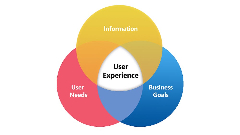
    Some readers might be unfamiliar with the science of user experience. We must therefore also remind ourselves what this science is about. By user experience, we mean a set of emotions and experience in general, related to using some product or service. User experience as science seeks to determine the key principles and factors which are responsible for creating a certain user experience and discover ways to build the desired UX based on these findings.

    (Source: https://upload.wikimedia.org/wikipedia/commons/8/80/User-experience-diagram.png)

    As such, UX design services can be successfully applied to designing landing pages and increasing their effectiveness, i.e. conversion rate and other important indicators. So with this in mind, let us review in detail the exact UX principles you should apply to design your landing pages in the future.

    Principle #1: No Distractions (No Navigation)

    (Photo by Stefan Cosma on Unsplash)

    Distractions are the enemies of high conversion. You don’t want your reader to be distracted by irrelevant elements on your web page. You want him or her to be focused on only one thing — your page’s content to persuade him to take the desired action. Therefore, you must ensure the complete absence of any distracting and irrelevant elements on the web page such as for example, navigation.

    Yes, you heard that right, navigation bars must be absent on landing pages. As such, it is an irrelevant element which distracts users from the landing page. Therefore, it must be removed. Don’t give your page’s visitors a single chance to get distracted. Besides navigation bars, there may be present some other distractive elements such as pop-up forms, etc. Carefully scan your landing pages to identify anything which may distract visitors and get rid of those.

    Principle #2: Minimalism

    (Photo by Thomas Quaritsch on Unsplash)

    Even among the elements which seem relevant and necessary, there may prove to be some non-essential ones which your landing page can do without. For example, unnecessary links which can take visitors away from a page, irrelevant useless content, etc. Once again, carefully scan a landing page to see if there are any non-vital elements which you can get rid of.

    This will allow to further improve a visitor’s focus, and correspondingly, your conversion rate. Minimalism is a real deal. Think of Apple’s success. Minimalism is the cornerstone of the brand’s philosophy which is largely responsible for its success. If Apple always seeks minimalism, wouldn’t it make sense for you to do so as well?

    #Principle 3: One Purpose, One CTA (Call-To-Action)

    (Photo by Smart on Unsplash)

    This principle once again demonstrates the importance of clear focus in landing page design. No distractions, minimalism and one purpose — this is what makes a high-converting landing page. Some landing pages oftentimes have more than one CTA. This confuses visitors and can decrease the conversion rate. A landing page must have only one goal, not two or more. You must have only one call-to-action throughout your entire page. If you want to add more than one CTA, you need to create separate pages for each.

    Principle #4: Don’t Use Too Many Fields in Your Forms

    Many landing pages have forms which request personal information from visitors. A logical question arises: what affects the conversion rate of a form, and correspondingly the conversion rate of your landing page? The answer is simple — what kind of information you request.

    Oftentimes we can see forms with a million of fields starting from your address and ending with your pet’s name. Needless to say, such forms don’t usually enjoy high conversions. You must strive to request only the most essential information which you cannot do without. The fewer fields you use, the better.

    Principle #5: Use the Right Color Scheme

    (Photo by Scott Webb on Unsplash)

    Remember once and for all, color is everything. What colors you use affects the behavior of your visitors, their mood and emotions i.e. the entire user experience. It is therefore important to select the right color scheme for your landing page. Now, how do you go about it? Ideally, you should have a UX expert/designer who can select the right palette using his or her knowledge of color theory. Otherwise, you may want to dive into the subject yourself or find ready-to-use color templates such as this one.

    Principle #6: Use the Right Fonts

    (Photo by Mr Cup / Fabien Barral on Unsplash)

    What fonts you use greatly affects a user’s perception of the text. You may have the best content in the world, but if it is laid in a horrible font, then nothing will help. Therefore, it is not enough to just have the right copy. That copy must be laid out with the right font. There is a separate division in the science of UX which deals with fonts — typography.

    It is a good idea to learn some basic UX principles of typography. Usability Geek has prepared a great article on the subject. The bottom line is, ensure that you use the right fonts which perfectly align with other elements of your landing page.

    Principle #7: Use Lists and Bullet Points

    (Photo by Glenn Carstens-Peters on Unsplash)

    Using bullets and lists is a great way to highlight the key points you want your readers to see. Also, it can serve as a great way to catch and focus a user’s attention. Information presented in form of bullets and lists is more easily perceived. Therefore, always put the key takeaways in such form. It is a good idea to list the main advantages in such a way. Use them wherever and whenever you can.

    Final Thoughts

    We hope you found this brief overview helpful. User experience is real science. If you learn the basic principles of effective UX and apply them to landing page design you should expect much higher conversions and overall business success. We wish you good luck on your journey:)

    from Hacker Noon https://hackernoon.com/top-7-ux-principles-for-designing-high-converting-landing-pages-3e4cb951c8e2?source=rss—-3a8144eabfe3—4