All electric vehicles by 2035 could be impossible without new battery tech


Were you unable to attend Transform 2022? Check out all of the summit sessions in our on-demand library now! Watch here.


California is enacting “a sweeping plan to restrict and ultimately ban the sale of gasoline-powered cars,” which Governor Gavin Newsom described as the “beginning of the end for the internal combustion engine.” Where California leads, many others follow. However, at present, there is no technology available that will allow for the mass adoption of electric vehicles (EVs) at a price point that the average consumer can afford. While policies like California’s aim to accelerate the global transition toward electric vehicles, there are crucial missing pieces to this plan.

Electric vehicles: Batteries, barriers and bans

Let’s get clear about what we’re working toward and the barriers to getting there. Most electric vehicles today use a lithium-ion battery that requires cobalt and nickel to function for long-range travel, which means that their batteries and the cars are expensive. The batteries that do use low-cost materials lack the range to be competitive with internal combustion for everyday consumers.

Based on current technology, the world is not even close to being on track to achieving California’s goal of banning the sale of new gasoline-powered cars and light trucks by 2035. The industry hasn’t yet defined a profitable roadmap to get there.

Scale alone can’t solve this with current technology. At the moment, doing the same thing in ever larger and larger factories won’t help automakers or consumers. Cobalt and nickel are becoming scarcer and more expensive as demand grows. It’s uncertain whether global miners will even be able to keep up with demand for these materials at current growth rates, let alone the growth rates needed for 100% of new cars to be electric by 2035.

Event

MetaBeat 2022

MetaBeat will bring together thought leaders to give guidance on how metaverse technology will transform the way all industries communicate and do business on October 4 in San Francisco, CA.


Register Here

Nickel prices soared from $29,000 a ton to about $100,000 in March 2022 and continue to fluctuate wildly. Cobalt mining is particularly problematic on ethical grounds, predominantly performed in the Democratic Republic of Congo in unregulated mines that lack adequate safeguards against child labor and corruption.

Electric vehicles still out of reach for most

Cheaper batteries depend on the development of new technology as soon as possible. Until then, EVs are very difficult to produce profitably across an entire automotive product line. Expensive luxury vehicles at the top end of a product line give an automaker the glow of an EV future, but lower-cost electric cars currently depend on government subsidies to reach mid-range consumer price points.

The truth is that with today’s EV battery technology, automakers can’t produce the affordable first car for a newly employed college grad. They also can’t make a utility van for a hard-working contractor or an SUV for a single parent juggling two jobs.

To achieve mass adoption, battery costs must come down. An EV battery involves a complex system of chemical storage that depends on an anode on one side and a cathode on the other, with a dance of lithium between the two. Multiple technologies are pushing to make a step-change in the cost of these batteries, but the road to getting new materials into a car on a dealer’s lot is long and complex.

To lower costs on the anode side of a battery, one could switch to higher-energy materials like lithium itself, or shoehorn in more high-energy silicon. Both of these approaches involve technical challenges that dozens of startup companies as well as major battery companies and universities have been working on for decades. Promising technologies in solid state anodes and nano-structured silicon, along with technology to increase the use of polymers in batteries, have combined over time to increase energy on the anode side.

With billions invested in bringing the tech to market, these innovations are just now getting tested widely in cars on the road, but this is only half of the equation.

The quest for sulfur cathodes

What has long been seen as the end-game material on the cathode side of the battery is cheap and abundant sulfur, but it has been devilishly hard to make it work. While no other realistic material on the periodic table matches it in energy potential, getting sulfur to perform to automotive specifications has been a decades-long challenge.

Where cobalt- and nickel-based batteries hold the energy of lithium in a crystal structure, sulfur contains lithium in a chemical conversion that creates by-products, making for poor battery performance. A handful of startups have pushed sulfur cathodes forward for decades but never quite produced a battery that can be third-party tested and put on the long and expensive road to being validated for an electric car.

One way to get sulfur across the “valley of death,” in the same way anode innovations are just now clawing out the other side of the valley, is to temper it in the forge of commercial-level testing. Build a sulfur battery at the same specifications needed for an automotive battery and make it fail over and over and over again. Every time you make it fail, figure out why and work around the failure mode. Combine chemistry, engineering, and innovations from universities, and you can start to push a sulfur system closer and closer to automotive performance levels.

I lead a startup company called Conamix and while we’re pushing the sulfur system and we’re tantalizingly close, we’re not yet good enough for third-party testing for automobiles.

Betting on new technology

Whether it is an innovation on the cathode side or the anode side of the battery, it still takes three to six years from third-party validation to move it to a car that a consumer can buy and drive. An automaker needs to know a new material works in ever-larger battery cells and that it can be produced in existing factories and at a truly massive scale.

The world need billions and billions of battery cells to achieve a 100% EV future. Companies like the one I founded back in 2014 are on the cutting edge of new materials that could someday change the dynamic of EV pricing worldwide. And we make only dozens of cells per day.

So there’s a gap. A promise gap — between the fully electrified future pushed by California and the reality of how hard it is to get new materials to market. Multiple technical holy grails have yet to be found and proved and pushed from the rough-and-tumble of a venture-backed startup to the scale that makes a difference for every consumer and, ultimately, for the planet as a whole.

If the world is going to have a hope of meeting these ambitious goals, we need to make big and smart bets on new technology at the same scale we make deadlines and promises.

Charlotte Hamilton is the co-founder and CEO of Conamix.

DataDecisionMakers

Welcome to the VentureBeat community!

DataDecisionMakers is where experts, including the technical people doing data work, can share data-related insights and innovation.

If you want to read about cutting-edge ideas and up-to-date information, best practices, and the future of data and data tech, join us at DataDecisionMakers.

You might even consider contributing an article of your own!

Read More From DataDecisionMakers

from VentureBeat https://venturebeat.com/datadecisionmakers/all-evs-by-2035-not-without-new-battery-tech/

Exploring Midjourney’s AI art style using circles | by Steve Dennis | Aug, 2022

How materials, moods, and mediums affect the output of a simple circle

Sunset. A large ring of yellow light floats in the air above two silhouetted figures. A desert landscape stretches out to a towering sandstone butte. Behind it, is a circle of swirling cloud.
All images by MidJourney, directed by the author.

Midjourney is an AI image generation tool that take inputs from a human (usually through text prompts and parameters, but also other images) and uses a machine learning algorithm trained on a huge amount of image data to produce unique images.

Like most machine-learning models, Midjourney can be a bit of a black box. It’s so complex that it’s difficult to explain to a layperson what happens between the system receiving a text prompt and it producing an image.

What we can do, is explore the output we get based on the inputs we give, and look for patterns and make assumptions. This won’t necessarily get us a better understanding of how the system works, but it can help us learn how to use it better.

Note: I will frequently anthropomorphize Midjourney here. I understand it doesn’t actually think, imagine, like/dislike, or feel anything.

To best represent the detail of Midjourney’s output, the images below have large file sizes. Proceed with caution if you’re on a slow or metered mobile connection.

If you asked a random person in your life to draw you a circle they would probably find a blank sheet of paper, maybe a notepad with lines, pick up a pen or a pencil, and draw an outline of a circle.

But what happens when we ask the same thing of Midjourney?

A thin yellow/white circle glows, slightly illuminating a dark forest canopy behind it. Teal and orange hues of the fading light give way to black at the edges.
Prompt: “A circle”

You can see with simple prompts, Midjourney fills in a LOT of gaps with what boils down to weighted dice-rolls, on aspects of an image which a human would typically leave blank. Run a prompt like this through the system ten times and you’ll probably get 6–8 fairly different images with different aspects, and a lot of similar traits. Without stylistic or color descriptors, it leans heavily into the cinematic teal-and-orange look by default, as you can see here. It LOVES clouds. You can see it has quite a specific painterly look, which it also favors by default.

We can try to dial it back through more specific text prompts to get it to something resembling what a human would make.

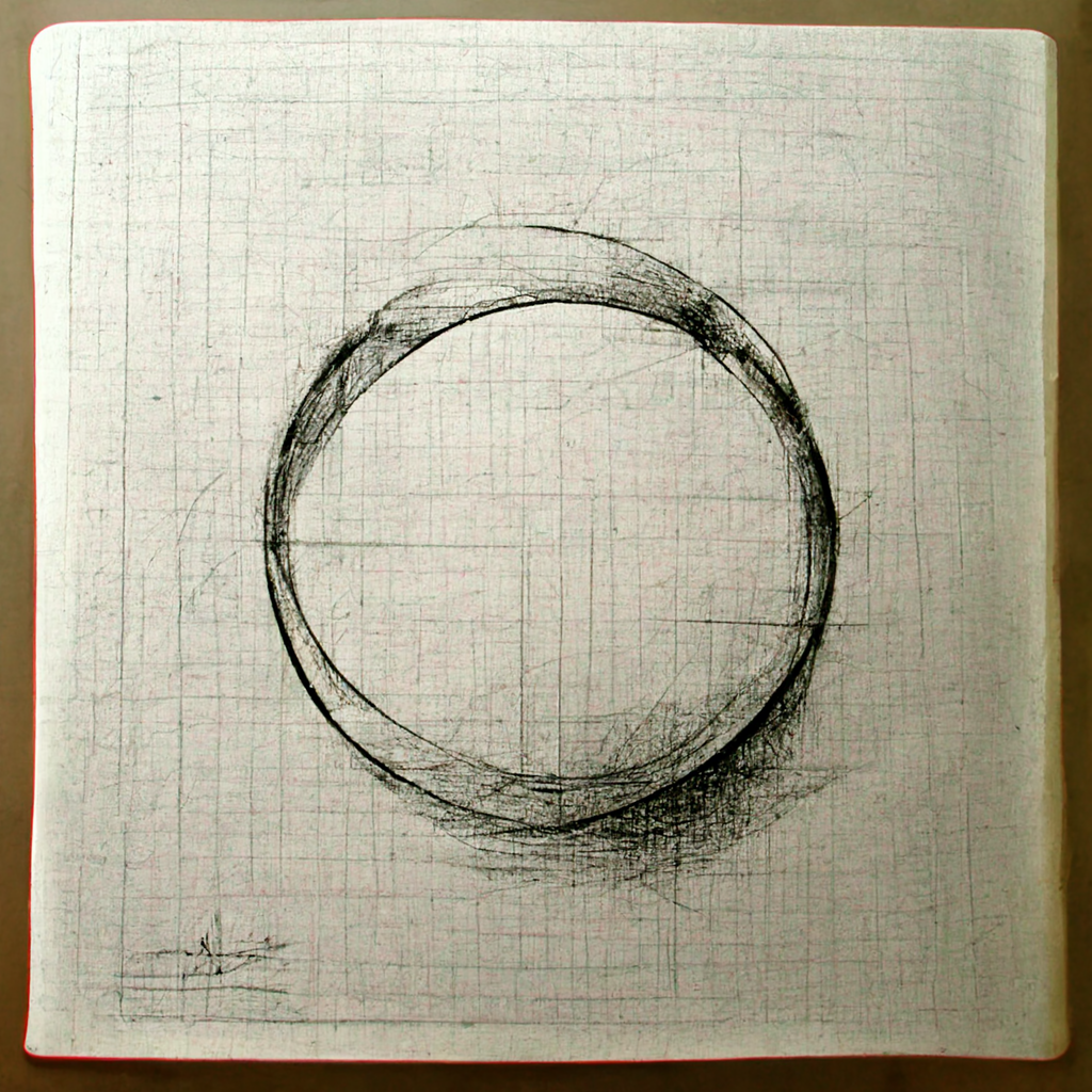
A charcoal sketch of a ring shape. Messy and disconnected, but with light and shadow considered. Grid-lines are scribbled across the page in faint pencil. It looks like a page from a notebook.
Prompt: “A pencil line drawing of a circle”

Even still, it’s far more detailed than we’d expect from a human and still takes a lot of trial and error to simplify.

A think pencil circle on white paper, surrounded by a softer pencil circle that looks like someone might have done a pencil-rub on the bottom of a coffee mug. A dark shadow covers the bottom right corner of the paper.
Prompt: “A simple pencil outline of a circle on white paper”

Midjourney is exceptionally good at simulating different types of materials. It usually understands the basic properties, forms, or colors of many interesting materials, and we get some interesting results playing with these.

Materials and colors will help add flavor to your prompts. Experiment with combinations, both expected and odd. Pay attention to materials in your surroundings. Around me right now I see crinkled paper, black plastic, brushed aluminium, grey woven cotton, and blue foam. Let your environment inspire you.

Midjourney does very well with poetic descriptions and adjectives, but only if you’re not after something highly specific and prefer to simply invoke a mood.

The best way to use it is to leave a lot of room for interpretation and just sort of roll the dice. You’ll notice certain moods favor certain color schemes (blues for melancholy, reds for horror), but often that teal and orange will still creep in.

A warm sunrise glow bathes a floating circle made of branches, thick and dense, twisted together. It’s shape is near-perfect, with the branches on top growing lush green foliage, while the bottom is dry and brown. A figure stares up at it from below. Clouds in the sky behind it.
Prompt: “A mysterious circle”
An orange ring of flame appears to be a portal into a dark, creepy, nearly symmetrical forest. The shapes of branches might make a face, but you can’t be sure in the darkness.
Prompt: “An evil circle”
A muted cold blue sky with wispy trees to the side of the frame. A person looks up at a beige ring in the sky, filled with increasingly darker blues, like a tunnel into darker times.
Prompt: “A circle of melancholy”
A circle made from negative space. Its orange and teal coloring evokes a sunset, but the dark blue inner circle has a tree growing out the top of it which bleeds into the negative space, breaking it up slightly. Its edges are imperfect. A figure looks up at it from below, as if dreaming it.
Prompt: “An imaginary circle”
An aurora-like circle containing a second semi-circle in the night sky. It appears otherworldly. Tree branch shapes can be seen within it, seemingly growing in the middle of the sky.
Prompt: “An ethereal circle”
A dark black and red void, surrounded by a sandy circle. Shapes of people in black and red surround it, fading into a chaos of red and black noise.
Prompt: “A horrific circle”
A circular art canvas hangs on a nondescript brown wall. The outer edge of the circle is a mix of painterly dark blues and blacks, while the inner edge has white willow-like branches forming a circle, with pink and orange flowers blossoming from the bottom half.
Prompt: “A blossoming circle”

The default “midjourney painting” style can be overridden by invoking certain styles using specific keywords or parameters. Whether you want a specific painting style, a 3D render, a clay sculpt, or a specific style of photography or illustration, there’s a good chance Midjourney has a basic understanding of it.

Grainy black and white, overlapping shadows of rings and bars, lit harshly from off-screen.
Prompt: “A circle in a film noir”
An atmospheric foggy street scene at night. The cracked pavement is lit by a thin circle of warm light, almost like a long-exposure light-painting. It frames park benches, fading into the fog, with the light of billboards and street lights in the distance.
Prompt: “A circle rendered in Octane with volumetric lighting and fog”

Octane is a rendering tool for digital 3D work, designed primarily to render things with realistic physical properties and accurate lighting. You’ll see it frequently used in Midjourney pieces aiming for a specific look. You can see aspects of this in the way the ring of light is lighting the ground.

A circle that looks like a top-down view of an ancient clay pot on display in a museum. Harsh top lighting accentuates carvings around the rim. The middle a swirl of clay, as if made quickly on a pottery wheel.
Prompt: “A circle sculpted from clay”
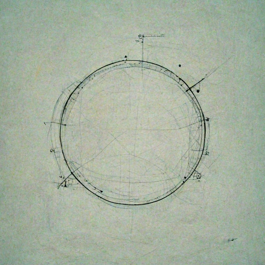
An ink drawing of a circle with lighter lines, dots and angles. It evokes a blueprint or technical drawing without any specific text or description.
Prompt: “A technical drawing of a circle”
A circular canvas hanging on a brown wall. The canvas is full of various splotches of blue, yellow, red, orange, green, and purple, that go from light on the outside to darker in the middle, before forming a lighter center. It gives it a sense of depth.
Prompt: “A watercolor circle”

While simply stating “A circle” in our prompt makes it the subject by default, things can change a bit when we start describing the environment our subject is in. As you’ll see, given a lack of subject detail the environment can shape the subject in interesting, sometimes unexpected ways.

A landscape painting style with a field full of flowers, and a single tree in the distance. In the foreground is a circle on the ground, shown in perspective, made from pink, blue, and orange flowers.
Prompt: “A circle in a field of flowers”
Stormy seas rage at the bottom of the frame, with dark clouds looming in the background. A swirl of waves creates a circle in the middle of frame. Physically impossible, but menacing and beautiful.
Prompt: “A circle in stormy seas”
A small forest clearing, with colorful sprint foliage in the background. The clearing has a circle of dirt, maybe two metres across, like someone or something has walked in a circle for days, wearing down the grass to dry dust.
Prompt: “A circle in a forest”
A more abstract painterly scene of mountains in the foreground with a huge sky taking up most of the frame. Behind and between the mountains, an orange circle sits, the bottom of it fading into the mist behind the first mountain range.
Prompt: “A circle in the mountains”
A circle of bright light, like a door or gate illuminates a dark city alleyway. The only other lights are faint red lights from the windows of buildings.
Prompt: “A circle in a dark alley”
A huge modernist circular room, maybe a lobby, with a reflective orange circle on the floor, with a teal outer ring. Some office chairs look out a window on the far edge. orange and white ring-lighting circles the outer edge of the ceiling. Blue and yellow wall panels surround the window. It’s a space devoid of people or life.
Prompt: “A circle in a corporate office”

Aspect ratios can also drastically effect the type and compositions of images created. If you ever want to print something on a standard poster size, or use something as a phone or desktop wallpaper, get familiar with the aspect ratio parameter and use it accordingly, as it’s exceptionally hard to reformat a square image that you’ve decided you like.

Midjourney can attempt to evoke the style of a particular artist. This is one of the more ethically controversial ways to use AI in art, especially when dealing with any sort of commercialized work. While humans can and do also copy the style of others, the grey area is substantial when it’s an AI model doing the copying. This is especially (and understandably) a concern for working artists, and anyone well known enough for the system to recognize. The works are still unique in any legal/copyright sense (as of today), but it could still be frowned on by the community.

Similarly grey is the popular “trending on Artstation” descriptor, which will broadly approximate not one specific artist, but much of the type of work and styles that are frequently seen on Artstation.com, which is hugely popular with artists working in film, games, concept art, and illustration.

A yellow ring of light looms massive in the sky, rimmed with an orange halo. It’s on a sunset sky, directly above a rocky mountain range in the middle of the desert. It evokes Close Encounters of the Third Kind, but with a wider and shorter mountain.
Prompt: “A circle trending on Artstation”

This article just scratches the surface. The infinite possibilities and real power of systems like this come from your (human) experimentation, direction and taste, combining all the concepts above and more to create unique works that may inspire and delight yourself and others.

A dark green misty forest with black twisted branches. A golden portal sits to the right of the frame, little lights like fireflies fly around it, possibly attracted to it.
Prompt: “a mystical circle made of tree branches and liquid smoke in the trees of a lush jungle at night. Terrifying and magical. Gold accents.” (16:9)
A large wooden circle sits in the sand, waves blown around it, like it’s been there for months. Black and white photograph style.
Prompt: “a black and white photograph of a lonely wooden circle, abandoned in the sand dunes.” (16:9)
An apocalyptic dark fantasy hellscape, plumes of smoke and fire create circles, while dark figures wander a swampy wasteland.
Prompt: “a circle of fire and smoke in a forgotten wasteland abyss. (16:9)

Thanks for reading. You can follow my AI-generated art experiments on Instagram. If you get value from stories like this and want unlimited access to all the content on Medium, consider becoming a Medium member. It only costs $5 a month, and that money will help support me, this publication, and other writers you read on Medium.

from Medium https://towardsdatascience.com/exploring-midjourneys-art-style-using-circles-a461a78e7196

My Five Biggest Design System Mistakes | by Steve Dennis | Sep, 2022

Lessons learned from bootstrapping a small design system from scratch

Image by Midjourney, directed and edited by the author.

A lot of design system articles focus on the ideal or best ways to approach certain problems. There’s a lot less written on what doesn’t work, and what was learned from it.

Our design system team has always been small and scrappy, trying to do what we can with limited resources, often while juggling other responsibilities. I’m incredibly proud of what the team has been able to build, punching way above our weight in some areas. But mistakes were made (often by me), despite good intentions.

Here are my five biggest mistakes, and what I’d do differently next time.

When we built Castor in 2019, one of the major pain points was supporting dark mode and theming. We did this using design tokens. Design tokens have been around as a concept since 2014, but they really started gaining traction in smaller design systems over the last few years. Engineering tools to support them are in a pretty good state, but design tools are still catching up.

Mistake

I advocated for splitting our token architecture into two layers, base tokens, and semantic tokens. The semantic tokens were things like background-main, content-secondary, or border-input and are the colors we encourage designers to design UI with in Figma. We ensure all our components are built using only these tokens so that they support our dark/light mode themes out of the box.

A visual example of what happens to our semantic token values when dark or light themes are applied.

I was concerned about having too many available options and duplications in the palettes available to designers, so I chose a naming approach that aimed for a balance between being broad enough for one color to cover multiple uses, but also being specific enough to know what colors to use in different scenarios.

Examples of our content and background design tokens. content-main, background-main, content-secondary, background-surface, etc…

This was fine… until it wasn’t.

Once we started getting into more complex components, it became hard to make token naming decisions, and the choices to use certain colors in different contexts got further and further away from their intended uses.

To maintain simplicity for users with this approach ended up being too complex to maintain.

Lesson

Don’t overcomplicate decision points. What we should have done was had a simple, fairly static semantic theme palette for general design use, and then have components use their own palettes with hyper-specific token aliases (based on Nathan Curtis’ fantastic article on token naming). This would mean new tokens for every component in the system, which would mean more tokens, but a lot less complexity in decision making.

With the dark/light mode token architecture described above, one of our goals was to allow designers to easily design in either dark or light mode, without the overhead of having to maintain double the number of components.

Mistake

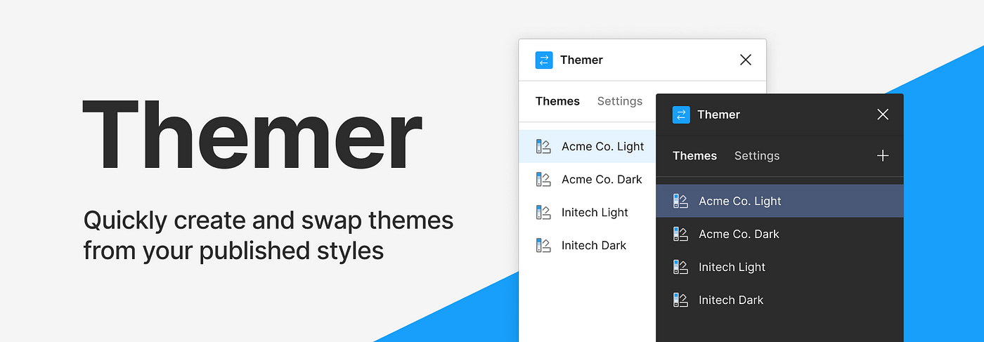
We built the Figma side of our system around a third-party plugin called Themer. It allows us to define color and type tokens as styles in Figma, and dynamically swap frames or whole pages between dark and light mode. Initially, we had a good experience. A few small issues but nothing major.

Figma Community header for the Themer plugin

Then, slowly over time, Figma started to change, and Themer didn’t.

Variants were added as a new component capability. Now, whenever a variant is switched, the component theme resets to the default and has to be reapplied via the plugin. This was a significant problem for general system usability, as we had entire products that were developed in dark-mode exclusively.

Performance also degraded to the point that it’d sometimes take over 10 seconds to apply a theme to a screen. But given the resources we had, switching our approach here would simply take too much time, and wasn’t viable short/medium term.

Lesson

Be very, very careful about relying on third-party plugins. Themer is a great plugin, but at present it’s not best suited to meet our needs, and as such it shouldn’t be an integral part of our system.

Given Figma’s current capabilities, I think I would opt for a dark/light theme toggle setup as a variant. This would allow variants and variant properties to be used without an extra step. It would increase maintenance complexity, but it’d be a worthy trade-off for the system usability improvements.

I hold out hope that Figma may implement native token support in the near future. We don’t want to attempt a big migration to another plugin like Figma Tokens if there’s a chance we’ll have to do another migration to a native solution shortly after.

As a note, we are still using Themer at present, and it’s been fully rewritten recently to solve a bunch of small issues and performance problems, though the variant issue remains a problem.

This is probably the most common one on the list. We went into the project with the best intentions. We absolutely nailed a bunch of aspects of the system, and were incredibly happy with the components we’d built, and the basic usability of the system itself.

Mistake

We failed to put the effort in and publish our documentation early and often. We had an honest attempt early on. We set up a private Zeroheight site, and researched aspects of documentation that we liked and disliked from other design systems. We found some good ones, and tried to replicate them in Zeroheight, but kept running into minor issues and blockers that just got in the way of us writing the content.

A page from our partially finished Zeroheight site.

As we kept building components, I kept putting off documentation for them because we didn’t have a good standard set, a baseline of what the documentation needed to include and how it should be structured.

And we kept putting it off.

As of writing this, we still don’t have good general purpose public documentation available. We have a really nice Storybook instance, which we are very happy with, but nothing that helps explain key system concepts, and design considerations, or helps integrators with accessibility.

Lesson

Don’t let tools get in the way of your writing. Ignore how you lay out images, do’s and don’ts, and color palettes for now, and use whatever tool you’re most comfortable with to get ideas out of your head and shared. The team can iterate from there.

My next step for Castor is to try using Notion (something I’m familiar and comfortable with) to write up the core content, and then figure out whether to keep it there and polish, or look at different solutions.

It’s me. I’m the person. Having been involved in the design of Castor from the ground up, I’ve always felt it is “my baby” to a certain extent. As a result, I tried to involve myself in major decisions, and did a lot of the work myself. While I did put in a lot of effort trying to optimize the process for wider contributions, writing process documentation and setting up process diagrams with our project manager, as a part-timer I should have realized I can’t do everything.

Mistake

A few parts of the system are simply overly complex (the theme tokens for components as mentioned earlier being the main area). Every time a new component requires token changes, I have to handle these myself. They involve lots of manual changes in lots of files across multiple systems. I also have to ensure these changes align with code within a short window of time.

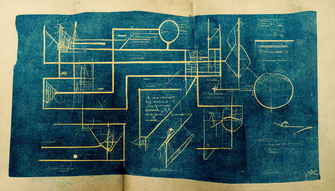
An abstract representation of a system blueprint.
Not an actual system diagram.

At one point we started an iteration on our color tokens to better align the visuals of some of our dark and light mode components to make them a little easier to manage. This work had knock-on effects to a lot of contributions that were already in progress, and they were blocked until these other changes went live. During this time other projects were taking more of my day, my number of direct reports grew, and the time I had to oversee these changes dropped to zero. Components were in a half-finished state for months, and velocity dropped significantly.

Lesson

Design the system to empower the wider team. One of our biggest constraints was the fact that myself and the majority of the team were part-time. I should have spent more effort designing the system to allow more independent contributions, and to document parts of the architecture well enough to allow others to contribute. We should have invested in better tooling to manage token parity between Figma and Code. We developed a plugin during a hack-day, but never got it into production.

Once we secure more resources to work on improvements, I’ll prioritize some of this tooling and refine the process to be a lot less complex, more distributed, and asynchronous.

Design systems can be a lot of fun to design and build. You spend months sweating over details, making plans, and trying to justify your impact. When you’re that close to something, you can sometimes take for granted that your work is visible and understood outside of your team.

We did a handful of company-wide slide decks and presentations before and after launch to build awareness, but nothing sustained or targeted.

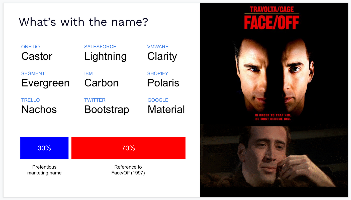
A slide explaining the name Castor. 30% Pretentious Marketing Name, 70% Reference to Castor Troy from Face/Off.

Mistake

Despite great efforts building the system, planning and coordinating the initial migration, seeking contribution from the wider team, and working on a robust metrics system, ultimately I failed to effectively communicate the value of continued investment as broadly within the company as I needed to. We lost our full-time engineer to a re-org, and a few larger projects hitting at once further constrained what our part-timers were able to achieve.

Lesson

Set aside time to plan communication. Ensure there are regular communication channels where the team’s work and impact is highlighted. This could be a monthly newsletter, quarterly talks to the company, or more 1:1s to engage business leaders to discover their problems and concerns, and ensure it’s clear where you can help.

Continually justifying your own existence is an exhausting reality that a lot of design systems folks face daily, but I think with more planning in our communication, we could have had more impact with less stress than we have to date.

Everyone makes mistakes, and no one is able to design a perfect system. What’s important is having the self-awareness to identify those mistakes, and apply and share the lessons, so you and others don’t run into the same problems over and over again.

So, what’s your biggest design system mistake?

Thanks for reading. If you get value from stories like this and want unlimited access to all the content on Medium, consider becoming a Medium member. It only costs $5 a month, and that money will help support me, and other writers you read on Medium.

If these articles are relevant to your job, you might even be able to justify it as a learning & development expense! Food for thought.

from Medium https://medium.com/@subcide/my-five-biggest-design-system-mistakes-4725859926c2

Naming Tokens in Design Systems. Terms, Types, and Taxonomy to Describe… | by Nathan Curtis | EightShapes

Terms, Types, and Taxonomy to Describe Visual Style

Masthead image with abstract visualization

Design tokens have provided a visual foundation of many design systems since Salesforce pioneered the concept in 2014. I wrote an impassioned article on design tokens in 2016, and my energy on the topic continues to grow. As systems of visual style spread across a widening landscape of components, platforms and outputs, design tokens — and their names — are increasingly important.

Effective token names improve and sustain a team’s shared understanding of visual style through design, code, and other interdisciplinary handoffs. Terms matter. As we make things, we must be able to browse and search tools to quickly recognize and recall the purposeful decisions we’ve made. Not just in code and documentation, but in design tools too.

Code, documentation, and design tools exhibiting design tokens.
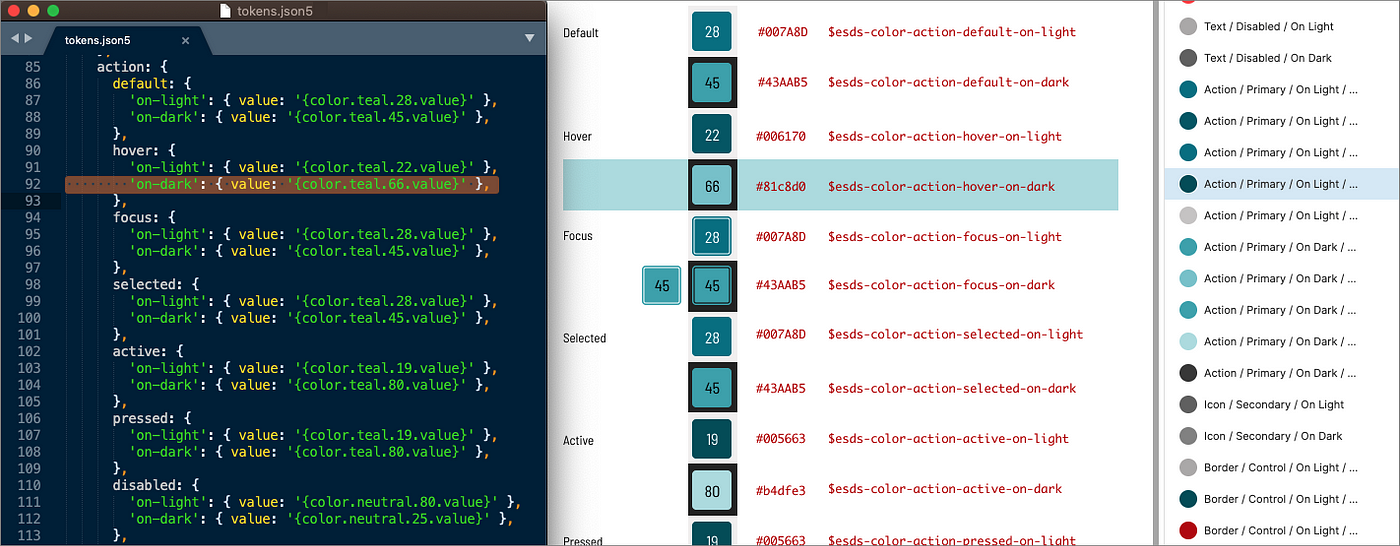
Design tokens across code (left), documentation (center) and design tool styles (right). The naming isn’t perfect: can you spot the inconsistency?

And naming is hard. Building token schema is a formative and occasionally passionate activity for a team. I’ve contributed to architecting tokens at Discovery Education, Morningstar, REI, USAC, NetApp, and ~10 other systems, each time unique yet informed by those that came before. Other public token collections inspire us too: Adobe, Shopify (as-is, emerging), Infor, Bloomberg, Sprout, Orbit and USDS among them.

Salesforce UX Token hierarchy (Ferrua & Rewis, Clarity 2019)

As tokens become more sophisticated, naming patterns matter. Brandon Ferrua and Stephanie Rewis of Salesforce UX (at Clarity 2019) and Kaelig Deloumeau-Prigent of Shopify UX (at Design Systems Community Chapter Toronto, September 2020) exposed their models. Adobe Spectrum and Danny Bank’s Style Dictionary token tool document their models too.

Even simple design tokens exhibit naming patterns via levels.

Basic token examples

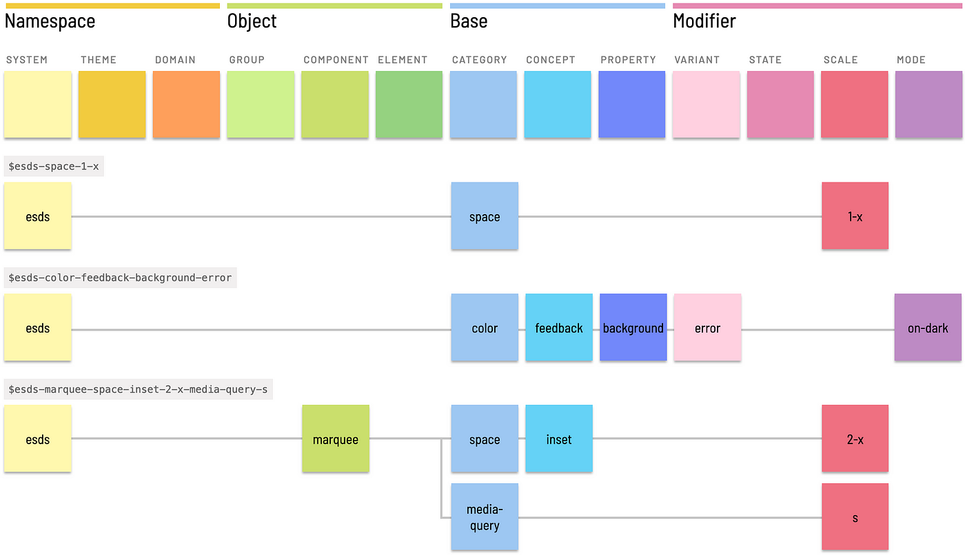
For example, the $esds-color-neutral-42 token combines four levels — namespace (in this example, esds standing for “EightShapes Design System”), category, variant, and scale to map to #6B6B6B. Similarly, $esds-space-1-x orders namespace, category, and scale levels to represent 16px as another generic value.

Complicated token examples
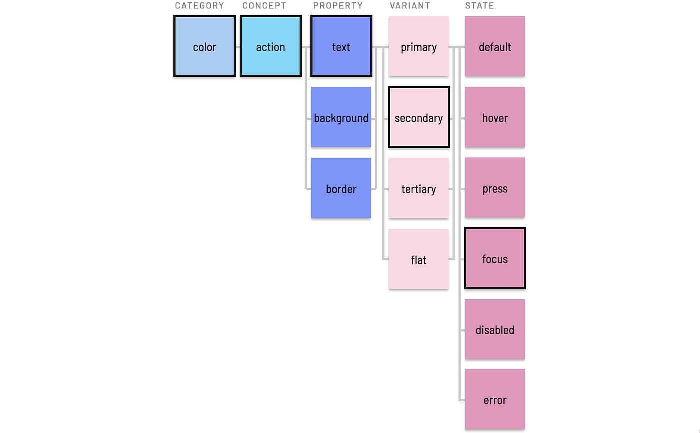
Complicated tokens comprised of many levels: namespace, category, concept, property, variant, and scale

Beyond generics, we need more levels to realize tokens’ promise as a way to centrally record and widely reuse purposeful visual decisions. The moderately complicated $esds-color-feedback-background-error and $esds-font-heading-size-1 purposefully represents values (#B90000 and 64px, respectively). More levels lead to more complicated yet specific tokens, such as how$esds-marquee-space-inset-2-x-media-query-s incorporates a component name and also includes two category / scale pairs.

Token levels as columns, with associated examples

To be sufficiently descriptive, a tokenized language that incorporates both taxonomy and typology needs many levels. Enough levels, as it turns out, to organize them into groups:

  • Base levels as a token’s backbone that combine category (for example, color), concept (action) and property (size).
  • Modifier levels to refer to one or more of variant (primary), state (hover), scale (100), and mode (on-dark).
  • Object levels to refer to a component (button), element within a component (left-icon), or component group (forms).
  • Namespace levels combining any (or all, in extreme cases!) of system (esds), theme (ocean or subbrand), or domain (retail).
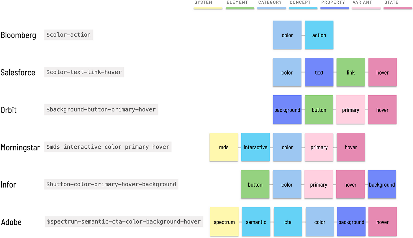
Tokens presenting a primary action’s hover color, from Bloomberg, Salesforce, Orbit, Morningstar, Infor and Adobe

Different system applies levels differently. The diagram above depicts tokens from six different catalogs corresponding to my guess of their token that represents a primary action’s hovered color. I know, I know, I tried my best but may not have found the right token each time. Newsflash: that’s what users of tokens face. Nevertheless, the illustration exhibits varying depth, specificity, order, and intent found across systems. And patterns are evident.

This article expands on how to consider token naming with a solid base extended by modifiers, objects and namespaces. Along the way, principles and topics like completeness, order, and polyhierarchy deepen appreciation for the challenges that teams face as a token inventory grows.

Category and property offer a base point of departure for most token names. As a collection grows, a single category level proves insufficient as token subsets are organized as concepts.

Category

Tokens exist within a prototypical category like color, font, or space.

Common categories with associated variant terms

Categories span visual style concerns and may overlap at times. Other than quintessential color, different systems name categories in different ways. Common categories include:

  • color
  • font (aka type, typography, text)
  • space (aka units, dimension, spacing)
  • size (aka sizing)
  • elevation (aka z-index, layer, layering)
  • breakpoints (aka media-query, responsive)
  • shadow (aka depth)
  • touch
  • time (aka animation, duration)

As shown in the list above, examples lead with a “preferred term” (like font) followed by an “aka” that highlights “variant terms” (like type and typography) used by other systems for the same purpose. These equivalent terms are provided for inspiration as your team forms a controlled vocabulary.

Principle: Avoid homonyms. Even top-level categories trigger difficult choices. type is a homonym, interpreted as many different things like shorthand for typography or as a category. The latter is troublesome for variable names! Similarly, some substitute text for typography, yet text is also synonym for content and a property too (more on that later). With typography being so darn long, teams often end up choosing font.

Property

A category can be paired with a relevant property to define a token, although the pair is insufficient to define a purposefully meaningful value.

Category/property example pairs

Relevant color properties include text, background, border and fill, resulting in basic tokens that lack context, like:

$color-background: #FFFFFF
$color-text: #000000
$color-border: #888888

Common typography properties include size, weight, line-height, and letter-spacing, resulting in tokens like:

$font-weight: normal
$font-size: 14px
$font-line-height: 1.25

Category / property pairs are exceedingly general and not purposefully useful. We need concepts and modifiers.

Concept

Tokens can be grouped per category by adding one or more concepts.

Concept level examples

For example, color can be grouped into concepts like:

  • feedback (aka notification, messaging, alert) with variants like success , warning, and error.
  • action (aka cta, interactive, interaction) to corral colors affording calls-to-action (links, buttons, …) and selected items (like tabs, navigation items, checkboxes, radio buttons, and filters).
  • visualization (aka dataviz, charting, charts). The financial Morningstar Design System even includes sub-concepts within visualization for correlation, valuation, performance, and asset-allocation colors and a default visualization color order.
  • commerce colors with variants for sale, clearance, inventory, and timing urgency.

Concepts combine with variants to form tokens like $color-feedback-success, $color-action-primary, and $color-visualization-performance-positive.

Concept level examples

Similarly, typography tokens are often grouped into concepts like heading (aka header, heading-levels, headline, display) andbody (aka text — there’s that homonym again!).

Special cases like eyebrow heading or lead (aka lede, deck, subheader, subhead) feel different from the headings (1, 2, 3, …) and body (s, m, l) concepts, respectively. Such a naming challenges hints at how variant and scale levels are also needed to achieve sufficiently purposeful names.

Principle: Homogeneity Within, Heterogeneity Between

At all levels, especially concept, strive for homogeneity within a class (like visualization) and heterogeneity between classes (such as visualization versus commerce). To keep concept counts low, you could fit sale and clearance into visualization. However, visualization is for charts whereas sale and clearance color objects within an e-commerce flow. Given the distinct meanings, divide them into separate concepts.

Tokens imbue purpose using modifying variant, state, scale, and mode levels. Modifiers are used independently or in concert, paired with levels like category, concept and property to form what can be an extensive stylistic typology of purposeful decisions.

Variant

A variant distinguishes alternative use cases. For example, a design language creates hierarchy and contrast by varying text color as:

  • primary (aka default, base)
  • secondary (aka subdued, subtle)
  • tertiary (aka nonessential)

Similarly, interfaces vary feedback color to alert the user of:

  • success (aka confirmation, positive)
  • error (aka danger, alert, critical)
  • information (aka info)
  • warning
  • new

Tokens like $color-text-primary, $color-background-warning, and $color-fill-new combine a category / property pair with variant.

Variant level examples

Principle: Flexibility or Specificity?
Tokens like $color-success combine category (color) and variant (success) as a parsimonious identifier applicable to many scenarios. This leaves interpretation to the user to apply $color-success to any of background, border or text.

Flexibility comes at the expense of specificity and — by extension — potentially precision of application. A success color may only be intended for text or background but not both. Even more, an object reflecting success may require distinct colors for text versus background versus border. In this case, including a property level in a token results in a more specific yet less flexibly applied $color-background-success or $color-text-success.

State

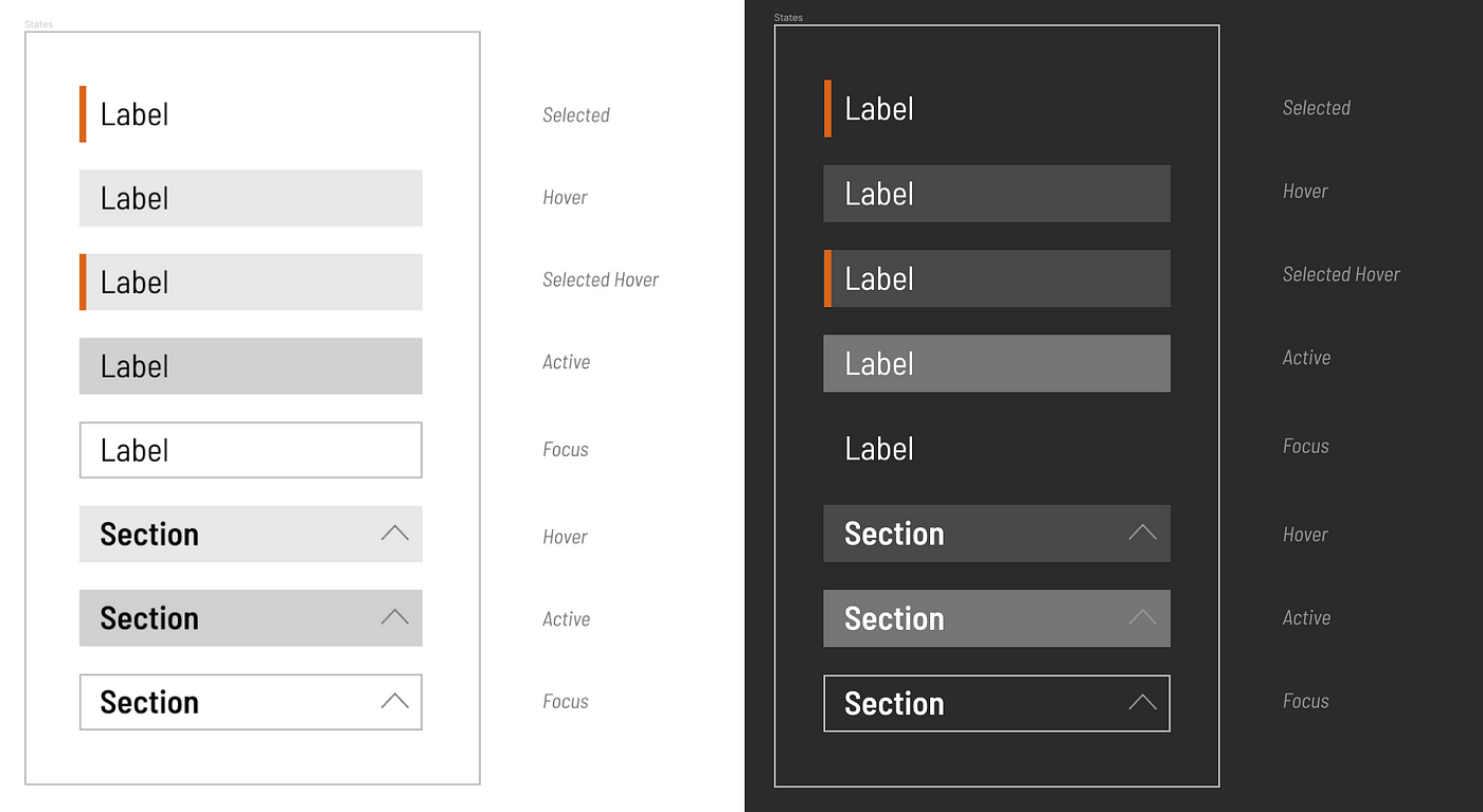
Tokens can specify properties based on interactive states, like:

  • default
  • hover, when a pointer is positioned above an object
  • press / active, between the time a user presses and releases an object
  • focus, when an object is able to accept input
  • disabled, when an object is not able to accept input
  • visited, for alternative link display when already visited
  • error, when an object is in an error state
State level example

States often associate an object (button) or category (color), concept ( action)and property (text) tuple associated with a variant (secondary). This results in a fully formed token like $color-action-text-secondary-focus.

Scale

Tokens scale choices of varying size, space and other options applied to and between things. Common types of scale include:

  • Enumerated values like heading levels’ 1, 2, 3, 4, and 5.
  • Ordered values like Google Material color levels of 50, 100, …, 900.
  • Bounded scales like HSL’s 0 to 100 lightness value to vary shades of a tint, such as slate gray’s slate-42, slate-90, and slate-95.
  • Proportion, often establishing a base 1-x and growing (2-x, 4-x, …) and shrinking (half-x, quarter-x, …) relatively.
  • T-shirt sizes, starting with small (variants: s), medium (variants: m, standard, base, default) and large (variant: l) and expanding to xl, xs, and xxxl. Pro tip: Size ≠ space, so consider using proportion instead of t-shirts for space despite what I said four years ago.

Scale manifests in both generic and purposeful tokens. For example, most systems define generic (aka, primitive) spacers like $esds-space-2-x for 32px and colors like $esds-color-neutral-42 for #6B6B6B that are aliased to purposeful uses of space and color. In this case, 2-x and 42 sit on proportion and lightness scales, respectively.

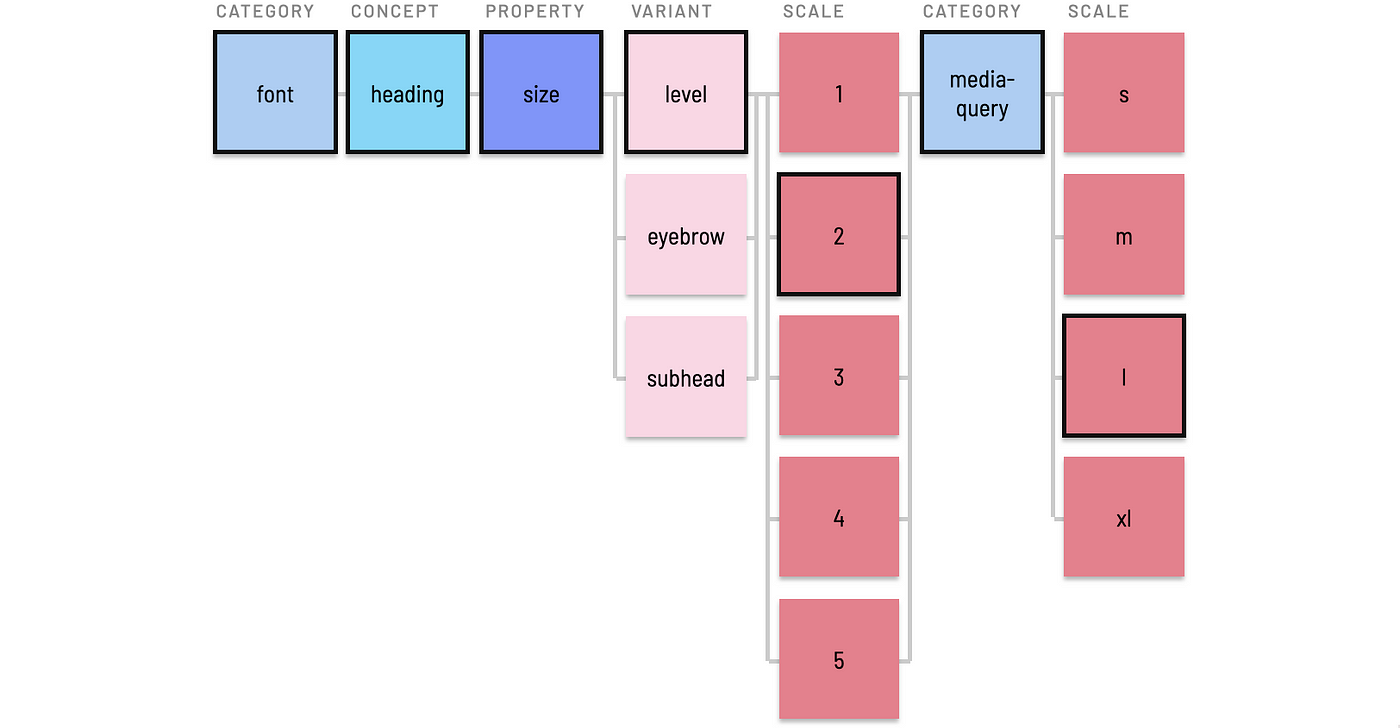
Purposeful token specify a scale (level-1) in the context of category (font), concept (heading) and property (size) for a token like $esds-font-size-heading-level-1 and $esds-font-size-body-small.

Scale level example

Less often, specificity requires chaining concept / scale pairs into one token. For example, a responsive typography system can combine heading as enumerated level (1, 2, 3, …) with media query breakpoints (media-query) as t-shirt sizes (m, l, …) to store a decision like 45px.

Scale level example, with two category / scale pairs

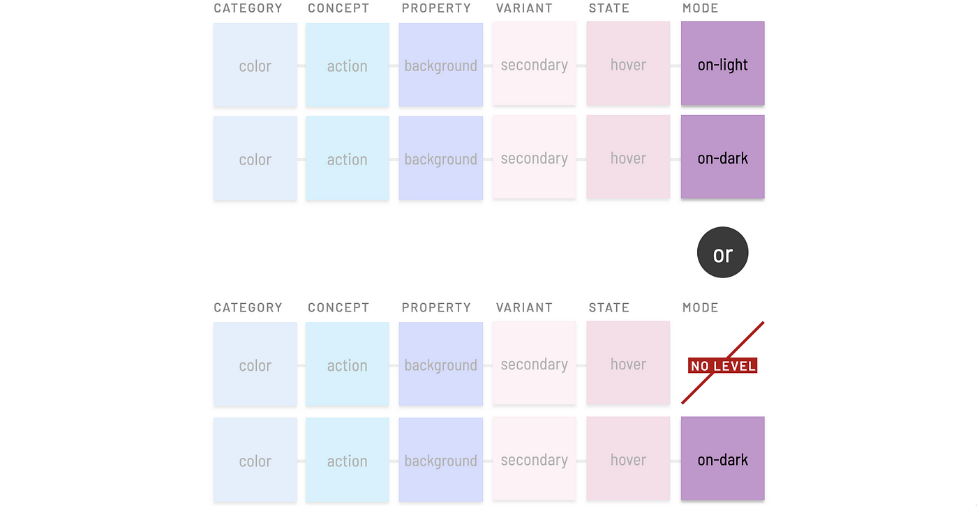
Mode (Usually, for “Light” and “Dark”)

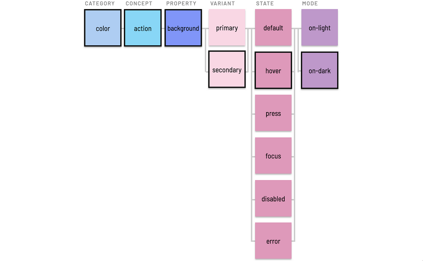
Tokens can employ a mode modifier to distinguish values across two or more surface/background settings on which elements appear. This enables distinct light and dark modes, and expressive systems can also extend to additional brand-color mode (for EightShapes, that’d be orange surfaces on which many of our components rest).

UI elements on a light and dark background

For example, you may need tokens for both $color-action-background-secondary-hover-on-light and $color-action-background-secondary-hover-on-dark to distinguish the hovered background color of items in vertical navigation, vertical filters, and horizontal tabs.

Color mode level token example

This increases the quantity of tokens, but in practice is limited to small subsets and is eased by aliasing simpler values (imagine, $color-accent-hover-on-dark) reusable across many predictable purposes.

Principle: Explicit versus Truncated Defaults

Tokens using mode could assume a default background (typically, “light” or white) and append an on-dark modifier only to “dark” alternatives. This avoids having to add on-light to many tokens where on-dark is irrelevant.

On the other hand, some systems rely upon parallel construction across sibling tokens to predictably iterate over a set, such that on-light, on-dark, and on-brand modified names will be expected and required.

Token naming contrast: include or exclude a level’s default?

Principle: Include or Exclude Modifying Terms?

Tokens read more clearly by prepending terms like on- prior to a label like dark or light. However, on-dark takes more space and requires more effort to type. Such a choices tilts heavily towards personal preferences. Sure, I prefer on-light’s readability to conclude a token. However, my Cap Score opinion (check out Cap Watkin’s “Sliding Scale”) is weak about what the convention is yet strong that a convention exists.

Contrasting example: include or exclude a modifying term?

Tokens promise reuse of purposeful decisions across a component catalog. Nevertheless, there are moments when tokens are reusable across only a few components or —woah! — just a single component. An object level classifies tokens specific to a component, element nested within a component, or a component group. This commonly arises when working on a cluster of components like forms.

For example, an input component uses many existing tokens, such as $esds-color-text-primary to color the textual value. On the other hand, a token collection may have nothing relevant to apply to an input’s border color and roundedness. Generic tokens like $esds-color-neutral-70 and explicit values like 4px will suffice, right?

Within a Component

The border color might be relevant elsewhere, but there’s no guarantee. In that cases, we’ll want to record that component-specific token ($esds-input-color-border) somewhere. But where?

Component level token example

A global token isn’t the place to start. Instead, record it in a place specific to that component, such as input’s design specs or the header of theinput.scss file. These locations are handy for recording decisions using conventional names and referencing past decisions when working on other components.

Component code editor highlighting a token.

Nested Elements

Even atomic components like input can end up having nested elements like icons and links, also relevant candidates for reusing style.

Nested element token example

Tokens specific to a nested element may include both component name and element name, much like the BEM CSS methodology. Element-specific tokens can also emerge in a local context like specs or input.scss, such as $esds-input-left-icon-color-fill, $esds-input-left-icon-size, and $esds-input-inline-link-color-text.

Variants of an input component, annotating border and icon color

Component Groups

A component group like forms (aka ui-controls or form-controls) is relevant for tokens local to one component are also relevant for other related components that together form a meaningful group. For example, Select, Checkbox, and Radio Button may also use $esds-color-neutral-70 for borders.

Component group token example

Since the decision is relevant to many components (my rule of thumb is 3 or more), now is the time to:

  1. Add $esds-forms-color-border to global tokens.
  2. Replace $esds-input-color-border with $esds-forms-color-border.
  3. Remove $esds-input-color-border from input.scss.
  4. Apply $esds-forms-color-border to Select, Checkbox, and Radio.
Input, Select, Checkbox and Radio with border and selected color annotated

Principle: Start Within, Then Promote Across Components

The emergent practice of identifying candidates for and promoting token ideas from local to global locations is a healthy way to add tokens gradually.

Principle: Don’t Globalize Decisions Prematurely

The shared need for a consistent form element border is predictable. Such elements are designed together, and these conventions emerge quickly.

Other cases aren’t as clear cut. Imagine working on tooltip, with popover and menu maybe to come later. A system might reuse shadows and notch roundedness, but can’t guarantee it. In this case, keep tooltip-specific tokens local to that component, and reference them later as work on popover or menu starts. This can avoid annoyingly subjective debates (“These are the notched-layers!”) and polluting a global namespace prematurely.

Small teams working in one namespace with limited collaborators need not worry about levels for namespace. However, given that tokens exist to propagate style across many scopes and platforms, prepending namespace(s) to scope variables to a system, theme or domain can be essential.

System Name

Many systems prepend a namespace level using a:

  • System name, such as comet- or orbit-. Short system names, such as five characters or less, typically work well. Otherwise, settle for a…
  • System acronym for long names, such as slds- (for Salesforce Lightning Design System) or mds- (for Morningstar Design System).

As a result, common tokens namespaced to esds appear to developers as $esds-color-text-primary and $esds-font-family-serif, distinct from and easy to trace relative to the variables a team creates.

Theme

Systems may often offer a theme that shifts color, typography and other styles across a component catalog. For example, an organization like Marriott may defining themes for JW Marriott, Renaissance, W, Courtyard, and other hotels. A theme’s primary purpose would be to flow visual decisions that extend and often override existing tokens. For Marriott’s Courtyard, that may be flowing a branded action color (#a66914) across components like buttons, checkboxes, and selected tab highlights.

Theme token level example

Conventions for naming and flowing tokens in themed architectures is a considerably complicated topic beyond the scope of this article. Different teams set up tools, compilation, and naming structures in different and often very sophisticated ways. However, a few “themes about theming” are posited here to clarify the intent of a theme level.

For example, consider an animation app (supported by, say, the $aads “Animation App Design System”) may offer color themes such as ocean, sands, mountain, and sunset. Each theme may need to vary similar but distinct design tokens in both generalized and specific contexts.

// General tokens to alias thematic colors to many contexts
$aads-ocean-color-primary
$aads-sands-color-primary
$aads-sunset-color-secondary
// Specific token overrides and extensions
$aads-ocean-color-heading-text-1
$aads-sands-color-heading-text-1
$aads-mountain-color-alert-background-success

One way to record token decisions is to append theme (ocean) to a system namespace (like aads), resulting in a narrower namespace of $aads-ocean. This namespace provides system authors a place to map theme-specific values that override and at times extend default token values. For example, when compiling visual decisions for the ocean theme, the following mappings could be relevant:

$aads-color-text-primary 
= $aads-ocean-color-primary;
$aads-color-forms-text-metadata
= $aads-ocean-color-primary;
$aads-color-background-secondary-on-dark
= $aads-ocean-color-primary;

Principle: Theme ≠ Mode. A theme may eventually require on-light, on-dark color applications. Marriott courtyard components may very well require light and dark modes just as much as Marriott renaissance components require. As a result, a theme is orthogonal to a color mode in systems using both concepts.

Domain

While I’ve not yet observed this in practice, I anticipate systems will scale to support ecosystems of tokens for design system tiers. A domain (aka business unit) level offers namespaces for a group to create, isolate, and distribute a set of tokens on their own beyond the set coming from the system’s core.

Domain token level example

For example, a consumer group building marquees, card tile systems, and other promotional components could result in a wide collection of new tokens. This could result in tokens in a consumer namespace like:

$esds-consumer-color-marquee-text-primary
$esds-consumer-color-promo-clearance
$esds-consumer-font-family-marquee
$esds-consumer-space-tiles-inset-2-x

These local decisions may need to be applied across multiple themes (various consumer product lines) or color modes (consumer’s light and dark mode).

Every organization is different, so there’s no conventional names to start from. One bank may divide into credit-card, bank and loan domains, whereas another into sales and servicing groups. An internet company may contrast consumer versus business. Teams may want to distinguish public vs partner vs internal applications. Looking in from the outside, I could imagine a group like Shopify Retail benefiting from “retail” tokens extending what they got from the core Polaris team, and that some of those may be useful to other teams or even promote into a core.

Regardless of level, topics of completeness, order, and polyhierarchy recur in token naming discussions.

Completeness

No single token includes all potential levels. Some levels — domain, theme, element — are rarely needed. Other levels — a quantitative scale versus qualitative variant — tend to be mutually exclusive. Avoid dogmatically including all levels possible or duplicating token-tuples redundantly. Instead, include only the levels needed to sufficiently describe and distinguish purposeful intent.

// Good
$esds-shape-tile-corner-radius
$esds-shape-tile-shadow-offset
// Bad, redundant
$esds-shape-tile-corner-radius-default-on-light
$esds-shape-tile-corner-radius-default-on-dark
$esds-shape-tile-shadow-offset-default-on-light
$esds-shape-tile-shadow-offset-default-on-dark

Order

As evidenced in reviewing tokens across my projects and other public collections, there’s no prevailing token level order. As such, here are some patterns I’ve sensed hold steady:

  • Base levels (category, property, concept) are a backbone in the middle.
  • Levels within Base vary based on preferences for hierarchical strictness (color-interactive-background), readability (interactive-background-color), or keeping levels like category and property paired together (color-background-interactive).
  • Namespaces (system, theme, domain) are prepended first.
  • Modifiers (variant, state, scale, mode) tend to be appended last.
  • Object levels (component group, component, and nested element) are subordinate to namespaces and establish context that can contain and therefore precede base and modifier levels.
  • Order within modifiers isn’t consistent, although mode is often last (given its framing of “on” and use limited to only color and, even then, only when there’s a distinction).

While level order presented here is an option, it’s not the only option. Your system’s level order depends on what levels you use, what your system needs, and the discriminating tastes of each team member.

Polyhierarchy

Concept, category, variant and other levels can overlap and compete. For example, an “error red” can be both concept variant color-feedback-error and object variant of ui-controls-color-text-error (included in packages for Input, Checkbox, Select, and other form controls). This forces us to decide:

At what level(s) do I store this purposeful decision?
Is it ok to store the same decision in two different locations?
If purpose of two different choices is nearly identical, should it be 1 or 2 tokens?

Both color-feedback and ui-controls-color-text concepts have other variants (warning, success, info and label, value, and helper-text, respectively) for which error completes a set. Even if the actual red value is the same, I value the completeness of both sets. Therefore, I would consider aliasing one (the object variant) to the other (the concept variant).

$ui-controls-color-text-error = $color-feedback-error
(= $color-red-36)
(= #B90000)

This also hedges against the possibility that the ui-controls-color-text-error red could be adjusted later without impacting other uses of color-feedback-error, tracing a change to only those values fitting that purpose.

Thinking across so many possible token levels can feel daunting (as can a blog post that’s this long). As you take a look at your tokens next time, be buoyed by the notion that you have a range of choices to make as you craft a vocabulary for your team to share and grow together. Happy naming!

from Medium https://medium.com/eightshapes-llc/naming-tokens-in-design-systems-9e86c7444676

My Five Biggest Design System Mistakes | by Steve Dennis | Sep, 2022

Lessons learned from bootstrapping a small design system from scratch

Image by Midjourney, directed and edited by the author.

A lot of design system articles focus on the ideal or best ways to approach certain problems. There’s a lot less written on what doesn’t work, and what was learned from it.

Our design system team has always been small and scrappy, trying to do what we can with limited resources, often while juggling other responsibilities. I’m incredibly proud of what the team has been able to build, punching way above our weight in some areas. But mistakes were made (often by me), despite good intentions.

Here are my five biggest mistakes, and what I’d do differently next time.

When we built Castor in 2019, one of the major pain points was supporting dark mode and theming. We did this using design tokens. Design tokens have been around as a concept since 2014, but they really started gaining traction in smaller design systems over the last few years. Engineering tools to support them are in a pretty good state, but design tools are still catching up.

Mistake

I advocated for splitting our token architecture into two layers, base tokens, and semantic tokens. The semantic tokens were things like background-main, content-secondary, or border-input and are the colors we encourage designers to design UI with in Figma. We ensure all our components are built using only these tokens so that they support our dark/light mode themes out of the box.

A visual example of what happens to our semantic token values when dark or light themes are applied.

I was concerned about having too many available options and duplications in the palettes available to designers, so I chose a naming approach that aimed for a balance between being broad enough for one color to cover multiple uses, but also being specific enough to know what colors to use in different scenarios.

Examples of our content and background design tokens. content-main, background-main, content-secondary, background-surface, etc…

This was fine… until it wasn’t.

Once we started getting into more complex components, it became hard to make token naming decisions, and the choices to use certain colors in different contexts got further and further away from their intended uses.

To maintain simplicity for users with this approach ended up being too complex to maintain.

Lesson

Don’t overcomplicate decision points. What we should have done was had a simple, fairly static semantic theme palette for general design use, and then have components use their own palettes with hyper-specific token aliases (based on Nathan Curtis’ fantastic article on token naming). This would mean new tokens for every component in the system, which would mean more tokens, but a lot less complexity in decision making.

With the dark/light mode token architecture described above, one of our goals was to allow designers to easily design in either dark or light mode, without the overhead of having to maintain double the number of components.

Mistake

We built the Figma side of our system around a third-party plugin called Themer. It allows us to define color and type tokens as styles in Figma, and dynamically swap frames or whole pages between dark and light mode. Initially, we had a good experience. A few small issues but nothing major.

Figma Community header for the Themer plugin

Then, slowly over time, Figma started to change, and Themer didn’t.

Variants were added as a new component capability. Now, whenever a variant is switched, the component theme resets to the default and has to be reapplied via the plugin. This was a significant problem for general system usability, as we had entire products that were developed in dark-mode exclusively.

Performance also degraded to the point that it’d sometimes take over 10 seconds to apply a theme to a screen. But given the resources we had, switching our approach here would simply take too much time, and wasn’t viable short/medium term.

Lesson

Be very, very careful about relying on third-party plugins. Themer is a great plugin, but at present it’s not best suited to meet our needs, and as such it shouldn’t be an integral part of our system.

Given Figma’s current capabilities, I think I would opt for a dark/light theme toggle setup as a variant. This would allow variants and variant properties to be used without an extra step. It would increase maintenance complexity, but it’d be a worthy trade-off for the system usability improvements.

I hold out hope that Figma may implement native token support in the near future. We don’t want to attempt a big migration to another plugin like Figma Tokens if there’s a chance we’ll have to do another migration to a native solution shortly after.

As a note, we are still using Themer at present, and it’s been fully rewritten recently to solve a bunch of small issues and performance problems, though the variant issue remains a problem.

This is probably the most common one on the list. We went into the project with the best intentions. We absolutely nailed a bunch of aspects of the system, and were incredibly happy with the components we’d built, and the basic usability of the system itself.

Mistake

We failed to put the effort in and publish our documentation early and often. We had an honest attempt early on. We set up a private Zeroheight site, and researched aspects of documentation that we liked and disliked from other design systems. We found some good ones, and tried to replicate them in Zeroheight, but kept running into minor issues and blockers that just got in the way of us writing the content.

A page from our partially finished Zeroheight site.

As we kept building components, I kept putting off documentation for them because we didn’t have a good standard set, a baseline of what the documentation needed to include and how it should be structured.

And we kept putting it off.

As of writing this, we still don’t have good general purpose public documentation available. We have a really nice Storybook instance, which we are very happy with, but nothing that helps explain key system concepts, and design considerations, or helps integrators with accessibility.

Lesson

Don’t let tools get in the way of your writing. Ignore how you lay out images, do’s and don’ts, and color palettes for now, and use whatever tool you’re most comfortable with to get ideas out of your head and shared. The team can iterate from there.

My next step for Castor is to try using Notion (something I’m familiar and comfortable with) to write up the core content, and then figure out whether to keep it there and polish, or look at different solutions.

It’s me. I’m the person. Having been involved in the design of Castor from the ground up, I’ve always felt it is “my baby” to a certain extent. As a result, I tried to involve myself in major decisions, and did a lot of the work myself. While I did put in a lot of effort trying to optimize the process for wider contributions, writing process documentation and setting up process diagrams with our project manager, as a part-timer I should have realized I can’t do everything.

Mistake

A few parts of the system are simply overly complex (the theme tokens for components as mentioned earlier being the main area). Every time a new component requires token changes, I have to handle these myself. They involve lots of manual changes in lots of files across multiple systems. I also have to ensure these changes align with code within a short window of time.

An abstract representation of a system blueprint.
Not an actual system diagram.

At one point we started an iteration on our color tokens to better align the visuals of some of our dark and light mode components to make them a little easier to manage. This work had knock-on effects to a lot of contributions that were already in progress, and they were blocked until these other changes went live. During this time other projects were taking more of my day, my number of direct reports grew, and the time I had to oversee these changes dropped to zero. Components were in a half-finished state for months, and velocity dropped significantly.

Lesson

Design the system to empower the wider team. One of our biggest constraints was the fact that myself and the majority of the team were part-time. I should have spent more effort designing the system to allow more independent contributions, and to document parts of the architecture well enough to allow others to contribute. We should have invested in better tooling to manage token parity between Figma and Code. We developed a plugin during a hack-day, but never got it into production.

Once we secure more resources to work on improvements, I’ll prioritize some of this tooling and refine the process to be a lot less complex, more distributed, and asynchronous.

Design systems can be a lot of fun to design and build. You spend months sweating over details, making plans, and trying to justify your impact. When you’re that close to something, you can sometimes take for granted that your work is visible and understood outside of your team.

We did a handful of company-wide slide decks and presentations before and after launch to build awareness, but nothing sustained or targeted.

A slide explaining the name Castor. 30% Pretentious Marketing Name, 70% Reference to Castor Troy from Face/Off.

Mistake

Despite great efforts building the system, planning and coordinating the initial migration, seeking contribution from the wider team, and working on a robust metrics system, ultimately I failed to effectively communicate the value of continued investment as broadly within the company as I needed to. We lost our full-time engineer to a re-org, and a few larger projects hitting at once further constrained what our part-timers were able to achieve.

Lesson

Set aside time to plan communication. Ensure there are regular communication channels where the team’s work and impact is highlighted. This could be a monthly newsletter, quarterly talks to the company, or more 1:1s to engage business leaders to discover their problems and concerns, and ensure it’s clear where you can help.

Continually justifying your own existence is an exhausting reality that a lot of design systems folks face daily, but I think with more planning in our communication, we could have had more impact with less stress than we have to date.

Everyone makes mistakes, and no one is able to design a perfect system. What’s important is having the self-awareness to identify those mistakes, and apply and share the lessons, so you and others don’t run into the same problems over and over again.

So, what’s your biggest design system mistake?

Thanks for reading. If you get value from stories like this and want unlimited access to all the content on Medium, consider becoming a Medium member. It only costs $5 a month, and that money will help support me, and other writers you read on Medium.

If these articles are relevant to your job, you might even be able to justify it as a learning & development expense! Food for thought.

from Medium https://medium.com/@subcide/my-five-biggest-design-system-mistakes-4725859926c2

Designing with AI: prompts are the new design tool

Designing with AI: ‘prompts’ are the new design tool

Exploring AI image generation.

The prompt

sci-fi dream autumn landscape with a white castle, colorful autumn maple leaves, trees, satellite view, hyper detailed, dreamy, volumetric lighting

The image

Midjourney prompt created using www.promptmakr.com

I am sure by now you have heard about AI image generators like Midjourney, Dall-E, Stable Diffusion, Nightcafe etc. Irrespective of which tool you use, what’s surprising is the fact that now you can give simple text instructions to a machine and it will generate some amazing images for you like the example above.

But you must also be wondering, then why is it that not everyone is able to produce these stunning images we see from others on Midjourney showcase or Instagram.

Introducing “Prompt Engineering”

The answer lies in what is known as — Prompt Engineering. Prompt Engineering is the concept in Natural Language Processing (NLP). Usually machine learning models are trained using millions and millions of data points and they start forming their own knowledge base, so one can never really figure out what the machine has learned. The best way to know what the machine knows is to craft different prompts and see what output we get.

The art of generating desired images through these Text-to-Image generators lies in gaining a good understanding of this knowledge. This is where Prompt Engineers come into the picture.

Prompt Engineers are people who have mastered the art of writing prompts that give consistent good results and leverage most of the features provided by the image generator engines. In this article we will focus mainly on Midjourney prompt engineering and learn the nuances of writing good prompts as well as some tricks to generating stunning images.

Basic prompts

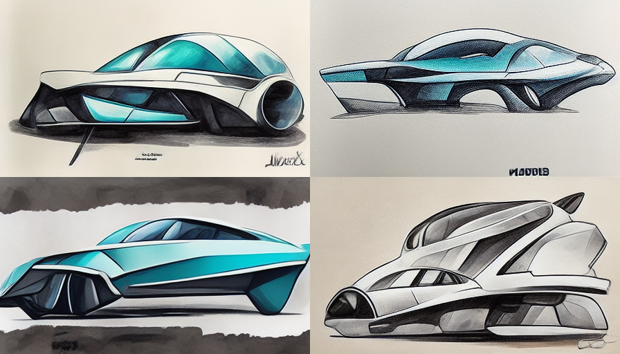
Let’s look at two prompts and the images they generated.

Left image:

side profile car

Right image:

industrial design side profile sketch of a futuristic car, illustration, copic marker style, modern vehicle, creative
Midjourney prompt created using www.promptmakr.com

As you can see, the images on the right-hand side are more consistent and give us a result in the desired style while the images on the left are also nice but the styling was chosen by the algorithm.

This also tells us that Midjourney has learned what a Copic marker-style industrial design sketch looks like. It can also understand simple instructions like side view, front view, top view etc.

Let’s look at one more example.

Left image:

portrait of a humanoid

Right image:

portrait of a humanoid with exposed brain made of complex mechanical parts, bokeh, Nikon, f 1.8, cinematic lighting, robotic, octane render
Midjourney prompt created using www.promptmakr.com

Once again, you can see, there are more things Midjourney knows and can help with your image rendering. Here we used its knowledge of a specific camera (Nikon), F-Stop of the lens (f 1.8), type of lighting, and lastly a rendering engine (Octane) too.

The more you know about what Midjourney has learned, the more you can take advantage of it, and the best way to find about is to play with it as much as you can.

What do we already know?

So is there a complete list of things Midjourney has been trained on? Well, not really. But, some of the things Midjourney can understand are listed on the Midjourney website here.

We know that Midjourney can understand things like:

  • Different Art styles
    – Japanese Anime, Steam Punk, Cyber Punk, Post Modern, Surreal etc.
  • Famous and popular Artists
    – Andy Warhol, Da Vinci, Monet, Waterhouse, Picasso, Dali etc.
  • Types of realism
    – Photorealistic, Hyper detailed, Sharp focus, Atmospheric etc.
  • Rendering engines
    – Octane render, VRay, Unreal engine, Ray tracing etc.
  • Lighting Styles
    – Volumetric, Cinematic, Soft box, Glowing, Rim light etc.
  • Camera positions
    – Wide angle shot, Ultra wide angle shot, Portrait, Low angle shot etc.
  • Types of cameras
    – Nikon, Sony, Leica M, Hasseblad etc.
  • Photographic styles
    – Macro, Fisheye, Polaroid, Kodachrome, Early wet plate etc.
  • ISO
    – Different ISO values to simulate film grains.
  • Resolution
    – HD, 8K, Full HD etc.

Apart from these kinds of image parameters, Midjourney can also be instructed to do some specific things like:

  • Add chaos
    – A numeric value between 0–100 defines how random and unique the generated image will be.
  • Stylize
    – The stylize argument sets how strong of a ‘stylization’ your images have, the higher you set it, the more opinionated it will be
  • Aspect ratio
    – Default images are 1:1 square images. But you can define any aspet ration you want your image to be.
  • Image size
    – This allows you to specify pixel size for your images (size ranging from 256 to 2034 pixels).
  • Image URL
    – Reference images for Midjourney to simulate the look.

… and much more.

Prompt Examples

Here are some more examples images and the associated prompts.

Apocalyptic chaos

lots of people in front of a military vehicle, food distribution, apocalyptic, chaos, foggy, fantastic backlight, fight, Octane render, back light, cinematic, ISO 400, 8K, --chaos 100 --s 2500 --q 1 --ar 4:5
Midjourney prompt created using www.promptmakr.com

Futuristic home

futuristic house in the middle of a rain forest, fill screen, organic shaped curved glass windows, modern interiors, night scene, fantastic lighting, octane render, 8K, ultra detailed, --ar 16:9
Midjourney prompt created using www.promptmakr.com

The workshop

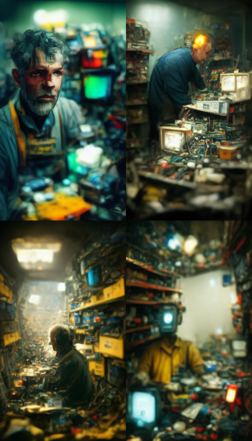
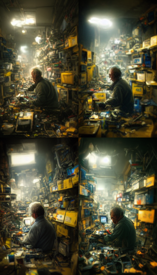
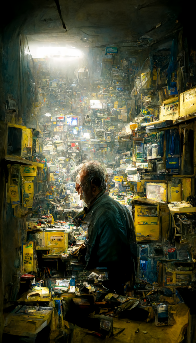
closeup of a man behind a desk inside a highly cluttered old electronics repair shop, walls filled with electronics junk equipments, broken electronics, cables, wires, walls filled from floor to ceiling, dim lighting, single bulb hanging from the ceiling, hyper realistic, --ar 9:16
Midjourney prompt created using www.promptmakr.com

The process

As you can see, you can get pretty crazy with these prompts, and you will be pleasantly surprised by how much Midjourney knows and can accurately depict whats on your mind.

But there is a process to achieving these results. You will most likely never get the perfect result in the first attempt.

So whats the trick?

Let’s go over this last example of the workshop image and follow the steps to demonstrate how I achieved this.

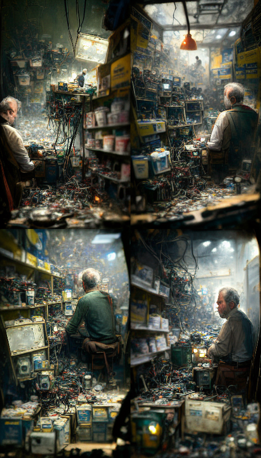
After I entered the prompt, these were the 4 variations I got.

Midjourney prompt created using www.promptmakr.com

As you can see, Midjourney gives you a good variation to start with. I liked the image at the bottom left. It was closet to what I was thinking of. So I asked Midjourney to create more variations of this image. The resulting 4 variations looked like these:

Midjourney prompt created using www.promptmakr.com

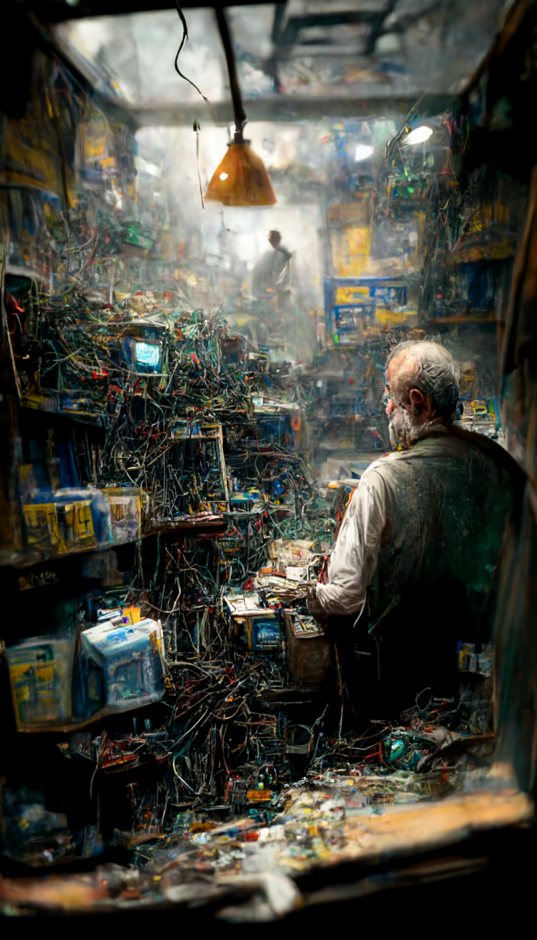
From these, the top right one looked good to me in terms of lighting and composition. So I first “upscaled” it. Below is the upscaled image.

Midjourney prompt created using www.promptmakr.com

I was liking where this was going, so I once again created variations of this image and got these results.

Midjourney prompt created using www.promptmakr.com

Now this was starting to look like the kind of space I was visualizing. The top right one seemed like the one I wanted. So I “upscaled” this one too (below).

Midjourney prompt created using www.promptmakr.com

I really liked this image. I could have stopped here and this would have been a great image for someone looking for a rustic, painterly look. But I wanted to also try and see what “Remaster” feature will do to this image. So I remastered it and this is what it generated:

Midjourney prompt created using www.promptmakr.com

I still love the rustic style of the non-remastered image, but the remaster feature really cleaned up a lot of clutter and made is more realistic.

Remastering is an experimental feature which lets you increase the quality and coherence of the image. You can try it and see if you like. It all depends on your taste and the graphic style you are seeking.

Conclusion

As you can see, there is a lot that goes into creating a good image through these text-to-image AI tools. If you are quipped with the right tools, knowledge, and process, you can start creating some amazing art and graphics using Midjourney.

On one hand it sounds really scary to me as a designer, but on the other hand I see this as another evolution of the art industry and the tools we use.


Designing with AI: prompts are the new design tool was originally published in UX Collective on Medium, where people are continuing the conversation by highlighting and responding to this story.

from UX Collective – Medium https://uxdesign.cc/prompts-are-the-new-design-tool-caec29759f49?source=rss—-138adf9c44c—4

One formula to rule them all: the ROI of a Design System

Co-authored with Guido Baena Wehrmann (Guidobw)

TL;DR: Design systems are a crucial success factor for digital businesses, and virtually every major player works with one. Still, they can sometimes be hard to sell to management. Here’s a ready-to-use formula to calculate the ROI of any design system.

Design systems have become a standard in the digital industry. Virtually every big player uses one — from Amazon over Google and Airbnb to Uber. There have been numerous studies and reports on their efficacy in improving productivity, reducing bugs, and improving digital products (e.g., Boehm & Basili, 2001; Klüver, 2019; Loomer, 2016; Ray, 2018; Slack, 2019; Sparkbox, n.d.). And yet — as we have experienced in various jobs firsthand — it’s still a common situation that the value of having a design system has to be proven again and again.

For many features implemented in digital products, a simple competitive benchmark is enough to convince management, particularly in e-commerce. “If everyone else is doing it, we can just copy with pride,” is an often-heard statement. But the same standard seems not to apply to design systems.

This is most probably due to the fact that, at least at first, design systems are perceived as a very abstract investment — the value they’ll ultimately produce is not immediately visible and noticeable. On top, the upfront investment can seem huge to management compared to smaller, more concrete features design and development teams could be working on that produce more graspable value (and technical/design debt) more quickly.

Hence, the necessity to prove the value of a new design system beyond a simple competitive benchmark is a reality everyone who wants to get started with this topic must face, as Ben Callahan has already noted in a previous article on the topic (Callahan, 2021). We’ve personally done it time and again.

To make this reality more manageable for everyone, based on our experience, we’ve devised a general formula to approximate the return of investment (ROI) of a design system with a minimum of parameters. We see this as a handy complement to the great but a little more strategic advice Callahan (2021) already provides on how to sell a design system.

In the following, we will first give a very brief introduction to design systems. Subsequently, we’ll introduce our formula, elaborate on the assumptions we made, and explain the different parameters you can tweak. We’ll conclude with a specific example of how to apply it.

A Very Brief Introduction to Design Systems

A design system is a “collection of reusable components, guided by clear standards, that can be assembled together to build any number of applications.” (Fanguy, 2019). Examples of design systems are Material Design by Google, Lightning by Salesforce, and Polaris by Shopify. Zalando also has a design system, about which they regularly write on Medium. In general, it is safe to say that design systems have become a staple in every serious digital organization, independent of the kind of industry.

It is important to note here that design systems should not be confused with mere style guides or simple component libraries (Speicher, 2020). A true design system spans the whole organization in terms of interaction and visual design, engineering, brand design, content, and so on. It introduces clear guidelines on how and why to use them, particularly in combination, on top of the ‘simple’ components.

“A design system [sometimes also called a ‘design language’] is a set of standards to manage design at scale by reducing redundancy while creating a shared language and visual consistency across different pages and channels.”
 — 
Fessenden (2021)

It allows for creating and replicating design work quickly and at scale, alleviating strain on design and development resources. It leads to less repetitive work, which enables a focus on larger, more complex problems, more creativity, more innovation, and therefore has a wide range of advantages:

  • More quality and consistency (cf. Wong, 2019);
  • Reduced time inefficiency;
  • A unified language within and between cross-functional teams;
  • Visual consistency across products, channels, and departments;
  • An educational tool and reference, e.g., for quicker onboarding;
  • A single source of truth for designers, developers, and all other stakeholders.

We believe that if Henry Ford lived today and worked on a digital Model T, he’d use a design system.

There are different ways a design system can be built and maintained within an organization, the two most popular ones being the centralized model and the federated model (Curtis, 2015). We base this article, and our formula, on the federated model, which means that designers and developers work out “what the system is and spread[ing] it out to everyone else. Without quitting their day jobs on product teams.” (Curtis, 2015) We do this for two reasons.

First, if you have trouble gaining management buy-in in the first place, arguing for a centralized model — with a dedicated team taking care of the design system — might only complicate the mission further. A federated approach is a good starting point because designers and developers can simply get working on the design system ‘on the side.’ It can then be transformed into a centralized model — or a hybrid one (cf. Manwaring & Mateo, 2018) — once the value of the design system has been recognized.

Second, in a centralized model, a design system often evolves into a product of its own, complete with product managers, customer support, and so on. However, for the sake of keeping our formula as feasible as possible, we’re focusing only on designers and developers in the following. Design system‒induced productivity gains for such teams are easy to benchmark, and you’ll see that just this limited scope already makes for a very compelling case.

The ROI of a Design System

cost = max((240/X), 6) * X% + min(60-(240/X),54) * Y% | gain = max((120/X), 3) * (Z%/2) + min(60-(240/X), 54) * Z% | ROI = ((gain-cost)/cost) * 100

Our design system ROI formula has two components:

  1. What you’ll gain over time from the design system you build;
  2. What building and maintaining will cost you.

Having calculated these two components, it’s straightforward to use them in the standard formula to calculate ROI. In the following, we’ll explain all of the different parts in more detail.

Assumptions

Our formula orients at the ‘Design System Efficiency Curve,’ i.e., at first, you’ll see a drop in productivity due to the necessary upfront investment. Still, after a break-even point where the design system has grown enough to compensate for that, productivity gains are significant.

A diagram with time on the x-axis and productivity on the y-axis. A horizontal line at ca. 50% productivity denotes the constant base state without a design system. The curve for “with a design system” first lies under that line, then crosses it and is well above that line in the long-run.
Fig. 1. The ‘Design System Efficiency Curve.’ Taken from Callahan (2021).

For a specific formula, however, it’s necessary to make some (conservative but adjustable) assumptions. In our case, we have agreed on the general assumptions below in discussions within a design system task force comprising representatives from our design and engineering teams at BestSecret Group.

cost = max((240/X), 6) * X% + min(60-(240/X),54) * Y% | gain = max((120/X), 3) * (Z%/2) + min(60-(240/X), 54) * Z% | “240” set in red, “6” in light green, “60” in dark blue, “54” in light blue, “120” in pink, “3” in dark green
  1. A design system is ‘good’ for five years (= 60 months). That is, we anticipate a major revamp roughly every five years, e.g., due to a change in brand identity. This is where the 60 in the formula comes from. We’re well aware that a brand redesign is, of course, no reason to throw away everything and start from scratch again and that a design system might even make a rebrand much easier. However, please bear in mind that we want to make very conservative assumptions here and that if a business decides to shake up things, it would still be necessary to adjust a lot of things in a design system that go beyond pure day-to-day maintenance.
  2. The estimate of our designers and engineers was that if one initially invests 20% of their time into building the design system, it will take them 12 months to get it up and running. If they invest less or more, the ramp-up phase will become longer or shorter in a linear manner because a given design system will always need the same amount of effort put into it. Please note that this assumption varies with the amount of person-power a company could put into a design system. Obviously, if there are 200 designers and 200 developers who could all spend 20% of their time on a design system, things might move much faster than 12 months, and the 240 and 120 in the formula could be tweaked accordingly. We consider our assumption reasonable for an ‘average’ set-up with ~10 designers and ~30 developers (plus/minus).
  3. However, a design system takes at least 6 months to set up. Anything less would be unrealistic in a real-world setting (due to coordination and alignment efforts), and we anticipated that probably no business would agree to invest more than 40% of designers’ or developers’ time in setting up a design system. That’s why we have included the max and min functions in the formula, and that’s where the 6 and 54 (60 months minus 6 months) come from.
  4. For the first half of the ramp-up phase, we have no productivity gains yet.
  5. For the second half of the ramp-up phase, we have 50% productivity gains. That’s why we have 3 instead of 6 in the gain part of the formula.
  6. After the ramp-up phase, we have full productivity gains.

With these assumptions in place, we can now have a look at what the parameters X, Y, and Z mean.

Parameters

cost = max((240/X), 6) * X% + min(60-(240/X),54) * Y% | gain = max((120/X), 3) * (Z%/2) + min(60-(240/X), 54) * Z% | “X” set in purple, “Y” in orange, “Z” in gold

X denotes the percentage of time invested in building the design system. If X=20, the formula gives us 240⁄20=12 months of ramp-up phase.

Note: For X<4.62, the formula “breaks down” since the ramp-up phase would be ≥5 years.

Y denotes the percentage of time invested in ongoing maintenance after the ramp-up phase. In our specific case, we assumed 0.5X, but essentially, Y could be anything.

Z denotes the amount of time saved by using the design system in percent. This is equal to productivity or efficiency gains.

X and Y are relatively straightforward to specify: you ‘just’ have to agree on how much time you want to / can spend taking care of the design system. However, Z is a different story. Since it’s the productivity gain yielded by the design system, it’s impossible to know the parameter precisely beforehand. So, how can we estimate Z in a meaningful way? Essentially, this is a predictive judgment, so we followed the advice by Kahneman et al. (2021) — considering the base rate of design system productivity gains by doing a literature review and averaging the numbers reported.

The existing studies about design system productivity gains we found most convincing were Klüver (2019), Loomer (2016), Ray (2018), Slack (2019), and Sparkbox (n.d.).

Klüver (2019), Ray (2018), and Slack (2019) report 50%, 31%, and 34% better efficiency for design teams, which means an average of Z=38.

Klüver (2019), Loomer (2016), and Sparkbox (n.d.) report 25%, 20%, and 47% better efficiency for development teams, which means an average of Z=31.

Hence, in our case, we calculated ROI separately for design and development teams with the two different values for Z, and then aggregated it afterwards. In the next section, we’ll guide you through how exactly that works.

Example

Acme, Inc. has a team of 5 designers and a team of 10 developers who want to kick off building a design system together. They want to prove that the gains yielded by a design system in the mid- to long-term far exceed the necessary investment. Therefore, they grab the design system ROI formula and get going.

They estimate that everyone would probably be able to invest 30% (X=30) of their time during the ramp-up phase and afterwards 10% (Y=10) for maintenance. They moreover rely on the above base rates for productivity gains (Z=38 for design, Z=31 for development). They start with the ROI for the design team over the next five years.

Design

On the cost side, 30% time investment means the ramp-up phase would be 240/30 = 8 months long. That is, 8*30% = 2.4 months would be effectively spent on building the design system. Afterwards, 60-8 = 52 months remain for the 5-year period, and of those, 52*10% = 5.2 months would be effectively spent on maintenance. Overall, there would be 7.6 months (out of five years) of work put into the design system.

cost = max((240/30), 6) * 30% + min(60–(240/30), 54) * 10% <=> cost = 8*30% + 52*10% = 2.4+5.2 = 7.6

On the gain side, a ramp-up phase of 8 months would mean four months of half the productivity gains. That is 4*(38%/2) = 0.76 months. Afterwards, for the remaining 52 months, we would see full productivity gains, i.e., 52*38% = 19.76 months. Overall, the design system would therefore save the design team 20.52 months of needless work.

gain = max((120/30), 3) * (38%/2) + min(60–(240/30), 54) * 38% <=> gain = 4*19% + 52*38% = 0.76+19.76 = 20.52

Together with the 7.6 months of work spent on building and maintaining the design system, this yields an ROI of (20.52-7.6)/7.6 = 170%. In other words, you get $2.70 back for every dollar invested in the design system.

If one designer costs $5,000 a month, that means the design system would cost Acme, Inc. 7.6*$5,000*5 = $190,000 while it would save them 20.52*$5,000*5 = $513,000 when looking at the design team alone.

Development

Doing the same thing for development is relatively straightforward based on the above. Since the designers and developers at Acme, Inc. agreed on everyone investing 30% for ramp-up and 10% for maintenance, the cost side stays exactly the same. Like the designers, the developers will be busy with the design system for effectively 7.6 months over five years.

On the gain side, however, we have to exchange the value for Z, from 38 to 31. Luckily, that’s the only thing, and the rest remains as above.

gain = max((120/30), 3) * (31%/2) + min(60–(240/30), 54) * 31% <=> gain = 4*15.5% + 52*31% = 0.62+16.12 = 16.74

So, in the case of development, we’d invest 7.6 months and save 16.74 months of unnecessary work. This gives us an ROI of (16.74-7.6)/7.6 = 120%.

If one developer costs $6,000 a month, that means the design system would cost Acme, Inc. 7.6*$6,000*10 = $456,000 while it would save them a whooping 16.74*$6,000*10 = $1,004,400 when looking at the development team alone.

Bringing It All Together

Combining the calculations for design and development, therefore, yields the following:

Design:

  • costs = $190,000
  • gains = $513,000
  • ROI = 170%

Development:

  • costs = $456,000
  • gains = $1,004,400
  • ROI = 120%

Total:

  • costs = $646,000
  • gains = $1,517,400 (net gains = $871,400)
  • ROI = (1,517,400–646,000) / 646,000 = 135%
A bar chart made of stacks of dollar bills illustrating $646,000 in costs, $1,517,400 in gains, and $871,400 in net gains. Next to that, we reiterate the ROI formula and indicate 135% ROI.
Fig. 2. Overall costs, gains, net gains, and ROI from our Acme, Inc. example.

To top things off and make them look more like an approximation, you can round the final numbers and indicate the error. We’ve played around with some variance in the parameters (please feel free to do so on your own) and for the final result, ±25% seems to be reasonable. For instance, “we estimate 135% ROI and $900,000 (±225,000) net gains from the design system over five years.”

Conclusion

Based on Ben Callahan’s ‘Design System Efficiency Curve’ and our own experiences with pitching design systems to management, we have devised a general formula with only three parameters for quickly and easily calculating the ROI of a design system. We hope this formula will prove useful to our many colleagues that are just as excited about design systems as we are and want to get started working on this. As a little additional helper, you can download our design system ROI calculator in Excel.

We know all of this is just an approximation based on a lot of assumptions. Additionally, we have only considered designers and developers in a federated model here, and not dived deeper into topics like onboarding benefits, scale benefits, consistency and trust benefits, and better accessibility and usability, which all provide value on top of plainly being more productive (Callahan, 2021).

Also, we have not considered productivity gains for product, QA, and user research teams and so on (who as well benefit from a design system) in our formula. One reason for this is simplicity — we wanted to provide a formula that is feasible and easily understandable. Another is that efficiency gains in design and development teams are at the core of a design system, and benchmarks are widely available for determining the parameter Z. (All this, however, also means that the true ROI of a design system is probably much higher than what our formula yields, which makes the case even stronger rather than weaker.)

Despite all these limitations in our approach, the value of a design system is undeniable. We’re confident that our formula can reliably prove this and help build a compelling case, at the very least, for cases similar to ours. Otherwise, the underlying assumptions can be easily fine-tuned. And if in doubt, it’s always possible to implement a design system MVP and prove its value through a controlled experiment. We just hope we can help you get that MVP approved.

☕ I love coffee, and if you enjoy what I write, you can spend me one if you like, or subscribe to my newsletter. 🗞️

Acknowledgments

We want to thank Ben Callahan and Martin Schmitz for taking the time to read earlier drafts of this article and providing invaluable feedback. And, of course, a big shout-out to all members of the BestSecret Design System Task Force.

References

Boehm, Barry, and Victor R. Basili. “Top 10 list [software development].” Computer 34, no. 1 (2001): 135–137.

Callahan, Ben. “The Never-Ending Job of Selling Design Systems.” A List Apart, February 9, 2021. Accessed July 28, 2022.

Curtis, Nathan. “Team Models for Scaling a Design System.” EightShapes, September 17, 2015. Accessed August 4, 2022.

Fanguy, Will. “A Comprehensive Guide to Design Systems.” Inside Design Blog, June 24, 2019. Accessed July 28, 2022.

Fessenden, Therese. “Design Systems 101.” Nielsen Norman Group, April 11, 2021. Accessed July 28, 2022.

Kahneman, Daniel, Olivier Sibony, and C. R. Sunstein. Noise. HarperCollins UK, 2021. (this is an affiliate link)

Klüver, Anja. “Design as an Agent for Change: The Business Case for Design Systems,” YouTube video, 29:45, November 29, 2019.

Loomer, Drew. “How Your Company Benefits by Building a Design System.” Projekt202, October 13, 2016. Accessed July 28, 2022.

Manwaring, Brendon, and Josh Mateo. “The Paradox of Design Systems.” Spotify Design, December 2018. Accessed August 4, 2022.

Ray, Bryn. “How Much Is a Design System Worth?” UX Collective, July 19, 2018. Accessed July 28, 2022.

Slack, Clancy. “Measuring the Value of Design Systems.” Figma, December 19, 2019. Accessed July 28, 2022.

Sparkbox. “The Value of Design Systems Study: Developer Efficiency and Design Consistency.” Sparkbox.com, n.d. Accessed July 28, 2022.

Speicher, Maximilian. “What’s a Design System, Design Language, and Design Language System? And What’s the Difference?” The Startup, May 31, 2020. Accessed July 28, 2022.

Wong, Euphemia. “Principle of Consistency and Standards in User Interface Design.” The Interaction Design Foundation, October 2019. Accessed July 28, 2022.

Copyright © 2022 by Maximilian Speicher & Guido Baena Wehrmann ● Originally published by Smashing Magazine


One formula to rule them all: the ROI of a Design System was originally published in UX Collective on Medium, where people are continuing the conversation by highlighting and responding to this story.

from UX Collective – Medium https://uxdesign.cc/one-formula-to-rule-them-all-the-roi-of-a-design-system-d3722ccefa14?source=rss—-138adf9c44c—4

The new wave of Javascript web frameworks

Introduction

Staying current in the Javascript ecosystem is not for the faint of heart.

It’s challenging for those entering the industry to follow what’s happening amongst the new libraries, frameworks, concepts, and strong opinions.

It’s a good reminder that if you’re on the bleeding edge, you are usually the one bleeding. Defaulting to “boring” technologies, ones you are familiar with, and being a late adopter is often a great choice.

With that said, this post will get us up to speed on the bleeding edge of frameworks in the Javascript ecosystem.

We’ll make sense of the current landscape by looking at the past pain points when building large-scale web applications.

Rather than focus on the proliferation of solutions, we’ll dive into the underlying problems. Where each framework gives different answers and makes different trade-offs.

By the end, we’ll have a high-level model of popular frameworks like React, Svelte, Vue, Solid, Astro, Marko, Fresh, Next, Remix, Qwik, and the “meta frameworks” fit into today’s landscape.

It’s helpful to understand the past to make sense of the present. We’ll start with a trip down memory lane to see the path behind us.

This story’s been told before. This time we’ll focus on the problems on larger projects that sparked alternative approaches and ways of thinking.

A handwavy history of web pages

The web began as static documents linked together. Someone could prepare a document ahead of time, and put it on a computer.

The cool thing now was that somebody else could access it — without having to move their physical body to the same geographic location. Pretty neat.

At some point, we thought it would be cool to make these documents dynamic.

We got technologies like CGI that allowed us to serve different content based on the request.

We then got expressive languages like Perl to write these scripts. Influencing the first language explicitly built for the web – PHP.

The nice innovation with PHP was connecting HTML directly to this backend code. It made it easy to programmatically create documents that embedded dynamic values.

One of the most significant breakthroughs for the web was going from this:

<html>
	<body>
	This document has been prepared ahead of time.
	Regards.
	</body>
</html>

To having easily embedded dynamic values:

<html>
	<body>
	Y2K? <?php echo time(); ?>
	</body>
</html>

Pandora’s box opened

These dynamic pages were a hit. We could now easily customize what we sent to users, including cookies that enabled sessions.

Server-based templating frameworks emerged across the language ecosystems that were now talking to databases. These frameworks made it easy to start with static pages and scale up to dynamic ones.

The web was evolving quickly, and we wanted more interactive experiences. For this we used browser plugins like Flash. For everything else, we would “sprinkle” Javascript fragments over the HTML served from the backend.

Tools like jQuery and Prototype cropped up and smoothed over the rough edges of web APIs and the quirks between the competing browsers.

Fast forwarding and hand waving. Tech companies were getting bigger, and as projects and teams grew, it was common for more business logic to creep into these templates.

Server code was being written to massage data into the server templating language. Templates often evolved into a mishmash of business logic that accessed global variables. Security was becoming a concern, with attacks like SQL injection commonplace.

Eventually we got “Ajax: A New Approach to Web Applications”.

The new thing you could do now was update the page asynchronously, instead of a synchronous refresh.

This pattern was popularized by the first big client-side applications like Google maps and Google docs.

We were starting to see the power of the web’s distribution for desktop-style software. It was a significant step forward compared to buying software on CDs down at the shops.

Javascript gets big

When node came around, the new thing it enabled was writing your backend in the same language as the frontend. All in async-first model developers were familiar with.

This was (and is) compelling. With more businesses coming online, the competitive advantage was being able to ship and iterate fast.

Node’s ecosystem emphasized reusing small single-purpose packages you could grab off the shelf to get stuff done.

The frontend backend split

Our appetite for a web that could rival desktop and mobile continued to grow. We now had a collection of reusable “widget” libraries and utilities like jQuery UI, Dojo, Mootools, ExtJs and YUI etc.

We were getting heavy on those sprinkles and doing more in the frontend. This often led to duplicating templates across the frontend and backend.

Frameworks like Backbone and Knockout and many others popped up. They added separation of concerns to the frontend via the MVC, MVVM et al. architectures, and were compatible with all the widgets and jQuery plugins we had collected.

Adding structure helped scale all this frontend code. And accelerated moving templates over from the backend.

We were still writing fine-tuned DOM manipulations to update the page and keep components in sync. This problem was non-trivial, and bugs related to data synchronization were common.

Angular, backed by Google, stepped onto the scene. It promoted a productivity boost by powering up HTML to be dynamic. It came with two-way data binding, with a reactivity system inspired by spreadsheets.

These declarative two-way bindings removed much of the boilerplate in updating things imperatively. This was nice and made us more productive.

As things scaled, it became hard to track down what was changing and often led to poor performance. Where cycles of updates would happen, occupying the main thread (today libraries like Svelte keep two-way bindings while mitigating their downsides).

Beside the rise of mobile, these productivity-boosting frameworks accelerated the frontend backend split.

This paved the way for exploring different architectures that emphasized this decoupling.

This was a major part of the JAMstack philosophy, which emphasizes pre-baking HTML ahead of time and serving it from a CDN.

At the time, this was a throwback to serving static documents.

But now we had a git-based workflow, robust CDN infrastructure that didn’t rely on a centralized server far away, and decoupled frontends talking to independent APIs. Chucking static assets on a CDN had much lower operational cost than operating a server.

Today, tools like Gatsby, Next, and many others leverage these ideas.

React rises

Hand waving and fast forwarding into the era of big tech. We’re trying to move fast and break things.

For those entering the industry, Javascript was big, and building a decoupled SPA backed by a separate backend was becoming the status quo.

There were a couple of challenges that React was born from at Facebook:

  1. Consistency when data changes frequently: Keeping many widgets in sync with each other was still a significant challenge. A lack of predictability in the data flow made this problematic at scale.

  2. Scaling organizationally: Time to market and speed were prioritized. Onboarding new developers who can get up to speed quickly and be productive was essential.

React was born and the cool new thing you could do was write frontend code declaratively.

Separation of concerns on the frontend was famously re-thought, where previous MVC frameworks didn’t scale.

Moving up from templates to Javascript-driven JSX was initially hated. But most of us came around.

The component model allowed for decoupling separate frontend teams, who could more easily work on independent components in parallel.

As an architecture, it allowed the layering of components. From shared primitives, to “organisms” composed up to the page’s root.

A unidirectional dataflow made the data flow easier to understand, trace and debug. It added the predictability that was hard to find previously.

The virtual DOM meant we could write functions that returned descriptions of the UI and let React figure out the hard bits.

This solved the consistency issues when data changed frequently and made the composition of templates much more ergonomic.

React at scale – hitting CPU and network limits

More fast forwarding. React’s a hit and has become an industry-standard — often even for sites that don’t need its power. At the far end of scale, we start to see some limits.

Running up against the CPU

The DOM was a problem with React’s model. Browsers weren’t built to constantly create and destroy DOM nodes in a continuous rendering cycle.

Like any problem that can be solved by introducing a new level of indirection, React abstracted it behind the virtual DOM.

People need to perceive feedback under like 100ms for things to feel smooth. And much lower when doing things like scrolling.

Combined with a single-threaded environment, this optimization becomes the new bottleneck in highly interactive applications.

Large interactive apps were becoming unresponsive to user input while the reconciliation between the virtual DOM and the real DOM happened. Terms like long task started popping up.

This led to an entire rewrite of React in 2017 that contained the foundations for concurrent mode.

Runtime costs adding up

Meanwhile moving faster meant shipping more code down the wire. Slow start-up times were an issue as browsers chewed through Javascript.

We started noticing all the implicit runtime costs, not only with HTML and the virtual DOM, but with how we wrote CSS.

The component model smoothed over our experience with CSS. We could colocate styles with components, which improved deletability. A fantastic attribute for anyone whose been scared to delete CSS code before.

The cascade and all it’s specificity issues we’d been fiddling with were being abstracted away by CSS in JS libraries.

The first wave of these libraries often came with implicit runtime costs. We needed to wait until the components were rendered before injecting those styles onto the page. This led to styling concerns being baked into Javascript bundles.

At scale poor performance is often a death by a thousand cuts, and we were noticing these costs. This has since led to new CSS in JS libraries that focus on having no run time cost by using an intelligent pre-compiler to extract stylesheets.

Network inefficiency and render-blocking components

When the browser renders HTML, a render-blocking resource like CSS or scripts prevent the rest of the HTML from displaying.

Parents often become render-blocking for child components in a component hierarchy. In practice, many components depend on data from a database and code from a CDN (via code-splitting).

This often leads to a waterfall of sequential blocking network requests. Where components fetch data after they render, unlocking async child components. Who then fetch the data they need, repeating the process.

It’s common to see “spinner hell” or cumulative layout shifts where bits of UI pop into the screen as they load.

React has since released Suspense to help smooth over the loading phases of a page. But by default, it does not prevent sequential network waterfalls. Suspense for data fetching allows the pattern of “render as you fetch”.

How does Facebook address these issues?

We’ll continue our detour to understand how some of React’s tradeoffs are mitigated at scale. This will help frame the patterns in the new frameworks.

  • Optimizing runtime costs

    In React there’s no getting around the runtime cost of the virtual DOM. Concurrent mode is the answer to keeping things responsive in highly interactive experiences.

    In the realm of CSS in JS, an internal library called Stylex is used. This keeps the ergonomic developer experience without the runtime cost when thousands of components are rendered.

  • Optimizing the network

    Facebook avoids the sequential network waterfall problem with Relay.

    For a given entry point, static analysis determines exactly what code and data need to load.

    This means both code and data can be loaded in parallel in an optimized graphQL query.

    This is significantly faster than sequential network waterfalls for initial loads and SPA transitions.

  • Optimizing Javascript bundles

    A fundamental problem here is shipping Javascript that isn’t relevant to specific users.

    This is hard when there are A/B tests, feature-flagged experiences, and code for particular types and cohorts of users. Also language and locale settings.

    When there are many forking branches of code, a static dependency graph can’t see the modules that get used together in practice for specific cohorts of users.

    Facebook uses an AI-powered dynamic bundling system. This leverages its tight client-server integration to calculate the optimal dependency graph based on the request at runtime.

    This is combined with a framework for loading bundles in phased stages, based on priority.

What about the rest of the ecosystem?

Facebook has complex infrastructure and in-house libraries built up over many years. If you’re a big tech company, you can chuck an incredible amount of money and resources to optimize these trade-offs at the far scale.

This creates a pit of success for frontend product developers to get stuff done while maintaining performance.

Most of us are not building a suite of applications at Facebook’s scale. Still, at a lot of large organizations performance is the hot topic. We can learn from these patterns – things like fetching data as high up as possible, parallelizing the network, and using inline requires, etc.

Big tech companies often roll their own application frameworks internally. Leaving many solutions scattered across various userland libraries.

This has led to many having Javascript ecosystem fatigue and framework burnout.

The world of Javascript: scattered, divided, leaderless

Still with us? We’re in the era of SPA by default. This is the status quo for those entering the industry.

React is the undisputed champ, and we see the trade-offs at big scale.

React provided one layer. Leaving other necessary layers up to the ecosystem, causing churn in every vital aspect: routing, state management, data fetching, etc., each having its own concepts and APIs.

Immutable versus mutable, OOP with classes versus functional style, the debates and libraries bloomed.

Today, many developers are drowning in uncertainty around what choices to make and how to architect things.

Arise, arise riders of React alternatives!

Components were sticky. But the runtime costs, Javascript-driven JSX, and the complexity were up for debate.

Many grass-rooted alternatives, not from big tech companies, have gained widespread mind share. Let’s get a super high-level overview of them:

Vue

When people were assessing migrating to Angular 2 or React, Vue filled the gap of having a low barrier to entry to getting started.

You didn’t have to mess around with a complicated webpack config. You could pull it from a CDN and start building components using templates intuitive to many developers.

Core components like routing and styling were available for the core team, reducing decision fatigue.

It also mitigated aspects of React’s reconciliation algorithm by using static analysis on templates to allow optimizations for faster runtime. Referred to as a compiler-informed virtual DOM.

Svelte

Svelte pioneered the pre-compiled approach, removing complexity and overhead we were seeing at runtime.

The idea was to have a framework that compiles itself away, with a streamlined output of minimal vanilla JavaScript. All while maintaining a modern authoring experience based on declarative components with a familiar mutable style of Javascript.

It eschewed the virtual DOM entirely and thus wasn’t bound by the constraints of having an immutable style of writing Javascript to do things like updating state. For many, this was a much simpler and saner model of building stuff on the web.

Solid

Solid came with a straightforward and predictable reactivity model, inspired by Knockout. Like React, it eschews templates for ease in composability of functions.

While React takes the approach of constantly re-rendering the world. Solid renders once, and then uses a streamlined reactivity system to do fine-grain updates without the overhead of a virtual DOM.

Solid looks like what many of us React developers wished our new code using hooks looked like. Its API is perhaps more ergonomic, smoothing over many things like hooks dependency arrays, with its focus on fine-grained reactivity and composable primitives.

Learning from each other

There is much more to be said about each of these frameworks. Each makes different trade-offs based on their underlying models and preferences.

In reality, evolution often comes from people winging it as they go. Trying different solutions to current pain points, with each framework learning from the other.

A big theme is streamlining and simplifying. Moving things out of runtime to compile time is one of these themes, inspiring “React forget”, a feature to potentially remove the need for memoization.

What they all have in common is solving the interactive part of a document. As we’ve seen, this is a challenging aspect to get right in a way that scales easily.

Meanwhile, we’re seeing the tradeoffs with pure client-side rendering. That blank white screen when loading a page is taking longer.

On mobile devices and networks, it’s a bit of a disaster.

For a lot of websites, moving fast, with fast performance that doesn’t degrade, becomes a major competitive advantage.

We took a step and were exploring ways to render content faster by rendering it first on the server (only to discover that it’s a tradeoff).

This initial step back sparked the way for many “meta” frameworks and a new wave of HTML-first frontend frameworks.

The new wave of Javascript web frameworks

We shall not cease from exploration. And the end of all our exploring will be to arrive where we started. And to know the place for the first time.

Inspired by PHP, Next stepped up to streamline the process of creating static pages pushed to a CDN. It also smoothed over the hairy parts of using SSR in React apps.

It came with some much-wanted opinions on structuring an app, using file-based routing. And a bunch of other nice features.

Since then a wave of other “meta” frameworks were created. For Vue, we have a similar framework in Nuxt. Svelte’s Sveltekit, and the up and coming SolidStart.

These are server-first, designed to integrate all pieces and ergonomics of a web framework. Not only the interactive element that has been in the spotlight for a long time.

The conversation starts to be about improving the user experience and the developer experience without trading one for the other.

The MPAs strike back

A multi-page architecture serves HTML from a server, where navigations are full page refreshes.

Fast startup is critical for many sites, especially those outside a login. It directly ties to things like search rankings and bounce rates.

Using a client-rendered library like React is overkill for many sites and apps with low interactivity.

For many this means flipping the script. Being HTML-first instead of Javascript-first, MPA over SPA, and defaulting to zero Javascript.

Frameworks like Marko, Astro, Fresh, Rocket, and Enhance and others bake in this approach.

In contrast to some of the meta-frameworks, the router stays on the server, rather than have the client side router take over after the first load.

In the Javascript ecosystem, this is a throwback to server-based templating shortly after Node.

This round of MPAs differ from previous generations. The “sprinkles” are authored in an component-based model, often using the islands pattern. In the same language across frontend and backend code. Often co-located in the same file.

Which removes the issue of duplicated templating code constructed differently across frontend and backend when adding in some sprinkles of interactivity.

The return of progressive enhancement

Remix brings a return to progressive enhancement in the React ecosystem.

From a technical perspective, is a compiler for React Router, and like other up and coming meta-frameworks, an edge-compatible runtime.

It addresses the same challenges Facebook solves at scale with Relay through its nested layout and data fetching API.

This allows early fetching of code and data in parallel. Which is a good prerequisite for the “fetch as you render” pattern with Suspense.

The emphasis on progressive enhancement means it’s APIs are based on web standards, with the data mutation story based on HTML forms.

Instead of wiring up event handlers to make imperative fetch requests. You render forms that submit data to action functions that process them on the server (often in the same file). Inspired by PHP.

Similarly to Next, applications can be scaled down to work without Javascript like a traditional server-rendered MPA, or scale up to an interactive React app on a per page basis.

Remix also provides many APIs and patterns for handling things like optimistic UI updates, handling of race conditions, and graceful degradation that you’d hope a well-thought-out framework that focuses on the end-user experience provides.

A hybrid future

Not to be confused with the Quic protocol. Qwik the framework is all about minimizing unnecessary Javascript.

While its API looks like React, its approach differs from the other meta-frameworks by honing in on the hydration process.

Just like how you can pause a virtual machine and move it to a different physical machine. Qwik takes this idea to the work that happens between the server and the browser.

It’s idea of “resumable” hydration means you can start something on the server and resume it on the client without any rework.

This is in contrast to partial hydration, which moves when the hydration work happens, where Qwik trys to avoid doing it in the first place.

It’s an interesting set of ideas leveraging the power of having a tight server and client integration that allows this kind of dynamic bundling and serving.

These concepts start to blur the line between MPA and SPAs, where an application can start as an MPA and transition to a SPA dynamically. Sometimes referenced (in more buzzwords) as “transitional apps”.

Life at the edge

Meanwhile backend infrastructure and hosting are constantly improving.

CDN’s at the edge made serving our SPA’s static assets easy and fast. It’s becoming feasible to move run-times and data to the edge now too.

This is creating a new runtime layer outside the browser, but still as close to users as possible.

This makes it easier to move a lot things currently done in the browser back to servers. While somewhat mitigating the network latency tradeoff that’s made by doing that.

Ideas like React server components are exploring the concept of streaming server component output to browsers from this layer.

New Javascript run times like Deno and Bun are cropping up to simplify and streamline the Javascript ecosystem, and are built for this new world of edge run times optimized for speed and fast start up times.

It’s also led to application frameworks adopting standard web APIs to run in this layer. With serverless functions and streaming architectures are being explored.

Streaming is a big theme here. It allows flushing HTML early, so the browser can progressively render it as it is received. And start chewing through any render-blocking resources like CSS and JS while the backend fetches any data simultaneously. This helps parallelize a lot of otherwise sequential round trips.

Recap

We covered a lot of ground, and we barely scratched the surface.

There’s no one universal answer to what is the best framework, architecture or pattern mentioned in this post and the countless others we didn’t mention.

It’s always a tradeoff against specific metrics. And knowing what to tradeoffs to make will depend on what you are building. Who your users are, and their usage patterns. And whatever other requirements around key user experiences (like performance budgets) are set.

For most of us, the truth will be somewhere in the middle. The great thing about the new wave of frameworks and innovation is that they provide levers to scale up and down as needed.

For those coming into the industry and those experienced alike it’s always a good bet to invest in the fundamentals.

The evolution of frameworks slowly push the native web further, removing the previous needs of frameworks to smooth its rough edges, and mitigating previous tradeoffs – allowing us to adopt its features natively more and more.

References and resources

from frontendmastery.com https://frontendmastery.com/posts/the-new-wave-of-javascript-web-frameworks/

What’s AR’s Role in Architecture & Engineering?


Though we spend ample time examining consumer-based AR endpoints, greater near-term impact is seen in the enterprise. This takes many forms including brands that use AR to promote products in greater dimension, and industrial enterprises that streamline operations.

These industrial endpoints include visual support in areas like assembly and maintenance. The idea is that AR’s line-of-sight orientation can guide front-line workers. Compared to the “mental mapping” they must do with 2D instructions, visual support makes them more effective.

This effectiveness results from AR-guided speed, accuracy, and safety. These micro efficiencies add up to worthwhile bottom-line impact when deployed at scale. Macro benefits include lessening job strain and closing the “skills gap,” which can preserve institutional knowledge.

But how is this materializing today and who’s realizing enterprise AR benefits? Our research arm ARtillery Intelligence tackled these questions in its report: Enterprise AR: Best Practices & Case Studies, Vol 2. We’ve excerpted it below, featuring Nox Innovations’ AR deployment.

Enterprise AR: Best Practices & Case Studies, Volume II

Positioning and Planning

Our enterprise AR case studies so far have included aerospace, healthcare, and warehousing. But another field that’s aligned with AR’s spatial positioning and planning capabilities is architecture and engineering. This is where Nox Innovations has deployed AR.

Specifically, Nox has applied AR to building information modeling (BIM). This involves large-scale construction projects that use computer modeling before the physical construction process. It allows architects and engineers to anticipate issues virtually (less expensive).

Adding AR to this traditional workflow involves software from VisualLive and Microsoft Hololens. This takes the benefits of BIM modeling a step further by letting on-site engineers overlay models directly on their corresponding real-world positions. This gives them additional perspective.

Moreover, the benefits span engineering and construction phases. By visualizing BIM models in their real-world locations, AR can assist architectural work in earlier phases; and construction in later phases. The alignment between the two can reduce deviation in BIM models.

For example, on-site foremen in construction phases can better envision and execute what architects and engineers planned. Put another way, AR can bridge the gap between engineering and construction. That gap is typically where expensive issues or human error can occur.

“People are shocked because you’re able to see the content that you created right there in real time, in the space that it’s going to be installed,” said Nox Innovations’ project engineer Alexandria Monnin.

The AR Space Race, Part VII: Microsoft

Bottom-Line Impact

Much of the above was put into play in the construction of Microsoft data centers. Here, all the above stakes are elevated because of complex designs such as electrical, mechanical, and piping. Microsoft’s Azure Spatial Anchors were also used for positional accuracy of BIM models.

As background for those unfamiliar, Azure Spatial Anchors are Microsoft’s spatial computing product that enable persistent anchored digital components. In other words, digital content can be affixed to physical structures, where they will stay and appear persistently across user sessions.

Using this software, engineers can lock down digital models to a specific physical point. That is then used as a persistent digital reference for subsequent construction and assembly work. The digital model stays in place, which is a key function in engineering and planning.

By doing all the above, Nox achieved a 21 percent increase in productivity and a 14 percent reduction in fabrication errors in the field. These metrics, again, represent solutions to traditionally expensive problems. And when applied at scale, they can have meaningful bottom-line impact

“Construction rework is expensive,” said Monnin. “With the HoloLens and VisualLive, we’re able to avoid rework because you’re able to go out there on site, verify the model, and then during installation, we can catch up front that something isn’t going to work.”

More from AR Insider…

from AR Insider https://arinsider.co/2022/09/27/whats-ars-role-in-architecture-engineering/

AR-Onboarding Walkthroughs in Mobile Apps


Augmented reality (AR) is a promising new technology that has applications in domains ranging from ecommerce to education and gaming. However, AR also comes with relatively complex interactions as it is trying to realistically combine a virtual scene or artifact with the user’s physical space.

Our Research

To understand the user experience of mobile apps that use augmented reality, we ran a usability-testing study involving 11 participants; 7 sessions were held in person and 4 were remote. This study included a diverse group of applications from areas such as education, health, fitness, art, history, ecommerce, and entertainment. The goal of the study was to see if any progress had been made since our last AR study involving ecommerce apps and to investigate how AR is used in other domains beyond ecommerce.

AR Still Unfamiliar to Most Users

Many people still have no idea what augmented reality is:  most of our participants did not know much about AR or were not at all familiar with the term. When asked “How would you describe the AR technology to someone who might not know anything about it?” eight participants confused AR with virtual reality. For example, one participant stated: “I have seen AR in demos at the store, where you put the head set on, but I don’t have anything like that in my possession. So, it [my experience with AR] has been pretty limited.” Three participants had used AR before once and just one participant had used it twice.

AR Onboarding: Tips and Walkthroughs

While extensive help and tutorials are generally not needed for mobile apps, some onboarding can increase users’ awareness of new, unfamiliar technologies such as AR. AR presents users with novel interaction patterns, many of which are still lacking in both usability and functionality. Hence, many AR experiences will benefit from some form of education or onboarding.

There are two types of instructional content commonly used in mobile apps:
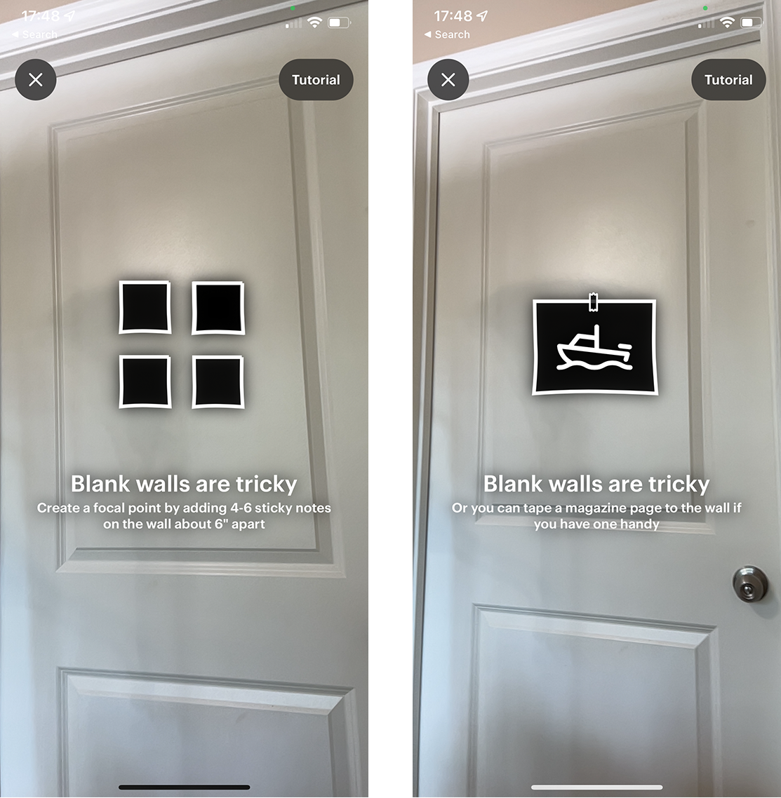
Contextually relevant tips are brief instructions or hints that are related to the user’s goal. They are generally the more effective method of providing help — usually, because users are motivated to pay attention to them. AR-related tips can highlight key parts of the UI, tell people how to interact with the AR object, alert them of additional options, or give them feedback about how to correct certain actions (e.g., during calibration).
Bob’s Furniture: The user received timely contextual tips that highlighted certain functionalities (e.g., using the plus icon to add an object to the room — left or tapping to see more colors of the chair — right). However, some tips (such as Nice choice) were unnecessary and didn’t add any value to the experience but instead distracted the user.

Instructional walkthroughs are generally more complex and teach users about how to interact with the application. While their use in mobile apps is not generally recommended (since most mobile apps are fairly simple and don’t need explanations of the UI), instructional walkthroughs do have a place in AR-based applications due to the novelty of AR and AR-related patterns. Thus, AR walkthroughs can provide step-by-step onboarding and teach users the key components and functionality for completing the task by guiding them through a series of actions in an AR experience.

While both tips and walkthroughs can successfully assist novice users throughout an AR experience, this article focuses on onboarding walkthroughs.

AR-Related Walkthroughs

Walkthroughs are not a substitute for the poor interface design. AR-related instructional walkthroughs should generally have two goals:

  • Increase awareness of the AR feature and show its potential.
  • Guide users through the novel interactions of a simple AR experience so they can learn how to use the AR feature.

If the primary functionality of the app is AR-related, the app may combine both these goals into a single walkthrough that is presented upon launch, If, however, AR is just a supporting feature for your app, don’t flood the user with AR instructions when the app is first launched. Often, users tend to dismiss lengthy or complex walkthroughs that are shown when they first use an app, especially if they consider them irrelevant for their immediate goals. Instead, show an interactive, instructional walkthrough when the AR feature is first used. Awareness of the AR technology can be created through a tip on those pages that include the AR feature.

Kinfolk app’s start screen introduced the purpose of the application and mentioned the AR feature (left). A deck-of-cards walkthrough provided detailed instructions about how to use the AR feature (right). A study participant was glad to receive this information. However, after launching the experience, she had to refer to the help menu multiple times to review the details of the available features and options.

In our study, the most used type of walkthrough was the deck of cards. While this onboarding style provided an overview of the AR features and set users’ expectations for the feature, it often caused cognitive overload and strained the user’s working memory. Participants couldn’t fully remember what they had read and had to refer to the help menu or relaunch the experience to review the deck of cards one more time.

Interactive walkthroughs were generally more effective than static walkthroughs, as they gave users a chance to practice a small-scale AR activity. Participants were generally appreciative when they could see detailed instructions about how to work with the AR feature and felt delighted when they were able to easily complete a first AR task within the app.

One participant using the JigSpace app was pleased with the detailed instructions that guided her through her first AR interaction within the app: “It’s easier than most apps, because it actually gives you  [instructions] at the bottom of the screen that actually tell you what you can do and what you can’t do. Tells you ‘just swipe it,’ ‘spin it’ — pretty straight forward.”

The JigSpace app provided an optional interactive walkthrough that showed the potential of the AR and helped the user practice the app’s key tasks and features.
Civilization AR app: The optional interactive walkthrough (provided upon launching) took the participant through the experience of calibrating the AR feature (left) and interacting with a historical AR artifact (right). It introduced various key functionalities of the app and provided audio instructions and feedback in addition to written text. Despite the positive outcome of this experience, the instructions were hard to read due to the poor contrast with the background.

AR-Walkthrough Components

In addition to highlighting the core functionality of the UI, being aware of some of the main challenges that users face in their first interactions with AR features can help app designers set the stage for a successful AR experience. In particular, an AR walkthrough should be brief and touch upon the following key considerations for getting started with the AR feature:

  • What to expect from the AR experience
  • How to handle the device
  • How to prep the environment.

What to Expect from the AR Experience?

When landing on the homepage of an app, many users had no idea about how AR was used. Sharing an overview of the AR experience and its goal clearly and in a descriptive way will help the users prepare for the next steps.

Focus first on the high-level purpose of the AR feature (e.g., see how a piece of furniture will look in your room, create interactive 3D presentations, drive a Mars Rover in your own environment) and, once that is clear, present users with low-level instructions such as how to use the specific controls in the interface.

The JigSpace app displayed an overview of the application’s functionality, followed by an optional interactive walkthrough that provided additional information about the key features of the app.

A participant trying a game in the ARLOOPA app could not understand the goal of the game and what she should expect from the AR experience. She stated: “I don’t know how to play it. I’m just going to try a different game. I did not understand that one. […] So, I push Help because I don’t know how to do it.”

Unfortunately, using the Help menu did not resolve the issue, as it provided low-granularity information about interacting with the AR object and did not mention the goal of the game. The participant said: I don’t understand how to play this game at all. This is where I get frustrated.” She added: “It would have been helpful to get a better description of ideas or directions, I guess. This seems really weird. Even though I don’t understand how to play the game, I am inside the game because it’s so zoomed in, but it doesn’t help because you don’t even know what you’re doing. So, this needs to be described better.”

A participant playing a game in the ARLOOPA app could not understand the goal of the game (left); when she accessed the help page (right), the information provided had too low granularity and did not help her.

The Mission to Mars app showed an initial walkthrough with some basic instructions about interacting with the AR object. However, the objective of the AR experience was unclear. Hence, the participant later struggled to understand the hints and tips as she was using the app. Clarifying the purpose of the AR experience ahead of time could have helped her see the bigger picture and resolved potential confusion. She said:  “I don’t know what ‘follow the arrow to the nearest circle’ means. It seems like, it’s supposed to be a game. Cause it has a green thing that says like health, which I associate with game and staying alive. […] Oh, what’s that? Oh, I can drive it. […] So, there’s really no direction as to what I’m doing. I didn’t know I could drive it, but I sort of figured it out with this white circle thing. I’m backing it up. I don’t know. It seems sort of awkward, but actually it’s cool. […] I didn’t know what the Mars Rover looked like. Oh, I guess I was supposed to navigate this guy to this green area.”

The walkthrough in the Mission to Mars app included basic instructions about interacting with the AR object, but did not clearly state the purpose of the app. (If you carefully read the text in the left screenshot, you will discover it, but most users won’t patiently read lengthy descriptions.) Moreover, game-specific signifiers (like the Health meter in the right screenshot) might not be familiar to users with little gaming experience.

How to Hold the Mobile Device

Due to the participants’ unfamiliarity with the AR technology, they often were unaware that the device’s camera would be used to take advantage of the AR feature. For instance, upon launching BBC’s Civilizations AR app, a participant was confused when she received instructions in text format but could not see any other visuals on the screen. Initially, she assumed that the AR feature had failed; it took her a couple of minutes to realize that the problem occurred because she had placed the phone on the table and the desk was blocking the camera view. She said: “Well, ‘cause I had my phone on the table, the camera was on already. So, it was already going. I didn’t really realize that. So, I thought it was just black and I was waiting for the tutorial to tell me what to do. So now I want to go back in the tutorial and find out what it was telling me. I don’t want to skip the tutorial.”

One participant browsing BBC’s Civilizations AR app had her phone on the table during the walkthrough and did not realize that the AR experience relied on her phone’s camera. After accidentally picking up her phone, she understood what the problem was.

Let users know how they should hold their phone: whether they should keep it in their hands, at a specific height, angle, or orientation (portrait or landscape). Inform users that the camera should not be covered and should be directed towards an empty area. This information will prevent mistakes such as placing the phone on the table or leaning it against the wall.

The Home Court basketball-training app didn’t tell the user that it was supposed to be used in landscape mode. Hence, our participant had to relaunch the experience after realizing that the landscape direction is the preferred option for the task.

Furthermore, the handling of the device should take into account physical limitations and should not conflict with accomplishing the primary task. For instance, participants struggled with drawing in the SketchAR app. The app “projected” an image onto a piece of paper and the user could trace the lines in that image to make their own drawing. To draw the selected image, the user had to hold the phone very still with one hand above the paper and draw on the paper with the other hand, while looking at the screen so they could replicate the image on the paper. Moving the phone could cause the user to lose their work.

A participant who attempted this task commented: “I have to hold the phone […] in place without moving. So, in this case it seems pretty difficult to keep it up, [it] keeps losing the paper. […]. [It’s frustrating] that it keep losing the paper, but, more than that, it is that I’m holding my phone with my left hand, looking at it without trying to move it. Because I feel like if I move it, then it’s going to lose track of the paper. […] I’ve lost it. […] Is it because the table is white as well and it’s losing it or is it because I’m just moving around so much?”

The Sketch AR app superimposed an image of a dog on a physical piece of paper (left). The user was supposed to trace the dog on the paper while keeping the phone’s camera still in the other hand. Our study participant kept losing the image and their progress (right).

How to Prep the Environment

Preparing the physical environment can be another hurdle that users need to overcome as they interact with an AR feature. Users should receive timely and contextually relevant step-by-step instructions regarding requirements such as lighting, surface quality, and space size. For example, some applications will perform better when viewed outdoors or in a particular location.

One participant who was using the Smartify: Museum and Art Guide app received no clear instructions regarding the preferred size of the space where she should place an AR artifact; hence she had difficulty fitting and adjusting it in her room. She said, “So, it should have told me, you know, ‘the object is going to be three-by-three-feet size;’ then, I would have scanned or chosen the location accordingly so that there wouldn’t have been this confusion of, you know, ‘more light, move your phone, and all that.’ […]  If they would tell me ‘this particular art item would need this much space. So, scan accordingly’ — that would be helpful.”

In the Smartify: Museum and Art Guide app, the participant had to scan a space to position an AR artifact in it, but the app didn’t specify the required size of the area. The participant struggled to find the right spot for launching the AR experience.

The Augmented Berlin app did give some instructions regarding the requirements of AR experience, but the instructions were not detailed enough. A study participant said, “It was good that it gave me a tip like that it would require more space and lighting, but, you know, it didn’t tell me how much. More — could be any amount. So having the exact space that it would require, like saying it would require a 10-by-10-feet wall, […] would have been helpful for me to choose the right space, because now I can hear the audio and the audio says ‘here, it happened something, something happened here’ [but I don’t see anything].”

The Augmented Berlin app did give some instructions regarding the requirements of AR experience, but the instructions were not detailed enough.

Additionally, the instructions should not be overwhelming or too complicated. The Best Buy app asked the user to attach four stickers to the environment to calibrate the AR feature. One study participant felt it was too much and skipped this part: “It’s getting difficult for me to, you know, project it because it needs particular things, but I think I [will] just try to place and I tap it. […] It says your TV was placed but I can’t see the TV. Yeah, [..]’ it’s a little difficult, it’s not very […]’’ user friendly. It’s asking so many specifications to be, like, perfect.” 

The Best Buy app asked the user to go through additional steps to complete the calibration process. However, the participant considered the particular requirements overwhelming.

Many users won’t bother to go through a complicated process to view an item in the room, especially if their primary goal is not interaction with the AR object. In such cases, the AR feature is useful only if it adds extra value with minimum effort.

Another critical aspect of the AR experience is users’ safety. Many AR interactions involve moving around the physical environment while looking at the phone screen. Hence, users might disregard their environment or miss potential hazards such as slippery surfaces, sharp objects, or obstacles. Tell users to find a safe place away from all these potential risks before beginning the AR experience.

The Mission to Mars application provided a brief, optional instructional onboarding, including examples of environmental requirements, such as appropriate surface (top right), lighting requirements (bottom left), and camera handling (bottom right). These instructions, combined with visual examples, were helpful in guiding users throughout the process. Additionally, the tutorial warned the users about potential safety hazards and ensured the users’ safety before starting the experience (top left). 

Conclusion

AR is an exciting new technology that has plenty of potential. Many of our study participants were delighted when they were able to go through an experience successfully. For example, after using the MauAR — Berlin Wall app, one participant said, “I think it’s cool! I will probably hang on to this [app] after this [session]! I would probably like [to] run through it and finish it out. I’ve never seen anything like it! […] It’s like an education application that is a little more immersive…”

However, AR-related patterns (as well as the meaning of AR) are unfamiliar to most users. To help people take advantage of AR in your apps, consider developing contextual tips and instructional walkthroughs that set the stage and help users prepare for the interaction.

Make sure that your walkthroughs describe the purpose of your app and how the AR functionality fits in. Then clearly explain to users how they are supposed to handle their device throughout their experience and how their space should be chosen for an optimal, safe interaction.

from NN/g latest articles and announcements https://www.nngroup.com/articles/ar-walkthroughs/