How to Authenticate a User with Face Recognition in React.js


With the advent of Web 2.0, authenticating users became a crucial task for developers.

Before Web 2.0, website visitors could only view the content of a web page – there was no interaction. This era of the internet was called Web 1.0.

But after Web 2.0, people gained the ability to post their own content on a website. And then content moderation became a never-ending task for website owners.

To reduce spam on these websites, developers introduced user authentication systems. Now website moderators can easily know the source of spam and can prevent those spammers from accessing the website further.

If you are want to know how to implement content moderation on your website, you can read my article on How to detect and blur faces in your web applications.

Now let’s see what we’ll be getting into in this tutorial.

What You’ll Learn in This Tutorial

In this tutorial, we will discuss different authentication techniques you can use to authenticate users. These include email-password authentication, phone auth, OAuth, passwordless magic links, and at last facial authentication.

Our primary focus will be on authentication via face recognition techniques in this article.

We’ll also build a project that teaches you how to integrate facial recognition-based authentication in your React web application.

In this project, we’ll use the FaceIO SaaS (software as a service) platform to integrate facial recognition-based authentication. So, make sure you set up a free FaceIO account to follow along.

And finally, we’ll take a look at the user privacy aspect and discuss how face recognition doesn’t harm your privacy. We’ll also talk about whether it’s a reliable choice for developers in the future.

This article is packed with information, hands-on projects, and discussions. Grab a cup of coffee and a slice of pizza 🍕 and let’s get started.

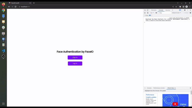
The final version of this project looks like this. Looks interesting? Let’s do it then.

faceIO-final

Different Types of User Authentication Systems

There are many user authentication systems out there right now that you can choose to implement in your websites. There are no real superior or inferior auth techniques. All of these auth systems depend on using the right tool for the job.

For example, if you are making a simple landing page to collect emails from users, there is no need to use OAuth. But if you are building a social platform, then using OAuth makes more sense than traditional authentication. You can pull the user’s details and profile images directly from OAuth.

If your web application is built around any investment-related content or legally binding services, then using phone auth makes more sense. A user can create unlimited email accounts but they’ll have limited phone numbers to use.

Let’s take a look at some popular authentication systems so we can see their pros and cons.

Email-password based authentication

Email-password-based authentication is the oldest technique for verifying a user. The implementation is also very simple and easy to use.

The pro of this system is you don’t need to have a third-party account to log in. If you have an email, whether it is self-hosted or from a service (like Gmail, Outlook, and so on), you are good to go.

The primary con of this system is you need to remember all of your passwords. As the number of websites is constantly growing and we need to log in to most sites to access our profiles, remembering passwords for every site becomes a daunting task for us humans.

Coming up with a unique and strong password is also a huge task. Our brains aren’t typically capable of memorizing many random strings of letters and numbers. This is the biggest drawback of email-password-based authentication systems.

Phone authentication

Phone authentication is generally a very reliable auth technique to verify a user’s identity. As a user typically doesn’t have more than one phone number, this can be best suited for assets-related websites where user identity is very important.

But the drawback of this system is people don’t want to reveal their phone numbers if they don’t trust you. A phone number is much more personal than an email.

One more important factor of phone authentication is its cost. The cost of sending a text message to a user with an OTP is high compared to email. So website owners and developers often prefer to stick with email auth.

OAuth-based authentication

OAuth is a relatively new technique compared to the previous two. In this technique, OAuth providers user authentication and useful information on behalf of the user.

For example, if the user has an account with Google (for example), they can log in to other sites directly using their Google account. The website gets the user details details from Google itself. This means that there’s no need to create multiple accounts and remember every password for those accounts.

The major drawback of this system is that you as a developer have to trust the OAuth providers and many people don’t want to link all their accounts for privacy reasons. So you’ll often see an email-password field in addition to OAuth on most websites.

Magic links solve most of the problems you face in email password-based authentication. Here you have to provide only your password and you will receive an email with an auth link. Then you have to open this link in your browser and you are done. No need to remember any passwords.

This type of authentication has gained in popularity these days. It saves a lot of time for the user, and it’s also very cheap. And you don’t have to trust a 3rd-party like in the case of OAuth.

Facial recognition authentication

Facial recognition is one of the latest authentication techniques, and many developers are adopting it these days. Facial recognition reduces the hassle of entering your email-password or any other user credentials to log in to a web application.

The most important thing is that this authentication system is fast and doesn’t need any special hardware. You just need a webcam, which almost all devices have nowadays.

Facial recognition technology uses artificial intelligence to map out the unique facial details of a user and store them as a hash (some random numbers and text with no meaning) to reduce privacy-related issues.

Building and deploying an artificial intelligence-based face recognition model from scratch is not easy and can be very costly for indie developers and small startups. So you can use SaaS platforms to do all this heavy-lifting for you. FaceIO and AWS recognition are examples of these type of services you can use in your projects.

In this hands-on project, we are going to use FaceIO APIs to authenticate a user via facial recognition in a React web application. FaceIO gives you an easy way to integrate the authentication system with their fio.js JavaScript library.

Project Setup

Before starting, make sure to create a FaceIO account and create a new project. Save the public ID of your FaceIO project. We need this ID later in our project.

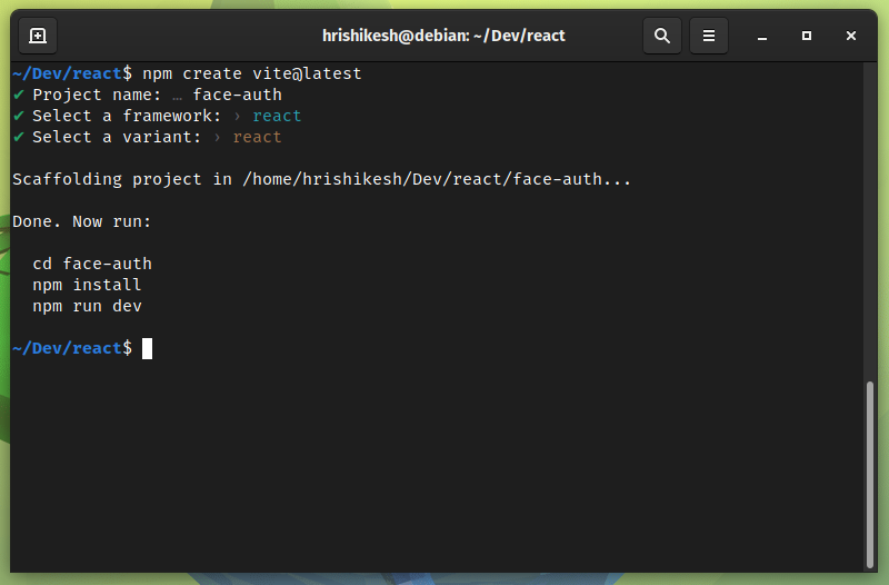
To make a React.js project, we will use Vite. To start a Vite project, navigate to your desired folder and execute the following command:

npm create vite@latest

Then follow the instructions and create a React app using Vite. Navigate inside the folder and run npm insall to install all the dependencies for your project.

Screenshot-from-2022-07-27-10-46-05

After following all these steps, your project structure should look like this:

.
├── index.html
├── package.json
├── package-lock.json
├── public
│   └── vite.svg
├── src
│   ├── App.css
│   ├── App.jsx
│   ├── assets
│   │   └── react.svg
│   └── main.jsx
└── vite.config.js

How to Integrate FaceIO into Our React Rroject

To integrate FaceIO into our project, we need to add their CDN in the index.html file. Open the index.html file and add the faceIO CDN before the root component. To learn more, check out FaceIO’s integration guide.

<body>    
    <script src="https://cdn.faceio.net/fio.js"></script>
    <div id="root"></div>
    <script type="module" src="/src/main.jsx"></script>
</body>

Now remove all the code from the App.jsx file to start from scratch. I’ve kept this tutorial as minimal as possible. So I’ve only added a heading and two buttons in the UI to demonstrate how the FaceIO facial authentication process works.

Here, one button works as a sign-in button, and the other one works as a log-in button.

The code inside the App.jsx file looks like this:

import "./App.css";
function App() {
  return (
    <section>
      <h1>Face Authentication by FaceIO</h1>
      <button>Sign-in</button>
      <button>Log-in</button>
    </section>
  );
}

export default App;

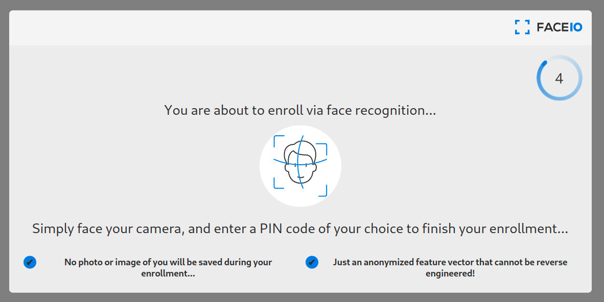
How to Register a User’s Face using FaceIO

Working with FaceIO is very fast and easy. As we are using the fio.js library, we have to execute only one helper function to authenticate a user. This fio.js library will do most of the work for us.

To register a user, we initialize our FaceIO object inside a useEffect hook. Otherwise, every time a state changes, it re-runs the components and reinitializes the faceIO object.

let faceio;
useEffect(() => {
    faceio = new faceIO("Your Public ID goes here");
}, []);

Your FaceIO public ID is located on your FaceIO console. Copy the public ID and paste it here to initialize your FaceIO object.

Now, define a function named handleSignIn(). This function contains our user registration logic.

Inside the function call the enroll method of the faceIO object. This enroll method is equivalent to the sign-up function in a standard password backed registration system and accepts a payload argument. You can add any user-specific information (for example their name or email address) to this payload.

This payload information will be stored along with the facial authentication data for future reference. To learn about other optional arguments, check out their API docs.

In our sign-in button, on user click we invoke this handleSignIn() function. The code snippets for user sign-in look like this:

const handleSignIn = async () => {
    try {
      let response = await faceio.enroll({
        locale: "auto",
        payload: {
          email: "example@gmail.com",
          pin: "12345",
        },
      });

      console.log(` Unique Facial ID: ${response.facialId}
      Enrollment Date: ${response.timestamp}
      Gender: ${response.details.gender}
      Age Approximation: ${response.details.age}`);
    } catch (error) {
      console.log(error);
    }
  };

<button onClick={handleSignIn}>Sign-in</button>
faceIO-1
FaceIO screen

How to Sign In using Face Recognition

After registering the user, then you’ll need to get the user into the authentication or log-in/sign-in flow. Using the fio.js library also makes it very easy for us to set up a log-in flow using face authentication.

We have to invoke the authenticate method of the faceIO object which is equivalent to the sign-in function in a standard password backed registration system and all the critical work will be done by the fio.js package.

At first, define a new function named handleLogIn() to handle all the log-in logic in our React app. Inside this function, we invoke the authenticate method of the faceIO object as I mentioned earlier.

This method accepts a locale argument. This is the default language of the interaction of users with FaceIO widgets. If you are not sure, you can assign auto in this field.

The authenticate method also take more optional arguments like permissionTimeout, idleTimeout, replyTimeout and so on. You can check out their API documentation to know more about optional arguments.

We invoke this handleLogIn() function when someone clicks on the Log-in button:

const handleLogIn = async () => {
    try {
      let response = await faceio.authenticate({
        locale: "auto",
      });

      console.log(` Unique Facial ID: ${response.facialId}
          PayLoad: ${response.payload}
          `);
    } catch (error) {
      console.log(error);
    }
  };

<button onClick={handleLogIn}>Log-in</button>

Our user authentication project using FaceIO and React is now complete! You learned how to register and login a user. You can see the process is fairly simple compared to implementing an email-password based or some other authentication method we discussed earlier in this article.

Now you can style all the jsx elements using CSS. I didn’t add CSS here to reduce complexity in this project. If you are curious, you can take a look at my GitHub gist.

If you want to host this React FaceIO project for free, you can check out this article on how to deploy your React and Nextjs project in Cloudflare pages.

How to Use the FaceIO REST API

Besides providing widgets via the fio.js library, FaceIO also provides REST APIs to streamline the authentication process.

Every application in the FaceIO console has an API key. You can use this API key to access the FaceIO REST API endpoints. The base URL for the REST API is https://api.faceio.net/.

The URL schema accepts URL parameters like this https://api.faceio.net/cmd?param=val&param2=val2. Here cmd is an API endpoint and param is an endpoint parameter if it accepts any.

Using the REST API endpoints, you can automate various tasks in your backend.

  1. You can delete a face ID on a user’s request.
  2. You can attach a payload with a face ID.
  3. You can change the PIN associated with a face ID.

This REST API is intended to be used purely on the server side. Make sure you don’t expose it to clients. It’s important that you read the following Privacy and Security sections to learn more about this.

How to Use FaceIO WebHooks

Webhooks are event-driven communication systems among servers. You can use this webhook feature of FaceIO to update and sync your backend with new events happening in your front-end web application.

The event of this webhook fires on new user enrollment, facial authentication success, facial ID deletion, and so on.

You can set up FaceIO webhooks in your project console. A typical webhook call from FaceIO lasts for 6 seconds. This contains all the information about a specific event in a JSON format and looks like this:

{
  "eventName":"String - Event Name",
  "facialId": "String - Unique Facial ID of the Target User",
  "appId":    "String - Application Public ID",
  "clientIp": "String - Public IP Address",
  "details": {
     "timestamp": "Optional String - Event Timestamp",
     "gender":    "Optional String - Gender of the Enrolled User",
     "age":       "Optional String - Age of the Enrolled User"
   }
}

Privacy and FaceIO

Privacy is the most important thing for a user nowadays. As big corporations use your data for their good, questions arise on whether the privacy of these face recognition techniques is valid and legitimate.

FaceIO as a service follows all the privacy guidelines and gets user consent before requesting their camera access. Even if the developer wanted, FaceIO doesn’t scan faces without getting consent. Users can easily opt-out of the system and can delete their facial data from the server.

FaceIO is CCP and GDPR compliant. As a developer, you can release this facial authentication system anywhere in the world without facing privacy issues. You can read this article to know more about FaceIO privacy best practices.

FaceIO Security

The security of a web application is an important topic to discuss and consider. As a developer,  you are responsible for the security of a site or application’s users.

FaceIO follows some important and serious security guidelines for user data protection. FaceIO hashes all the unique facial data of the user along with the payload we specified earlier. So the stored information is nothing but some random strings which can’t be reverse engineered.

FaceIO outlines some very important security guidelines for developers. Their security guide focuses on adding a strong pin code to protect user data. FaceIO also rejects covered faces so that no one can impersonate someone else.

Conclusion

If you’ve read this far, thank you for your time and effort. Make sure to follow along with the hands-on tutorial so you can fully grasp the topic.

The project should be approachable if you follow all the steps. If you make something out of it, show me on Twitter. If you have any questions, please ask. I will happy to help you. Till then, have a good day.

from freeCodeCamp https://www.freecodecamp.org/news/authenticate-with-face-recognition-reactjs/

The Principles and Laws of UX Design

Five prominent rings.

Blue, yellow, black, green, and red.

It’s one of the most recognizable symbols globally – a hallmark of good design. Yet, designing an Olympic logo isn’t a walk in the park.

Striking a delicate balance between the host city and the revelry of the games is a tough act – although not unachievable. The logo of the 1964 Tokyo Games, designed by Yusaku Kamekura and Masaru Katsumi, is a stellar example of timeless design.

Why did the logo work?

Among other reasons, it embodied two crucial commandments in Dieter Ram’s principles (we’ll come back to this) of design: (a) Good design is long-lasting, and (b) Good design is as little design as possible.

Who doesn’t know the “land of the rising sun”?

As much as it captured the very essence of Tokyo, it also celebrated the spirit of sport.

Tokyo Olympic 1964

Tokyo Olympic 1964

Across the world, the Allianz Arena in München, Germany, can accommodate 75,000 spectators. But, that’s not the only thing that’s impressive about it. Host to the opening ceremonies of the 2006 World Cup, it’s considered one of the best architectural structures. The stadium’s design emphasizes the procession-like walk of the fans toward the stadium.

Although a crater-like shape, the stairs on the outside lead to a great slope to the approach, so it looks like a swarm of ants making their way home from an aerial view. Thousands of fans walk shoulder to shoulder, the adrenaline rush is high, and there’s solidarity in the air. The exterior of the stadium also changes color. Each aspect of the stadium is a masterclass in innovative design.

This is to say that all designs must serve a purpose.

But, before we get there, let’s go back to the roots of designing to what UX design has become now. The objective has always been the same – to create a user-friendly experience.

It is the base of all design, whether in art, architecture, or digital spaces.

A Brief History of Design

According to an article published by Career Foundry, we can travel back to 6000 B.C. to start our journey in design. With the concept of Feng Shui implemented in living spaces, the idea was to move objects around to make life harmonious and optimal. Choosing the right colors too is an intrinsic part of Feng Shui as it affects a person’s mood.

Not too different from designing any user interface, is it?

By 500 B.C., alphabets had taken concrete shape – a milestone in designing and a breakthrough in communication. Modern-day design, efficiency, and the purpose of design as we see it now perhaps started with Toyota. It put the people and the workers in the forefront, encouraging a healthy lifestyle, a decent pay — actively incorporating suggestions and feedback.

They placed their employees at the heart – a critical step in defining user experience.

Had UX design finally seen the light of day? Perhaps, it did.

Cut to – the 70s – to Apple.

Xerox’s PARC research center deserves a special mention here though. The mouse and the graphical interface were boons that the center bestowed on the world and set the path for future personal computing that we’ve come to accept as necessities today.

Before the world relied on Siri or got used to the “Marimba” ringtone, Macintosh released Apple’s first PC with a graphical user interface, a built-in screen, and a mouse. Then, in 2001, teenagers found the only way to stay “cool” by playing around with the iPod click-wheel, till they landed on The Calling’s “Wherever You Will Go.”

It was a time of great UI, even better UX, and incredible music.

In 1995, Donald Norman, a cognitive scientist at Apple, coined “User Experience. At Apple, he worked as a User Experience Architect, the first there ever was.

In 2022, the term has evolved into so much more than just what looks good.

It’s a shape-shifting phenomenon that looks different every day. The focus now is on personalized and localized user experience with a heavy dose of augmented reality, artificial intelligence, data visualization, 3D elements, and responsive designs.

Now, let’s get to the meat.

Principles of UI/UX Design

The Pareto Principle

Pareto Principle

Ever heard of the 80/20 rule — eat 80% of the pie and leave the rest for the spouse – no, unfortunately, not that one.

The principle states that 80% of the effects of any process result from 20% of the effort that has gone into it. However, you might want to view it slightly differently in UX design. Suppose the 80% are your users and 20% are your features.

Bottom line – simplify interfaces. Get rid of the frills. Remove buttons or features that don’t contribute to the outcome.

The Gestalt Principle

The Gestalt Principle or Gestalt psychology are laws of human perception that describe how humans group similar elements, recognize patterns and simplify complex images when we perceive objects.”

For designers, it’s crucial to understand and implement this principle to organize the layout of any interface and make it aesthetically pleasing.

Six common laws fall under the Gestalt Principle:

  •  Closure (Reification)

Gestalt Principle

The human mind is wired to complete spaces in perceived incomplete shapes. Hence, we automatically fill in gaps between elements, so that the mind can accept them as one singular or whole entity.

Designers rely heavily on this law to create logos with negative spaces or make negative spaces look not as barren.

  • Common region

Law of common region

The human mind also groups elements that fall in the same closed region. To put this law to use, designers deliberately place related objects in the same closed area to show the difference from another set of closed areas.

An excellent way to create a common region is by placing elements inside a border.

  • Continuation

Law of common region 2

Whether with lines, curves, or a sequence of shapes, our eyes tend to follow a natural path. A break in these elements might be jarring – a key learning for a designer. It may immediately drive a user away. Continuation also affects positive and negative spaces in design.

The objective is to create a flow that is easy to navigate.

When designing an E-commerce website, ensure that navigation follows a linear path. In the example given below, one can quickly categorize and differentiate between primary and secondary navigation. Home, profile, shop, contact and help promptly stand out as one group while men, women, and kids are another.

  • Figure/Ground (Multi-stability)

Figure/Ground (Multi-stability)

What do you see first? A vase or two faces?

What’s happening here is called the principle of multi-stability. The image can be interpreted in two ways, but our mind can only interpret one view in one go. Because it’s out of our conscious control, we can’t predict what and who will see the vase first or the two faces.

When posed with a dilemma like this one, our mind is quick to fight uncertainty and look for solid and stable items. But, in most cases, unless an image is truly abstract, the foreground catches our eye first.

In UX design, this principle is used in navigation panels, modals, and dialogs.

  • Proximity (Emergence)

Law of Proximity

It’s the spatial relationship between elements inside a perceived or actual frame. To follow this rule, place things related close to each other and unrelated things further from each other.

Peace Innovation

You can also apply the same rule in the context of text. Sentences should be grouped in paragraphs and separated below and above by whitespace. Whitespaces around headings demarcate the beginning of a new topic or paragraph.

Clingy Cat Solution

  • Similarity (Invariance)

Similarity (Invariance)

The invariance principle states that our brain finds similarities and differences in everything. This is why it’s easy to make something the center of attention in a crowd of similar objects. Imagine a wall full of black squares in different sizes and one solitary red square. Without realizing it, you created two groups in your head.

The fields and the button are the same sizes in the image below. However, the button is of a different color – this immediately prompts us to perform a specific function. We intuitively knew that the blue texts are links in the description text.

Log In Panel

Understanding design principles provides designers with a good head start on their journey. But, there are 10 commandments of design by Dieter Rams that a designer must follow:

Dieter Ram’s 10 Commandments for Good Design

Good design is innovative
Developments in technology go hand-in-hand with those of UI and UX design – they supplement each other. As a result, there is always room for innovative design with new offerings in technology, especially when designing for the masses. However, innovative design doesn’t have to rely on technology alone. It can also benefit from shifting trends in user behavior.

Good design makes a product useful

The sole purpose of designing is to serve a practical purpose. When a design meets functional, psychological, and aesthetic criteria, it emphasizes the usefulness of a product.

Good design is aesthetic 

Human beings are visual creatures and have relied on visual cues since the beginning of time to find food, shelter, mates, and the like. So, when designing a product, the aesthetic quality is integral to its usefulness and success.

Good design makes a product understandable

If you must explain a product and what it does; consider the battle lost. Good design describes the product’s structure as it is carefully laid out in the product itself. It should be self-explanatory and intuitive.

Good design is unobtrusive

In UX design, products will rarely take up ample physical space. Yet, good UX design seamlessly finds itself incorporated into our daily life. The design should be neutral and feel personalized.

Good design is honest

If your design attempts to manipulate the consumer – you should go back to the drawing board and start afresh. Good UI design has nothing to hide; it’s transparent.

Good design is long-lasting

Good design doesn’t attempt to be fashionable; it stays classic and never appears antiquated. Instead, it stands out as fresh even in a constantly changing world.

Good design is thorough down to the last detail

When designing a product, a designer must put himself in the user’s shoes. Starting a project by forcing a solution is not the way to go. Instead, focus on all the pain points and leave nothing out. Practice care and accuracy at every step of the design process.

Good design is environmentally-friendly

What can you do as a UI designer to make your designs more earth-friendly? For starters, you can choose an eco-friendly web host, power your website with a green energy source, and create simple designs. All of which will help reduce the carbon emissions of your website.

Good design is as little design as possible

Always strip down to the basics and keep what is crucial. The more the clutter, the more confused the user will be. Focus on reducing elements and buttons as it will help you concentrate on essential aspects and things that matter.

Getting the hang of it? There’s just one last thing we’ll cover now. Pay attention – it’s important.

UX Laws Every Designer Should Know About

Hick’s law

Hick’s law

Hick’s law states that the more the choices – the more the user is spoilt for it. This directly increases the decision-making time as they are burdened with the complexity of options. To incorporate Hick’s law into your design, break complex tasks into smaller steps and minimize choice when response times are critical.

Sometimes, the user needs a little help. Highlight options as recommendations to help ease their user journey. However, be careful of what you’re subtracting or removing – you may miss out on crucial elements.

Fitts’s law

Fitts’s law

Fitt’s law simplifies the process for users even more. Think of it this way – the user wants to hit a bull eye at one shot, but the only difference is that the center of the target shouldn’t be a small red dot. It should be as large as possible.

Touch targets should be large enough so that users can accurately select them. Ensure that there is enough space between the touch target and other buttons so that movements are quick, deliberate, and precise.

Miller’s law

Miller’s law

On average, Miller’s law states that a person can only retain seven items in their working memory. Suppose you are designing a navigation page – bombard the user with more than seven elements and chances are that they would most likely not recall the location they had arrived from.

This is often why services or products with several options are grouped to reduce the memory load.

Jakob’s Law

Jakob’s Law

Jakob’s law states that users will often project expectations of other sites on yours. If they prefer a website for any reason, they will enjoy spending time on it. When they hop onto your site, they will expect a similar sense of aesthetic and satisfaction their preferred site offers.

While it may seem counter-intuitive, it may be a good idea to hover around benchmarks already set and not try to create something overtly unique.

Even when armed with all the knowledge in the world, mistakes are bound to happen. When designing for UX, designers often make the following mistakes. With everything we’ve learned, let’s figure out how we can avoid them.

UX Design Mistakes to Avoid

Inconsistencies

Inconsistency is a major turn-off for all, whether in life or UX designing. For instance, while using straight lines as dividers for icons, elements, or segments, ensure that the lines are thick or thin. If you’ve settled on a font, incorporate fonts of the same family throughout the product. When each element within your design creates what appears to be a consistent pattern, inconsistency breaks the pattern. The anomaly stands out in a jarring way.

Blurred lines between primary and secondary buttons

Not demarcating primary and secondary buttons is a good way to annoy a user – the biggest sin a designer can commit. Primary and secondary buttons exist as they serve a specific purpose. Highlight primary buttons in a strong color and add more visual weight to them.

Lack in text hierarchy

A lack in text hierarchy can also instantly break your design. Think of study notes you made in school while cramming for an exam. You capitalized the main topic, wrote over it to make it appear bold, and even drowned it in some fluorescent yellow highlighter. The important bits followed as sub-headings and then bullet points. A clear ranking of the most critical information to the least stood out most effectively. Apply similar practices for UX design and ensure that you let your text breathe with adequate spacing.

Not focusing on icons

Bad iconography can make a potentially successful design or product one that will instantly be forgotten. Why are icons important in UX design? Users recognize them instantly, and it helps them navigate better. Most importantly – icons save space. The purpose of an icon is to communicate a concept quickly. Hence, it’s best to stick to figures and images that resonate with the action it prompts. Line style, hand-drawn, and multi-color icons are all the rage in 2022.

Low-quality images

We’re in 2022 – visuals are everything. There is no excuse for you to settle for low-quality images. Your user most definitely won’t. While you’re at it, look for images that speak about your service or product and find high-quality images only. Staged and fake photos may land you in a hot mess, so look for realistic and creative photos.

Now, to stay abreast – let’s equip you with some UX trends for 2022.

2022 UX Trends to Keep an Eye On

  1. Simplicity wins. If there’s one thing you must learn from Dieter Rams – it’s simplicity. Whether we’re in 2022 or 3022 – one thing will remain constant. Simplicity; it will never run out of fashion. So, when designing a product, your sole aim shouldn’t be to chase everything that’s transforming around you. Start with the basics and come back to the basics.
  2. Delicate serifs will continue to reign, but now is an excellent time to experiment with typography. Go bold and go big. Keep in mind that it may appear boxy. Likewise, 70s-inspired disco fonts are making quite the comeback.
  3. Characterized by blurred backgrounds, Glassmorphism creates a frosted glass effect. To create this effect, place light or dark elements on colorful multi-layer backgrounds. As you add another layer of a blurry effect to the background of the elements, it appears as though it’s morphed into frosted glass.
  4. Were you aware that 22% of internet users buy groceries using voice assistants? If you didn’t, now is a good time to incorporate voice user interfaces in your design or product.
  5. Diversity and inclusivity shouldn’t just be buzzwords anymore. When designing a product, you must also think about how accessible it is for every audience member – including those with limited abilities. An all-inclusive design is the need of the hour.

Now that you’ve got this crash course under your belt, will you become the best designer the world has ever seen? Perhaps, not just yet – but you’ll become one that was better than yesterday. While following the laws and principles is crucial in understanding user experience and how best to design for the user, design thinking is the first step in designing UI.

from Pepper Square https://www.peppersquare.com/blog/the-principles-and-laws-of-ux-design-why-every-designer-should-know-them/

CSS container queries are finally here

I can’t contain my excitement while writing the first few words for this article. Ladies and gentlemen, CSS container queries are finally here! Yes, you read that right. They’re currently supported in Google Chrome (105) and soon in Safari 16. This is a huge milestone for web development. For me, I see it just like when we started building responsive websites via media queries, which is a game changer. Container queries are equally important (from my point of view, at least).

When I wrote the first article on container queries back in April 2021, the syntax changed several times, and I see this as a chance to write a fresh article and keep the previous one for reference. In this article, I will explain how container queries work, how we can use them, and what the syntax looks like, and share a few real-life examples and use cases.

Are you ready to see the new game-changer CSS feature? Let’s dive in.

Introduction

When designing a component, we tend to add different variations and change them either based on a CSS class, or the viewport size. This isn’t ideal in all cases and can force us to write CSS based on a variation class or a viewport size.

Consider the following example.

We have a card component that should switch to a horizontal style when the viewport is large enough. At the first glance, that might sound okay. However, it’s a bit complex when you think about it more deeply.

If we want to use the same card in different places, like in a sidebar where the space is tight, and in the main section where we have more space, we’ll need to use class variations.

.c-article {
  /* Default stacked style */
}

@media (min-width: 800px) {
  /* Horizontal style. */
  .c-article--horizontal {
    display: flex;
    align-items: center;
  }
}

If we don’t apply the variation class to the card component, we might end up with something like the following.

Notice how the card component in its stacked version is too large. For me, this doesn’t look good from a UI perspective.

With container queries, we can simply write CSS that responds to the parent or container width. Consider the following figure:

Notice how in a media query, we query a component based on the viewport or the screen width. In container queries, the same happens, but on the parent level.

What are container queries?

A way to query a component against the closest parent that has a defined containment via the container-type property.

That’s it. It’s just how we used to write CSS in media queries, but for a component level.

Container queries syntax

To query a component based on its parent width, we need to use the container-type property. Consider the following example:

.wrapper {
  container-type: inline-size;
}

With that, we can start to query a component. In the following example, if the container of the .card element has a width equal to 400px or larger, we need to add a specific style.

@container (min-width: 400px) {
  .card {
    display: flex;
    align-items: center;
  }
}

While the above works, it can become a bit overwhelming when having multiple containers. To avoid that, It’s better to name a container.

.wrapper {
  container-type: inline-size;
  container-name: card;
}

Now, we can append the container name next to @container like the following:

@container card (min-width: 400px) {
  .card {
    display: flex;
    align-items: center;
  }
}

Let’s revisit the initial example and see how we can get benefit from container queries to avoid having multiple CSS classes.

.wrapper {
  container-type: inline-size;
  container-name: card;
}

.c-article {
  /* Default stacked style */
}

@container card (min-width: 400px) {
  /* Horizontal style. */
  .c-article {
    display: flex;
    align-items: center;
  }
}

Browser support

Container queries are now supported in Chrome 105, and soon in Safari 16.

The same applies to container query units, too.

Also, there is a polyfill that you can use today. I haven’t tested it yet, but it’s within the plan.

Use cases for CSS container queries

With the stable launch of container queries in Google Chrome, I’m excited to add a new little project which is lab.ishadeed.com. This is inspired by Jen Simmons’s CSS grid experiments. It includes fresh demos for container queries that you can play with them your browser.

The lab has 10 different examples for you to explore how container queries are really helpful. I’m planning to add more in the future.

You can check them from this link. Happy resizing!

Outro

This is a big day for CSS, and I can’t wait to see what you will create with CSS container queries.

I wrote an ebook

I’m excited to let you know that I wrote an ebook about Debugging CSS.

If you’re interested, head over to debuggingcss.com for a free preview.

from Ahmad Shadeed Blog https://ishadeed.com/article/container-queries-are-finally-here/

Is Dwell Time AR’s Next Performance Metric? Part II


We recently posted a question: Does AR have a measurement problem? In short, AR marketing is so new that it hasn’t developed native metrics. That plus brand marketers’ comfort with existing metrics draws them towards established analytics like clicks and impressions.

But the issue is that those metrics were made for different formats, including online display and search ads. As such, they don’t do justice to AR’s unique abilities, including deeper depth of engagement. That depth can lead to favorable outcomes like brand awareness and conversions.

But one metric that’s starting to emerge to better evaluate AR is dwell time. It’s showing strong early signs which in turn signals AR’s depth of engagement. This experiential depth and lasting impression (e.g., brand recall) are common and longstanding objectives for brand marketers.

So for part II of this series, we’re spotlighting a few case studies from ARtillery Intelligence’s recent report, AR Marketing Best Practices and Case Studies, Vol 2. We’ve pulled a few case studies that specifically demonstrate AR’s ability to drive favorable dwell times.

When reading these mini case studies, keep in mind that AR campaign dwell times – often exceeding 1 minute – compare to online video ads that average about 20 seconds.

AR Marketing: Best Practices & Case Studies, Volume II

Next Level

To accompany and market the film release of Jumanji: The Next Level, Sony Pictures was interested in creating an AR experience for prospective filmgoers. Partnering with AR-focused creative agency Trigger, it created a game to draw fans in to the movie’s themes.

Specifically, gameplay immersed users in the world of Jumanji through both AR and audio. The latter utilized Amazon’s Lex API, letting users activate game elements through voice. This included character-driven audio playback – a natural medium for storytelling.

For example, users could say “show me Jumanji” to activate a virtual map that was overlayed in their space. They could then visit locations from the movie by activating other map locations by voice. Resulting animations included animals running through 3D scenes.

Finally, the experience had a tangible call-to-action to capture users’ interest at the right time. Upon completing the game, they were channeled into a ticket-purchasing flow by saying “buy tickets.” This melds gameplay and commerce in engaging and elegant ways.

But the real proof is in the results. The experience achieved an average dwell time of 5 minutes (more than 2.5x the web AR benchmark). It was also the first AR experience to integrate Amazon Lex and was a finalist for the 2020 Augie Award for Best AR Campaign.

Is Dwell Time AR’s Next Performance Metric?

Future Footwear

With an interest in AR’s demonstrative properties, New York fashion label Khaite released a “try-before-you-buy” experience for its Spring 2021 shoe collection. Working with creative agency ROSE, it launched a web AR campaign that let shoppers visualize the product in 3D

Specifically, users on its website or print lookbook could scan QR codes to activate 3D models in their space. This included 3D versions of Khaite’s heels, boots, sandals, and shoes that users could rotate, enlarge and inspect. It also featured realistic shadows, textures, and lighting.

The outcome of these types of AR product visualization experiences is generally to boost consumer confidence before buying. The result is often greater conversions and/or basket sizes. AR can also lessen product returns. given a more informed and confident consumer.

As for Khaite’s results and ROI specifically, it achieved a 400 percent increase in sales due to the AR experience. It also increased dwell time by more than 4 minutes. “It really feels like you’re handling the shoe in a store,” Khaite founder Catherine Holstein told Vogue.

We’ll pause there and circle back in the next case study to examine AR marketing best practices and results.

Header image credit: Trigger

More from AR Insider…

from AR Insider https://arinsider.co/2022/09/06/is-dwell-time-ars-next-performance-metric-part-ii/

Improving Accessibility with Design Tokens


About this presentation

Ever since Salesloft’s rebrand I’ve been thinking a lot about accessibility. Our decision to make green our brand color helps us standout in the marketplace. However, it causes issues for our customers affected by colorblindness.

This presentation covers discusses improving accessibility with design tokens. By using tokens to enable theming, we can begin to build colorblind themes.

This is an abbreviated version from July 22, 2022 and given to Salesloft’s Product Leadership, Product Management and Product Experience teams.

Transcript

Good morning everyone.

For those of you I haven’t had the opportunity to meet yet, my name is Sam Solomon. I’m a Staff designer here and I lead design for our platform and workflow pods.

I’d like to talk with you today about improving accessibility with design tokens.

But first, I’d like to talk about a problem.

A problem several of our customers started having about a year ago.

For those of you who have been here longer than a year this page might look familiar—it’s our old homepage, old colors and old brand.

If you login to Salesloft today, this is what you’ll see.

This is the rebranded product—which was a great accomplishment.

It has been well-received by our customers and allowed us to differentiate ourselves in the market.

And as far as rebranding projects go, this went incredibly smoothly.

However, there’s a problem.

Because not everyone got this. Some people got this—

A collection of gray blobs.

Those that got this—of course—are our users affected by colorblindness. Some 4 to 5 percent of the population, and presumably our customers.

And it’s unfortunate. 

You know salesloft isn’t a place to go to kill downtime. It’s not a travel website that someone uses once or twice a year.

It’s not a toy.

Salesloft is a professional tool that our customers use 2 to 6 hours each day. 

Many depend on it for their livelihoods. If demos don’t get booked or deals aren’t closed, salespeople are going to struggle.

And that’s something I take very seriously.

To better illustrate the problem here I have our 3 most common buttons. 

Real quick—can you tell which is the destructive one?

Did you guess right?

Now buttons have labels in the app and we require confirmation for destructive actions. But it’s not super-easy to tell, is it?

—and this is 10 times the size of most of the buttons on our screens.

So what do we do about this?

The answer is to give the user back a bit of control through theming.

So a colorblind user with a colorblind theme might instead see something like this.

Cool, right? But how do we get there?

We’ll need to need to adjust Salesloft’s design system to move away from standard color variables and towards design tokens.

What exactly does that mean?

I’ve taken this blurb from Adobe’s Spectrum Design System.

Essentially design tokens take the subtle, overarching patterns that already exist in the design system. It codifies and turns them into variables.

Just to level-set—today we’ll be discussing colors specifically, because that is most impactful to our colorblind users. Just know that there are a lot of other uses for design tokens.

OK, so let’s take a look at how to implement design tokens.

This is a shot from a theme I’m calling Light Default—which is basically our existing theme.

If you look closely you’ll see colors—Green 500, Blue 500—accompanied by a label.

Essentially, what we’re trying to do here is take these colors and apply labels that have meaning and inherit from these colors.

So when we take these labels and start applying them to components, we’ll end up with something like this—

As you can see we’re not applying colors to these components. We’re applying those design tokens.

For the background of the button we’re not applying Base Green or Green 500, we’re applying Action/Primary Default.

For the field border we’re not applying Gray Base, we’re applying Border/Default.

Hopefully the gears are starting to turn. We’re going to keep these tokens, but change the colors that they are associated with them—that’s how we’ll build a theme.

So I have some examples screens I’ve build in Figma using design tokens. Let’s take a look.

This page should look somewhat familiar to you all. It’s a recreation of our Cadence Detail page.

Notice I’ve put a few large tokens in the corner of each page so you can see how the status colors change—Primary, Info, Warning, Danger.

Now let’s see how this changes with a Red-Green colorblind theme.

Watch the buttons—those are the most notable elements to change.

See how the buttons change from green to blue? Also you’ll notice that the error color changed from red to yellow.

Let’s take a look at another colorblind theme.

Here the buttons change to teal. To help those affected by yellow-blue colorblindness.

And it’s not just colorblindness. Maybe I have a hard time staring at a bright white screen all day. What can I do about that?

This is a Dark Tritanopia theme. Not only will it help those who are yellow-blue colorblind, but also for those who don’t like the brightness of our largely light theme.

I know I’m running out of time here, so I’m going to cycle through one more example real quick.

This is the default people list.

Light Protanopia theme—for red-green colorblindness.

Tritanopia theme for yellow-blue colorblindess.

And finally a Dark Tritanopia theme.

We’re nearing time here—I have a couple closing comments.

First, I’d like to thank Andrii, who has been a huge resource. He’s always quick to answer questions or be a sounding board. He’s helped point me in the right direction when I’ve been unsure. So shout out to him.

Finally, I’ve stressed the importance of building an accessible platform for our customers—this isn’t a game. We’ve got real people that count on our efforts. They count on our efforts to make a living. 

Let’s not let them down.

Thank you.

from Sidebar https://solomon.io/improving-accessibility-with-design-tokens/

At Long Last, Mathematical Proof That Black Holes Are Stable


In 1963, the mathematician Roy Kerr found a solution to Einstein’s equations that precisely described the spacetime outside what we now call a rotating black hole. (The term wouldn’t be coined for a few more years.) In the nearly six decades since his achievement, researchers have tried to show that these so-called Kerr black holes are stable. What that means, explained Jérémie Szeftel, a mathematician at Sorbonne University, “is that if I start with something that looks like a Kerr black hole and give it a little bump”—by throwing some gravitational waves at it, for instance—“what you expect, far into the future, is that everything will settle down, and it will once again look exactly like a Kerr solution.”

The opposite situation—a mathematical instability—“would have posed a deep conundrum to theoretical physicists and would have suggested the need to modify, at some fundamental level, Einstein’s theory of gravitation,” said Thibault Damour, a physicist at the Institute of Advanced Scientific Studies in France.

In a 912-page paper posted online on May 30, Szeftel, Elena Giorgi of Columbia University and Sergiu Klainerman of Princeton University have proved that slowly rotating Kerr black holes are indeed stable. The work is the product of a multiyear effort. The entire proof—consisting of the new work, an 800-page paper by Klainerman and Szeftel from 2021, plus three background papers that established various mathematical tools—totals roughly 2,100 pages in all.

The new result “does indeed constitute a milestone in the mathematical development of general relativity,” said Demetrios Christodoulou, a mathematician at the Swiss Federal Institute of Technology Zurich.

Shing-Tung Yau, an emeritus professor at Harvard University who recently moved to Tsinghua University, was similarly laudatory, calling the proof “the first major breakthrough” in this area of general relativity since the early 1990s. “It is a very tough problem,” he said. He did stress, however, that the new paper has not yet undergone peer review. But he called the 2021 paper, which has been approved for publication, both “complete and exciting.”

One reason the question of stability has remained open for so long is that most explicit solutions to Einstein’s equations, such as the one found by Kerr, are stationary, Giorgi said. “These formulas apply to black holes that are just sitting there and never change; those aren’t the black holes we see in nature.” To assess stability, researchers need to subject black holes to minor disturbances and then see what happens to the solutions that describe these objects as time moves forward.

For example, imagine sound waves hitting a wineglass. Almost always, the waves shake the glass a little bit, and then the system settles down. But if someone sings loudly enough and at a pitch that exactly matches the glass’s resonant frequency, the glass could shatter. Giorgi, Klainerman, and Szeftel wondered whether a similar resonance-type phenomenon could happen when a black hole is struck by gravitational waves.

They considered several possible outcomes. A gravitational wave might, for instance, cross the event horizon of a Kerr black hole and enter the interior. The black hole’s mass and rotation could be slightly altered, but the object would still be a black hole characterized by Kerr’s equations. Or the gravitational waves could swirl around the black hole before dissipating in the same way that most sound waves dissipate after encountering a wineglass.

Or they could combine to create havoc or, as Giorgi put it, “God knows what.” The gravitational waves might congregate outside a black hole’s event horizon and concentrate their energy to such an extent that a separate singularity would form. The spacetime outside the black hole would then be so severely distorted that the Kerr solution would no longer prevail. This would be a dramatic sign of instability.

from Wired Top Stories https://www.quantamagazine.org/black-holes-finally-proven-mathematically-stable-20220804/

How big data could form the cornerstone of the metaverse


Interested in learning what’s next for the gaming industry? Join gaming executives to discuss emerging parts of the industry this October at GamesBeat Summit Next. Register today.


The emergence of the metaverse will be big business for virtually every company across a broad range of industries. Bloomberg’s estimates place the potential market value at $800 billion by 2024, and in October 2021 Facebook rebranded to Meta in preparation for the brand new digital landscape. 

The metaverse has been heralded by many as a brand new frontier for immersive technology that combines the likes of artificial intelligence, interactive video graphics, and both virtual and augmented reality. 

For many businesses, however, the key technology that appears set to grow alongside the metaverse is big data. Today, it’s possible for companies to learn actionable insights surrounding swathes of customers as they browse online, but in the age of the metaverse, the sheer volume of data that individuals will produce will vastly multiply. 

Although many businesses are waiting to see how the metaverse unravels, it’s certainly worth anticipating how the new era of technology can improve their processes, marketing efforts, and customer experience models. 

Partnering AI and big data

As data shows, AI can partner with big data to deliver a range of enhancements through user experience models and product discovery. 

We can already see early evidence of big data at work in the form of digital twins, which lean on computer programming to build true-to-life simulations regarding product performance without the need for building costly prototypes. This is a particularly dominant practice in the world of aviation due to the expenses associated with aerospace flight simulations. 

In the world of the metaverse, the volume of data that individuals will produce as they navigate the Web3 landscape will aid digital twin simulations to shape exactly how audiences will respond to new services or applications: delivering detailed predictions regarding engagement levels, anticipated pain points, and likelihood of repeat use. 

“The metaverse is part of the next iteration of the Internet, which some call Web3, and it promises to upend everything we know,” said Maxim Manturov, head of investment advice at Freedom Finance Europe. “Over the next few years, we will probably all be working, playing, communicating and investing in this overarching ecosystem. The early days of the Internet, known as Web 1.0, were characterized by static one-way web pages. Remember Netscape and Yahoo? Users were no more than passive observers. Then came Web 2.0, the period we are currently in. Controlled by a small number of companies like Facebook and YouTube, today’s internet is highly centralized, even though users play the role of active participants. This brings us to Web3, which will open up a whole new level of experience.”

Considering the all-encompassing changes that metaverse technology is likely to bring to all businesses with an online presence, let’s take a closer look at at how big data can optimize company operations over the coming years.

Big data can transform business intelligence

As the metaverse grows, businesses will be capable of using cloud data to collect and analyze swathes of data from both in-house and third-party sources within platforms to gain rich, actionable insights into audiences and their collective interests and intents. 

Such sources of data could be structured, semi-structured, or wholly unstructured, with available platforms and algorithms working to interpret the swathes of information whilst forecasting future outcomes with strong levels of accuracy. 

While the metaverse will be a revolutionary development for everyone, businesses are learning how to anticipate the new wave of big data that the new frontier will generate through virtual and augmented channels. And it’s likely that more intricate algorithms will already be in place by the time the metaverse reaches mainstream adoption. 

In survey results, we can see that big data is currently used for a wide variety of insights by organizations around the world. As individuals ditch their keyboards for virtual avatars in an immersive virtual environment, we’re likely to see far greater volumes of dependence on big data analysis in building predictive models and decision-making activities. 

We’ll also see big data become more prevalent across a range of industries in the wake of the metaverse. One such example will be within the trade industry, whereby brands and online stores will be capable of building a digital presence in new digital marketplaces in which customers can interact with stores as if they were walking through a virtual high street. 

Adopting gamification

In a metaverse store, every time a customer engages with a virtual product, they can generate large swathes of data surrounding their intent and interests. This is to the point where businesses may be capable of building a vast customer profile based simply on where the interactions are coming from. 

It will also be possible to identify user sentiment based on how they interact with your company. As entertainment will be key in a future built on Web3, it’s likely that businesses will look to gamification solutions to retain visitors for longer and to better understand their interests. 

Data suggests that 72% of metaverse users in 2021 participated in entertainment or gaming solutions online, while 44% acquired in-game material including skins and downloadable content. Once again, businesses can optimize this information to gain rich insights into how their audience behaves, what they like, what causes them to navigate away, and what would be most likely to keep them engaged longer. 

Furthermore, it will be possible to use other information, such as a customer’s choice of cryptocurrency to make payments, to better understand their attitudes and values. This kind of data can also help to identify emerging micro and macro trends towards certain coins, decentralized finance protocols, and tokenization practices to embrace. 

We’ve already seen Facebook move quickly in transforming itself into Meta in preparation for the metaverse. It’s certain that the newly rebranded Meta has already tapped into Facebook’s vast reserves of big data to identify how to best approach the task of building into the new frontier. 

In this regard, Meta is already a master when it comes to acting on swathes of big data, and companies can benefit from observing the social media giant’s early steps into the world of the metaverse. 

Along with user identities, metadata surrounding Facebook’s marketing capabilities will be transferred into metadata to make Meta a leading marketing portal as the early metaverse begins to take shape. Such data can be used to great effect in delivering extremely powerful targeted campaigns for businesses in the future. 

Despite Meta’s early big data dominance, Sandbox could also be utilized in a way to deliver actionable data surrounding its early popularity. Sandbox has more than 500,000 users, many of whom have their own in-world assets and games. Should a business look to process the vast data available on such a platform, its marketing campaigns could reach their intended audience with unprecedented accuracy

For now, the metaverse is still very much in its fledgling stages. While many businesses are waiting longer to see how the dust on this new frontier will settle, it can be beneficial to put the feelers out to see how big data can impact the business operations of tomorrow. 

The next generation of the internet represents a fresh chance to outmaneuver competitors. By moving earlier and faster, the businesses that embrace the metaverse now are likely to win over their target audience with far greater efficiency in this brave new world. 

Dmytro Spilka is the head wizard at Solvid.

GamesBeat’s creed when covering the game industry is “where passion meets business.” What does this mean? We want to tell you how the news matters to you — not just as a decision-maker at a game studio, but also as a fan of games. Whether you read our articles, listen to our podcasts, or watch our videos, GamesBeat will help you learn about the industry and enjoy engaging with it. Learn more about membership.

from VentureBeat https://venturebeat.com/2022/07/30/how-big-data-could-form-the-cornerstone-of-the-metaverse/

Augmented Reality App for Service Technicians – Über die UX Design Awards

The Augmented Reality Model Tracking app for Service Technicians of BEUMER AutoCa® enables service technicians to execute an inspection visually, …

from Google Alert https://www.google.com/url?rct=j&sa=t&url=https://ux-design-awards.com/en/gewinner/augmented-reality-app-for-service-technicians&ct=ga&cd=CAIyGmJhYjllOWZjNzViYWJhMTA6Y29tOmVuOlVT&usg=AOvVaw1Q9YeqyVo-H9-mu8wivRt3

Comparing the UX of diabetes monitoring systems

It can be diabetic life or death, so you should probably have some good UX.

A Dexcom sensor on someone’s arm, pairing to a receiver.

First and foremost: this is not coming from nowhere or without any knowledge of the surrounding health topic. I’m a type 1 diabetic! I use a Dexcom every day.

So what is a Dexcom? It’s a continuous glucose monitor (CGM), and it basically consists of a sensor and transmitter combo that sends me blood sugar (glucose) data every five minutes, reducing my need to prick my finger, and I’m very lucky to have one. Although there is a separate receiver you can buy, most younger diabetics now will download the Dexcom app appropriate to their generation (G5, G6, and the recently released G7) onto their smartphone.

I thought it would be interesting to consider how a company has changed and modernized their UI over time by comparing and contrasting the three different generations of the app to see what improved, what didn’t, and what’s left.

Please note that for the G5 and G7 respectively, I’ve never touched them with my own two hands. There wouldn’t be much point, as I’d need to somehow get a G5 sensor to make the G5 app work (I’m not rich enough to pull that off randomly), and the G7 has not yet reached America. This will mainly focus on the visual analysis. This also means working with given Dexcom images, which are subpar but still informative.

The Dexcom G5 Experience

An explanatory screen for the Dexcom G5

I’m sorry about the image quality. This is what I’ve got as someone who can’t personally access the app in a useful way. So this is the Dexcom G5, which landed here in 2017.

You’ll notice throughout all of the Dexcom apps, there is a consistency in that little circle and arrow indicator that shows your blood sugar’s current number as well as its trend (i.e. what direction it has generally been heading), as well as the general alignment of the information. The indicator and trend arrow is the Dexcom logo as well — it’s synonymous with the brand.

The bottom half of the screen is a graph that shows each individual reading for the past few hours as a dot. You can turn the screen horizontally to see up to 24 hours of past readings in a neat graph.

Let’s go ahead and talk about some of the positives and negatives.

  • Positive: Dexcom has always cleverly color-coded its signals, as shown on the right side of the image. This is good. At a glance, a user knows: yellow is high, grey is okay, and red is low.
  • Negative: However, their use of color in the app itself is jarring. Color should be used sparingly, as we all know. Turning the entire part of the graph yellow or red is fairly bad. I’m pretty sure black dots on that red color wouldn’t past contrast tests, and it feels like it might draw the eye down to the graph rather than the immediate reading.
  • Positive: The use of font size to create hierarchy immediately draws the eye to the center of the screen with the reading. The “202” is the most important information for a user to see quickly. When you wake up at 1 AM shaky and trying to figure out if your blood sugar is dangerously low, you need to comprehend that number right away.
  • Negative: The buttons on top are confusing. They need labels. Consider that a good portion of Dexcom users are older, simply because diabetes is so widespread, and handing this to my older family would result in some confusion. The option to enter a value from a separate glucose monitor looks like a syringe, which means little. Is it to enter insulin doses, which I do inject? The clearest button on top is the menu.

The Dexcom G6 Experience

An explanatory screen for the Dexcom G6

So this is the guy I know like the back of my hand. It’s surprising how little the design changed overall. In fact, almost all of the features remain completely unchanged. I have my complaints still, though, especially as a regular user.

  • Positive: Colors no longer change the graph background, only the indicator background. This keeps the graph looking less obtrusive and doesn’t pull attention away. Overall, the colors here are gentler and less abrasive — less stark black on white, less sudden jarring color changes.
  • Positive: The change in font of the current reading makes the entire screen feel more cohesive, though it does rely more on your understanding of the indicator immediately.
  • Negative: Moving the calibration by separate monitor button (i.e. the syringe) off of the home screen feels like a lost opportunity. You have to navigate through the settings and then find Calibrate on there (now helpfully marked with a drop of liquid, i.e. blood, instead of the syringe). To me, calibration isn’t a “setting”. It’s a function in the app.
  • Negative: Okay. Here is a confession. I’ve used a G6 for a while now. I still don’t know what that thing is to the top left of the current reading— the bell thing, I mean. It reads that “Scheduled alerts will sound” when you tap on it which is… great, I guess? But it’s also profoundly unhelpful. I don’t know!

The Dexcom G7 Experience

So, here’s the new guy on the block. In Europe, at least. And I’m jealous of everyone getting to go out with the new guy.

If you’re wondering why the numbers are different, mmol/L is the European measurement, while mg/dl is the U.S. measurement.

This interface is gorgeous. It’s still so Dexcom. The current reading indicator and trend arrow, the graph underneath, and all those other trademarks but now everything is so much clearer. Let’s go over it.

  • Positive: Look at the bottom: icon labels! Text and an icon! “History” and “Profile” Already sound more interesting.
  • Positive: They’ve moved the old ‘tilt your phone to the side for the graph’ thing onto a series of time period selectors above the graph.
  • Positive: Can I say that the organization and map of this app already looks better than it used to? Just from the home page alone. That’s a sign that things are going the right direction.
  • Negative(?): I do wonder if the trend indicator and current reading is as attention-grabbing at 1 AM as on prior versions. It’s more starkly separate in the G5 especially and in the G6 as well. I’d have to see it on an in person screen to really get a sense of how the elevation helps bring that forward.
  • Unclear: I’m really not sure about what the plus button in the top right means. My instinct says it’s to add your own reading, whether to calibrate or just to have in your history, as in the Events section in the G6. I’m not really sure on first glance. I’m also curious about the three dots on the graph for the same reason.

Conclusion

I didn’t want my first article on Medium here to be just another case study.

So I thought I’d take a niche topic relevant to me and my chronic illness and take a closer look at it. It’s rare that you see an app have three different generations to it with distinct features and differences but such a specific brand identity that persists across all versions.

Dexcom is stepping forward in its UX. It’s moved ahead very quickly in a matter of years, which I’m happy to see. Ease of use is especially important for medical technology which matters to so many people.

I’m very excited to see Dexcom G7 make its way to the U.S. for a lot of reasons. But I’m especially excited to see that new app on my phone screen, making managing my glucose a little easier.


Comparing the UX of diabetes monitoring systems was originally published in UX Collective on Medium, where people are continuing the conversation by highlighting and responding to this story.

from UX Collective – Medium https://uxdesign.cc/comparing-dexcoms-home-screen-ux-over-time-9a974bea3f11?source=rss—-138adf9c44c—4