
Lessons learned from bootstrapping a small design system from scratch

A lot of design system articles focus on the ideal or best ways to approach certain problems. There’s a lot less written on what doesn’t work, and what was learned from it.
Our design system team has always been small and scrappy, trying to do what we can with limited resources, often while juggling other responsibilities. I’m incredibly proud of what the team has been able to build, punching way above our weight in some areas. But mistakes were made (often by me), despite good intentions.
Here are my five biggest mistakes, and what I’d do differently next time.
When we built Castor in 2019, one of the major pain points was supporting dark mode and theming. We did this using design tokens. Design tokens have been around as a concept since 2014, but they really started gaining traction in smaller design systems over the last few years. Engineering tools to support them are in a pretty good state, but design tools are still catching up.
Mistake
I advocated for splitting our token architecture into two layers, base tokens, and semantic tokens. The semantic tokens were things like background-main, content-secondary, or border-input and are the colors we encourage designers to design UI with in Figma. We ensure all our components are built using only these tokens so that they support our dark/light mode themes out of the box.
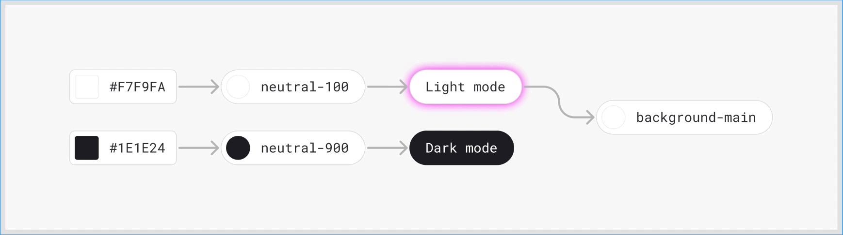
I was concerned about having too many available options and duplications in the palettes available to designers, so I chose a naming approach that aimed for a balance between being broad enough for one color to cover multiple uses, but also being specific enough to know what colors to use in different scenarios.

This was fine… until it wasn’t.
Once we started getting into more complex components, it became hard to make token naming decisions, and the choices to use certain colors in different contexts got further and further away from their intended uses.
To maintain simplicity for users with this approach ended up being too complex to maintain.
Lesson
Don’t overcomplicate decision points. What we should have done was had a simple, fairly static semantic theme palette for general design use, and then have components use their own palettes with hyper-specific token aliases (based on Nathan Curtis’ fantastic article on token naming). This would mean new tokens for every component in the system, which would mean more tokens, but a lot less complexity in decision making.
With the dark/light mode token architecture described above, one of our goals was to allow designers to easily design in either dark or light mode, without the overhead of having to maintain double the number of components.
Mistake
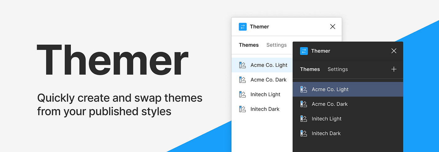
We built the Figma side of our system around a third-party plugin called Themer. It allows us to define color and type tokens as styles in Figma, and dynamically swap frames or whole pages between dark and light mode. Initially, we had a good experience. A few small issues but nothing major.
Then, slowly over time, Figma started to change, and Themer didn’t.
Variants were added as a new component capability. Now, whenever a variant is switched, the component theme resets to the default and has to be reapplied via the plugin. This was a significant problem for general system usability, as we had entire products that were developed in dark-mode exclusively.
Performance also degraded to the point that it’d sometimes take over 10 seconds to apply a theme to a screen. But given the resources we had, switching our approach here would simply take too much time, and wasn’t viable short/medium term.
Lesson
Be very, very careful about relying on third-party plugins. Themer is a great plugin, but at present it’s not best suited to meet our needs, and as such it shouldn’t be an integral part of our system.
Given Figma’s current capabilities, I think I would opt for a dark/light theme toggle setup as a variant. This would allow variants and variant properties to be used without an extra step. It would increase maintenance complexity, but it’d be a worthy trade-off for the system usability improvements.
I hold out hope that Figma may implement native token support in the near future. We don’t want to attempt a big migration to another plugin like Figma Tokens if there’s a chance we’ll have to do another migration to a native solution shortly after.
As a note, we are still using Themer at present, and it’s been fully rewritten recently to solve a bunch of small issues and performance problems, though the variant issue remains a problem.
This is probably the most common one on the list. We went into the project with the best intentions. We absolutely nailed a bunch of aspects of the system, and were incredibly happy with the components we’d built, and the basic usability of the system itself.
Mistake
We failed to put the effort in and publish our documentation early and often. We had an honest attempt early on. We set up a private Zeroheight site, and researched aspects of documentation that we liked and disliked from other design systems. We found some good ones, and tried to replicate them in Zeroheight, but kept running into minor issues and blockers that just got in the way of us writing the content.

As we kept building components, I kept putting off documentation for them because we didn’t have a good standard set, a baseline of what the documentation needed to include and how it should be structured.
And we kept putting it off.
As of writing this, we still don’t have good general purpose public documentation available. We have a really nice Storybook instance, which we are very happy with, but nothing that helps explain key system concepts, and design considerations, or helps integrators with accessibility.
Lesson
Don’t let tools get in the way of your writing. Ignore how you lay out images, do’s and don’ts, and color palettes for now, and use whatever tool you’re most comfortable with to get ideas out of your head and shared. The team can iterate from there.
My next step for Castor is to try using Notion (something I’m familiar and comfortable with) to write up the core content, and then figure out whether to keep it there and polish, or look at different solutions.
It’s me. I’m the person. Having been involved in the design of Castor from the ground up, I’ve always felt it is “my baby” to a certain extent. As a result, I tried to involve myself in major decisions, and did a lot of the work myself. While I did put in a lot of effort trying to optimize the process for wider contributions, writing process documentation and setting up process diagrams with our project manager, as a part-timer I should have realized I can’t do everything.
Mistake
A few parts of the system are simply overly complex (the theme tokens for components as mentioned earlier being the main area). Every time a new component requires token changes, I have to handle these myself. They involve lots of manual changes in lots of files across multiple systems. I also have to ensure these changes align with code within a short window of time.
At one point we started an iteration on our color tokens to better align the visuals of some of our dark and light mode components to make them a little easier to manage. This work had knock-on effects to a lot of contributions that were already in progress, and they were blocked until these other changes went live. During this time other projects were taking more of my day, my number of direct reports grew, and the time I had to oversee these changes dropped to zero. Components were in a half-finished state for months, and velocity dropped significantly.
Lesson
Design the system to empower the wider team. One of our biggest constraints was the fact that myself and the majority of the team were part-time. I should have spent more effort designing the system to allow more independent contributions, and to document parts of the architecture well enough to allow others to contribute. We should have invested in better tooling to manage token parity between Figma and Code. We developed a plugin during a hack-day, but never got it into production.
Once we secure more resources to work on improvements, I’ll prioritize some of this tooling and refine the process to be a lot less complex, more distributed, and asynchronous.
Design systems can be a lot of fun to design and build. You spend months sweating over details, making plans, and trying to justify your impact. When you’re that close to something, you can sometimes take for granted that your work is visible and understood outside of your team.
We did a handful of company-wide slide decks and presentations before and after launch to build awareness, but nothing sustained or targeted.
Mistake
Despite great efforts building the system, planning and coordinating the initial migration, seeking contribution from the wider team, and working on a robust metrics system, ultimately I failed to effectively communicate the value of continued investment as broadly within the company as I needed to. We lost our full-time engineer to a re-org, and a few larger projects hitting at once further constrained what our part-timers were able to achieve.
Lesson
Set aside time to plan communication. Ensure there are regular communication channels where the team’s work and impact is highlighted. This could be a monthly newsletter, quarterly talks to the company, or more 1:1s to engage business leaders to discover their problems and concerns, and ensure it’s clear where you can help.
Continually justifying your own existence is an exhausting reality that a lot of design systems folks face daily, but I think with more planning in our communication, we could have had more impact with less stress than we have to date.
Everyone makes mistakes, and no one is able to design a perfect system. What’s important is having the self-awareness to identify those mistakes, and apply and share the lessons, so you and others don’t run into the same problems over and over again.
So, what’s your biggest design system mistake?
Thanks for reading. If you get value from stories like this and want unlimited access to all the content on Medium, consider becoming a Medium member. It only costs $5 a month, and that money will help support me, and other writers you read on Medium.
If these articles are relevant to your job, you might even be able to justify it as a learning & development expense! Food for thought.
from Medium https://medium.com/@subcide/my-five-biggest-design-system-mistakes-4725859926c2