
It can be diabetic life or death, so you should probably have some good UX.

First and foremost: this is not coming from nowhere or without any knowledge of the surrounding health topic. I’m a type 1 diabetic! I use a Dexcom every day.
So what is a Dexcom? It’s a continuous glucose monitor (CGM), and it basically consists of a sensor and transmitter combo that sends me blood sugar (glucose) data every five minutes, reducing my need to prick my finger, and I’m very lucky to have one. Although there is a separate receiver you can buy, most younger diabetics now will download the Dexcom app appropriate to their generation (G5, G6, and the recently released G7) onto their smartphone.
I thought it would be interesting to consider how a company has changed and modernized their UI over time by comparing and contrasting the three different generations of the app to see what improved, what didn’t, and what’s left.
Please note that for the G5 and G7 respectively, I’ve never touched them with my own two hands. There wouldn’t be much point, as I’d need to somehow get a G5 sensor to make the G5 app work (I’m not rich enough to pull that off randomly), and the G7 has not yet reached America. This will mainly focus on the visual analysis. This also means working with given Dexcom images, which are subpar but still informative.
The Dexcom G5 Experience
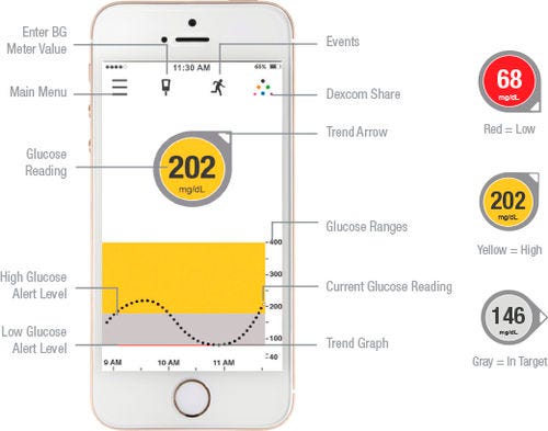
I’m sorry about the image quality. This is what I’ve got as someone who can’t personally access the app in a useful way. So this is the Dexcom G5, which landed here in 2017.
You’ll notice throughout all of the Dexcom apps, there is a consistency in that little circle and arrow indicator that shows your blood sugar’s current number as well as its trend (i.e. what direction it has generally been heading), as well as the general alignment of the information. The indicator and trend arrow is the Dexcom logo as well — it’s synonymous with the brand.
The bottom half of the screen is a graph that shows each individual reading for the past few hours as a dot. You can turn the screen horizontally to see up to 24 hours of past readings in a neat graph.
Let’s go ahead and talk about some of the positives and negatives.
- Positive: Dexcom has always cleverly color-coded its signals, as shown on the right side of the image. This is good. At a glance, a user knows: yellow is high, grey is okay, and red is low.
- Negative: However, their use of color in the app itself is jarring. Color should be used sparingly, as we all know. Turning the entire part of the graph yellow or red is fairly bad. I’m pretty sure black dots on that red color wouldn’t past contrast tests, and it feels like it might draw the eye down to the graph rather than the immediate reading.
- Positive: The use of font size to create hierarchy immediately draws the eye to the center of the screen with the reading. The “202” is the most important information for a user to see quickly. When you wake up at 1 AM shaky and trying to figure out if your blood sugar is dangerously low, you need to comprehend that number right away.
- Negative: The buttons on top are confusing. They need labels. Consider that a good portion of Dexcom users are older, simply because diabetes is so widespread, and handing this to my older family would result in some confusion. The option to enter a value from a separate glucose monitor looks like a syringe, which means little. Is it to enter insulin doses, which I do inject? The clearest button on top is the menu.
The Dexcom G6 Experience
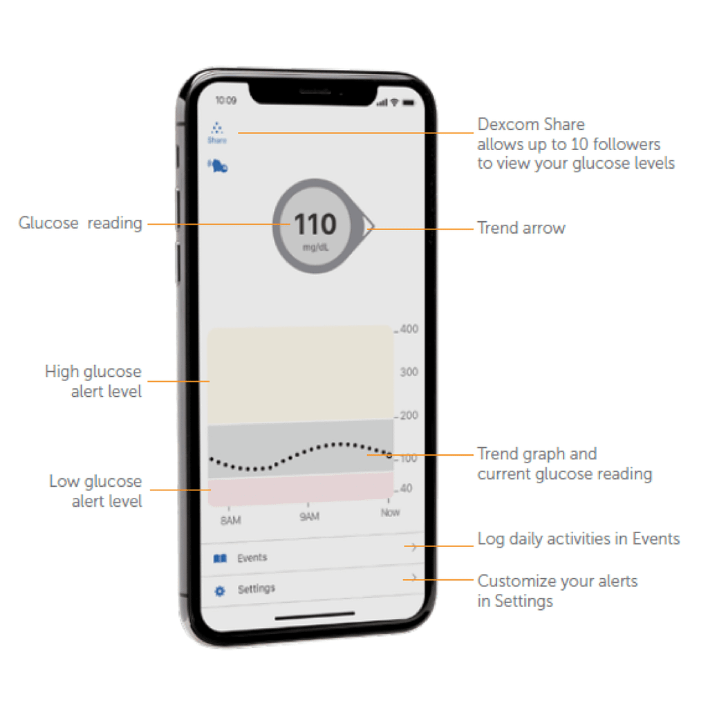
So this is the guy I know like the back of my hand. It’s surprising how little the design changed overall. In fact, almost all of the features remain completely unchanged. I have my complaints still, though, especially as a regular user.
- Positive: Colors no longer change the graph background, only the indicator background. This keeps the graph looking less obtrusive and doesn’t pull attention away. Overall, the colors here are gentler and less abrasive — less stark black on white, less sudden jarring color changes.
- Positive: The change in font of the current reading makes the entire screen feel more cohesive, though it does rely more on your understanding of the indicator immediately.
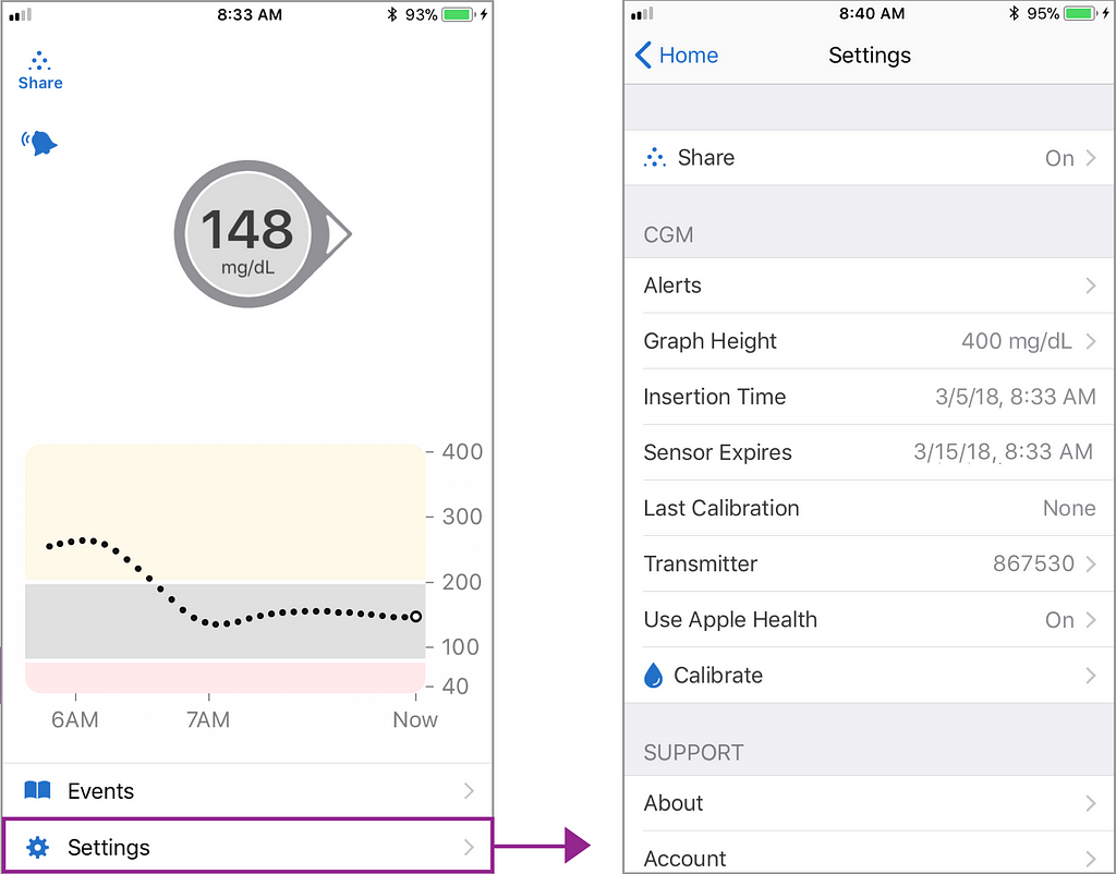
- Negative: Moving the calibration by separate monitor button (i.e. the syringe) off of the home screen feels like a lost opportunity. You have to navigate through the settings and then find Calibrate on there (now helpfully marked with a drop of liquid, i.e. blood, instead of the syringe). To me, calibration isn’t a “setting”. It’s a function in the app.
- Negative: Okay. Here is a confession. I’ve used a G6 for a while now. I still don’t know what that thing is to the top left of the current reading— the bell thing, I mean. It reads that “Scheduled alerts will sound” when you tap on it which is… great, I guess? But it’s also profoundly unhelpful. I don’t know!
The Dexcom G7 Experience
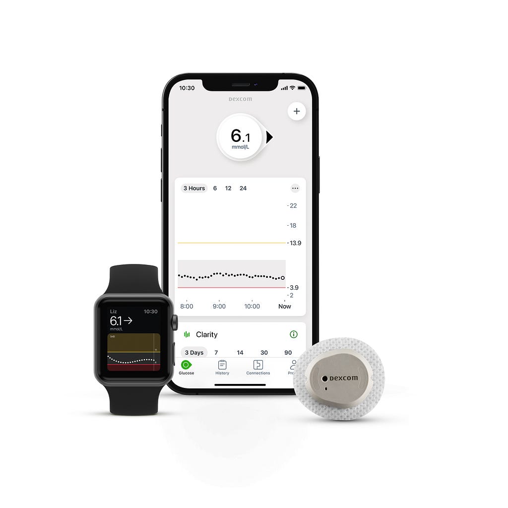
So, here’s the new guy on the block. In Europe, at least. And I’m jealous of everyone getting to go out with the new guy.
If you’re wondering why the numbers are different, mmol/L is the European measurement, while mg/dl is the U.S. measurement.
This interface is gorgeous. It’s still so Dexcom. The current reading indicator and trend arrow, the graph underneath, and all those other trademarks but now everything is so much clearer. Let’s go over it.
- Positive: Look at the bottom: icon labels! Text and an icon! “History” and “Profile” Already sound more interesting.
- Positive: They’ve moved the old ‘tilt your phone to the side for the graph’ thing onto a series of time period selectors above the graph.
- Positive: Can I say that the organization and map of this app already looks better than it used to? Just from the home page alone. That’s a sign that things are going the right direction.
- Negative(?): I do wonder if the trend indicator and current reading is as attention-grabbing at 1 AM as on prior versions. It’s more starkly separate in the G5 especially and in the G6 as well. I’d have to see it on an in person screen to really get a sense of how the elevation helps bring that forward.
- Unclear: I’m really not sure about what the plus button in the top right means. My instinct says it’s to add your own reading, whether to calibrate or just to have in your history, as in the Events section in the G6. I’m not really sure on first glance. I’m also curious about the three dots on the graph for the same reason.
Conclusion
I didn’t want my first article on Medium here to be just another case study.
So I thought I’d take a niche topic relevant to me and my chronic illness and take a closer look at it. It’s rare that you see an app have three different generations to it with distinct features and differences but such a specific brand identity that persists across all versions.
Dexcom is stepping forward in its UX. It’s moved ahead very quickly in a matter of years, which I’m happy to see. Ease of use is especially important for medical technology which matters to so many people.
I’m very excited to see Dexcom G7 make its way to the U.S. for a lot of reasons. But I’m especially excited to see that new app on my phone screen, making managing my glucose a little easier.
Comparing the UX of diabetes monitoring systems was originally published in UX Collective on Medium, where people are continuing the conversation by highlighting and responding to this story.
from UX Collective – Medium https://uxdesign.cc/comparing-dexcoms-home-screen-ux-over-time-9a974bea3f11?source=rss—-138adf9c44c—4