There are times to use toggle switches and times not to. When designers misuse them, it leads to confused and frustrated users. Knowing when to use them requires understanding the different types of toggle states and options.
Contextual States Vs. System States
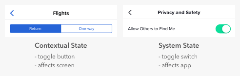
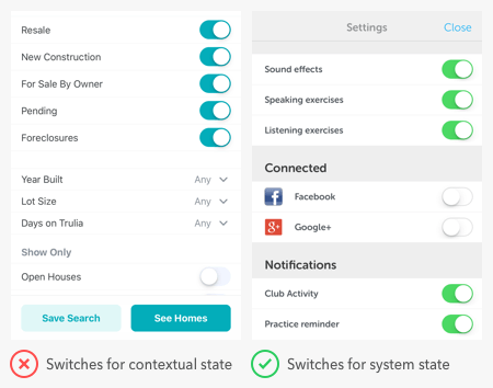
It’s easy for designers to confuse toggle switches and toggle buttons because they both manage states, but there’s a fundamental difference. Toggle switches are for system states, and toggle buttons are for contextual ones. A contextual state only affects the current screen in focus, while a system state takes effect everywhere on the app.
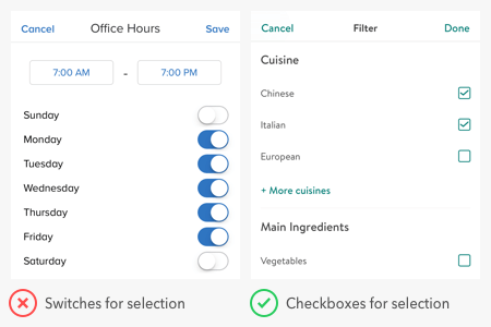
Many apps misuse toggle switches by using them for contextual states. For example, a common mistake is to use switches for search filters. The filters only apply to the context of search, not to the entire system. Therefore, the proper selection controls to use are checkboxes, not switches.
Users expect switches to render an immediate effect when they toggle it on. However, the search filter settings don’t take effect until after users press the “save” button. If there’s a delayed effect due to a separate button, switches are the wrong controls to use. A switch itself is a “button” that activates state. A separate button for the switch isn’t necessary.
It’s typical to find switches in a settings screen of an app because that’s where users go to manage system states. But you can also use them for modes that affect the app. The example below shows switches for privacy mode and dark mode.
Binary Options Vs. Opposing Options
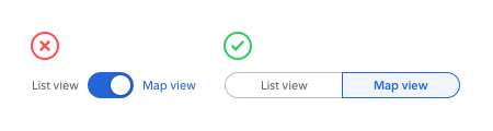
Switches are for binary options, not opposing options. A binary option represents a single state that is either on or off — or in other words, true or false. Opposing options are two separate states that are opposite but related to different user tasks.
Some apps make the mistake of using switches for opposing options. They place the option labels on opposite sides of the switch and use the direction of the thumb to indicate the state. This practice is a misuse of switches that confuses users because the visual cue isn’t clear. Not only that, but the switch has two different states without an off state as they would expect.
When you have opposing options, toggle buttons are the right control to use. In the example, “list view” and “map view” are the opposing options for users to toggle. A toggle button in this context works better than a switch because it groups the options and allows users to view them side-by-side. They’re also able to select each option directly and get clear visual feedback.
States Vs. Actions
Switches are for states and buttons are for actions. You should never use a switch in place of a button, or you’ll throw users off. When they see a call to action, they expect to interact with a button, not a switch.
The example shows an app using a toggle switch as a download button. This approach is a misuse of switches because downloading is a one-time action, not a persistent state. Turning the switch on downloads the content but ends after that. Turning the switch off doesn’t undownload it, which can mislead users.
Three Conditions for Using Switches
Next time you’re considering a toggle switch on your app, check if the situation meets these three conditions. If it does, you’ll know for sure that a toggle switch is the correct control to use.
Use a toggle switch if you are:
1. Applying a system state, not a contextual one
2. Presenting binary options, not opposing ones
3. Activating a state, not performing an action
from UX Movement https://uxmovement.com/mobile/stop-misusing-toggle-switches/
Buttons have more than an enabled and disabled state. They also have a loading state. The loading state isn’t usually shown to users because most actions happen within seconds. But for operations that take longer than usual to occur, not showing the loading state leads to action errors.
Action Errors
If the action takes longer than expected to finish, users need to know that the system is processing their request. If they see nothing happening, they’ll think they didn’t press the button correctly. This belief will cause them to press the button again.
When users press a button more than once, it not only increases the system’s processing load, but it duplicates the operation. Depending on the context, this can lead to significant errors that not only frustrate users but you as well.
For example, users could accidentally send repetitive messages, submit forms multiple times, or order the same product twice. These action errors create extra data that you have to manage and clean up. And sometimes cleaning up that data can cost you time and money.
Progress Buttons
To prevent these errors, you need to use progress buttons on operations that take longer than two seconds. A research study found that users expect pages to load in two seconds or less, and become impatient when it takes longer.
A progress button gives users a visual cue that indicates a loading state. When users see a process taking place, they’re less likely to press the button again. It’s crucial to ensure no action errors occur by disabling the button when it’s in progress.
You can display the button’s loading state outside of the button, but this isn’t ideal. Users already have their eyes on the button when they press it. By placing it on the button, it’s in line with their visual field. A progress indicator in another area means users have to look for it and might miss it.
Progress buttons should be simple to implement and have a consistent style. This way, users can better recognize the loading state, and the buttons won’t conflict other screen elements. The progress indicator shouldn’t increase the button size or dimensions. Nor should it require the button to have a unique background color. Instead, use a transparent background to signify a disabled state and a high contrast color for the indicator.
The progress indicator shouldn’t hide the button label, so users always know what’s in progress. Accomplishing this is difficult when you don’t have enough space to fit both the indicator and label together. What you can do is use a linear progress indicator instead of a circular one. This approach displays the progress inside the button while keeping the button label visible. You can also show the progress on the top edge of your button if it has sharp corners.
To better inform users what’s in progress, you can also change the button label to describe what the system is doing. For example, changing the original label from “submit” to “submitting…” tells users what’s happening as they’re waiting. Keep in mind this approach may not work if your button isn’t wide enough to hold a longer label.
Follow the Two-Second Rule
The loading state isn’t what most designers consider when they design buttons. But when your actions take longer than two seconds to complete, it’s essential to show users the loading state. Progress buttons are the control for doing this. Make use of them so users won’t commit action errors that cause you trouble.
from UX Movement https://uxmovement.com/buttons/when-you-need-to-show-a-buttons-loading-state/
How UX Writing and Microcopy Fit into a Company’s Broader Strategy
UX writing is also about business. As I stated earlier, UX writers must align with a company’s values and identity and play an important role in the UX-design process. UX writing is not an isolated task. The UX writer is involved in mapping and building the customer journey—work that has a tremendous impact on attracting new customers.
Therefore, UX writers should be aware of customers’ expectations, needs, and backgrounds, as well as their current stage in their user journey. Based on this information, UX writers plan a strategy to provide a coherent, consistent narrative throughout the product journey.
UX writers also develop a tone that aligns with the story the product intends to tell. What is the feeling that this language evokes? Is it engendering curiosity, relief, or trust? How does it help customers in their journey? Is the language intuitive? These are the questions that UX writers must answer to ensure they create compelling, clear microcopy that benefits the business.
As a result, UX writing plays a key role in generating the results of a company’s overall strategy. The right words in a headline or call to action can make the difference between a customer who engages with your product and one who leaves after three seconds of interacting with your user interface. When UX writers are able to reflect a company’s mission and identity, this can translate into a big difference in revenue.
UX writers also bridge multiple areas of an enterprise. While the creation of microcopy occurs in a company’s UX design department, UX writers can also assist in other areas such as communications, marketing, and public relations, enabling a company to communicate effectively with their target audience. Also, since UX writing is a relatively new field, UX writers typically have diverse backgrounds that provide a variety of perspectives and can enrich the process of product ideation and development.
What Is a UX Writer’s Skillset?
What are the skills UX writers need to understand a target audience, align with a company’s strategy, and write compelling text? Let’s explore their skillset.
First, they must be observers. Paying attention to their surroundings is a quality most people take for granted. But could you tell me how many columns there are in your workplace? Or would you be able to draw the ceiling lamps in your office? Even though we look at things, we don’t always observe them. We hear, but we don’t always listen.
Being as curious and amazed about the world around us as a child is the quality that makes the difference in writing microcopy. The mind of a UX writer should be prepared to catch inspiration even in the least expected moments. Charles Baudelaire, a French poet, wrote about the flâneur, a person who wanders the city, learning about behavior and social dynamics. Baudelaire said, “His passion and his profession are to become one flesh with the crowd.” The flâneur is a great observer and communicator, just as UX writers are. UX writers learn about and understand the user’s behavior and can share this knowledge with their colleagues and synthesize it into words.
UX writers are also great listeners. Listening to people’s conversations at work or in public spaces gives important clues about how they relate to products. Even listening to their own conversations with relatives and friends can be a valuable asset in UX writing. Listening enables writers to see what is out there that a company might be missing internally.
What Is Good UX Writing?
UX writers must have the skills that are necessary to choose words that speak to an audience in a compelling way. But how does the UX writer do this? If you want to improve your UX writing, you should do the following:
Write simple, accurate words. Don’t try to sound smart. You don’t need fancy words. In fact, the accessibility and clarity of your words is the best indicator of your expertise in UX writing. Write copy that a six-year-old child can understand.
Avoid user frustration. Be kind to users who might encounter situations that could be frustrating to them. Examples of this are the 404 pages that appear instead of the page a user wanted and the messages users get when they type their email address incorrectly or choose a user name that already exists. Don’t make the user feel frustrated about having made a mistake. Instead, focus on providing a solution or turn the situation into a fun moment that encourages the user to keep navigating through your Web site.
Be creative, but remember the importance of patterns. One challenge of writing UX microcopy is choosing appealing words that align with a company’s brand identity while maintaining the use of language that users can easily recognize and understand. According to Jakob Nielsen: “Users spend most of their time on other sites. This means that users prefer your site to work the same way as all the other sites they already know.” Therefore, good user interfaces employ standard visual structures to enhance the experience of users. The same applies to UX writing. There are certain words that users recognize when filling in a form on a Web site or signing into an application. If you harness the potential of familiar words and patterns in creating microcopy that is, nevertheless, creative and unique, your users will want to come back to your app or site.
Make your microcopy invisible. Microcopy helps guide users through a user interface. But it should be so clear and enjoyable to read that users don’t notice you’re guiding them. In filmmaking, an invisible montage shows such a fluid sequence of events that viewers are not even aware that they are actually watching fragments of recorded images and sounds. Ideally, they perceive a fluid, coherent story that makes them forget they are in a movie theater. The same can happen with good microcopy that supports a fluid journey. Customers need not spend much time reading text or understanding button labels. They just follow the visual path that UX designers and writers have created for them.
Make your writing personal. Good microcopy is about establishing a conversation with users and enhancing personal interactions. Because you are talking directly to users, use you in your sentences to get their attention and show them there is a human behind the screen—one who cares about them. Sometimes you’ll also need to use I in your user interfaces—for example, in microcopy such as “I want to know more” or “I accept the privacy policy.”
Harnessing the Power of Words
Gone are the days when product teams added microcopy at the end of the design phase or thought of UX writing as a task that any member of the team could easily complete. Choosing the right button label—just one, two, or perhaps three words—can be harder than writing big blocks of text. But that single button could make the difference between users engaging with your product or leaving your Web site. Most companies are realizing the complexity and importance of choosing the right words to communicate with their customers and ensure a compelling user experience. Harness the power of words!
from UXmatters https://www.uxmatters.com/mt/archives/2019/08/ux-writing-creating-microcopy-that-speaks-to-users.php
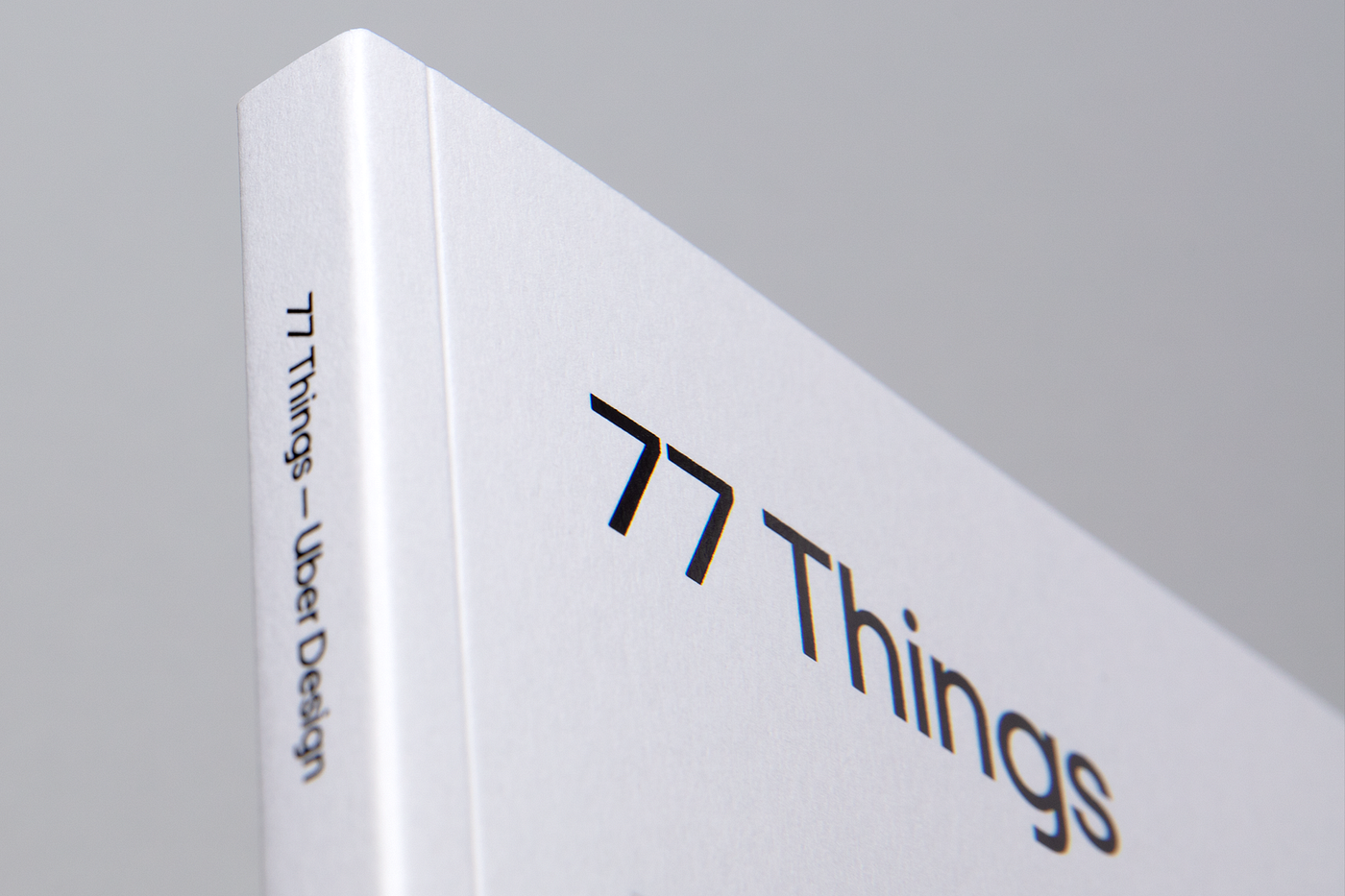
Last year, Michael Gough had an idea. Actually, he had 77 of them — 77 thoughts and insights that he’d developed over a lifetime spent crafting his design thinking, including stints at Adobe and Microsoft and working as an architect. Now, as Uber’s new head of design, we found an opportunity to share these ideas with the world.
The timing couldn’t have been better. Our Brand team had recently started rethinking Uber’s brand positioning, creating a new visual identity system — typefaces, color palette, grid, layout, photography, and motion. Using Uber’s new system to share Michael’s thoughts on design seemed like a perfect collaboration.
As Senior Brand Designer, I worked with Chad Balanza and Mason Field, under the direction of Peter Markatos, to realize Michael’s vision.
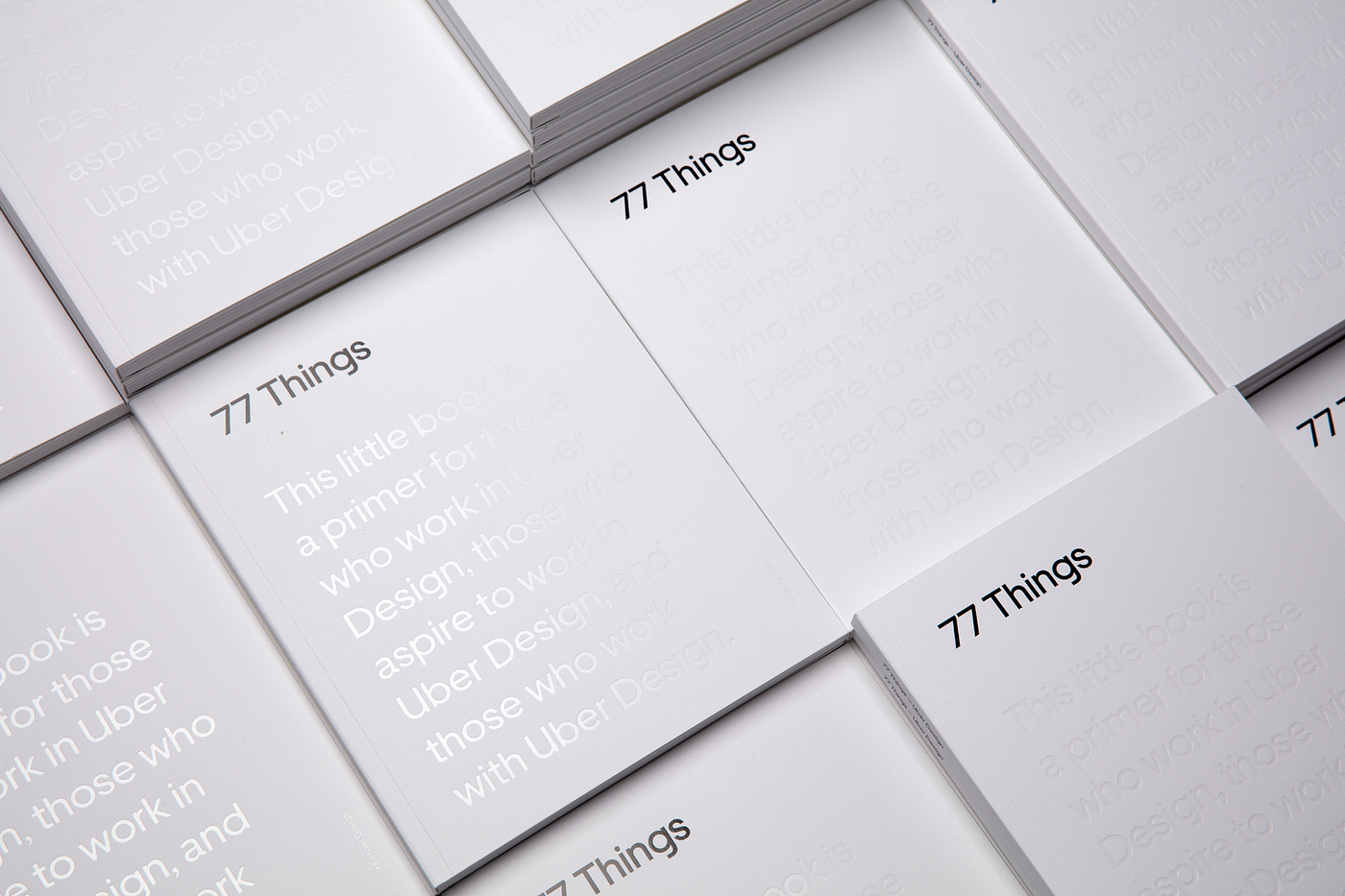
The result was 77 Things — a design-forward, aesthetic exploration of some core principles of design.
This book is not for sale. The only way to get a copy is to come to our Uber design events or by joining our team. In the meantime, get the Google Chrome extension on your computer.
The challenge
The book required us to explore the boundaries of Uber’s new visual identity system. Our goal was to showcase examples of how to place the whole range of our new identity to use.
What’s interesting is the book was shaped by its own content. After all, if you are going to put forth 77 design principles, you’d better live up to them. A central theme of the book is designing for pattern. Throughout the book, we followed one of the principles most critically:
“Pattern recognition is an essential skill for creators. See the patterns in user behavior and how to change them. Understand the implicit patterns of use, layout, and function in your work. Then, make them explicit.” — 77/77 Things
We decided to put these practices into designing the book — looking for the patterns in these principles and thinking about how not only to spotlight but to interact with them. In short, we would make them explicit.
The first step of the process
The first step was to figure out the patterns and elements we wanted to use to exemplify our brand. Once we had a clear vision of a grid, type rules, and everything figured out, we were able to place each page quickly. In just four months we went from concept to final print.
We also had to balance the intention of the pace at which someone will read the book. We wanted to create a book that didn’t insist on being read front-to-back or all in one go. Ideally, the book reads as well by flipping to a random page as it does reading from the beginning. We used images to give the reader a break — to pause and think about what was just read — as well as to serve as visual associations to the text, references that would be more significant than a page number.
The second step of the process
Next, we began testing readability and trying to push the new brand identity to its limits. We wanted to know a few key things:
Is this easy to read?
Are we showing the full range of the beauty and functionality of our typeface?
Are we striking the right balance between headlines and copy?
Are we using our secondary colors in a subtle but effective way?
Is the contrast too much?
Are the colors working well with black and white?
Are we making the book interactive in a way that complements the content rather than distracting from it?
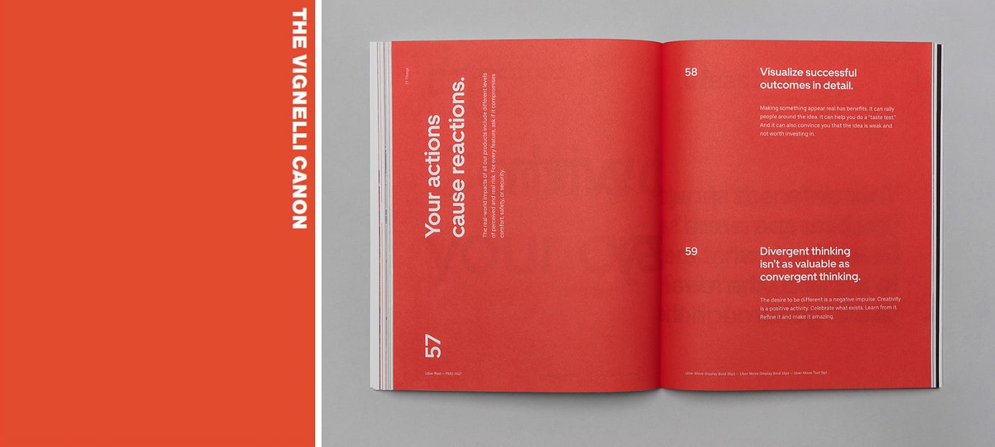
The overall aesthetic of 77 Things followed our new design system, and that system was heavily influenced by modernist design. We didn’t try to reinvent the wheel. Josef Muller Brockmann, Massimo Vignelli, Otl Aicher, and Alexandre Wollner were key sources of inspiration.
For example, we loved how Vignelli uses typography, layout, and composition to draw focus or pace the reader’s attention. I tested different layouts to influence the pace at which someone would read this book.
Massimo Vignelli on the left. 77 Things book design on the right
What didn’t work?
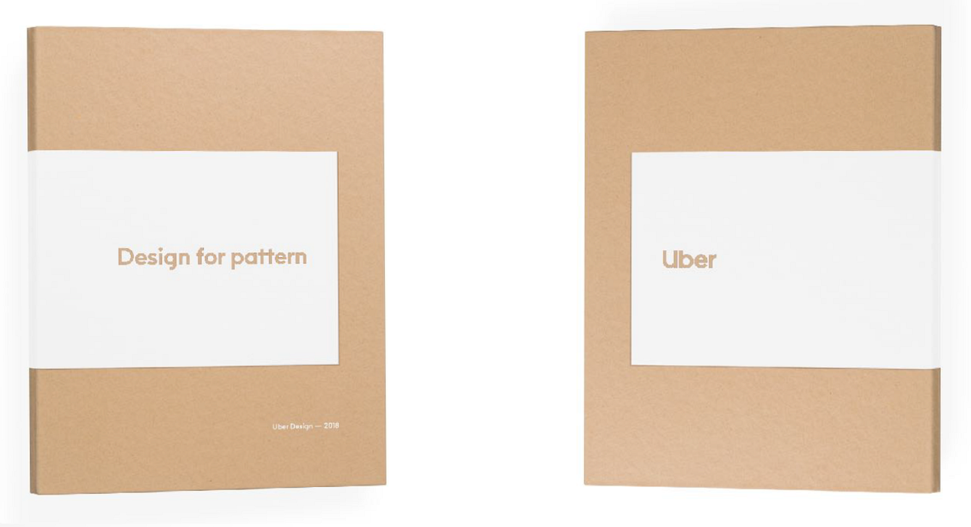
We developed many concepts for the cover. One particular design utilized a combination of craft paper and white foil that the team favored initially. We were intrigued by the contrast of materials and loved that the book would have a grit to it in hand. It would feel raw and unfinished — like a workbook of sorts. This played nicely with the idea that this was by no means a completed work: designers would be encouraged to add to it, write notes in it, and further develop these theories we design by.
Early design idea we moved away from
Another design iteration we evolved
But ultimately, the master brand system helped us determine the right approach, and we felt it was inconsistent with our original thinking. Craft paper was not a material or texture that best represented the new Uber. This book would be the first artifact produced after the launch of our new visual identity system; it was imperative that it embodies the principles of the brand moving forward.
The inspiration for the book title came from an essay by Wendell Barry titled “Solving for Pattern.” Our original name, “Designing for Pattern,” was intended to pay tribute to it. We wanted the book to inspire and be shared amongst our audience. We didn’t want the book to end up dusty on a coffee table or tucked away in a drawer. Ultimately, our desire for simplicity and accessibility won out over our effort of homage. The title “77 Things” is an attempt to remind the designer that this book should be picked up and read from time to time: each of these 77 things can help you hone the craft of design at any point throughout your career.
The third step of the process
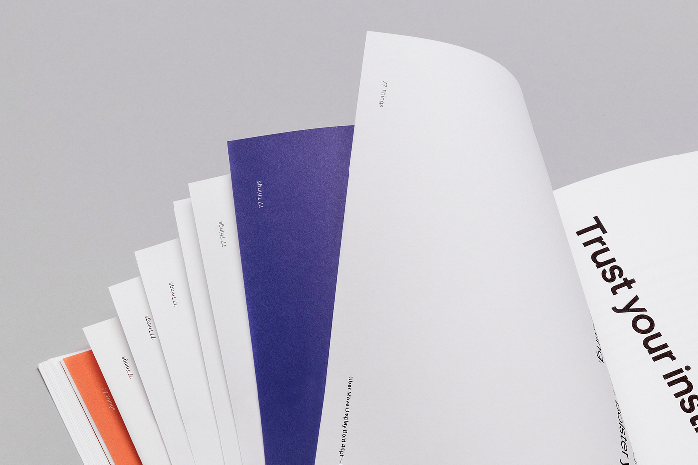
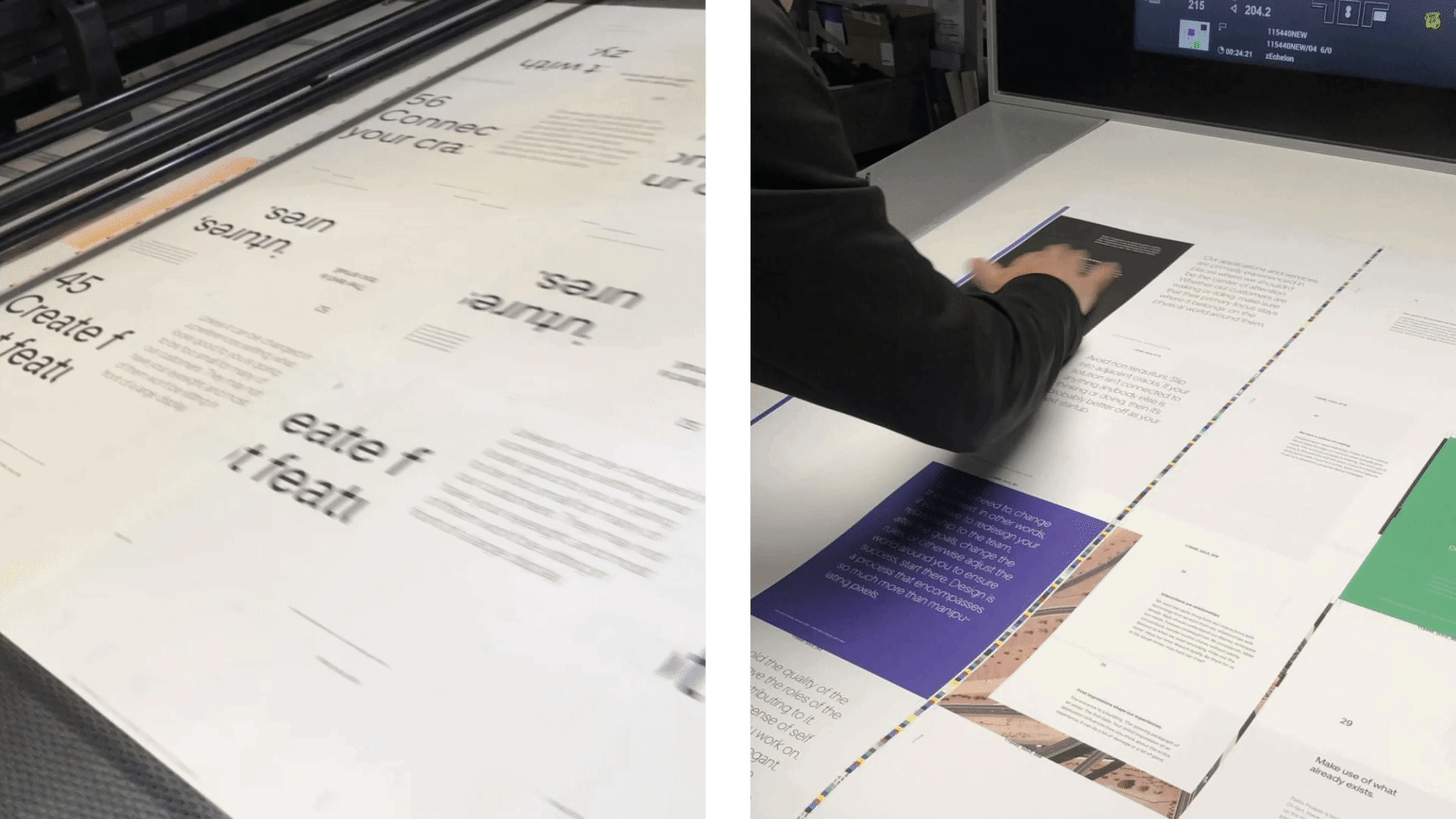
The print process required us to think about paper. We first chose an uncoated paper with a nice texture. We had a really analog feeling about the book but outside of the cover, we didn’t have a lot of extra fancy stuff going on in the book.
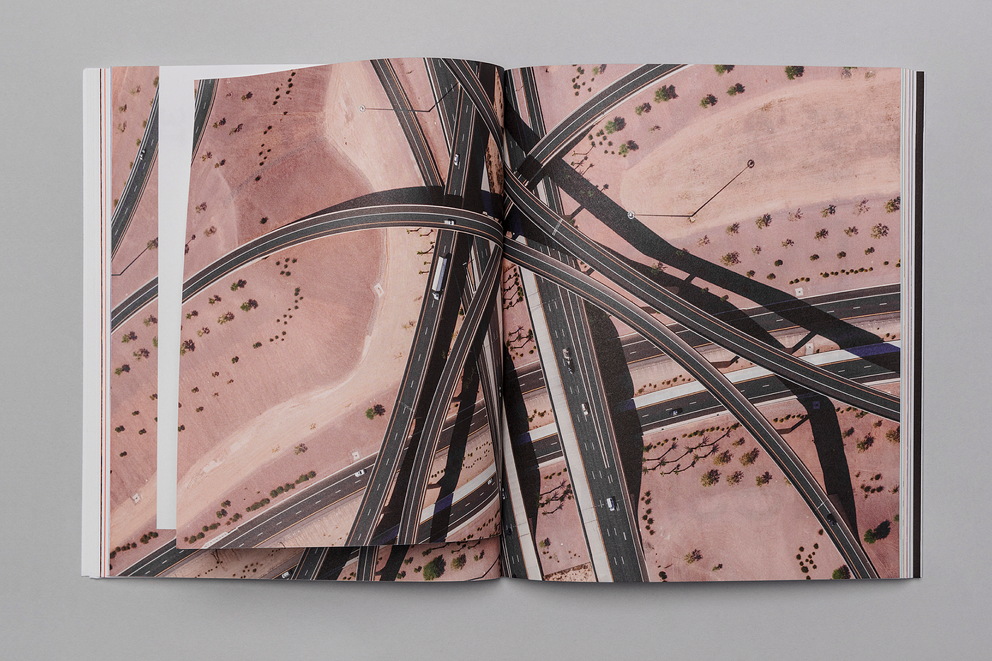
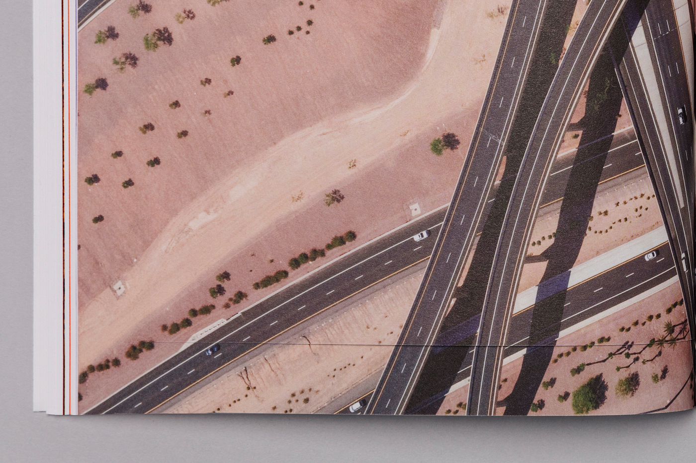
The printing itself was a challenge. We used PMS (Pantone Matching System) colors for our solid background color) to ensure 100% accuracy with our new secondary palette. We had tried using CMYK to cut down costs, but the first print just didn’t look right. One page, in particular, that was tricky was the flyout page with the desert photo. The inserted page was printed at a different moment in the production. In any print run, small variations in color are typical, but for this page, we needed the insert to match exactly with the main page. In addition, the cut of the page made it difficult to align perfectly. It took a few times before we got it right.
Anatomy of the Book
Typeface
“Understand type and how to use it.” — 51/77 Things
The Uber Move typeface is one of our identity’s strongest assets. Thinking on that, we use every single weight of the Uber move display and text fonts, in different body sizes. This is not the way we use Uber Move in our daily work, but this book is a great opportunity to show off the beautiful shape of our exclusive typeface.
The main rules of the typeface
1st: Weight Jump
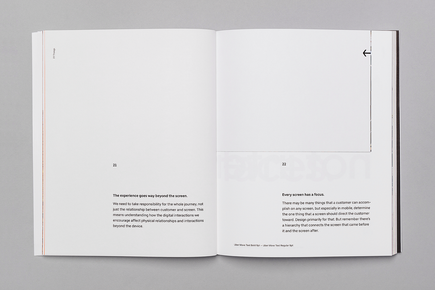
The first way to create hierarchy is to use the right pairing of fonts. For example, if we’re using ‘bold’ for the principle, we use ‘regular’ for the text.
2nd: Weight Jump + Size
Another way to create hierarchy is to find the right balance of sizes between a headline (in our case, each principle, in bold) and the corresponding body copy. Each principle is either the same size as its body copy or else at least twice the body copy’s size. This is a good rule of thumb for sizing. If body copy is just a little smaller than a headline (80% the size, say) then the difference between the two is hazy, and the end result feels sloppy. We wanted either identity (with the headline and the copy the same size, which is visually pleasing) or a discernible difference (2x or more) that was clear and clearly intentional.
3rd: Size
Inspired by a quote from Massimo Vignelli, the first spread layout starts with a different hierarchy set. We use a medium weight for both the principle and the body copy. However, the principle is 13 times bigger than the body copy. This creates an obvious, pleasing contrast.
4th: Space
A classical way to build hierarchy through a well-organized grid system is to allow for the right negative space between each element. One of our spread pages was also inspired by classical design posters from great designers such as Josef Müller-Brockmann and Otl Aicher.
7 Photos
“Don’t demand attention and don’t distract.” — 74/77
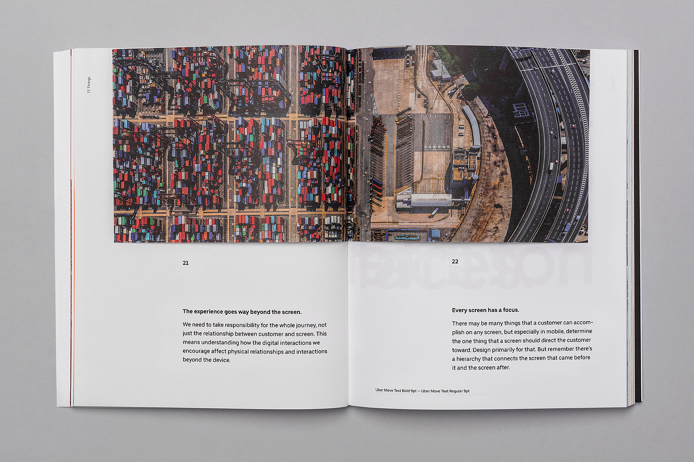
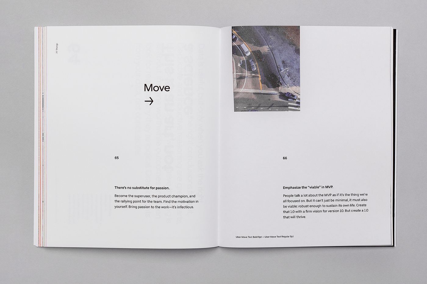
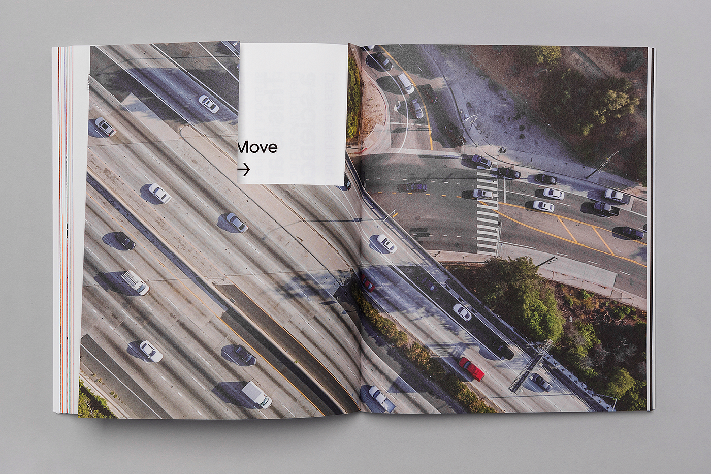
We chose 7 photos in the book for their pattern, texture repetition, movement, and alternation between city environments and nature.
7 Colors
“Embrace diversity.” — 16/77
We use our 6 secondary colors as the backgrounds for the 6 sections of the book. To complete the pattern, the 7th background color is one of our main colors: black.
7 Layouts
“Know the grid. Use the grid.” — 35/77
To maintain a pattern, we laid out a grid-based on multiples of seven. The most important part of the grid was the baseline. After some exercises, we decided to use 7pt, which is a tight baseline. This allowed us to create several different body copy sizes and to always set the leading to fit multiples of seven. This will be obvious to people who are more experienced with layout, but for those who aren’t, a good tip is to really give a lot of attention to the leading — it’s not just about making your type big to be easily readable, the right space between the lines makes the reading experience more elegant and comfortable for the reader. It makes all the difference on a project.
With the baseline and the margins set, we defined the six columns, and then the gutters and rolls, which we set at 14pt. With those combinations, we created the different modules we had available for the main content of the book:
It’s important to note that 77 Things was not an orthodox editorial project. For insights on using grids for more traditional design, I would highly recommend Grid Systems in Graphic Design by Josef Müller-Brockmann. I’d also recommend Visual Design: 50 Years by Alexandre Wollner, which isn’t specifically about editorial design but is full of great stuff about modernist brand identity design, including a step-by-step explanation of how the book itself is designed, which is a really good demonstration of the grid system at work.
Interactions
“Interactions are relationships” — 32/77
With 77 Things, we created some interactions between the reader and the book, some of them really simple, like changing the orientation of the book, and others a little bit more complex: using cut-outs to mask, reveal, or hide.
The finale
For the 77th principle, we created a special interaction, and the 76th principle leads to it.
The poster
At the end of the book, we inserted a detachable, folded page that opens into a poster with all 77 principles.
My reflections
Personally, designing 77 Things has been a deeply rewarding experience. Feedback has been positive, which is always nice, but past that, working on this project helped reinforce design skills I already had and to practice some new ones as well. Eight months later, I’m still using the techniques I learned from this experience and I don’t see that stopping any time soon.
Thanks for reading. I am excited to hear your feedback. If you have any questions please comment below. This book is not for sale. The only way to get a copy is to come to our Uber design events or by joining our team. In the meantime, get the Google Chrome extension on your computer. If you are interested in joining our team, please check out the current job listings.
__
77 Things
Written by Michael Gough with contributions from Eric Schlakman, Erik Klimczak, and Roy West, with support from Christopher Starr, Dana Beatty, and Lori Mann.
Designed by Braz de Pina, Mason Field, and Chad Balanza, under the direction of Peter Markatos.
Design production by Lori Mann.
Composed in Adobe® InDesign®.
Set in Uber Move, a typeface created for Uber by Jeremy Mickel / MCKL. Uber Move was inspired by the international language of transportation.
Printed in California with John Litster and Echelon Fine Printing on Mohawk Superfine Ultrawhite
Facebook is getting closer to letting you type with just your thoughts
During its developer conference in 2017, Facebook announced its plans to develop a brain-computer interface (BCI) that would let you type just by thinking. Now, researchers from the University of California, San Francisco (UCSF) working under this program have posted a study today noting their algorithm was able to detect spoken words from brain activity in real-time.
The team connected high-density electrocorticography (ECoG) arrays to three epilepsy patients’ brains to record brain activity. Then it asked these patients simple questions, and asked them to answer aloud. Researchers said the algorithm recorded the brain activity while patients spoke. They noted the model decoded these words with accuracy as high as 76 percent.
Facebook said it doesn’t expect this system to be available anytime soon, but it could soon make interaction with AR and VR hardware very easy:
We don’t expect this system to solve the problem of input for AR anytime soon. It’s currently bulky, slow, and unreliable. But the potential is significant, so we believe it’s worthwhile to keep improving this state-of-the-art technology over time. And while measuring oxygenation may never allow us to decode imagined sentences, being able to recognize even a handful of imagined commands, like “home,” “select,” and “delete,” would provide entirely new ways of interacting with today’s VR systems — and tomorrow’s AR glasses.
Earlier this month, Elon Musk’s Neuralink also announced a project that will let you control your iPhone via a device attached to your brain. While these devices may not hit the market in a couple of years, it’ll be an exciting space to watch out for.
from The Next Web https://thenextweb.com/artificial-intelligence/2019/07/31/facebook-is-getting-closer-to-letting-you-type-with-just-your-thoughts/
I start off every design workshop by saying the following statement: The first rule of design is: It’s all about the type (typography). The second rule of design is: It’s all about the type.
This is a reference to the movie Fight Club where the character Tyler (played by Brad Pitt) introduces newcomers to the rules of his underground bare-knuckle fighting club. Now I’m sure I don’t look half as cool as Brad Pitt saying that but I should get points for trying, no? The statement is clear though: Typography is the premier thing you need to keep in mind at all times.
Now, keep in mind that when I say design, I mean visual design, more specifically, the things that are relevant to your average non-designer person: Making a little website, a resume, a poster, some social media posts and things of that nature. But just for the purpose of this article, I’m going to focus on user interface design more.
The problem with typography is that it’s so subtle that most people don’t seem to pay enough attention to it. However, you could make complete designs with type only if you know what you’re doing.
The importance of typography
Let’s ask ourselves a simple question: What if the purpose of a website or app? Isn’t it to convey certain information? Isn’t it all just a frame to put a bunch of information in? The purpose of UI designers is just to arrange those pieces of information in a way that makes sense.
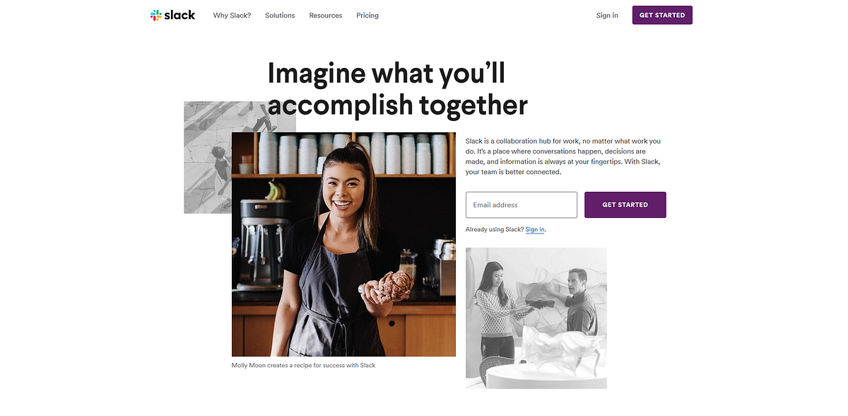
Most information in any website or application is text. Take a look at how Slack’s website would look like without Text.
Slack.com
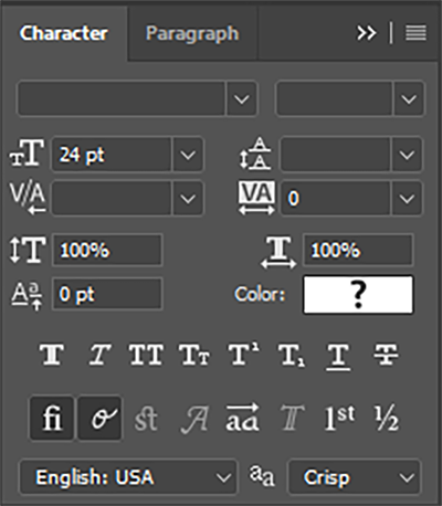
We don’t have too many layers to play with when it comes to typography. For pictures, it’s much easier because you have a whole lot of parameters you can play with: Brightness, contrast, saturation, color, exposure and each one of those had endless possibilities. With type, there isn’t a lot to mess with. So it’s both easier and harder. Here are the settings that are at our disposal to format text.
Typeface choice
Weight
Tracking (letter spacing)
Leading (Line spacing)
Slack.com
I’m sure that many wouldn’t think much of these settings. Heck, I know UI designers and front-end developers who have never used any of these parameters (apart from choosing a typeface of course). And yes, you’re right, you don’t absolutely have to. But it gives you an extra layer of refinement that makes your work stand out and look more "professional". I’m going to go into the details of how each of these can help you make better designs.
1- Know your typefaces
Picking a good font for your design is in my opinion, the most "make or break" step to your design. In that regard, try to keep these things in mind
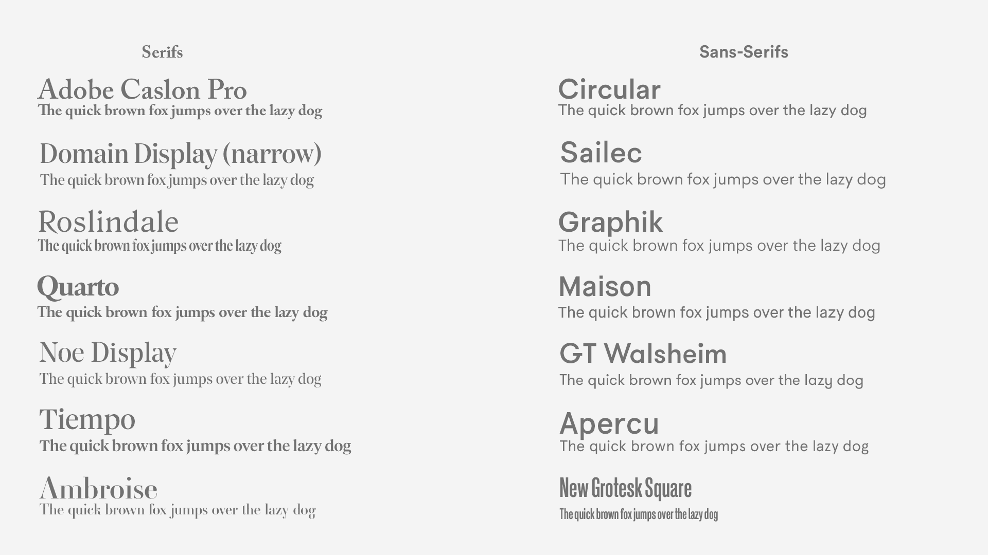
Try premium fonts
Helvetica Neue and Segoe are perfectly fine. But If you’re the kind of person who’s always using Open sans, Roboto, Raleway, Lato, and the rest of the Google fonts gang, you are really missing out. Google Fonts is greatly contributing to this notion that free fonts are just as good as premium fonts with tricky licenses. They’re not. Not by a long shot. Here’s my premium font cheat sheet
(apologies for the inconsistent weights, I don’t have the whole font families, they’re expensive 🤣 )
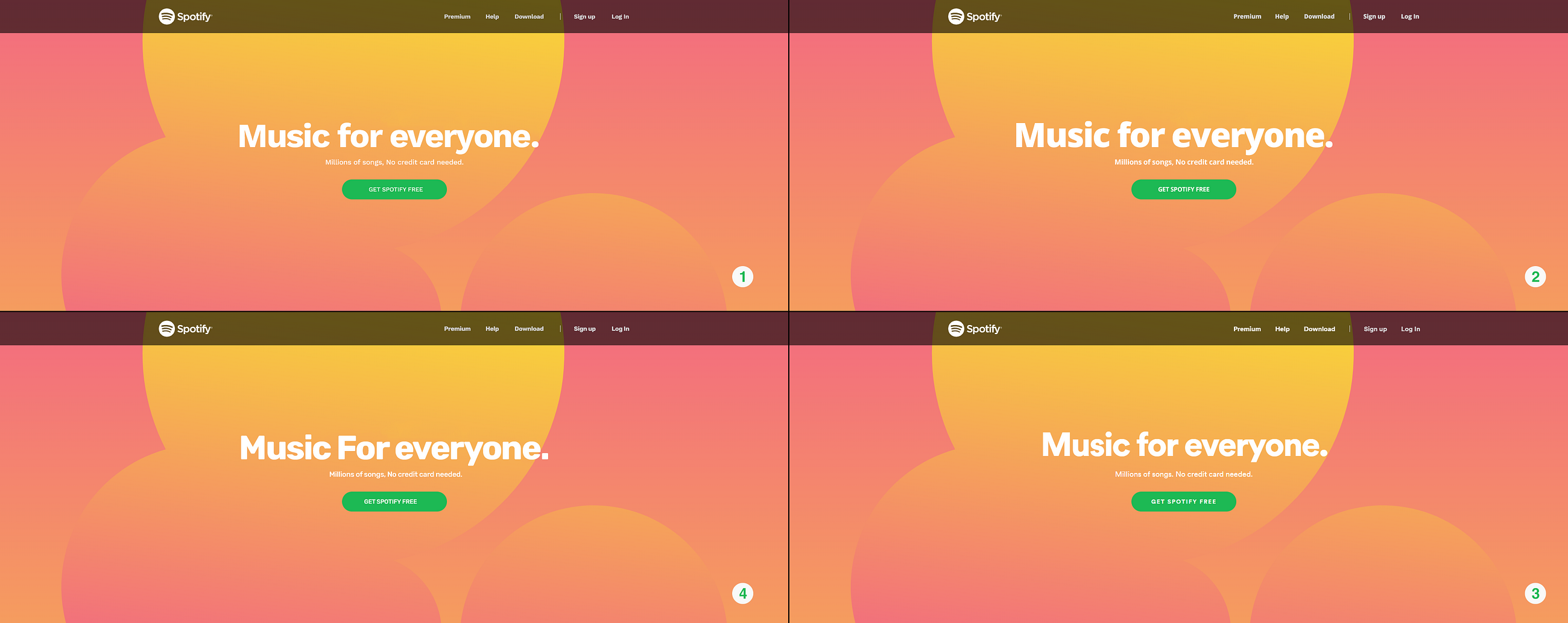
Most of the famous Google fonts are not bad at all. But that’s about the extent of it. Just not bad. A typeface introduces you to a vast dimension of expression that is inaccessible by any other tool or technique. To waste that space by using a standard font when there’s so much that could be said with a beautiful well-crafted one is a true shame. Here’s Spotify’s landing page in its original font and in 3 of the closest Google fonts in my opinion: Open Sans, Work Sans, and Rubik. Could you guess which one is the original?
Open Sans vs Work Sans vs Rubik Vs Circular (Original font)
It’s number three. But if you didn’t get it right, it’s no biggy because I think we can all agree that the other ones are pretty close right? True. Pretty close, but that’s it. Circular, which is the original font here, is far superior to all the others. Now that you’ve taken another look, which one would you choose?
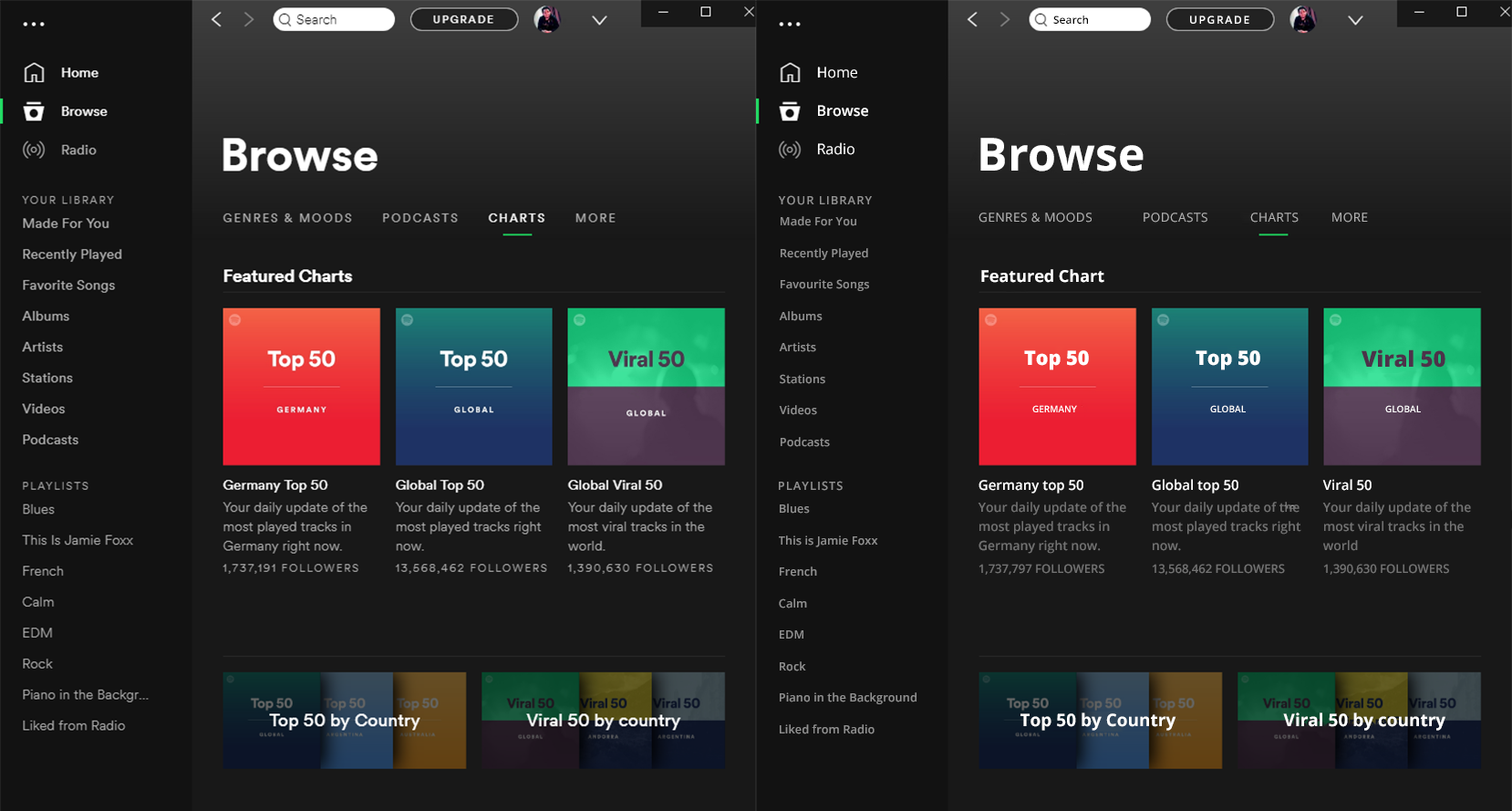
But it does not just display headers that make the difference. Premium fonts render much better at a small scale too and they conserve their personality much better too. Do you want to try again? I’ve taken the Liberty of remaking the Spotify windows app with Open sans to show you how much difference it makes.
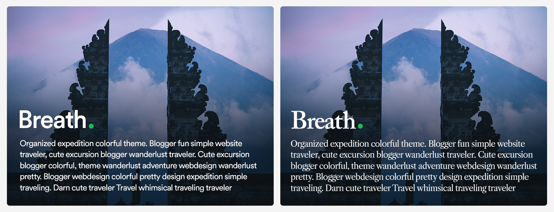
Consider Serifs
Some people might tell you that you should use serifs for long bodies of text because they are more "legible". But the research that initially made that claim has been debunked too many times to count. But still, serifs introduce a lot of character (no pun intended) and sophistication to a website. They have this vintage flare that feels serious, premium, bold, and most of all, intentional. They will also help you stand out of the mold of the sans-serif web epidemy.
Sans Serif (Circular) | Serif (Caslon pro)
Know how to pair fonts
When you have a few years of visual design under your belt, this probably comes naturally to you. You probably have a go-to font combination. But For those of us who didn’t go to design school and learned to match fonts based on the x-height (or don’t know what that is), It’s not really that complicated. You can go online and find nice font pairing in websites like Fontpair or of course, the indispensable Typewolf which I still can’t believe is free.
My advice to you is to mix styles. You can mix a serif with a sans-serif, maybe a script and a serif, or if you’re feeling a little adventurous, might I suggest a monospace and a sans-serif 👌
2- Weights
Knowing which weights to choose for your composition is the first step of making the best of your typeface choice. Here are a few rules
Pick two or three weights, no more
Just because your font has 20 different weights and styles, doesn’t mean you should use them all. Two or three weights would be enough, one for standard, one for titles, and maybe one for large headers like on hero sections. That should be enough for most cases.
Skip a weight
If you have many weights to choose from, you might want to skip a weight to emphasize the contrast. For instance, if you chose regular for your paragraphs, you might want to skip medium and try semibold for titles, skip bold and try heavy for headers. Remember, the goal is not how heavy it looks. The goal is how different it is from the other text. If you do everything else right (colors, spacing etc…) you won’t need much else to draw contrast.
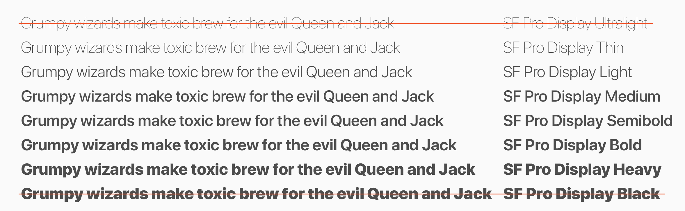
Avoid Black and hairline (ultralight)
Generally speaking, I don’t remember many cases where I used Black or hairline for a UI project. Sure, they have their uses. But keep in mind their shortcomings as well. Hairline text, which isn’t available in many fonts to be fair, is not very legible and wouldn’t work for small text. Black can take up so much space and clutter the composition, so stay clear of those two as much as you can. The best use for them is for large display headers
San Francisco Display Pro font family (Apple’s proprietary font)
3- Tracking
Tracking refers to the space between glyphs (characters) of a word. It is often confused with Kerning which is the spacing between two individual glyphs, which is something built into the font file itself. If you ask me, this is the most underused parameter of all.
Play with tracking before you choose another font
I used to suffer a lot with choosing fonts before I learned to leverage tracking. Some fonts naturally take too much horizontal space. Consider Poppins for instance, one of my all-time favorite fonts. You just couldn’t use it as much as you’d want to because it took too much space. The solution is to reduce the tracking instead of trying to find another font that wouldn’t necessarily capture the whimsical vibe of Poppins (don’t try it, there isn’t any)
Poppins | Poppins (-40 tracking) | Circular
Notice how we managed to fit in the title and squeeze in 5 extra words by either reducing the tracking or changing the font entirely. The new font, however, doesn’t necessarily capture the entire essence of the original choice. Note also how much sturdier Poppins gets when you tighten up the tracking making it not only take less space but also hold the composition tighter.
Consider condensed fonts
Domain-display gave me a lot of trouble when I tried to use it for headers in an editorial project. It was taking up too much space even after reducing the tracking. Luckily, there was a condensed version of the font that not only reduced the kerning but also made the glyphs themselves more horizontally compact without sacrificing the beautiful structure of the typeface. This reduced the horizontal real-estate needed and allowed me to keep the density that I required.
I also remember designing an app where I had very little horizontal space to play with. I decided to go with Encode-Sans-Condensed which gave me the possibility to write the information on one line to save space all while remaining fairly readable and aesthetically pleasing
4- Leading
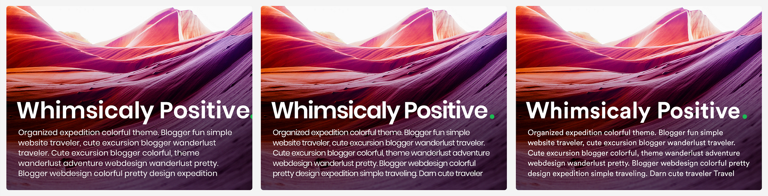
This one is perhaps the most subtle of the parameters, but it can definitely be a lifesaver sometimes. Line spacing comes-in very handy if you’re designing landing pages, blogs, newsfeeds, and any other text-rich design. Before thinking about the nitty-gritty details I’m about to go into, always consider the main point of separating lines: legibility. Hence, the leading shouldn’t necessarily be directly proportional to the text size. The rule of thumb when it comes to leading is that you decrease it for headers and increase it for small text. This is because if your font size is 72, the space between the lines is more than necessary to tell them apart
Control Information density
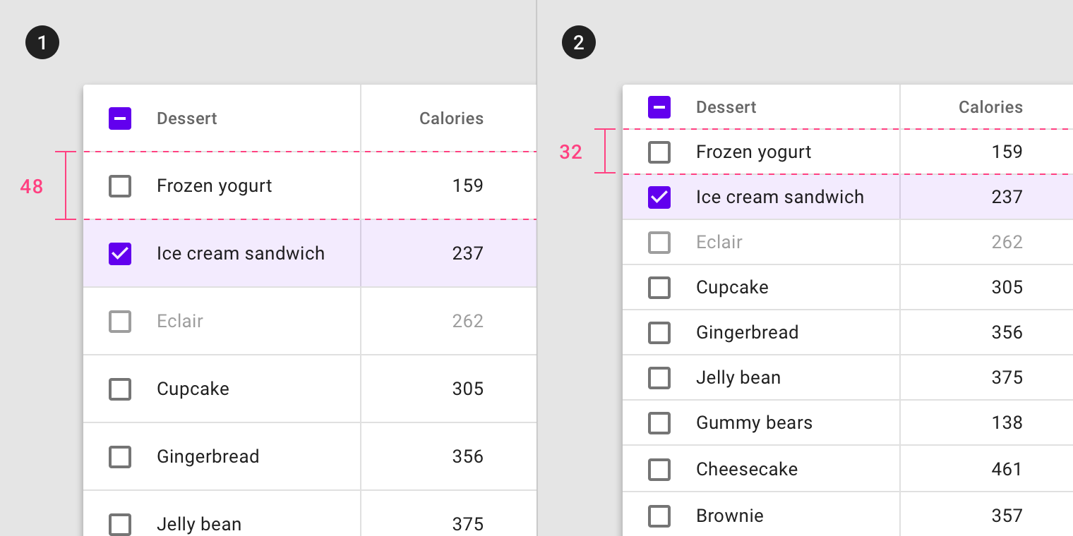
We are always trying to strike balance between how much information we want to convey to the user/visitor vs how much they are willing to receive per unit of space. That’s the challenge of information density. Too dense and the interface feels cluttered and busy. Too little and it feels empty and wasteful. Here’s an example that doesn’t involve leading, but perfectly illustrates the concept of information density
If you’re going with a very breathable, low-density design with large margins between components, sometimes text blocks can feel "loose" inside the layout. You might remedy that by increasing the leading and thus introduce more breathability into the paragraphs themselves, hence complying with the overall breathability of the design.
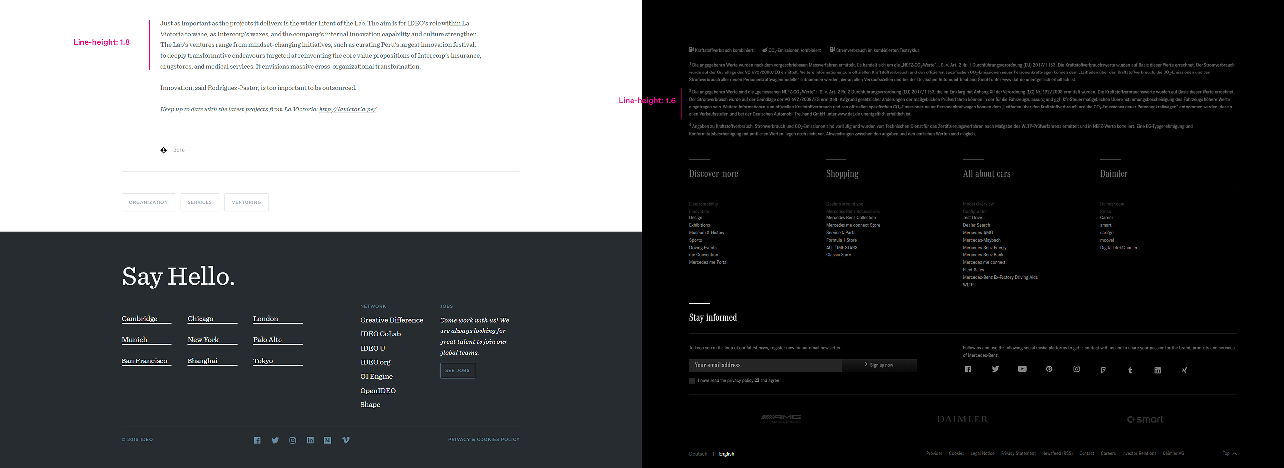
Here’s an example that contrasts the breathable and effortless feeling website of IDEO, the world leading design agency vs the compact, rich and loaded website of Mercedes-Benz, a leader in engineering and manufacturing.
Breathable vs compact compositions
Notice how the paragraphs on IDEO’s website are more breathable thus complement the overall generous spacing of the composition. Contrast that with Mercedes-Benz’s website where text blocks are slightly tighter thus conveying an image of increased information saturation.
Draw Attention/ Increase emphasis
If you leverage line spacing correctly, you create an opportunity to use contrast to highlight certain blocks
If you feel just a little nerdier, you can consider anti-aliasing which can be of great importance for digital projects, But that’s a subject for another time. The main takeaway is this: Give typography more attention in all your projects. learning to leverage the few parameters that we have at our disposal will make your designs go from good to great.
from Muzli https://muz.li/inspiration/why-ui-web-design-is-all-about-typography/


