
There are times to use toggle switches and times not to. When designers misuse them, it leads to confused and frustrated users. Knowing when to use them requires understanding the different types of toggle states and options.
Contextual States Vs. System States
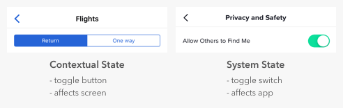
It’s easy for designers to confuse toggle switches and toggle buttons because they both manage states, but there’s a fundamental difference. Toggle switches are for system states, and toggle buttons are for contextual ones. A contextual state only affects the current screen in focus, while a system state takes effect everywhere on the app.
Many apps misuse toggle switches by using them for contextual states. For example, a common mistake is to use switches for search filters. The filters only apply to the context of search, not to the entire system. Therefore, the proper selection controls to use are checkboxes, not switches.
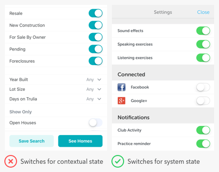
Users expect switches to render an immediate effect when they toggle it on. However, the search filter settings don’t take effect until after users press the “save” button. If there’s a delayed effect due to a separate button, switches are the wrong controls to use. A switch itself is a “button” that activates state. A separate button for the switch isn’t necessary.
It’s typical to find switches in a settings screen of an app because that’s where users go to manage system states. But you can also use them for modes that affect the app. The example below shows switches for privacy mode and dark mode.

Binary Options Vs. Opposing Options
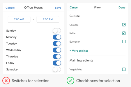
Switches are for binary options, not opposing options. A binary option represents a single state that is either on or off — or in other words, true or false. Opposing options are two separate states that are opposite but related to different user tasks.
Some apps make the mistake of using switches for opposing options. They place the option labels on opposite sides of the switch and use the direction of the thumb to indicate the state. This practice is a misuse of switches that confuses users because the visual cue isn’t clear. Not only that, but the switch has two different states without an off state as they would expect.
When you have opposing options, toggle buttons are the right control to use. In the example, “list view” and “map view” are the opposing options for users to toggle. A toggle button in this context works better than a switch because it groups the options and allows users to view them side-by-side. They’re also able to select each option directly and get clear visual feedback.
States Vs. Actions
Switches are for states and buttons are for actions. You should never use a switch in place of a button, or you’ll throw users off. When they see a call to action, they expect to interact with a button, not a switch.

The example shows an app using a toggle switch as a download button. This approach is a misuse of switches because downloading is a one-time action, not a persistent state. Turning the switch on downloads the content but ends after that. Turning the switch off doesn’t undownload it, which can mislead users.
Three Conditions for Using Switches
Next time you’re considering a toggle switch on your app, check if the situation meets these three conditions. If it does, you’ll know for sure that a toggle switch is the correct control to use.
Use a toggle switch if you are:
1. Applying a system state, not a contextual one
2. Presenting binary options, not opposing ones
3. Activating a state, not performing an action
from UX Movement https://uxmovement.com/mobile/stop-misusing-toggle-switches/