
Web Design
Why UI web design is all about typography

Ayadi Ghaith, March 25, 2019
I start off every design workshop by saying the following statement:
The first rule of design is: It’s all about the type (typography).
The second rule of design is: It’s all about the type.
This is a reference to the movie Fight Club where the character Tyler (played by Brad Pitt) introduces newcomers to the rules of his underground bare-knuckle fighting club. Now I’m sure I don’t look half as cool as Brad Pitt saying that but I should get points for trying, no? The statement is clear though: Typography is the premier thing you need to keep in mind at all times.
Now, keep in mind that when I say design, I mean visual design, more specifically, the things that are relevant to your average non-designer person: Making a little website, a resume, a poster, some social media posts and things of that nature. But just for the purpose of this article, I’m going to focus on user interface design more.
The problem with typography is that it’s so subtle that most people don’t seem to pay enough attention to it. However, you could make complete designs with type only if you know what you’re doing.
The importance of typography
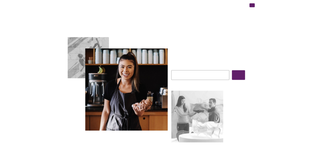
Let’s ask ourselves a simple question: What if the purpose of a website or app? Isn’t it to convey certain information? Isn’t it all just a frame to put a bunch of information in? The purpose of UI designers is just to arrange those pieces of information in a way that makes sense.
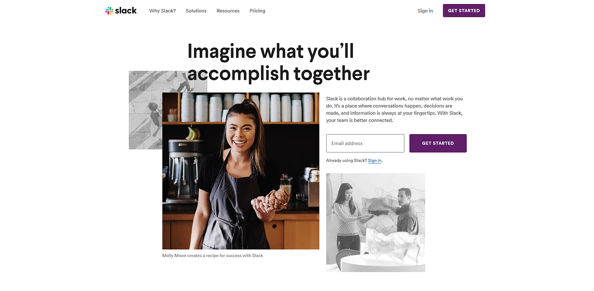
Most information in any website or application is text. Take a look at how Slack’s website would look like without Text.
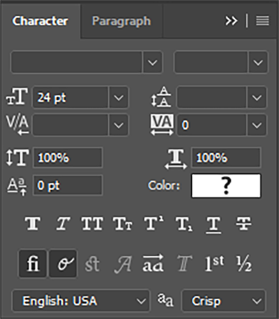
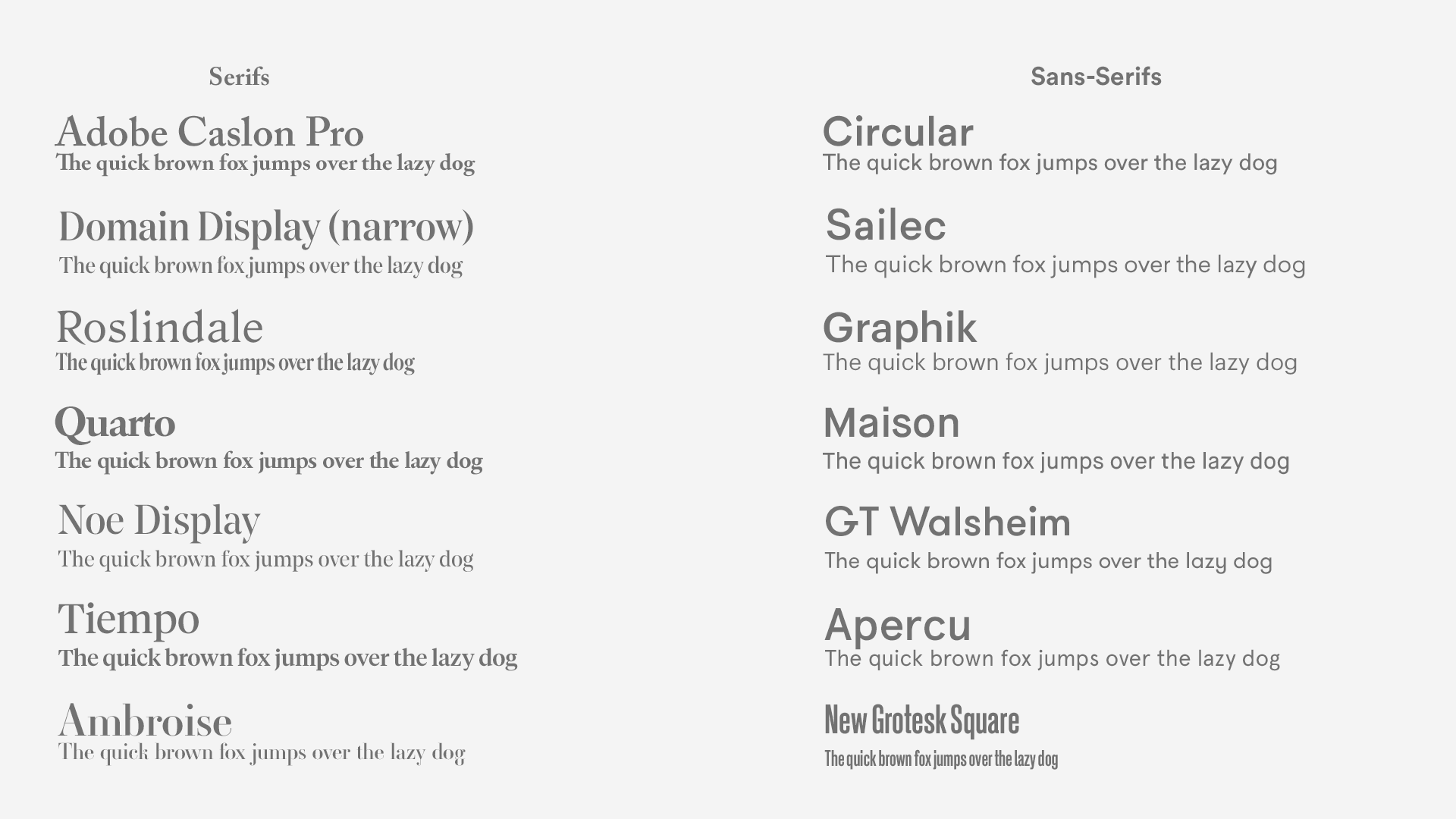
We don’t have too many layers to play with when it comes to typography. For pictures, it’s much easier because you have a whole lot of parameters you can play with: Brightness, contrast, saturation, color, exposure and each one of those had endless possibilities. With type, there isn’t a lot to mess with. So it’s both easier and harder. Here are the settings that are at our disposal to format text.
- Typeface choice
- Weight
- Tracking (letter spacing)
- Leading (Line spacing)
I’m sure that many wouldn’t think much of these settings. Heck, I know UI designers and front-end developers who have never used any of these parameters (apart from choosing a typeface of course). And yes, you’re right, you don’t absolutely have to. But it gives you an extra layer of refinement that makes your work stand out and look more "professional". I’m going to go into the details of how each of these can help you make better designs.
1- Know your typefaces
Picking a good font for your design is in my opinion, the most "make or break" step to your design. In that regard, try to keep these things in mind
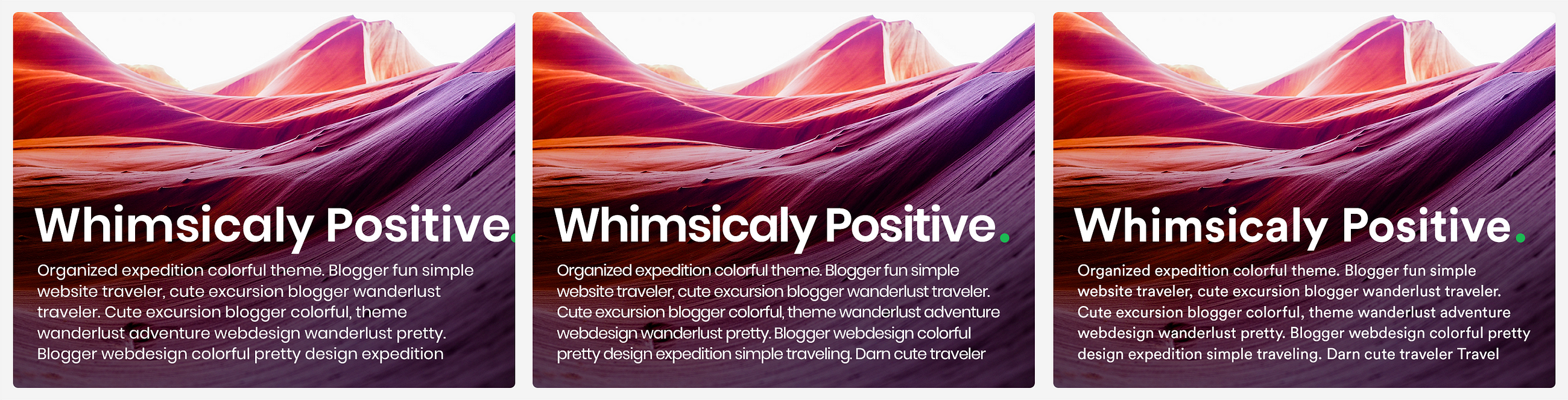
Try premium fonts
Helvetica Neue and Segoe are perfectly fine. But If you’re the kind of person who’s always using Open sans, Roboto, Raleway, Lato, and the rest of the Google fonts gang, you are really missing out. Google Fonts is greatly contributing to this notion that free fonts are just as good as premium fonts with tricky licenses. They’re not. Not by a long shot. Here’s my premium font cheat sheet
Most of the famous Google fonts are not bad at all. But that’s about the extent of it. Just not bad. A typeface introduces you to a vast dimension of expression that is inaccessible by any other tool or technique. To waste that space by using a standard font when there’s so much that could be said with a beautiful well-crafted one is a true shame. Here’s Spotify’s landing page in its original font and in 3 of the closest Google fonts in my opinion: Open Sans, Work Sans, and Rubik. Could you guess which one is the original?
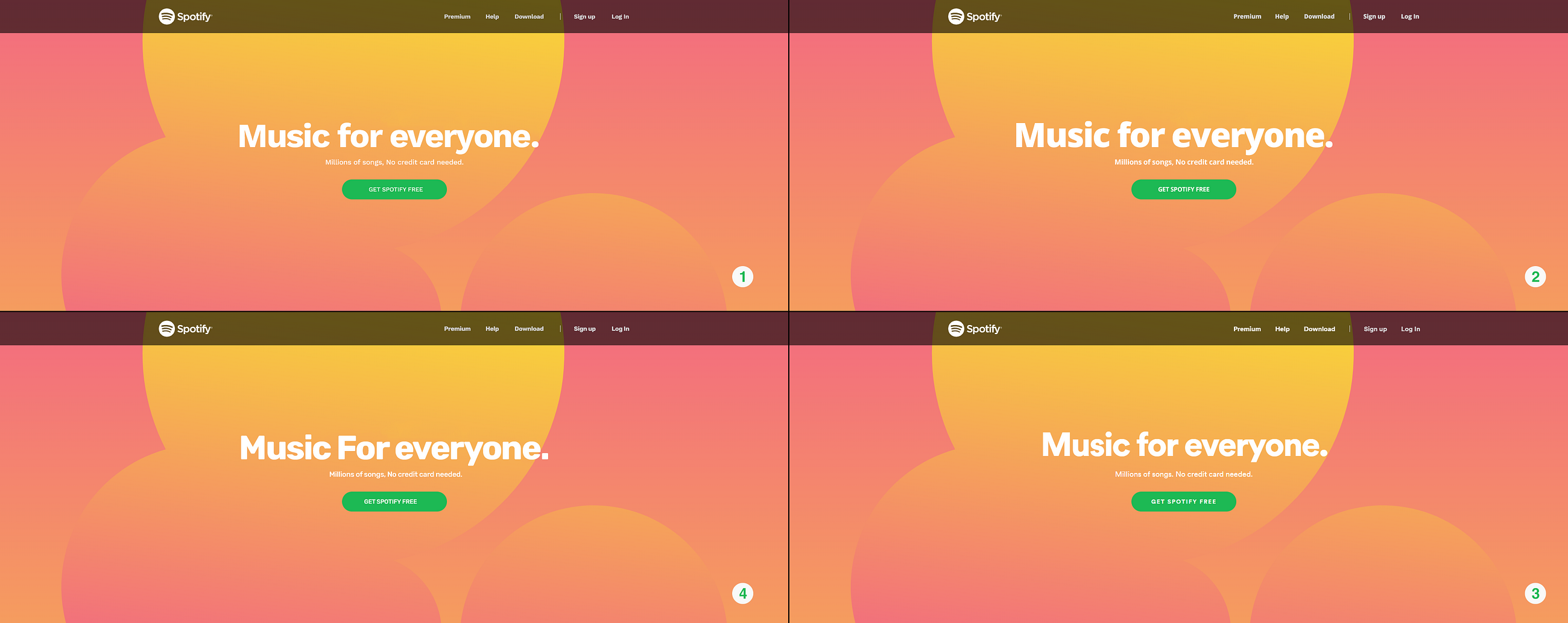
It’s number three. But if you didn’t get it right, it’s no biggy because I think we can all agree that the other ones are pretty close right? True. Pretty close, but that’s it. Circular, which is the original font here, is far superior to all the others. Now that you’ve taken another look, which one would you choose?
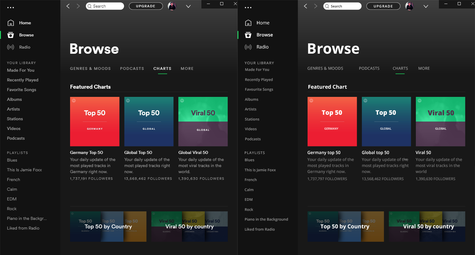
But it does not just display headers that make the difference. Premium fonts render much better at a small scale too and they conserve their personality much better too. Do you want to try again? I’ve taken the Liberty of remaking the Spotify windows app with Open sans to show you how much difference it makes.
Consider Serifs
Some people might tell you that you should use serifs for long bodies of text because they are more "legible". But the research that initially made that claim has been debunked too many times to count. But still, serifs introduce a lot of character (no pun intended) and sophistication to a website. They have this vintage flare that feels serious, premium, bold, and most of all, intentional. They will also help you stand out of the mold of the sans-serif web epidemy.
Know how to pair fonts
When you have a few years of visual design under your belt, this probably comes naturally to you. You probably have a go-to font combination. But For those of us who didn’t go to design school and learned to match fonts based on the x-height (or don’t know what that is), It’s not really that complicated. You can go online and find nice font pairing in websites like Fontpair or of course, the indispensable Typewolf which I still can’t believe is free.
My advice to you is to mix styles. You can mix a serif with a sans-serif, maybe a script and a serif, or if you’re feeling a little adventurous, might I suggest a monospace and a sans-serif 👌
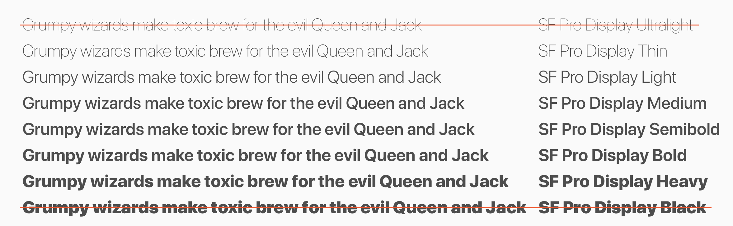
2- Weights
Knowing which weights to choose for your composition is the first step of making the best of your typeface choice. Here are a few rules
Pick two or three weights, no more
Just because your font has 20 different weights and styles, doesn’t mean you should use them all. Two or three weights would be enough, one for standard, one for titles, and maybe one for large headers like on hero sections. That should be enough for most cases.
Skip a weight
If you have many weights to choose from, you might want to skip a weight to emphasize the contrast. For instance, if you chose regular for your paragraphs, you might want to skip medium and try semibold for titles, skip bold and try heavy for headers. Remember, the goal is not how heavy it looks. The goal is how different it is from the other text. If you do everything else right (colors, spacing etc…) you won’t need much else to draw contrast.
Avoid Black and hairline (ultralight)
Generally speaking, I don’t remember many cases where I used Black or hairline for a UI project. Sure, they have their uses. But keep in mind their shortcomings as well. Hairline text, which isn’t available in many fonts to be fair, is not very legible and wouldn’t work for small text. Black can take up so much space and clutter the composition, so stay clear of those two as much as you can. The best use for them is for large display headers
3- Tracking
Tracking refers to the space between glyphs (characters) of a word. It is often confused with Kerning which is the spacing between two individual glyphs, which is something built into the font file itself. If you ask me, this is the most underused parameter of all.
Play with tracking before you choose another font
I used to suffer a lot with choosing fonts before I learned to leverage tracking. Some fonts naturally take too much horizontal space. Consider Poppins for instance, one of my all-time favorite fonts. You just couldn’t use it as much as you’d want to because it took too much space. The solution is to reduce the tracking instead of trying to find another font that wouldn’t necessarily capture the whimsical vibe of Poppins (don’t try it, there isn’t any)
Notice how we managed to fit in the title and squeeze in 5 extra words by either reducing the tracking or changing the font entirely. The new font, however, doesn’t necessarily capture the entire essence of the original choice. Note also how much sturdier Poppins gets when you tighten up the tracking making it not only take less space but also hold the composition tighter.
Consider condensed fonts
Domain-display gave me a lot of trouble when I tried to use it for headers in an editorial project. It was taking up too much space even after reducing the tracking. Luckily, there was a condensed version of the font that not only reduced the kerning but also made the glyphs themselves more horizontally compact without sacrificing the beautiful structure of the typeface. This reduced the horizontal real-estate needed and allowed me to keep the density that I required.
I also remember designing an app where I had very little horizontal space to play with. I decided to go with Encode-Sans-Condensed which gave me the possibility to write the information on one line to save space all while remaining fairly readable and aesthetically pleasing
4- Leading
This one is perhaps the most subtle of the parameters, but it can definitely be a lifesaver sometimes. Line spacing comes-in very handy if you’re designing landing pages, blogs, newsfeeds, and any other text-rich design. Before thinking about the nitty-gritty details I’m about to go into, always consider the main point of separating lines: legibility. Hence, the leading shouldn’t necessarily be directly proportional to the text size. The rule of thumb when it comes to leading is that you decrease it for headers and increase it for small text. This is because if your font size is 72, the space between the lines is more than necessary to tell them apart
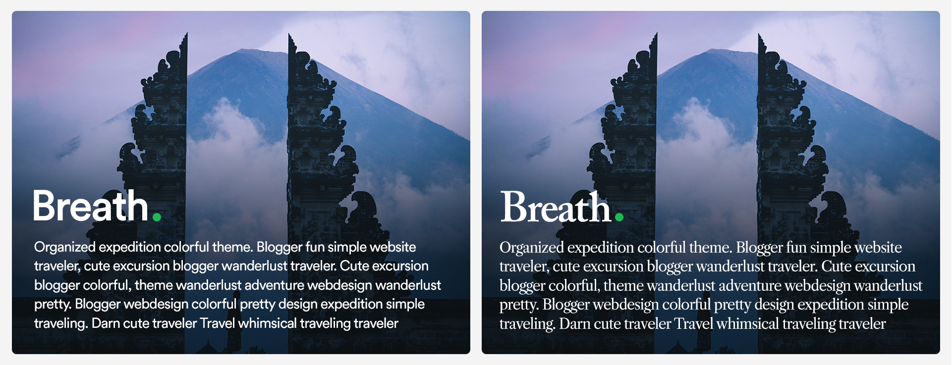
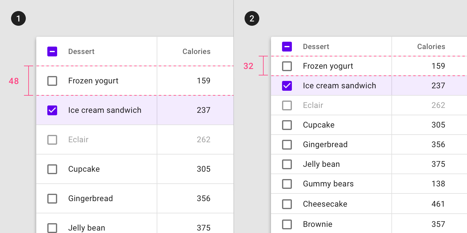
Control Information density
We are always trying to strike balance between how much information we want to convey to the user/visitor vs how much they are willing to receive per unit of space. That’s the challenge of information density. Too dense and the interface feels cluttered and busy. Too little and it feels empty and wasteful. Here’s an example that doesn’t involve leading, but perfectly illustrates the concept of information density
Complement spacing
If you’re going with a very breathable, low-density design with large margins between components, sometimes text blocks can feel "loose" inside the layout. You might remedy that by increasing the leading and thus introduce more breathability into the paragraphs themselves, hence complying with the overall breathability of the design.
Here’s an example that contrasts the breathable and effortless feeling website of IDEO, the world leading design agency vs the compact, rich and loaded website of Mercedes-Benz, a leader in engineering and manufacturing.
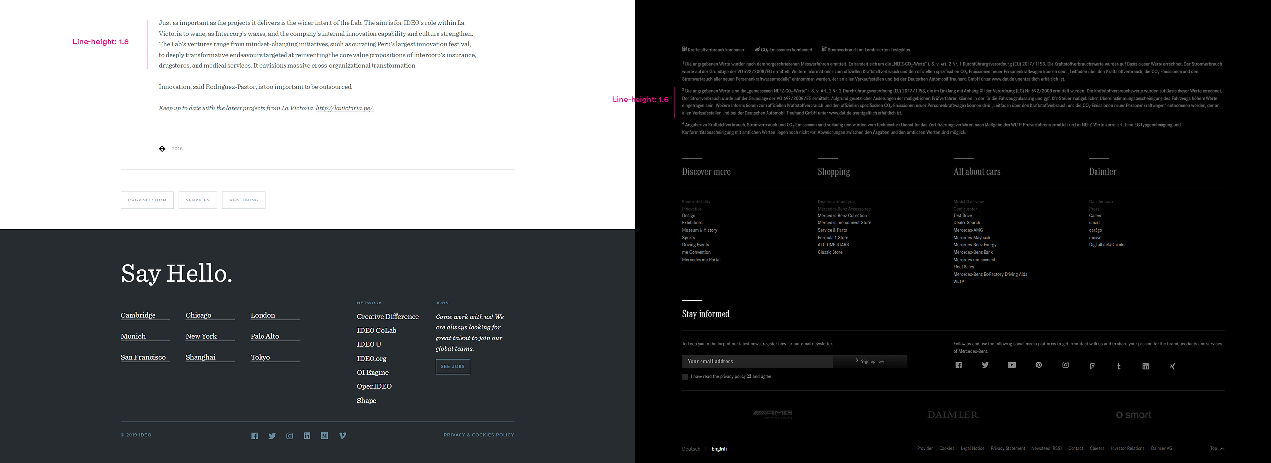
Notice how the paragraphs on IDEO’s website are more breathable thus complement the overall generous spacing of the composition. Contrast that with Mercedes-Benz’s website where text blocks are slightly tighter thus conveying an image of increased information saturation.
Draw Attention/ Increase emphasis
If you leverage line spacing correctly, you create an opportunity to use contrast to highlight certain blocks
If you feel just a little nerdier, you can consider anti-aliasing which can be of great importance for digital projects, But that’s a subject for another time. The main takeaway is this: Give typography more attention in all your projects. learning to leverage the few parameters that we have at our disposal will make your designs go from good to great.
from Muzli https://muz.li/inspiration/why-ui-web-design-is-all-about-typography/