
Last year, Michael Gough had an idea. Actually, he had 77 of them — 77 thoughts and insights that he’d developed over a lifetime spent crafting his design thinking, including stints at Adobe and Microsoft and working as an architect. Now, as Uber’s new head of design, we found an opportunity to share these ideas with the world.
The timing couldn’t have been better. Our Brand team had recently started rethinking Uber’s brand positioning, creating a new visual identity system — typefaces, color palette, grid, layout, photography, and motion. Using Uber’s new system to share Michael’s thoughts on design seemed like a perfect collaboration.
As Senior Brand Designer, I worked with Chad Balanza and Mason Field, under the direction of Peter Markatos, to realize Michael’s vision.
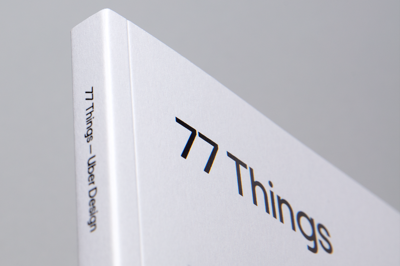
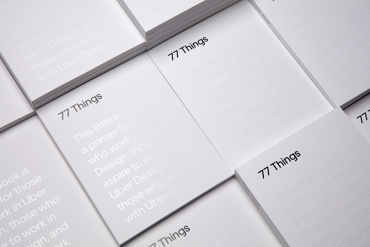
The result was 77 Things — a design-forward, aesthetic exploration of some core principles of design.
This book is not for sale. The only way to get a copy is to come to our Uber design events or by joining our team. In the meantime, get the Google Chrome extension on your computer.

The challenge
The book required us to explore the boundaries of Uber’s new visual identity system. Our goal was to showcase examples of how to place the whole range of our new identity to use.
What’s interesting is the book was shaped by its own content. After all, if you are going to put forth 77 design principles, you’d better live up to them. A central theme of the book is designing for pattern. Throughout the book, we followed one of the principles most critically:
“Pattern recognition is an essential skill for creators. See the patterns in user behavior and how to change them. Understand the implicit patterns of use, layout, and function in your work. Then, make them explicit.” — 77/77 Things


We decided to put these practices into designing the book — looking for the patterns in these principles and thinking about how not only to spotlight but to interact with them. In short, we would make them explicit.
The first step of the process
The first step was to figure out the patterns and elements we wanted to use to exemplify our brand. Once we had a clear vision of a grid, type rules, and everything figured out, we were able to place each page quickly. In just four months we went from concept to final print.
We also had to balance the intention of the pace at which someone will read the book. We wanted to create a book that didn’t insist on being read front-to-back or all in one go. Ideally, the book reads as well by flipping to a random page as it does reading from the beginning. We used images to give the reader a break — to pause and think about what was just read — as well as to serve as visual associations to the text, references that would be more significant than a page number.
The second step of the process
Next, we began testing readability and trying to push the new brand identity to its limits. We wanted to know a few key things:
- Is this easy to read?
- Are we showing the full range of the beauty and functionality of our typeface?
- Are we striking the right balance between headlines and copy?
- Are we using our secondary colors in a subtle but effective way?
- Is the contrast too much?
- Are the colors working well with black and white?
- Are we making the book interactive in a way that complements the content rather than distracting from it?
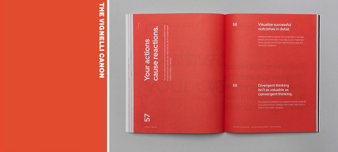
The overall aesthetic of 77 Things followed our new design system, and that system was heavily influenced by modernist design. We didn’t try to reinvent the wheel. Josef Muller Brockmann, Massimo Vignelli, Otl Aicher, and Alexandre Wollner were key sources of inspiration.
For example, we loved how Vignelli uses typography, layout, and composition to draw focus or pace the reader’s attention. I tested different layouts to influence the pace at which someone would read this book.

What didn’t work?
We developed many concepts for the cover. One particular design utilized a combination of craft paper and white foil that the team favored initially. We were intrigued by the contrast of materials and loved that the book would have a grit to it in hand. It would feel raw and unfinished — like a workbook of sorts. This played nicely with the idea that this was by no means a completed work: designers would be encouraged to add to it, write notes in it, and further develop these theories we design by.


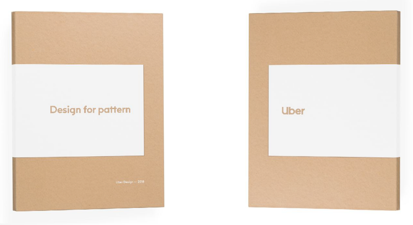
But ultimately, the master brand system helped us determine the right approach, and we felt it was inconsistent with our original thinking. Craft paper was not a material or texture that best represented the new Uber. This book would be the first artifact produced after the launch of our new visual identity system; it was imperative that it embodies the principles of the brand moving forward.
The inspiration for the book title came from an essay by Wendell Barry titled “Solving for Pattern.” Our original name, “Designing for Pattern,” was intended to pay tribute to it. We wanted the book to inspire and be shared amongst our audience. We didn’t want the book to end up dusty on a coffee table or tucked away in a drawer. Ultimately, our desire for simplicity and accessibility won out over our effort of homage. The title “77 Things” is an attempt to remind the designer that this book should be picked up and read from time to time: each of these 77 things can help you hone the craft of design at any point throughout your career.

The third step of the process
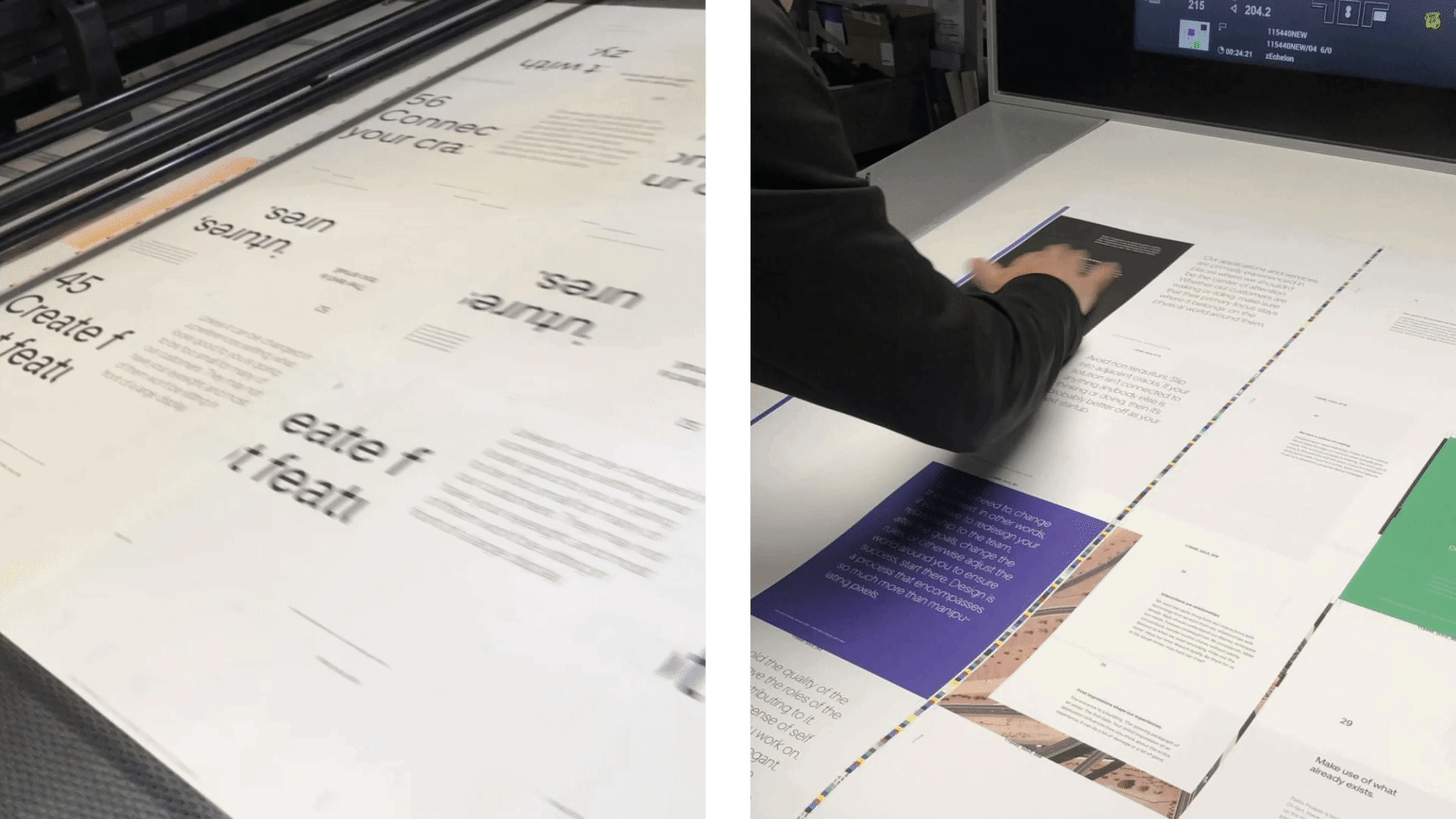
The print process required us to think about paper. We first chose an uncoated paper with a nice texture. We had a really analog feeling about the book but outside of the cover, we didn’t have a lot of extra fancy stuff going on in the book.
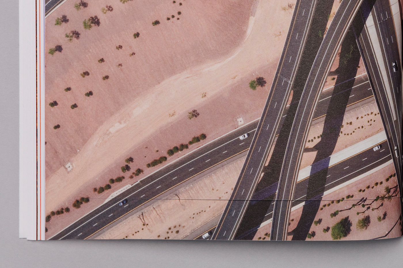
The printing itself was a challenge. We used PMS (Pantone Matching System) colors for our solid background color) to ensure 100% accuracy with our new secondary palette. We had tried using CMYK to cut down costs, but the first print just didn’t look right. One page, in particular, that was tricky was the flyout page with the desert photo. The inserted page was printed at a different moment in the production. In any print run, small variations in color are typical, but for this page, we needed the insert to match exactly with the main page. In addition, the cut of the page made it difficult to align perfectly. It took a few times before we got it right.


Anatomy of the Book
Typeface
“Understand type and how to use it.” — 51/77 Things
The Uber Move typeface is one of our identity’s strongest assets. Thinking on that, we use every single weight of the Uber move display and text fonts, in different body sizes. This is not the way we use Uber Move in our daily work, but this book is a great opportunity to show off the beautiful shape of our exclusive typeface.
The main rules of the typeface
1st: Weight Jump
The first way to create hierarchy is to use the right pairing of fonts. For example, if we’re using ‘bold’ for the principle, we use ‘regular’ for the text.
2nd: Weight Jump + Size
Another way to create hierarchy is to find the right balance of sizes between a headline (in our case, each principle, in bold) and the corresponding body copy. Each principle is either the same size as its body copy or else at least twice the body copy’s size. This is a good rule of thumb for sizing. If body copy is just a little smaller than a headline (80% the size, say) then the difference between the two is hazy, and the end result feels sloppy. We wanted either identity (with the headline and the copy the same size, which is visually pleasing) or a discernible difference (2x or more) that was clear and clearly intentional.
3rd: Size
Inspired by a quote from Massimo Vignelli, the first spread layout starts with a different hierarchy set. We use a medium weight for both the principle and the body copy. However, the principle is 13 times bigger than the body copy. This creates an obvious, pleasing contrast.
4th: Space
A classical way to build hierarchy through a well-organized grid system is to allow for the right negative space between each element. One of our spread pages was also inspired by classical design posters from great designers such as Josef Müller-Brockmann and Otl Aicher.
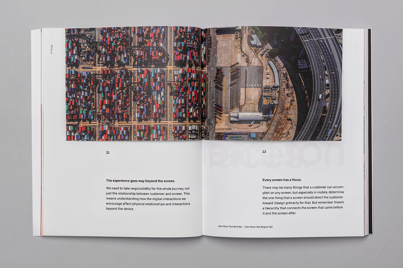
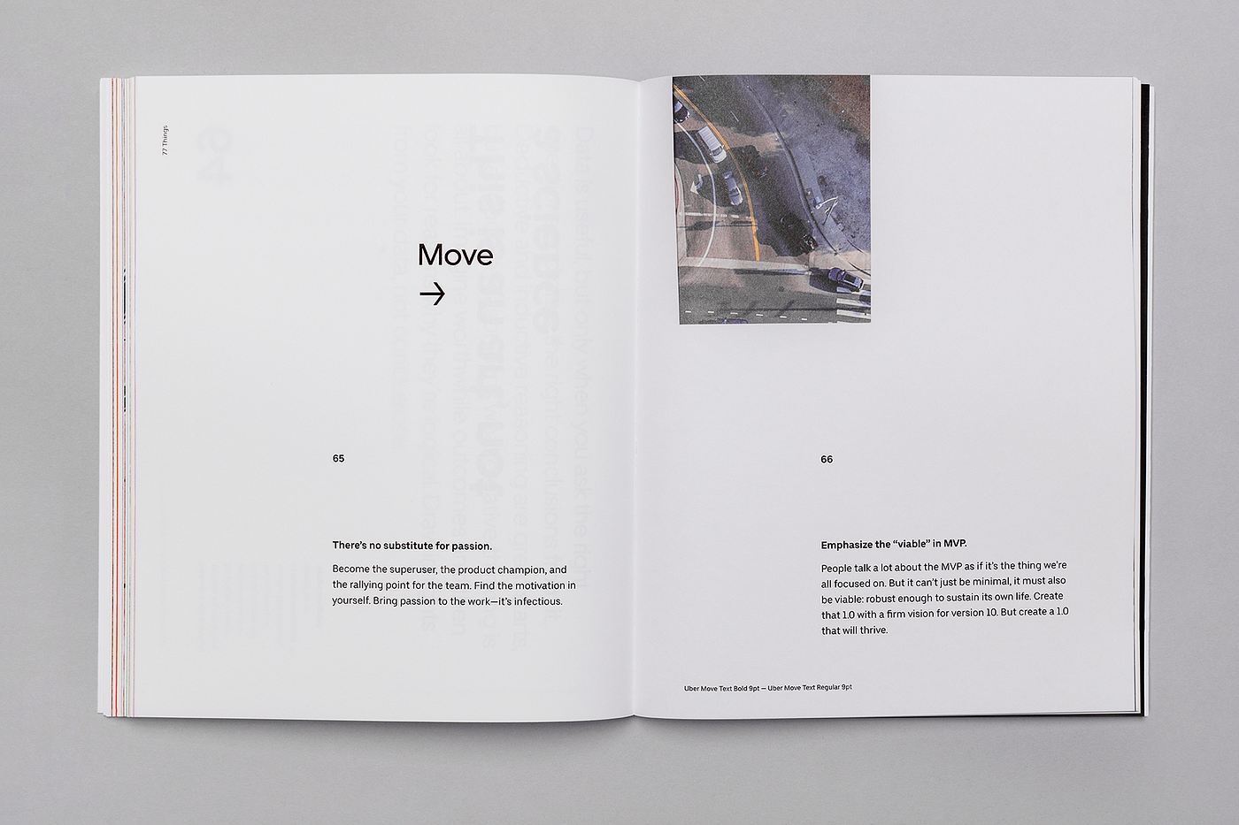
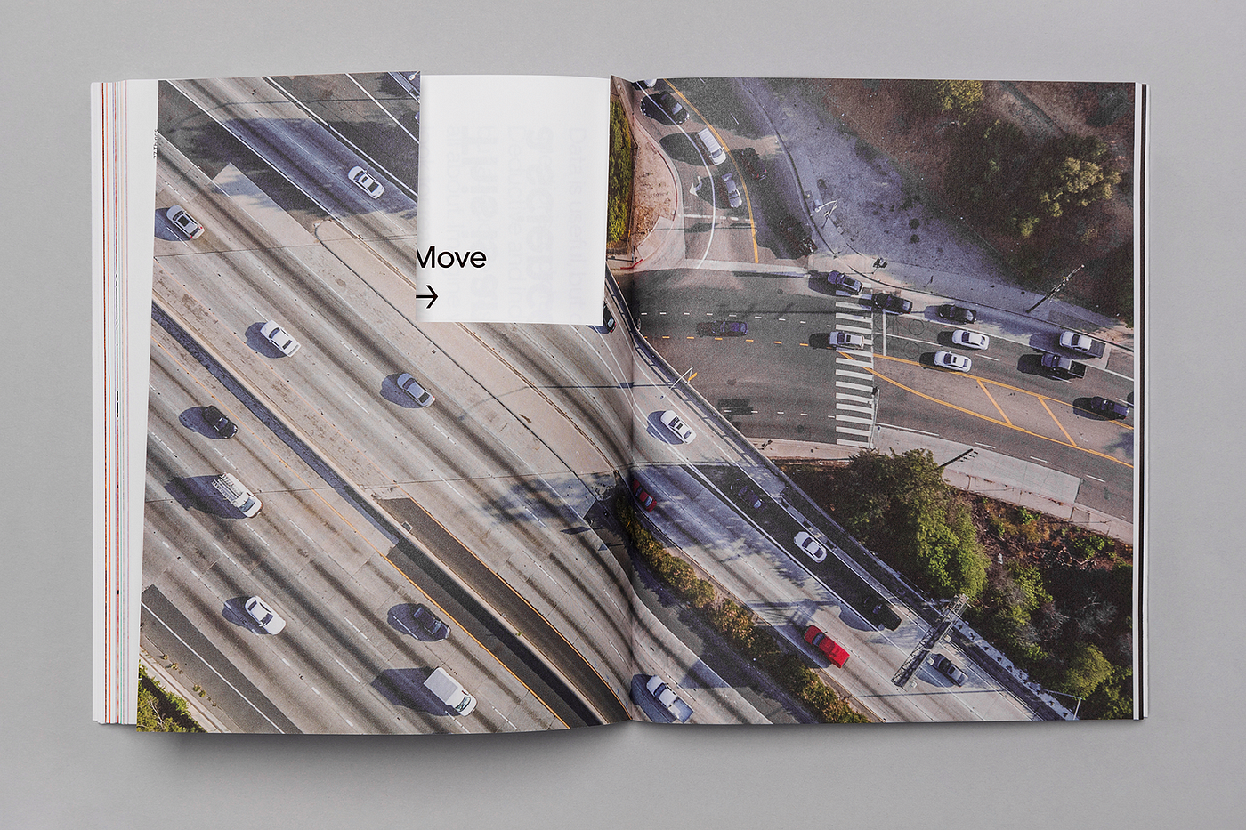
7 Photos
“Don’t demand attention and don’t distract.” — 74/77
We chose 7 photos in the book for their pattern, texture repetition, movement, and alternation between city environments and nature.
7 Colors
“Embrace diversity.” — 16/77
We use our 6 secondary colors as the backgrounds for the 6 sections of the book. To complete the pattern, the 7th background color is one of our main colors: black.
7 Layouts
“Know the grid. Use the grid.” — 35/77
To maintain a pattern, we laid out a grid-based on multiples of seven. The most important part of the grid was the baseline. After some exercises, we decided to use 7pt, which is a tight baseline. This allowed us to create several different body copy sizes and to always set the leading to fit multiples of seven. This will be obvious to people who are more experienced with layout, but for those who aren’t, a good tip is to really give a lot of attention to the leading — it’s not just about making your type big to be easily readable, the right space between the lines makes the reading experience more elegant and comfortable for the reader. It makes all the difference on a project.
With the baseline and the margins set, we defined the six columns, and then the gutters and rolls, which we set at 14pt. With those combinations, we created the different modules we had available for the main content of the book:
It’s important to note that 77 Things was not an orthodox editorial project. For insights on using grids for more traditional design, I would highly recommend Grid Systems in Graphic Design by Josef Müller-Brockmann. I’d also recommend Visual Design: 50 Years by Alexandre Wollner, which isn’t specifically about editorial design but is full of great stuff about modernist brand identity design, including a step-by-step explanation of how the book itself is designed, which is a really good demonstration of the grid system at work.
Interactions
“Interactions are relationships” — 32/77
With 77 Things, we created some interactions between the reader and the book, some of them really simple, like changing the orientation of the book, and others a little bit more complex: using cut-outs to mask, reveal, or hide.


The finale
For the 77th principle, we created a special interaction, and the 76th principle leads to it.


The poster
At the end of the book, we inserted a detachable, folded page that opens into a poster with all 77 principles.


My reflections
Personally, designing 77 Things has been a deeply rewarding experience. Feedback has been positive, which is always nice, but past that, working on this project helped reinforce design skills I already had and to practice some new ones as well. Eight months later, I’m still using the techniques I learned from this experience and I don’t see that stopping any time soon.
Thanks for reading. I am excited to hear your feedback. If you have any questions please comment below. This book is not for sale. The only way to get a copy is to come to our Uber design events or by joining our team. In the meantime, get the Google Chrome extension on your computer. If you are interested in joining our team, please check out the current job listings.
__
77 Things
Written by Michael Gough with contributions from Eric Schlakman, Erik Klimczak, and Roy West, with support from Christopher Starr, Dana Beatty, and Lori Mann.
Designed by Braz de Pina, Mason Field, and Chad Balanza, under the direction of Peter Markatos.
Design production by Lori Mann.
Composed in Adobe® InDesign®.
Set in Uber Move, a typeface created for Uber by Jeremy Mickel / MCKL. Uber Move was inspired by the international language of transportation.
Printed in California with John Litster and Echelon Fine Printing on Mohawk Superfine Ultrawhite
Eggshell cover and text.
Includes content and ideas from “57 Things” by Adobe Systems, © Adobe Systems 2011, written by Michael Gough with contributions by Shawn Cheris, Ethan Eismann, and Ty Lettau.
from Medium https://medium.com/uber-design/77-things-about-uber-design-4621516e495c