
We’re able to see different colors because of our retina’s innate ability to differentiate frequencies of light waves.
Certain colors or shades evoke different sentiments in people. In this post, I want to give a quick introduction to color theory, ways to combine colors, and tools for designing with color — that you as a designer can benefit from to make your designs delightful.
Let’s start!
Different moods are attributed to different colors and you can use these different colors to achieve different ends.
- Red has been traditionally associated with Love, Energy, and Intensity. So a lot of car ads, or anything related to love are some shade of red.
- Yellow tends to be used for things to convey Joy, Attention, Intellect. Yellow is an incredibly attention-grabbing colour. However, yellow is not a good choice for the background of your app or as the main interface. Yellow can cause attention fatigue. It’s an excellent choice for app icon design or app screenshot design.
- Green has been associated with Freshness, Safety, and Growth. This is why you’ll see most nature, healthy food, related companies use green for their branding.
- Blue — Stability. Trust. Serenity. No surprise why both Facebook and Twitter are blue.
- Purple stands for royalty. Wealth. Feminity. Purple tends to be used for women-targeted products. And luxury products.
To see these theories in action, start analyzing advertisements. After all, ads are really well thought-out experiments in persuasion and manipulating human psychology.
Next time you see an ad, try to see what techniques or design principles they’re using to make their design look beautiful and what emotion they’re trying to evoke.
Choosing a color palette is not all about advertising and attention-grabbing, though. It’s also about selling your product and appealing to certain instincts or desires that people have.
So the next time you’re designing an app/website, the first thing to think about is what emotions you want to evoke and ideas you’re trying to convey to the user and pick a colour palette accordingly.
Read this to learn more.
How to combine colors to create color palettes
Now, of course you’re not going to use the same color everywhere in your app. You’re going to need combinations of color that go well with each other and are pleasant to look at.
To combine colors, artists and designers often use a tool called color wheel.
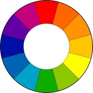
There are a few ways you can use the science of color theory to combine different colors for your designs.
Analogous Color Palette
For this combination, you pick up a color from the color wheel. Then you pick up a color adjacent to it. And you create a design using those colors. Analogous colors create a design that is harmonious and easy to look at.
Complementary Color Palette
For this combination, pick a color and a pick a color opposite to it on the color wheel. For example, the red and green here.
Complementary Color design is usually attention-grabbing and thus not so good for the main interface or the background of your app. Instead, use them for your app icon or the screenshots.
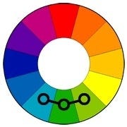
Split Colors
For this color combination, you pick up a color. And then pick up two colors that are adjacent to the opposite color.
They’re still attention-grabbing but also pleasant to look at.
Triadic Color Palette
You pick up a color and draw an equilateral triangle. They tend to give a well-balanced feel.
This color palette is from the 90s, so it feels a little bit dated. A lot of fast-food chains from the era have their logos in the triadic color scheme.
Monochromatic Colours
They’re very modern and very much in vogue. Monochromatic designs look beautiful on modern smartphone screens. You simply pick up a single color and combine it with either various amounts of white or various amounts of black to create different tones and shades that stand out from each other.
You can mix as much black or white to get the contrast that you want. These color palettes tend to be incredibly contemporary and work very well for modern digital design.
Read this and this to learn even more.
Tools for designing with color
We covered a bit of theory behind how different colors can be combined to look pleasing to the eye and achieve certain effects.
There are tons of online tools to use for finding a color palette or making your own. My most used tools are:
- Color Hunt. This is a place where professional designers go to curate their favorite color palettes. You can find Hot, Random, Popular pallets and depend on the mood of the color palette, you can find one for your particular project.
- Flat UI Colors. This website has 20 colors formulated to work especially well on the iOS platform. For Android, I’ve heard Material Palette is what developers use.
- ColorZilla. This is a super awesome chrome extension that finds out the HEX code of any color on a website.
By using these tools, understanding the theory behind moods of color, and mixing and matching colors, you should be able to arrive at a color palette that is suitable for your app/website project. This will help make your product look appealing as well as to evoke a certain idea or emotion within your user.
This article was originally published on freeCodeCamp.
Read next:
Learn how to shoot photos like a pro for only $25
from WebdesignerNews https://thenextweb.com/syndication/2018/03/06/facebooks-logo-blue-designers-guide-color-emotion/