The 3M Health Care Business Group follows a strict UX design process that allows for complexity—but isn’t overly complex.

That principle is paramount to the work of the 3M Health Care Business Group’s UX team. Projects include physical products such as smart inhalers and digital products ranging from enterprise medical coding software to internal sales tools.
“Our design approach is to regularly connect with colleagues in other disciplines like marketing and R&D as strategic partners,” says Andy Vitale, lead interaction designer at 3M Health Care. “When our UX and business teams work together with clear vision and goals, we find greater success through a shared commitment to authenticity.”
Vitale’s team currently supports six different divisions of the Health Care Business Group at 3M; Health Information Systems (e.g. billing and hospital quality of care), Critical and Chronic Care, Food Safety, and Drug Delivery Systems, Infection Prevention, and Oral Care (dental and orthodontic).
His small team tackles a big list of projects, supporting both new products and long-established brands.
In a complex space where large companies struggle with scaling UX methodologies, 3M stands in stark contrast to engineering-driven enterprise. The product development process reflects one of the most mature UX models we’ve seen to date.
Due in part to the strong design culture built in the past few years since Chief Design Officer Eric Quint joined the organization, 3M Design follows a disciplined UX process rooted in co-design and customer validation.
“Show, don’t tell” is a philosophy that drives all the design work you see below.

Team structure
Vitale’s six-person UX team for 3M Health Care covers the following disciplines:
- Interaction Design
- User Research
- UX Strategy
- Information Architecture
- Visual & UI Design
- Content Strategy
- Front-End UX Development
Each team member’s skillset is T-shaped. While they may specialize in certain disciplines, each person can also help cover other areas as needed.
Initial research
At 3M, product and feature solutions can come from multiple sources, including business, technical or design teams. The 3M Health Care Design Officer also meets with the division leadership to prioritize projects based on resourcing, current status, and expected impact.
Once a project starts, the first step for the UX team is to review any existing research for context around the design problem. Stakeholders provide the following information to designers on an ongoing basis:
- Market research: Information around the market landscape and how existing or future 3M solutions could fit.
- Industry insights research: Information specific to the business division that identifies opportunities.
- Voice of customer research: Any initial user research conducted by the business.
By reviewing the three sources of research, the design team better understands the current status of the project and the desired target users. The information also provides talking points for stakeholder interviews and helps uncover points of validation for future field visits with customers.
Stakeholder interviews
After reviewing the existing research, Vitale’s team prepares a short discussion guide for stakeholder interviews. The stakeholder interviews help the team understand business requirements. They also inform the first draft of the design brief.
Stakeholder interviews are usually conducted on an individual basis, lasting between 45 minutes to 60 minutes per session. Occasionally, the team might conduct department interviews instead (e.g. two to three marketing people in one interview), but they don’t hold cross-departmental group stakeholder interviews.
The 1:1 format allows Vitale’s team to thoroughly explore each person’s subject matter expertise and vision of success for the project. If more information is required, the designers are free to schedule follow-up interviews.
When conducting stakeholder interviews, consider Kim Goodwin’s guidelinesfor each department:
- General Stakeholder Interview
- Marketing Stakeholder Interview
- Engineering Stakeholder Interview
- Sales Stakeholder Interview
- Executive and SME Stakeholder Interview
Customer journey mapping
With a clearer picture of business requirements, the UX team conducts a customer journey mapping workshop to plot out the user’s perspective before, during, and after service:
- Emotions: Any moments of satisfaction, anticipation, and frustration.
- Touchpoints: Every step of the journey that the user interacts with the company
- Channels: Where interactions occur (e.g. online, mobile app, etc.).
- Moments of Truth: Any particular touchpoints or actions that generate lasting frustration or satisfaction.
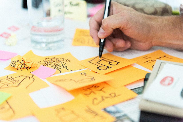
The designers typically map the journey out on a large board, while stakeholders add their thoughts with Post-it notes next to each step. Together, the team then discusses all of the potential roadblocks and opportunities.
“We try to build the customer journey collaboratively before we get too far ahead of ourselves,” Vitale explains. “Before we talk to customers, we want to make sure we’re all on the same page internally as far as understanding the problem and opportunity.”
After the first half-day “all-hands” customer journey mapping workshop, the design team will then follow up with two-hour sessions as needed. Once the whole exercise is complete, the UX team sends a summary email prioritizing the project goals and any newly revealed constraints.
For efficiency, Vitale recommends first sending out a clear agenda with timeboxes for each part of the workshop.
Grab design ebooks created by best designers
All for free

Do you want to know more about UI Design?
Download ‘The Enterprise UX Best Practices Bundle’ FOR FREE!
Contextual inquiries
Following the customer journey mapping, the UX team conducts on-site field research, which could last up to several days with multiple users at different organizations.
Because Vitale’s team designs enterprise products, they speak with the end-users, managers, and software purchasers. The goal of the on-site visits is to validate all the insights generated so far in the initial research analysis and customer journey mapping.
“Empathy mapping is a critical part of our work,” Vitale explains. “From the beginning, we’re doing customer field visits to observe our users in their natural habitats. We’ve found bringing customers in for interviews wasn’t enough–we need to be where they live and work to truly understand their issues. And we don’t want to just hear their pain points, we want to hear their needs and desires.”
During onsite visits, the team gathers customers together for conversations about their needs and solutions based on a prepared discussion guide. Vitale’s team typically stay onsite for a few days, with hour-long group discussions and many 1:1 observations (30 to 60 minutes) of individuals at work.
“We like to observe our users doing their normal tasks,” Vitale says. “They tend to get comfortable with us looking over their shoulder. It’s just so important to understand the reasoning behind what they do rather than just their steps.”
At the end of each day, all of the designers will sort their notes into a shared template. The designated research lead then sorts through the data to remove duplicates and identify patterns.
Building user personas
Once the team returns to their office at 3M, they transform the new information into personas for user groups.
These personas are shared with the business team. The team will also update the design brief to reflect new user requirements uncovered in the field visits. “By looking at these personas together as a design team, we can see the overlaps in needs between different user groups,” Vitale says. “From there we can begin sketching solutions around the initial hypotheses and core features.”
Once the design team has finished more refined sketches of the feature ideas, they present the concepts to key internal stakeholders. All the consolidated research is available to everyone in a cloud folder.
The design brief
The research ultimately feeds into the formal design brief.
While the first draft is created after the stakeholder interviews, the design brief takes final shape after the field research. The design brief puts everyone on the same page and references:
- Business needs explored through stakeholder interviews
- User needs validated through field research
- Overall UX principles based on brand guidelines and sketching
- Project timeline
Once all internal stakeholders agree to the brief, the team dives into more detail.
Feature prioritization
With involvement from the developers, the UX team prioritizes all features based on feasibility and how much they align with the goals of the design brief.
A spreadsheet acts as an early product roadmap by breaking down features by category, owner, and schedule. The team also includes tabs for technical, UX, and business notes.
To visualize requirements for stakeholders and developers, the UX team also creates atomic models (in Illustrator) mapping out page flows and taxonomies. Since the models will evolve, the team doesn’t want to overwhelm stakeholders with a complex tree of 50 to 60 features across the whole system. Instead, designers only share high-level interactions between 10 and 12 core feature sets.
Once the team finishes their work, they hold a 2-hour workshop for stakeholder feedback on the following items:
- Spreadsheet of prioritized features
- Relationships between feature sets outlined in atomic models
- User research and market research supporting the above decisions
Priorities may shift, so designers need to be ready. “Storytelling is one of our greatest strengths as designers,” Vitale says. “By explaining how each feature impacts the user along touchpoints of the customer journey map, we create a common reference point for stakeholders. They start to see how their decisions impact the user, and identify the path to the right solution.”
User-validated design sprints
The next step: design sprints. The first sprints address high-impact features.
Before they start, the team reaches out to a core group of users (typically eight to 12 people) to schedule testing.
3M Health Care’s UX team then follows an alternating one- to two-week sprint cycle of design and user testing for feedback and validation. Starting with low-fidelity prototypes, the design team increases the fidelity as their concepts begin to solidify, and the users become more comfortable with the design sprint process.

Design at 3M Health Care
“We usually build and test prototypes within that 40- to 80-hour duration. We understand our user’s time is valuable and appreciate that they are willing to spend time working with us,” Vitale says.
The overall length of the project varies widely depending on whether the project is an update to an existing product or an entirely new offering.
The design and testing cycles typically happen in a “rinse and repeat” format before they move into development. To keep everyone on track, the whole team also participates in daily standups.
For the sake of efficiency, the 3M Health Care team tests users remotely and through satisfaction surveys. Along the way, they communicate regularly with their core business team and adjust the design and technical requirements as needed.
Despite the different project lengths and scopes, the commitment to customer testing and team collaboration helps define the final design.
“Our basic methodology is always the same: we put the right people in the room, work together to solve problems, and make sure the customer’s voice is heard,” Vitale explains. “The results are increased customer satisfaction and ultimately, a real seat at the table for UX to impact the organization.”
Conclusion
3M Health Care’s structured process shows how enterprise companies can practice collaborative design amid complexity:
- Check every design problem against initial research before diving into a full kickoff.
- Validate existing research with on-site customer interviews.
- Involve stakeholders in co-design sessions to sketch out ideas, but empower designers to make the key decisions.
- Align the larger team to a formal design brief informed by market and user research.
- Adjust design sprint length based on iteration stage.
- Alternate each design sprint with a usability testing sprint.
For more best practices from top companies, download the free e-book Real-Life UX Processes: Design in Action.
Originally posted on FastCo. Design
The post How To Design With Discipline: UX Lessons From 3M appeared first on Studio by UXPin.
from Blog – Studio by UXPin https://www.uxpin.com/studio/blog/design-discipline-ux-lessons-3m/


