Designing Design System for Complex Products
Benefits of design system and how to build it

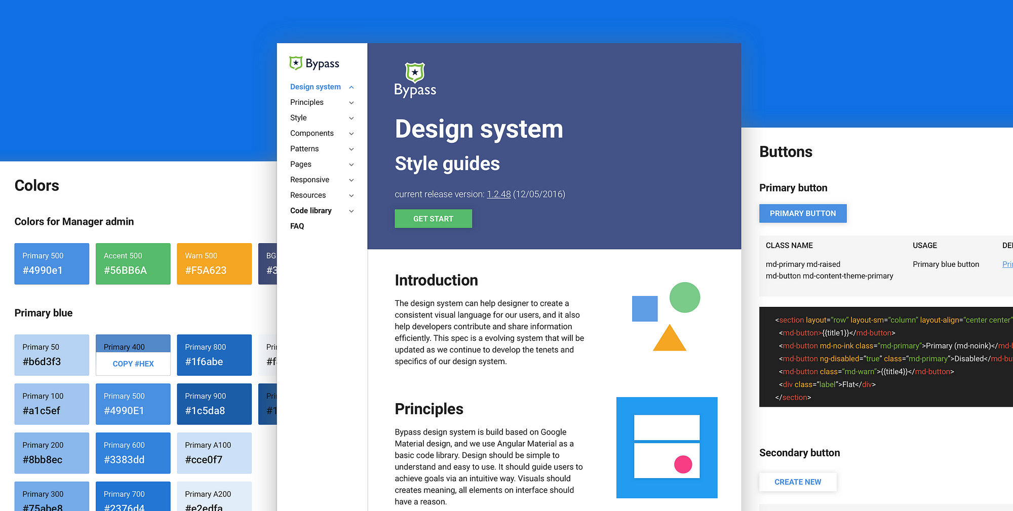
In my last article “How to get a head start on design system”, I talked about how to start building a simple style guide when you lack resources. Today I’ll share more knowledge about the process of building a design system for complex products (such as SaaS web applications). And I’ll share some helpful resources in the end as well.
Why did we start
Back in early 2014, when I just joined Bypass, because our products were very complicated, there were tons of inconsistency across the board. There were different buttons, different inputs, different layouts of the same element, and different interactions for the same flows. We wasted a lot of time debating design details, just because there were no solid rules for our product. These inconsistencies also brought bad experience to our users: they caused confusion and made it harder to understand and learn the system.
On the development side, because of the variety in code library, it was hard to find the “correct code”. Sometimes developers just wrote new codes instead of reusing the old ones, which led to even more inconsistency. It was a vicious circle, and with our team growing over time, communication and product delivery got harder.
Problems we had
1.50 shades of grey: Since our products were very complex, it was always hard to keep consistency. There were many UI inconsistencies across the system, including different colors, fonts, font sizes, etc.
2.Lack of rules: When our designers were building a new feature, it was easy for us to get bogged down with the details. Even simple questions like “Which component should I use?” and “Should I guide users to a new page, or use a pop-up dialog instead?” became very time-consuming to decide on.
3. Poor quality of delivery: Because of the lack of design rules, it was very hard for different teams to communicate with each other. I used to put lots of “red lines” with detailed descriptions on my design, to provide as many details as possible to the developers. But it was not an efficient way to hand off, and sometimes developers did not follow all the details I put on my design.
Imagine that your team launched a new project and people were celebrating, but you noticed a bunch of design bugs. You must be as happy as everyone else was, no?

4.Inconsistent code library: Because there was no rule, developers sometimes just grabbed what they found in the code base and implemented it in new projects. Some other times, they came up with completely new components with a different style, and this further complicated the code library.
5. User confusion: Our users needed a logic path to study the product and build a mental model about it. However, the inconsistencies we had made them confused and frustrated when they could not get their expected feedback.
How to build a design system
1.Start with the style guide
A style guide is the infrastructure of the design system, to know more details about it, you can refer to my previous article “How to get a head start on design system.”
*Optional: build a live library

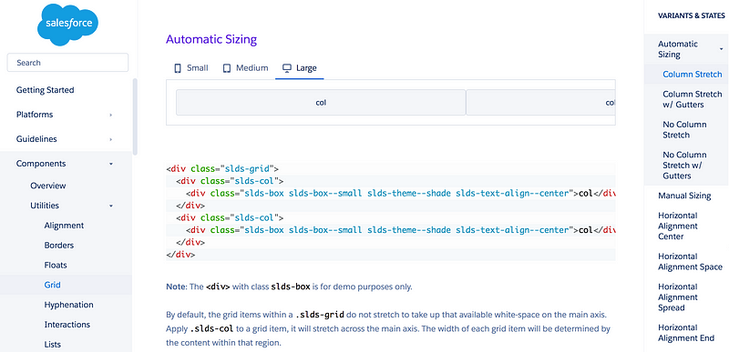
If you have a front-end buddy or you can code yourself, a live library can make everyone’s life easier. It’s an efficient tool for front-end developers to keep consistency, avoid mistakes and speed up the development process. Lightning design system and Angular material are good examples for live library
Find your front-end buddy who cares about design details. Then talk about the components in style guides with him/her, and find the best way to build them. Listen to your buddy, because sometimes your front-end buddy will have amazing ideas that you have never thought about. Then document the codes for each component, and make sure that developers can easily understand and reuse them.

2.From style guide to design system

During the process of building the style guide, you also gain more knowledge about the product. After the style guide is done, you can move on to include guidelines, principles, rules, and of course.
You can document very detailed rules. For example, you can have a section on “How to delete an object”, and the intro would be “Edit object, trigger edit panel, delete object, pops up confirmation dialog, confirm to delete the object, back to index with “Object deleted.” toast.”

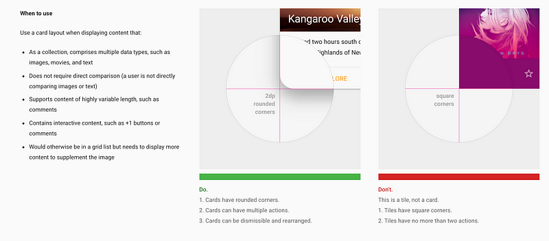
You can also add “don’t” and “do” examples for each design pattern. It will help people get clear idea about how to reuse these components. And you can also describe in which situation, with what conditions, designers should use which design pattern.
Benefits of having a design system
Efficient tool for product people
Design system is a recipe that helps designers to run the “kitchen” smoothly. Buy using the same recipe, designers can keep offering quality “dishes” to customers. Designers can find what ingredients they have in the library, as well as when and where to use them. And it’s also a very good hand-off tool that can keep everyone on the same page.
Efficient tool for developers
A live library that has all global components can speed up the development process. It can allow developers to copy and paste codes, and help them to work easily, quickly and reduce bugs. Each developer can also contribute to the library to make it become an “evolving system”.
Smooth hand-off tool
As the company grows, cooperation and hand-off work become harder and harder. With the design system, hand-off becomes easily and smoothly. There are three groups of people who can take advantage of it.
For QA people, they know what to test, and whether the delivery matches with design rules. For designers, there’s no more debating about global interactions. Also, designers can work on other designers’ design file without any confusion. For developers, they can understand design files clearly, and build them out in a proper way.
Quality delivery, consistent UI & expectation
Thanks to the consistent components and design rules, we get high quality outcomes across the board. For our users, it’s easier for them to learn and operate. Now they can study the system pretty easily and get their expected feedback every time.
Once design system is implemented
Bringing a great design system to live is like this:

and everyone in your company is like this

Style guides resources & tools
The following is a list of resources I use to build our design system, and tools that very helpful for beginners.
Thanks for @Ignacio Giri’s comments on my last article about style guide tools. Consider about different usages, I will include some powerful CMS tools as well. If you have any config & front-end knowledge, these tools can help you and your team build live library pretty easily.
The CMS Tools
[1]Github
Github is a developer friendly tool to manage live style guides. Here’s a very helpful article talk about how to manage style guides with Github: Managing style guides at Shyp
[2]Statamic
Statamic is a powerful tool that could be used by both designers and developers. Once you install and study the proper way to use it, you can build a live library quickly. It is also powerful for you and your team to do version control.
[3]Cloudcannon
If you are a designer who know how to work with HTML, JavaScript, CSS and any static content, Cloudcannon is the tool that can help you do things right. It’s kind of similar with the way you customize your personal website in Squarespace. And it’s powerful for agency designers who are in charge of tons of display websites at the same time.
Tools without coding skills
[1] Craft
Craft is a Sketch plugin that can help designers cooperate via a cloud design library. Designers can cooperate to build style guides and components symbol library with it.
[2]frontify.com
Frontify is an online style guide documentation tool. It’s very friendly for beginners.
[3]Confluence is a team documenting tool that usually be used to document everything about product, including design principles, rules, and etc.
Examples for design system
Material Design
It is the famous design guidelines that publicized by Google. It Includes introduction, style, motion, layout, components, patterns, growth &communications, usability and resources. It’s very helpful if you want to build your product in Google material style, or your team is using any material design frameworks.
Material guidelines do not have a code library, but there are some third party resources that built base on Material design. Such as Angular Material, Material Design Lite, Material for Bootstrap and Material UI.
Lighting Design System
Lighting design system is build for Salesforce SaaS product. It includes guidelines, components, design tokens, icons, and related resources. Designers can put component classes name on design deliveries, then developers can build the correct components easily.
For example, if a designer says : “I want to apply a light shadow to this card.” Then the card shadow spec in sketch is like 0px 2px 2px 0px rgba(0,0,0,.16). And they can provide the class name as $elevation-shadow-2on design mockups, it can help developers to build the exact card that designers want.
Other examples:
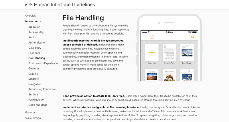
iOS human interface guidelines
Styleguide.io (you can find tons of examples on this website)
Style Guide Inspirations by Muzli
Related articles
This is, without a doubt, the coolest Sketch technique you’ll see all day by Jon Moore
Managing Style Guides at Shyp by Micah Sivitz
Building a visual language by Airbnb design team
How we keep our styleguide up-to-date across the GoCardless design team by Sam Wills
Animation in Design Systems by Sarah Drasner
Thanks for reading!
If you like my articles, you are more welcome to give me a ❤️ :)
from uxdesign.cc – User Experience Design – Medium https://uxdesign.cc/designing-design-system-for-complex-products-5ff2d3051fa1?source=rss—-138adf9c44c—4
