
This is what 500 years of graphic design in print looks like
A new book from Phaidon chronicles the history of printed imagery

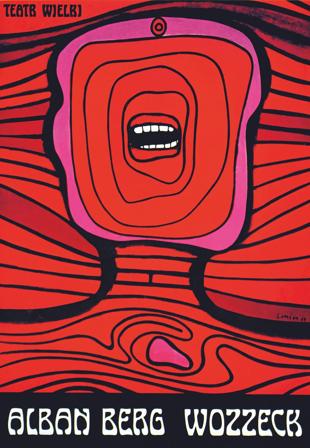
Wozzeck, poster, Jan Lenica, 1964, Warsaw Opera, Poland.
In 1455, the budding Italian urbanist and author Enea Silvio Bartolomeo Piccolomini was in Frankfurt viewing a first edition of the Gutenberg Bible. Later he gushed in a letter to Cardinal Juan Carvajal, “The script was very neat and legible, not at all difficult to follow — your grace would be able to read it without effort, and indeed without glasses.” Enea, who was three years off from being ordained Pope Pius II, was already well on his way to Holiness that day. But his epiphany with the printed page almost certainly helped shape the pontiff-to-be’s ambition in letters: Pius’ novel The Tale of Two Lovers would become a 15th century bestseller and remains in print to this day.
Gutenberg’s accomplishment—the first major book printed with mass-produced, moveable type—was a watershed in the advancement of information distribution. It was also the European impetus for what we now call graphic design.

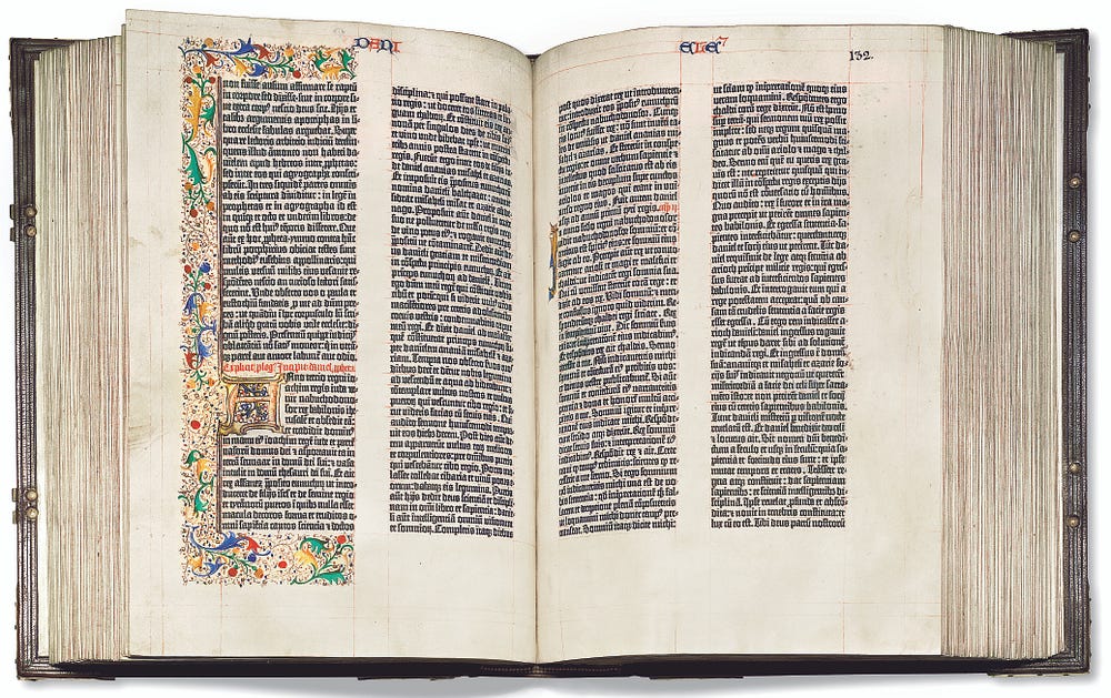
The Gutenberg Bible, book, Johannes Gutenberg, c.1453 to 1455, self- commissioned, Germany (page 469).
A new book published by Phaidon, Graphic: 500 Designs that Matter, collects milestones from the rich history of visual communication into a single tome of pioneering design and typology. Pairing canonical works to emphasize visual echoes across the ages, Graphic draws connections between images as disparate as the Nazi swastika (1920) and original Macintosh alert icons (1984). The result is a bold, non-chronological litany of some of the most important visual messaging of the past thousand years. Think Fette Fraktur meets the Nike “swoosh” logo.
In a world inundated with information, graphic design—the way in which messages are communicated through media—is vitally important. From subway maps to pie charts, great design cuts through the clutter to help shape and direct daily experience, either by facilitating our ability to quickly absorb what we need to know, or forcing us to question the obvious. Now if only the internet would catch up.

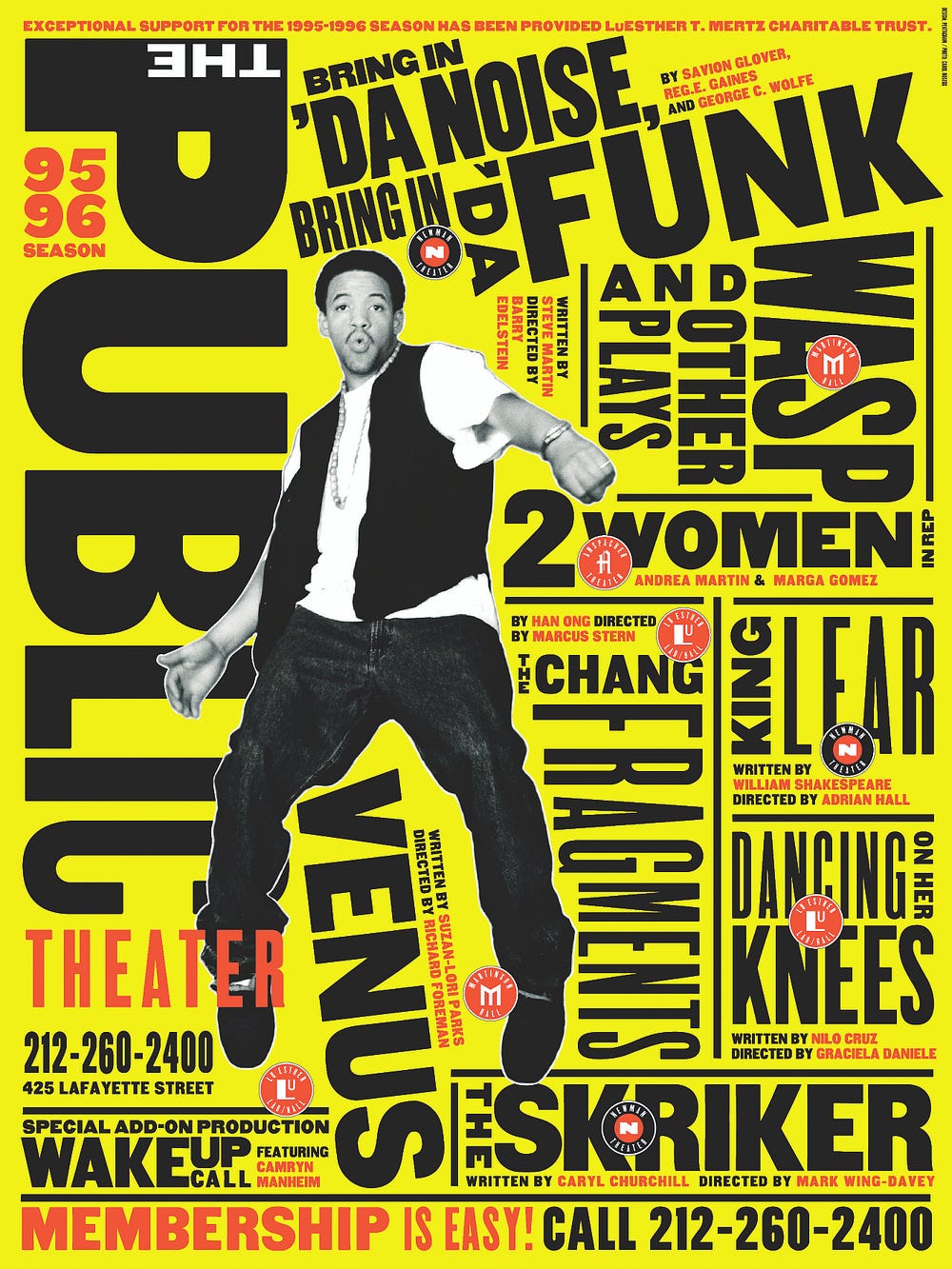
Public Theater, poster, Paula Scher, 1995, Public Theater, US: ‘Bring in ’Da Noise, Bring in ’Da Funk’, Public Theater poster, 1995.

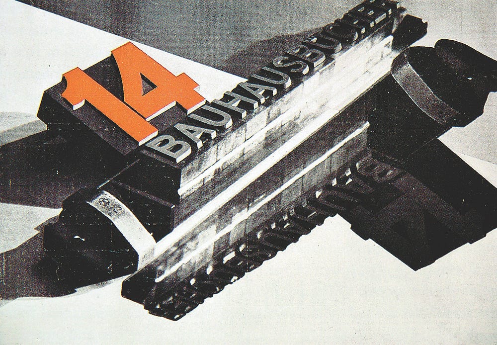
Bauhaus programmes, book, László Moholy-Nagy, Herbert Bayer, Walter Gropius, 1922 to 1931, Bauhaus, Germany: Bauhausbücher 14 by László Moholy-Nagy, 1929.

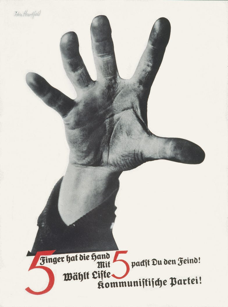

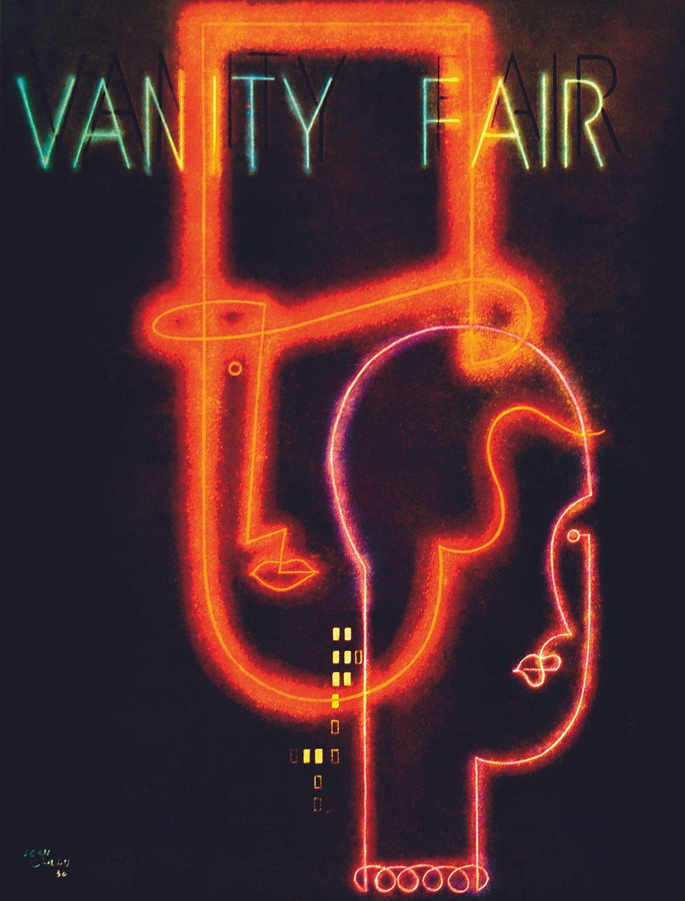
(left) 5 Finger Hat Die Hand, poster, John Heartfield, 1928, German Communist Party, Germany: Die Rote Fahne, 13 May 1928. | (right) Vanity Fair, magazine cover, Mehemed Fehmy Agha, 1929 to 1936, Condé Nast Publications, US / Vanity Fair, cover illustration by Jean Carlu, art direction by Mehemed Fehmy Agha, April 1931.

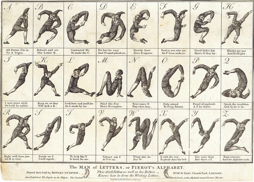
The Man of Letters, or Pierrot’s Alphabet, typeface, (designer unknown), 1794, Bowles & Carver, UK.

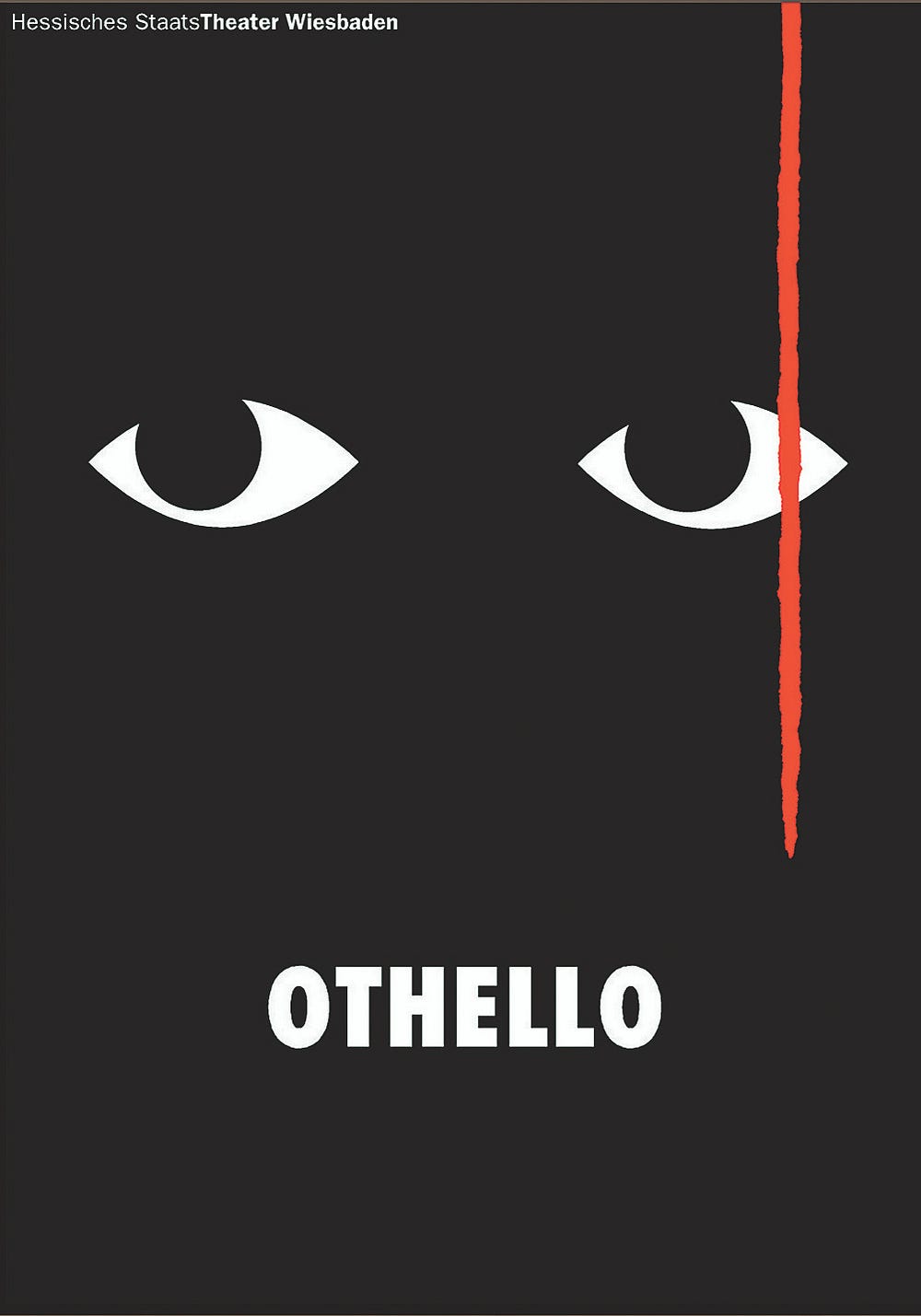

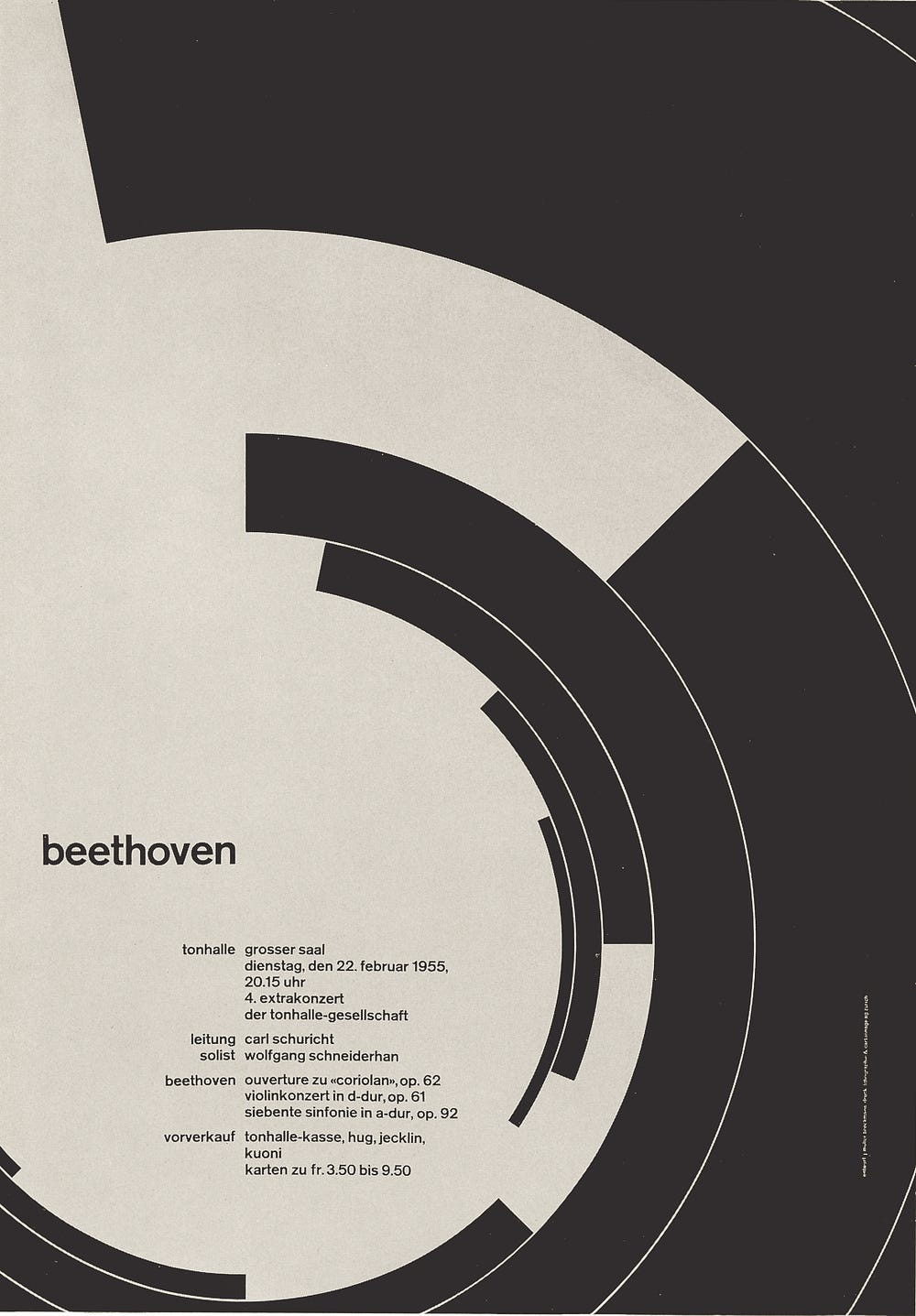
(left) Othello, poster, Gunter Rambow, 1999, Hessisches Staatstheater, Germany. | (right) Beethoven, poster, Josef Müller-Brockmann, 1955, Tonhalle Zürich, Switzerland; image courtesy: © Josef Müller-Brockmann Archive.


IBM, 1956–1991, identity, Paul Rand, IBM, U.S.

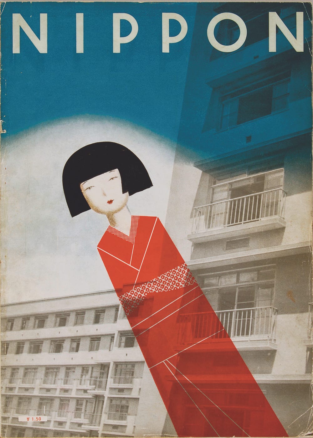
Nippon, magazine cover, Nihon Kobo [Japan Studio], 1934 to 1944, self- commissioned, Japan; image courtesy: Fukushima Prefectural Museum of Art © Miwa Natori: Nippon, design Ayao Yamana, photograph Yoshio Watanabe, 1934.

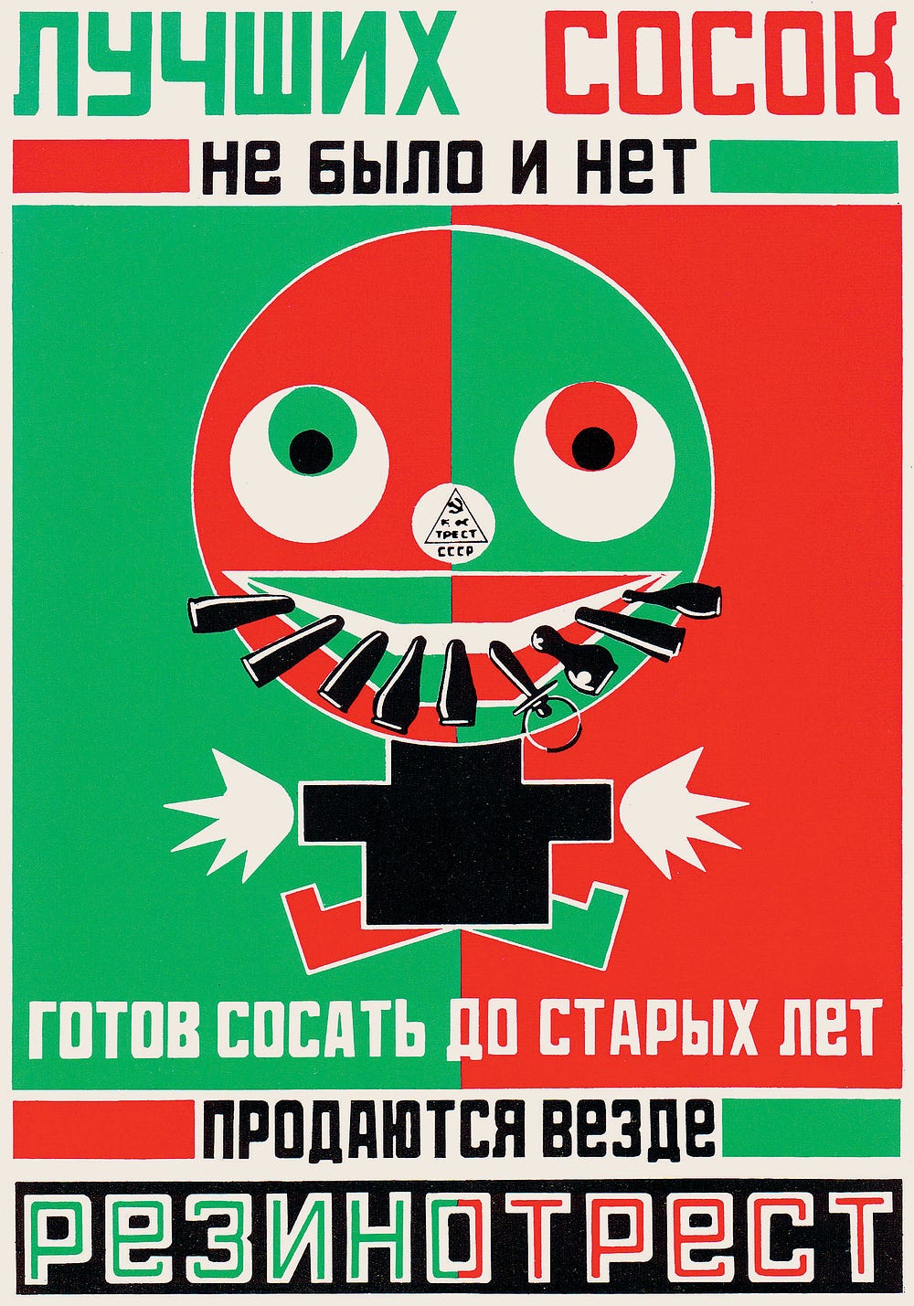
Luchshih Sosok ne Bilo i Nyet, poster, Aleksandr Rodchenko, 1923, Rezinotrest, Russia.

Graphic: 500 Designs that Matter is published by Phaidon. All images courtesy the publisher.
from Sidebar https://sidebar.io/out?url=https%3A%2F%2Ftimeline.com%2Fthis-is-what-500-years-of-graphic-design-in-print-looks-like-53d413e56987