Emotional design is the secret sauce of many successful products. It can make all the difference between a good product and one that users talk about to everyone.

Think of a digital product you love and have raved about to your friends. Often, in this crowded market, these products are not one of a kind — there are competitors who offer almost identical functionality. So why do you prefer one over the other? It’s more than what the product does, it’s how the product makes you feel.
Usually, when we think about the role emotions play in the marketplace, we think of advertising. Psychological and neuroscientific research has revealed that —
Emotions are so powerful they influence our perception, decision making, and even memory — the more emotional an experience the better we remember it.
However, these days it takes on average seven impressions for people to act, and no amount of advertising will ensure customer retention. Instead of waiting till that later stage to consider emotions, product designers can inspire specific feelings in their users by designing with emotions in mind from the get go.
Emotional design has the power to turn users into fans, spreading the word about products they love. Don Norman defines it as making a product or service that delivers in a person the emotions that we (the company) cares about. It’s the secret weapon of companies like Apple, Mailchimp, and Slack, which is why copycats have a hard time mimicking their success. The investment required to implement emotional design is small, so it’s something any company can profit from, especially startups with a limited marketing budget.
How to implement Emotional Design
First, before thinking about emotional design, the product must provide value to its users. Next, the design needs to be functional, reliable, and usable. Only then can we focus on adding the emotional cherry on top, by thinking “what feeling do we want our product to spark in the user?” and designing toward that emotional goal.
Let’s look at a few of the main components of great emotional design:
Contrast and Delight
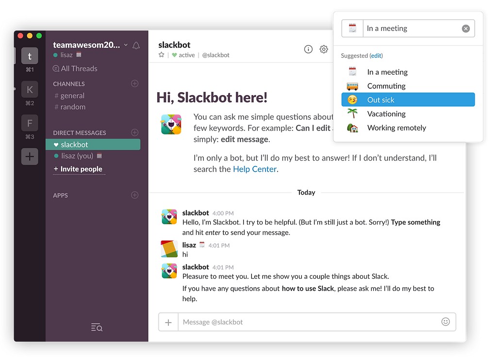
Slack has been called the fastest growing workplace software ever, by The Verge. But its functionality did not vary much from its competitor Hipchat, according to Andrew Wilkinson, the founder of Metalab, which designed the original Slack.
The difference lies within emotional design. Slack looks very different from its competitors which makes it stand out. Its round shapes, vibrant colors, friendly typeface and emojis make it more reminiscent of a computer game than the typical blue-grey enterprise software. But it doesn’t just look different, it also feels different — the animations give the impression that the app is playfully jumping around. When the logo is loading for example, it bursts into colors like a confetti explosion. “When you hear people talk about Slack, they often say it’s ‘fun,” Andrew wrote on Medium.

Personality and Humor
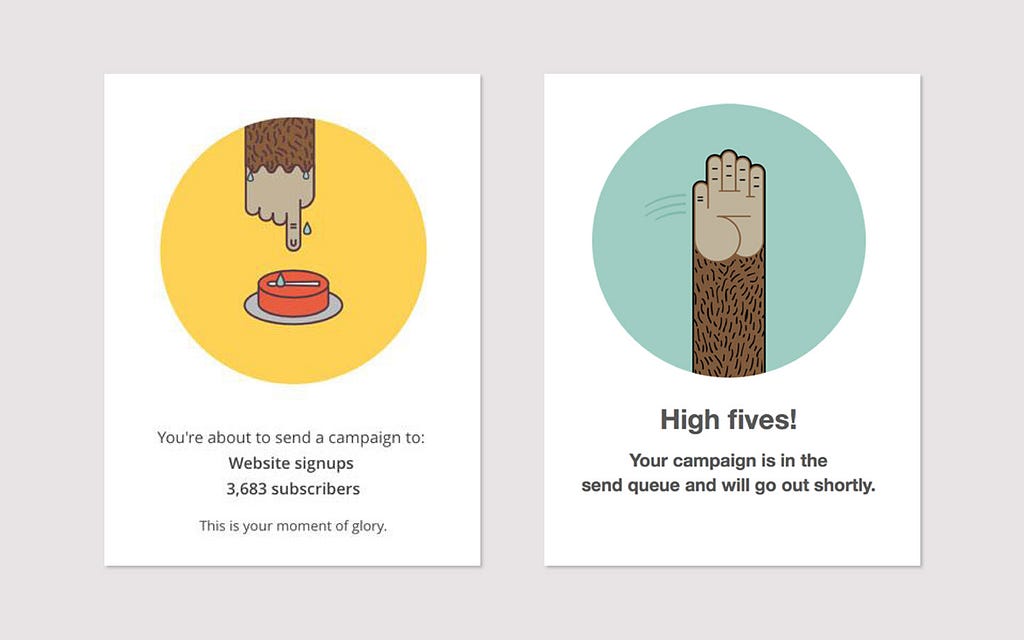
We like interacting with humans more than machines, so adding personality to our products helps users build a bond with them. For example, Mailchimp lets its personality shine through in the smallest details, from the copy on its front page to the graphics users receive as they send out email blasts. Its tone of voice is familiar, friendly, and funny, like an actual person and not a faceless bot. The voice of Mailchimp tells jokes and stories and talks to its users like a good old friend:

Users loved this so much, they’ve even tweeted about their experience when sending a campaign through Mailchimp.
Reward
Neuroscientists have found that dopamine is released in anticipation of a reward. It’s this positive rush of emotions that keep us repeating certain behaviors and can even lead to addictions. Instagram for example uses rewards very effectively. Users obsessively check their feed, because they’re hoping for likes on their last post, which would make them feel good.
Variable Surprise
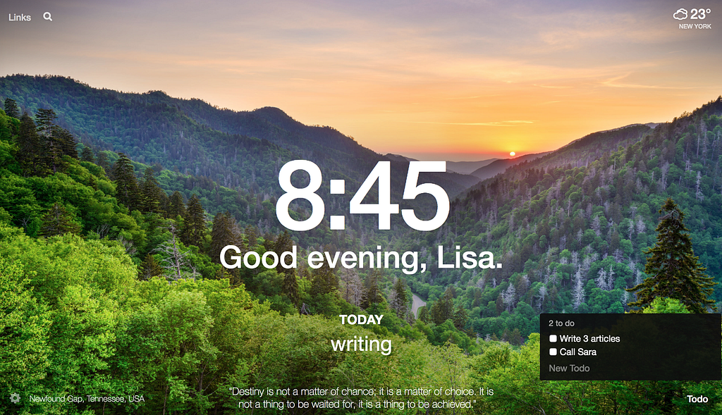
The Google Chrome Plugin “Momentum” surprises its users every day with a different quote and background image from a beautiful destination. Users expect variability, but the exact image and quote is a mystery until it’s revealed, so each morning it’s a delightful experience. I’ve even tweeted it’s quote several times, and recommended the product to friends.

The overlooked business value
When it comes to digital product design many companies still focus on simply making their products functional and usable. Why? Working as a digital Product Designer, I realized that in the hectic world of product development, we often feel pressure to ship new features fast and push delightful elements to “later” (which often means never). As a result, companies end up spending more money on advertising to compensate for users who are not returning or not talking about their product.
In my own experience, product teams are often simply not aware or underestimate the business value of emotional design.
It can actually help to meet important business goals such as increasing conversion and sales. It even has the power to make users forgive the shortcomings of a product.
For instance, in his book Emotional Design, Don Norman writes about the business value of emotional design:
“Apple Computer found that when it introduced the colorful iMac computer, sales boomed, even though those fancy cabinets contained the same hardware and software as Apple’s other models, ones that were not selling particularly well.
And in Aaron Walter’s book Designing for Emotion, he reports on how Blue Sky Resumes (a service that helps people create resumes) saw a 65% increase in clients each month and a 85% increase in total revenues, by changing nothing but their design.
While emotional design alone does not make a product great, it has the power to inspire strong feelings in users, emotions which equate in high rates of retention and positive word-of-mouth. It’s a powerful growth hack that any company should take advantage of, and in today’s competitive market it’s becoming an essential element of success.

The most overlooked growth hack: designing for emotions was originally published in uxdesign.cc on Medium, where people are continuing the conversation by highlighting and responding to this story.
from uxdesign.cc – Medium https://uxdesign.cc/the-most-overlooked-growth-hack-designing-for-emotions-1a3ba503d4f4?source=rss—-138adf9c44c—4
