Growing your influence at work
I got the privilege to deliver this talk (adapted as a blog post) at the National Digital Design Conference (www.nd2c.com) in Pakistan on Sept 23rd 2017. ND2C was the largest design conference in the country so far, and included renowned international speakers, like Stefan Sagmeister and Debbie Millman, and amazingly talented local designers and creatives. It was the vision of two fearless women, executed through them and their team. Shout to the Featured Women and our TED coach Soness Stevens who helped me bring my first conference talk (and now first Medium post) to life, as well as the friends who helped edit it.
I remember my first few days at Google. I was so excited. A month after this picture was taken, I had gained 7 kgs because of all the free food in the cafeteria.

I used to take these Google buses to go to work, that had this cool interior and free wifi. But I made sure to sit in the back so I didn’t look like an awkward tourist.
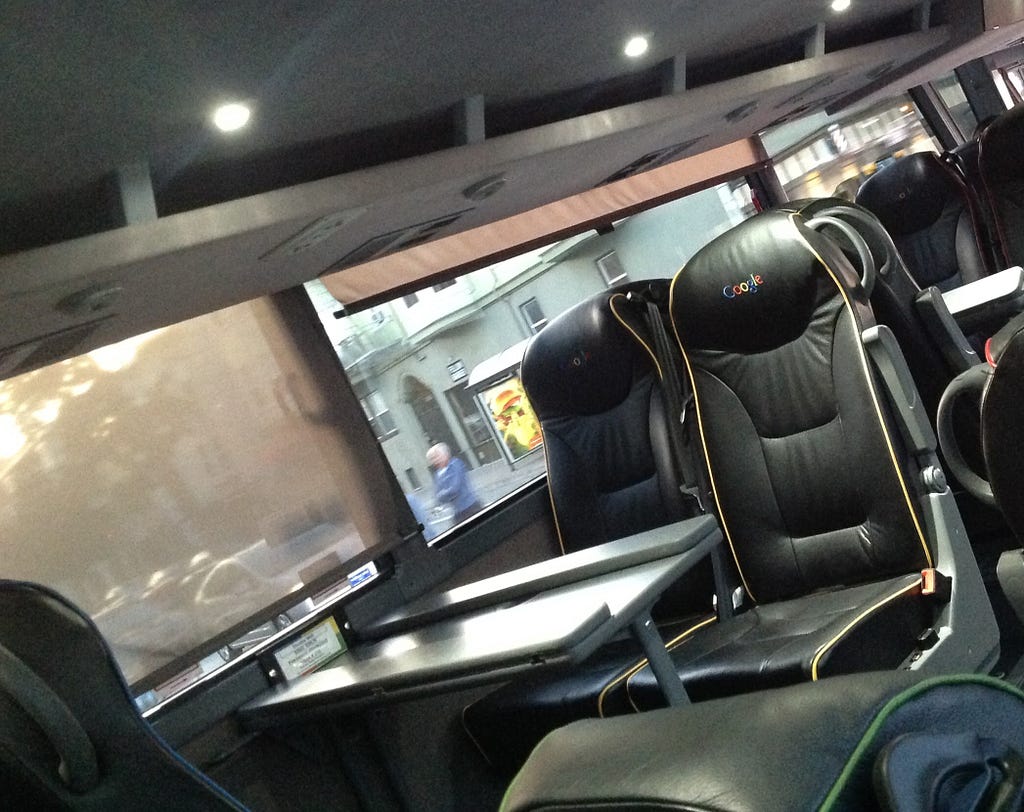
But, as the novelty wore off, I started to doubt how well I was doing. I thought to myself, “I’ve trained in engineering, not design. A year ago, I didn’t even know that those gray boxy diagrams were called wireframes. Did I just do well in the interviews somehow?”
And then, it got worse: the woman who used to sit next to me got fired. I began to wonder if a girl like me from Rawalpindi really belonged at a place like Google, in Silicon Valley.
That same bus became a place where I would quietly put my head down and cry. I felt like an imposter.
Many people feel this way in new situations, but I think designers are particularly prone to it. Many around us don’t understand this new field. And our colleagues sometimes use us as a service to churn out pixels. We are often self-taught, and unsure if designers can truly lead companies.
Sure…we know Steve Jobs used design to make Apple successful. But he was a rare legend, right?
What about these successful companies?
Did you know they all had founders who were designers by trade? These leaders recognized that as technology becomes more accessible, consumers demand better experiences. They used their design skills to set their product apart.
It’s been 4 years since I started at Google. I have observed many designers in leadership positions and have grown from that self-doubting newbie to a Senior Interaction Designer. I’ve found one main difference between how junior and senior designers approach problems. I want to share that with you so it can help you navigate the relatively uncharted path of a design career.
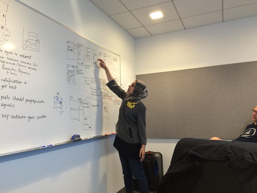
Our education systems often train us to become specialized experts in narrow fields. We are encouraged to be hyper-focused on a single, discrete problem. However, in an interdisciplinary field like design, we need to balance this focus with breadth. We need to prevent ourselves from getting so distracted by perfecting pixels that we forget to widen our vision and see the big picture.
So, what is it that makes some designers great?
It’s system-level thinking.
Fast Co. design describes this as:
“A mindset — a way of seeing and talking about reality that recognizes the interrelatedness of things.”
Let me explain what this means and why it’s important, through an analogy: my husband and I recently moved to our first apartment together. The first thing we had to buy was a bed. How might you approach that problem? Take a few seconds to think about it.
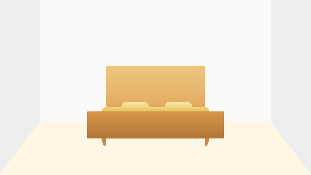
I might think to myself, “Ooo mid-century modern is really trending these days,” and buy a new king bed in that style.
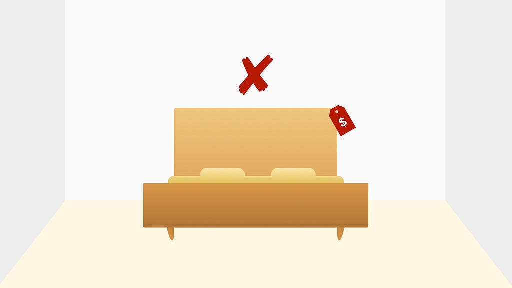
But, lets assume I’m a lil more thoughtful. I discuss the budget with my husband and realize a king bed will be too expensive. It’s more economical to keep his existing queen-sized mattress.
So I go ahead and buy a reasonably priced, queen-size bed instead.
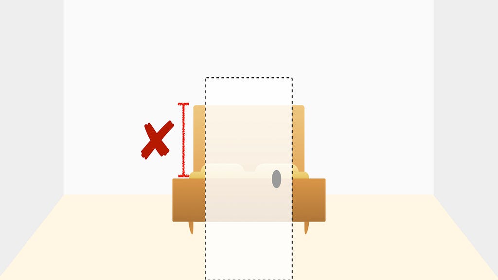
Now the bed arrives. Oh nooo, I didn’t measure the door! The headboard won’t fit!
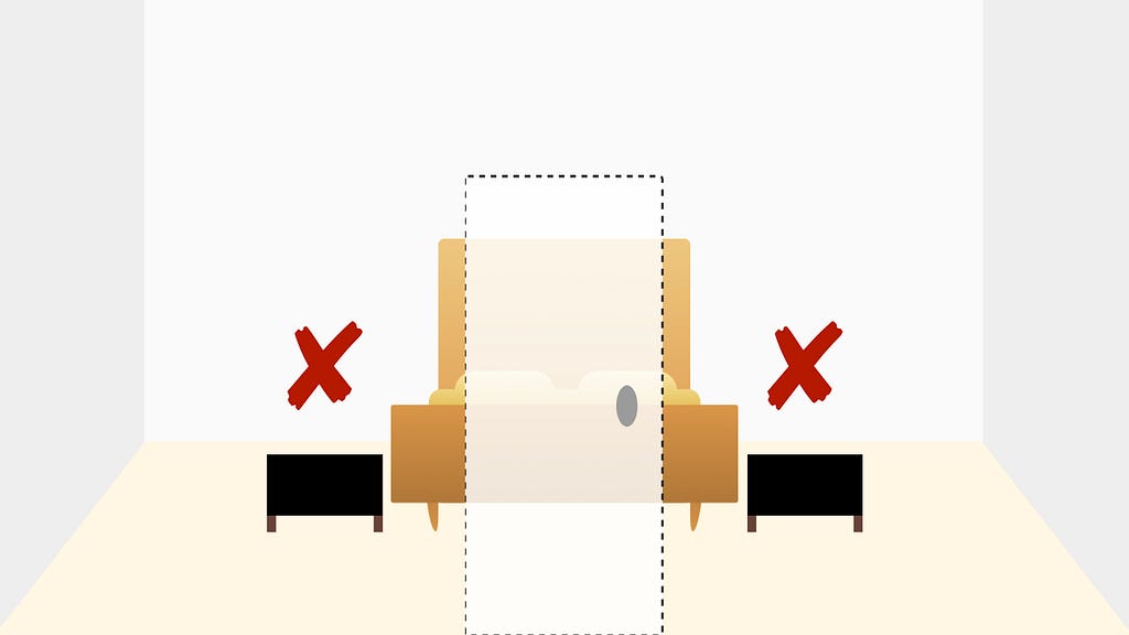
And when the bedside tables my husband ordered arrive, they are in a dark bachelor-pad style, and don’t fit with my mid-century modern theme.
I should have focused not just on buying a trendy bed but on making the whole house feel cohesive and meeting both our needs.
This included things like:
- Our financial goals: how we want to divide our overall expenses
- Physical constraints: the space of other items
- An agreed aesthetic: what should the look and feel be
Had I considered this ahead of time, I might have bought a reasonably priced queen-sized bed, with a smaller headboard, and agreed on an industrial style that met both our tastes.
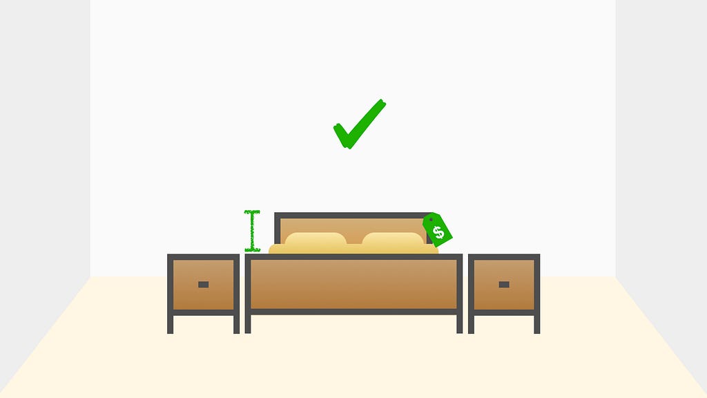
Hopefully that gives you a sense about what it means to think about interrelated things at a system-level.
Now, let’s switch gears and see how we can widen our vision when we build products.
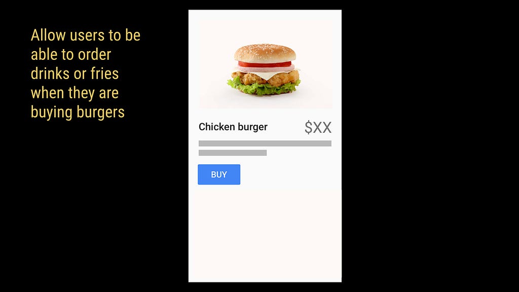
Say you have been hired by a food delivery startup. The CEO asks you to update the following screen so users can buy drinks and fries when they are buying a burger.
How would you approach this problem? Take a few seconds to think about it.
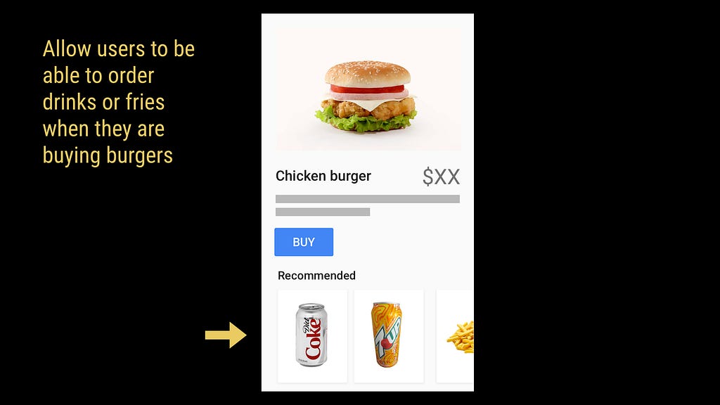
One option is to recommend drinks and fries in a carousel at the bottom. Users can tap on items to add them their cart
But is there a better way to do this than what we were told? Lets step back.
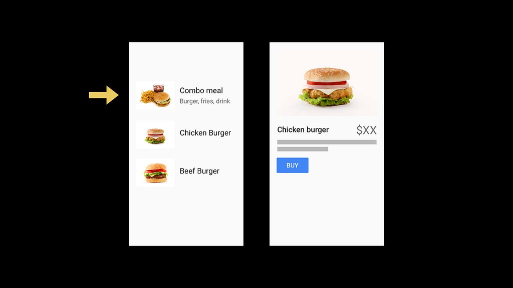
The screen before this one has a list of options.
It might better, for example, to add a combo meal here so we don’t have to encourage users to add items later. This is probably also easier to implement than building a new carousel component.
But why were we asked to allow the user to add a drink or fries in the first place? Why is this important to the business? It’s to increase sales. But is there a better way to do that in the app?
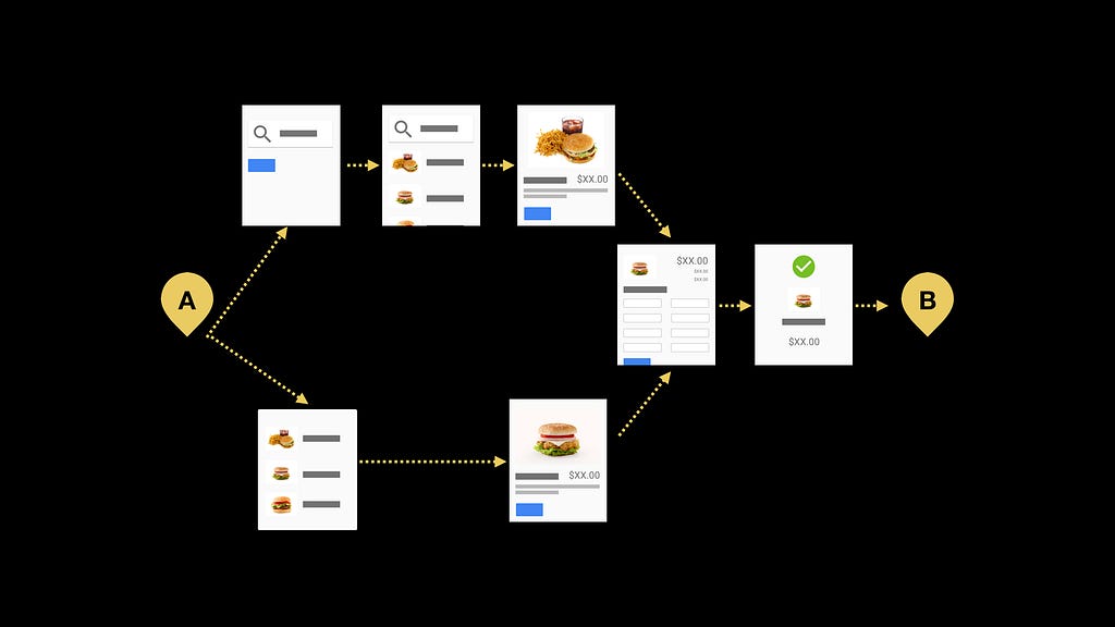
If we look at our app overall, it allows users to go from point A, of wanting to buy burgers, to point B, completing their purchase, through various flows.
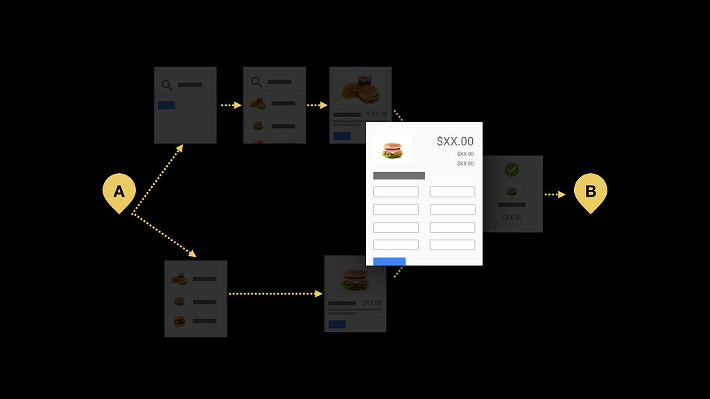
It turns out 90% of our users never finish buying what they put in their cart and abandon on this checkout page.
So, instead of just focusing on getting larger orders, we can suggest ways of simplifying our checkout page. From this vantage point, we can even call out any inconsistencies in UI patterns used here relative to the rest of the app.
Now we are getting more users from A to B. But sales are still low. Turns out there aren’t many users at point A in the first place because most people aren’t using our app. Let’s look at the whole market.
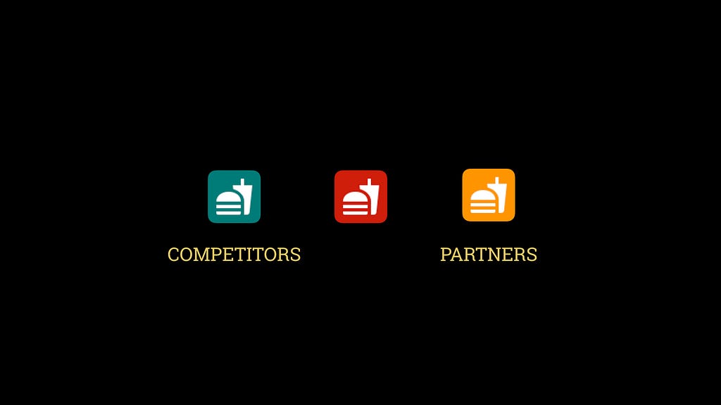
Maybe our competitors have a really cool feature that we should build as well or we need to partner with burger joints to get more customers.
In order to solve the real problem in the most efficient way, we resisted the temptation to focus on the screen we were given and explored pain points at flows and at the product level.
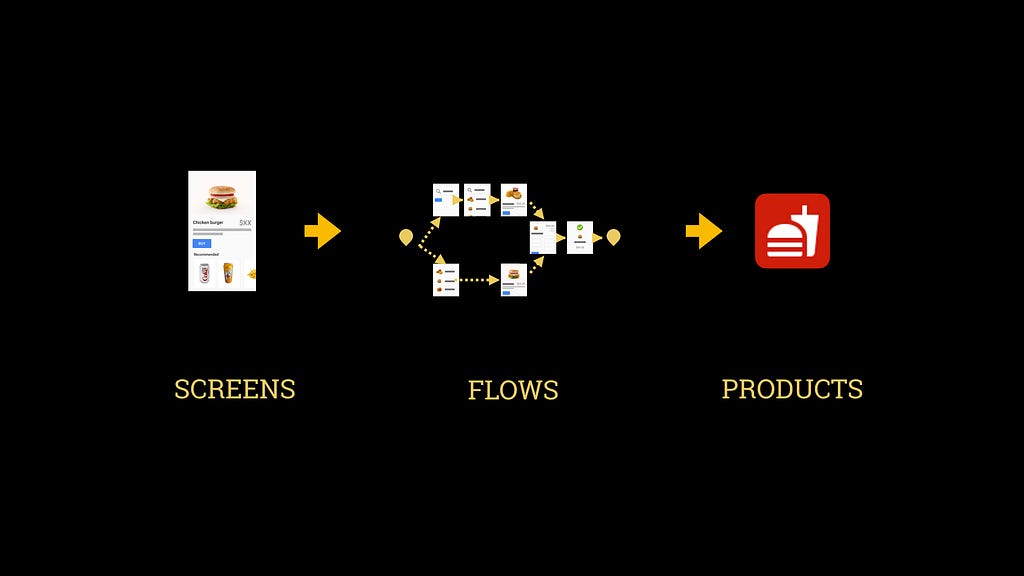
It can be overwhelming to think about how rest of the system impacts your goals but ignoring it doesn’t protect you either. So, let me share three lessons that have helped me:
1. First, get your first win
Do focus on the basics and become an expert at the tools, processes, and methodologies that are core to your job. And then create something, however small, that brings value to others. For me it was launching my first small project. When I received a bonus from my manager, I finally accepted that he didn’t actually think I sucked. Gaining that confidence freed me to think bigger.
2. It is also your job.
I often hear people say, “That’s not my job,” and that inhibits them from understanding how their work relates to that of others on the team. So number two is…yes, it is also your job.
- Put on the business hat: How can your designs improve the company’s success metrics?
- Put on the technical hat: What is easy or difficult to build in the given timeline?
- Put on the UX hat: Are there existing patterns or research that you should leverage?
Its no wonder then, that great designers are excellent communicators. You can’t just show your designs, you have to articulate the tradeoffs between a good experience and the business or technical constraints. Invite coworkers to observe research or design sprints so they can also understand the factors that led to the solution. Accept feedback and discuss a way forward. Especially when our peers may not understand UX, we need to speak their language.
3. Be curious.
Learn beyond expectations, even if you can’t see the immediate value. Train your mind to wander productively. When you find a few minutes to spare, open up industry news, read a medium post, or dabble in a new tool.
10 years ago when the first iPhone came out, those who quickly adapted their designs for smartphones gained a competitive advantage.
In that vein, let’s go back to the food delivery experience from earlier. We were reacting to the picture that exists today. But what if we were curious about the picture we can create?
Given that same task today at Google, I might design an experience that starts on my phone while I’m leaving work, continues through notifications in my car, and ends on an assistive device in my living room — all through voice conversations.
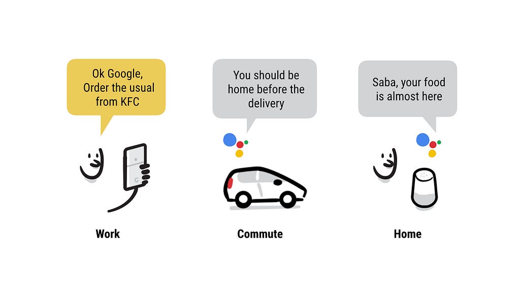
Technology changes very rapidly: an experience that was impossible a month ago, might be within reach today. By being curious about emerging skills you can keep yourself and your companies relevant.
I’m currently on the Google Assistant team, partly because of a project I helped out with, even though I didn’t know much about conversation design at the time.
It’s said:
“Luck is what happens when preparation meets opportunity.”
I suspect like many of you, I would not be standing here as a designer today, had it not been for curiosity. As I mentioned, I was pursuing engineering in college. By taking photos for a newspaper and creating posters for events, I inadvertently taught myself the adobe suite. By the time I discovered design as a career, I was already on a path towards it. Curiosity helped me prepare for the opportunity I couldn’t yet see.
So try these three things.
1. Get your first win
2. It’s also your job
3. Be curious
As you adopt this system-level thinking and increase your influence, embrace any self-doubt as growing pains. Remind yourself that you are taking agency of your own career path, against expectations. And like those leaders we look up to, you are improving product strategy through design.
Also don’t forget that by perfecting your own craft and individual products, you are improving the perception of design as an industry around you.
So next time you’re on a project ask yourself, am I focused on just the pixels or can I see the big-picture?
Thank you.
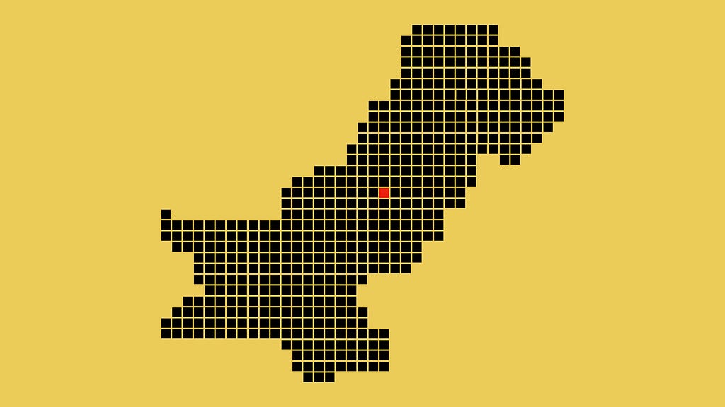
From Pixel to Big Picture was originally published in uxdesign.cc on Medium, where people are continuing the conversation by highlighting and responding to this story.
from uxdesign.cc – Medium https://uxdesign.cc/from-pixel-to-big-picture-c573ddaf971e?source=rss—-138adf9c44c—4
