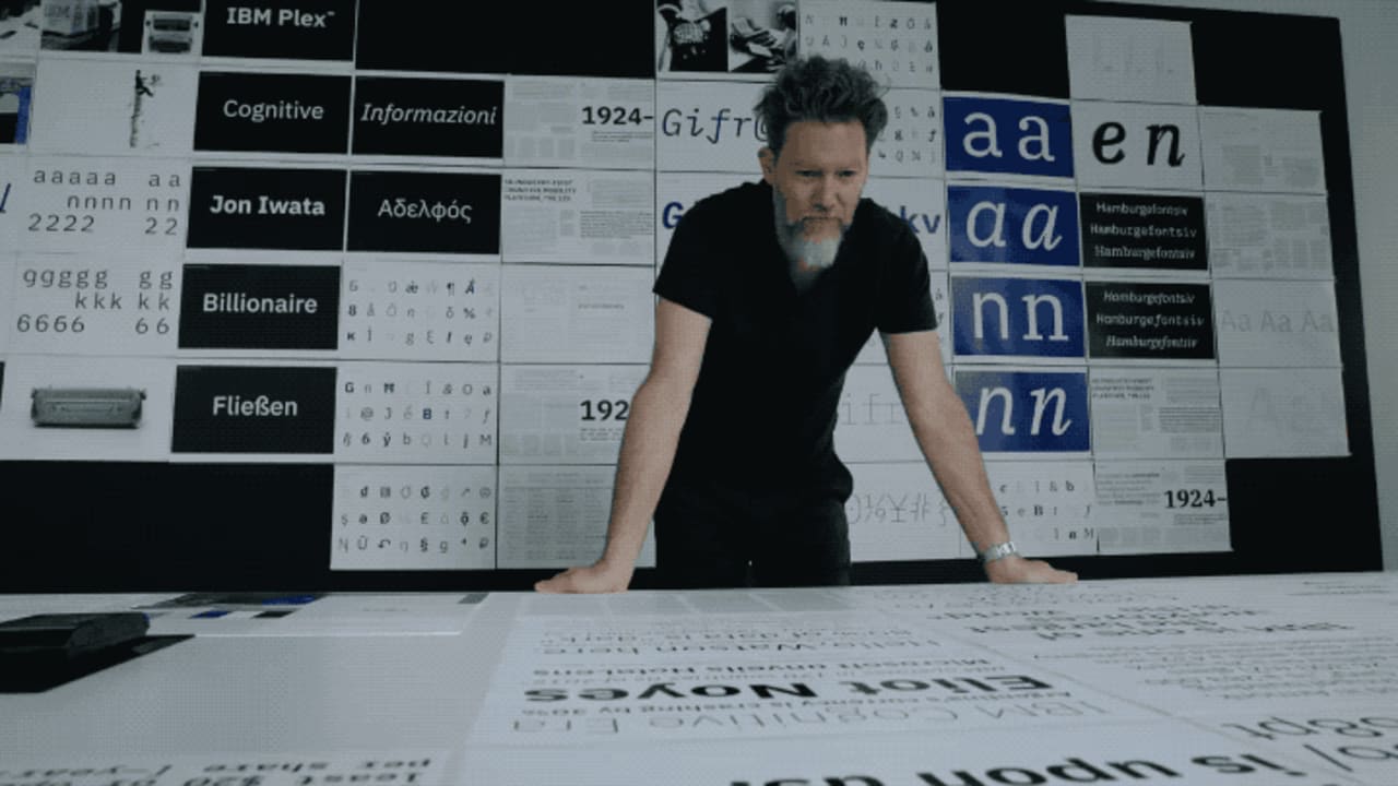
IBM is no stranger to icons. Over the years, it’s created quite a few: the mainframe computer, the ThinkPad laptop, the Selectric typewriter, the Eye-Bee-M logo. The company hopes its new bespoke typeface IBM Plex, which launched in beta this week (though the official version won’t be released until early 2018), could become just as iconic–a kind of Helvetica for this century.
“When I came to IBM, it was a big discussion: Why does IBM not have a bespoke typeface? Why are we still clinging on to Helvetica?” Mike Abbink, the typeface’s designer and IBM’s executive creative director of brand experience and design, says in a video explainer. “The way we speak to people and the conversations we need to have and we’d like to have, is that still the right way to express ourselves? We should really design a typeface that really reflects our belief system and make it relevant to people now. Helvetica is a child of a particular sect of modernist thinking that’s gone today.”
To uncover what the typeface should express, Abbink and his team took a deep dive into IBM’s archives. They were especially interested in the company’s history in the postwar years, when its design-led business strategy first took shape and the legendary practitioner Paul Rand, who defined design as a system of relationships, created its famous eight-bar logo. In Rand’s logo, Abbink and his team saw a contrast between hard edges–the engineered, rational, and mechanical–and curves–the softer more humanistic elements. It’s a reflection of the man-and-machine relationship that runs through the company’s history–a dynamic that is reflected in the final form of IBM Plex. Each of the letters and glyphs has those hard “engineered” edges and soft “humanistic” curves, just like Rand’s logo.
The Plex family includes a sans serif, serif, and monospace versions. The designers also created a rigorous style guide that’s akin to a digital standards manual and includes a type scale, which plays into responsive displays; eight different weights (a nod to how the IBM logo is composed of eight horizontally stacked bars); and usage guidelines, which dive into everything from information hierarchies to color and ragging. All together, it’s easy to see Plex as a gentler, friendlier, more casual Helvetica for a broad range of uses both digital and print-based.
Historically, IBM has used design to distinguish itself, whether it’s creating a better typewriter by introducing the “font ball” or defining laptop computing through the “TrackPoint nub.” Now the company is throwing its weight behind its $1 billion artificial intelligence unit Watson and is–in an effort to allay fear about this technology–positioning it as an assistant to humans rather than a replacement for them. A design tool at its core, IBM Plex is an expression of that same intersection between humans and technology. IBM will make the typeface free for anyone to download and is encouraging its widespread adoption. “If shoe stores or coffee shops or small businesses are using it for their identity, awesome,” Abbink says in the video. “They’re agreeing they want to be part of a discussion around machines and how they’re going to evolve and progress our world.”
So far, the response has been mixed: a thread on Hacker News reveals that many commenters agree with IBM’s decision to create its own consistent visual language. “I think this is all about establishing a new distinctive look,” commenter Ged Byrne writes. “The current one screams ‘1990’ at anybody reading. Now they need something that is distinctly IBM while gently whispering ‘2020’ into the reader’s ear.” Others argue the execution isn’t as sharp as they would like. Some don’t agree with the decision never to use true black, some believe the lighter weights won’t work on screens with low resolution, some nitpick on the 75-character-per-line limit.
The typeface is still a work in progress, but the company is sure about what the end result will be, at least–as Abbink proclaims in the video, “IBM Plex is the new Helvetica.”
from Sidebar https://sidebar.io/out?url=https%3A%2F%2Fwww.fastcodesign.com%2F90150350%2Fibms-quest-to-design-the-helvetica-of-the-21st-century
