
If so, Hoefler & Co. just released the perfect novelty product for you: the Typographic Ticket Book, an official-looking sheaf of common design crimes that you can use to write friends, co-workers, and total strangers up for. Ticketable infractions include “improper kerning,” “use of display font at text size,” and other designery in-jokes that will make any font nerd snicker. But the Ticket Book’s best jokes just might be on designers themselves.
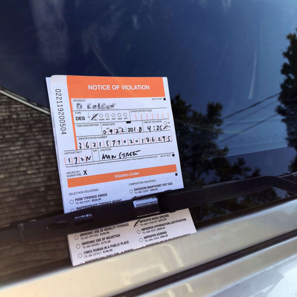
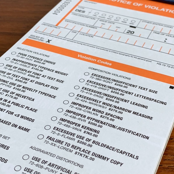
First, though, let us praise Hoefler & Co.’s attention to detail. The Ticket Book nails all the design conventions of municipal meter-maid gear: “things set in ALL CAPS that would be easier to read in lowercase, searing colors that dazzle the eyes, and confounding administrative indicia like bar codes and form numbers,” says Jonathan Hoefler. “And Helvetica. If the state is dressing you down, it’s always in Helvetica. Helvetica means you’re in trouble.”
The delights don’t stop there. Individual citation codes run the gamut from dad-jokey (“poor typeface choice: 72-60-HUH”) to so-inside-baseball-it-hurts (“improper hyphenation/justification: 72-436-RVR“), with a few dashes of guffaw-inducing surrealism thrown in for kicks (“improper word spacing: 72-428-C/WLKN”… get it?). The ticket book includes 32 “common design infractions,” which Hoefler admits he had to edit down. “Space permitting, [it] could probably have run to at least 60,” he says.
This wry self-deprecation is the Ticket Book’s satirical secret weapon, and what makes it such a great piece of design in itself instead of a one-note sneer at supposed typographic rubes. Hoefler & Co. knows that anyone who’s picky enough to even get these jokes is at risk of becoming a walking, talking design crime themselves. Hoefler freely admits that taking the piss was his whole inspiration to begin with: “Earlier this summer, a friend got a stern ticket for some inscrutable traffic violation, which got us thinking about the absurdity of treating ridiculous topics with deadly earnest.”
Which brings me to my favorite gag in the Ticket Book: its cover. An officious-looking eagle clutches a banner emblazoned with the words “final_art_final9.ai”—which, if you make a living in design, will surely make your shoulders sag in resigned recognition of how little power you actually wield. (For those not in the know: that string of alphabet soup is a common file-naming convention in Adobe Illustrator, denoting the mind-numbing lengths that client-driven revisions regularly go to.) And below that, Hoefler can’t resist giving the knife one more twist: the Latin motto FACIET MAIOR LOGO means–wait for it—”make the logo bigger.” Oh, it hurts so good!
So, while anonymously issuing smirky tickets for “non-ironic use of a novelty typeface” may give certain design purists a trollish kind of thrill, be advised that Hoefler’s irony cuts both ways. “The next time you run into some pedantic ding-dong mansplaining the difference between ‘font’ and ‘typeface,’ you should write them up,” he says. “It’s right there on the ticket.”
from WebdesignerNews https://www.fastcompany.com/90251608/cite-people-for-design-crimes-with-this-ticket-book