

Users today are more complicated than ever: they want more, and they want it faster, better, personalized, and easier to use. Their busy, connected lifestyle leaves no room for forgiving usability and performance issues. They will abandon most apps without thinking twice, 21 percent of them after just one launch. With all these user demands, what sets the successful apps above the rest? What can app professionals do to make sure their app doesn’t disappear into the app store graveyard?
The answer lies in understanding users and tapping into their deepest unmet needs. An app team that understands what its users want — even before they know it themselves — is already positioning the app for success. That’s why it’s vital at every stage of the process to acknowledge a few undeniable truths about your users, in order to better understand their needs and desires. This guide will show you how mobile app users have changed and pinpoint several basic needs for you to address.
A guide to the genus “user”
Users are complicated creatures, but after all, we are all users: we all download and launch apps every day, and we all have preferences that make us delete this app and keep the other. There can be many reasons behind these often-unconscious choices, but usually they can be grouped into several basic traits.
With no time and plenty of options, users are quick to say “bye.”
You can probably empathize with this: users have no time. They want to start using the features as soon as their fingers can tap. This is due to the principle of least effort. This principle has a huge impact on an app’s success. Users are quick to abandon apps that don’t instantly meet their needs, especially since there are plenty of competitors to choose from.
The principle of least effort states that a person “will strive to solve their problems in such a way as to minimize the total work that they must expend.” In mobile apps, this means that users want to accomplish the task they came to do on the app in the minimum number of steps — faster than on desktop. Take to-do list apps for example. Users want to add tasks to their list quickly. An app that makes them go through several steps before the “Add Task” event simply isn’t giving them what they need. Another example is onboarding: many users prefer to skip it altogether, but aren’t given the option.
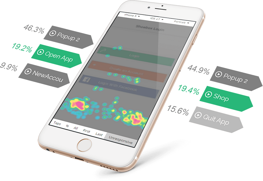
How do you know if your app follows the principle of least effort? By monitoring user behavior and being on the lookout for points of frustration — especially on problem-prone areas like onboarding, navigation menus and payment screens. There are many app analytics platforms that can help you do this well. Following navigation paths is a good way to spot issues with menus and navigation. A detailed conversion funnel analysis will indicate where users are dropping off. Finally, touch heatmaps can spot specific points of user frustration.
Users have their hands full.
After a decade of smartphone use, our phones are so connected to our hands that we don’t need both to operate them. Depending on the tasks users perform on the app, there’s a lot to consider when planning the size and placement of each element. It’s not just about reach — users have complained that certain elements don’t respond as well to their thumb gestures in general. Also, some mobile app users, such as young children and seniors, will have unique user interface needs according to their dexterity.
How do you ensure a smooth gesture user experience? Imagine when and where your users will be interacting with the app. Will it be on their morning commute, with a cup of coffee in their other hand? Will they be using the app while doing something else, like cooking, playing an instrument or working out? Creating these scenarios can help you in the design stage of your app. Then, from testing to post launch, your analytics tools will help you see these scenarios through.
Users are not going to use your app the way you intended.
The fact that an app is designed to be used in a certain way doesn’t mean that the user will use it that way. They might use it for a completely different purpose than you and your design team have imagined. After all, Frisbees were originally meant to hold pies. Some users might download a note-taking app, for example, and end up using it to make shopping lists.
This misalignment of expectations can lead to a common ailment of mobile apps: unresponsive gestures. A user taps the screen expecting the app to behave in a certain way, only to find that this action is impossible. One example is when users try to swipe in order to get to the next screen, but the app’s designers never created such a function. These scenarios can lead to a lot of repetitive, frustrated tap-tap-tapping, users “killing” the app or abandonment.
They don’t trust you.
In a world where security breaches happen even to market leaders, it’s only natural for users to feel skittish when giving their personal information online. One hiccup in the payment process, account creation screen or any interaction that asks for personal details — and they’ll bolt.
How do you make your users trust you? Give them a reason to. In general, to get users to trust you, you have to give before you take. This is called the Reciprocity Principle, and it means giving your users a reason to trust them before you start asking for their trust.
For example, on the often-stressful payment screen, give them signs that they’re safe: a certification badge for whatever payment SDK you’re using and/or an icon indicating a secure connection. Display their total and shipping address at all times. You should also include some friendly, transparent microcopy. All of these will make your users feel that they’re in safe hands — and so is their bank account.
Summary
Mobile technology’s lightning-fast advancement has created app users that are picky, tech-savvy and impatient. Mobile app professionals need to keep this top of mind when ideating, designing and optimizing new apps. To create a successful app, they need to get to know their target audience, understand their preferences and desires and address them one by one. By doing this, app creators can tap into previously unmet needs, earning a loyal user base and setting their app above competitors. These initiatives can save an app from disappearing into the app store ether.
Four undeniable traits of every mobile app user was originally published in UX Collective on Medium, where people are continuing the conversation by highlighting and responding to this story.
from UX Collective – Medium https://uxdesign.cc/four-undeniable-traits-of-every-mobile-app-user-f2b445d975a6?source=rss—-138adf9c44c—4