A guide to newcomers.

“You are not your user”
A reminder that you are not designing the product for people like yourself. Often used as a way to encourage more user research in a project.
“If Henry Ford had asked people what they wanted, they would have told him faster horses”
Used as a counter-argument to the previous statement, when you start to realize you won’t have time or money to do enough user research.
“We are testing the design, not your skills”
Disclaimer given to users at the start of a user testing session to make them feel better about being stupid.
“Designers should have a seat at the table”
When you are not able to prove your strategic value to the company based on your everyday actions and behaviors, and you have to beg to be invited to important meetings.
“Choices should be limited to 7 plus or minus 2”
A nicer way of saying that choices should range from 5 to 9, without sounding too broad. When in reality every good designer knows choices should range from 1 to 2.
“People don’t want to buy a quarter-inch drill bit; they want a quarter-inch hole”
Wait, do they really want a hole? Or do they want wireless Bluetooth instead, so no holes are needed whatsoever?
“UX should be a mindset, not a step in the process”
When you realize the deadline is coming close and you haven’t been able to finish your deliverables. Used to try to retroactively convince the PM to extend the project timeline.
“Content is king”
A pretty strong argument to convince everyone to push the deadline because you haven’t received the content that will go on the page you are designing.
“Never underestimate the stupidity of the user”
An efficient way of outsourcing your own responsibility of giving users enough context so they know what to do (a.k.a. being a good designer).
“I’m wondering if this breaks accessibility standards”
Used as last resort when you are running out of arguments to convince other designers their design is not working.
“A user interface is like a joke; if you have to explain it, it’s not that good”
An easy way of killing that onboarding wizard/walkthrough idea your stakeholders are asking for. Watch out for the backfire: others might agree with your argument and blame on you the fact that the product is not that working that well.
“People don’t scroll”
The most offensive statement you can throw at a designer.
“People are used to scrolling; think about the way you use Instagram”
A polite counter-argument to the previous statement. The Instagram example can be replaced by any other feed-based product your interlocutor might be addicted to.
“The fold doesn’t exist”
If you can’t convince them, confuse them.
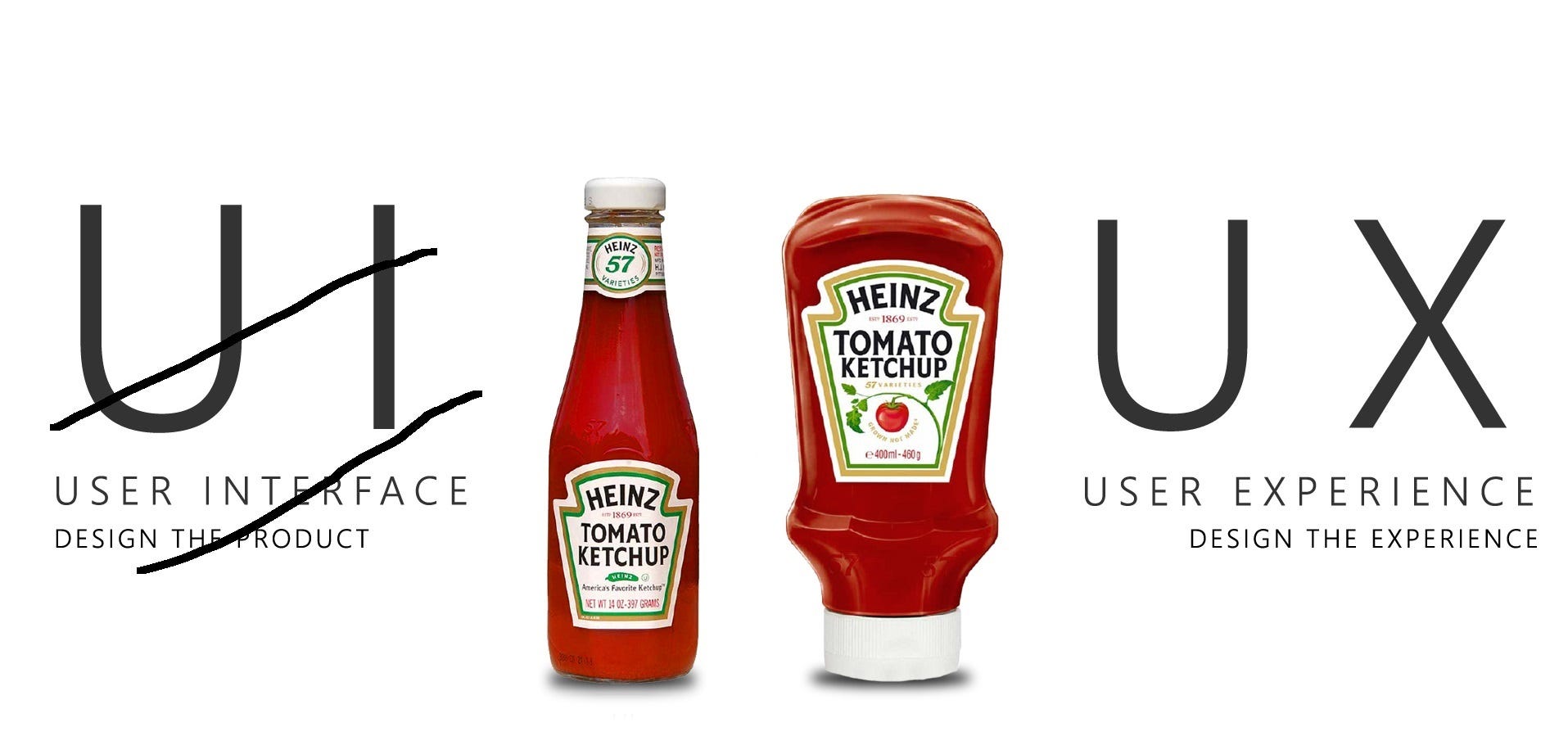
“UI vs. UX”
Pzajsodiajhsknfksdjbfsdbfkqwehjoqiwejroe. Usually followed by even more cliché analogies of ketchup bottles or unpaved walkways.

“All pages should be accessible in 3 clicks”
Just. Don’t.
“Should designers code?”
A commonly used wild card when the audience is running out of questions in a Q&A session at a design event.
“If you think good design is expensive, you should look at the cost of bad design”
A passive-aggressive way of explaining to clients you will not reduce your price. Usually ineffective.
“You can’t design an experience; experiences are too subjective to be designed”
An argument used by coworkers who are running out of things to say but somehow still want to sound smart.
“Let the users decide”
None of us is going to win this endless argument, so we should take this to c̶o̶u̶r̶t̶ user testing. But I’m still going to prove you wrong at the end.
“No one enters a website through the homepage anymore”
Popular at the peak of the SEO era (2005–2008), the argument was used to cut short endless meetings where a large group of stakeholders is trying to design your homepage by committee.
“The only other industry who names their customers ‘users’ are drug dealers”
Can’t even explain why this one exists. Used a lot when the term UX came about in the early 2000s, is becoming pretty popular again in the “designing for addition” era.
“When escalators break, they actually become stairs”
Originally used to explain the concept of graceful degradation, the quote started being adopted by developers to convince the product owner that certain bugs do not need to be fixed.
“Mobile users are distracted”
Just a generalization made by someone who still thinks the primary use case for mobile devices is on-the-go, while doing groceries and simultaneously trying to tame a wild giraffe.
“You don’t know what you don’t know”
Honestly, no one knows.
“Leave your ego by the door”
An inspirational quote used before you walk into a user testing session or a collaborative work session with your coworkers. Looks particularly great if written in Helvetica, printed and framed, and hung by the entrance of truly collaborative office spaces.
“Double diamond”
Hey, we need a slide in this deck that represents our design process — can you come up with something that is relatively simple to understand, that will make us look less chaotic than we actually are?
“Users don’t read”
An overly used argument to convince clients and stakeholders to cut copy length in half. If you made this far to this article, you’re living proof that this statement is untrue.
Any cliché missing from the list? Please add it in the comments.
This article is part of Journey: lessons from the amazing journey of being a designer.
A comprehensive (and honest) list of UX clichés was originally published in UX Collective on Medium, where people are continuing the conversation by highlighting and responding to this story.
from Stories by Fabricio Teixeira on Medium https://uxdesign.cc/a-comprehensive-and-honest-list-of-ux-clich%C3%A9s-96e2a08fb2e9?source=rss-50e39baefa55——2
