Supernova — exploding design tool myths
Developers are a tough market — we always know we could do it ourself, and better.
Designer tools are a very noisy market with a combination of big dollars spent by incumbents such as Adobe, hot VC-backed startups and a muttering of scrappy incomers.
Bridging those two worlds with a genuinely better offering is very, very ambitious. Supernova is a relatively recent Mac tool which does just that (and they just graduated Y-Combinator’s W19 class).
Approaching the Supernova
I first noticed Supernova on Product Hunt when they were #2 product of the day, back in July 2017. With a long background in such tools (see below), I was fascinated but also sceptical. It’s easy to talk big about generating code but very hard to get right. I was deep in non-UI development and didn’t think I needed the tool but liked what I was hearing.
By early 2018 two things had become obvious — I was going to have to put a lot more effort into UI development of my product, and Supernova was convincingly real. I’d been going from paper prototype straight to XCode but needed to play with high-fidelity prototypes of a lot more screens. For the first time, as an amateur designer, I started throwing together screens in Sketch.
Welcome to Hand-off Hell.
In many teams, there’s an uncomfortable designer-developer loop called Hand off. A bunch of static pictures representing the screen have to be completely re-created using programming languages and other tools. The only thing from from the original, carefully-drawn, images that goes directly into the final product are small icons. The bigger your team and product, the more painful this loop. The result is often developers making fine visual design decisions because there’s not the time to go back to a designer.
If you are really unlucky, as a developer, you just get static images. You don’t even get vector art originals in Sketch, where you can go inside and see what measurements were used. I’ve found myself using tools to work out the colours and relative sizes from a bunch of screenshots saved as JPEG images.
Small teams and solo founders need a lot of leverage. Supernova is to UI development as Cloud computing is to backend.
Even working by yourself, going from Sketch drawings to working code i̵s̵ was a manual process. There have been a few tools doing code generation from Sketch, mostly for web, and one native iOS tool that’s since apparently died on the vine. Nothing really accelerated the process, before Supernova.
Supernova Studio is the best, most usable and technically-credible code generation and prototyping tool I’ve seen in twenty years.
You start by bringing in the static screen layouts from Sketch, which are little more than rectangles with occasional words. Quickly, in Supernova, you mark them as different components, buttons, image views, tables of cells. Some of these components are automatically identified (a photograph is obviously some kind of image view). This semantic analysis is continually improving.
You can add interactions, navigation to other screens and animations (discussed more below). Within Supernova alone, the preview lets you see a reasonable representation of the app experience.
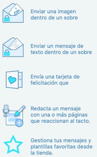
Supernova provides built-in translation, using Google Translate. This means at any time you can preview your screens in different languages.
In particular, because you can preview on different devices sizes, you can see how your prose will wrap differently. This is not just about aesthetics — it’s insulting to a user to cut off the description of a feature just because you only test in English.
Dividing and Unifying with Code Generation
Ask any two developers their opinion on tools that automatically generate code and you will likely get three opinions back.
Smart engineers are lazy engineers and appreciate tools which save time building the same skeletons or boilerplate code. We’re used to at least the basics being created with different project types in XCode, Android Studio and other tools.
Taking that a step further to generating an entire, nearly working screen, is where people’s previous bad experiences start to surface. In theory, going from layout to finished code is a relatively mechanical process. In practice, people have their own ways of doing things. This means, for some teams, Supernova’s code generation will be an unused feature. But, even if you have a good reason to ignore it, having compilable code generated means any measurements and layout logic can at least be examined.
Being able to inspect generated code unifies your design and development teams with harmony rather than frustrated questions. Comparing changes in the generated code is also an easy way for developers to see the evolution of a design.
If you’re unified because your design and development teams are residing in the same brain, then a tool like Supernova is a sanity-saver as well as major time-saver. The smaller the team, the more I recommend sticking closely to their generated code and relax without having to learn as much detail about different platforms.
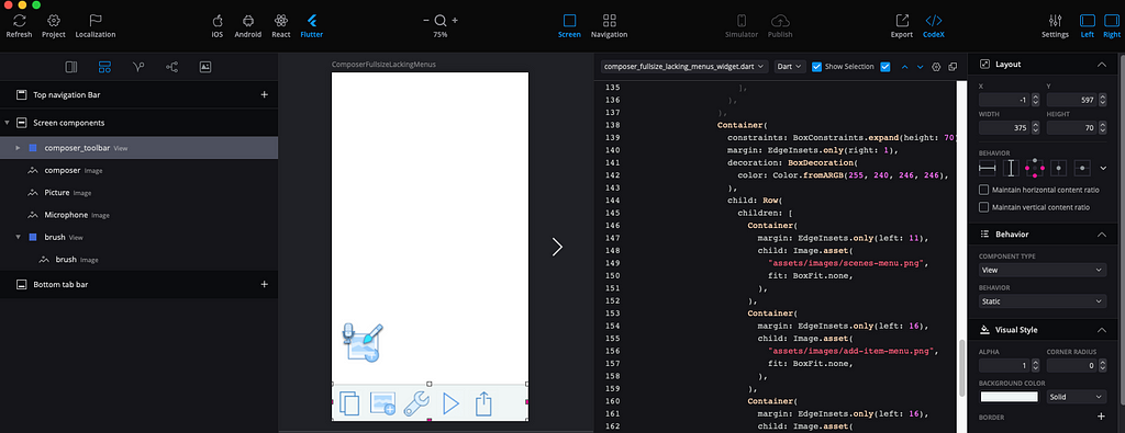
Currently, Supernova generates platform-distinct code for iOS (Swift) and Android (Java or Kotlin) as well as the cross-platform React Native (JavaScript) and new hotness Flutter (Dart). The latter two have been added in the year I’ve been using the tool.
So, as well as being a productivity tool, it becomes an educational one. I can design a trivial user interface with a couple of controls, see the familiar Swift code and iOS resources then compare that to Flutter or Kotlin.
Animation is the new table-stakes in user experience.
Supernova gives you both kinds of animation a modern app needs
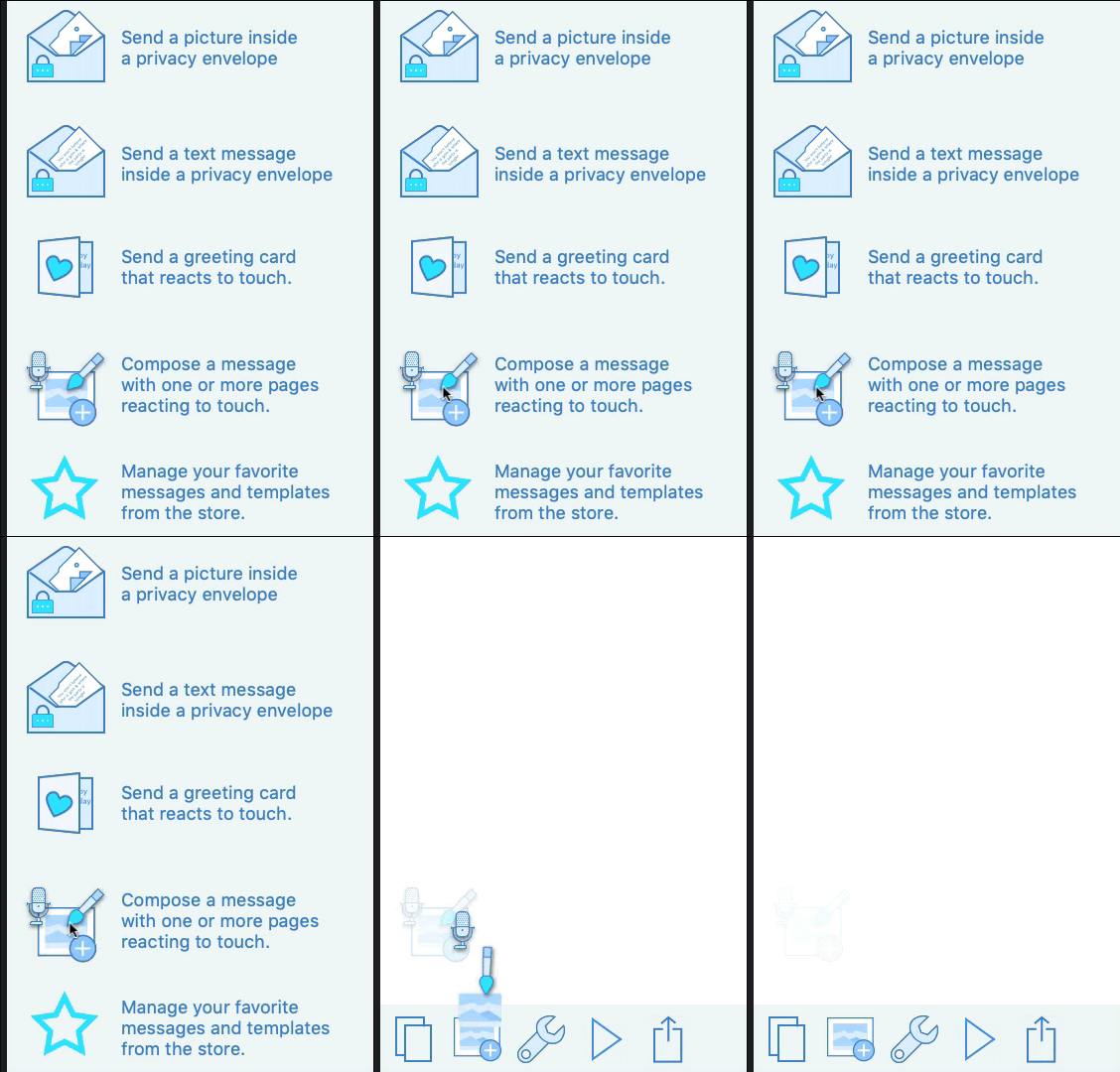
The gif below was recorded from the Supernova preview screen and demonstrates two kinds of animation. The project files are available on github, including the original Sketch.
First, there’s the trivial slide-in effect as you change screens. A button on a menu has the Interaction type Navigate to screen.The most basic kind of prototyping experience starts with linking together your screen images with different hotspots
A much more complex animation is built up and triggered on entry to the second screen. I wanted a flight-control kind of illusion of different tools you can use in the Composer to fly into the menu at the bottom. A copy of the icon has three extra shapes overlaid on top of it which move at different rates when the animation starts.
The Supernova team consider the existing animation very much an introductory product. They’ve shared a roadmap showing many features coming, but even these simple property animations were enough for me to design a simple micro-interaction I was happy with.
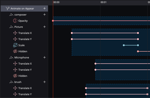
Remember that Supernova is a full code-generating product, not just a prototyping tool. Many of their competitors stop at letting you visually edit an animation, maybe saving a video to show how it works.
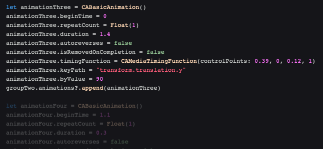
Supernova’s Codex provides live, real-time generated code alongside your visual design, letting you flip between languages to see how animation works in each. The Swift code below has a portion highlighted because I selected the Microphone’s Translate Y property animation. It’s comforting and educational, when you have built up a complex animation, to be able to step through the components and see the matching code.
Why is this guy an authority on tools?
I’ve been an obsessive tool user and maker as a developer for over 35 years. (Let me tell you about the way VAX/VMS let you combine FORTRAN and BASIC subroutines with COBOL…).
In the Classic Mac era, I worked on the two dominant code generation tools. I was contracted to write the Think Class Library code generators for George Cossey’s Marksman (aka Prototyper). Think Class Library (TCL) was a major OO framework, part of the Think C product acquired by Symantec. It was a 2nd generation OO framework, similar to Apple’s MacApp. Greg Dow, the TCL architect, went on to write the dominant C++ framework of the Classic Mac era — Metrowerks’s PowerPlant.
From 1992 to 1999 I worked in close collaboration with Spec Bowers of AppMaker on his code-generation product especially on the PowerPlant generators. I extended his product to integrate my OOFILE database and forms framework. Later, I created a compile-time mapping(PP2MFC) that allowed you to compile PowerPlant frameworks for Windows. I wrote custom code generators for AppMaker to generate Windows apps and we co-marketed these including a booth at Macworld, back when it was the dominant Moscone-filling conference.
My most recent commercial SDK/tooling gig was working at Realm on the Xamarin SDK 2015–2017 (just to let you know I’m not an old dude who’s past it). Oh, I live in the world’s most isolated continental capital city — all the above collaborations have been online from Perth, Western Australia. I really understand remote work.
Supernova — exploding design tool myths was originally published in UX Collective on Medium, where people are continuing the conversation by highlighting and responding to this story.
from UX Collective – Medium https://uxdesign.cc/supernova-exploding-design-tool-myths-5135d9f6e2fe?source=rss—-138adf9c44c—4
