By Joanna Ngai
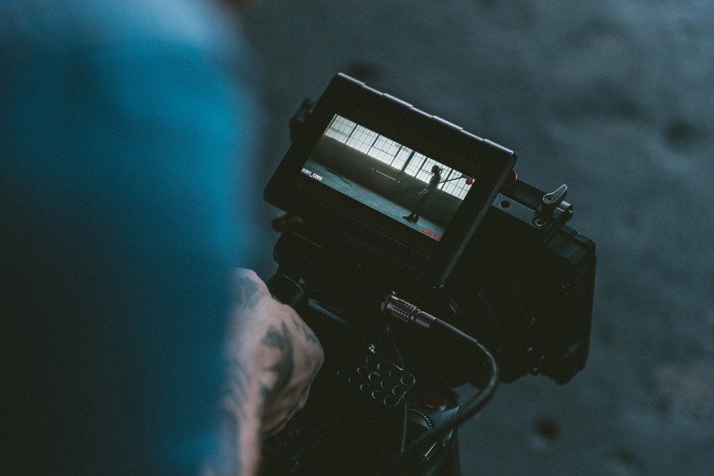
Film making is an art form. For UX designers, it’s a place to find inspiration through stories coming to life. The teamwork and efforts of multi-disciplinary teams coming together for a film offers a revealing perspective into the creative process that can be helpful in understanding design.
Looking back to your own favorite films — why are they so memorable? What is the nature of a compelling story? Here’s some lessons from cinematography to carry over to design.

1. Choices carry meaning
Colors, like features, follow the changes of the emotions.
— Pablo Picasso
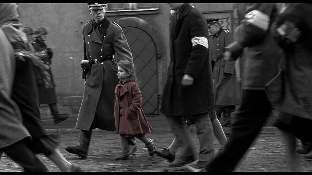
While it is a human tendency to look for patterns, things in frame (or out of the frame) play a crucial role in supporting the larger storyline of a film. Color is used to evoke certain emotional shifts or match the tone of the genre. Directors can use palettes to convey tension or suspense, or to highlight an object or person. Subtle framing choices in composition help ensure every shot contributes to the story.
In the same way, UX designers should intentionally craft information architecture that supports customer, organization and business goals, being mindful that such choices (whether intentional or not) steer users toward certain actions and behaviors. The details add up, whether it’s the choices in color, pixels or other imagery to evoke an emotional response.
Lastly, what is obvious to you as a designer may not be obvious to the user, so make sure to incorporate user research to stimulate customer experiences/reactions early and often.

2. Help create focus
Images, like words in a dictionary, have no power or value except through their position and relation.
— Robert Bresson
A filmmaker uses composition techniques like adjusting the field of view, camera angles, lights and staging to guide a user’s eye to what’s important in a scene. There’s a belief that overwhelming the senses is counterproductive to delivering a story. Therefore, editing is a ruthless but critical part of the process that deletes, re-arranges and filters the film to help give the product its final polish.
In the same way, elements in design need to work together to ensure clarity and simplicity over features. Be candid about what is necessary and what can be omitted, whether it’s a superfluous feature or verbose content. A smooth transition or timely animation can aid in tying together a flow or keeping a user’s attention.
While it’s tempting to neglect your content strategy, it will serve your product well in the long run if you use familiar understandable words that are relevant for your audience, in the UI copy and documentation.
3. Know the rules so you can break them
I’ve found a rut is the consequence of sticking to tried and tested methods that don’t take into account how you or the world has changed.
— Twyla Tharp
It’s important to understand why certain methods are used classically so you can know how and when not too “follow the rules”. In film, the 180 degree rule says that the camera should remain on one side of an interaction as a way to keep the audience oriented to characters in a scene so that cuts aren’t jarring or confusing. That statement also hints at when the rule can be violated.

Similarly, in design, there’s a deference for patterns and rules around grid, typography, etc. And while best practices are there for a reason, it’s important to understand that even the good guidelines and rules have their limitations.
For example, David Carson is a notable graphic designer who’s ground-breaking indifference to the grid system demonstrates that breaking of rules can push typography, visual communication and layout to the next level. William Bernbach, the advertising powerhouse known for his campaigns for Volkswagen (Think Small and Lemon), Avis (We Try Harder), and Life Cereal (Mikey Likes It), has said that “the memorable never emerged from a formula”. Rules can be broken, for the right reasons.
Conclusion
There is a natural evolution between art, design and film that makes it inevitable to find parallels. In both great films and UX, you must create focus and clarify what is happening in order to meet your goals. Remember to use all the tools in your arsenal (be it composition, editing, color, imagery, motion, etc.) to not only make the product real for your audience and also for your team throughout the creative process.
—
Did you find this useful? Buy me a coffee to give my brain a hug 🍵
Feel free to check out my design work or my handbook on UX design, upgrading your portfolio and understanding design thinking.
7 Reasons to Join IDF and Learn UX Design
from Stories by Joanna Ngai on Medium https://medium.com/@ngai.yt/what-ux-designers-can-learn-from-filmmaking-e87a7cc4288e?source=rss-225928e09472——2
