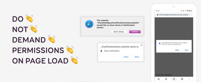
TLdNR: push notifications became yet another way to artificially re-engage users and force content down their throat. That’s why so many of them hate it. But there’s some interesting use cases for it. Here is some advice on how to stop ruining it for the rest of us. Spoiler alert: stop asking for permission on page load (and make them useful for users)
A few weeks ago I stumbled upon a kind of fun / trollesque site: “ Should I Add Push Notifications To My Website? — No “. That’s all fun and I understand the purpose of this site and also why it exists. But I would not be that strict. There’s some interesting use-cases for push notification, BUT as usually website abused it for the sake of engagement. Users are now annoyed by it, the usual story of our industry. Here is my opinion and advice on that matter.
Originally published at stephaniewalter.design — Cet article existe aussi en Français —
We got greedy, that’s why we can’t have nice things
Push notifications used to be a “native app feature only”. You needed users to download your app to push them content. But things changed. Thanks to a few cool APIs like Push + Service Workers browsers now have the ability to send notifications to users. This works on both mobile (Android Chrome and Firefox) and desktop (Chrome on Mac and Win, Safari on Mac and Edge on Win10). Fortunately, users need to give permission to the site to send those. And sadly, that’s when things are starting to get annoying for them.
For the sake of **sick** growth hacking, we got greedy. Website owners now see push notifications as yet another way to force content down user’s throat, to increase page views and profit, to sell more “Gummistiefeln” shoes in the process (this will be explained later in the article). Don’t get me wrong, there’s nothing wrong with making money. But not at the expense of user’s experience.
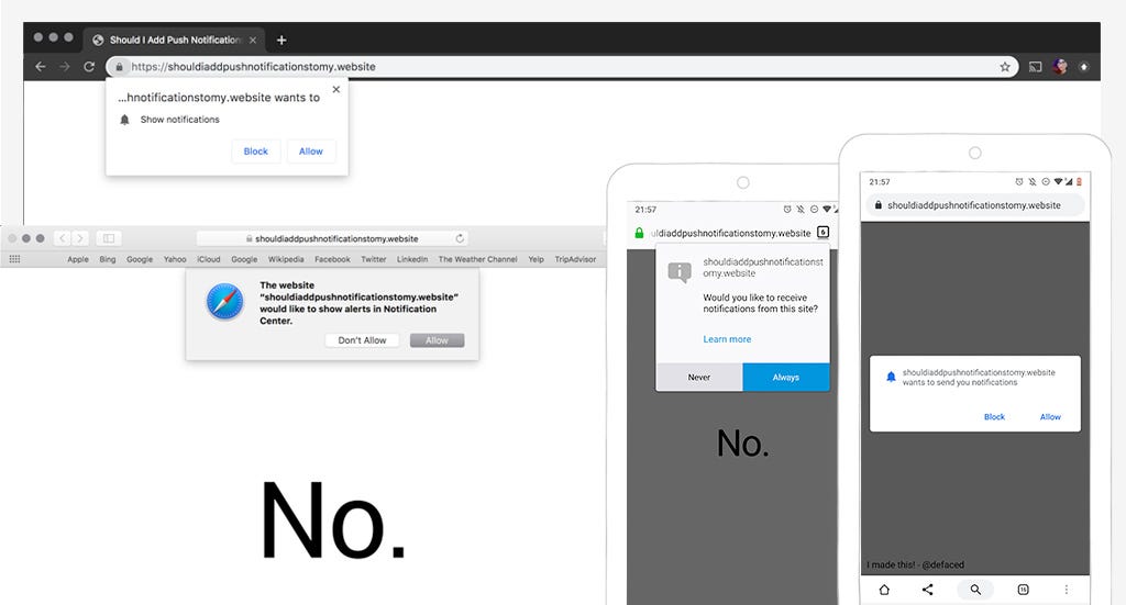
Many websites now ask permission for push notifications (and geolocation) directly on page load on first visit. And THAT’S the issue. Those sites are both greedy and lazy. Most users don’t not know about this particular site, the content, the value. Yet those sites want access to their notifications. They want their attention span and the authorisation to distract them, right here, right know. They don’t give users time to understand the value of their content. Of course, users are fed up with that. It’s so annoying that some browsers like Firefox now try to shield users from all this mess and provide an option to block them all for once. And in January 2020 users will need to have interacted with the page before seeing notification request.
According to Chris Wilson at Chrome Dev summit in 2018: “ 90% of permission prompts are dismissed or ignored”. This is why we can’t have nice things. Every time something new arrives on the web, some people find ways to ruin it for the rest of us. And this is exactly what is happening with push notifications. The big “issue” is not the technology, but what we do with it. Humans are both greedy and lazy.
Push notifications can bring value to users for some use-cases
You might think that I’m against push notifications. But I’m not. Let’s not forget that more and more of our tools and services are now cloud based. We have a lot of Sass tools, tools in the browser, etc. There’s actually some interesting cases for “in the browser push notifications” that bring real value to users. And that’s why I’m even more pissed at those sites who are abusing it and ruining it for the rest of us. There’s a lot of really cool stuff that we could do with push notifications. Here are a few examples, feel free to share yours in the comments.
Appointments, meetings and events
I hate calling doctors. I book my appointments on Doctena whenever I can. They have an app but honestly, I never bothered downloading it. I kind of expect that for the moment I don’t need to go to the doctor that often. Push notifications on such sites for appointments would be a great idea. Something like “yeah stef you got an appointment in 1 hours + the address”.
I also use the web version of outlook at my client’s office. I get notifications within the interface in the browser about my meetings. But if I’m not on the right tab (or if the tab was closed) I miss it. Let’s have some browser push notifications for meetings if the users want them (even if the tab was closed)!
Last but not least, notifications could be an interesting feature for conferences websites. Some conferences have a super complex setup with many rooms and users can schedule where they want to go. Sending them reminders about the sessions that will start soon could bring some value.
When it comes to professional or personal online tools, push notifications linked to appointments and events can be an interesting feature for some users.
Flight (train) delays on mobile browsers
Some of you might now that I travel a lot. I travel with a lot of different airlines. Like many users, I do not bother installing the native app of every company I will travel with. Even if they don’t install the app, users want to know about flight (or trains) delays. Some companies like KLM let you get notified by SMS or WhatsApp.
Push notifications also work for some mobile browsers like Android Chrome (not yet in Safari last time I checked). On Android, they integrate on the system like native notifications. They also work even when the website was closed thanks to Service Workers.
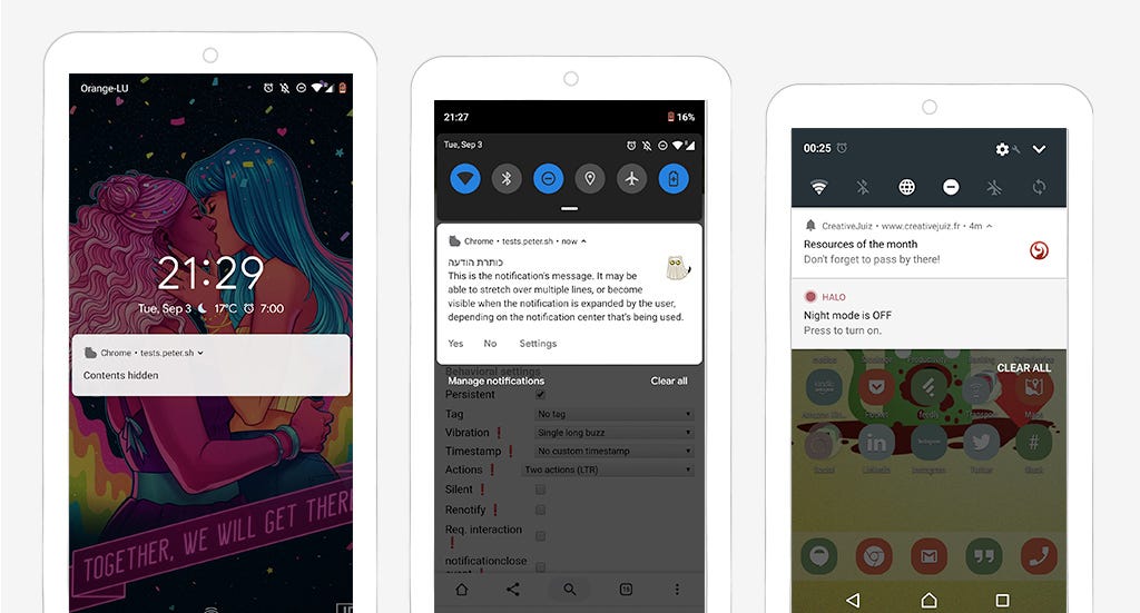
Notifications could be sent from the airline’s sites to user’s phones to give them information about arrivals, departures, gates and delays of their specific flight.
Also, if you want to know more about this kind of mobile nice little features and more, you can take a look at the slides of my talk on mobile capabilities: Super Secret Powers of Mobile Browsers
Deliveries
Another use case for valuable notifications is deliveries. Online shopping sites could send notifications about parcel status and delivery directly through their websites. No need to install an app.
Messages and chats (Slack, etc.)
One of the most obvious use cases for push notifications is of course messages and chats alerts. I won’t go into the details of the user’s attention and the issues of FOMO (Fear Of Missing Out) that can sometimes come with too many notifications, especially for chats. But again, we live in an area of a lot of communication tools are in the browser. If you take a look at slack, you can download their app for your computer, but you can also access your slack channels with the URLs in the browsers. Online chats and instant messages services are a good candidate for push notifications in the browser.
How to NOT ruin your push notifications experience
As you’ve read, push notifications can bring value to users. But for that, we need to ask for permissions and build them the right way
You only get one chance to ask the question — ask wisely.
Users can refuse to grant access to notifications. If they change their mind afterwards and decide they want to give you permission to notify them, granting the access to push notifications back is tricky.
On Android and Chrome, they need to find some setting hidden deeply somewhere in the browser setting on both phone and desktop. Most users don’t even know how to do that. Believe me. I refused to grant access to microphone once, I needed it later for a call and it took me 10minutes to find how to grant the access again. Most users won’t even try.
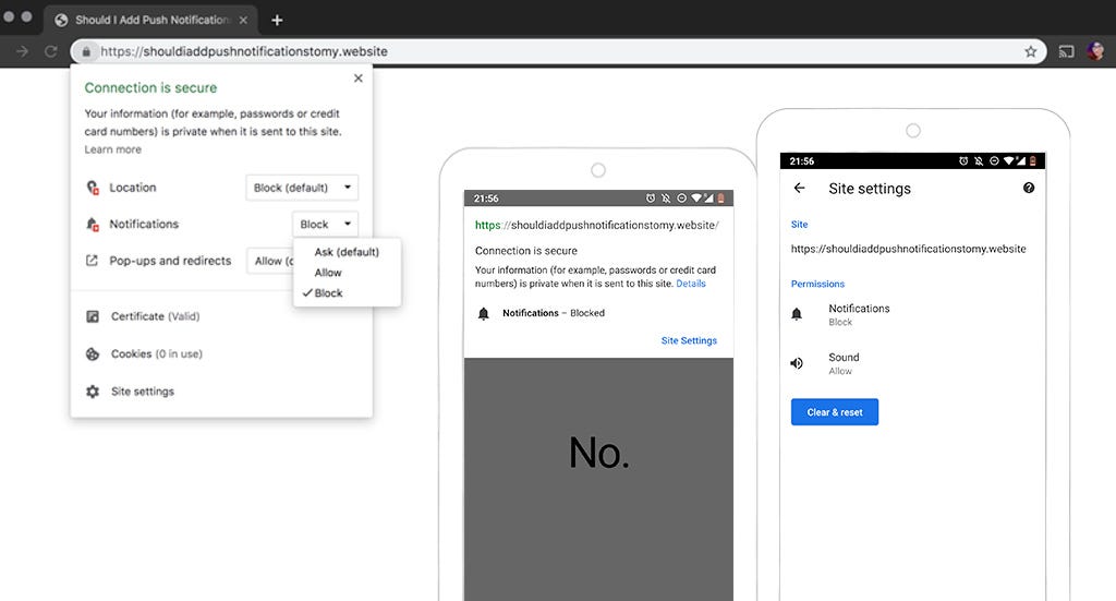
On iOS Safari, last time I checked, if the users refused to grant access, you can ask a second time. After that, users need to go somewhere in the settings (of the OS).
I don’t have a computer with Windows and Edge so I’ve no idea what happens if users refuse. I checked this article which explains a little bit how to enable disable them is it also looks that you need to go through settings. If you have Edge and know what happens when users refuse the notifications access you can comment 🙂
At the time of writing this article, this all means that, if users refuse to grant you access to notifications, it’s going to be a whole mess to get them to approve again. Understand this: you will get ONE CHANCE at asking permissions. And only one. And this also goes for microphone, geolocation, etc. So, choose wisely when and how to ask.
When and how to ask for push notifications permission
Users are not likely to grant you access on the first visit, especially if they don’t know your website. Especially if they come from a search engine, followed a link on a blog or social medias. They don’t know you, why would they want to engage with your content (yet) ? They’ve no idea what you will bring to the table. STOP trying to trick users into granting access on the first visit: don’t demand permissions on page load.
For the user to grant access to push notifications, they need to understand what’s the benefit. So, you need 2 things:
- Help users users understand what they gain when they grant you access to push notifications
- Ask in context (again, not on page load)
So…. Stop Demanding Permission Access On Page Load!!!
Back to my doctor’s appointment site. Once I booked the appointment, I could get a small block on the page explaining me that I can activate push notifications if I want to be reminded 1 hours before my appointment. For e-commerce site, you ask for permissions at the end of the checkout. Explain to users that they will be notified about the delivery status. For social networks, you could do like twitter’s PWA and tell users what they have to gain by turning on notifications.
In those cases, users already invested in your site and get the value proposition to enable push notifications.
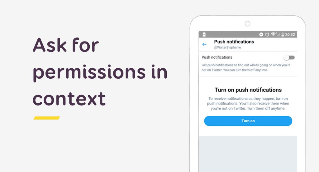
Instead of triggering the “real” permission prompt right away, you can also have a first “fake” permission button in the browser. If the user refuses this one, you will get an extra chance to ask later. If they accept, you trigger the actual real permission request in the browser. This is called the “ double permission” pattern. Luke Wroblewski has an interesting 4 minutes video on that topic for native apps. But this technique can also work for websites.
Also, please note that I focus on notifications here. But it’s the same for geolocation or media/microphone permissions. Don’t ask on page load, ask in context, when users understand why you ask and what they will have to gain from it.
3 rules for good notifications
While it’s easy to throw any content towards user’s throats, good notifications are actually quite hard to achieve. Guess what: you need to understand what your users expect. Do some user research here, maybe some AB testing to really understand what kind of content they expect and what’s valuable for them.
By the way, if you are curious about what information you can put into browser notifications, you can play with this Notification Generator.
1 — Good notifications need good timing.
Again, this might sound obvious, but it’s not. Did you ever wake up in the middle of the night in Europe because of some poorly timed notifications from a US website? Time zones matter people!!!
Getting the delay notification after the flight took off is also not a great experience. Bottomline: make sure that the notifications you are sending are well timed based on your user needs.
You could also ask for user preferences somewhere in their settings to ask them:
- How often they want to get notification (daily, weekly, for every event, etc.)
- When they prefer to get them (if it’s not time sensitive like flight delays)
Another quick piece of advice: if your user is currently visiting your site on a tab and this tab is the active one, avoid push notifications. Instead, use notifications in the UI of your web app instead (like toasts or alerts).
2- Good notifications are precise and actionable
Notifications are no emails. The intent is to go straight to the point, short. So, don’t interrupt users with trivial things.
If you need users to do an action, you can add call to actions to them. Create precise call to actions so that users understand what to expect when they click.
3 — Good notifications are personal
Last year, amazon decided that I REALLY needed some Gummistiefeln shoes. They were quite persistent. For one month, they sent me all the different colors possible, trying and trying. I’m not sure why, I mostly buy hardware and hair color, never bought any clothes or shoes on the site. Anyway: don’t do that. I kept the push notifications on for fun, to be able to rant in an article. Most users might disable notifications at some point here when you start sending them not relevant content.
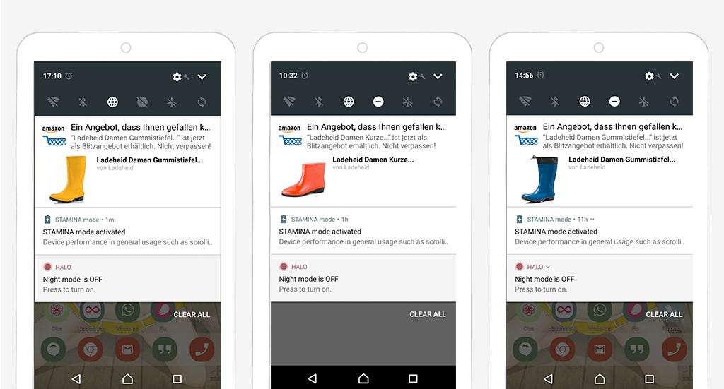
So, good notifications are personal. Try to customize them towards user preferences. Even better: let users decide what they want to see.
Let users control what they need
And this brings me to the last point: give users control over the notifications. Not all your users will want to get notification for all your content. Twitter lite and flipkart are 2 interesting examples. They let users customise what they want to receive as push notifications.
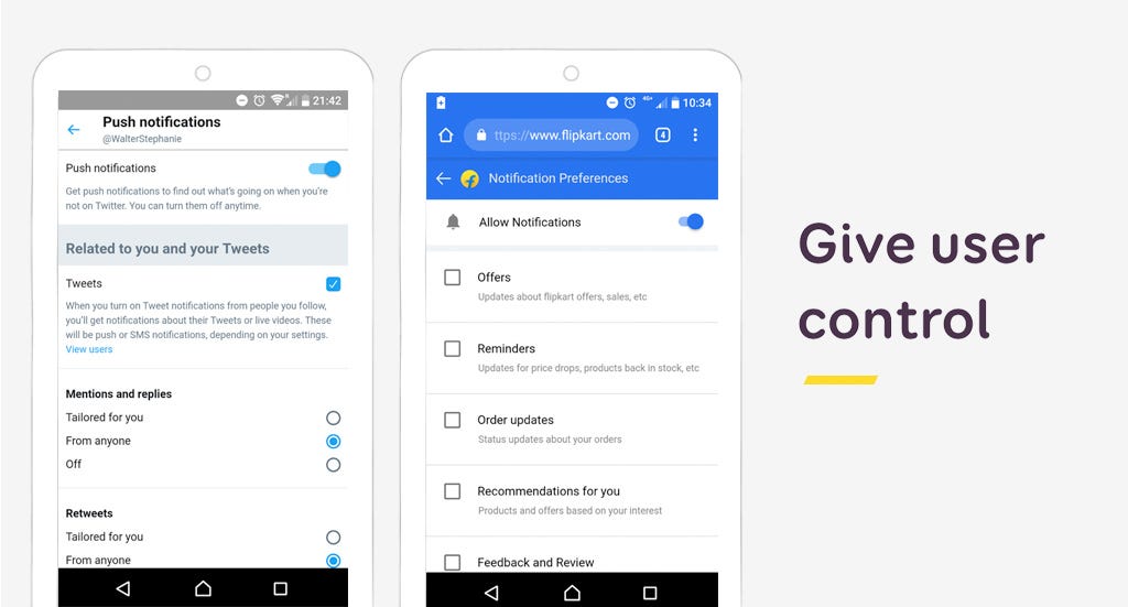
Also, as mentioned before, it’s super complex to find out how to disable notifications in the browser. Please provide simple and user-friendly solution to opt-out of the notifications. And a way to turn them all off. To put it simple: you know those settings you use for newsletter to avoid annoying users (and ending up in the spam box)? You can do the same for push notifications. Thank you.
And yes, your growth hacking friends don’t like that idea. But yeahy, I’m a user experience designer, I’m here to fight for your users 😉
That’s it, I was going to write a “small article” but let’s face it, I don’t do small articles. I don’t have anything against push notifications. We got greedy and abused a really nice tool. Let’s stop doing that.
Going further
Here is a selection of interesting articles to go a little bit further:
- Permission UX — the Google Guidelines for asking permission on the web (for notifications but also for geolocation)
- Aggressive Web Apps — Phil Nash — JSConf EU 2018 — the video of a talk on notifications implementation with a lot of good advice regarding permission and UX
- Privacy UX: Better Notifications and Permission Requests — Vitaly’s great article on how to request for permissions and making push notifications less of a privacy issue, less stressful, a must read to go deeper into the topic
- Why Permission Priming is Good UX this one deals more with the topic of native notifications but still relevant for web guidelines as well
I, I’m Stéphanie, I’m a Senior UX Designer and Mobile Expert. I write blog posts and speak at conferences. Do you want me to give a talk or workshop at your conference, or simply want to know more about me? You can take a look at my portfolio and contact me.
The ultimate guide to not f#!@ing up push notifications was originally published in UX Collective on Medium, where people are continuing the conversation by highlighting and responding to this story.
from UX Collective – Medium https://uxdesign.cc/the-ultimate-guide-to-not-f-ing-up-push-notifications-1b2777a71b26?source=rss—-138adf9c44c—4
