Avoid pitfalls and deliver value fast.
The process described in this article will work for various scopes of redesign — from a feature or view level to full application redesigns. These recommendations will help you avoid pitfalls and deliver value fast, and are based on the experience we gained from hundreds of redesigns, bumps, and bruises along the way.
Change is not an event; it’s a process
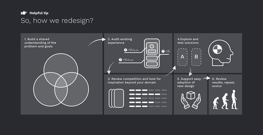
Let’s clarify one thing from the start; this article is not a strick walkthrough. When designing a product today, it’s both impossible and unsensible to set up a rigid process and follow it for every situation; we need to be agile and quick to adapt. It is necessary to have an outline of the design process you will follow. If the results are not satisfactory, you can go back and analyze what you did wrong and improve the process. If you did things randomly, you would always get random results.
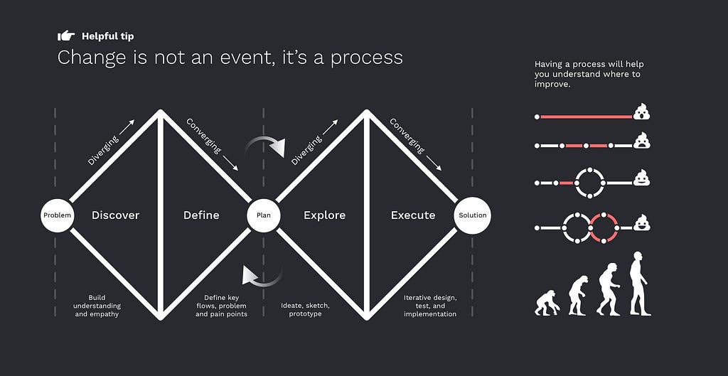
A great place to start is what many of you know as the “double diamond” process. It takes you through four main phases to get from the problem to the solution:
- Discovery — building shared understanding and empathy
- Definition — identifying key flows, challenges and pain points
- Exploration — ideate, sketch, low fi prototype
- Execution —iterative design, test, and implementation
A redesign is never really done; it’s a continuous effort to keep experience relevant.
Start with building shared understanding
As a designer, your role is to bring everyone on the same page and unite over one common goal. First, interview stakeholders to understand what and why we are trying to achieve for the business and on what timeframe. Check their expectations regarding look and feel, functionality, and target audience. Interviewing dev and support teams it’s also a good idea to get more insight into what are problem areas.
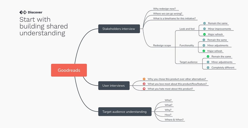
But your primary target is users. Specifically, you need to be interested in the following:
- Why you chose this product over other alternatives?
- What you love most about this product/flow/feature?
- What you hate most about this product?
On a higher-level before touching anything, you need to know Who is doing What?, Why and How they are doing it?
There are many mind mapping tools like X-Mind that can help you structure and fill that info, even during the interview.
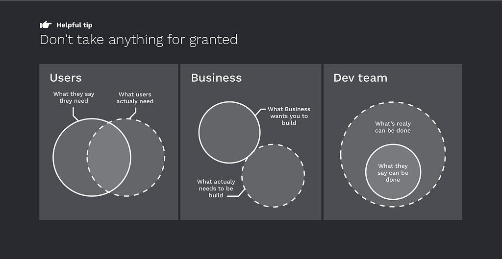
Don’t take anything for granted
Your goal is to listen and capture everyone’s thoughts and propositions, but don’t take it as absolute truth. In the end, you are the expert who needs to filter through the noise and find where to focus.
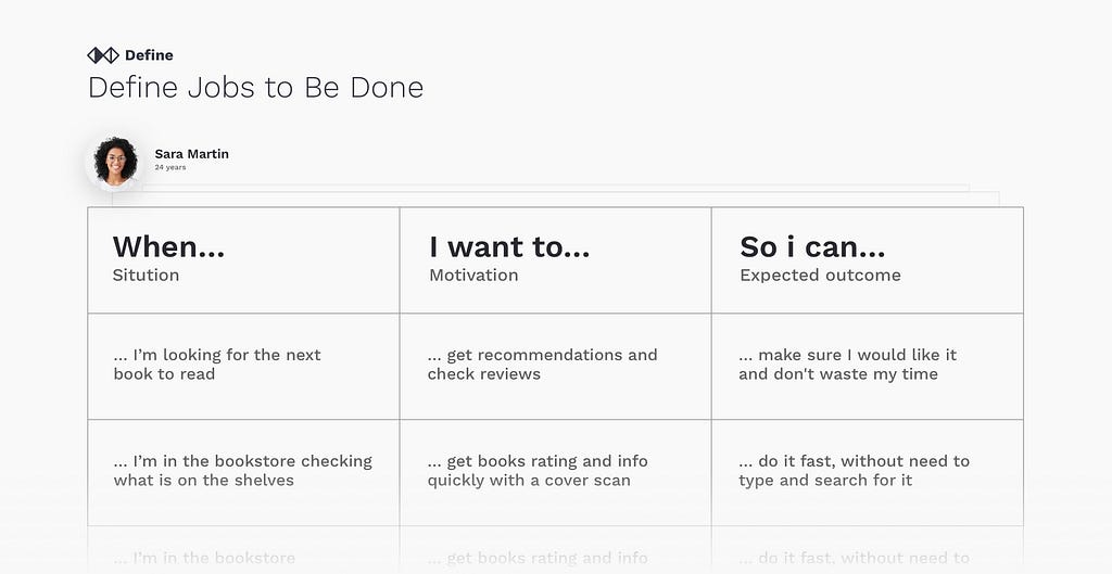
Define Jobs to Be Done
There are many activities you can do to understand users better, build empathy. User journeys and value propositions are beneficial, but there is not always time to do them when we are talking about something small. Personas, on the other hand, are fluffy and fake and have very little practical application. An essential thing that you can do is to list Jobs to be done. This will help you understand the user’s motivations and expectations.
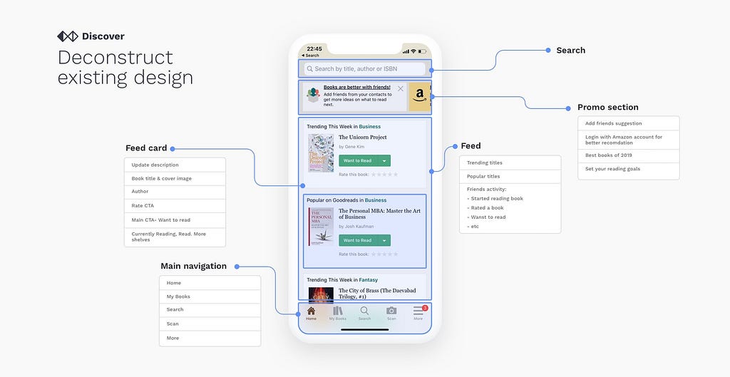
Deconstruct existing design
The number one mistake that designers do during the redesign process is that they completely ignore and disregard the current design. The worst thing you can do is to take the current design and create a new one based on your personal preferences. There was probably a ton of thinking and research that went into the creation of the original solution. Your goal is to carefully inspect the current design, try to understand how it works, and the intention behind each decision.
Review analytics
Once you narrowed down your focus to some key areas, you need to know the performance of the design. Since we are doing a redesign, we have a luxury of learning from analytics and checking the real design performance without subjective judgments. Usage data is the most persuasive argument you will have when you need to justify your design decisions with stakeholders and a baseline that you can use to compare the new design performance.
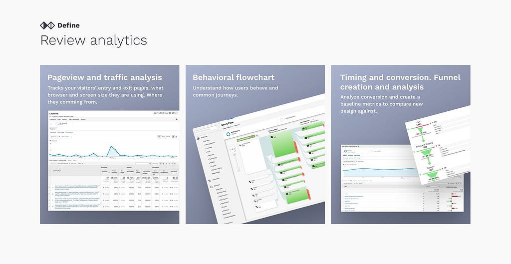
Pageview and traffic analysis
Tracks your visitors’ entry and exit from different pages, what browser and screen size they are using, and where they are coming from.
Behavioral flowchart
It helps you to understand how users behave and common journeys.
Timing and conversion. Funnel creation and analysis
Analyzes conversion and creates baseline metrics to compare the new design.
Review competition
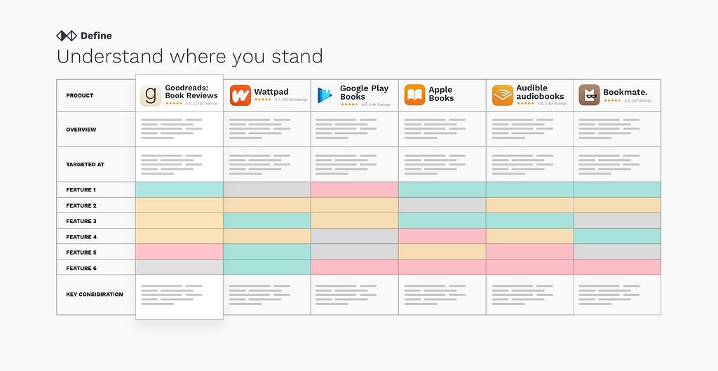
It’s one of the first natural questions that should come to mind. “Well, what are others doing?” As your customers will have to choose between your product and its alternatives, you need to analyze the experience they provide to customers. When reviewing both direct and indirect competition, look for commonalities, similar flows. Define what is considered a standard experience for your case. You can collect all of your findings in the InVision board or any similar tool.
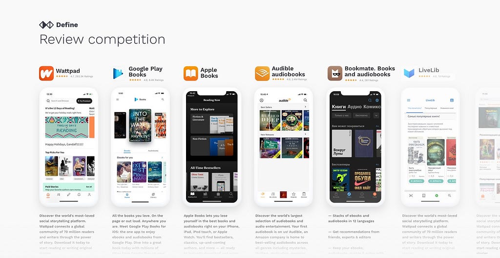
Understand where you stand
Competitor analysis allows you to find out if there are any gaps in the market. If you have more time, start creating a simple matrix where you will list the core information about the competition. Understand what each competitor product is targeted at, how advanced their features are, what is their revenue model and market presence. Comparing it to your product will give you a high-level overview of where you stand.
Explore beyond your domain
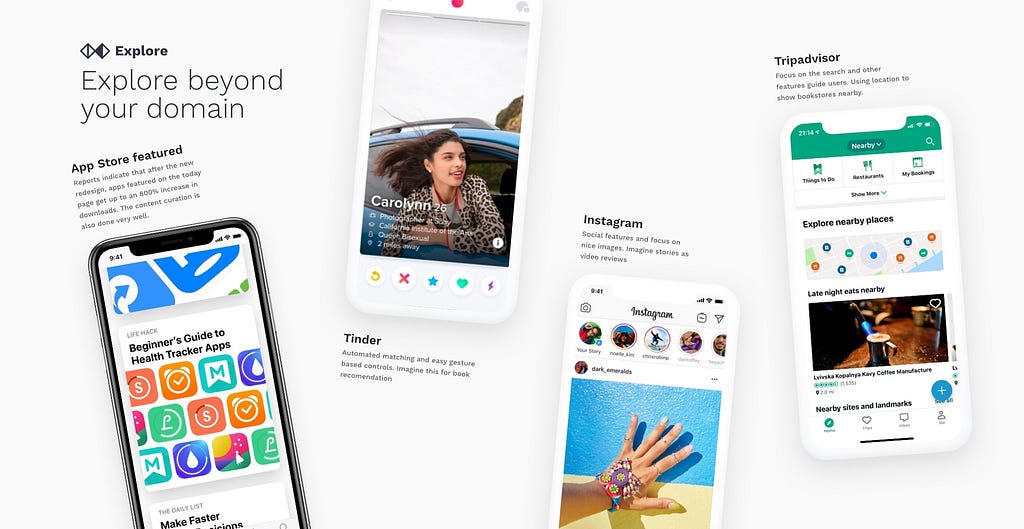
Fresh ideas and innovation are never coming from competitor analysis. As everyone keeping a close eye on each other, you can only learn what is considered to be a standard. For inspiration, look beyond your domain. There are hundreds of amazing products that deal with similar problems that you are trying to solve in a different context.
Identify key problem areas
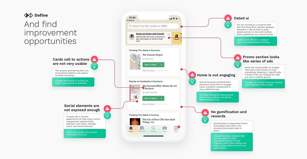
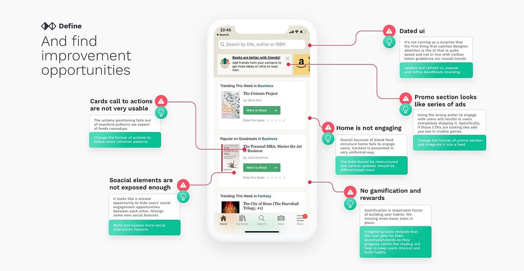
Once you have understood everything clearly with the help of data from analytics, you can start identifying key problem areas with the existing design. Those problems can range from usability issues to visual flows, bugs, inconsistencies, wrong patterns applied, or exotic solutions without any reason. For usability check, you can use ten usability heuristics as a cheat sheet to find out whether the design ticks all boxes. https://www.nngroup.com/articles/ten-usability-heuristics/
And find improvement opportunities
Once you found out the issues, the next step is to find solutions for each identified problem. Competitive research and exploration should give you enough inspiration.
Understand the value versus the effort
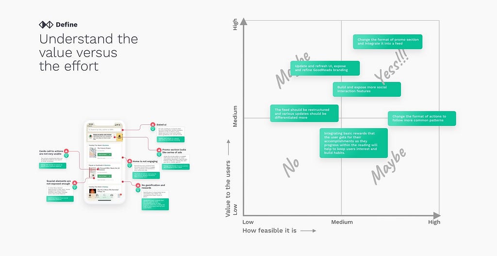
Having a list of problems and ideas on how to solve them is a good thing, but it needs prioritization. We need to understand what are the low hanging fruits. For each opportunity, we need to understand what it will take to deliver it and how much value we will add for the end-user. Ideally, we want to focus on the upper right quadrant in the graph below.
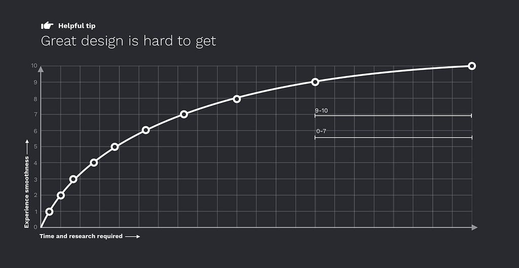
Great design is hard to get
There are no perfect designs, and there is always space for improvement. But excellent user experience comes at great cost. Creating a marginal improvement in already great design will require exponentially more resources invested than taking something bad and turning it into an average design. But don’t let this discourage you, in the great book “Zero to One: Notes on Startups” author Peter Thiel explains that marginal improvements will only get us so far. Sometimes to substantially improve the experience, you need to reinvent it completely.
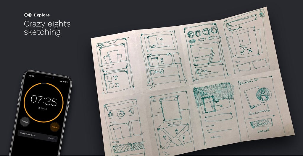
Sketch on paper first
Hand sketches are great ways to start offloading some of the ideas from your head into the physical world. You can use a technic called Crazy eights sketching to force yourself to generate eight ideas in 8 minutes. This is a great way to force yourself out of one variant and explore other crazy ideas. It will be perfect if you can do it with stakeholders and event devs. Some ideas that come out of those sketches are unique and creative.
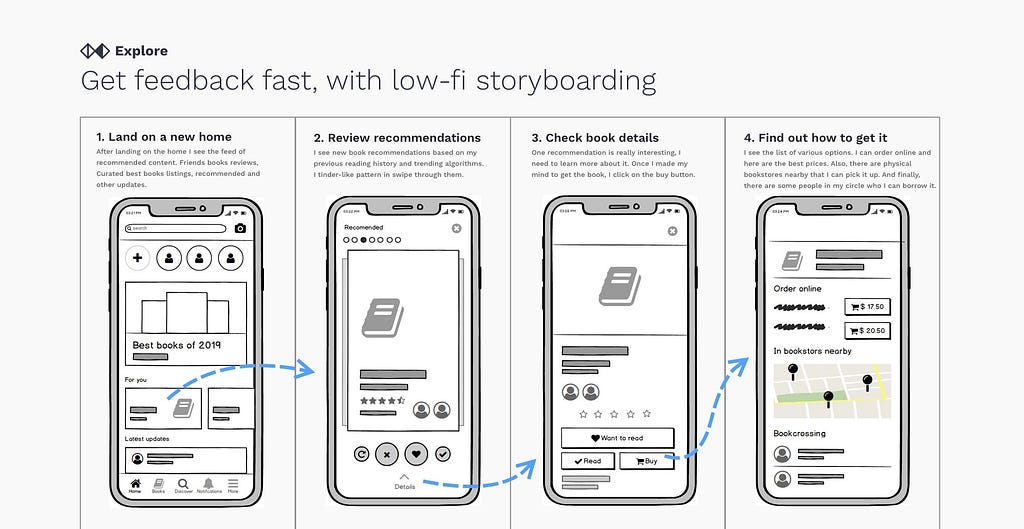
Get feedback fast, with low-fi storyboarding
Each hour spent on low fidelity will save 10 hrs from being spent on high fidelity work later. Try to sketch a very rough idea of flow, have a quick validation, and add a layer of fidelity. Starting feedback sessions with presentation of high fidelity work may show your stakeholders that there is no space for changes, and their opinion was not taken in the account.
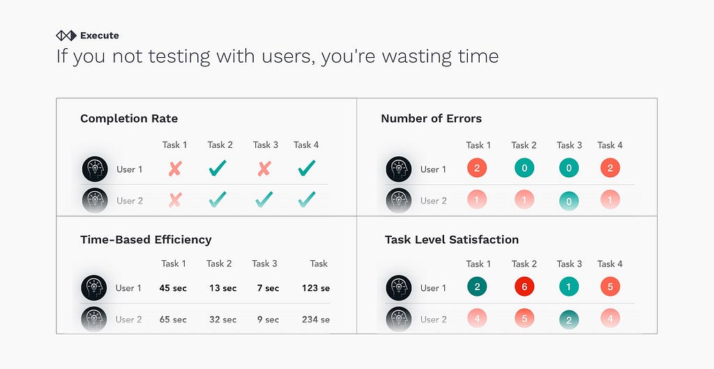
If you are not testing with users, you’re wasting time
It is as simple as that. Everyone can confidently say that they know better than the users, and “ users don’t know they need it till they get it.” That statement is true only in a very rare case. Don’t forget that everything you are doing is for users.
Sell your design
This is basic advice, even though so many people seem to miss it. Like in a fancy restaurant, presentation is as important as the dish itself. If you spend months crafting a design, spend some time on presentation. And remember you are not selling new styles, clean fonts. Create a new story, a story about newly empowered users, because humans are fascinated by stories and visions.

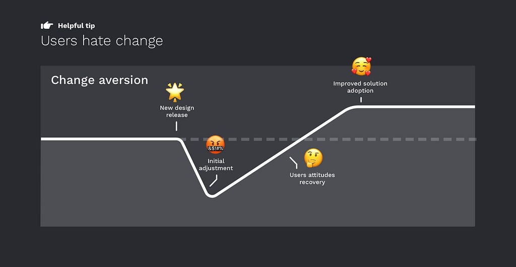
Users hate change
Once the newly redesigned product is delivered to end-users, everyone expects massive excitement and a stream of praise from gratefull users only to find out the effect may be the opposite. This stage requires patience and persistence. Users hate change, doesn’t matter how bad was the original design, they got used to it, and now they need to learn something new. Monitoring analytics post-release and keep in mind users will need to go through some initial adjustment. Give them some time to recover attitudes and fall in love with a new design. Support easy feature adoption with some contextual help and guidance.
There is always space for improvement
The design process never stops. New patterns emerge, more tools become accessible by users. Smooth user experience comes when you truly understand the problem you are solving and help users solve it effortlessly.
Leave your responses on what are your tips for a successful redesign.
Follow for more design content in the future.
How to redesign, step by step was originally published in UX Collective on Medium, where people are continuing the conversation by highlighting and responding to this story.
from UX Collective – Medium https://uxdesign.cc/how-to-redesign-step-by-step-guide-869379604734?source=rss—-138adf9c44c—4
