Law of conservation of complexity

So far we have covered various UX principles and we only had one prime agenda for the experience of our users — To make their life as simple as possible. But what if I tell you that you can only do this to a point. After that point, you run into a pitfall called oversimplification.
Who was Tesler?
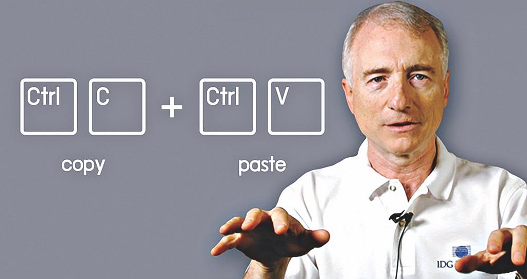
Do you remember this powerful functionality of copy-paste in our devices? Larry Tesler is the co-creator who worked at Apple, Xerox, Amazon, Yahoo and played a significant role in the early graphical interfaces.

Though he was a computer scientist, he specialised in human-computer interaction and gave us this very law of conservation of complexity. Respect!
What is the Tesler’s Law?
In simple words, it is very similar to the law of conservation of energy. You know that energy can neither be created nor be destroyed, it can only be transferred from one system to another. In a similar fashion, complexity is also conserved.
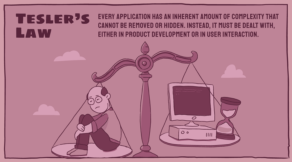
Every application has an inherent amount of complexity that cannot be removed or hidden. Instead, it must be dealt with, either in product development or in user interaction.
Now we know that there exists some amount of complexity that cannot be reduced. So the question is — who would deal with this complexity? It has to be assumed either by users or the product.

Tesler argues that an engineer should spend extra time reducing complexity on the application instead of making users spend more time on the task they’re trying to perform.
Paradox of Simplicity
It’s no surprise that we all want our life to be simple. We all want our products to be simple. But at the same time, we don’t want to sacrifice our options and other capabilities.
Now, this is a tricky situation. We can’t have both. It is not possible to have simplicity and complexity together.
If you provide our users with all the cool features, you tend to make the product complex and it is not simple anymore.
So what do we do in such a situation?
Don Norman in his book — Living with complexity, explains that what we really mean by simplicity is the need to have a better conceptual model.
A conceptual model is the underlying belief structure held by a person about how something works.
Conceptual models help us organize and understand other complex things. One good example of that would be how we see files and folders on our devices. It fits our conceptual model.

These files and folders don’t exist on our devices. It would get stored across multiple locations.
Whether something is complicated is in the mind of the beholder — Don Norman
The first time somebody would use Photoshop to edit and create illustrations, a novice would find it extremely complex. But a professional would need all those options to quickly achieve any task in mind. Not providing them with all these powerful features would make their life more complex, not simpler.
So understanding the conceptual model becomes important for the users you are going to create product for.
Why did we make the UX complex?
We have been talking a lot about Tesler’s Law and I know that you would like to see the examples now to understand it better.
Let me give you one incident from my experience while working with Expedia, an online travel platform.
To make life simple for our travelers, the moment they started giving us origin and destination for flights, we ran a background API call to fetch the results even before they clicked on Search button.
The moment they clicked on Search button, without any wait time, the results were already there. To our surprise, this actually resulted in higher exit rates from the search results page.


After a deeper analysis, we figured out that travellers thought our system isn’t doing any work to fetch the best results as there was no wait time.
We actually had add an artificial delay of two seconds to make them trust the Expedia application. It fit their expectations. We had to add the complexity here to improve the UX.
Things don’t always need to be incredibly simple for users
Similarly, banking applications aren’t expected to transfer the amount in a split second as our customers aren’t accustomed to that. Make everything automated and incredibly simple, you run the risk of customers not trusting your bank.
Complexity for Emergency
What if you make the plane completely automated without the need for experienced pilots in the cockpit?
Imagine a case of an accident where you need the pilot to take control of the plane and land it safely. In such a situation, pilots would panic for they haven’t been practicing flying the plane for long and systems are completely automated.

That is why you would add some complexity here so that these pilots would have to intervene regularly during their daily flights for the time when things break.
Perceived Simplicity vs Operational Complexity
It has been a recent trend where to make things simple, we move towards minimalism. One should not misinterpret minimalism as simplicity.
Perceived simplicity is not at all the same as simplicity of usage: operational simplicity. Perceived simplicity decreases with the number of visible controls and displays — Norman
What is more important for customers is operational simplicity. The goal to finish a task. Removal of necessary controls and functionalities for the sake of perceived simplicity could add to operational complexity.
References
Shopify UX blogs
Living with complexity — Don Norman
Tesler’s Law. This is why you cannot make UX any simpler. was originally published in UX Collective on Medium, where people are continuing the conversation by highlighting and responding to this story.
from UX Collective – Medium https://uxdesign.cc/teslers-law-this-is-why-you-cannot-make-ux-any-simpler-d4c0706686a5
