
Design principles are commonly referenced for providing better usability, but some can also improve accessibility.
User experience designers are responsible for ensuring a product’s usability and accessibility. Unfortunately, accessibility is often overlooked. Content and features should be accessible, easy to understand, and efficient to use for a broad audience with a diverse range of abilities.
Accessibility is often touted as being beneficial for the 15% of the world’s population that has permanent disabilities. While that is true, it’s a bit short-sighted as 100% of the world’s population has temporary and situational disabilities that limit our ability to interact with our technical devices for short periods of time. And as we age, our abilities tend to decrease in vision, hearing, mobility, and cognition.
A few examples of temporary or situational disabilities include misplaced glasses, musculoskeletal injuries, poor lighting while viewing a screen, and loud environments while trying to hear audio.
Accessible designs benefit everyone. There’s a variety of situations in which people without permanent disabilities benefit from accessibility; curb cuts are a perfect example.
This list discusses a few design principles we commonly hear about for improving usability and points out how they also improve experiences for low vision, physical and cognitive disabilities.
Low vision
Low vision refers to visual disabilities other than total blindness, which includes impairments from aging, diabetes, contrast sensitivity, and color blindness. By designing with the figure-ground principle in mind, we can improve experiences for low vision.
Figure-Ground Principle
This is one of Gestalt’s Principles, which states that when we perceive something visually, our mind attempts to distinguish the foreground (figure) from the background (ground). When neither the foreground nor background stands out prominently, it causes visual tension. And this can be an even greater challenge when someone has low vision.
Apply Figure-Ground principle for low vision:
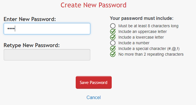
- Use a contrast checker to ensure you provide sufficient contrast between foreground and background elements. For most text, the contrast ratio should be 4:5:1 or higher. For text that’s 24px and larger or bolded text that’s 19px and larger, the contrast ratio should be at least 3:1.
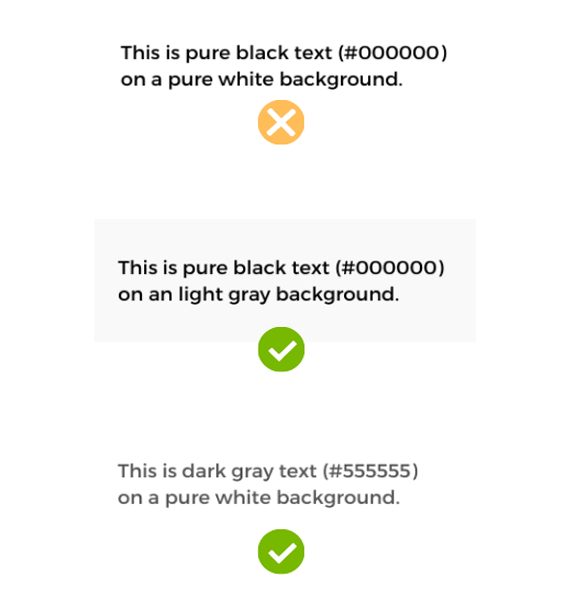
- Note that too much contrast can be challenging for people with dyslexia, so avoid pure opposing colors for text and background combinations, such as pure black text against pure white background. Use pure black text on light gray backgrounds or dark gray text on pure white backgrounds.
Von Restorff Effect
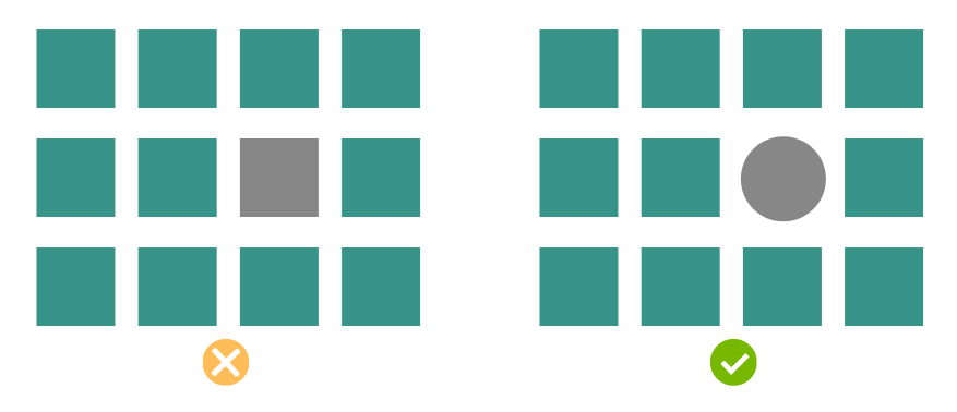
This principle states that when multiple similar items are presented, the one that differs from the rest in size, color, shape or other characteristics will more likely be remembered. It’s important to properly apply this principle to improve experiences for people with visual impairments.
Apply Von Restorff effect for low vision:
- Color blindness can degrade the ability to distinguish between certain color combinations and cataracts allows less light into the eye, causing colors to be less vivid. To draw attention to an item, don’t rely on color alone. Change another characteristic as well, or add text.
Physical Disabilities
Physical disabilities include limited mobility, involuntary movements and painful movements to include: arthritis, amputations, repetitive stress injuries, tremors and physical injuries. By designing with Fitt’s law in mind, we can improve experiences for physical disabilities.
Fitt’s Law
How long it will take to access a target depends on the target’s size and distance. So, it takes longer to reach buttons and links when they are smaller in size or farther away from the starting position. This can be a greater challenge and take longer when someone has a physical disability.
Apply Fitt’s Law for physical disabilities:
- Properly size buttons for touch screens. Ensure the touchable area for buttons is a minimum of 44px in width and 44px in height, or larger.
- Keep in mind that on handheld touch screen devices, the edges of the screen are easier and faster to access.
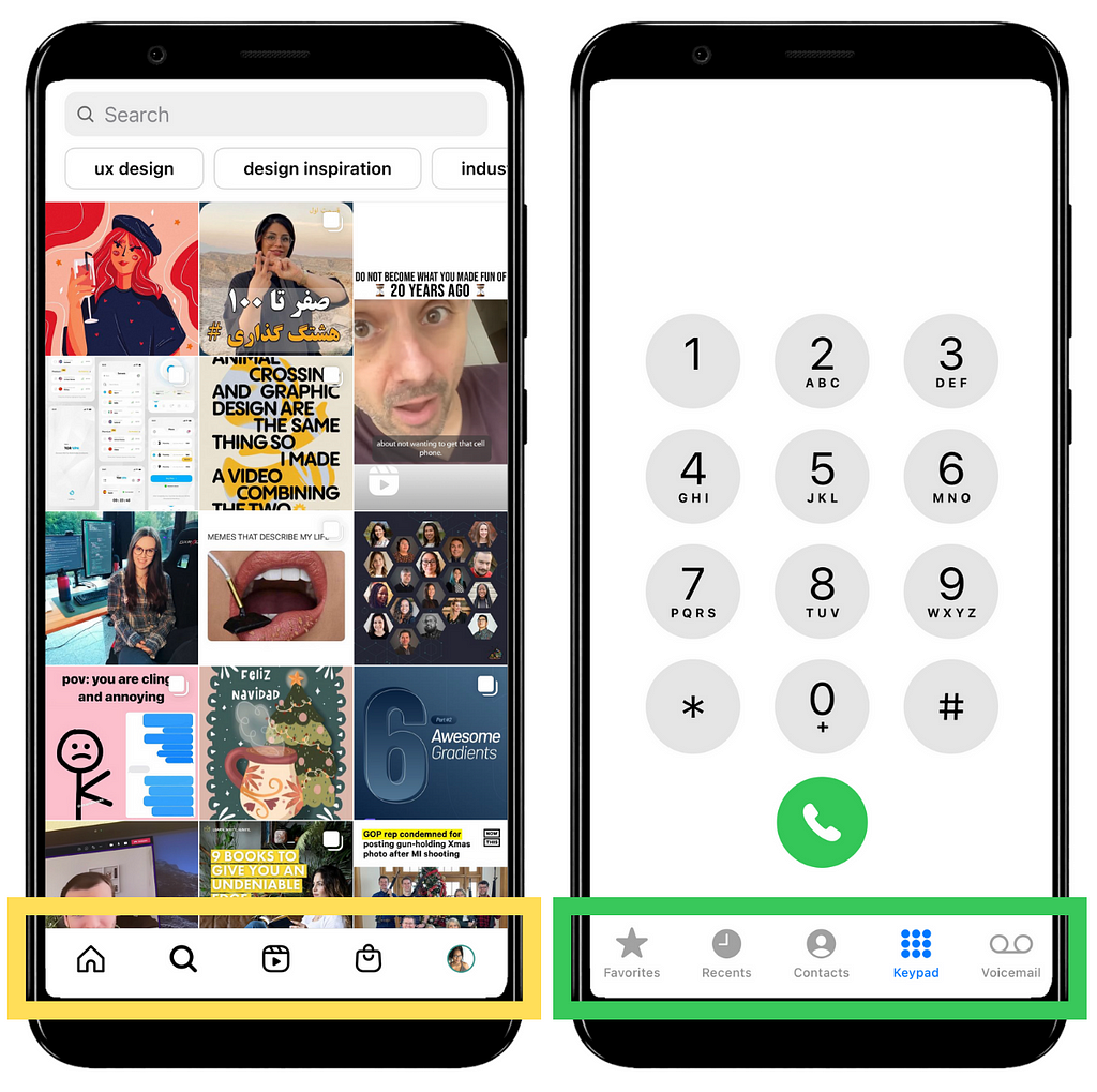
- When an icon is used as a button include a label, whenever possible. This not only provides clarity of what the icon represents, it also increases the touchable area.
Cognitive Disabilities
Cognitive and learning disabilities include neurodiversity, intellectual disabilities, autism, Alzheimer’s disease, and ADHD (attention deficit hyperactivity disorder). By designing with Miller’s law and Fitt’s law in mind, we can improve experiences for cognitive disabilities.
Miller’s Law (Magic Number 7+/- 2)
The capacity of our short-term memory’s is 7 chucks of information, plus or minus 2. This is why phone numbers and credit card numbers are not one long string of digits, instead they are “chunked” for memorability. Here’s an example of numbers divided into chunks versus grouped together:

Apply Miller’s Law for cognitive disabilities:
- Provide instructional content in concise bulleted lists and highlight or bold keywords so information is easier to memorize.
- We are actually better at recognizing than recalling information so minimize the need to remember information from one part of a website or application to another. For examples: provide tooltips instead of separate help documentation and keep people informed of their progress.
Hick’s Law
The more choices people have, the longer it will take to make a decision. This can also be applied to the amount of information people have to process in order to find information and complete tasks.
Hick’s law and Miller’s law may seem similar, but Miller’s law is about “chunking” content for short-term memory, while Hick’s law is minimizing options to faster decision making and decreased time to complete tasks.
Apply Hick’s Law for cognitive disabilities:
- Limit options to minimize overwhelm.
- Group content into sections and use descriptive headings so people can easily scan to find what they are looking for.
- Provide sufficient time for people to access content and complete tasks. If there are is a time limit, provide an option to extend the time.
Final Thoughts
Products should be designed to add value to people’s lives, not create barriers. To accomplish that, designers must consider a broad range of abilities and use cases. For more accessibility guidance, you’ll want to visit WCAG’s Quick Reference guide or WebAIM.
If you’re a UX designer, I hope this is helpful as you design for diverse abilities.
References
- Laws of UX
- Intro to Web Accessibility
- What’s New in WCAG 2.1
- W3C: Cognitive Accessibility
- 6 Surprising Bad Practices That Hurt Dyslexic Users
Thank you
Found this article helpful? Don’t forget to applaud, follow, and share.
If you’re not already, consider becoming a Medium member. It will give you access to all Medium articles and support my writing, as I will receive a small commission.
UX design principles that improve both usability and accessibility was originally published in UX Collective on Medium, where people are continuing the conversation by highlighting and responding to this story.
from UX Collective – Medium https://uxdesign.cc/ux-design-principles-that-can-improve-both-usability-and-accessibility-2bac92c455fa?source=rss—-138adf9c44c—4