I wanted to see how far I could push myself creatively. So I redesigned Instagram.

The challenge: to take an application I love and use everyday, then see how far I could push myself creatively as a designer, by rebuilding it from the ground up.
I chose Instagram because I’ve been a dedicated user since 2011 — a year after it was launched.
Originally, I started using Instagram for its filters. But over the past 6 years, I’ve been able to see all kinds of changes and innovations that have emerged within the app. And I now use Instagram pretty religiously to express myself and stay connected with current trends.
You could say I’m an Insta-veteran.
Side note: I do not work for Instagram, and the views from this case study are strictly my own. Unlike the designers who work at Instagram, I don’t have full access to all the user data that influenced their current design. As a result, this case study is not exhaustive, and I am certainly not suggesting that Instagram abandon their current design and adopt my redesign.

My personal goals in undertaking all this
My goals for the redesign:
- To facilitate a more engaging and seamless experience when it comes to exploring and staying connected
- To design a more personable and intuitive user interface
- To design through user empathy (HCD)
My goals for my own personal development:
- Learn how to conduct and analyze user research, create flow charts and wireframes, design through Sketch, craft animations through Principle, and prototype through Invision
- Complete my first design project from start to finish while sticking to my design principles
The roles I assumed during the process of building this redesign:
- User Researcher
- Data Analyst
- UI/UX Designer
- Product Designer
I left my sketches and wireframes out of this article for the sake of brevity, but you’re welcome to view them here.
Understanding Instagram the company
Instagram is a visual-storytelling application that provides a platform for users to curate and share life’s beautiful and creative moments. Since it’s debut in 2010, Instagram’s user base has grown into the hundreds of millions, allowing people from all over the world to connect and share moments from their life.
To keep up with its ever growing presence, Instagram is constantly innovating creatively to push forward its mission of “sharing the world’s moments.”
My user research and data
Before I began my redesign project, I conducted interviews with 40 Instagram users to get a better understanding of whom I was designing for:
- What does a typical Instagram user look like?
- What are their reasons for using Instagram?
- What keeps them coming back?
I conducted these interviews either in person or via a phone or video call.
Target Audience Demographics
Among the 40 Instagrammers I interviewed, there was 10 males and 30 females. The age of the male users ranged from 22 to 27 years old, while the female users ranged from 19 to 25 years old. 65% are currently college students or high school graduates with plans to pursue higher education.
I felt like this was a fair representative sample of Instagram’s current user base since 90% of Instagram users are younger than 35. Furthermore, 55% of all 18–29 years old in US are Instagram users.
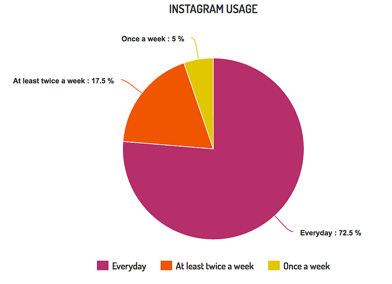
To make this even more interesting, 67.5% of the users I interviewed ranked Instagram in their Top 3 Most Used Application. Additionally, 72.5% of the people sampled uses their Instagram everyday.
And the fun continues
I asked the 40 Instagrammers I interviewed to describe Instagram using 3 adjectives. What do you think about Instagram? How does it make you feel?
I collected a total of 64 adjectives.
The top 3 adjectives were: Creative, Fun, and Simple
I also asked what they liked about Instagram. Here were their top 3 reasons:
- it’s picture-based
- it’s easy and simple to use
- it helps them stay connected

Who do you relate with more? Are you like Alex, who uses Instagram to share his life and occasionally uses the search feature to find cool things? Or are you like Sam, who uses Instagram to stay connected with friends and her interests? Or both?
Either way, I’ll be designing with users like you, Sam, and Alex in mind.
Now that you have a better understanding of who I was designing for, we can move on to the good stuff!
Experience #1: the Home Page
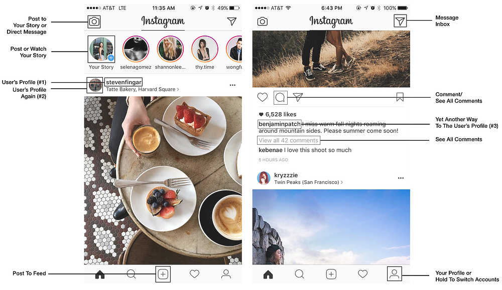
Aside from the repetitive functions within the home page, there were three major problems that I noticed.
Problem #1: Content Overload (Instastories vs Feed)
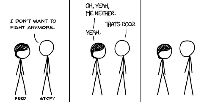
Immediately after opening the application, Instagram users are met with two prime features competing for their attention — should they scroll through the stories or surf through the feed?
Both options are very content-saturated, and can almost feel like an endless pit of scrolling. According to research on the paradox of choice, more choices can actually lead to decision fatigue, less happiness, and guilt or fear of missing out (FOMO). This is especially concerning when almost half of the Instagrammers I sampled reported checking their Instagram right after waking up and/or at night before bed.
Side note: I decided to keep the minimal chromatic design Instagram implemented in 2016 because I thought the reasoning and logic behind it was pure genius. You can read about it here.
For the solution, I chose to integrate the stories directly into the feed for a couple of reasons:
- The feed and story will now be working together to facilitate a more cohesive experience for the user.
- Integrating stories into the newsfeed also prevents it from being a “rooftop deck” like what Julie Zhuo (Product Design VP at Facebook) mentioned. In the current Instagram design, Instastories are easily forgotten once the user starts scrolling through the feed. Out of sight, out of mind.

- By implementing the stories into the feed, these would operate on a variable-ratio schedule of reinforcement. This is the most powerful type of operant conditioning that generates the highest response for any target behavior — in this case, instastories engagement.

Side Note: Don’t worry, I didn’t get rid of Instastories. I just moved them into the message inbox, which you can get to by clicking on the top right corner of the home page. I will discuss this further below.
Problem #2: Disassociation between top nav and swipe gestures
One of the main questions I sought to answer through my user research was whether or not the swiping features on the Instagram home page was intuitive.
Simply put, are Instagram users aware that swiping left and right corresponded with the top navigation?
To answer this question, I conducted a relatively simple experiment during the interviews.
Method (n=40)
Before I started this experiment, I reminded the users that they should not be looking at Instagram for this portion of the interview. Then I primed the user to visualize the interface of Instagram by describing to me the layout of a typical profile page of Instagram from top to bottom. And then again, with the home page. After describing the home page. I asked them four simple questions.
For swiping:
- From the home page, where does it take you when you swipe from left to right? Answer: Camera to post to story
- From the home page, where does it take you when you swipe from right to left? Answer: Message Inbox
For the top nav:
3. How do you get to the screen to post to your story? Answer: Top left camera icon
4. How do you get to your message inbox? Answer: Top right “arrow” icon
Note: If the user answered this part of the question with “swipe left/right”, I would prompt them to give an alternative answer. (Do you know another way to get to ______?)
Here’s all the data I collected.
Based on my results, overall swipe knowledge of Instagram isn’t that great:
- Only 20% of people responded correctly to both swipe responses.
- 30% got at least one correct, and 50% got NONE correct.
- 50% of people know swiping left to right takes them to the camera.
- 20% of people know swiping right to left takes them to the message inbox.
Top Navigation:
- 72.5% of people know how to get to their message inbox by clicking on the top right arrow icon.
- 55% of people know how to post to their story by clicking on the top left camera icon.
Additional fun facts and stats:
- Only 3 out of 40 people interviewed got all four questions correct.
- On a scale of 1–5 on how familiar they are with navigating around Instagram, 75% of people rated themselves 4 or higher. Only 30% of those people got at least ONE of the swiping questions right.
- A considerably high 92.3% of the people who answered incorrectly believed or guessed that swiping left would take them to the explore/search page. (Which makes sense since the search/explore icon is located next to the home icon on the bottom nav)
The analysis from the results suggests that Instagram users have not established an association between the top navigation and the swiping features.
“I don’t know. I just tap around until I find what I’m looking for, and then all of a sudden I see my face…” — random Instagram user when asked how do they get to their message inbox
One way to make the swipe gestures more intuitive might be to link it with the bottom navigation. However, I thought this would be a great opportunity for me to implement a completely new feature…
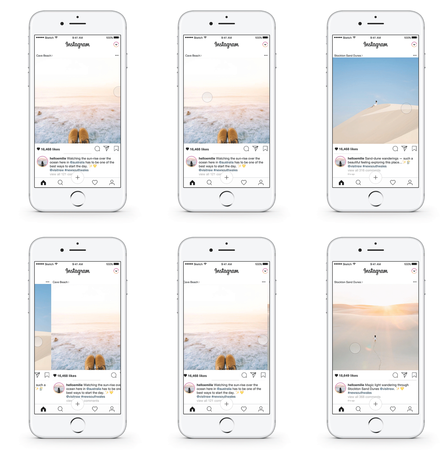
Swiping to see new and older posts
Part of my user research was spent reading through the reviews of Instagram on the app store. One of the main complaints from Instagram users was the lack of chronological order on the feed.
What I wanted to know was why people wanted their feed to be chronological? Why were they so upset about this change? By digging deeper, I found that users correlated chronological with thoroughness. With Instagram’s current algorithm, popular posts (deemed to be posts that you wanted to see) are located towards the top of the feed. This frustrates Instagram users because they would often missed a post that they would want to see but didn’t (aka FOMO — fear of missing out).
To compromise with Instagram’s current algorithm and the user’s need for chronological order, I decided to implement this swiping feature with an indicator to give users some peace of mind:

For example, if the indicator is in the middle. You’ll know that this is not the newest post and you can swipe right to see the newer posts. If the indicator is on the far left, you can rest assure knowing that you’re on the newest post from that user. To see older posts, just keep swiping left.

Problem #3: Top left corner — out of reach, out of mind.
People hold their phones in many ways. Regardless of how they hold it, the top left corner of the screen will alway be the most inconvenient and painful location to place a navigation for users. Because reaaaaach *drops phone on face*… or something to that effect.
Research suggests that the most accessible and least painful spot to place the navigations will be towards the bottom of the phone — right next to the user’s thumb.

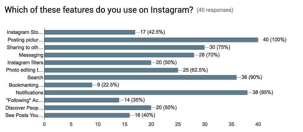
From my data, 100% of the people I interviewed know how to post to their feed (because they use it). However only 57.5% of those same people either don’t know how to post to their story or just don’t use it at all. To increase the posting activity for Instastories, I chose to combine the two posting features because 1) it is now easily accessible and 2) low-key praying that the popularity from the feed will rub off on the stories.
Experience #2: Explore and Discover Mode
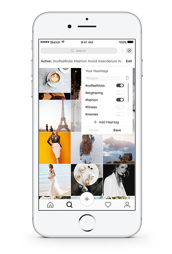
Now you have the option to explore spontaneously through Instagram’s current native algorithm or discover intentionally through your own collection of saved hashtags. So Sam and Alex can just turn on “#ecgtracing” or “#fitness” to stay updated with their interests.
In my case, I would probably turn on “#coffeefliicks” and “#dametravelers” to see aesthetic pictures of coffee and places. You can also just click individually on the hashtags to see one at a time and then drag down to refresh to see all the active hashtags together. You can also click to add new hashtags, delete hashtags, or search within your hashtags collection (and yes, it’s in alphabetical order).

Experience #3: Sliding into the DM and Stories
Only 42.5% of the users I interviewed used Instastories. Two of the biggest reasons why people didn’t use Instastories were because 1) they already have Snapchat and/or 2) they kept seeing new stories from people they don’t particularly care about.
To remedy the second reason, I implemented a new feature called “Stories From Your Favs” to instill more value and purpose into using Instastories.
Now the stories of the people you love, adore, and/or admire are all at the top for your feed for your immediate viewing pleasure. Talk about staying connected!
You can easily remove or add people to your favs by clicking on the heart located next to their name. (Awee)
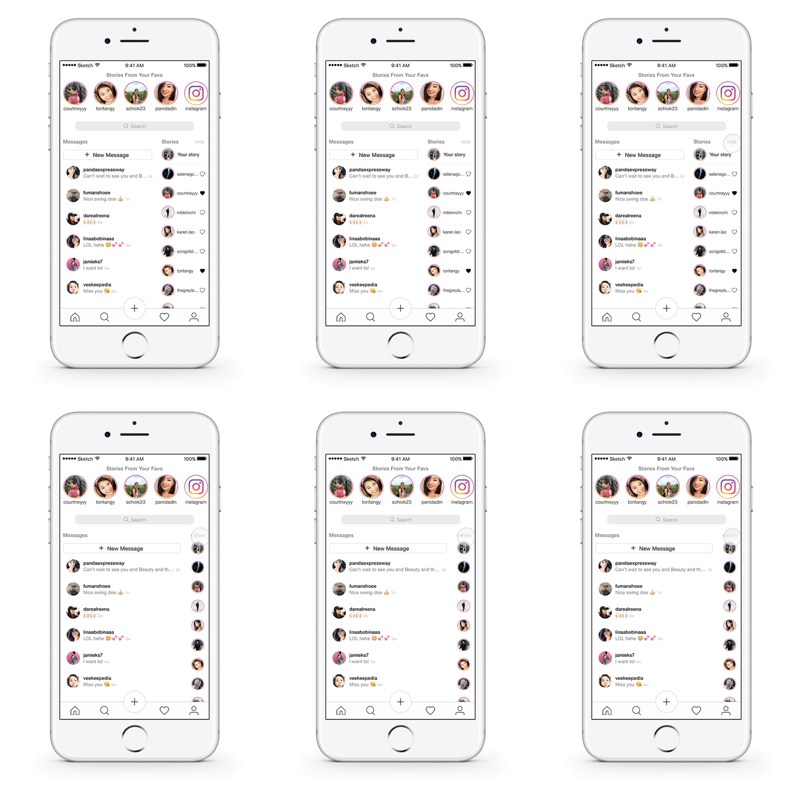
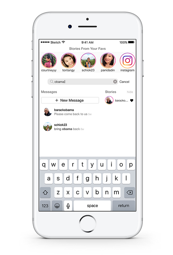
Side note: What was my reason for moving stories into the DM? First, I needed a place to put the stories since I moved it out of the feed. Second, when you reply to a story or send a photo, it goes directly into your message inbox. Therefore, it made sense to group Instastories and DM into one big happy package.
Another side note: In the current message inbox interface, there is no bottom navigation. Users would only know how to get back to the home page if they know how to use the swiping features, and as I mentioned above — only 20% of the users I interviewed knew that swiping left takes them to their DM. With that in mind, I decided to keep the bottom navigation static here so that users wouldn’t feel lost.
Experience #4: Notifications and Profile
Ahhhh… the final stretch. For the notifications and profile page, I wanted to give the user interface more breathing room by adding more negative space and grouping/nesting similar items.
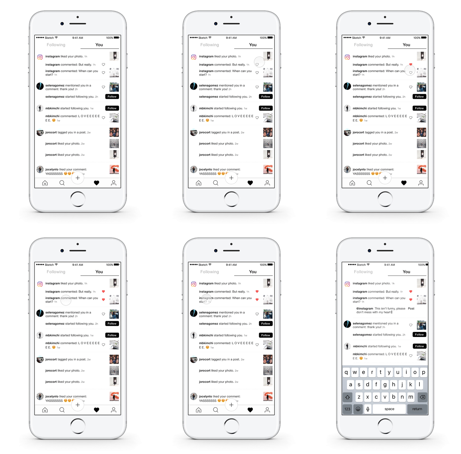
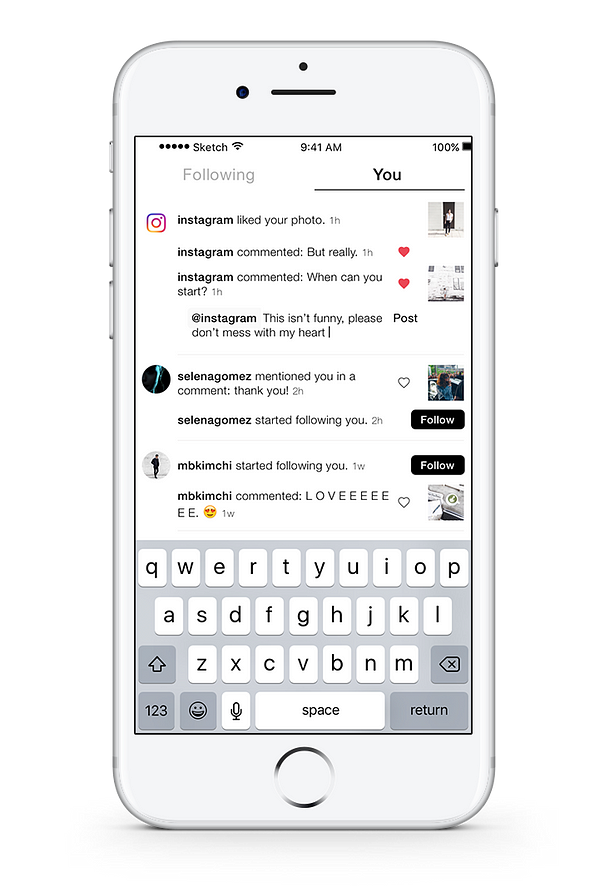
Additionally, you can now “like” and reply to comments directly within your notifications just by holding that person’s username (tapping takes you to their profile). Once you hold the username, it will trigger a comment box to appear with an automatic @username. Then all you need to do is to type your response and hit “Post”.
I thought this would be a great feature because often times, you can get lost in the sea of comments within the post. What was their username again? Where is the comment? What did the comment say?
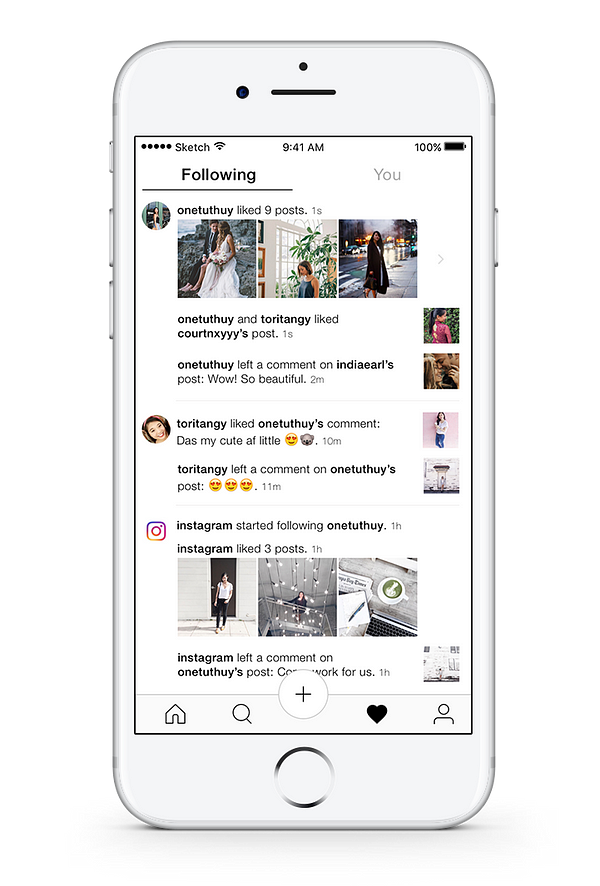
“Following” Notifications
Last fun fact of the day — only 35% of the Instagram users I interviewed checked the activities of the people they were following. Whether to keep this function or not was probably the hardest decision I had to make. I decided to keep it and simply redesigned it in a way as to draw more attention to the activities by enlarging the photos.
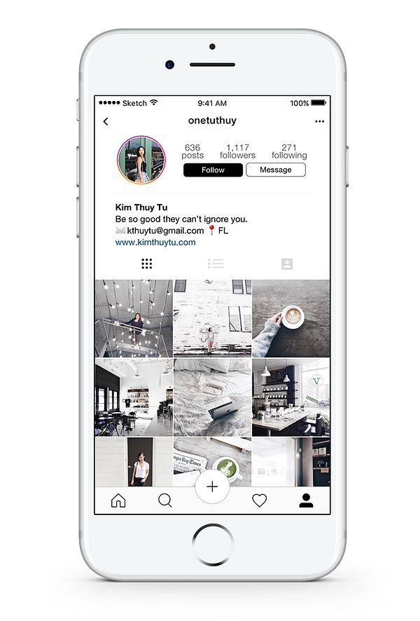
Profile
To be honest, I love Instagram’s current design. To increase the minimalism, I made some slight changes to the viewing icons and added in more negative space to keep the design consistent.
Reflecting on the work I’ve done here
Going into this project, I knew this would be the perfect opportunity for me to hone my design skills. I had just switched from studying medicine this past semester, and I wanted to pursue a career in product design. So I figured the best way for me to learn would be to just throw myself into a project, and go from there.
Looking back now, that is a complete understatement. Within the last two months, I was able to learn all the things I set out to learn in order to deliver this project and so much more.
I think one of the best things about the learning and creation process is that you come to curate your own. You learn what works, and what doesn’t. You learn how to do things faster, better, and more efficiently. You learn random things along the way while trying to learn about the thing you actually set out to learn.
And the cherry on top of that is that it doesn’t end. The learning process is continuous.
“Design doesn’t get easier. You just get better.”
And that’s a wrap. Thank you so much for reading!
from Sidebar http://sidebar.io/out?url=https%3A%2F%2Fmedium.freecodecamp.com%2Fi-wanted-to-see-how-far-i-could-push-myself-creatively-so-i-redesigned-instagram-1ff99f28fa8b%23.jmfeahdul
