SNEAK CONTEXT IN. (ALWAYS)
A dataset might lead to many stories. Data is a tool that filters reality in a highly subjective way, and from quantity, we can get closer to quality. Data, with its unique power to abstract the world, can help us understand it according to relevant factors. How a dataset is collected and the information included — and omitted — directly determines the course of its life. Especially if combined, data can reveal much more than originally intended. As semiologists have theorized for centuries, language is only a part of the communication process — context is equally important.
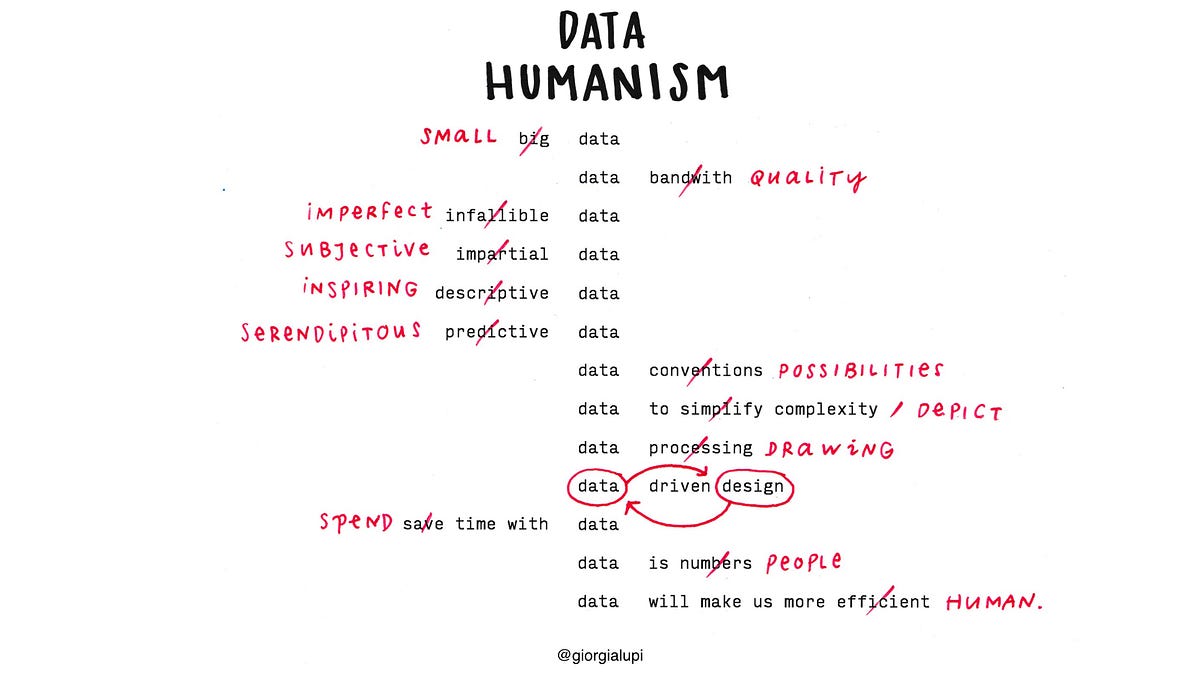
This is why we have to reclaim a personal approach to how data is captured, analyzed and displayed, proving that subjectivity and context play a big role in understanding even big events and social changes — especially when data is about people.
Data, if properly contextualized, can be an incredibly powerful tool to write more meaningful and intimate narratives.
To research this realm, I undertook a laborious personal project: a yearlong hand-drawn data correspondence with information designer Stefanie Posavec. We have numerous personal and work similarities — I am Italian and live in New York, and she is American and lives in London. We are the exact same age, and we are only-children living far away from our families. Most importantly, we both work with data in a very handcrafted way, trying to add a human touch to the world of computing and algorithms, using drawing instead of coding as our form of expression. And despite having met only twice in person, we embarked upon what we called Dear Data.
For a year, beginning Sept. 1, 2004, Posavec and I collected our personal data around a shared topic — from how many times we complained in a week, to how frequently we chuckled; from our obsessions and habits as they showed up, to interactions with our friends and partners. At the end of the week we analyzed our information and hand-drew our data on a postcard-sized sheet of paper, creating analog correspondence we sent to each other across the Atlantic. It was a slow, small and incredibly analog transmission, which through 52 pretexts in the form of data revealed an aspect of ourselves and our lives to the other person every week.
We spent a year collecting our data manually instead of relying on a self-tracking digital app, add- ing contextual details to our logs and thus making them truly personal, about us and us alone.
For the first seven days of Dear Data we chose a seemingly cold and impersonal topic: how many times we checked the time in a week.
On the front of my postcard, (as shown above) every little symbol represents all of the times I checked the time, ordered per day and hour chronologically — nothing complicated. But the different variations of my symbols on the legend indicate anecdotal details that describe these moments: Why was I checking the time? What was I doing? Was I bored, hungry or late? Did I check it on purpose, or just casually glance at the clock while occupied in another activity? Cumulatively, this gave Posavec an idea of my daily life through the excuse of my data collection — something that’s not possible if meaning isn’t included in the tracking.
As the weeks moved on, we shared everything about ourselves through our data: our envies, the sounds of our surroundings, our private moments and our eating habits.
We truly became friends through this manual transmission. And in fact, removing technology from the equation triggered us to find different ways to look at data — as excuses to reveal something about ourselves, expanding beyond any singular log, adding depth and personality to quantitative bits of information.
In a time when self-tracking apps are proliferating, and when the amount of personal data we collect about ourselves is increasing all the time, we should actively add personal and contextual meaning to our tracking. We shouldn’t expect an app to tell us something about ourselves without any active effort on our part; we have to actively engage in making sense of our own data in order to interpret those numbers according to our personal story, behaviors and routine.
While not everyone can do a project as hyper-personal as this one, data visualization designers can make their interpretations more personal by spending time with any type of data. This is the only way we can unlock its profound nature and shed light on its real meaning.
from Sidebar http://sidebar.io/out?url=https%3A%2F%2Fmedium.com%2F%40giorgialupi%2Fdata-humanism-the-revolution-will-be-visualized-31486a30dbfb%23.y7krgbafl
