A handy article about human attention from a psychologist’s and a UX Designer’s view.

As a UX designer, we design digital products that people interact with. When we designing these products, we spend a lot of time on different research to understand the behavior, habits, and needs of our users. However, there is a couple of general patterns that characteristic of all people. To be consciously used, we need to understand the process of human cognition.
The purpose of this article is to understand the concept, function and types of visual attention and to use this knowledge in everyday product design.
What does psychology say?
In this section one of my friend, Anikó Tőzsér helps us to clarify the basic principles of human attention.
What determines what we pay attention for?
Attention is an ability which helps to select the information between different stimuli and process. Our attention can decide that we want to deal with the stimuli or ignore it. Sometimes this process is automatic and sometimes we focus our attention on a problem which we have to solve.
Psychology of attention deals with mechanisms of perception which form the behavior, and how consistent behavior is created. Psychological researchers of attention concentrate on audition and sight.
Spatial attention vs feature-based attention
There are two ways of visual attention: spatial attention and feature-based attention. Spatial attention means that we direct our attention to a particular region. Feature-based attention means that we direct our attention to a particular feature, for example colour.
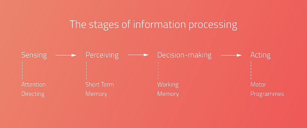
Human Information processing
For the sake of design products, which grab people’s attention, we need to understand the processing of human information.

However this is a debated issue.
- When one period is finished, the next one starts, and the periods contain more and more complicated feature of the stimuli.
- Others argue that it’s continuous, which means that every stimulus is transmitted immediately.
Types of attention
There are different types of attention, which are determined by the situation and the intensity of the stimuli.
Selective Attention: it is an automatic process, which chooses between important and less important stimuli depending on the situation. As we can attend to only one thing at the same time, this kind of process helps to select the most important stimuli in the given situation.
As a UX designer we need to be aware of the fact of intensive changes: intensive changes of the environment draw the user attention. With this fact under our belt, we can consciously design user experiences that truly fit the users.
Divided attention: if a process is automatic, more process can happen simultaneously. A great every day example is driving and talking at the same time. We can pay attention only to one action at the same time, that’s why if something happens on the road in front of the driver, the driver will stop talking and concentrate on the driving. In this moment the attention becomes Focused, when the attention is limited to one object, action or stimuli.
Focused attention is the brain’s ability to concentrate its attention on a target stimulus for any period of time.(cognitivefit)
Sustained Attention: Sustained attention is when we keep our focus on one subject for a long time, even if we need to repeat the given action or activity.
As a UX Designer, we need to know that during the learning and working activities (listening to a teacher or reading an online lesson) the users need to use their sustained attention. It means that everything on the user interface should serve this goal.
Attention is a limited cognitive resource
As a UX designer we need to reduce cognitive overload.
Each sense modality has some separate attentional resource. An auditory task interferes less with a secondary visual task would.
”It is much easier to monitor the road ahead while talking on a cell phone than when looking at the navigation system.” (Visualexpert)
In one moment 5–9 (7+-2 The magical number) objects can be detected, which means that the area of spatial attention is not constant, it can be broader or smaller.
Cocktail Party Effect:
Cocktail party effect is the ability to tune into a single voice and tune out all others during a crowded party. This also could happen in the digital environment. Web party effect is the cocktail party effect in the web environment.
As Dr. Susan Weinschenk explained in her article, you can use the senses to grab attention. Colours, contrast, fonts, white spaces, beeps, and tones are helping to capture attention.

Too Many Options (Hick’s Law)
More choices need more cognitive load. “It describes the time it takes for a person to make a decision as a result of the possible choices he or she has: increasing the number of choices will increase the decision time logarithmically.”

Change Blindness
Depending on our focus, our brains can be fully blind to changes going on around us. We need to design our products according the main user goals and tasks. UX is a treasure box full of with useful methods and techniques. Creating user journey map or conduct task analysis could help us to avoid the ‘change blindness’ effect.
Thank you! ❤️
UX & Psychology go hand in hand — Introduction to human attention was originally published in UX Design Collective on Medium, where people are continuing the conversation by highlighting and responding to this story.
from UX Design Collective – Medium https://uxdesign.cc/ux-psychology-go-hand-in-hand-introduction-to-human-attention-a70ffd2c4289?source=rss—-138adf9c44c—4
